
Search results for "Reduce action" in Home Design Ideas




Find the right local pro for your project


 Roe Anne White Photography
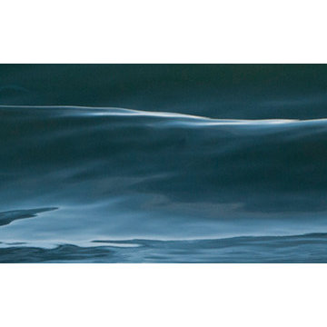
100 GRAND at Sullivan Goss - an American Gallery, Santa Barbara, CA December 2013 - February 2014 -- © Roe Anne White Photography
w a v e @ p o r c h . sept 7 - oct 31, 2018 . opening reception sept 8 from 3:00 - 5:00 . 3823 santa claus lane . carpinteria, ca
 Lola Cwikowski Studio
An Ohio family in search of a place to enjoy the Portuguese coast acquired a four-bedroom apartment just outside the center of Cascais. Our studio was engaged to turn a compartmented interior into a holiday residence for a household that gathers in numbers: one that could seat everyone at once and still hold the ease and lightness of a home by the beach.
The original plan included a kitchen and laundry room sealed off from the living room, floor finishes and levels that changed from threshold to threshold, and bathrooms in varying styles. Work began by redefining the alignments and circulation. The principal transformation was the opening of the kitchen, creating a more generous social setting centered on a bespoke island fitted with storage and seating.
The interior takes its cues from the building’s geometric façade, which projects and recedes in volumes and voids. Bespoke joinery in oak and lacquer carries continuity and order through the apartment. Concealed storage runs throughout: at the entrance, in the dining area, along the living area, and beneath built-in benches. The laundry is merged into the kitchen behind perforated doors for ventilation while keeping the service area discreet. Behind the sofa, a console slips a workspace into the living area without conceding its openness.
Curved elements answer the rectilinear architecture; artisanal glazed vertical tiles repeat from the backsplashes onto custom side tables. The palette stays deliberately narrow; the muted oak and lacquer are joined by a softened timber floor, Portuguese Lioz stone, and walls painted to the color of bare plaster. Existing doors and baseboards were repainted in a warm light gray that draws the original elements into the language of the new interior. Upholstery and decorative accents hint at the terracotta, sky blue, and yellow of the façade.
The bedrooms are set with upholstered headboards on oak frames, bedside tables that extend those outlines, and wardrobes fit for a long stay. Locally made rugs, bedcovers, and throw pillows soften the composition. In the bathrooms, the plans were reorganized and the showers enlarged. Lioz was used for the counters and sinks, shelves, shower bases, and bathtub surround, with microcement bringing a soothing warmth to the walls, and storage in floating cabinets. Deeper in tone than the rest of the apartment yet never dim, they are quietly elegant rooms made for lingering — taking one’s time getting ready, or unwinding at the end of a day.
PHOTOGRAPHY: © ALEXANDER BOGORODSKIY
 Nick's Pro Tile & Bath Remodeling
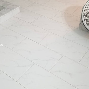
This bathroom remodel features a bright and modern walk in shower with large format white tile and a custom herringbone accent niche. The shower floor was finished with small mosaic tile for proper drainage and slip resistance. Matching floor tile was installed throughout the bathroom for a seamless, clean look.
The design focuses on simplicity, clean lines, and a timeless finish. Every detail was completed with precision to ensure a high quality and long lasting result.



 Ollin Stone
This Zermatt Quartzite is certainly the belle of the ball – rare, luxurious, and full of color. The stone appears quite delicate with its rosy hue “marred” by the unique pattern left by the dark veins scrawled across the surface. Elegance still reigns, thanks to the patches of white quartz. 2CM Quartzite slabs w/ polished finish, custom finishes available upon request.






 Shades of Gray Design Studio
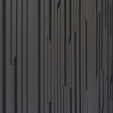
Wood accent wall.
Living room - contemporary open concept vaulted ceiling living room idea in Austin with a wall-mounted tv
Living room - contemporary open concept vaulted ceiling living room idea in Austin with a wall-mounted tv
 KURV Architecture DPC (Alex Hughes Architects)
Located in the heart of Manhattan’s Lower East Side, the building was erected on a shallow commercial lot between two 120 year old masonry buildings and a new residential rental building. 330 Grand Street is a mix of 725 SF 1BRs and 1050 SF 2BR apartments. It also contains a 1100 SF two story duplex as well as private and public rooftop space, large private balconies for most units and two large private terraces for the ground floor units.
330 Grand Street was originally designed and approved at the NYC DOB as a prefabricated modular building. During the pandemic, as shipping costs skyrocketed putting the project at risk, we suggested redesigning the building as a reinforced cast-in-place concrete structure. Concrete was readily available and prices had not been affected by the demand increase that many other materials suffered in the pandemic. We took this opportunity to raise floor to ceiling heights, enlarge high performance windows and redistribute the buildings MEPFS and Structural Systems to create very open floor plans.
The challenge was to create a luxurious sensorial living experience with very limited means. In a city with very high construction costs, low cost residential buildings in the area are usually devoid of good quality, design and character. Our approach was to aim high for the end user, prioritizing natural light, open space with long visual perspectives, high ceilings and as always, rejecting the use of predefined building templates.
Our biggest challenge was to ensure that the small spaces feel as clean cut, large and bright as possible. Several unique design decisions were made to ensure low cost and high quality;
Floor plans were laid out so that spaces were wide open and free of clutter from mechanical or structural interruptions. Therefore all infrastructure was placed in lateral demising walls, which in turn act as the unit’s storage and kitchen. The apartments feel wide open, are super quiet and have more storage space than any other comparable apartment in the city.
To solve the problem of the site’s shallow commercial lot which is typically prone to dark interior spaces we focused our attention on the building’s envelope. Instead of the usual small punched window openings, oversized high performance windows were designed to ensure that light penetrated as far as possible into the units. In the smaller 1BR units, the full 50’ depth of the lot is perceived by partitioning spaces with sliding pocket doors that can be retracted to allow deep visual perspectives, making the sight lines in the space feel longer, larger, more ample than normal. In addition to the full height glazing, each unit above the 2nd floor receives a 7 foot covered balcony, adding 120 to 240 sf to each apartment, something unusual in New York City buildings. The space is large enough for a full size dining table, when the weather permits being outside.
We also worked hard to ensure modularity. For example, all kitchen units are all identical throughout the building. The idea of modularity and the economy of the repetitive unit is exercised to the maximum through the building.
Hardware, appliances, flooring, wall coverings and material finishes are all carefully selected to feel bespoke, high quality and unique.
It was important to KURV that the result of this work manifest into something that would deeply connect with the end user and sustain relationships with the consumers of this space.
All images by KURV Architecture ©






65