
Search results for "Reduce after school" in Home Design Ideas

 Bremen Builders
Amy Smucker Photography -
This shower has 4 body sprayers, a rain head and hand held shower wand. The glass door swings both ways because many people pull a door open to enter. When finished with their shower they can open the door inward and pull the towel off the exterior towel bar/door handle. Drying off in the shower reduces the amount of water that drips onto the bathroom floor.
Most shower glass installers rest the glass on the (usually flat) curb and apply a bead of silicone to keep the water from going out to the bathroom floor.
As with other projects, we sloped the curbs in the 3 shower stalls in this house inward and the glass walls are raised about 1/4 inch above the tile curb so air can flow easily which helps dissipate moisture after a shower.
The water doesn't splash out because the curb is sloped up on the outside of the glass. And more importantly since there is no silicone where the water can sit and grow mold this configuration makes cleaning the shower easy.

 Suzanna Santostefano
Inspiration for a bedroom and mid-sized eclectic gender-neutral dark wood floor and brown floor kids' bedroom remodel in Austin with white walls

 JRP Design & Remodel
Our client came to us with a desire to take an overgrown, neglected space and transform it into a clean contemporary backyard for the family to enjoy. Having had less than stellar experiences with other contractors, they wanted to find a trustworthy company; One that would complement their style and provide excellent communication. They saw a JRP banner at their son's baseball game at Westlake High School and decided to call. After meeting with the team, they knew JRP was the firm they needed to give their backyard a complete overhaul.
With a focus on sleek, clean lines, this contemporary backyard is captivating. The outdoor family room is a perfect blend of beauty, form, and function. JRP reworked the courtyard and dining area to create a space for the family to enjoy together. An outdoor pergola houses a media center and lounge. Restoration Hardware low profile furniture provides comfortable seating while maintaining a polished look. The adjacent barbecue is perfect for crafting up family dinners to enjoy amidst a Southern California sunset.
Before renovating, the landscaping was an unkempt mess that felt overwhelming. Synthetic grass and concrete decking was installed to give the backyard a fresh feel while offering easy maintenance. Gorgeous hardscaping takes the outdoor area to a whole new level. The resurfaced free-form pool joins to a lounge area that's perfect for soaking up the sun while watching the kids swim. Hedges and outdoor shrubs now maintain a clean, uniformed look.
A tucked-away area taken over by plants provided an opportunity to create an intimate outdoor dining space. JRP added wooden containers to accommodate touches of greenery that weren't overwhelming. Bold patterned statement flooring contrasts beautifully against a neutral palette. Additionally, our team incorporated a fireplace for a feel of coziness.
Once an overlooked space, the clients and their children are now eager to spend time outdoors together. This clean contemporary backyard renovation transformed what the client called "an overgrown jungle" into a space that allows for functional outdoor living and serene luxury.
Photographer: Andrew - OpenHouse VC
Find the right local pro for your project

 Casework Inter Design
A lot of homes built in the early 1900s in Portland have been remodeled beyond recognition. The trim has been painted, the floors replaced and the built-ins just didn't make it through years of wear and tear. That's not the case with this home in the Ladd's Addition neighborhood of Portland. Built in 1911, the dark trim remained unpainted, the fir floors still intact and the built-ins in the dining room were in almost perfect condition but the home was dark, empty and didn't function for the owners.
Contrary to all my other thoughts in design to lighten a home, we embraced the dark. The trim and floors were sanded and refinished to their original state. In the entry, the walls were painted black. After multiple meetings and conversations with the client where nothing out there seemed quite right, I developed along with artist, Michael Paulus, a custom flower that fit the owner's personality and style down to the scale and exact color palette. This became the inspiration and guiding color scheme to create a glamorous but livable home that was neutral and rich in texture.
Interior Design: Casework
Photography: George Barberis
General Contractor: Hammer & Hand
Hand Painted Walls: Michael Paulus
Custom Mantel and Bathroom Cabinet: Brian Pietrowski
Press: Gray Magazine

 Rock Custom Builders / Remodeling RockCustoms.com
This is a Kitchen Remodel we did on an existing home that another builder had initially built. Before the remodel you can see the kitchen was very closed off and lacking storage. After we remodeled the kitchen not only was the kitchen opened up but we custom made counters, additional cabinetry, bead board ceilings, subway tile, new stainless sink, wired for recessed lighting, painted as well as created a coffee bar and more. We would love to discuss your remodel/addition/or new build of your project. We are committed to Build Beautiful. Thanks for your Consideration. -Joel & Megan Ray.
 Rock Custom Builders / Remodeling RockCustoms.com
This is a Kitchen Remodel we did on an existing home that another builder had initially built. Before the remodel you can see the kitchen was very closed off and lacking storage. After we remodeled the kitchen not only was the kitchen opened up but we custom made counters, additional cabinetry, bead board ceilings, subway tile, new stainless sink, wired for recessed lighting, painted as well as created a coffee bar and more. We would love to discuss your remodel/addition/or new build of your project. We are committed to Build Beautiful. Thanks for your Consideration. -Joel & Megan Ray.

 Story Homes
A galley kitchen places all counters, cabinetry and appliances along one or both long walls. The style was designed with space efficiency in mind, but it also makes cooking and entertaining convenient.
The original kitchen in this project had knotty pine cabinets and a soffit that framed the kitchen but reduced storage. A butcher block on wheels became a center island that the owner wanted to keep.
The remodeling design called for new stainless steel appliances, with antique white upper and lower cabinets and black granite countertops. The soffit was eliminated which allowed the upper cabinets to reach to the ceiling, adding more than 24 cubic feet of storage space.
Note the single light above the stainless steel sink that reinforces a nautical theme. The walls below the cabinets and the back splash feature white subway tiling, and under-cabinet lighting makes the whole kitchen feel more open and spacious.
This design makes the most out of long, narrow spaces to create an inviting kitchen for entertaining family and friends.


 Housing & Building Association of Colorado Springs
The Home
While looking for space where their active family could expand, these homeowners turned to Black Forest, with trees that remind them of their Indiana years. A stunning Pikes Peak view underscores how fortunate they are to live in Colorado. This home features classic nods to the owner’s French heritage while embracing a thoroughly of-the-moment Colorado lifestyle. Priorities for these homeowners included blending outdoor and indoor spaces wherever possible with generously proportioned windows and doors, porches, patios and balconies.
A gracious lime-washed brick entry punctuates a simplified white stucco and black-frame-windowed exterior with traditional
rooflines. Dramatic open spaces on the main floor comfortably accommodate the everyday activities of this busy family of four, while
providing for welcomed visits from family and friends. A functional, open kitchen is designed for serious cooking, a butler’s pantry for
staples, and serveware storage and dining spaces that effortlessly host after-school snacking to multi-course meals. A main-level,
Peak-view office comfortably supports working at home, complete with a beer cave and tasting nook for hosting fellow aficionados
after work is done. Guests will find comfort and privacy in a ma in-level guestroom suite or sleepover fun in the built-in bunks of the
expansive over-garage bonus room.
This home is a true collaboration that blends the homeowner’s long-held vision of their ideal home brought to life by the builder’s vision
and design/build process that achieves something truly…Warm and welcoming in the Forest.
The Builder
Stauffer & Sons Construction is a true Design-Build team creating some of the finest living spaces in the Pikes Peak region for over twenty years. We’ve developed an easy point-of-entry to the Design-Build process that begins with our very popular Conceptual Design and Budgeting Agreement. This affordable, low-commitment step provides answers to the early-stage questions of “what and how much?” With this critical information in place, a robust collaboration between client and builder ensues, resulting in a thoughtfully designed home that strikes a balance between size and scope and budget.
The Interior Design
Family, friends and soon-to-be friends are welcomed into this updated version of a French country farmhouse through a bricked archway and a solid arch-top entry door. Once inside, a sweeping gallery of windows adorned with flower-filled window boxes sets a nice foreground to the ponderosa pine forest. A great room with a two-story, lime-washed, brick fireplace sits juxtaposed to a cozy farm-styled kitchen with large island, plenty of storage and a Pikes Peak view. This family home features a simple, clean design with warm, wooden beams and solid, white-oak flooring. This home is designed to be lived in. Wherever you go, downstairs, upstairs or out on the porch, this home wraps around you and is a delightful place to enjoy.

 Garrett Leather
© Forest Productions, Michael Mandolfo
Inspiration for a contemporary family room remodel in New York
Inspiration for a contemporary family room remodel in New York
 Forward Design Build Remodel
Formerly a very divided bathroom, our goal was to open the space up allowing the natural light from the window to pass through the entire bathroom while still providing privacy.
We worked to creatively incorporate additional storage and to close off the toilet into a private closet. The homeowners were very interested in a Japanese soaking tub and maintaining a very clean and modern space to relax after working heavily in color and pattern with their work. We created a taller showering space by moving the plumbing into the floor. We used a floor length linear drain to allow for the large format tiles throughout reducing grout lines.
All beams were original to the space and were important to keep visible for cohesiveness throughout the home. They really bring an element of warmth and a touch of rustic to an otherwise very modern space.
With thoughtful modern finishes and a neutral color palette, we were able to create a space that is relaxing for the mind and body.


 Edgewater Design Group
As written in Northern Home & Cottage by Elizabeth Edwards
Sara and Paul Matthews call their head-turning home, located in a sweet neighborhood just up the hill from downtown Petoskey, “a very human story.” Indeed it is. Sara and her husband, Paul, have a special-needs son as well as an energetic middle-school daughter. This home has an answer for everyone. Located down the street from the school, it is ideally situated for their daughter and a self-contained apartment off the great room accommodates all their son’s needs while giving his caretakers privacy—and the family theirs. The Matthews began the building process by taking their thoughts and
needs to Stephanie Baldwin and her team at Edgewater Design Group. Beyond the above considerations, they wanted their new home to be low maintenance and to stand out architecturally, “But not so much that anyone would complain that it didn’t work in our neighborhood,” says Sara. “We
were thrilled that Edgewater listened to us and were able to give us a unique-looking house that is meeting all our needs.” Lombardy LLC built this handsome home with Paul working alongside the construction crew throughout the project. The low maintenance exterior is a cutting-edge blend of stacked stone, black corrugated steel, black framed windows and Douglas fir soffits—elements that add up to an organic contemporary look. The use of black steel, including interior beams and the staircase system, lend an industrial vibe that is courtesy of the Matthews’ friend Dan Mello of Trimet Industries in Traverse City. The couple first met Dan, a metal fabricator, a number of years ago, right around the time they found out that their then two-year-old son would never be able to walk. After the couple explained to Dan that they couldn’t find a solution for a child who wasn’t big enough for a wheelchair, he designed a comfortable, rolling chair that was just perfect. They still use it. The couple’s gratitude for the chair resulted in a trusting relationship with Dan, so it was natural for them to welcome his talents into their home-building process. A maple floor finished to bring out all of its color-tones envelops the room in warmth. Alder doors and trim and a Doug fir ceiling reflect that warmth. Clearstory windows and floor-to-ceiling window banks fill the space with light—and with views of the spacious grounds that will
become a canvas for Paul, a retired landscaper. The couple’s vibrant art pieces play off against modernist furniture and lighting that is due to an inspired collaboration between Sara and interior designer Kelly Paulsen. “She was absolutely instrumental to the project,” Sara says. “I went through
two designers before I finally found Kelly.” The open clean-lined kitchen, butler’s pantry outfitted with a beverage center and Miele coffee machine (that allows guests to wait on themselves when Sara is cooking), and an outdoor room that centers around a wood-burning fireplace, all make for easy,
fabulous entertaining. A den just off the great room houses the big-screen television and Sara’s loom—
making for relaxing evenings of weaving, game watching and togetherness. Tourgoers will leave understanding that this house is everything great design should be. Form following function—and solving very human issues with soul-soothing style.

 User
How do you flip a blank canvas into a Home? Make it as personable as you can. I follow my own path when it comes to creativity. As a designer, you recognize many trends, but my passion is my only drive. What is Home? Its where children come home from school. It's also where people have their gatherings, a place most people use as a sanctuary after a long day. For me, a home is a place meant to be shared. It's somewhere to bring people together. Home is about sharing, yet it's also an outlet, and I design it so that my clients can feel they could be anywhere when they are at Home. Those quiet corners where you can rest and reflect are essential even for a few minutes; The texture of wood, the plants, and the small touches like the rolled-up towels help set the mood. It's no accident that you forget where you are when you step into a Master-bathroom – that's the art of escape! There's no need to compromise your desires; it may appeal to your head as much as your heart.

 Mottram Architecture
Timber frame homes offer unique challenges during a remodel. What often makes them beautiful and attractive to most homeowners, also makes them challenging for space requirements.
Context: The lovely couple that owned this home were struggling with some interesting floor plan challenges that just didn't work for their family. The loved the beautiful timbers and woodwork of their home, but the dramatically sloping ceilings on the second floor, particularly in the bathroom, just didn't work for this 1 1/2 bath home. Needing to use the skylight to approach the toilet was a less then ideal scenario. Although the bathroom footprint was more then adequate, the sloped ceiling only made half of the space useable. Check out the Before/After post on our blog to see the photos of the house pre-renovation. As much as they loved all the wood features in their home, another challenge they had was light. The wood ceiling made everything inside the house darker, even with a fantastic array of south facing windows, there were spaces in the home that felt dark and small. When they contacted us they wanted to know how could they make their brighter and more inviting, were there solutions to the 2nd floor sloped ceiling issues, and if they were going to do all of this work, how could they make their home more comfortable and efficient. A nagging water leak in the upstairs bathroom spurred them into action and here is how we solved their dilemma.
Conclusion: First, we added a little dormer to the rear of the house so we could get full headroom in nearly all of the upstairs bathroom! Then we decided to extend that dormer one more timber bay over to create a walk in closet with natural light and plenty of space. Since we were contemplating energy efficiency, we resolved a nagging issue that is present in a lot of timber frame construction, air tightness. Commonly found in timber frame construction, fiberglass insulation is installed in the rafter bays and board ceilings are installed over top. Unfortunately, board ceilings are anything but air tight, and fiberglass insulation needs to be in an airtight cavity for maximum effectiveness. So we were able to solve two issues at the same time for this homeowner. We removed the board ceiling and fiberglass insulation, we dense packed the rafter bays with cellulose insulation, and installed sheetrock in place of the boards. The boards were salvaged for re-use by the homeowner, and the space and light quality was dramatically improved. Some may think that losing the board ceiling took something away from the space, but what you'll see in the pictures is that it highly accentuates the heavy timbers and really makes them stand out in a beautiful way. Now with this added airtightness, better insulation, and brighter space, the homeowner hardly runs their wood stove, and it's so quiet in the space, an added bonus from changing the insulation. It became necessary to also add a sheetrock ceiling to the living room to hide the plumbing from the new bathroom layout above. Changing this ceiling gave the homeowner some real quality lighting that was lacking in the living room before. The brighter ceiling and new lighting layout completely transforms the living room into a space you want to hang out, even though the layout didn't change at all. When the homeowner saw the finished spaces she said "I can't believe this is my house, I want to live in this house"
Energy Efficiency: I touched a little on the efficiency above, but like all projects done with Mottram Architecture, we always want to leave you with a little extra. Timber frame construction with board ceilings and fiberglass insulation are notoriously leaky! If you want to know what we think about fiberglass insulation, check our our blog post on Why Fiberglass Insulation Sucks. By installing cellulose insulation and covering it with sheetrock we were able to greatly reduce the heat flowing out of this home. It not only improves cashflow it improves the comfort level in the space. Who wants to sit in their living room and feel a draft? Let us remind you, we are not saying cellulose insulation is an air barrier, we use the sheetrock to help with that, but it does significantly reduce the air flow over fiberglass insulation. And when we reduce the airflow, we reduce the heat flow. And when we reduce the heat flow, we reduce the need to re-heat that drafty air from outside. When it comes to energy efficiency the first and best place to start is air infiltration. We greatly reduced the air infiltration with the new insulation, but we also added a hat and warm boots. What I mean by that is, we improved the insulation in the roof, and we installed insulation in the basement. Maybe it's a silly analogy, but when you think about keeping warm, we always start with the hat and boots! With sustainability in mind, the next project will be to add a deck to the front of this house with rain catchment barrels from the metal roof. They are planning to plant a garden in the spring and the rain catchment system will help to irrigate the new garden.
Builder: East Shore Builders
Photographer: Michael Eric Berube
Michael Eric Berube, Maine Virtual Home Tours
 Forward Design Build Remodel
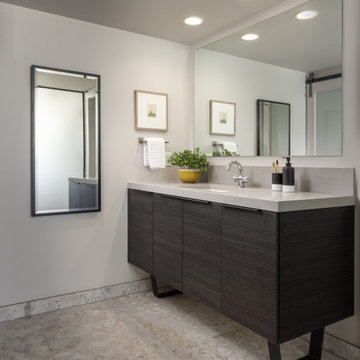
Formerly a very divided bathroom, our goal was to open the space up allowing the natural light from the window to pass through the entire bathroom while still providing privacy.
We worked to creatively incorporate additional storage and to close off the toilet into a private closet. The homeowners were very interested in a Japanese soaking tub and maintaining a very clean and modern space to relax after working heavily in color and pattern with their work. We created a taller showering space by moving the plumbing into the floor. We used a floor length linear drain to allow for the large format tiles throughout reducing grout lines.
All beams were original to the space and were important to keep visible for cohesiveness throughout the home. They really bring an element of warmth and a touch of rustic to an otherwise very modern space.
With thoughtful modern finishes and a neutral color palette, we were able to create a space that is relaxing for the mind and body.
 Casework Inter Design
A lot of homes built in the early 1900s in Portland have been remodeled beyond recognition. The trim has been painted, the floors replaced and the built-ins just didn't make it through years of wear and tear. That's not the case with this home in the Ladd's Addition neighborhood of Portland. Built in 1911, the dark trim remained unpainted, the fir floors still intact and the built-ins in the dining room were in almost perfect condition but the home was dark, empty and didn't function for the owners.
Contrary to all my other thoughts in design to lighten a home, we embraced the dark. The trim and floors were sanded and refinished to their original state. In the entry, the walls were painted black. After multiple meetings and conversations with the client where nothing out there seemed quite right, I developed along with artist, Michael Paulus, a custom flower that fit the owner's personality and style down to the scale and exact color palette. This became the inspiration and guiding color scheme to create a glamorous but livable home that was neutral and rich in texture.
Interior Design: Casework
Photography: George Barberis
General Contractor: Hammer & Hand
Hand Painted Walls: Michael Paulus
Custom Mantel and Bathroom Cabinet: Brian Pietrowski
Press: Gray Magazine
 Forward Design Build Remodel
Formerly a very divided bathroom, our goal was to open the space up allowing the natural light from the window to pass through the entire bathroom while still providing privacy.
We worked to creatively incorporate additional storage and to close off the toilet into a private closet. The homeowners were very interested in a Japanese soaking tub and maintaining a very clean and modern space to relax after working heavily in color and pattern with their work. We created a taller showering space by moving the plumbing into the floor. We used a floor length linear drain to allow for the large format tiles throughout reducing grout lines.
All beams were original to the space and were important to keep visible for cohesiveness throughout the home. They really bring an element of warmth and a touch of rustic to an otherwise very modern space.
With thoughtful modern finishes and a neutral color palette, we were able to create a space that is relaxing for the mind and body.

 Forward Design Build Remodel
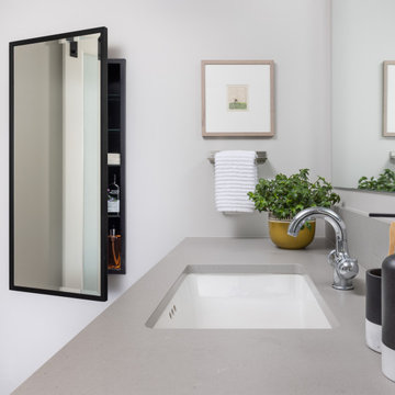
Formerly a very divided bathroom, our goal was to open the space up allowing the natural light from the window to pass through the entire bathroom while still providing privacy.
We worked to creatively incorporate additional storage and to close off the toilet into a private closet. The homeowners were very interested in a Japanese soaking tub and maintaining a very clean and modern space to relax after working heavily in color and pattern with their work. We created a taller showering space by moving the plumbing into the floor. We used a floor length linear drain to allow for the large format tiles throughout reducing grout lines.
All beams were original to the space and were important to keep visible for cohesiveness throughout the home. They really bring an element of warmth and a touch of rustic to an otherwise very modern space.
With thoughtful modern finishes and a neutral color palette, we were able to create a space that is relaxing for the mind and body.
 Casework Inter Design
A lot of homes built in the early 1900s in Portland have been remodeled beyond recognition. The trim has been painted, the floors replaced and the built-ins just didn't make it through years of wear and tear. That's not the case with this home in the Ladd's Addition neighborhood of Portland. Built in 1911, the dark trim remained unpainted, the fir floors still intact and the built-ins in the dining room were in almost perfect condition but the home was dark, empty and didn't function for the owners.
Contrary to all my other thoughts in design to lighten a home, we embraced the dark. The trim and floors were sanded and refinished to their original state. In the entry, the walls were painted black. After multiple meetings and conversations with the client where nothing out there seemed quite right, I developed along with artist, Michael Paulus, a custom flower that fit the owner's personality and style down to the scale and exact color palette. This became the inspiration and guiding color scheme to create a glamorous but livable home that was neutral and rich in texture.
Interior Design: Casework
Photography: George Barberis
General Contractor: Hammer & Hand
Hand Painted Walls: Michael Paulus
Custom Mantel and Bathroom Cabinet: Brian Pietrowski
Press: Gray Magazine
 Forward Design Build Remodel
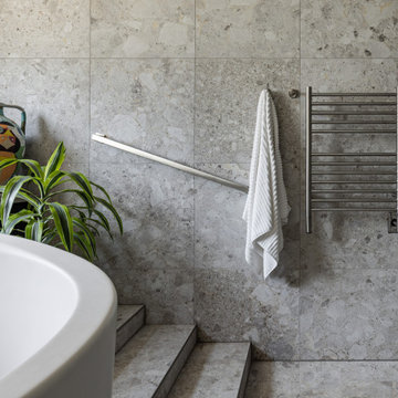
Formerly a very divided bathroom, our goal was to open the space up allowing the natural light from the window to pass through the entire bathroom while still providing privacy.
We worked to creatively incorporate additional storage and to close off the toilet into a private closet. The homeowners were very interested in a Japanese soaking tub and maintaining a very clean and modern space to relax after working heavily in color and pattern with their work. We created a taller showering space by moving the plumbing into the floor. We used a floor length linear drain to allow for the large format tiles throughout reducing grout lines.
All beams were original to the space and were important to keep visible for cohesiveness throughout the home. They really bring an element of warmth and a touch of rustic to an otherwise very modern space.
With thoughtful modern finishes and a neutral color palette, we were able to create a space that is relaxing for the mind and body.
66