
Search results for "Reduce based" in Home Design Ideas
 Sweet Smiling Landscape Design
This very social couple were tying the knot and looking to create a space to host their friends and community, while also adding much needed living space to their 900 square foot cottage. The couple had a strong emphasis on growing edible and medicinal plants. With many friends from a community garden project they were involved in and years of learning about permaculture, they wanted to incorporate many of the elements that the permaculture movement advocates for.
We came up with a California native and edible garden that incorporates three composting systems, a gray water system, rain water harvesting, a cob pizza oven, and outdoor kitchen. A majority of the materials incorporated into the hardscape were found on site or salvaged within 20-mile of the property. The garden also had amenities like an outhouse and shower for guests they would put up in the converted garage.
Coming into this project there was and An old clawfoot bathtub on site was used as a worm composting bin, and for no other reason than the cuteness factor, the bath tub composter had to stay. Added to that was a compost tumbler, and last but not least we erected an outhouse with a composting toilet system (The Nature's Head Composting Toilet).
We developed a gray water system incorporating the water that came out of the washing machine and from the outdoor shower to help water bananas, gingers, and canailles. All the down spouts coming off the roof were sent into depressions in the front yard. The depressions were planted with carex grass, which can withstand, and even thrive on, submersion in water that rain events bring to the swaled-out area. Aesthetically, carex reads as a lawn space in keeping with the cottage feeling of the home.
As with any full-fledged permaculture garden, an element of natural building needed to be incorporated. So, the heart and hearth of the garden is a cob pizza oven going into an outdoor kitchen with a built-in bench. Cob is a natural building technique that involves sculpting a mixture of sand, soil, and straw around an internal structure. In this case, the internal structure is comprised of an old built-in brick incinerator, and rubble collected on site.
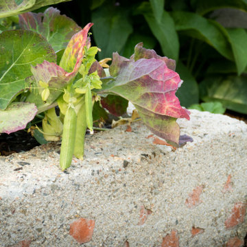
Besides using the collected rubble as a base for the cob structure, other salvaged elements comprise major features of the project: the front fence was reconstructed from the preexisting fence; a majority of the stone edging was created by stones found while clearing the landscape in preparation for construction; the arbor was constructed from old wash line poles found on site; broken bricks pulled from another project were mixed with concrete and cast into vegetable beds, creating durable insulated planters while reducing the amount of concrete used ( and they also just have a unique effect); pathways and patio areas were laid using concrete broken out of the driveway and previous pathways. (When a little more broken concrete was needed, we busted out an old pad at another project a few blocks away.)
Far from a perfectly polished garden, this landscape now serves as a lush and inviting space for my clients, their friends and family to gather and enjoy each other’s company. Days after construction was finished the couple hosted their wedding reception in the garden—everyone danced, drank and celebrated, christening the garden and the union!
 Sweet Smiling Landscape Design
This very social couple were tying the knot and looking to create a space to host their friends and community, while also adding much needed living space to their 900 square foot cottage. The couple had a strong emphasis on growing edible and medicinal plants. With many friends from a community garden project they were involved in and years of learning about permaculture, they wanted to incorporate many of the elements that the permaculture movement advocates for.
We came up with a California native and edible garden that incorporates three composting systems, a gray water system, rain water harvesting, a cob pizza oven, and outdoor kitchen. A majority of the materials incorporated into the hardscape were found on site or salvaged within 20-mile of the property. The garden also had amenities like an outhouse and shower for guests they would put up in the converted garage.
Coming into this project there was and An old clawfoot bathtub on site was used as a worm composting bin, and for no other reason than the cuteness factor, the bath tub composter had to stay. Added to that was a compost tumbler, and last but not least we erected an outhouse with a composting toilet system (The Nature's Head Composting Toilet).
We developed a gray water system incorporating the water that came out of the washing machine and from the outdoor shower to help water bananas, gingers, and canailles. All the down spouts coming off the roof were sent into depressions in the front yard. The depressions were planted with carex grass, which can withstand, and even thrive on, submersion in water that rain events bring to the swaled-out area. Aesthetically, carex reads as a lawn space in keeping with the cottage feeling of the home.
As with any full-fledged permaculture garden, an element of natural building needed to be incorporated. So, the heart and hearth of the garden is a cob pizza oven going into an outdoor kitchen with a built-in bench. Cob is a natural building technique that involves sculpting a mixture of sand, soil, and straw around an internal structure. In this case, the internal structure is comprised of an old built-in brick incinerator, and rubble collected on site.
Besides using the collected rubble as a base for the cob structure, other salvaged elements comprise major features of the project: the front fence was reconstructed from the preexisting fence; a majority of the stone edging was created by stones found while clearing the landscape in preparation for construction; the arbor was constructed from old wash line poles found on site; broken bricks pulled from another project were mixed with concrete and cast into vegetable beds, creating durable insulated planters while reducing the amount of concrete used ( and they also just have a unique effect); pathways and patio areas were laid using concrete broken out of the driveway and previous pathways. (When a little more broken concrete was needed, we busted out an old pad at another project a few blocks away.)
Far from a perfectly polished garden, this landscape now serves as a lush and inviting space for my clients, their friends and family to gather and enjoy each other’s company. Days after construction was finished the couple hosted their wedding reception in the garden—everyone danced, drank and celebrated, christening the garden and the union!
 Sweet Smiling Landscape Design
This very social couple were tying the knot and looking to create a space to host their friends and community, while also adding much needed living space to their 900 square foot cottage. The couple had a strong emphasis on growing edible and medicinal plants. With many friends from a community garden project they were involved in and years of learning about permaculture, they wanted to incorporate many of the elements that the permaculture movement advocates for.
We came up with a California native and edible garden that incorporates three composting systems, a gray water system, rain water harvesting, a cob pizza oven, and outdoor kitchen. A majority of the materials incorporated into the hardscape were found on site or salvaged within 20-mile of the property. The garden also had amenities like an outhouse and shower for guests they would put up in the converted garage.
Coming into this project there was and An old clawfoot bathtub on site was used as a worm composting bin, and for no other reason than the cuteness factor, the bath tub composter had to stay. Added to that was a compost tumbler, and last but not least we erected an outhouse with a composting toilet system (The Nature's Head Composting Toilet).
We developed a gray water system incorporating the water that came out of the washing machine and from the outdoor shower to help water bananas, gingers, and canailles. All the down spouts coming off the roof were sent into depressions in the front yard. The depressions were planted with carex grass, which can withstand, and even thrive on, submersion in water that rain events bring to the swaled-out area. Aesthetically, carex reads as a lawn space in keeping with the cottage feeling of the home.
As with any full-fledged permaculture garden, an element of natural building needed to be incorporated. So, the heart and hearth of the garden is a cob pizza oven going into an outdoor kitchen with a built-in bench. Cob is a natural building technique that involves sculpting a mixture of sand, soil, and straw around an internal structure. In this case, the internal structure is comprised of an old built-in brick incinerator, and rubble collected on site.
Besides using the collected rubble as a base for the cob structure, other salvaged elements comprise major features of the project: the front fence was reconstructed from the preexisting fence; a majority of the stone edging was created by stones found while clearing the landscape in preparation for construction; the arbor was constructed from old wash line poles found on site; broken bricks pulled from another project were mixed with concrete and cast into vegetable beds, creating durable insulated planters while reducing the amount of concrete used ( and they also just have a unique effect); pathways and patio areas were laid using concrete broken out of the driveway and previous pathways. (When a little more broken concrete was needed, we busted out an old pad at another project a few blocks away.)
Far from a perfectly polished garden, this landscape now serves as a lush and inviting space for my clients, their friends and family to gather and enjoy each other’s company. Days after construction was finished the couple hosted their wedding reception in the garden—everyone danced, drank and celebrated, christening the garden and the union!
Find the right local pro for your project

 Cure Design Group
KITCHEN RENOVATION CURRENT CRAFTSMAN
This client started off just being curious about our services - what we could do, and if we could even help her update her kitchen. She and her husband with their two teenage kids have lived in their home for several years without updating anything since the house was originally built. They didn’t quite have a budget in mind yet. They didn’t know their style, or even if they had one. Their timeline was simple, “as fast as you can so we’re not without a kitchen for very long” (usually what we hear for kitchen updates).
After a very productive consultation: determining the scope of work and zeroing in on a budget, I was very excited to update this underwhelming space to something that is modern but timeless, something that is theirs. And, it was easy to see what type of design style they gravitated toward looking at the pieces they already own: Craftsman/Prairie Style. I left the meeting so excited to weave in yet another genre of design to my CDG portfolio! We circled in our contractor to discuss the changes they were looking to make and the scope of work that would be theirs. Then I was off to get designing:
// Because the kitchen’s footprint and the defined breakfast space delineated by the bay, we kept the perimeter cabinetry as it was originally laid out. We updated these cabinets to a beautiful soft Alabaster White with a Barn Wood Glaze to highlight the simplicity of the shaker style doors. We added transom cabinets above the uppers, with only the back wall having seeded glass inserts to highlight some of their collectables.
// The original shaped island was counter-productive (See what I did there?) in functionality and design. We squared this off to reduce some of the angles and gain more storage. We highlighted the new island with a contrasting oak cabinet in a dark finish, to pay our respects to the craftsman style, and topped with a concrete-like countertop as a nod to the Prairie Style, allowing the homeowners to gain two extra seats and a massive -uninterrupted- work surface.
// The small section of cabinetry between the garage entry and fridge now is the perfect dump-station for mail, electronics, whatever is in their hands when they come into the house; and completely hidden by the refrigerator.
// The disconnected cabinetry in the breakfast area makes for a great place to have a working office. Accessible from the kitchen or the adjacent great room, this is the perfect place for the kids to do their homework while mom and dad are putting together dinner. The base cabinets are built out for office-type storage: paper and pencil drawers, filing systems, and cord management. Additionally, the long counter provides a ton of worksurface to spread out.
// The largest transformation was the pantry. We raised the height of the doorway and added huge custom designed bypass sliding barndoors. Finished with a dark stain to compliment the island and cut to inset 4 stained glass windows, typical of this style of design, and driving home the concept for the whole space.
// They were desperate to replace their flooring with something extremely durable to flow throughout the kitchen and the whole main level. This beautiful new flooring is actually a textured LVT(!) Which allowed them to save on overall cost and extend the life of their new flooring purchase.
// They loved their copper table, so we kept it and added new simple, mid-century modern chairs around it and a shiny new craftsman-style chandelier above. We added bright barstools in a burnt orange-red accent, and a bright woven rug to tie it all together.
// Because the kitchen renovation was shaping up to be pretty spectacular, they decided they needed to now replace their ‘now-these-look-a-little-too-old’ upholstered seating in the neighboring great room with 2 new sofas. We found the perfect sage-y-grey fabric which we covered on sofa frames that have and exposed oak-wood base, which we finished in a warm weathered grey.
// As every designer knows, a room isn’t finished until there’s something on the windows. Now that the new flooring was installed and every other room on the main level ‘seemed’ to be updated, we needed to update the window treatments in the dining, and great rooms to reflect their new design concept.
I hope you find the ‘after’ photos refreshing (as refreshing as it was for me to work on something that’s not a “Farm House” style that’s saturating the industry right now!) This was such a fun project and a great collaboration with our contractor.

 Jack Edward
In the world of property management, fostering positive relationships with tenants, prospects, and landlords is key to ensuring a thriving rental community. One of the most fundamental aspects of tenant satisfaction is ensuring that their living spaces are equipped with functional appliances. Imagine the frustration of a tenant with a malfunctioning refrigerator or a broken washing machine. It's in such moments that the role of property managers becomes crucial. By offering fast and timely appliance repair and maintenance services, property managers can not only address the immediate needs of their tenants but also build lasting trust and loyalty. In this blog, we will explore the importance of reliable appliance repair services for property managers and how they can strengthen their bonds with tenants, prospects, and landlords.
Understanding the Tenant's Perspective:
For tenants, a well-maintained and fully functional home is not just a luxury but a necessity. Appliances like refrigerators, ovens, washing machines, and HVAC systems are integral to their daily lives. When these appliances break down, it can disrupt their routine and cause significant inconvenience. Tenants appreciate property managers who promptly address these issues, demonstrating a commitment to their comfort and well-being.
Meeting Prospective Tenants' Expectations:
When prospects are searching for a new rental property, they evaluate not only the space and location but also the level of service provided. A property managed by professionals who offer reliable appliance repair services stands out in the competitive rental market. Prospective tenants are more likely to choose a property where their potential issues, including appliance repairs, will be promptly resolved.
Earning the Trust of Landlords:
Landlords entrust property managers with their investments, expecting them to maintain the property and keep the tenants satisfied. Providing efficient appliance repair services not only ensures tenant retention but also earns the trust of landlords. A property manager who can handle repairs swiftly and cost-effectively protects the landlord's investment, leading to a positive and enduring partnership.
Benefits of Reliable Appliance Repair Services:
⦁ Tenant Satisfaction: Fast and reliable appliance repairs lead to satisfied tenants, enhancing their overall living experience.
⦁ Reduced Vacancy Rates: Properties with a reputation for excellent maintenance and quick issue resolution attract and retain tenants, minimizing vacancy periods.
⦁ Positive Word-of-Mouth: Happy tenants are more likely to recommend the property to others, increasing the likelihood of attracting new tenants through referrals.
⦁ Enhanced Property Value: Well-maintained properties retain their value and appeal, ensuring a steady stream of income for landlords.
⦁ Improved Tenant-Landlord Relations: Proactive property managers who promptly address repair issues strengthen their relationships with both tenants and landlords, creating a harmonious living environment.
In the competitive world of property management, offering reliable appliance repair services isn't just a service; it's a testament to a property manager's commitment to their tenants, prospects, and landlords. By promptly addressing repair needs and ensuring the smooth functioning of appliances, property managers not only resolve immediate problems but also lay the foundation for enduring, trust-based relationships. After all, in the eyes of tenants, prospects, and landlords, a property manager who can keep the appliances running smoothly is a valuable partner worth keeping. Building strong bonds through reliable appliance repair services isn't just a strategy – it's a pathway to long-lasting success and mutual satisfaction in the realm of property management.
 Cure Design Group
KITCHEN RENOVATION CURRENT CRAFTSMAN
This client started off just being curious about our services - what we could do, and if we could even help her update her kitchen. She and her husband with their two teenage kids have lived in their home for several years without updating anything since the house was originally built. They didn’t quite have a budget in mind yet. They didn’t know their style, or even if they had one. Their timeline was simple, “as fast as you can so we’re not without a kitchen for very long” (usually what we hear for kitchen updates).
After a very productive consultation: determining the scope of work and zeroing in on a budget, I was very excited to update this underwhelming space to something that is modern but timeless, something that is theirs. And, it was easy to see what type of design style they gravitated toward looking at the pieces they already own: Craftsman/Prairie Style. I left the meeting so excited to weave in yet another genre of design to my CDG portfolio! We circled in our contractor to discuss the changes they were looking to make and the scope of work that would be theirs. Then I was off to get designing:
// Because the kitchen’s footprint and the defined breakfast space delineated by the bay, we kept the perimeter cabinetry as it was originally laid out. We updated these cabinets to a beautiful soft Alabaster White with a Barn Wood Glaze to highlight the simplicity of the shaker style doors. We added transom cabinets above the uppers, with only the back wall having seeded glass inserts to highlight some of their collectables.
// The original shaped island was counter-productive (See what I did there?) in functionality and design. We squared this off to reduce some of the angles and gain more storage. We highlighted the new island with a contrasting oak cabinet in a dark finish, to pay our respects to the craftsman style, and topped with a concrete-like countertop as a nod to the Prairie Style, allowing the homeowners to gain two extra seats and a massive -uninterrupted- work surface.
// The small section of cabinetry between the garage entry and fridge now is the perfect dump-station for mail, electronics, whatever is in their hands when they come into the house; and completely hidden by the refrigerator.
// The disconnected cabinetry in the breakfast area makes for a great place to have a working office. Accessible from the kitchen or the adjacent great room, this is the perfect place for the kids to do their homework while mom and dad are putting together dinner. The base cabinets are built out for office-type storage: paper and pencil drawers, filing systems, and cord management. Additionally, the long counter provides a ton of worksurface to spread out.
// The largest transformation was the pantry. We raised the height of the doorway and added huge custom designed bypass sliding barndoors. Finished with a dark stain to compliment the island and cut to inset 4 stained glass windows, typical of this style of design, and driving home the concept for the whole space.
// They were desperate to replace their flooring with something extremely durable to flow throughout the kitchen and the whole main level. This beautiful new flooring is actually a textured LVT(!) Which allowed them to save on overall cost and extend the life of their new flooring purchase.
// They loved their copper table, so we kept it and added new simple, mid-century modern chairs around it and a shiny new craftsman-style chandelier above. We added bright barstools in a burnt orange-red accent, and a bright woven rug to tie it all together.
// Because the kitchen renovation was shaping up to be pretty spectacular, they decided they needed to now replace their ‘now-these-look-a-little-too-old’ upholstered seating in the neighboring great room with 2 new sofas. We found the perfect sage-y-grey fabric which we covered on sofa frames that have and exposed oak-wood base, which we finished in a warm weathered grey.
// As every designer knows, a room isn’t finished until there’s something on the windows. Now that the new flooring was installed and every other room on the main level ‘seemed’ to be updated, we needed to update the window treatments in the dining, and great rooms to reflect their new design concept.
I hope you find the ‘after’ photos refreshing (as refreshing as it was for me to work on something that’s not a “Farm House” style that’s saturating the industry right now!) This was such a fun project and a great collaboration with our contractor.

 Bella Domicile
Dale Hall Photography, LLC
Eat-in kitchen - traditional eat-in kitchen idea in Milwaukee with an undermount sink, flat-panel cabinets, medium tone wood cabinets, quartzite countertops and stainless steel appliances
Eat-in kitchen - traditional eat-in kitchen idea in Milwaukee with an undermount sink, flat-panel cabinets, medium tone wood cabinets, quartzite countertops and stainless steel appliances

 Thyme & Place Design LLC
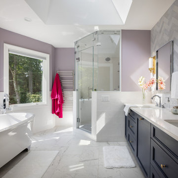
This medium sized bathroom had ample space to create a luxurious bathroom for this young professional couple with 3 young children. My clients really wanted a place to unplug and relax where they could retreat and recharge.
New cabinets were a must with customized interiors to reduce cluttered counter tops and make morning routines easier and more organized. We selected Hale Navy for the painted finish with an upscale recessed panel door. Honey bronze hardware is a nice contrast to the navy paint instead of an expected brushed silver. For storage, a grooming center to organize hair dryer, curling iron and brushes keeps everything in place for morning routines. On the opposite, a pull-out organizer outfitted with trays for smaller personal items keeps everything at the fingertips. I included a pull-out hamper to keep laundry and towels off the floor. Another design detail I like to include is drawers in the sink cabinets. It is much better to have drawers notched for the plumbing when organizing bathroom products instead of filling up a large base cabinet.
The room already had beautiful windows and was bathed in naturel light from an existing skylight. I enhanced the natural lighting with some recessed can lights, a light in the shower as well as sconces around the mirrored medicine cabinets. The best thing about the medicine cabinets is not only the additional storage but when both doors are opened you can see the back of your head. The inside of the cabinet doors are mirrored. Honey Bronze sconces are perfect lighting at the vanity for makeup and shaving.
A larger shower for my very tall client with a built-in bench was a priority for this bathroom. I recommend stream showers whenever designing a bathroom and my client loved the idea of that feature as a surprise for his wife. Steam adds to the wellness and health aspect of any good bathroom design. We were able to access a small closet space just behind the shower a perfect spot for the steam unit. In addition to the steam, a handheld shower is another “standard” item in our shower designs. I like to locate these near a bench so you can sit while you target sore shoulder and back muscles. Another benefit is cleanability of the shower walls and being able to take a quick shower without getting your hair wet. The slide bar is just the thing to accommodate different heights.
For Mrs. a tub for soaking and relaxing were the main ingredients required for this remodel. Here I specified a Bain Ultra freestanding tub complete with air massage, chromatherapy and a heated back rest. The tub filer is floor mounted and adds another element of elegance to the bath. I located the tub in a bay window so the bather can enjoy the beautiful view out of the window. It is also a great way to relax after a round of golf. Either way, both of my clients can enjoy the benefits of this tub.
The tiles selected for the shower and the lower walls of the bathroom are a slightly oversized subway tile in a clean and bright white. The floors are a 12x24 porcelain marble. The shower floor features a flat cut marble pebble tile. Behind the vanity the wall is tiled with Zellige tile in a herringbone pattern. The colors of the tile connect all the colors used in the bath.
The final touches of elegance and luxury to complete our design, the soft lilac paint on the walls, the mix of metal materials on the faucets, cabinet hardware, lighting and yes, an oversized heated towel warmer complete with robe hooks.
This truly is a space for rejuvenation and wellness.

 SCJ Studio Landscape Architecture
A Seattle couple needed to take advantage of our amazing summer weather and asked for a way to watch movies outside. We were up to the challenge, designing a custom concrete bench that by day serves as built-in seating and transforms at night into a perfect spot to catch a flick on the fly! Other touches include modern planting and steel planters to match the contemporary feel of the home.
Photos by Miranda Estes Photography
 Cure Design Group
KITCHEN RENOVATION CURRENT CRAFTSMAN
This client started off just being curious about our services - what we could do, and if we could even help her update her kitchen. She and her husband with their two teenage kids have lived in their home for several years without updating anything since the house was originally built. They didn’t quite have a budget in mind yet. They didn’t know their style, or even if they had one. Their timeline was simple, “as fast as you can so we’re not without a kitchen for very long” (usually what we hear for kitchen updates).
After a very productive consultation: determining the scope of work and zeroing in on a budget, I was very excited to update this underwhelming space to something that is modern but timeless, something that is theirs. And, it was easy to see what type of design style they gravitated toward looking at the pieces they already own: Craftsman/Prairie Style. I left the meeting so excited to weave in yet another genre of design to my CDG portfolio! We circled in our contractor to discuss the changes they were looking to make and the scope of work that would be theirs. Then I was off to get designing:
// Because the kitchen’s footprint and the defined breakfast space delineated by the bay, we kept the perimeter cabinetry as it was originally laid out. We updated these cabinets to a beautiful soft Alabaster White with a Barn Wood Glaze to highlight the simplicity of the shaker style doors. We added transom cabinets above the uppers, with only the back wall having seeded glass inserts to highlight some of their collectables.
// The original shaped island was counter-productive (See what I did there?) in functionality and design. We squared this off to reduce some of the angles and gain more storage. We highlighted the new island with a contrasting oak cabinet in a dark finish, to pay our respects to the craftsman style, and topped with a concrete-like countertop as a nod to the Prairie Style, allowing the homeowners to gain two extra seats and a massive -uninterrupted- work surface.
// The small section of cabinetry between the garage entry and fridge now is the perfect dump-station for mail, electronics, whatever is in their hands when they come into the house; and completely hidden by the refrigerator.
// The disconnected cabinetry in the breakfast area makes for a great place to have a working office. Accessible from the kitchen or the adjacent great room, this is the perfect place for the kids to do their homework while mom and dad are putting together dinner. The base cabinets are built out for office-type storage: paper and pencil drawers, filing systems, and cord management. Additionally, the long counter provides a ton of worksurface to spread out.
// The largest transformation was the pantry. We raised the height of the doorway and added huge custom designed bypass sliding barndoors. Finished with a dark stain to compliment the island and cut to inset 4 stained glass windows, typical of this style of design, and driving home the concept for the whole space.
// They were desperate to replace their flooring with something extremely durable to flow throughout the kitchen and the whole main level. This beautiful new flooring is actually a textured LVT(!) Which allowed them to save on overall cost and extend the life of their new flooring purchase.
// They loved their copper table, so we kept it and added new simple, mid-century modern chairs around it and a shiny new craftsman-style chandelier above. We added bright barstools in a burnt orange-red accent, and a bright woven rug to tie it all together.
// Because the kitchen renovation was shaping up to be pretty spectacular, they decided they needed to now replace their ‘now-these-look-a-little-too-old’ upholstered seating in the neighboring great room with 2 new sofas. We found the perfect sage-y-grey fabric which we covered on sofa frames that have and exposed oak-wood base, which we finished in a warm weathered grey.
// As every designer knows, a room isn’t finished until there’s something on the windows. Now that the new flooring was installed and every other room on the main level ‘seemed’ to be updated, we needed to update the window treatments in the dining, and great rooms to reflect their new design concept.
I hope you find the ‘after’ photos refreshing (as refreshing as it was for me to work on something that’s not a “Farm House” style that’s saturating the industry right now!) This was such a fun project and a great collaboration with our contractor.
 Cure Design Group
KITCHEN RENOVATION CURRENT CRAFTSMAN
This client started off just being curious about our services - what we could do, and if we could even help her update her kitchen. She and her husband with their two teenage kids have lived in their home for several years without updating anything since the house was originally built. They didn’t quite have a budget in mind yet. They didn’t know their style, or even if they had one. Their timeline was simple, “as fast as you can so we’re not without a kitchen for very long” (usually what we hear for kitchen updates).
After a very productive consultation: determining the scope of work and zeroing in on a budget, I was very excited to update this underwhelming space to something that is modern but timeless, something that is theirs. And, it was easy to see what type of design style they gravitated toward looking at the pieces they already own: Craftsman/Prairie Style. I left the meeting so excited to weave in yet another genre of design to my CDG portfolio! We circled in our contractor to discuss the changes they were looking to make and the scope of work that would be theirs. Then I was off to get designing:
// Because the kitchen’s footprint and the defined breakfast space delineated by the bay, we kept the perimeter cabinetry as it was originally laid out. We updated these cabinets to a beautiful soft Alabaster White with a Barn Wood Glaze to highlight the simplicity of the shaker style doors. We added transom cabinets above the uppers, with only the back wall having seeded glass inserts to highlight some of their collectables.
// The original shaped island was counter-productive (See what I did there?) in functionality and design. We squared this off to reduce some of the angles and gain more storage. We highlighted the new island with a contrasting oak cabinet in a dark finish, to pay our respects to the craftsman style, and topped with a concrete-like countertop as a nod to the Prairie Style, allowing the homeowners to gain two extra seats and a massive -uninterrupted- work surface.
// The small section of cabinetry between the garage entry and fridge now is the perfect dump-station for mail, electronics, whatever is in their hands when they come into the house; and completely hidden by the refrigerator.
// The disconnected cabinetry in the breakfast area makes for a great place to have a working office. Accessible from the kitchen or the adjacent great room, this is the perfect place for the kids to do their homework while mom and dad are putting together dinner. The base cabinets are built out for office-type storage: paper and pencil drawers, filing systems, and cord management. Additionally, the long counter provides a ton of worksurface to spread out.
// The largest transformation was the pantry. We raised the height of the doorway and added huge custom designed bypass sliding barndoors. Finished with a dark stain to compliment the island and cut to inset 4 stained glass windows, typical of this style of design, and driving home the concept for the whole space.
// They were desperate to replace their flooring with something extremely durable to flow throughout the kitchen and the whole main level. This beautiful new flooring is actually a textured LVT(!) Which allowed them to save on overall cost and extend the life of their new flooring purchase.
// They loved their copper table, so we kept it and added new simple, mid-century modern chairs around it and a shiny new craftsman-style chandelier above. We added bright barstools in a burnt orange-red accent, and a bright woven rug to tie it all together.
// Because the kitchen renovation was shaping up to be pretty spectacular, they decided they needed to now replace their ‘now-these-look-a-little-too-old’ upholstered seating in the neighboring great room with 2 new sofas. We found the perfect sage-y-grey fabric which we covered on sofa frames that have and exposed oak-wood base, which we finished in a warm weathered grey.
// As every designer knows, a room isn’t finished until there’s something on the windows. Now that the new flooring was installed and every other room on the main level ‘seemed’ to be updated, we needed to update the window treatments in the dining, and great rooms to reflect their new design concept.
I hope you find the ‘after’ photos refreshing (as refreshing as it was for me to work on something that’s not a “Farm House” style that’s saturating the industry right now!) This was such a fun project and a great collaboration with our contractor.
 Cure Design Group
KITCHEN RENOVATION CURRENT CRAFTSMAN
This client started off just being curious about our services - what we could do, and if we could even help her update her kitchen. She and her husband with their two teenage kids have lived in their home for several years without updating anything since the house was originally built. They didn’t quite have a budget in mind yet. They didn’t know their style, or even if they had one. Their timeline was simple, “as fast as you can so we’re not without a kitchen for very long” (usually what we hear for kitchen updates).
After a very productive consultation: determining the scope of work and zeroing in on a budget, I was very excited to update this underwhelming space to something that is modern but timeless, something that is theirs. And, it was easy to see what type of design style they gravitated toward looking at the pieces they already own: Craftsman/Prairie Style. I left the meeting so excited to weave in yet another genre of design to my CDG portfolio! We circled in our contractor to discuss the changes they were looking to make and the scope of work that would be theirs. Then I was off to get designing:
// Because the kitchen’s footprint and the defined breakfast space delineated by the bay, we kept the perimeter cabinetry as it was originally laid out. We updated these cabinets to a beautiful soft Alabaster White with a Barn Wood Glaze to highlight the simplicity of the shaker style doors. We added transom cabinets above the uppers, with only the back wall having seeded glass inserts to highlight some of their collectables.
// The original shaped island was counter-productive (See what I did there?) in functionality and design. We squared this off to reduce some of the angles and gain more storage. We highlighted the new island with a contrasting oak cabinet in a dark finish, to pay our respects to the craftsman style, and topped with a concrete-like countertop as a nod to the Prairie Style, allowing the homeowners to gain two extra seats and a massive -uninterrupted- work surface.
// The small section of cabinetry between the garage entry and fridge now is the perfect dump-station for mail, electronics, whatever is in their hands when they come into the house; and completely hidden by the refrigerator.
// The disconnected cabinetry in the breakfast area makes for a great place to have a working office. Accessible from the kitchen or the adjacent great room, this is the perfect place for the kids to do their homework while mom and dad are putting together dinner. The base cabinets are built out for office-type storage: paper and pencil drawers, filing systems, and cord management. Additionally, the long counter provides a ton of worksurface to spread out.
// The largest transformation was the pantry. We raised the height of the doorway and added huge custom designed bypass sliding barndoors. Finished with a dark stain to compliment the island and cut to inset 4 stained glass windows, typical of this style of design, and driving home the concept for the whole space.
// They were desperate to replace their flooring with something extremely durable to flow throughout the kitchen and the whole main level. This beautiful new flooring is actually a textured LVT(!) Which allowed them to save on overall cost and extend the life of their new flooring purchase.
// They loved their copper table, so we kept it and added new simple, mid-century modern chairs around it and a shiny new craftsman-style chandelier above. We added bright barstools in a burnt orange-red accent, and a bright woven rug to tie it all together.
// Because the kitchen renovation was shaping up to be pretty spectacular, they decided they needed to now replace their ‘now-these-look-a-little-too-old’ upholstered seating in the neighboring great room with 2 new sofas. We found the perfect sage-y-grey fabric which we covered on sofa frames that have and exposed oak-wood base, which we finished in a warm weathered grey.
// As every designer knows, a room isn’t finished until there’s something on the windows. Now that the new flooring was installed and every other room on the main level ‘seemed’ to be updated, we needed to update the window treatments in the dining, and great rooms to reflect their new design concept.
I hope you find the ‘after’ photos refreshing (as refreshing as it was for me to work on something that’s not a “Farm House” style that’s saturating the industry right now!) This was such a fun project and a great collaboration with our contractor.

 San Luis Kitchen Co.
Doors and drawer-heads stained Dark Lager contrast with black face-frames for a dramatic look. The gray quartz counter is extended full height at the back splash.
A bank of floor to ceiling cabinets separates the dining area from the kitchen, confining the space in both rooms. Note the massive blank end of the cabinets – in desperation to reduce the scale of this monolith, the homeowners decorated it with a clock and small nick-knacks, but it didn’t help. This is not a welcoming entrance to the kitchen. On the dining side, there is a hutch (with mirrored back), which ostensibly could serve as a buffet, however it is inconvenient to the prep area of the kitchen as it is tucked behind the tall pantry cabinets. And on the opposite wall is a separate wet bar which could serve more conveniently with a more unified kitchen and dining space.
You would think that the large pantry cabinets would be a plus in a kitchen, however their placement and the deep fixed shelves belie any positive contribution.
The looming wall of cabinetry confines the space and is a claustrophobe’s nightmare. Then note the clutter and chaos of storing small food items (normally most of your daily supplies don’t come in giant bulk quantities and sizes) on deep fixed shelves. Nothing really fits and canned goods become lost behind cereal boxes while baking supplies are piled on top of the snacks!
The decision to remodel – the lady of the house wanted her kitchen to reflect the couples’ modern lifestyle. They are passionate people who love to entertain their friends and family – they need an open and accessible space that is both dramatic in bearing and easy to use on a daily basis.
San Luis Kitchen began design by helping the homeowners choose a style and color scheme for their kitchen. The decision was made – a slab style cabinet door in a “Dark Lager” stain on maple wood. Because the homeowners did not want handles on their cabinets, we used a face frame cabinet construction to allow for “finger-pull” opening of the doors and drawers. The face frame is colored black as a contrast to the doors for a bold finish. Dark gray engineered-quartz counters and full height backsplash complete the picture.
Kitchen layout and design is next. The sink remains at the corner window with the dishwasher moved to the left wall – giving space for a 36” range-top and dramatic 42” rectilinear hood. The refrigerator remains in place but is replaced with a black model. The cabinet above it is now 24” deep for a custom look and a built-in microwave/oven combo are placed to the right. Simple-line contemporary trim and uniform black and stainless modern appliances reinforce the linear aesthetic created by the doorstyle and face frame detailing.
In place of the pantry, San Luis Kitchen designed a true buffet – accessible from both kitchen and dining sides. The storage needs are met by upper cabinets, base corner swing-out shelves and drawers, and a tall (adjustable) roll-out shelf unit on the dining side. We added an end wall (with niches) and extended the cabinetry and counter beyond as a welcome to the kitchen. In the dining room glass doors for display items grace the buffet. The wet bar is now visually and functionally joined to the kitchen – matching cabinetry and the more open overall plan tie everything together as a whole.
Now in their new kitchen, the homeowners can prepare, serve, and enjoy a meal with their guests. The mosaic glass backsplash used at the bar adds pizzazz for fun gatherings and an evening’s entertainment.
 Cure Design Group
KITCHEN RENOVATION CURRENT CRAFTSMAN
This client started off just being curious about our services - what we could do, and if we could even help her update her kitchen. She and her husband with their two teenage kids have lived in their home for several years without updating anything since the house was originally built. They didn’t quite have a budget in mind yet. They didn’t know their style, or even if they had one. Their timeline was simple, “as fast as you can so we’re not without a kitchen for very long” (usually what we hear for kitchen updates).
After a very productive consultation: determining the scope of work and zeroing in on a budget, I was very excited to update this underwhelming space to something that is modern but timeless, something that is theirs. And, it was easy to see what type of design style they gravitated toward looking at the pieces they already own: Craftsman/Prairie Style. I left the meeting so excited to weave in yet another genre of design to my CDG portfolio! We circled in our contractor to discuss the changes they were looking to make and the scope of work that would be theirs. Then I was off to get designing:
// Because the kitchen’s footprint and the defined breakfast space delineated by the bay, we kept the perimeter cabinetry as it was originally laid out. We updated these cabinets to a beautiful soft Alabaster White with a Barn Wood Glaze to highlight the simplicity of the shaker style doors. We added transom cabinets above the uppers, with only the back wall having seeded glass inserts to highlight some of their collectables.
// The original shaped island was counter-productive (See what I did there?) in functionality and design. We squared this off to reduce some of the angles and gain more storage. We highlighted the new island with a contrasting oak cabinet in a dark finish, to pay our respects to the craftsman style, and topped with a concrete-like countertop as a nod to the Prairie Style, allowing the homeowners to gain two extra seats and a massive -uninterrupted- work surface.
// The small section of cabinetry between the garage entry and fridge now is the perfect dump-station for mail, electronics, whatever is in their hands when they come into the house; and completely hidden by the refrigerator.
// The disconnected cabinetry in the breakfast area makes for a great place to have a working office. Accessible from the kitchen or the adjacent great room, this is the perfect place for the kids to do their homework while mom and dad are putting together dinner. The base cabinets are built out for office-type storage: paper and pencil drawers, filing systems, and cord management. Additionally, the long counter provides a ton of worksurface to spread out.
// The largest transformation was the pantry. We raised the height of the doorway and added huge custom designed bypass sliding barndoors. Finished with a dark stain to compliment the island and cut to inset 4 stained glass windows, typical of this style of design, and driving home the concept for the whole space.
// They were desperate to replace their flooring with something extremely durable to flow throughout the kitchen and the whole main level. This beautiful new flooring is actually a textured LVT(!) Which allowed them to save on overall cost and extend the life of their new flooring purchase.
// They loved their copper table, so we kept it and added new simple, mid-century modern chairs around it and a shiny new craftsman-style chandelier above. We added bright barstools in a burnt orange-red accent, and a bright woven rug to tie it all together.
// Because the kitchen renovation was shaping up to be pretty spectacular, they decided they needed to now replace their ‘now-these-look-a-little-too-old’ upholstered seating in the neighboring great room with 2 new sofas. We found the perfect sage-y-grey fabric which we covered on sofa frames that have and exposed oak-wood base, which we finished in a warm weathered grey.
// As every designer knows, a room isn’t finished until there’s something on the windows. Now that the new flooring was installed and every other room on the main level ‘seemed’ to be updated, we needed to update the window treatments in the dining, and great rooms to reflect their new design concept.
I hope you find the ‘after’ photos refreshing (as refreshing as it was for me to work on something that’s not a “Farm House” style that’s saturating the industry right now!) This was such a fun project and a great collaboration with our contractor.
 Bella Domicile
Dale Hall Photography, LLC
Example of a classic eat-in kitchen design in Milwaukee with an undermount sink, recessed-panel cabinets, medium tone wood cabinets, quartzite countertops, beige backsplash, ceramic backsplash and stainless steel appliances
Example of a classic eat-in kitchen design in Milwaukee with an undermount sink, recessed-panel cabinets, medium tone wood cabinets, quartzite countertops, beige backsplash, ceramic backsplash and stainless steel appliances

 McCabe By Design LLC
Photo: A Kitchen That Works LLC
Example of a mid-sized transitional l-shaped cork floor and beige floor kitchen design in Seattle with a farmhouse sink, shaker cabinets, dark wood cabinets, quartz countertops, white backsplash, stone slab backsplash, stainless steel appliances, an island and white countertops
Example of a mid-sized transitional l-shaped cork floor and beige floor kitchen design in Seattle with a farmhouse sink, shaker cabinets, dark wood cabinets, quartz countertops, white backsplash, stone slab backsplash, stainless steel appliances, an island and white countertops

 Universal Appliance and Kitchen Center
Features:
• M Touch innovative and revolutionary controls are both easy-to-operate and navigate. An intuitive swipe of the screen will quickly lead you to your desired selection
• MultiSteam technology delivers powerful steam generation and optimum steam distribution via 6 inlet ports
• Plumbed water supply and drainage
• Wired roast probe for perfect roasting
• 3-in-1 appliance
• True European convection oven
• Steam oven
• Combination of steam and convection oven
• MasterChef and MasterChef Gourmet menus offer over 150 food types to cook to perfection
• XL stainless steel cavity
• Lift up control panel conceals water and condensate container (both containers are dishwasher-safe)
• ComfortSwivel handle moves with the motion of your wrist, creating a more ergonomic feel when opening and closing the oven door
Dimensions:
Overall Unit Width - Excluding Fascia Dimension 219/16” (548mm)
Overall Height - Excluding Fascia Dimension 1711/16” (449mm)
Overall Unit Depth - Excluding Fascia Dimension 215/8” (550mm)
Oven Door Clearance 13” (330mm)
Depth with door open 3411/16” (898mm)
Overall Fascia Dimensions:
237/16” (595mm) W x 18” (455.5mm) H x 7/8” (22mm) D
Built-In Dimensions:
Minimum Cabinet Width 221/16” — 223/8” (560 - 568mm)
Minimum Cabinet Depth 217/8” (555mm)
Minimum Cabinet Opening Height 1711/16” — 1713/16” (450 — 452mm)
Minimum Base Support 60 lbs
Additional Cut-outs Required - Venting and plumbing cut-out required 1911/16” x 19/16” (500 x 40 mm)
Water Supply Requirements:
Connect to a cold water supply only. Must be connected to a shut-off valve. The water shut-off valve must be accessible after installation. The water pressure must be between 14.5 psi (1 bar) and may not exceed 87.02 psi (6 bar). If the pressure is higher than 87.02 psi (6 bar), a pressure reducing valve must be installed. The
supplied hose has a length of 59” (1500mm). The hose must not be shortened. The entire hose length must not exceed 24’7” (7.5m).
Drainage Requirements:
Drain hose loop may be positioned at or above the flood level of the sink or drain board to which it is connect to provide the proper air gap. The top of end the drain hose must not be higher than 1911/16” (500mm) to where it connects to the drain trap. The drain hose must not be shortened. The entire hose length must not exceed 24’7” (7.5m). See installation manual for additional information.
 highland
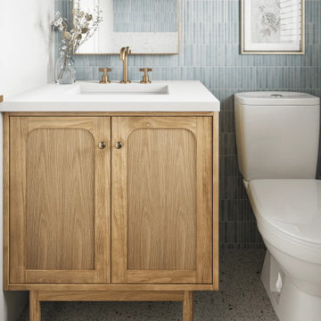
Renovating a bathroom is one of the most rewarding home improvement projects you can undertake. It adds immediate value to your property and elevates your daily routine. However, designing the perfect space requires balancing aesthetics with practical utility. At the heart of this balance is the vanity — it is the functional hub where you get ready each morning, a vital storage unit, and the visual centerpiece of the room.
To ensure you make the right investment, here is an in-depth look at choosing a bathroom vanity that blends style, longevity, and everyday functionality.
1. Assessing the Layout and Space Constraints
Before you fall in love with a specific design or finish, you must determine what your bathroom can physically handle. Scale is everything. A vanity that is too large disrupts traffic flow, while one that is too small gets lost visually and lacks adequate storage.
The next major step is determining the scale of your plumbing fixtures. Understanding how to choose a bathroom sink and vanity setup comes down to a simple choice: single or double sinks. Your choice will depend on who uses the bathroom and the overall footprint of the space.
Single Sink Vanities
Typically ranging from 20 to 48 inches (50–120 cm) in width, single vanities are the ideal choice for powder rooms, guest bathrooms, or small master suites. For very compact spaces, you can find narrower options starting around 16 inches (40 cm). The major advantage of a single-sink layout is that it provides more usable countertop space for cosmetics, toiletries, and decorative items. If you want to skip the guesswork and invest in a premium, beautifully handcrafted fixture, explore the luxury collections at Willow Bath and Vanity. From elegant single vanities to spacious double setups, their masterfully built furniture combines solid wood construction with elite styling to transform any bathroom into a spa-like retreat.
Double Sink Vanities
Usually starting at 48 inches (120 cm) and extending up to 72 inches (180 cm) or more, double vanities are a lifesaver for shared master bathrooms. They allow two people to get ready simultaneously without fighting for sink space. Keep in mind that a double vanity naturally reduces both cabinet storage space and countertop real estate since a second sink basin and plumbing lines take up substantial interior room.
Sink Types to Consider
The countertop is the workhorse of the bathroom. It regularly comes into contact with running water, toothpaste, soapy residue, and high-heat styling tools. Knowing how to choose a bathroom vanity top requires evaluating how much maintenance you are willing to perform against the look you want to achieve. Material Pros Cons Maintenance Level Quartz Highly durable, non-porous, stain and scratch-resistant. Offers the look of stone without the hassle. Premium pricing; can show seams on very large custom layouts. Low (No sealing required) Marble Timeless, elegant, and luxurious. Every slab features a completely unique veining pattern. Porous; prone to scratching, etching from acids, and water stains. Requires careful daily use. High (Requires regular sealing) Granite Naturally strong, heat-resistant, and chemically stable. Unique earthy patterns. Porous; can chip if subjected to heavy impacts. Medium (Requires occasional sealing) When coordinating your countertop, ensure it complements your bathroom’s floor tiles, shower surround, and plumbing hardware to maintain visual harmony.
4. Selecting the Core Vanity Style and Finish
Once the functional components are locked in, you can focus on the architectural style of the vanity base. The base dictates the design theme of the entire room.
Conclusion
Choosing the perfect vanity is a step-by-step process that combines precise measurements with your personal design taste. By taking careful measurements, choosing between a single- or double-sink setup, and picking a durable counter material like quartz or granite, you can transform your bathroom into a beautiful, organized retreat. Prioritize high-quality materials and smart craftsmanship, and your new vanity will look spectacular and serve your household reliably for years to come.
1. Assessing the Layout and Space Constraints
Before you fall in love with a specific design or finish, you must determine what your bathroom can physically handle. Scale is everything. A vanity that is too large disrupts traffic flow, while one that is too small gets lost visually and lacks adequate storage.
- Take Precise Measurements: measure the available width, depth, and height. Remember to account for surrounding fixtures.
- Check Clearance Zones: ensure there is enough clearance for the bathroom door to swing open, for shower glass doors to clear the vanity, and for drawers and cabinet doors to extend fully without hitting the toilet or walls.
-
Locate Existing Plumbing: moving pipes can significantly increase renovation costs. If you want a seamless installation, look for a vanity configuration that aligns easily with your current plumbing setup.
The next major step is determining the scale of your plumbing fixtures. Understanding how to choose a bathroom sink and vanity setup comes down to a simple choice: single or double sinks. Your choice will depend on who uses the bathroom and the overall footprint of the space.
Single Sink Vanities
Typically ranging from 20 to 48 inches (50–120 cm) in width, single vanities are the ideal choice for powder rooms, guest bathrooms, or small master suites. For very compact spaces, you can find narrower options starting around 16 inches (40 cm). The major advantage of a single-sink layout is that it provides more usable countertop space for cosmetics, toiletries, and decorative items. If you want to skip the guesswork and invest in a premium, beautifully handcrafted fixture, explore the luxury collections at Willow Bath and Vanity. From elegant single vanities to spacious double setups, their masterfully built furniture combines solid wood construction with elite styling to transform any bathroom into a spa-like retreat.
Double Sink Vanities
Usually starting at 48 inches (120 cm) and extending up to 72 inches (180 cm) or more, double vanities are a lifesaver for shared master bathrooms. They allow two people to get ready simultaneously without fighting for sink space. Keep in mind that a double vanity naturally reduces both cabinet storage space and countertop real estate since a second sink basin and plumbing lines take up substantial interior room.
Sink Types to Consider
- Undermount: installed beneath the counter for a smooth, seamless surface that is incredibly easy to wipe down.
- Vessel: sits atop the counter like a decorative bowl. It makes a bold style statement but raises the overall height of the counter surface.
- Drop-In: features a lip that rests on the counter cutout. It is easier to install, but its edges can catch dirt.
-
The countertop is the workhorse of the bathroom. It regularly comes into contact with running water, toothpaste, soapy residue, and high-heat styling tools. Knowing how to choose a bathroom vanity top requires evaluating how much maintenance you are willing to perform against the look you want to achieve. Material Pros Cons Maintenance Level Quartz Highly durable, non-porous, stain and scratch-resistant. Offers the look of stone without the hassle. Premium pricing; can show seams on very large custom layouts. Low (No sealing required) Marble Timeless, elegant, and luxurious. Every slab features a completely unique veining pattern. Porous; prone to scratching, etching from acids, and water stains. Requires careful daily use. High (Requires regular sealing) Granite Naturally strong, heat-resistant, and chemically stable. Unique earthy patterns. Porous; can chip if subjected to heavy impacts. Medium (Requires occasional sealing) When coordinating your countertop, ensure it complements your bathroom’s floor tiles, shower surround, and plumbing hardware to maintain visual harmony.
4. Selecting the Core Vanity Style and Finish
Once the functional components are locked in, you can focus on the architectural style of the vanity base. The base dictates the design theme of the entire room.
- Freestanding vanities: sit directly on the floor, supported by legs or a solid kickboard base. This is a traditional, stable configuration that offers the maximum hidden cabinet and drawer storage space.
- Wall-Mounted (Floating) vanities: anchored directly onto the wall studs, leaving the floor underneath completely clear. Floating vanities are staples of modern, minimalist design. They create an illusion of space, making small rooms look larger, and make cleaning the bathroom floor incredibly easy.
- Console vanities: feature an open shelving design supported by a metal or wood frame. It offers a light, airy look reminiscent of a boutique hotel, though it sacrifices hidden storage.
Conclusion
Choosing the perfect vanity is a step-by-step process that combines precise measurements with your personal design taste. By taking careful measurements, choosing between a single- or double-sink setup, and picking a durable counter material like quartz or granite, you can transform your bathroom into a beautiful, organized retreat. Prioritize high-quality materials and smart craftsmanship, and your new vanity will look spectacular and serve your household reliably for years to come.

 Coco Maison Design
We reimagined a closed-off room as a mighty mudroom with a pet spa for the Pasadena Showcase House of Design 2020. It features a dog bath with Japanese tile and a dog-bone drain, storage for the kids’ gear, a dog kennel, a wi-fi enabled washer/dryer, and a steam closet.
---
Project designed by Courtney Thomas Design in La Cañada. Serving Pasadena, Glendale, Monrovia, San Marino, Sierra Madre, South Pasadena, and Altadena.
For more about Courtney Thomas Design, click here: https://www.courtneythomasdesign.com/
To learn more about this project, click here:
https://www.courtneythomasdesign.com/portfolio/pasadena-showcase-pet-friendly-mudroom/
 Thyme & Place Design LLC
This medium sized bathroom had ample space to create a luxurious bathroom for this young professional couple with 3 young children. My clients really wanted a place to unplug and relax where they could retreat and recharge.
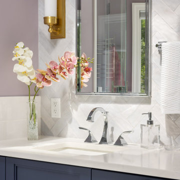
New cabinets were a must with customized interiors to reduce cluttered counter tops and make morning routines easier and more organized. We selected Hale Navy for the painted finish with an upscale recessed panel door. Honey bronze hardware is a nice contrast to the navy paint instead of an expected brushed silver. For storage, a grooming center to organize hair dryer, curling iron and brushes keeps everything in place for morning routines. On the opposite, a pull-out organizer outfitted with trays for smaller personal items keeps everything at the fingertips. I included a pull-out hamper to keep laundry and towels off the floor. Another design detail I like to include is drawers in the sink cabinets. It is much better to have drawers notched for the plumbing when organizing bathroom products instead of filling up a large base cabinet.
The room already had beautiful windows and was bathed in naturel light from an existing skylight. I enhanced the natural lighting with some recessed can lights, a light in the shower as well as sconces around the mirrored medicine cabinets. The best thing about the medicine cabinets is not only the additional storage but when both doors are opened you can see the back of your head. The inside of the cabinet doors are mirrored. Honey Bronze sconces are perfect lighting at the vanity for makeup and shaving.
A larger shower for my very tall client with a built-in bench was a priority for this bathroom. I recommend stream showers whenever designing a bathroom and my client loved the idea of that feature as a surprise for his wife. Steam adds to the wellness and health aspect of any good bathroom design. We were able to access a small closet space just behind the shower a perfect spot for the steam unit. In addition to the steam, a handheld shower is another “standard” item in our shower designs. I like to locate these near a bench so you can sit while you target sore shoulder and back muscles. Another benefit is cleanability of the shower walls and being able to take a quick shower without getting your hair wet. The slide bar is just the thing to accommodate different heights.
For Mrs. a tub for soaking and relaxing were the main ingredients required for this remodel. Here I specified a Bain Ultra freestanding tub complete with air massage, chromatherapy and a heated back rest. The tub filer is floor mounted and adds another element of elegance to the bath. I located the tub in a bay window so the bather can enjoy the beautiful view out of the window. It is also a great way to relax after a round of golf. Either way, both of my clients can enjoy the benefits of this tub.
The tiles selected for the shower and the lower walls of the bathroom are a slightly oversized subway tile in a clean and bright white. The floors are a 12x24 porcelain marble. The shower floor features a flat cut marble pebble tile. Behind the vanity the wall is tiled with Zellage tile in a herringbone pattern. The colors of the tile connect all the colors used in the bath.
The final touches of elegance and luxury to complete our design, the soft lilac paint on the walls, the mix of metal materials on the faucets, cabinet hardware, lighting and yes, an oversized heated towel warmer complete with robe hooks.
This truly is a space for rejuvenation and wellness.
58