
Search results for "Reduce blaze" in Home Design Ideas




Find the right local pro for your project








 Schumacher Interiors, LLC
Jackie wanted a fresh new look for her living room, and she REALLY wanted cream leather furniture. We found her this great set at an affordable price, kept the existing wall color and carpet, and let new fabrics and wall art bring in the color. The room now looks fresh and modern, as well as much bigger!
ps - the rocker cushions are still being recovered. Stay tuned for updated photos!




 KURV Architecture DPC (Alex Hughes Architects)
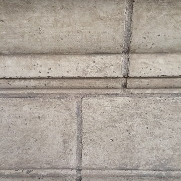
Located in the heart of Manhattan’s Lower East Side, the building was erected on a shallow commercial lot between two 120 year old masonry buildings and a new residential rental building. 330 Grand Street is a mix of 725 SF 1BRs and 1050 SF 2BR apartments. It also contains a 1100 SF two story duplex as well as private and public rooftop space, large private balconies for most units and two large private terraces for the ground floor units.
330 Grand Street was originally designed and approved at the NYC DOB as a prefabricated modular building. During the pandemic, as shipping costs skyrocketed putting the project at risk, we suggested redesigning the building as a reinforced cast-in-place concrete structure. Concrete was readily available and prices had not been affected by the demand increase that many other materials suffered in the pandemic. We took this opportunity to raise floor to ceiling heights, enlarge high performance windows and redistribute the buildings MEPFS and Structural Systems to create very open floor plans.
The challenge was to create a luxurious sensorial living experience with very limited means. In a city with very high construction costs, low cost residential buildings in the area are usually devoid of good quality, design and character. Our approach was to aim high for the end user, prioritizing natural light, open space with long visual perspectives, high ceilings and as always, rejecting the use of predefined building templates.
Our biggest challenge was to ensure that the small spaces feel as clean cut, large and bright as possible. Several unique design decisions were made to ensure low cost and high quality;
Floor plans were laid out so that spaces were wide open and free of clutter from mechanical or structural interruptions. Therefore all infrastructure was placed in lateral demising walls, which in turn act as the unit’s storage and kitchen. The apartments feel wide open, are super quiet and have more storage space than any other comparable apartment in the city.
To solve the problem of the site’s shallow commercial lot which is typically prone to dark interior spaces we focused our attention on the building’s envelope. Instead of the usual small punched window openings, oversized high performance windows were designed to ensure that light penetrated as far as possible into the units. In the smaller 1BR units, the full 50’ depth of the lot is perceived by partitioning spaces with sliding pocket doors that can be retracted to allow deep visual perspectives, making the sight lines in the space feel longer, larger, more ample than normal. In addition to the full height glazing, each unit above the 2nd floor receives a 7 foot covered balcony, adding 120 to 240 sf to each apartment, something unusual in New York City buildings. The space is large enough for a full size dining table, when the weather permits being outside.
We also worked hard to ensure modularity. For example, all kitchen units are all identical throughout the building. The idea of modularity and the economy of the repetitive unit is exercised to the maximum through the building.
Hardware, appliances, flooring, wall coverings and material finishes are all carefully selected to feel bespoke, high quality and unique.
It was important to KURV that the result of this work manifest into something that would deeply connect with the end user and sustain relationships with the consumers of this space.
All images by KURV Architecture ©


 Tile Doctor Ltd
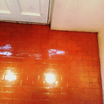
Here’s a quick job I completed in the coastal town of Eastbourne in East Sussex. While more commonly I am asked to work on entire floors, this customer was specifically interested in restoring a small doorway-like area with Quarry tiled flooring, the reason being that it had been covered for a long time by an old wardrobe and dog basket. As a result, the area had not been properly cared for, becoming very dusty and dirty. Also revealed were some unsightly splashes of white paint from previous decoration work.
The customer was keen to finally give this area of the floor the attention it needed, and so asked me to come in to provide a thorough clean and lay down some fresh sealer.
My first task was actually to relocate the old wardrobe and dog basket to the garage to get the area ready for cleaning. Then, to begin the cleaning process, I stripped away any old existing sealer and the white paint splashes by using Tile Doctor Remove & Go stripper in combination with a wire brush. Remove & Go is a versatile product that can also be used to break down glues and other adhesives.
I then washed the area down with water and promptly vacuumed up any moisture, before sitting down with a heat gun for an hour to dry the tiles. Usually a floor should be left for up to 48 hours to dry completely before sealing, but in this case the area was so small that I was able to dry it in the space of an hour.
Nonetheless, I opted to install a fan and leave the floor for an extra hour over lunch to ensure any excess moisture was removed. This is really important to do before sealing, as any remaining moisture can cloud the sealer and damage its performance.
To complete the restoration, I sealed the tiles using nine coats of the topical, water-based sealer Seal & Go, which is suitable for building up surface protection against dirt and stains on internal unsealed porous surfaces such as Victorian, Quarry and Sandstone tiles. The Quarry tiles were quite porous, which is not uncommon for Quarry Tiles and really soaked up the sealer.
As the photographs show, the results of the restoration were very good, with smiles all round – including from the slightly bemused family dog!
Rupert Mcleod
East Sussex Tile Doctor
 Kitchen Refresh
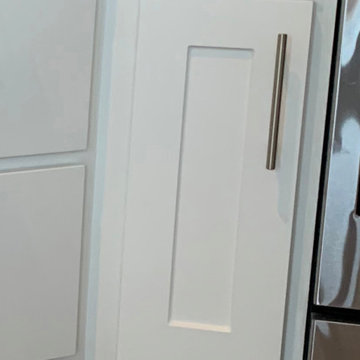
SEE THE HINGES?
Nope you don't - One of the small items that adds a better look is when we eliminate exposed hinges, like seen here. They just make a cabinet system look busy and are a visual distraction to the kitchen's overall appearance.
 Windows Floors & Decor
Lexi Brooke Photography
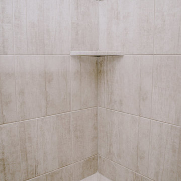
Home design - contemporary ceramic tile pebble tile floor and multicolored floor home design idea in Kansas City
Home design - contemporary ceramic tile pebble tile floor and multicolored floor home design idea in Kansas City


60