
Search results for "Reduce changed" in Home Design Ideas
 TKS Design Group
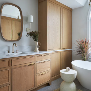
Several years ago, Jill and Brian remodeled their kitchen with TKS Design Group and recently decided it was time to look at a primary bath remodel.
Jill and Brian wanted a completely fresh start. We tweaked the layout slightly by reducing the size of the enormous tub deck and expanding the vanities and storage into the old tub deck zone as well as pushing a bit into the awkward carpeted dressing area. By doing so, we were able to substantially expand the existing footprint of the shower. We also relocated the French doors so that the bath would take advantage of the light brought in by the skylight in that area. A large arched window was replaced with a similar but cleaner lined version, and we removed the large bulkhead and columns to open the space. A simple freestanding tub now punctuates the area under the window and makes for a pleasing focal point. Subtle but significant changes.
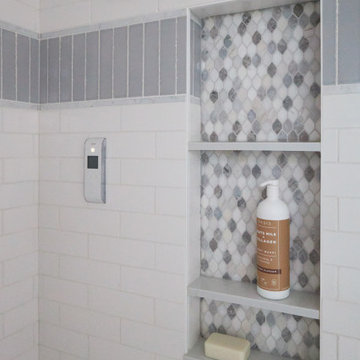
We chose a neutral gray tile for the floor to ground the space, and then white oak cabinetry and gold finishes bring warmth to the pallet. The large shower features a mix of white and gray tile where an electronic valve system offers a bit of modern technology and customization to bring some luxury to the everyday. The bathroom remodel also features plenty of storage that keeps the everyday necessities tucked away. The result feels modern, airy and restful!

 kimberly peck architect
photos by Pedro Marti
For this project the client hired us to renovate the top unit of this two family brownstone located in the historic district of Bedstuy in Brooklyn, NY. The upper apartment of the house is a three story home of which the lower two floors were fully renovated. The Clients wanted to keep the historic charm and original detail of the home as well as the general historic layout. The main layout change was to move the kitchen from the top floor to what was previously a living room at the rear of the first floor, creating an open dining/kitchen area. The kitchen consists of a large island with a farmhouse sink and a wall of paneled white and gray cabinetry. The rear window in the kitchen was enlarged and two large French doors were installed which lead out to a new elevated ipe deck with a stair that leads down to the garden. A powder room on the parlor floor from a previous renovation was reduced in size to give extra square footage to the dining room, its main feature is a colorful butterfly wallpaper. On the second floor The existing bedrooms were maintained but the center of the floor was gutted to create an additional bathroom in a previous walk-in closet. This new bathroom is a large ensuite masterbath featuring a multicolored glass mosaic tile detail adjacent to a more classic subway tile. To make up for the lost closet space where the masterbath was installed we chose to install new French swinging doors with historic bubble glass beneath an arched entry to an alcove in the master bedroom thus creating a large walk-in closet while maintaining the light in the room.
 Richard Best Architect, Inc.
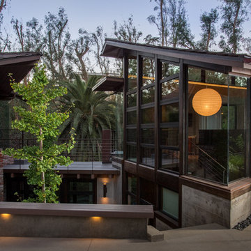
Hillside Modernism In Context.
The owners of this modern hillside home sought to have a home in a nice Los Angeles neighborhood wherein they could raise their burgeoning family. The owners purchased a 1948 2000sf, single story, 2 bedroom English Cottage styled home (believed to have been originally owned by Yul Brynner) on a ½ acre hillside site in the exclusive Brentwood area of Los Angeles. The property slopes downward away from the street and overlooks a mini eucalyptus arroyo. The owners love their new location but are now faced-with having to raise their new and growing family on a hillside with extremely limited yard spaces for children to play and in a location where nature is very close – deer as well as coyotes wander the arroyo.
In 2000 the owners commissioned architect Richard Best to add 2500sf to the cottage and transform it into a home more fitting to their growing family’s needs. Subsequently, in 2014/15, the owners again commissioned Richard to create a 2-story master suite addition. Living in or visiting the completed project - the original 1948 home remodeled + the 2000 addition + the 2014/15 addition, one goes through an unexpected and delightful experience as the spaces of the home “unfold” to reveal intimacy and environmental immersion.
It was important to Richard and to the owners that their remodels and additions be appropriately designed to fit into the neighborhood and have the feel, scale, and soul of the original cottage. With this in-mind, Richard has interpreted the design intentions of the original cottage - “modernizing” the architectural vocabulary and creating open-plan, 2-story additions which promote site “engagement” at various floor levels and openness to the outdoors in a manner clearly inspired by the original cottage, yet modern.
At the front door of the original (still remains as it was) 1948 structure, one is presented with a quaint a low-slung entry which establishes a very comfortable sense of scale. Inside, the remodeled spaces of the original cottage exude comfort and a cozy sensibility evoked by the reuse of the original home’s exposed timber framing structure, open-plan circulation, and an inventive two-sided steel fireplace which acts as a room divider between the living room and a home office. Accordion wood doors connect these rooms to a newly formed outdoor rear patio. At this point one also gets ones first hint that something very interesting is happening just beyond – a glimpse of the 2000 & 2014/15 additions.
Moving from the original 1948 structure into the 2-story 2000 addition, one is greeted by a modern and open linear floor plan arrangement – a kitchen, casual dining and family room extend perpendicularly from the 1948 structure into the rear yard and down the hillside. The open framed cathedral ceiling and wood roof trusses establish a lofty feeling and a rhythm discretely separating the open rooms one from the other. Extensive use of windows and French doors connect the indoors to the outdoors and provide abundant natural lighting. This new appendage ends with a symmetrical family room which has no corners – it is a geometry composed of two overlapped squares - one rotated 45 degrees atop the other to create double opportunities for bay windows. The design not only connects the home to the desired exterior flat yards spaces, but it also takes full advantage of the sloping terrain by adding a floor below the original level so as to maintain a scale appropriate to the neighborhood. The exterior materials were chosen taking “hints” from the original 1948 structure – natural redwood siding, reused brick veneer and wood doors/windows all serving to aesthetically connect the addition back-to the spirit of the original structure.
By 2014/15 the owners’ family has fully blossomed - the children are now teenagers and there is a need for additional space. However, the owners are very content with their remodeled cottage and Richard’s 2000 addition – unsure how to add to a home which they feel is quite perfect as it is … wanting whatever changes are to be made to be sympathetic to it. They are also concerned about potential additions blocking-out their views of the eucalyptus arroyo. The owners approached Richard with trepidation – we love our perfect house but we need it to be a bit bigger and we don’t want to block-out the arroyo views or create a hemmed-in feeling – how can we add but still see the arroyo.
In response Richard created a private yet connected 2-story master suite, which by its positioning, dynamic geometries and extensive glazing create the fourth side of the former rear patio, making it into exterior courtyard with views around and through the new addition into the arroyo. A dynamic angularity in the new master addition (inspired by the 2000 addition) simultaneously reduces the apparent size/presence of the master suite addition on the edge of the eucalyptus arroyo while creating framed views into the arroyo from the newly formed courtyard. The new master suite - a master bathroom, master closet and a master sleeping loft each having exterior decks and/or patios, is connected back to the 2000 addition via a glazed hallway which provides a sense of connectedness and privacy. A modern rustic aesthetic of exposed board-formed concrete, natural finished Corten steel exterior cladding, frameless metal windows, and clear finished Douglas Fir planks serve to “extend” the soul of the original cottage into the master suite.
The project is a highly sustainable design as well. Energy use is reduced by employing a high efficiency heat pump heating and cooling system, dual paned/gasketed metal window/door systems, natural lighting through a Kalwall skylight and generous exterior glazing with extensive eaves for shading, rigid roof insulation, and earthen backing – the lower floor is up-against the hillside which tends to even-out the day/night temperature differential.
Credits:
Architecture & Interior Design: Richard Best Architect Inc.
Structural Engineering: Dan Echeto & David Choi Associates
Interior Decor: Noelle Schoop
Landscape: Connie Heitzman
Photos: Carmel McFayden and Adriano Sarmento / James Porschen
Find the right local pro for your project

 Irons Brothers Construction Inc
A retired couple desired a valiant master suite in their “forever home”. After living in their mid-century house for many years, they approached our design team with a concept to add a 3rd story suite with sweeping views of Puget sound. Our team stood atop the home’s rooftop with the clients admiring the view that this structural lift would create in enjoyment and value. The only concern was how they and their dear-old dog, would get from their ground floor garage entrance in the daylight basement to this new suite in the sky?
Our CAPS design team specified universal design elements throughout the home, to allow the couple and their 120lb. Pit Bull Terrier to age in place. A new residential elevator added to the westside of the home. Placing the elevator shaft on the exterior of the home minimized the need for interior structural changes.
A shed roof for the addition followed the slope of the site, creating tall walls on the east side of the master suite to allow ample daylight into rooms without sacrificing useable wall space in the closet or bathroom. This kept the western walls low to reduce the amount of direct sunlight from the late afternoon sun, while maximizing the view of the Puget Sound and distant Olympic mountain range.
The master suite is the crowning glory of the redesigned home. The bedroom puts the bed up close to the wide picture window. While soothing violet-colored walls and a plush upholstered headboard have created a bedroom that encourages lounging, including a plush dog bed. A private balcony provides yet another excuse for never leaving the bedroom suite, and clerestory windows between the bedroom and adjacent master bathroom help flood the entire space with natural light.
The master bathroom includes an easy-access shower, his-and-her vanities with motion-sensor toe kick lights, and pops of beachy blue in the tile work and on the ceiling for a spa-like feel.
Some other universal design features in this master suite include wider doorways, accessible balcony, wall mounted vanities, tile and vinyl floor surfaces to reduce transition and pocket doors for easy use.
A large walk-through closet links the bedroom and bathroom, with clerestory windows at the high ceilings The third floor is finished off with a vestibule area with an indoor sauna, and an adjacent entertainment deck with an outdoor kitchen & bar.
 TKS Design Group
Several years ago, Jill and Brian remodeled their kitchen with TKS Design Group and recently decided it was time to look at a primary bath remodel.
Jill and Brian wanted a completely fresh start. We tweaked the layout slightly by reducing the size of the enormous tub deck and expanding the vanities and storage into the old tub deck zone as well as pushing a bit into the awkward carpeted dressing area. By doing so, we were able to substantially expand the existing footprint of the shower. We also relocated the French doors so that the bath would take advantage of the light brought in by the skylight in that area. A large arched window was replaced with a similar but cleaner lined version, and we removed the large bulkhead and columns to open the space. A simple freestanding tub now punctuates the area under the window and makes for a pleasing focal point. Subtle but significant changes.
We chose a neutral gray tile for the floor to ground the space, and then white oak cabinetry and gold finishes bring warmth to the pallet. The large shower features a mix of white and gray tile where an electronic valve system offers a bit of modern technology and customization to bring some luxury to the everyday. The bathroom remodel also features plenty of storage that keeps the everyday necessities tucked away. The result feels modern, airy and restful!
 Lighting EVER
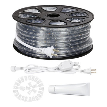
Perfect for cover lighting, outlining buildings, windows, walkway and garden paths, accenting decks, patios, front porches, staircases, garden and much more.
Color : Warm white.
Length per roll: 150ft(46m).
LED quantity: 1656 leds per roll, 11 leds per feet.
Diameter: 0.47-Inch. Input Voltage : 110-120 V AC.
Luminous intensity: 4000mcd/LED.
Wattage: 0.55W/ft (1.8W/m), total 82.8W.
Easy Installation. Simply plug into 110-120V AC household outlet without wiring.
Flexible. The slim, compact and flexible PCB tube can be shaped, formed or bent in any angle to perfectly fit the space being decorated.
Cuttable and linkable. It can be cut in every 3.28ft along the cutting marks, without damaging the rest strips.
Waterproof. IP65. Suitable for both indoor and outdoor applications.
Components saving. Can be directly connected into main supply, no power adapter, transformer or driver is required.
Reduce re-lamp frequency. Lifespan is over 50000 hrs. Save effort and labor costs on changing lights frequently.
Widely applicable. Not only be cut in sections, but also can run in max 150ft(46m) with only one power plug. It is convenient and cost-saving for large outdoor projects.
Eco-Friendly. No lead or mercury.
Applications. Perfect for cove lighting, outlining buildings/ windows/walkway and garden paths, accenting decks/ patios/front porches/staircases/garden and much more.
 Robert Miller FAIA Architects
Images by Nic LeHoux
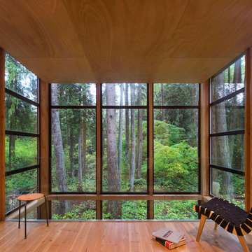
Designed as a home and studio for a photographer and his young family, Lightbox is located on a peninsula that extends south from British Columbia across the border to Point Roberts. The densely forested site lies beside a 180-acre park that overlooks the Strait of Georgia, the San Juan Islands and the Puget Sound.
Having experienced the world from under a black focusing cloth and large format camera lens, the photographer has a special fondness for simplicity and an appreciation of unique, genuine and well-crafted details.
The home was made decidedly modest, in size and means, with a building skin utilizing simple materials in a straightforward yet innovative configuration. The result is a structure crafted from affordable and common materials such as exposed wood two-bys that form the structural frame and directly support a prefabricated aluminum window system of standard glazing units uniformly sized to reduce the complexity and overall cost.
Accessed from the west on a sloped boardwalk that bisects its two contrasting forms, the house sits lightly on the land above the forest floor.
A south facing two-story glassy cage for living captures the sun and view as it celebrates the interplay of light and shadow in the forest. To the north, stairs are contained in a thin wooden box stained black with a traditional Finnish pine tar coating. Narrow apertures in the otherwise solid dark wooden wall sharply focus the vibrant cropped views of the old growth fir trees at the edge of the deep forest.
Lightbox is an uncomplicated yet powerful gesture that enables one to view the subtlety and beauty of the site while providing comfort and pleasure in the constantly changing light of the forest.
Sponsored
Fredericksburg, OH

High Point Cabinets
Columbus' Experienced Custom Cabinet Builder | 4x Best of Houzz Winner
 kimberly peck architect
photos by Pedro Marti
For this project the client hired us to renovate the top unit of this two family brownstone located in the historic district of Bedstuy in Brooklyn, NY. The upper apartment of the house is a three story home of which the lower two floors were fully renovated. The Clients wanted to keep the historic charm and original detail of the home as well as the general historic layout. The main layout change was to move the kitchen from the top floor to what was previously a living room at the rear of the first floor, creating an open dining/kitchen area. The kitchen consists of a large island with a farmhouse sink and a wall of paneled white and gray cabinetry. The rear window in the kitchen was enlarged and two large French doors were installed which lead out to a new elevated ipe deck with a stair that leads down to the garden. A powder room on the parlor floor from a previous renovation was reduced in size to give extra square footage to the dining room, its main feature is a colorful butterfly wallpaper. On the second floor The existing bedrooms were maintained but the center of the floor was gutted to create an additional bathroom in a previous walk-in closet. This new bathroom is a large ensuite masterbath featuring a multicolored glass mosaic tile detail adjacent to a more classic subway tile. To make up for the lost closet space where the masterbath was installed we chose to install new French swinging doors with historic bubble glass beneath an arched entry to an alcove in the master bedroom thus creating a large walk-in closet while maintaining the light in the room.

 User
Anchored by the homeowner’s 42-foot-long painting, the interiors of this Palm Springs residence were designed to showcase the owner’s art collection, and create functional spaces for daily living that can be easily adapted for large social gatherings.
Referencing the environment and architecture in both form and material, the finishes and custom furnishings bring the interior to life. Alluding to the roofs that suspend over the building, the sofas seem to hover above the carpets while the knife-edge table top appears to float above a metal base. Bleached and cerused wood mimic the “desert effect” that would naturally occur in this environment, while the textiles on the sofa are the same shade as the rocks of the landscape.
Monolithic concrete floors connect all of the spaces while concealing mechanical systems, and stone thresholds signal vertical level changes and exterior transitions. Large wall masses provide the optimal backdrop for the homeowner’s oversized art. The wall structures ground the interior, while the opposing expanses of glass frame the desert views. The location and use of operable doors and windows allows the house to naturally ventilate, reducing cooling loads. The furnishings create spaces in an architectural fashion.
Designed and fabricated for flexibility, the pieces easily accommodate the owners’ large social gatherings. The dining table can be split into two and the sofas can be pushed out along the walls, opening the center of the space to entertain. The design of the interior spaces and furnishings seamlessly integrates the setting, architecture, artwork and spaces into a cohesive whole.
 TKS Design Group
Several years ago, Jill and Brian remodeled their kitchen with TKS Design Group and recently decided it was time to look at a primary bath remodel.
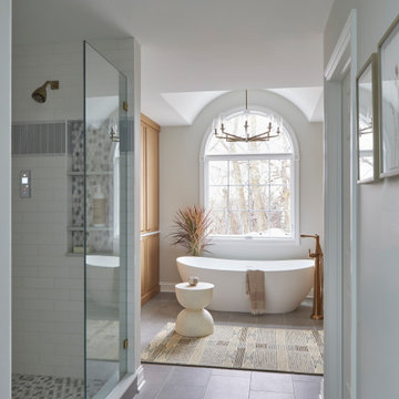
Jill and Brian wanted a completely fresh start. We tweaked the layout slightly by reducing the size of the enormous tub deck and expanding the vanities and storage into the old tub deck zone as well as pushing a bit into the awkward carpeted dressing area. By doing so, we were able to substantially expand the existing footprint of the shower. We also relocated the French doors so that the bath would take advantage of the light brought in by the skylight in that area. A large arched window was replaced with a similar but cleaner lined version, and we removed the large bulkhead and columns to open the space. A simple freestanding tub now punctuates the area under the window and makes for a pleasing focal point. Subtle but significant changes.
We chose a neutral gray tile for the floor to ground the space, and then white oak cabinetry and gold finishes bring warmth to the pallet. The large shower features a mix of white and gray tile where an electronic valve system offers a bit of modern technology and customization to bring some luxury to the everyday. The bathroom remodel also features plenty of storage that keeps the everyday necessities tucked away. The result feels modern, airy and restful!
 kimberly peck architect
photos by Pedro Marti
For this project the client hired us to renovate the top unit of this two family brownstone located in the historic district of Bedstuy in Brooklyn, NY. The upper apartment of the house is a three story home of which the lower two floors were fully renovated. The Clients wanted to keep the historic charm and original detail of the home as well as the general historic layout. The main layout change was to move the kitchen from the top floor to what was previously a living room at the rear of the first floor, creating an open dining/kitchen area. The kitchen consists of a large island with a farmhouse sink and a wall of paneled white and gray cabinetry. The rear window in the kitchen was enlarged and two large French doors were installed which lead out to a new elevated ipe deck with a stair that leads down to the garden. A powder room on the parlor floor from a previous renovation was reduced in size to give extra square footage to the dining room, its main feature is a colorful butterfly wallpaper. On the second floor The existing bedrooms were maintained but the center of the floor was gutted to create an additional bathroom in a previous walk-in closet. This new bathroom is a large ensuite masterbath featuring a multicolored glass mosaic tile detail adjacent to a more classic subway tile. To make up for the lost closet space where the masterbath was installed we chose to install new French swinging doors with historic bubble glass beneath an arched entry to an alcove in the master bedroom thus creating a large walk-in closet while maintaining the light in the room.
 TKS Design Group
Several years ago, Jill and Brian remodeled their kitchen with TKS Design Group and recently decided it was time to look at a primary bath remodel.
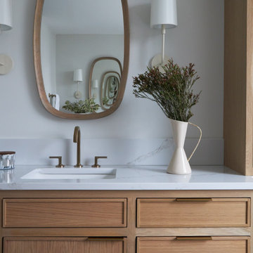
Jill and Brian wanted a completely fresh start. We tweaked the layout slightly by reducing the size of the enormous tub deck and expanding the vanities and storage into the old tub deck zone as well as pushing a bit into the awkward carpeted dressing area. By doing so, we were able to substantially expand the existing footprint of the shower. We also relocated the French doors so that the bath would take advantage of the light brought in by the skylight in that area. A large arched window was replaced with a similar but cleaner lined version, and we removed the large bulkhead and columns to open the space. A simple freestanding tub now punctuates the area under the window and makes for a pleasing focal point. Subtle but significant changes.
We chose a neutral gray tile for the floor to ground the space, and then white oak cabinetry and gold finishes bring warmth to the pallet. The large shower features a mix of white and gray tile where an electronic valve system offers a bit of modern technology and customization to bring some luxury to the everyday. The bathroom remodel also features plenty of storage that keeps the everyday necessities tucked away. The result feels modern, airy and restful!

 ZeroEnergy Design
This renovated brick rowhome in Boston’s South End offers a modern aesthetic within a historic structure, creative use of space, exceptional thermal comfort, a reduced carbon footprint, and a passive stream of income.
DESIGN PRIORITIES. The goals for the project were clear - design the primary unit to accommodate the family’s modern lifestyle, rework the layout to create a desirable rental unit, improve thermal comfort and introduce a modern aesthetic. We designed the street-level entry as a shared entrance for both the primary and rental unit. The family uses it as their everyday entrance - we planned for bike storage and an open mudroom with bench and shoe storage to facilitate the change from shoes to slippers or bare feet as they enter their home. On the main level, we expanded the kitchen into the dining room to create an eat-in space with generous counter space and storage, as well as a comfortable connection to the living space. The second floor serves as master suite for the couple - a bedroom with a walk-in-closet and ensuite bathroom, and an adjacent study, with refinished original pumpkin pine floors. The upper floor, aside from a guest bedroom, is the child's domain with interconnected spaces for sleeping, work and play. In the play space, which can be separated from the work space with new translucent sliding doors, we incorporated recreational features inspired by adventurous and competitive television shows, at their son’s request.
MODERN MEETS TRADITIONAL. We left the historic front facade of the building largely unchanged - the security bars were removed from the windows and the single pane windows were replaced with higher performing historic replicas. We designed the interior and rear facade with a vision of warm modernism, weaving in the notable period features. Each element was either restored or reinterpreted to blend with the modern aesthetic. The detailed ceiling in the living space, for example, has a new matte monochromatic finish, and the wood stairs are covered in a dark grey floor paint, whereas the mahogany doors were simply refinished. New wide plank wood flooring with a neutral finish, floor-to-ceiling casework, and bold splashes of color in wall paint and tile, and oversized high-performance windows (on the rear facade) round out the modern aesthetic.
RENTAL INCOME. The existing rowhome was zoned for a 2-family dwelling but included an undesirable, single-floor studio apartment at the garden level with low ceiling heights and questionable emergency egress. In order to increase the quality and quantity of space in the rental unit, we reimagined it as a two-floor, 1 or 2 bedroom, 2 bathroom apartment with a modern aesthetic, increased ceiling height on the lowest level and provided an in-unit washer/dryer. The apartment was listed with Jackie O'Connor Real Estate and rented immediately, providing the owners with a source of passive income.
ENCLOSURE WITH BENEFITS. The homeowners sought a minimal carbon footprint, enabled by their urban location and lifestyle decisions, paired with the benefits of a high-performance home. The extent of the renovation allowed us to implement a deep energy retrofit (DER) to address air tightness, insulation, and high-performance windows. The historic front facade is insulated from the interior, while the rear facade is insulated on the exterior. Together with these building enclosure improvements, we designed an HVAC system comprised of continuous fresh air ventilation, and an efficient, all-electric heating and cooling system to decouple the house from natural gas. This strategy provides optimal thermal comfort and indoor air quality, improved acoustic isolation from street noise and neighbors, as well as a further reduced carbon footprint. We also took measures to prepare the roof for future solar panels, for when the South End neighborhood’s aging electrical infrastructure is upgraded to allow them.
URBAN LIVING. The desirable neighborhood location allows the both the homeowners and tenant to walk, bike, and use public transportation to access the city, while each charging their respective plug-in electric cars behind the building to travel greater distances.
OVERALL. The understated rowhouse is now ready for another century of urban living, offering the owners comfort and convenience as they live life as an expression of their values.
Eric Roth Photo
 Andrew Mikhael Architect
Kitchen is Center
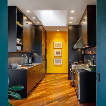
In our design to combine the apartments, we centered the kitchen - making it a dividing line between private and public space; vastly expanding the storage and work surface area. We discovered an existing unused roof penetration to run a duct to vent out a powerful kitchen hood.
The original bathroom skylight now illuminates the central kitchen space. Without changing the standard skylight size, we gave it architectural scale by carving out the ceiling to maximize daylight.
Light now dances off the vaulted, sculptural angles of the ceiling to bathe the entire space in natural light.
 TKS Design Group
Several years ago, Jill and Brian remodeled their kitchen with TKS Design Group and recently decided it was time to look at a primary bath remodel.
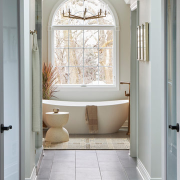
Jill and Brian wanted a completely fresh start. We tweaked the layout slightly by reducing the size of the enormous tub deck and expanding the vanities and storage into the old tub deck zone as well as pushing a bit into the awkward carpeted dressing area. By doing so, we were able to substantially expand the existing footprint of the shower. We also relocated the French doors so that the bath would take advantage of the light brought in by the skylight in that area. A large arched window was replaced with a similar but cleaner lined version, and we removed the large bulkhead and columns to open the space. A simple freestanding tub now punctuates the area under the window and makes for a pleasing focal point. Subtle but significant changes.
We chose a neutral gray tile for the floor to ground the space, and then white oak cabinetry and gold finishes bring warmth to the pallet. The large shower features a mix of white and gray tile where an electronic valve system offers a bit of modern technology and customization to bring some luxury to the everyday. The bathroom remodel also features plenty of storage that keeps the everyday necessities tucked away. The result feels modern, airy and restful!
 kimberly peck architect
photos by Pedro Marti
For this project the client hired us to renovate the top unit of this two family brownstone located in the historic district of Bedstuy in Brooklyn, NY. The upper apartment of the house is a three story home of which the lower two floors were fully renovated. The Clients wanted to keep the historic charm and original detail of the home as well as the general historic layout. The main layout change was to move the kitchen from the top floor to what was previously a living room at the rear of the first floor, creating an open dining/kitchen area. The kitchen consists of a large island with a farmhouse sink and a wall of paneled white and gray cabinetry. The rear window in the kitchen was enlarged and two large French doors were installed which lead out to a new elevated ipe deck with a stair that leads down to the garden. A powder room on the parlor floor from a previous renovation was reduced in size to give extra square footage to the dining room, its main feature is a colorful butterfly wallpaper. On the second floor The existing bedrooms were maintained but the center of the floor was gutted to create an additional bathroom in a previous walk-in closet. This new bathroom is a large ensuite masterbath featuring a multicolored glass mosaic tile detail adjacent to a more classic subway tile. To make up for the lost closet space where the masterbath was installed we chose to install new French swinging doors with historic bubble glass beneath an arched entry to an alcove in the master bedroom thus creating a large walk-in closet while maintaining the light in the room.
 TKS Design Group
Several years ago, Jill and Brian remodeled their kitchen with TKS Design Group and recently decided it was time to look at a primary bath remodel.
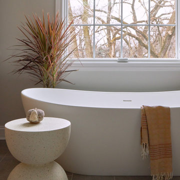
Jill and Brian wanted a completely fresh start. We tweaked the layout slightly by reducing the size of the enormous tub deck and expanding the vanities and storage into the old tub deck zone as well as pushing a bit into the awkward carpeted dressing area. By doing so, we were able to substantially expand the existing footprint of the shower. We also relocated the French doors so that the bath would take advantage of the light brought in by the skylight in that area. A large arched window was replaced with a similar but cleaner lined version, and we removed the large bulkhead and columns to open the space. A simple freestanding tub now punctuates the area under the window and makes for a pleasing focal point. Subtle but significant changes.
We chose a neutral gray tile for the floor to ground the space, and then white oak cabinetry and gold finishes bring warmth to the pallet. The large shower features a mix of white and gray tile where an electronic valve system offers a bit of modern technology and customization to bring some luxury to the everyday. The bathroom remodel also features plenty of storage that keeps the everyday necessities tucked away. The result feels modern, airy and restful!

 Crystal Kitchen + Bath
After 11 years on the Gull Lake chain in Nisswa, this couple decided to sell their cabin. Their current home has the lake view, pine trees and “up north” feel right here in Plymouth. The goal of this remodel was to incorporate some of the Nisswa cabin features into an “urban cabin”.
The first step was, large windows were installed to take in the view of the lake. Some features borrowed from the cabin are the interior wood tongue & groove siding, ledge stone fireplace and scraped hickory flooring. Designer, Carol Kornak, reconfigured the appliance locations and reoriented the kitchen by added an island with eating space. And, a subtle but rewarding change occurred in the back hall. Often a bottleneck, the hallway to the garage was a catch-all for coats, boots, mail, etc. With a little design magic (by removing a wall, reducing pantry depth) and adding a boot bench and hooks for coats, the narrow hallway feels more spacious. To keep them organized there is a mail sorting and charging station hidden behind closed doors.
Admittedly, the couple isn’t roughing it with their Wolf/Sub-Zero appliance package including refrigerator, wine cooler, cooktop, steam oven and warming drawer. The new cabinetry from Crystal Cabinet Works in rustic hickory and painted finish pairs beautifully with the two Cambria countertops and completes the transformation into the “Urban Cabin”. The only thing missing is the 2 ½ hour drive and the dock & boat. Luckily, Lake Minnetonka is only a short drive away.
 TKS Design Group
Several years ago, Jill and Brian remodeled their kitchen with TKS Design Group and recently decided it was time to look at a primary bath remodel.
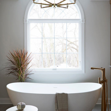
Jill and Brian wanted a completely fresh start. We tweaked the layout slightly by reducing the size of the enormous tub deck and expanding the vanities and storage into the old tub deck zone as well as pushing a bit into the awkward carpeted dressing area. By doing so, we were able to substantially expand the existing footprint of the shower. We also relocated the French doors so that the bath would take advantage of the light brought in by the skylight in that area. A large arched window was replaced with a similar but cleaner lined version, and we removed the large bulkhead and columns to open the space. A simple freestanding tub now punctuates the area under the window and makes for a pleasing focal point. Subtle but significant changes.
We chose a neutral gray tile for the floor to ground the space, and then white oak cabinetry and gold finishes bring warmth to the pallet. The large shower features a mix of white and gray tile where an electronic valve system offers a bit of modern technology and customization to bring some luxury to the everyday. The bathroom remodel also features plenty of storage that keeps the everyday necessities tucked away. The result feels modern, airy and restful!
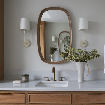 TKS Design Group
Several years ago, Jill and Brian remodeled their kitchen with TKS Design Group and recently decided it was time to look at a primary bath remodel.
Jill and Brian wanted a completely fresh start. We tweaked the layout slightly by reducing the size of the enormous tub deck and expanding the vanities and storage into the old tub deck zone as well as pushing a bit into the awkward carpeted dressing area. By doing so, we were able to substantially expand the existing footprint of the shower. We also relocated the French doors so that the bath would take advantage of the light brought in by the skylight in that area. A large arched window was replaced with a similar but cleaner lined version, and we removed the large bulkhead and columns to open the space. A simple freestanding tub now punctuates the area under the window and makes for a pleasing focal point. Subtle but significant changes.
We chose a neutral gray tile for the floor to ground the space, and then white oak cabinetry and gold finishes bring warmth to the pallet. The large shower features a mix of white and gray tile where an electronic valve system offers a bit of modern technology and customization to bring some luxury to the everyday. The bathroom remodel also features plenty of storage that keeps the everyday necessities tucked away. The result feels modern, airy and restful!
50