
Search results for "Reduce changed" in Home Design Ideas

 Katie Hutchison Studio
The new owners of this house in Harvard, Massachusetts loved its location and authentic Shaker characteristics, but weren’t fans of its curious layout. A dated first-floor full bathroom could only be accessed by going up a few steps to a landing, opening the bathroom door and then going down the same number of steps to enter the room. The dark kitchen faced the driveway to the north, rather than the bucolic backyard fields to the south. The dining space felt more like an enlarged hall and could only comfortably seat four. Upstairs, a den/office had a woefully low ceiling; the master bedroom had limited storage, and a sad full bathroom featured a cramped shower.
KHS proposed a number of changes to create an updated home where the owners could enjoy cooking, entertaining, and being connected to the outdoors from the first-floor living spaces, while also experiencing more inviting and more functional private spaces upstairs.
On the first floor, the primary change was to capture space that had been part of an upper-level screen porch and convert it to interior space. To make the interior expansion seamless, we raised the floor of the area that had been the upper-level porch, so it aligns with the main living level, and made sure there would be no soffits in the planes of the walls we removed. We also raised the floor of the remaining lower-level porch to reduce the number of steps required to circulate from it to the newly expanded interior. New patio door systems now fill the arched openings that used to be infilled with screen. The exterior interventions (which also included some new casement windows in the dining area) were designed to be subtle, while affording significant improvements on the interior. Additionally, the first-floor bathroom was reconfigured, shifting one of its walls to widen the dining space, and moving the entrance to the bathroom from the stair landing to the kitchen instead.
These changes (which involved significant structural interventions) resulted in a much more open space to accommodate a new kitchen with a view of the lush backyard and a new dining space defined by a new built-in banquette that comfortably seats six, and -- with the addition of a table extension -- up to eight people.
Upstairs in the den/office, replacing the low, board ceiling with a raised, plaster, tray ceiling that springs from above the original board-finish walls – newly painted a light color -- created a much more inviting, bright, and expansive space. Re-configuring the master bath to accommodate a larger shower and adding built-in storage cabinets in the master bedroom improved comfort and function. A new whole-house color palette rounds out the improvements.
Photos by Katie Hutchison
 Katie Hutchison Studio
The new owners of this house in Harvard, Massachusetts loved its location and authentic Shaker characteristics, but weren’t fans of its curious layout. A dated first-floor full bathroom could only be accessed by going up a few steps to a landing, opening the bathroom door and then going down the same number of steps to enter the room. The dark kitchen faced the driveway to the north, rather than the bucolic backyard fields to the south. The dining space felt more like an enlarged hall and could only comfortably seat four. Upstairs, a den/office had a woefully low ceiling; the master bedroom had limited storage, and a sad full bathroom featured a cramped shower.
KHS proposed a number of changes to create an updated home where the owners could enjoy cooking, entertaining, and being connected to the outdoors from the first-floor living spaces, while also experiencing more inviting and more functional private spaces upstairs.
On the first floor, the primary change was to capture space that had been part of an upper-level screen porch and convert it to interior space. To make the interior expansion seamless, we raised the floor of the area that had been the upper-level porch, so it aligns with the main living level, and made sure there would be no soffits in the planes of the walls we removed. We also raised the floor of the remaining lower-level porch to reduce the number of steps required to circulate from it to the newly expanded interior. New patio door systems now fill the arched openings that used to be infilled with screen. The exterior interventions (which also included some new casement windows in the dining area) were designed to be subtle, while affording significant improvements on the interior. Additionally, the first-floor bathroom was reconfigured, shifting one of its walls to widen the dining space, and moving the entrance to the bathroom from the stair landing to the kitchen instead.
These changes (which involved significant structural interventions) resulted in a much more open space to accommodate a new kitchen with a view of the lush backyard and a new dining space defined by a new built-in banquette that comfortably seats six, and -- with the addition of a table extension -- up to eight people.
Upstairs in the den/office, replacing the low, board ceiling with a raised, plaster, tray ceiling that springs from above the original board-finish walls – newly painted a light color -- created a much more inviting, bright, and expansive space. Re-configuring the master bath to accommodate a larger shower and adding built-in storage cabinets in the master bedroom improved comfort and function. A new whole-house color palette rounds out the improvements.
Photos by Katie Hutchison

 kimberly peck architect
photos by Pedro Marti
For this project the client hired us to renovate the top unit of this two family brownstone located in the historic district of Bedstuy in Brooklyn, NY. The upper apartment of the house is a three story home of which the lower two floors were fully renovated. The Clients wanted to keep the historic charm and original detail of the home as well as the general historic layout. The main layout change was to move the kitchen from the top floor to what was previously a living room at the rear of the first floor, creating an open dining/kitchen area. The kitchen consists of a large island with a farmhouse sink and a wall of paneled white and gray cabinetry. The rear window in the kitchen was enlarged and two large French doors were installed which lead out to a new elevated ipe deck with a stair that leads down to the garden. A powder room on the parlor floor from a previous renovation was reduced in size to give extra square footage to the dining room, its main feature is a colorful butterfly wallpaper. On the second floor The existing bedrooms were maintained but the center of the floor was gutted to create an additional bathroom in a previous walk-in closet. This new bathroom is a large ensuite masterbath featuring a multicolored glass mosaic tile detail adjacent to a more classic subway tile. To make up for the lost closet space where the masterbath was installed we chose to install new French swinging doors with historic bubble glass beneath an arched entry to an alcove in the master bedroom thus creating a large walk-in closet while maintaining the light in the room.
Find the right local pro for your project

 Irons Brothers Construction Inc
A retired couple desired a valiant master suite in their “forever home”. After living in their mid-century house for many years, they approached our design team with a concept to add a 3rd story suite with sweeping views of Puget sound. Our team stood atop the home’s rooftop with the clients admiring the view that this structural lift would create in enjoyment and value. The only concern was how they and their dear-old dog, would get from their ground floor garage entrance in the daylight basement to this new suite in the sky?
Our CAPS design team specified universal design elements throughout the home, to allow the couple and their 120lb. Pit Bull Terrier to age in place. A new residential elevator added to the westside of the home. Placing the elevator shaft on the exterior of the home minimized the need for interior structural changes.
A shed roof for the addition followed the slope of the site, creating tall walls on the east side of the master suite to allow ample daylight into rooms without sacrificing useable wall space in the closet or bathroom. This kept the western walls low to reduce the amount of direct sunlight from the late afternoon sun, while maximizing the view of the Puget Sound and distant Olympic mountain range.
The master suite is the crowning glory of the redesigned home. The bedroom puts the bed up close to the wide picture window. While soothing violet-colored walls and a plush upholstered headboard have created a bedroom that encourages lounging, including a plush dog bed. A private balcony provides yet another excuse for never leaving the bedroom suite, and clerestory windows between the bedroom and adjacent master bathroom help flood the entire space with natural light.
The master bathroom includes an easy-access shower, his-and-her vanities with motion-sensor toe kick lights, and pops of beachy blue in the tile work and on the ceiling for a spa-like feel.
Some other universal design features in this master suite include wider doorways, accessible balcony, wall mounted vanities, tile and vinyl floor surfaces to reduce transition and pocket doors for easy use.
A large walk-through closet links the bedroom and bathroom, with clerestory windows at the high ceilings The third floor is finished off with a vestibule area with an indoor sauna, and an adjacent entertainment deck with an outdoor kitchen & bar.
 Katie Hutchison Studio
The new owners of this house in Harvard, Massachusetts loved its location and authentic Shaker characteristics, but weren’t fans of its curious layout. A dated first-floor full bathroom could only be accessed by going up a few steps to a landing, opening the bathroom door and then going down the same number of steps to enter the room. The dark kitchen faced the driveway to the north, rather than the bucolic backyard fields to the south. The dining space felt more like an enlarged hall and could only comfortably seat four. Upstairs, a den/office had a woefully low ceiling; the master bedroom had limited storage, and a sad full bathroom featured a cramped shower.
KHS proposed a number of changes to create an updated home where the owners could enjoy cooking, entertaining, and being connected to the outdoors from the first-floor living spaces, while also experiencing more inviting and more functional private spaces upstairs.
On the first floor, the primary change was to capture space that had been part of an upper-level screen porch and convert it to interior space. To make the interior expansion seamless, we raised the floor of the area that had been the upper-level porch, so it aligns with the main living level, and made sure there would be no soffits in the planes of the walls we removed. We also raised the floor of the remaining lower-level porch to reduce the number of steps required to circulate from it to the newly expanded interior. New patio door systems now fill the arched openings that used to be infilled with screen. The exterior interventions (which also included some new casement windows in the dining area) were designed to be subtle, while affording significant improvements on the interior. Additionally, the first-floor bathroom was reconfigured, shifting one of its walls to widen the dining space, and moving the entrance to the bathroom from the stair landing to the kitchen instead.
These changes (which involved significant structural interventions) resulted in a much more open space to accommodate a new kitchen with a view of the lush backyard and a new dining space defined by a new built-in banquette that comfortably seats six, and -- with the addition of a table extension -- up to eight people.
Upstairs in the den/office, replacing the low, board ceiling with a raised, plaster, tray ceiling that springs from above the original board-finish walls – newly painted a light color -- created a much more inviting, bright, and expansive space. Re-configuring the master bath to accommodate a larger shower and adding built-in storage cabinets in the master bedroom improved comfort and function. A new whole-house color palette rounds out the improvements.
Photos by Katie Hutchison

 Period Architecture Ltd.
Angle Eye Photography
Example of a mid-sized classic enclosed medium tone wood floor living room design in Philadelphia with beige walls
Example of a mid-sized classic enclosed medium tone wood floor living room design in Philadelphia with beige walls

Sponsored
Fredericksburg, OH

High Point Cabinets
Columbus' Experienced Custom Cabinet Builder | 4x Best of Houzz Winner

 Horizon Interior Design
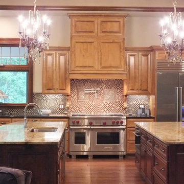
As a busy family of four with two boys and three cats, this client was ready for a kitchen remodel that made family life easier. With dated finishes, appliances, cabinetry, counters, and an oversized laundry room that could be better used as kitchen space, there were many aspects they wanted to change.
They had five different flooring surfaces within the line of sight, kept bumping into each other in the congested hallway, wanted to move their cooktop to the perimeter of their island rather than in the middle, hated their refrigerator location, and didn’t like having an island with two heights. Good thing they came to Horizon Interior Design, where we developed solutions for every problem!
We ran hardwood flooring throughout the main level to make it feel uniform and cohesive, opened up the hallway, and decreased the size of the laundry room to significantly extend their kitchen space and remove congestion in their hallway. We added more functional pull-out shelves to their pantry to replace the original rickety, narrow shelving and placed their refrigerator and cooktop on the perimeter wall, allowing for a large island with a solid surface and a decorative range hood.
We reduced the size of their kitchen windows to allow for more upper cabinetry space and added a granite waterfall feature on the island for a wow factor while placing the counter stools in such a way that they didn't block up main walkways. Dark cabinetry tied in nicely with the knots in the pine ceiling, and white tile backsplash brightened up the space beautifully. Our new kitchen layout meant the family had a nicer view while walking down the stairs, rather than staring at the top of kitchen cabinets.
Gugel Photography

 ZeroEnergy Design
This renovated brick rowhome in Boston’s South End offers a modern aesthetic within a historic structure, creative use of space, exceptional thermal comfort, a reduced carbon footprint, and a passive stream of income.
DESIGN PRIORITIES. The goals for the project were clear - design the primary unit to accommodate the family’s modern lifestyle, rework the layout to create a desirable rental unit, improve thermal comfort and introduce a modern aesthetic. We designed the street-level entry as a shared entrance for both the primary and rental unit. The family uses it as their everyday entrance - we planned for bike storage and an open mudroom with bench and shoe storage to facilitate the change from shoes to slippers or bare feet as they enter their home. On the main level, we expanded the kitchen into the dining room to create an eat-in space with generous counter space and storage, as well as a comfortable connection to the living space. The second floor serves as master suite for the couple - a bedroom with a walk-in-closet and ensuite bathroom, and an adjacent study, with refinished original pumpkin pine floors. The upper floor, aside from a guest bedroom, is the child's domain with interconnected spaces for sleeping, work and play. In the play space, which can be separated from the work space with new translucent sliding doors, we incorporated recreational features inspired by adventurous and competitive television shows, at their son’s request.
MODERN MEETS TRADITIONAL. We left the historic front facade of the building largely unchanged - the security bars were removed from the windows and the single pane windows were replaced with higher performing historic replicas. We designed the interior and rear facade with a vision of warm modernism, weaving in the notable period features. Each element was either restored or reinterpreted to blend with the modern aesthetic. The detailed ceiling in the living space, for example, has a new matte monochromatic finish, and the wood stairs are covered in a dark grey floor paint, whereas the mahogany doors were simply refinished. New wide plank wood flooring with a neutral finish, floor-to-ceiling casework, and bold splashes of color in wall paint and tile, and oversized high-performance windows (on the rear facade) round out the modern aesthetic.
RENTAL INCOME. The existing rowhome was zoned for a 2-family dwelling but included an undesirable, single-floor studio apartment at the garden level with low ceiling heights and questionable emergency egress. In order to increase the quality and quantity of space in the rental unit, we reimagined it as a two-floor, 1 or 2 bedroom, 2 bathroom apartment with a modern aesthetic, increased ceiling height on the lowest level and provided an in-unit washer/dryer. The apartment was listed with Jackie O'Connor Real Estate and rented immediately, providing the owners with a source of passive income.
ENCLOSURE WITH BENEFITS. The homeowners sought a minimal carbon footprint, enabled by their urban location and lifestyle decisions, paired with the benefits of a high-performance home. The extent of the renovation allowed us to implement a deep energy retrofit (DER) to address air tightness, insulation, and high-performance windows. The historic front facade is insulated from the interior, while the rear facade is insulated on the exterior. Together with these building enclosure improvements, we designed an HVAC system comprised of continuous fresh air ventilation, and an efficient, all-electric heating and cooling system to decouple the house from natural gas. This strategy provides optimal thermal comfort and indoor air quality, improved acoustic isolation from street noise and neighbors, as well as a further reduced carbon footprint. We also took measures to prepare the roof for future solar panels, for when the South End neighborhood’s aging electrical infrastructure is upgraded to allow them.
URBAN LIVING. The desirable neighborhood location allows the both the homeowners and tenant to walk, bike, and use public transportation to access the city, while each charging their respective plug-in electric cars behind the building to travel greater distances.
OVERALL. The understated rowhouse is now ready for another century of urban living, offering the owners comfort and convenience as they live life as an expression of their values.
Eric Roth Photo

 Robert Miller FAIA Architects
Images by Nic LeHoux
Designed as a home and studio for a photographer and his young family, Lightbox is located on a peninsula that extends south from British Columbia across the border to Point Roberts. The densely forested site lies beside a 180-acre park that overlooks the Strait of Georgia, the San Juan Islands and the Puget Sound.
Having experienced the world from under a black focusing cloth and large format camera lens, the photographer has a special fondness for simplicity and an appreciation of unique, genuine and well-crafted details.
The home was made decidedly modest, in size and means, with a building skin utilizing simple materials in a straightforward yet innovative configuration. The result is a structure crafted from affordable and common materials such as exposed wood two-bys that form the structural frame and directly support a prefabricated aluminum window system of standard glazing units uniformly sized to reduce the complexity and overall cost.
Accessed from the west on a sloped boardwalk that bisects its two contrasting forms, the house sits lightly on the land above the forest floor.
A south facing two-story glassy cage for living captures the sun and view as it celebrates the interplay of light and shadow in the forest. To the north, stairs are contained in a thin wooden box stained black with a traditional Finnish pine tar coating. Narrow apertures in the otherwise solid dark wooden wall sharply focus the vibrant cropped views of the old growth fir trees at the edge of the deep forest.
Lightbox is an uncomplicated yet powerful gesture that enables one to view the subtlety and beauty of the site while providing comfort and pleasure in the constantly changing light of the forest.
 Horizon Interior Design
As a busy family of four with two boys and three cats, this client was ready for a kitchen remodel that made family life easier. With dated finishes, appliances, cabinetry, counters, and an oversized laundry room that could be better used as kitchen space, there were many aspects they wanted to change.
They had five different flooring surfaces within the line of sight, kept bumping into each other in the congested hallway, wanted to move their cooktop to the perimeter of their island rather than in the middle, hated their refrigerator location, and didn’t like having an island with two heights. Good thing they came to Horizon Interior Design, where we developed solutions for every problem!
We ran hardwood flooring throughout the main level to make it feel uniform and cohesive, opened up the hallway, and decreased the size of the laundry room to significantly extend their kitchen space and remove congestion in their hallway. We added more functional pull-out shelves to their pantry to replace the original rickety, narrow shelving and placed their refrigerator and cooktop on the perimeter wall, allowing for a large island with a solid surface and a decorative range hood.
We reduced the size of their kitchen windows to allow for more upper cabinetry space and added a granite waterfall feature on the island for a wow factor while placing the counter stools in such a way that they didn't block up main walkways. Dark cabinetry tied in nicely with the knots in the pine ceiling, and white tile backsplash brightened up the space beautifully. Our new kitchen layout meant the family had a nicer view while walking down the stairs, rather than staring at the top of kitchen cabinets.
Gugel Photography
 ZeroEnergy Design
 (ZED) created this modern home for a progressive family in the desirable community of Lexington.
Thoughtful Land Connection. The residence is carefully sited on the infill lot so as to create privacy from the road and neighbors, while cultivating a side yard that captures the southern sun. The terraced grade rises to meet the house, allowing for it to maintain a structured connection with the ground while also sitting above the high water table. The elevated outdoor living space maintains a strong connection with the indoor living space, while the stepped edge ties it back to the true ground plane. Siting and outdoor connections were completed by ZED in collaboration with landscape designer Soren Deniord Design Studio.
Exterior Finishes and Solar. The exterior finish materials include a palette of shiplapped wood siding, through-colored fiber cement panels and stucco. A rooftop parapet hides the solar panels above, while a gutter and site drainage system directs rainwater into an irrigation cistern and dry wells that recharge the groundwater.
Cooking, Dining, Living. Inside, the kitchen, fabricated by Henrybuilt, is located between the indoor and outdoor dining areas. The expansive south-facing sliding door opens to seamlessly connect the spaces, using a retractable awning to provide shade during the summer while still admitting the warming winter sun. The indoor living space continues from the dining areas across to the sunken living area, with a view that returns again to the outside through the corner wall of glass.
Accessible Guest Suite. The design of the first level guest suite provides for both aging in place and guests who regularly visit for extended stays. The patio off the north side of the house affords guests their own private outdoor space, and privacy from the neighbor. Similarly, the second level master suite opens to an outdoor private roof deck.
Light and Access. The wide open interior stair with a glass panel rail leads from the top level down to the well insulated basement. The design of the basement, used as an away/play space, addresses the need for both natural light and easy access. In addition to the open stairwell, light is admitted to the north side of the area with a high performance, Passive House (PHI) certified skylight, covering a six by sixteen foot area. On the south side, a unique roof hatch set flush with the deck opens to reveal a glass door at the base of the stairwell which provides additional light and access from the deck above down to the play space.
Energy. Energy consumption is reduced by the high performance building envelope, high efficiency mechanical systems, and then offset with renewable energy. All windows and doors are made of high performance triple paned glass with thermally broken aluminum frames. The exterior wall assembly employs dense pack cellulose in the stud cavity, a continuous air barrier, and four inches exterior rigid foam insulation. The 10kW rooftop solar electric system provides clean energy production. The final air leakage testing yielded 0.6 ACH 50 - an extremely air tight house, a testament to the well-designed details, progress testing and quality construction. When compared to a new house built to code requirements, this home consumes only 19% of the energy.
Architecture & Energy Consulting: ZeroEnergy Design
Landscape Design: Soren Deniord Design
Paintings: Bernd Haussmann Studio
Photos: Eric Roth Photography
 kimberly peck architect
photos by Pedro Marti
For this project the client hired us to renovate the top unit of this two family brownstone located in the historic district of Bedstuy in Brooklyn, NY. The upper apartment of the house is a three story home of which the lower two floors were fully renovated. The Clients wanted to keep the historic charm and original detail of the home as well as the general historic layout. The main layout change was to move the kitchen from the top floor to what was previously a living room at the rear of the first floor, creating an open dining/kitchen area. The kitchen consists of a large island with a farmhouse sink and a wall of paneled white and gray cabinetry. The rear window in the kitchen was enlarged and two large French doors were installed which lead out to a new elevated ipe deck with a stair that leads down to the garden. A powder room on the parlor floor from a previous renovation was reduced in size to give extra square footage to the dining room, its main feature is a colorful butterfly wallpaper. On the second floor The existing bedrooms were maintained but the center of the floor was gutted to create an additional bathroom in a previous walk-in closet. This new bathroom is a large ensuite masterbath featuring a multicolored glass mosaic tile detail adjacent to a more classic subway tile. To make up for the lost closet space where the masterbath was installed we chose to install new French swinging doors with historic bubble glass beneath an arched entry to an alcove in the master bedroom thus creating a large walk-in closet while maintaining the light in the room.
 kimberly peck architect
photos by Pedro Marti
For this project the client hired us to renovate the top unit of this two family brownstone located in the historic district of Bedstuy in Brooklyn, NY. The upper apartment of the house is a three story home of which the lower two floors were fully renovated. The Clients wanted to keep the historic charm and original detail of the home as well as the general historic layout. The main layout change was to move the kitchen from the top floor to what was previously a living room at the rear of the first floor, creating an open dining/kitchen area. The kitchen consists of a large island with a farmhouse sink and a wall of paneled white and gray cabinetry. The rear window in the kitchen was enlarged and two large French doors were installed which lead out to a new elevated ipe deck with a stair that leads down to the garden. A powder room on the parlor floor from a previous renovation was reduced in size to give extra square footage to the dining room, its main feature is a colorful butterfly wallpaper. On the second floor The existing bedrooms were maintained but the center of the floor was gutted to create an additional bathroom in a previous walk-in closet. This new bathroom is a large ensuite masterbath featuring a multicolored glass mosaic tile detail adjacent to a more classic subway tile. To make up for the lost closet space where the masterbath was installed we chose to install new French swinging doors with historic bubble glass beneath an arched entry to an alcove in the master bedroom thus creating a large walk-in closet while maintaining the light in the room.

 McCullough's Flooring
Gorgeous master bath finished with Dal-Tile's Fabrique porcelain tile in the color Noir Linen polished. Tile size is 12"x24" installed in a brick joint pattern. The floor boasts underfloor heating on a timed thermostat.
 TKS Design Group
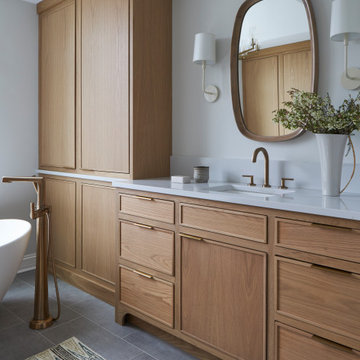
Several years ago, Jill and Brian remodeled their kitchen with TKS Design Group and recently decided it was time to look at a primary bath remodel.
Jill and Brian wanted a completely fresh start. We tweaked the layout slightly by reducing the size of the enormous tub deck and expanding the vanities and storage into the old tub deck zone as well as pushing a bit into the awkward carpeted dressing area. By doing so, we were able to substantially expand the existing footprint of the shower. We also relocated the French doors so that the bath would take advantage of the light brought in by the skylight in that area. A large arched window was replaced with a similar but cleaner lined version, and we removed the large bulkhead and columns to open the space. A simple freestanding tub now punctuates the area under the window and makes for a pleasing focal point. Subtle but significant changes.
We chose a neutral gray tile for the floor to ground the space, and then white oak cabinetry and gold finishes bring warmth to the pallet. The large shower features a mix of white and gray tile where an electronic valve system offers a bit of modern technology and customization to bring some luxury to the everyday. The bathroom remodel also features plenty of storage that keeps the everyday necessities tucked away. The result feels modern, airy and restful!
 ZeroEnergy Design
This renovated brick rowhome in Boston’s South End offers a modern aesthetic within a historic structure, creative use of space, exceptional thermal comfort, a reduced carbon footprint, and a passive stream of income.
DESIGN PRIORITIES. The goals for the project were clear - design the primary unit to accommodate the family’s modern lifestyle, rework the layout to create a desirable rental unit, improve thermal comfort and introduce a modern aesthetic. We designed the street-level entry as a shared entrance for both the primary and rental unit. The family uses it as their everyday entrance - we planned for bike storage and an open mudroom with bench and shoe storage to facilitate the change from shoes to slippers or bare feet as they enter their home. On the main level, we expanded the kitchen into the dining room to create an eat-in space with generous counter space and storage, as well as a comfortable connection to the living space. The second floor serves as master suite for the couple - a bedroom with a walk-in-closet and ensuite bathroom, and an adjacent study, with refinished original pumpkin pine floors. The upper floor, aside from a guest bedroom, is the child's domain with interconnected spaces for sleeping, work and play. In the play space, which can be separated from the work space with new translucent sliding doors, we incorporated recreational features inspired by adventurous and competitive television shows, at their son’s request.
MODERN MEETS TRADITIONAL. We left the historic front facade of the building largely unchanged - the security bars were removed from the windows and the single pane windows were replaced with higher performing historic replicas. We designed the interior and rear facade with a vision of warm modernism, weaving in the notable period features. Each element was either restored or reinterpreted to blend with the modern aesthetic. The detailed ceiling in the living space, for example, has a new matte monochromatic finish, and the wood stairs are covered in a dark grey floor paint, whereas the mahogany doors were simply refinished. New wide plank wood flooring with a neutral finish, floor-to-ceiling casework, and bold splashes of color in wall paint and tile, and oversized high-performance windows (on the rear facade) round out the modern aesthetic.
RENTAL INCOME. The existing rowhome was zoned for a 2-family dwelling but included an undesirable, single-floor studio apartment at the garden level with low ceiling heights and questionable emergency egress. In order to increase the quality and quantity of space in the rental unit, we reimagined it as a two-floor, 1 or 2 bedroom, 2 bathroom apartment with a modern aesthetic, increased ceiling height on the lowest level and provided an in-unit washer/dryer. The apartment was listed with Jackie O'Connor Real Estate and rented immediately, providing the owners with a source of passive income.
ENCLOSURE WITH BENEFITS. The homeowners sought a minimal carbon footprint, enabled by their urban location and lifestyle decisions, paired with the benefits of a high-performance home. The extent of the renovation allowed us to implement a deep energy retrofit (DER) to address air tightness, insulation, and high-performance windows. The historic front facade is insulated from the interior, while the rear facade is insulated on the exterior. Together with these building enclosure improvements, we designed an HVAC system comprised of continuous fresh air ventilation, and an efficient, all-electric heating and cooling system to decouple the house from natural gas. This strategy provides optimal thermal comfort and indoor air quality, improved acoustic isolation from street noise and neighbors, as well as a further reduced carbon footprint. We also took measures to prepare the roof for future solar panels, for when the South End neighborhood’s aging electrical infrastructure is upgraded to allow them.
URBAN LIVING. The desirable neighborhood location allows the both the homeowners and tenant to walk, bike, and use public transportation to access the city, while each charging their respective plug-in electric cars behind the building to travel greater distances.
OVERALL. The understated rowhouse is now ready for another century of urban living, offering the owners comfort and convenience as they live life as an expression of their values.
Eric Roth Photo

 kimberly peck architect
photos by Pedro Marti
For this project the client hired us to renovate the top unit of this two family brownstone located in the historic district of Bedstuy in Brooklyn, NY. The upper apartment of the house is a three story home of which the lower two floors were fully renovated. The Clients wanted to keep the historic charm and original detail of the home as well as the general historic layout. The main layout change was to move the kitchen from the top floor to what was previously a living room at the rear of the first floor, creating an open dining/kitchen area. The kitchen consists of a large island with a farmhouse sink and a wall of paneled white and gray cabinetry. The rear window in the kitchen was enlarged and two large French doors were installed which lead out to a new elevated ipe deck with a stair that leads down to the garden. A powder room on the parlor floor from a previous renovation was reduced in size to give extra square footage to the dining room, its main feature is a colorful butterfly wallpaper. On the second floor The existing bedrooms were maintained but the center of the floor was gutted to create an additional bathroom in a previous walk-in closet. This new bathroom is a large ensuite masterbath featuring a multicolored glass mosaic tile detail adjacent to a more classic subway tile. To make up for the lost closet space where the masterbath was installed we chose to install new French swinging doors with historic bubble glass beneath an arched entry to an alcove in the master bedroom thus creating a large walk-in closet while maintaining the light in the room.
 kimberly peck architect
photos by Pedro Marti
For this project the client hired us to renovate the top unit of this two family brownstone located in the historic district of Bedstuy in Brooklyn, NY. The upper apartment of the house is a three story home of which the lower two floors were fully renovated. The Clients wanted to keep the historic charm and original detail of the home as well as the general historic layout. The main layout change was to move the kitchen from the top floor to what was previously a living room at the rear of the first floor, creating an open dining/kitchen area. The kitchen consists of a large island with a farmhouse sink and a wall of paneled white and gray cabinetry. The rear window in the kitchen was enlarged and two large French doors were installed which lead out to a new elevated ipe deck with a stair that leads down to the garden. A powder room on the parlor floor from a previous renovation was reduced in size to give extra square footage to the dining room, its main feature is a colorful butterfly wallpaper. On the second floor The existing bedrooms were maintained but the center of the floor was gutted to create an additional bathroom in a previous walk-in closet. This new bathroom is a large ensuite masterbath featuring a multicolored glass mosaic tile detail adjacent to a more classic subway tile. To make up for the lost closet space where the masterbath was installed we chose to install new French swinging doors with historic bubble glass beneath an arched entry to an alcove in the master bedroom thus creating a large walk-in closet while maintaining the light in the room.
49