
Search results for "Reduce originally" in Home Design Ideas
 Ellen Farber Strategic Design
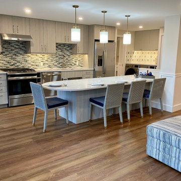
The kitchen was originally planned to mimic the location of appliances in her current kitchen to minimize re-learning of appliance locations. The only change was adding a trash cabinet between the fridge and the sink. A french door fridge allows someone in a wheelchair to easily access frozen and cold foods, while the water and ice dispenser on the outside of the door make it easy to stay hydrated rather than using the sink each time. She can roll up to the kitchen sink due to the recessed cabinetry under the sink or stand at counter height to put away dishes from the dishwasher. The dishwasher is ADA and very simple to use , and is raised off the floor so whether she is sitting or standing it's easier to reach. The gas cooktop has controls at the front making it easy to reach from the wheelchair and the exhaust fan above also has a control at the front. All cabinet door handles are D-shape, which makes them easy to grasp and there is plenty of electric outlets for charging phones, computers and small appliances. The kitchen island is table height at 30" so meal prep can be easily done in a wheelchair while guests and can be seated in a chair or wheelchair around the island. The dining chairs can also be turned around to add extra seating in the living room area. Pendant lights above the kitchen island light up the space, while recessed lighting in the kitchen and living room provide overall room lighting. There is also under cabinet lighting which makes the room glow at night! Wainscoting made of commercial grade material is strategically placed on sharp corners and exposed walls to reduce and minimize damage from the wheel chair, while creating a finished and complete look! We selected a free standing microwave to sit below the island, which is easy to use and is the same style as in her previous apartment. The island is 48" from the appliance wall, leaving ample space to open doors and maneuver around in the wheelchair and has easy access to the laundry area as well. We eliminated the pocket doors that had been in front of the laundry area for easy access, and since it was exposed, dressed it up with coordinating tile to the kitchen with additional cabinets above. There is a coordinating quartz counter on top of the washer and dryer for folding laundry or storing additional supplies.
 Katie Hutchison Studio
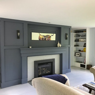
The new owners of this house in Harvard, Massachusetts loved its location and authentic Shaker characteristics, but weren’t fans of its curious layout. A dated first-floor full bathroom could only be accessed by going up a few steps to a landing, opening the bathroom door and then going down the same number of steps to enter the room. The dark kitchen faced the driveway to the north, rather than the bucolic backyard fields to the south. The dining space felt more like an enlarged hall and could only comfortably seat four. Upstairs, a den/office had a woefully low ceiling; the master bedroom had limited storage, and a sad full bathroom featured a cramped shower.
KHS proposed a number of changes to create an updated home where the owners could enjoy cooking, entertaining, and being connected to the outdoors from the first-floor living spaces, while also experiencing more inviting and more functional private spaces upstairs.
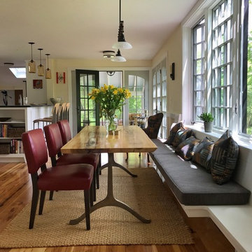
On the first floor, the primary change was to capture space that had been part of an upper-level screen porch and convert it to interior space. To make the interior expansion seamless, we raised the floor of the area that had been the upper-level porch, so it aligns with the main living level, and made sure there would be no soffits in the planes of the walls we removed. We also raised the floor of the remaining lower-level porch to reduce the number of steps required to circulate from it to the newly expanded interior. New patio door systems now fill the arched openings that used to be infilled with screen. The exterior interventions (which also included some new casement windows in the dining area) were designed to be subtle, while affording significant improvements on the interior. Additionally, the first-floor bathroom was reconfigured, shifting one of its walls to widen the dining space, and moving the entrance to the bathroom from the stair landing to the kitchen instead.
These changes (which involved significant structural interventions) resulted in a much more open space to accommodate a new kitchen with a view of the lush backyard and a new dining space defined by a new built-in banquette that comfortably seats six, and -- with the addition of a table extension -- up to eight people.
Upstairs in the den/office, replacing the low, board ceiling with a raised, plaster, tray ceiling that springs from above the original board-finish walls – newly painted a light color -- created a much more inviting, bright, and expansive space. Re-configuring the master bath to accommodate a larger shower and adding built-in storage cabinets in the master bedroom improved comfort and function. A new whole-house color palette rounds out the improvements.
Photos by Katie Hutchison
 Katie Hutchison Studio
The new owners of this house in Harvard, Massachusetts loved its location and authentic Shaker characteristics, but weren’t fans of its curious layout. A dated first-floor full bathroom could only be accessed by going up a few steps to a landing, opening the bathroom door and then going down the same number of steps to enter the room. The dark kitchen faced the driveway to the north, rather than the bucolic backyard fields to the south. The dining space felt more like an enlarged hall and could only comfortably seat four. Upstairs, a den/office had a woefully low ceiling; the master bedroom had limited storage, and a sad full bathroom featured a cramped shower.
KHS proposed a number of changes to create an updated home where the owners could enjoy cooking, entertaining, and being connected to the outdoors from the first-floor living spaces, while also experiencing more inviting and more functional private spaces upstairs.
On the first floor, the primary change was to capture space that had been part of an upper-level screen porch and convert it to interior space. To make the interior expansion seamless, we raised the floor of the area that had been the upper-level porch, so it aligns with the main living level, and made sure there would be no soffits in the planes of the walls we removed. We also raised the floor of the remaining lower-level porch to reduce the number of steps required to circulate from it to the newly expanded interior. New patio door systems now fill the arched openings that used to be infilled with screen. The exterior interventions (which also included some new casement windows in the dining area) were designed to be subtle, while affording significant improvements on the interior. Additionally, the first-floor bathroom was reconfigured, shifting one of its walls to widen the dining space, and moving the entrance to the bathroom from the stair landing to the kitchen instead.
These changes (which involved significant structural interventions) resulted in a much more open space to accommodate a new kitchen with a view of the lush backyard and a new dining space defined by a new built-in banquette that comfortably seats six, and -- with the addition of a table extension -- up to eight people.
Upstairs in the den/office, replacing the low, board ceiling with a raised, plaster, tray ceiling that springs from above the original board-finish walls – newly painted a light color -- created a much more inviting, bright, and expansive space. Re-configuring the master bath to accommodate a larger shower and adding built-in storage cabinets in the master bedroom improved comfort and function. A new whole-house color palette rounds out the improvements.
Photos by Katie Hutchison
Find the right local pro for your project
 Northern Roof Tiles
Architect: Andre Tchelistcheff Architects New York. NY
Builder: Xhema of Greenwich CT
Installer: TRM Enterprises Bridgehampton NY
Back story.
Northern has worked with both Xhema and TRM many tiles. We have worked with Andre before he branched out on his own.
Originally Xhema’s contact was to replace the roof and repair the garage, which as some point had been made into an indoor swimming pool without adequate ventilation. The budget was about $8m and there were 20 drawings.
By the time the job was 6 months old the scope of work has expanded to over $30m and over 200 drawings had been produced.
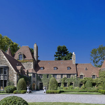
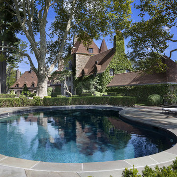
Northern was contacted to visit the site and evaluate the existing roof. Although the house had been added to over the years the same tile was used but due to the location of the house the color of the tile varied considerably from the front to the back.
Northern identified a large number of custom details which would require us to:
1) Match the existing Field tile in size, thickness (it was actually thicker at the butt and reduced to ½” where the tile is overlapped) , surface texture and the color.
2) Make tiles that are curved in their length to suit the curved rafter on the gabled dormers.
3) Make the curved tiles to suit the low slope octagonal tower.
4) Make the curved tiles and Arris style hips to suit the hipped dormers with the curved rafters.
5) Make the segmented tiles to suit the round turret.
6) Make the custom arris style hip tiles for the octagonal tower.
7) Make the custom Arris style hip to suit the different roof pitches as well as the varying splays at the eaves.
8) Make the custom pieces to suit the swept valleys
Simon broke down each section of the roof. He indented all items for each section and agreed the measure etc with the installers. This ‘Project Bible’ became an invaluable tool for the installer, our tile makers and us.
We shipped some samples from the original roof to Sahtas who replicated tall the details. I was visiting factory and delayed my return to the Saturday so that the tiles coming out of the kiln late Friday night could be wrapped and packed into newly purchase suit cases. I arrived home late Saturday evening and Simon picked me up Sunday afternoon and drove us down to Greenwich for an 8 am meeting with the clients. When we unpacked the tiles they were still warm and Hilfiger signed off on the color, although his wife suggested we make them a bit darker a ‘as he has a dreadful sense of color!’
We took Vincent Liot, owner of TRM to the factory twice so that he could oversee the prototyping of all the myriad custom pieces. This was an invaluable move as he pre-approved all the pieces before they were shipped.
The installation was completed and everyone was very pleased with the final outcome.
The Hilfiger’s estate manager told me that a group of friends who were staying the weekend after all the work was completed were heard to ask Mr. Hilfiger ‘I thought you were having a new roof’…to which he responded ‘we did but you can’t tell, which as the plan” …perfect!
In refection this is probably the most complicated roof Northern has ever had the pleasure to supply. We learned a lot of very valuable lessons but in future when we are asked how did we do it we will answer ‘that is for us to know and for you to pay for!’
 Northern Roof Tiles
Architect: Andre Tchelistcheff Architects New York. NY
Builder: Xhema of Greenwich CT
Installer: TRM Enterprises Bridgehampton NY
Back story.
Northern has worked with both Xhema and TRM many tiles. We have worked with Andre before he branched out on his own.
Originally Xhema’s contact was to replace the roof and repair the garage, which as some point had been made into an indoor swimming pool without adequate ventilation. The budget was about $8m and there were 20 drawings.
By the time the job was 6 months old the scope of work has expanded to over $30m and over 200 drawings had been produced.
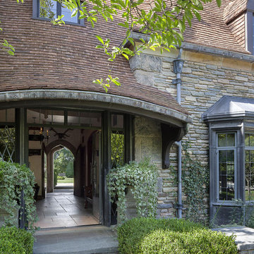
Northern was contacted to visit the site and evaluate the existing roof. Although the house had been added to over the years the same tile was used but due to the location of the house the color of the tile varied considerably from the front to the back.
Northern identified a large number of custom details which would require us to:
1) Match the existing Field tile in size, thickness (it was actually thicker at the butt and reduced to ½” where the tile is overlapped) , surface texture and the color.
2) Make tiles that are curved in their length to suit the curved rafter on the gabled dormers.
3) Make the curved tiles to suit the low slope octagonal tower.
4) Make the curved tiles and Arris style hips to suit the hipped dormers with the curved rafters.
5) Make the segmented tiles to suit the round turret.
6) Make the custom arris style hip tiles for the octagonal tower.
7) Make the custom Arris style hip to suit the different roof pitches as well as the varying splays at the eaves.
8) Make the custom pieces to suit the swept valleys
Simon broke down each section of the roof. He indented all items for each section and agreed the measure etc with the installers. This ‘Project Bible’ became an invaluable tool for the installer, our tile makers and us.
We shipped some samples from the original roof to Sahtas who replicated tall the details. I was visiting factory and delayed my return to the Saturday so that the tiles coming out of the kiln late Friday night could be wrapped and packed into newly purchase suit cases. I arrived home late Saturday evening and Simon picked me up Sunday afternoon and drove us down to Greenwich for an 8 am meeting with the clients. When we unpacked the tiles they were still warm and Hilfiger signed off on the color, although his wife suggested we make them a bit darker a ‘as he has a dreadful sense of color!’
We took Vincent Liot, owner of TRM to the factory twice so that he could oversee the prototyping of all the myriad custom pieces. This was an invaluable move as he pre-approved all the pieces before they were shipped.
The installation was completed and everyone was very pleased with the final outcome.
The Hilfiger’s estate manager told me that a group of friends who were staying the weekend after all the work was completed were heard to ask Mr. Hilfiger ‘I thought you were having a new roof’…to which he responded ‘we did but you can’t tell, which as the plan” …perfect!
In refection this is probably the most complicated roof Northern has ever had the pleasure to supply. We learned a lot of very valuable lessons but in future when we are asked how did we do it we will answer ‘that is for us to know and for you to pay for!’
 Northern Roof Tiles
Architect: Andre Tchelistcheff Architects New York. NY
Builder: Xhema of Greenwich CT
Installer: TRM Enterprises Bridgehampton NY
Back story.
Northern has worked with both Xhema and TRM many tiles. We have worked with Andre before he branched out on his own.
Originally Xhema’s contact was to replace the roof and repair the garage, which as some point had been made into an indoor swimming pool without adequate ventilation. The budget was about $8m and there were 20 drawings.
By the time the job was 6 months old the scope of work has expanded to over $30m and over 200 drawings had been produced.
Northern was contacted to visit the site and evaluate the existing roof. Although the house had been added to over the years the same tile was used but due to the location of the house the color of the tile varied considerably from the front to the back.
Northern identified a large number of custom details which would require us to:
1) Match the existing Field tile in size, thickness (it was actually thicker at the butt and reduced to ½” where the tile is overlapped) , surface texture and the color.
2) Make tiles that are curved in their length to suit the curved rafter on the gabled dormers.
3) Make the curved tiles to suit the low slope octagonal tower.
4) Make the curved tiles and Arris style hips to suit the hipped dormers with the curved rafters.
5) Make the segmented tiles to suit the round turret.
6) Make the custom arris style hip tiles for the octagonal tower.
7) Make the custom Arris style hip to suit the different roof pitches as well as the varying splays at the eaves.
8) Make the custom pieces to suit the swept valleys
Simon broke down each section of the roof. He indented all items for each section and agreed the measure etc with the installers. This ‘Project Bible’ became an invaluable tool for the installer, our tile makers and us.
We shipped some samples from the original roof to Sahtas who replicated tall the details. I was visiting factory and delayed my return to the Saturday so that the tiles coming out of the kiln late Friday night could be wrapped and packed into newly purchase suit cases. I arrived home late Saturday evening and Simon picked me up Sunday afternoon and drove us down to Greenwich for an 8 am meeting with the clients. When we unpacked the tiles they were still warm and Hilfiger signed off on the color, although his wife suggested we make them a bit darker a ‘as he has a dreadful sense of color!’
We took Vincent Liot, owner of TRM to the factory twice so that he could oversee the prototyping of all the myriad custom pieces. This was an invaluable move as he pre-approved all the pieces before they were shipped.
The installation was completed and everyone was very pleased with the final outcome.
The Hilfiger’s estate manager told me that a group of friends who were staying the weekend after all the work was completed were heard to ask Mr. Hilfiger ‘I thought you were having a new roof’…to which he responded ‘we did but you can’t tell, which as the plan” …perfect!
In refection this is probably the most complicated roof Northern has ever had the pleasure to supply. We learned a lot of very valuable lessons but in future when we are asked how did we do it we will answer ‘that is for us to know and for you to pay for!’
 Katie Hutchison Studio
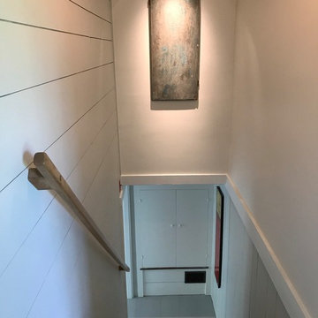
The new owners of this house in Harvard, Massachusetts loved its location and authentic Shaker characteristics, but weren’t fans of its curious layout. A dated first-floor full bathroom could only be accessed by going up a few steps to a landing, opening the bathroom door and then going down the same number of steps to enter the room. The dark kitchen faced the driveway to the north, rather than the bucolic backyard fields to the south. The dining space felt more like an enlarged hall and could only comfortably seat four. Upstairs, a den/office had a woefully low ceiling; the master bedroom had limited storage, and a sad full bathroom featured a cramped shower.
KHS proposed a number of changes to create an updated home where the owners could enjoy cooking, entertaining, and being connected to the outdoors from the first-floor living spaces, while also experiencing more inviting and more functional private spaces upstairs.
On the first floor, the primary change was to capture space that had been part of an upper-level screen porch and convert it to interior space. To make the interior expansion seamless, we raised the floor of the area that had been the upper-level porch, so it aligns with the main living level, and made sure there would be no soffits in the planes of the walls we removed. We also raised the floor of the remaining lower-level porch to reduce the number of steps required to circulate from it to the newly expanded interior. New patio door systems now fill the arched openings that used to be infilled with screen. The exterior interventions (which also included some new casement windows in the dining area) were designed to be subtle, while affording significant improvements on the interior. Additionally, the first-floor bathroom was reconfigured, shifting one of its walls to widen the dining space, and moving the entrance to the bathroom from the stair landing to the kitchen instead.
These changes (which involved significant structural interventions) resulted in a much more open space to accommodate a new kitchen with a view of the lush backyard and a new dining space defined by a new built-in banquette that comfortably seats six, and -- with the addition of a table extension -- up to eight people.
Upstairs in the den/office, replacing the low, board ceiling with a raised, plaster, tray ceiling that springs from above the original board-finish walls – newly painted a light color -- created a much more inviting, bright, and expansive space. Re-configuring the master bath to accommodate a larger shower and adding built-in storage cabinets in the master bedroom improved comfort and function. A new whole-house color palette rounds out the improvements.
Photos by Katie Hutchison

Sponsored
Columbus, OH

Wannemacher Interiors
Customized Award-Winning Interior Design Solutions in Franklin Cnty OH
 The Brooklyn Studio
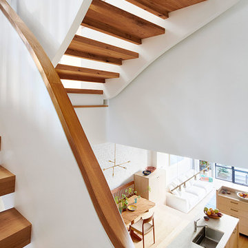
This residence was a complete gut renovation of a 4-story row house in Park Slope, and included a new rear extension and penthouse addition. The owners wished to create a warm, family home using a modern language that would act as a clean canvas to feature rich textiles and items from their world travels. As with most Brooklyn row houses, the existing house suffered from a lack of natural light and connection to exterior spaces, an issue that Principal Brendan Coburn is acutely aware of from his experience re-imagining historic structures in the New York area. The resulting architecture is designed around moments featuring natural light and views to the exterior, of both the private garden and the sky, throughout the house, and a stripped-down language of detailing and finishes allows for the concept of the modern-natural to shine.
Upon entering the home, the kitchen and dining space draw you in with views beyond through the large glazed opening at the rear of the house. An extension was built to allow for a large sunken living room that provides a family gathering space connected to the kitchen and dining room, but remains distinctly separate, with a strong visual connection to the rear garden. The open sculptural stair tower was designed to function like that of a traditional row house stair, but with a smaller footprint. By extending it up past the original roof level into the new penthouse, the stair becomes an atmospheric shaft for the spaces surrounding the core. All types of weather – sunshine, rain, lightning, can be sensed throughout the home through this unifying vertical environment. The stair space also strives to foster family communication, making open living spaces visible between floors. At the upper-most level, a free-form bench sits suspended over the stair, just by the new roof deck, which provides at-ease entertaining. Oak was used throughout the home as a unifying material element. As one travels upwards within the house, the oak finishes are bleached to further degrees as a nod to how light enters the home.
The owners worked with CWB to add their own personality to the project. The meter of a white oak and blackened steel stair screen was designed by the family to read “I love you” in Morse Code, and tile was selected throughout to reference places that hold special significance to the family. To support the owners’ comfort, the architectural design engages passive house technologies to reduce energy use, while increasing air quality within the home – a strategy which aims to respect the environment while providing a refuge from the harsh elements of urban living.
This project was published by Wendy Goodman as her Space of the Week, part of New York Magazine’s Design Hunting on The Cut.
Photography by Kevin Kunstadt
 Katie Hutchison Studio
The new owners of this house in Harvard, Massachusetts loved its location and authentic Shaker characteristics, but weren’t fans of its curious layout. A dated first-floor full bathroom could only be accessed by going up a few steps to a landing, opening the bathroom door and then going down the same number of steps to enter the room. The dark kitchen faced the driveway to the north, rather than the bucolic backyard fields to the south. The dining space felt more like an enlarged hall and could only comfortably seat four. Upstairs, a den/office had a woefully low ceiling; the master bedroom had limited storage, and a sad full bathroom featured a cramped shower.
KHS proposed a number of changes to create an updated home where the owners could enjoy cooking, entertaining, and being connected to the outdoors from the first-floor living spaces, while also experiencing more inviting and more functional private spaces upstairs.
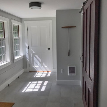
On the first floor, the primary change was to capture space that had been part of an upper-level screen porch and convert it to interior space. To make the interior expansion seamless, we raised the floor of the area that had been the upper-level porch, so it aligns with the main living level, and made sure there would be no soffits in the planes of the walls we removed. We also raised the floor of the remaining lower-level porch to reduce the number of steps required to circulate from it to the newly expanded interior. New patio door systems now fill the arched openings that used to be infilled with screen. The exterior interventions (which also included some new casement windows in the dining area) were designed to be subtle, while affording significant improvements on the interior. Additionally, the first-floor bathroom was reconfigured, shifting one of its walls to widen the dining space, and moving the entrance to the bathroom from the stair landing to the kitchen instead.
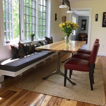
These changes (which involved significant structural interventions) resulted in a much more open space to accommodate a new kitchen with a view of the lush backyard and a new dining space defined by a new built-in banquette that comfortably seats six, and -- with the addition of a table extension -- up to eight people.
Upstairs in the den/office, replacing the low, board ceiling with a raised, plaster, tray ceiling that springs from above the original board-finish walls – newly painted a light color -- created a much more inviting, bright, and expansive space. Re-configuring the master bath to accommodate a larger shower and adding built-in storage cabinets in the master bedroom improved comfort and function. A new whole-house color palette rounds out the improvements.
Photos by Katie Hutchison
 Katie Hutchison Studio
The new owners of this house in Harvard, Massachusetts loved its location and authentic Shaker characteristics, but weren’t fans of its curious layout. A dated first-floor full bathroom could only be accessed by going up a few steps to a landing, opening the bathroom door and then going down the same number of steps to enter the room. The dark kitchen faced the driveway to the north, rather than the bucolic backyard fields to the south. The dining space felt more like an enlarged hall and could only comfortably seat four. Upstairs, a den/office had a woefully low ceiling; the master bedroom had limited storage, and a sad full bathroom featured a cramped shower.
KHS proposed a number of changes to create an updated home where the owners could enjoy cooking, entertaining, and being connected to the outdoors from the first-floor living spaces, while also experiencing more inviting and more functional private spaces upstairs.
On the first floor, the primary change was to capture space that had been part of an upper-level screen porch and convert it to interior space. To make the interior expansion seamless, we raised the floor of the area that had been the upper-level porch, so it aligns with the main living level, and made sure there would be no soffits in the planes of the walls we removed. We also raised the floor of the remaining lower-level porch to reduce the number of steps required to circulate from it to the newly expanded interior. New patio door systems now fill the arched openings that used to be infilled with screen. The exterior interventions (which also included some new casement windows in the dining area) were designed to be subtle, while affording significant improvements on the interior. Additionally, the first-floor bathroom was reconfigured, shifting one of its walls to widen the dining space, and moving the entrance to the bathroom from the stair landing to the kitchen instead.
These changes (which involved significant structural interventions) resulted in a much more open space to accommodate a new kitchen with a view of the lush backyard and a new dining space defined by a new built-in banquette that comfortably seats six, and -- with the addition of a table extension -- up to eight people.
Upstairs in the den/office, replacing the low, board ceiling with a raised, plaster, tray ceiling that springs from above the original board-finish walls – newly painted a light color -- created a much more inviting, bright, and expansive space. Re-configuring the master bath to accommodate a larger shower and adding built-in storage cabinets in the master bedroom improved comfort and function. A new whole-house color palette rounds out the improvements.
Photos by Katie Hutchison
 Northern Roof Tiles
Architect: Andre Tchelistcheff Architects New York. NY
Builder: Xhema of Greenwich CT
Installer: TRM Enterprises Bridgehampton NY
Back story.
Northern has worked with both Xhema and TRM many tiles. We have worked with Andre before he branched out on his own.
Originally Xhema’s contact was to replace the roof and repair the garage, which as some point had been made into an indoor swimming pool without adequate ventilation. The budget was about $8m and there were 20 drawings.
By the time the job was 6 months old the scope of work has expanded to over $30m and over 200 drawings had been produced.
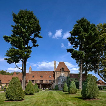
Northern was contacted to visit the site and evaluate the existing roof. Although the house had been added to over the years the same tile was used but due to the location of the house the color of the tile varied considerably from the front to the back.
Northern identified a large number of custom details which would require us to:
1) Match the existing Field tile in size, thickness (it was actually thicker at the butt and reduced to ½” where the tile is overlapped) , surface texture and the color.
2) Make tiles that are curved in their length to suit the curved rafter on the gabled dormers.
3) Make the curved tiles to suit the low slope octagonal tower.
4) Make the curved tiles and Arris style hips to suit the hipped dormers with the curved rafters.
5) Make the segmented tiles to suit the round turret.
6) Make the custom arris style hip tiles for the octagonal tower.
7) Make the custom Arris style hip to suit the different roof pitches as well as the varying splays at the eaves.
8) Make the custom pieces to suit the swept valleys
Simon broke down each section of the roof. He indented all items for each section and agreed the measure etc with the installers. This ‘Project Bible’ became an invaluable tool for the installer, our tile makers and us.
We shipped some samples from the original roof to Sahtas who replicated tall the details. I was visiting factory and delayed my return to the Saturday so that the tiles coming out of the kiln late Friday night could be wrapped and packed into newly purchase suit cases. I arrived home late Saturday evening and Simon picked me up Sunday afternoon and drove us down to Greenwich for an 8 am meeting with the clients. When we unpacked the tiles they were still warm and Hilfiger signed off on the color, although his wife suggested we make them a bit darker a ‘as he has a dreadful sense of color!’
We took Vincent Liot, owner of TRM to the factory twice so that he could oversee the prototyping of all the myriad custom pieces. This was an invaluable move as he pre-approved all the pieces before they were shipped.
The installation was completed and everyone was very pleased with the final outcome.
The Hilfiger’s estate manager told me that a group of friends who were staying the weekend after all the work was completed were heard to ask Mr. Hilfiger ‘I thought you were having a new roof’…to which he responded ‘we did but you can’t tell, which as the plan” …perfect!
In refection this is probably the most complicated roof Northern has ever had the pleasure to supply. We learned a lot of very valuable lessons but in future when we are asked how did we do it we will answer ‘that is for us to know and for you to pay for!’
 Katie Hutchison Studio
The new owners of this house in Harvard, Massachusetts loved its location and authentic Shaker characteristics, but weren’t fans of its curious layout. A dated first-floor full bathroom could only be accessed by going up a few steps to a landing, opening the bathroom door and then going down the same number of steps to enter the room. The dark kitchen faced the driveway to the north, rather than the bucolic backyard fields to the south. The dining space felt more like an enlarged hall and could only comfortably seat four. Upstairs, a den/office had a woefully low ceiling; the master bedroom had limited storage, and a sad full bathroom featured a cramped shower.
KHS proposed a number of changes to create an updated home where the owners could enjoy cooking, entertaining, and being connected to the outdoors from the first-floor living spaces, while also experiencing more inviting and more functional private spaces upstairs.
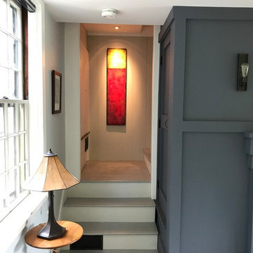
On the first floor, the primary change was to capture space that had been part of an upper-level screen porch and convert it to interior space. To make the interior expansion seamless, we raised the floor of the area that had been the upper-level porch, so it aligns with the main living level, and made sure there would be no soffits in the planes of the walls we removed. We also raised the floor of the remaining lower-level porch to reduce the number of steps required to circulate from it to the newly expanded interior. New patio door systems now fill the arched openings that used to be infilled with screen. The exterior interventions (which also included some new casement windows in the dining area) were designed to be subtle, while affording significant improvements on the interior. Additionally, the first-floor bathroom was reconfigured, shifting one of its walls to widen the dining space, and moving the entrance to the bathroom from the stair landing to the kitchen instead.
These changes (which involved significant structural interventions) resulted in a much more open space to accommodate a new kitchen with a view of the lush backyard and a new dining space defined by a new built-in banquette that comfortably seats six, and -- with the addition of a table extension -- up to eight people.
Upstairs in the den/office, replacing the low, board ceiling with a raised, plaster, tray ceiling that springs from above the original board-finish walls – newly painted a light color -- created a much more inviting, bright, and expansive space. Re-configuring the master bath to accommodate a larger shower and adding built-in storage cabinets in the master bedroom improved comfort and function. A new whole-house color palette rounds out the improvements.
Photos by Katie Hutchison
 Lincoln Lighthill Architect
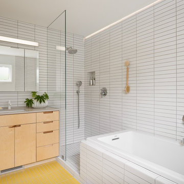
This Eichler-esque house, in a neighborhood known for its tracts of homes by the famous developer, was a little different from the rest- a one-off custom build from 1962 that had mid-century modern bones but funky, neo-traditional finishes in the worn-out, time capsule state that the new owners found it. This called for an almost-gut remodel to keep the good, upgrade the building’s envelope and MEP systems, and reimagine the home’s character. To create a home that feels of its times, both now and then- A mid-century for the 21st century.
At the center of the existing home was a long, slender rectangular form that contained a fireplace, an indoor BBQ, and kitchen storage, and on the other side an original, suspended wood and steel rod stair down to the bedroom level below. Under the carpeted treads we were sure we’d find beautiful oak, as this stair was identical to one at our earlier Clarendon heights mid-century project.
This elegant core was obscured by walls that enclosed the kitchen and breakfast areas and a jumble of aged finishes that hid the elegance of this defining element. Lincoln Lighthill Architect removed the walls and unified the core’s finishes with light grey ground-face concrete block on the upgraded fireplace and BBQ, lacquered cabinets, and chalkboard paint at the stair wall for the owners’ young children to decorate. A new skylight above the stair washes this wall with light and brightens up the formerly dark center of the house.
The rest of the interior is a combination of mid-century-inspired elements and modern updates. New finishes throughout- cork flooring, ground-face concrete block, Heath tile, and white birch millwork give the interior the mid-century character it never fully had, while modern, minimalist detailing gives it a timeless, serene simplicity.
New lighting throughout, mostly indirect and all warm-dim LED , subtly and efficiently lights the home. All new plumbing and fixtures similarly reduce the home’s use of precious resources. On the exterior, new windows, insulation, and roofing provide modern standards of comfort and efficiency, while a new paint job and brick stain give the house an elegant yet playful character, with the golden yellow Heath tile from the primary bathroom floor reappearing on the front door.

Sponsored
Columbus, OH
Wannemacher Interiors
Customized Award-Winning Interior Design Solutions in Franklin Cnty OH
 Katie Hutchison Studio
The new owners of this house in Harvard, Massachusetts loved its location and authentic Shaker characteristics, but weren’t fans of its curious layout. A dated first-floor full bathroom could only be accessed by going up a few steps to a landing, opening the bathroom door and then going down the same number of steps to enter the room. The dark kitchen faced the driveway to the north, rather than the bucolic backyard fields to the south. The dining space felt more like an enlarged hall and could only comfortably seat four. Upstairs, a den/office had a woefully low ceiling; the master bedroom had limited storage, and a sad full bathroom featured a cramped shower.
KHS proposed a number of changes to create an updated home where the owners could enjoy cooking, entertaining, and being connected to the outdoors from the first-floor living spaces, while also experiencing more inviting and more functional private spaces upstairs.
On the first floor, the primary change was to capture space that had been part of an upper-level screen porch and convert it to interior space. To make the interior expansion seamless, we raised the floor of the area that had been the upper-level porch, so it aligns with the main living level, and made sure there would be no soffits in the planes of the walls we removed. We also raised the floor of the remaining lower-level porch to reduce the number of steps required to circulate from it to the newly expanded interior. New patio door systems now fill the arched openings that used to be infilled with screen. The exterior interventions (which also included some new casement windows in the dining area) were designed to be subtle, while affording significant improvements on the interior. Additionally, the first-floor bathroom was reconfigured, shifting one of its walls to widen the dining space, and moving the entrance to the bathroom from the stair landing to the kitchen instead.
These changes (which involved significant structural interventions) resulted in a much more open space to accommodate a new kitchen with a view of the lush backyard and a new dining space defined by a new built-in banquette that comfortably seats six, and -- with the addition of a table extension -- up to eight people.
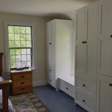
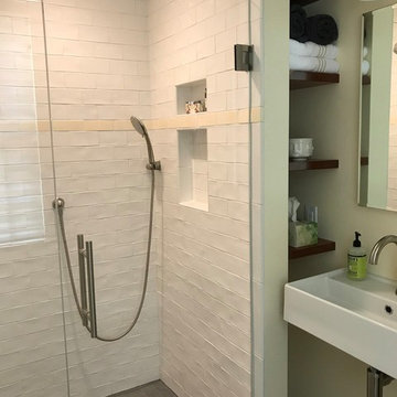
Upstairs in the den/office, replacing the low, board ceiling with a raised, plaster, tray ceiling that springs from above the original board-finish walls – newly painted a light color -- created a much more inviting, bright, and expansive space. Re-configuring the master bath to accommodate a larger shower and adding built-in storage cabinets in the master bedroom improved comfort and function. A new whole-house color palette rounds out the improvements.
Photos by Katie Hutchison
 Katie Hutchison Studio
The new owners of this house in Harvard, Massachusetts loved its location and authentic Shaker characteristics, but weren’t fans of its curious layout. A dated first-floor full bathroom could only be accessed by going up a few steps to a landing, opening the bathroom door and then going down the same number of steps to enter the room. The dark kitchen faced the driveway to the north, rather than the bucolic backyard fields to the south. The dining space felt more like an enlarged hall and could only comfortably seat four. Upstairs, a den/office had a woefully low ceiling; the master bedroom had limited storage, and a sad full bathroom featured a cramped shower.
KHS proposed a number of changes to create an updated home where the owners could enjoy cooking, entertaining, and being connected to the outdoors from the first-floor living spaces, while also experiencing more inviting and more functional private spaces upstairs.
On the first floor, the primary change was to capture space that had been part of an upper-level screen porch and convert it to interior space. To make the interior expansion seamless, we raised the floor of the area that had been the upper-level porch, so it aligns with the main living level, and made sure there would be no soffits in the planes of the walls we removed. We also raised the floor of the remaining lower-level porch to reduce the number of steps required to circulate from it to the newly expanded interior. New patio door systems now fill the arched openings that used to be infilled with screen. The exterior interventions (which also included some new casement windows in the dining area) were designed to be subtle, while affording significant improvements on the interior. Additionally, the first-floor bathroom was reconfigured, shifting one of its walls to widen the dining space, and moving the entrance to the bathroom from the stair landing to the kitchen instead.
These changes (which involved significant structural interventions) resulted in a much more open space to accommodate a new kitchen with a view of the lush backyard and a new dining space defined by a new built-in banquette that comfortably seats six, and -- with the addition of a table extension -- up to eight people.
Upstairs in the den/office, replacing the low, board ceiling with a raised, plaster, tray ceiling that springs from above the original board-finish walls – newly painted a light color -- created a much more inviting, bright, and expansive space. Re-configuring the master bath to accommodate a larger shower and adding built-in storage cabinets in the master bedroom improved comfort and function. A new whole-house color palette rounds out the improvements.
Photos by Katie Hutchison

 Katie Hutchison Studio
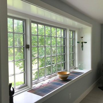
The new owners of this house in Harvard, Massachusetts loved its location and authentic Shaker characteristics, but weren’t fans of its curious layout. A dated first-floor full bathroom could only be accessed by going up a few steps to a landing, opening the bathroom door and then going down the same number of steps to enter the room. The dark kitchen faced the driveway to the north, rather than the bucolic backyard fields to the south. The dining space felt more like an enlarged hall and could only comfortably seat four. Upstairs, a den/office had a woefully low ceiling; the master bedroom had limited storage, and a sad full bathroom featured a cramped shower.
KHS proposed a number of changes to create an updated home where the owners could enjoy cooking, entertaining, and being connected to the outdoors from the first-floor living spaces, while also experiencing more inviting and more functional private spaces upstairs.
On the first floor, the primary change was to capture space that had been part of an upper-level screen porch and convert it to interior space. To make the interior expansion seamless, we raised the floor of the area that had been the upper-level porch, so it aligns with the main living level, and made sure there would be no soffits in the planes of the walls we removed. We also raised the floor of the remaining lower-level porch to reduce the number of steps required to circulate from it to the newly expanded interior. New patio door systems now fill the arched openings that used to be infilled with screen. The exterior interventions (which also included some new casement windows in the dining area) were designed to be subtle, while affording significant improvements on the interior. Additionally, the first-floor bathroom was reconfigured, shifting one of its walls to widen the dining space, and moving the entrance to the bathroom from the stair landing to the kitchen instead.
These changes (which involved significant structural interventions) resulted in a much more open space to accommodate a new kitchen with a view of the lush backyard and a new dining space defined by a new built-in banquette that comfortably seats six, and -- with the addition of a table extension -- up to eight people.
Upstairs in the den/office, replacing the low, board ceiling with a raised, plaster, tray ceiling that springs from above the original board-finish walls – newly painted a light color -- created a much more inviting, bright, and expansive space. Re-configuring the master bath to accommodate a larger shower and adding built-in storage cabinets in the master bedroom improved comfort and function. A new whole-house color palette rounds out the improvements.
Photos by Katie Hutchison

Sponsored
Columbus, OH
Wannemacher Interiors
Customized Award-Winning Interior Design Solutions in Franklin Cnty OH
 Cure Design Group
KITCHEN RENOVATION CURRENT CRAFTSMAN
This client started off just being curious about our services - what we could do, and if we could even help her update her kitchen. She and her husband with their two teenage kids have lived in their home for several years without updating anything since the house was originally built. They didn’t quite have a budget in mind yet. They didn’t know their style, or even if they had one. Their timeline was simple, “as fast as you can so we’re not without a kitchen for very long” (usually what we hear for kitchen updates).
After a very productive consultation: determining the scope of work and zeroing in on a budget, I was very excited to update this underwhelming space to something that is modern but timeless, something that is theirs. And, it was easy to see what type of design style they gravitated toward looking at the pieces they already own: Craftsman/Prairie Style. I left the meeting so excited to weave in yet another genre of design to my CDG portfolio! We circled in our contractor to discuss the changes they were looking to make and the scope of work that would be theirs. Then I was off to get designing:
// Because the kitchen’s footprint and the defined breakfast space delineated by the bay, we kept the perimeter cabinetry as it was originally laid out. We updated these cabinets to a beautiful soft Alabaster White with a Barn Wood Glaze to highlight the simplicity of the shaker style doors. We added transom cabinets above the uppers, with only the back wall having seeded glass inserts to highlight some of their collectables.
// The original shaped island was counter-productive (See what I did there?) in functionality and design. We squared this off to reduce some of the angles and gain more storage. We highlighted the new island with a contrasting oak cabinet in a dark finish, to pay our respects to the craftsman style, and topped with a concrete-like countertop as a nod to the Prairie Style, allowing the homeowners to gain two extra seats and a massive -uninterrupted- work surface.
// The small section of cabinetry between the garage entry and fridge now is the perfect dump-station for mail, electronics, whatever is in their hands when they come into the house; and completely hidden by the refrigerator.
// The disconnected cabinetry in the breakfast area makes for a great place to have a working office. Accessible from the kitchen or the adjacent great room, this is the perfect place for the kids to do their homework while mom and dad are putting together dinner. The base cabinets are built out for office-type storage: paper and pencil drawers, filing systems, and cord management. Additionally, the long counter provides a ton of worksurface to spread out.
// The largest transformation was the pantry. We raised the height of the doorway and added huge custom designed bypass sliding barndoors. Finished with a dark stain to compliment the island and cut to inset 4 stained glass windows, typical of this style of design, and driving home the concept for the whole space.
// They were desperate to replace their flooring with something extremely durable to flow throughout the kitchen and the whole main level. This beautiful new flooring is actually a textured LVT(!) Which allowed them to save on overall cost and extend the life of their new flooring purchase.
// They loved their copper table, so we kept it and added new simple, mid-century modern chairs around it and a shiny new craftsman-style chandelier above. We added bright barstools in a burnt orange-red accent, and a bright woven rug to tie it all together.
// Because the kitchen renovation was shaping up to be pretty spectacular, they decided they needed to now replace their ‘now-these-look-a-little-too-old’ upholstered seating in the neighboring great room with 2 new sofas. We found the perfect sage-y-grey fabric which we covered on sofa frames that have and exposed oak-wood base, which we finished in a warm weathered grey.
// As every designer knows, a room isn’t finished until there’s something on the windows. Now that the new flooring was installed and every other room on the main level ‘seemed’ to be updated, we needed to update the window treatments in the dining, and great rooms to reflect their new design concept.
I hope you find the ‘after’ photos refreshing (as refreshing as it was for me to work on something that’s not a “Farm House” style that’s saturating the industry right now!) This was such a fun project and a great collaboration with our contractor.
 Cure Design Group
KITCHEN RENOVATION CURRENT CRAFTSMAN
This client started off just being curious about our services - what we could do, and if we could even help her update her kitchen. She and her husband with their two teenage kids have lived in their home for several years without updating anything since the house was originally built. They didn’t quite have a budget in mind yet. They didn’t know their style, or even if they had one. Their timeline was simple, “as fast as you can so we’re not without a kitchen for very long” (usually what we hear for kitchen updates).
After a very productive consultation: determining the scope of work and zeroing in on a budget, I was very excited to update this underwhelming space to something that is modern but timeless, something that is theirs. And, it was easy to see what type of design style they gravitated toward looking at the pieces they already own: Craftsman/Prairie Style. I left the meeting so excited to weave in yet another genre of design to my CDG portfolio! We circled in our contractor to discuss the changes they were looking to make and the scope of work that would be theirs. Then I was off to get designing:
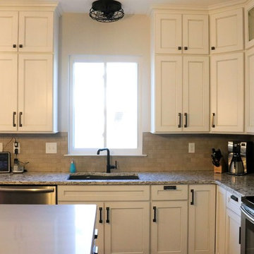
// Because the kitchen’s footprint and the defined breakfast space delineated by the bay, we kept the perimeter cabinetry as it was originally laid out. We updated these cabinets to a beautiful soft Alabaster White with a Barn Wood Glaze to highlight the simplicity of the shaker style doors. We added transom cabinets above the uppers, with only the back wall having seeded glass inserts to highlight some of their collectables.
// The original shaped island was counter-productive (See what I did there?) in functionality and design. We squared this off to reduce some of the angles and gain more storage. We highlighted the new island with a contrasting oak cabinet in a dark finish, to pay our respects to the craftsman style, and topped with a concrete-like countertop as a nod to the Prairie Style, allowing the homeowners to gain two extra seats and a massive -uninterrupted- work surface.
// The small section of cabinetry between the garage entry and fridge now is the perfect dump-station for mail, electronics, whatever is in their hands when they come into the house; and completely hidden by the refrigerator.
// The disconnected cabinetry in the breakfast area makes for a great place to have a working office. Accessible from the kitchen or the adjacent great room, this is the perfect place for the kids to do their homework while mom and dad are putting together dinner. The base cabinets are built out for office-type storage: paper and pencil drawers, filing systems, and cord management. Additionally, the long counter provides a ton of worksurface to spread out.
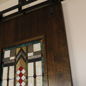
// The largest transformation was the pantry. We raised the height of the doorway and added huge custom designed bypass sliding barndoors. Finished with a dark stain to compliment the island and cut to inset 4 stained glass windows, typical of this style of design, and driving home the concept for the whole space.
// They were desperate to replace their flooring with something extremely durable to flow throughout the kitchen and the whole main level. This beautiful new flooring is actually a textured LVT(!) Which allowed them to save on overall cost and extend the life of their new flooring purchase.
// They loved their copper table, so we kept it and added new simple, mid-century modern chairs around it and a shiny new craftsman-style chandelier above. We added bright barstools in a burnt orange-red accent, and a bright woven rug to tie it all together.
// Because the kitchen renovation was shaping up to be pretty spectacular, they decided they needed to now replace their ‘now-these-look-a-little-too-old’ upholstered seating in the neighboring great room with 2 new sofas. We found the perfect sage-y-grey fabric which we covered on sofa frames that have and exposed oak-wood base, which we finished in a warm weathered grey.
// As every designer knows, a room isn’t finished until there’s something on the windows. Now that the new flooring was installed and every other room on the main level ‘seemed’ to be updated, we needed to update the window treatments in the dining, and great rooms to reflect their new design concept.
I hope you find the ‘after’ photos refreshing (as refreshing as it was for me to work on something that’s not a “Farm House” style that’s saturating the industry right now!) This was such a fun project and a great collaboration with our contractor.
 Katie Hutchison Studio
The new owners of this house in Harvard, Massachusetts loved its location and authentic Shaker characteristics, but weren’t fans of its curious layout. A dated first-floor full bathroom could only be accessed by going up a few steps to a landing, opening the bathroom door and then going down the same number of steps to enter the room. The dark kitchen faced the driveway to the north, rather than the bucolic backyard fields to the south. The dining space felt more like an enlarged hall and could only comfortably seat four. Upstairs, a den/office had a woefully low ceiling; the master bedroom had limited storage, and a sad full bathroom featured a cramped shower.
KHS proposed a number of changes to create an updated home where the owners could enjoy cooking, entertaining, and being connected to the outdoors from the first-floor living spaces, while also experiencing more inviting and more functional private spaces upstairs.
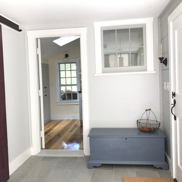
On the first floor, the primary change was to capture space that had been part of an upper-level screen porch and convert it to interior space. To make the interior expansion seamless, we raised the floor of the area that had been the upper-level porch, so it aligns with the main living level, and made sure there would be no soffits in the planes of the walls we removed. We also raised the floor of the remaining lower-level porch to reduce the number of steps required to circulate from it to the newly expanded interior. New patio door systems now fill the arched openings that used to be infilled with screen. The exterior interventions (which also included some new casement windows in the dining area) were designed to be subtle, while affording significant improvements on the interior. Additionally, the first-floor bathroom was reconfigured, shifting one of its walls to widen the dining space, and moving the entrance to the bathroom from the stair landing to the kitchen instead.
These changes (which involved significant structural interventions) resulted in a much more open space to accommodate a new kitchen with a view of the lush backyard and a new dining space defined by a new built-in banquette that comfortably seats six, and -- with the addition of a table extension -- up to eight people.
Upstairs in the den/office, replacing the low, board ceiling with a raised, plaster, tray ceiling that springs from above the original board-finish walls – newly painted a light color -- created a much more inviting, bright, and expansive space. Re-configuring the master bath to accommodate a larger shower and adding built-in storage cabinets in the master bedroom improved comfort and function. A new whole-house color palette rounds out the improvements.
Photos by Katie Hutchison
44