
Search results for "Reduce originally" in Home Design Ideas
 Lincoln Lighthill Architect
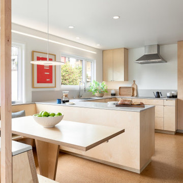
This Eichler-esque house, in a neighborhood known for its tracts of homes by the famous developer, was a little different from the rest- a one-off custom build from 1962 that had mid-century modern bones but funky, neo-traditional finishes in the worn-out, time capsule state that the new owners found it. This called for an almost-gut remodel to keep the good, upgrade the building’s envelope and MEP systems, and reimagine the home’s character. To create a home that feels of its times, both now and then- A mid-century for the 21st century.
At the center of the existing home was a long, slender rectangular form that contained a fireplace, an indoor BBQ, and kitchen storage, and on the other side an original, suspended wood and steel rod stair down to the bedroom level below. Under the carpeted treads we were sure we’d find beautiful oak, as this stair was identical to one at our earlier Clarendon heights mid-century project.
This elegant core was obscured by walls that enclosed the kitchen and breakfast areas and a jumble of aged finishes that hid the elegance of this defining element. Lincoln Lighthill Architect removed the walls and unified the core’s finishes with light grey ground-face concrete block on the upgraded fireplace and BBQ, lacquered cabinets, and chalkboard paint at the stair wall for the owners’ young children to decorate. A new skylight above the stair washes this wall with light and brightens up the formerly dark center of the house.
The rest of the interior is a combination of mid-century-inspired elements and modern updates. New finishes throughout- cork flooring, ground-face concrete block, Heath tile, and white birch millwork give the interior the mid-century character it never fully had, while modern, minimalist detailing gives it a timeless, serene simplicity.
New lighting throughout, mostly indirect and all warm-dim LED , subtly and efficiently lights the home. All new plumbing and fixtures similarly reduce the home’s use of precious resources. On the exterior, new windows, insulation, and roofing provide modern standards of comfort and efficiency, while a new paint job and brick stain give the house an elegant yet playful character, with the golden yellow Heath tile from the primary bathroom floor reappearing on the front door.
 Zelaya Properties LLC
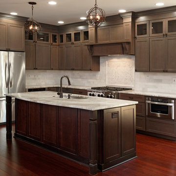
We used: Custom cherry cabinetry in Arts & Crafts Shaker style by Kabinart in Boulder and Espresso stains. Liberty Hardware Venetian bronze 1-1/2" cabinet knobs. KitchenAid Architect II Series 22 CF counter-depth French door refrigerator. KitchenAid Architect Series II 27" convection single wall oven. KitchenAid 36" 6-burner dual fuel freestanding commercial-style range. KitchenAid Architect II Series 24" dishwasher. Sharp Insight Pro Series 24" built-in microwave drawer (Model #KB6524PS). Crystorama Solaris 12" wide pendant lights in English bronze. Granite countertops in Brown Fantasy. 3"x6" polished marble backsplash.
Paint colors:
Walls: Glidden Silver Cloud 30YY 63/024
Ceilings/Trims/Doors: Glidden Swan White GLC23
Robert B. Narod Photography
 HUNTER DOUGLAS-LNG BLINDS
DUETTE® Honeycomb Shades
The Original Energy-Efficient Honeycomb Shade
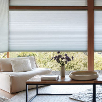
An innovative window treatment that looks beautiful and insulates your home all year round, Duette® Honeycomb Shades were the first cellular shades, specially engineered to provide energy efficiency at the window in both cold and warm climates. Their specially engineered honeycomb construction traps air in distinct pockets, which creates insulation that can help lower your energy consumption and energy bills.
Decorate every kind of window you have—even tricky skylights and unusually shaped panes—with Duette. Our signature honeycomb shades are one of our most versatile options and beautify every kind of interior.
Key Features
Premium Design & Style—Explore the richness of texture and warmth offered by The Alustra® Collection of Duette, a thoughtfully curated suite of exclusive design-inspired fabrics, textures, colors and hardware created to meet the expectations of leading designers and discerning consumers who seek the best in design.
Largest Selection in the Industry—Explore the widest selection of cellular pleat sizes, opacities, colors, textures and operating systems. Duette shades can also accommodate many specialty shaped windows, even tricky skylights.
Energy-Efficiency—Studies show that windows are responsible for up to 30% of your home’s energy losses. Duette shades trap air in distinct pockets, creating exceptional insulation. Our latest innovation, Duette Architella®, features a honeycomb-within-a-honeycomb design for even greater energy efficiency.
Room Darkening—The LightLock™ system, the newest iteration from Duette, is the first operating system of its kind to offer unparalleled darkness. The secret lies within the patent-pending side channel design, optimized to absorb or deflect nearly all incoming light.
Durability—All of our high-performing fabrics are resistant to fading and will maintain their crisp, neat pleats over time.
Vertical Application—For doors that need extra insulation, the Duette Vertiglide™ operating system is the ideal option. It’s designed for vertical applications and uses the same fabrics as your horizontal Duette shades. Use one shade to cover the entire expanse of a sliding door, or, cover the door with a split stack Vertiglide shade, with each side operating independently.
Sound Absorption—Improve your room’s acoustics while reducing the intensity of outside sound. Duette Honeycomb Shades absorb up to 70% of sound energy, creating a more quiet, tranquil room.
LNG Blinds
19 Addison Pl
Valley Stream, NY 11580
Call Us (516) 593-0044
#homesweethome #homedecor #lovemyhome #barenecessities #windows #instastyle #instadesign #interiordesign
#blinds #privacy #embellishment #instahomes #propertyowner #renovation #customblindsbydesign #hunterdouglas #showcase #displays #windowtreatments #windowcoverings #shades #shutters #drapery #interiors #decor
Find the right local pro for your project
 Katie Hutchison Studio
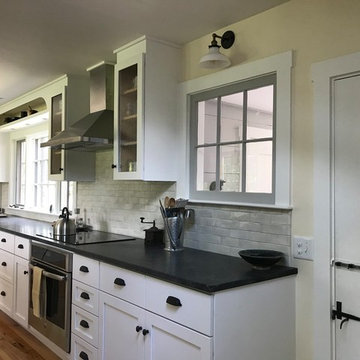
The new owners of this house in Harvard, Massachusetts loved its location and authentic Shaker characteristics, but weren’t fans of its curious layout. A dated first-floor full bathroom could only be accessed by going up a few steps to a landing, opening the bathroom door and then going down the same number of steps to enter the room. The dark kitchen faced the driveway to the north, rather than the bucolic backyard fields to the south. The dining space felt more like an enlarged hall and could only comfortably seat four. Upstairs, a den/office had a woefully low ceiling; the master bedroom had limited storage, and a sad full bathroom featured a cramped shower.
KHS proposed a number of changes to create an updated home where the owners could enjoy cooking, entertaining, and being connected to the outdoors from the first-floor living spaces, while also experiencing more inviting and more functional private spaces upstairs.
On the first floor, the primary change was to capture space that had been part of an upper-level screen porch and convert it to interior space. To make the interior expansion seamless, we raised the floor of the area that had been the upper-level porch, so it aligns with the main living level, and made sure there would be no soffits in the planes of the walls we removed. We also raised the floor of the remaining lower-level porch to reduce the number of steps required to circulate from it to the newly expanded interior. New patio door systems now fill the arched openings that used to be infilled with screen. The exterior interventions (which also included some new casement windows in the dining area) were designed to be subtle, while affording significant improvements on the interior. Additionally, the first-floor bathroom was reconfigured, shifting one of its walls to widen the dining space, and moving the entrance to the bathroom from the stair landing to the kitchen instead.
These changes (which involved significant structural interventions) resulted in a much more open space to accommodate a new kitchen with a view of the lush backyard and a new dining space defined by a new built-in banquette that comfortably seats six, and -- with the addition of a table extension -- up to eight people.
Upstairs in the den/office, replacing the low, board ceiling with a raised, plaster, tray ceiling that springs from above the original board-finish walls – newly painted a light color -- created a much more inviting, bright, and expansive space. Re-configuring the master bath to accommodate a larger shower and adding built-in storage cabinets in the master bedroom improved comfort and function. A new whole-house color palette rounds out the improvements.
Photos by Katie Hutchison
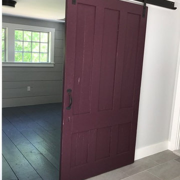 Katie Hutchison Studio
The new owners of this house in Harvard, Massachusetts loved its location and authentic Shaker characteristics, but weren’t fans of its curious layout. A dated first-floor full bathroom could only be accessed by going up a few steps to a landing, opening the bathroom door and then going down the same number of steps to enter the room. The dark kitchen faced the driveway to the north, rather than the bucolic backyard fields to the south. The dining space felt more like an enlarged hall and could only comfortably seat four. Upstairs, a den/office had a woefully low ceiling; the master bedroom had limited storage, and a sad full bathroom featured a cramped shower.
KHS proposed a number of changes to create an updated home where the owners could enjoy cooking, entertaining, and being connected to the outdoors from the first-floor living spaces, while also experiencing more inviting and more functional private spaces upstairs.
On the first floor, the primary change was to capture space that had been part of an upper-level screen porch and convert it to interior space. To make the interior expansion seamless, we raised the floor of the area that had been the upper-level porch, so it aligns with the main living level, and made sure there would be no soffits in the planes of the walls we removed. We also raised the floor of the remaining lower-level porch to reduce the number of steps required to circulate from it to the newly expanded interior. New patio door systems now fill the arched openings that used to be infilled with screen. The exterior interventions (which also included some new casement windows in the dining area) were designed to be subtle, while affording significant improvements on the interior. Additionally, the first-floor bathroom was reconfigured, shifting one of its walls to widen the dining space, and moving the entrance to the bathroom from the stair landing to the kitchen instead.
These changes (which involved significant structural interventions) resulted in a much more open space to accommodate a new kitchen with a view of the lush backyard and a new dining space defined by a new built-in banquette that comfortably seats six, and -- with the addition of a table extension -- up to eight people.
Upstairs in the den/office, replacing the low, board ceiling with a raised, plaster, tray ceiling that springs from above the original board-finish walls – newly painted a light color -- created a much more inviting, bright, and expansive space. Re-configuring the master bath to accommodate a larger shower and adding built-in storage cabinets in the master bedroom improved comfort and function. A new whole-house color palette rounds out the improvements.
Photos by Katie Hutchison

 Safari Thatch Inc.
The Sedgwick County Zoo’s Reed Family Elephants of the Zambezi River Valley exhibit opened to the public on May 26 2016. This is one of the newest, most advanced and the third largest elephant exhibit in North America at over 5 acres with the largest swimming hole at 550,000 gallons. The project will be used as an example of the correct way to design and build an Elephant exhibit for years to come. Safari Thatch provided all the thatching for the main pavilion and the other out buildings. We also provided all the materials for the pedestrian fencing, trellises and shade structures. It was an honor to work with the zoo on this project.
The Camp Zambezi main pavilion was one of the largest single structures we have thatched, at over 6000 sq ft, with our synthetic Viro Bali Class A Fire Rated Thatching at the time. The zoo went with this thatch for its look, cost, longevity, ease of application, and warranty. Safari Thatch also provided all the pedestrian fencing lining the walkways though out the exhibit. For this we used our Rustic Eucalyptus 4’ tall prefabricated fence panels with 6” Eucalyptus posts and 4” rails. This produces an almost indestructible fence with many years of use. Our original design with the varied heights of the upright pickets keeps patrons from placing anything on top of the fencing thus reducing the chance of people or property from falling inside exhibits protecting both the customers and the animals. We also used a post and rail fence to separate the people and landscaping. This was a 4” post and 3” rail Eucalyptus fence.
We used Eucalyptus poles for all the structural pole construction on all the out building in the exhibit. Eucalyptus is the fastest and straightest growing tree. They are all plantation grown and forest certified. We prefer these for pole style construction due to their strength over other wood poles and lack of taper, with less than an inch over 20 feet, removing extra weight that would be found in other poles. This is a beautiful and very large and state of the art exhibit and is a feather in the cape of the Sedgwick County Zoo. The people of Wichita and the surrounding area have adopted and taken great interest in
the newly arrived Elephants involving the entire community. The Elephants of the Zambezi River Valley has been a major attraction since it opened and should be on anyone must see list. Safari Thatch is proud to have been involved in this project.
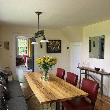 Katie Hutchison Studio
The new owners of this house in Harvard, Massachusetts loved its location and authentic Shaker characteristics, but weren’t fans of its curious layout. A dated first-floor full bathroom could only be accessed by going up a few steps to a landing, opening the bathroom door and then going down the same number of steps to enter the room. The dark kitchen faced the driveway to the north, rather than the bucolic backyard fields to the south. The dining space felt more like an enlarged hall and could only comfortably seat four. Upstairs, a den/office had a woefully low ceiling; the master bedroom had limited storage, and a sad full bathroom featured a cramped shower.
KHS proposed a number of changes to create an updated home where the owners could enjoy cooking, entertaining, and being connected to the outdoors from the first-floor living spaces, while also experiencing more inviting and more functional private spaces upstairs.
On the first floor, the primary change was to capture space that had been part of an upper-level screen porch and convert it to interior space. To make the interior expansion seamless, we raised the floor of the area that had been the upper-level porch, so it aligns with the main living level, and made sure there would be no soffits in the planes of the walls we removed. We also raised the floor of the remaining lower-level porch to reduce the number of steps required to circulate from it to the newly expanded interior. New patio door systems now fill the arched openings that used to be infilled with screen. The exterior interventions (which also included some new casement windows in the dining area) were designed to be subtle, while affording significant improvements on the interior. Additionally, the first-floor bathroom was reconfigured, shifting one of its walls to widen the dining space, and moving the entrance to the bathroom from the stair landing to the kitchen instead.
These changes (which involved significant structural interventions) resulted in a much more open space to accommodate a new kitchen with a view of the lush backyard and a new dining space defined by a new built-in banquette that comfortably seats six, and -- with the addition of a table extension -- up to eight people.
Upstairs in the den/office, replacing the low, board ceiling with a raised, plaster, tray ceiling that springs from above the original board-finish walls – newly painted a light color -- created a much more inviting, bright, and expansive space. Re-configuring the master bath to accommodate a larger shower and adding built-in storage cabinets in the master bedroom improved comfort and function. A new whole-house color palette rounds out the improvements.
Photos by Katie Hutchison

Sponsored
Columbus, OH

Wannemacher Interiors
Customized Award-Winning Interior Design Solutions in Franklin Cnty OH
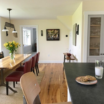 Katie Hutchison Studio
The new owners of this house in Harvard, Massachusetts loved its location and authentic Shaker characteristics, but weren’t fans of its curious layout. A dated first-floor full bathroom could only be accessed by going up a few steps to a landing, opening the bathroom door and then going down the same number of steps to enter the room. The dark kitchen faced the driveway to the north, rather than the bucolic backyard fields to the south. The dining space felt more like an enlarged hall and could only comfortably seat four. Upstairs, a den/office had a woefully low ceiling; the master bedroom had limited storage, and a sad full bathroom featured a cramped shower.
KHS proposed a number of changes to create an updated home where the owners could enjoy cooking, entertaining, and being connected to the outdoors from the first-floor living spaces, while also experiencing more inviting and more functional private spaces upstairs.
On the first floor, the primary change was to capture space that had been part of an upper-level screen porch and convert it to interior space. To make the interior expansion seamless, we raised the floor of the area that had been the upper-level porch, so it aligns with the main living level, and made sure there would be no soffits in the planes of the walls we removed. We also raised the floor of the remaining lower-level porch to reduce the number of steps required to circulate from it to the newly expanded interior. New patio door systems now fill the arched openings that used to be infilled with screen. The exterior interventions (which also included some new casement windows in the dining area) were designed to be subtle, while affording significant improvements on the interior. Additionally, the first-floor bathroom was reconfigured, shifting one of its walls to widen the dining space, and moving the entrance to the bathroom from the stair landing to the kitchen instead.
These changes (which involved significant structural interventions) resulted in a much more open space to accommodate a new kitchen with a view of the lush backyard and a new dining space defined by a new built-in banquette that comfortably seats six, and -- with the addition of a table extension -- up to eight people.
Upstairs in the den/office, replacing the low, board ceiling with a raised, plaster, tray ceiling that springs from above the original board-finish walls – newly painted a light color -- created a much more inviting, bright, and expansive space. Re-configuring the master bath to accommodate a larger shower and adding built-in storage cabinets in the master bedroom improved comfort and function. A new whole-house color palette rounds out the improvements.
Photos by Katie Hutchison
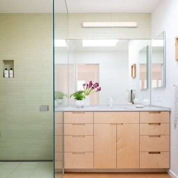 Lincoln Lighthill Architect
This Eichler-esque house, in a neighborhood known for its tracts of homes by the famous developer, was a little different from the rest- a one-off custom build from 1962 that had mid-century modern bones but funky, neo-traditional finishes in the worn-out, time capsule state that the new owners found it. This called for an almost-gut remodel to keep the good, upgrade the building’s envelope and MEP systems, and reimagine the home’s character. To create a home that feels of its times, both now and then- A mid-century for the 21st century.
At the center of the existing home was a long, slender rectangular form that contained a fireplace, an indoor BBQ, and kitchen storage, and on the other side an original, suspended wood and steel rod stair down to the bedroom level below. Under the carpeted treads we were sure we’d find beautiful oak, as this stair was identical to one at our earlier Clarendon heights mid-century project.
This elegant core was obscured by walls that enclosed the kitchen and breakfast areas and a jumble of aged finishes that hid the elegance of this defining element. Lincoln Lighthill Architect removed the walls and unified the core’s finishes with light grey ground-face concrete block on the upgraded fireplace and BBQ, lacquered cabinets, and chalkboard paint at the stair wall for the owners’ young children to decorate. A new skylight above the stair washes this wall with light and brightens up the formerly dark center of the house.
The rest of the interior is a combination of mid-century-inspired elements and modern updates. New finishes throughout- cork flooring, ground-face concrete block, Heath tile, and white birch millwork give the interior the mid-century character it never fully had, while modern, minimalist detailing gives it a timeless, serene simplicity.
New lighting throughout, mostly indirect and all warm-dim LED , subtly and efficiently lights the home. All new plumbing and fixtures similarly reduce the home’s use of precious resources. On the exterior, new windows, insulation, and roofing provide modern standards of comfort and efficiency, while a new paint job and brick stain give the house an elegant yet playful character, with the golden yellow Heath tile from the primary bathroom floor reappearing on the front door.
 Kestrel Shutters & Doors
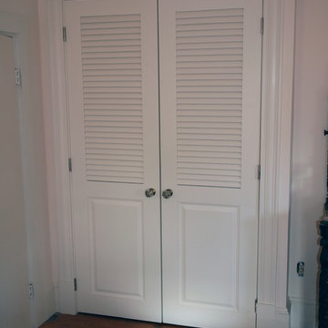
These traditional closet doors feature smaller, fixed louvers in the top and colonial raised panels in the bottom and are custom sized to fit your openings.
To receive a quote on our Fixed Louver over Raised Panel doors follow the "Visit Store" link: below.
 Katie Hutchison Studio
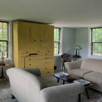
The new owners of this house in Harvard, Massachusetts loved its location and authentic Shaker characteristics, but weren’t fans of its curious layout. A dated first-floor full bathroom could only be accessed by going up a few steps to a landing, opening the bathroom door and then going down the same number of steps to enter the room. The dark kitchen faced the driveway to the north, rather than the bucolic backyard fields to the south. The dining space felt more like an enlarged hall and could only comfortably seat four. Upstairs, a den/office had a woefully low ceiling; the master bedroom had limited storage, and a sad full bathroom featured a cramped shower.
KHS proposed a number of changes to create an updated home where the owners could enjoy cooking, entertaining, and being connected to the outdoors from the first-floor living spaces, while also experiencing more inviting and more functional private spaces upstairs.
On the first floor, the primary change was to capture space that had been part of an upper-level screen porch and convert it to interior space. To make the interior expansion seamless, we raised the floor of the area that had been the upper-level porch, so it aligns with the main living level, and made sure there would be no soffits in the planes of the walls we removed. We also raised the floor of the remaining lower-level porch to reduce the number of steps required to circulate from it to the newly expanded interior. New patio door systems now fill the arched openings that used to be infilled with screen. The exterior interventions (which also included some new casement windows in the dining area) were designed to be subtle, while affording significant improvements on the interior. Additionally, the first-floor bathroom was reconfigured, shifting one of its walls to widen the dining space, and moving the entrance to the bathroom from the stair landing to the kitchen instead.
These changes (which involved significant structural interventions) resulted in a much more open space to accommodate a new kitchen with a view of the lush backyard and a new dining space defined by a new built-in banquette that comfortably seats six, and -- with the addition of a table extension -- up to eight people.
Upstairs in the den/office, replacing the low, board ceiling with a raised, plaster, tray ceiling that springs from above the original board-finish walls – newly painted a light color -- created a much more inviting, bright, and expansive space. Re-configuring the master bath to accommodate a larger shower and adding built-in storage cabinets in the master bedroom improved comfort and function. A new whole-house color palette rounds out the improvements.
Photos by Katie Hutchison
 Katie Hutchison Studio
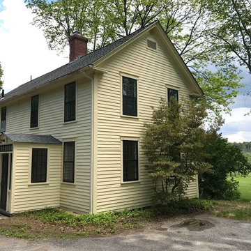
The new owners of this house in Harvard, Massachusetts loved its location and authentic Shaker characteristics, but weren’t fans of its curious layout. A dated first-floor full bathroom could only be accessed by going up a few steps to a landing, opening the bathroom door and then going down the same number of steps to enter the room. The dark kitchen faced the driveway to the north, rather than the bucolic backyard fields to the south. The dining space felt more like an enlarged hall and could only comfortably seat four. Upstairs, a den/office had a woefully low ceiling; the master bedroom had limited storage, and a sad full bathroom featured a cramped shower.
KHS proposed a number of changes to create an updated home where the owners could enjoy cooking, entertaining, and being connected to the outdoors from the first-floor living spaces, while also experiencing more inviting and more functional private spaces upstairs.
On the first floor, the primary change was to capture space that had been part of an upper-level screen porch and convert it to interior space. To make the interior expansion seamless, we raised the floor of the area that had been the upper-level porch, so it aligns with the main living level, and made sure there would be no soffits in the planes of the walls we removed. We also raised the floor of the remaining lower-level porch to reduce the number of steps required to circulate from it to the newly expanded interior. New patio door systems now fill the arched openings that used to be infilled with screen. The exterior interventions (which also included some new casement windows in the dining area) were designed to be subtle, while affording significant improvements on the interior. Additionally, the first-floor bathroom was reconfigured, shifting one of its walls to widen the dining space, and moving the entrance to the bathroom from the stair landing to the kitchen instead.
These changes (which involved significant structural interventions) resulted in a much more open space to accommodate a new kitchen with a view of the lush backyard and a new dining space defined by a new built-in banquette that comfortably seats six, and -- with the addition of a table extension -- up to eight people.
Upstairs in the den/office, replacing the low, board ceiling with a raised, plaster, tray ceiling that springs from above the original board-finish walls – newly painted a light color -- created a much more inviting, bright, and expansive space. Re-configuring the master bath to accommodate a larger shower and adding built-in storage cabinets in the master bedroom improved comfort and function. A new whole-house color palette rounds out the improvements.
Photos by Katie Hutchison
 Katie Hutchison Studio
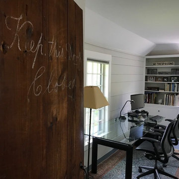
The new owners of this house in Harvard, Massachusetts loved its location and authentic Shaker characteristics, but weren’t fans of its curious layout. A dated first-floor full bathroom could only be accessed by going up a few steps to a landing, opening the bathroom door and then going down the same number of steps to enter the room. The dark kitchen faced the driveway to the north, rather than the bucolic backyard fields to the south. The dining space felt more like an enlarged hall and could only comfortably seat four. Upstairs, a den/office had a woefully low ceiling; the master bedroom had limited storage, and a sad full bathroom featured a cramped shower.
KHS proposed a number of changes to create an updated home where the owners could enjoy cooking, entertaining, and being connected to the outdoors from the first-floor living spaces, while also experiencing more inviting and more functional private spaces upstairs.
On the first floor, the primary change was to capture space that had been part of an upper-level screen porch and convert it to interior space. To make the interior expansion seamless, we raised the floor of the area that had been the upper-level porch, so it aligns with the main living level, and made sure there would be no soffits in the planes of the walls we removed. We also raised the floor of the remaining lower-level porch to reduce the number of steps required to circulate from it to the newly expanded interior. New patio door systems now fill the arched openings that used to be infilled with screen. The exterior interventions (which also included some new casement windows in the dining area) were designed to be subtle, while affording significant improvements on the interior. Additionally, the first-floor bathroom was reconfigured, shifting one of its walls to widen the dining space, and moving the entrance to the bathroom from the stair landing to the kitchen instead.
These changes (which involved significant structural interventions) resulted in a much more open space to accommodate a new kitchen with a view of the lush backyard and a new dining space defined by a new built-in banquette that comfortably seats six, and -- with the addition of a table extension -- up to eight people.
Upstairs in the den/office, replacing the low, board ceiling with a raised, plaster, tray ceiling that springs from above the original board-finish walls – newly painted a light color -- created a much more inviting, bright, and expansive space. Re-configuring the master bath to accommodate a larger shower and adding built-in storage cabinets in the master bedroom improved comfort and function. A new whole-house color palette rounds out the improvements.
Photos by Katie Hutchison

Sponsored
Columbus, OH
Wannemacher Interiors
Customized Award-Winning Interior Design Solutions in Franklin Cnty OH
 Katie Hutchison Studio
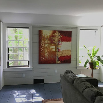
The new owners of this house in Harvard, Massachusetts loved its location and authentic Shaker characteristics, but weren’t fans of its curious layout. A dated first-floor full bathroom could only be accessed by going up a few steps to a landing, opening the bathroom door and then going down the same number of steps to enter the room. The dark kitchen faced the driveway to the north, rather than the bucolic backyard fields to the south. The dining space felt more like an enlarged hall and could only comfortably seat four. Upstairs, a den/office had a woefully low ceiling; the master bedroom had limited storage, and a sad full bathroom featured a cramped shower.
KHS proposed a number of changes to create an updated home where the owners could enjoy cooking, entertaining, and being connected to the outdoors from the first-floor living spaces, while also experiencing more inviting and more functional private spaces upstairs.
On the first floor, the primary change was to capture space that had been part of an upper-level screen porch and convert it to interior space. To make the interior expansion seamless, we raised the floor of the area that had been the upper-level porch, so it aligns with the main living level, and made sure there would be no soffits in the planes of the walls we removed. We also raised the floor of the remaining lower-level porch to reduce the number of steps required to circulate from it to the newly expanded interior. New patio door systems now fill the arched openings that used to be infilled with screen. The exterior interventions (which also included some new casement windows in the dining area) were designed to be subtle, while affording significant improvements on the interior. Additionally, the first-floor bathroom was reconfigured, shifting one of its walls to widen the dining space, and moving the entrance to the bathroom from the stair landing to the kitchen instead.
These changes (which involved significant structural interventions) resulted in a much more open space to accommodate a new kitchen with a view of the lush backyard and a new dining space defined by a new built-in banquette that comfortably seats six, and -- with the addition of a table extension -- up to eight people.
Upstairs in the den/office, replacing the low, board ceiling with a raised, plaster, tray ceiling that springs from above the original board-finish walls – newly painted a light color -- created a much more inviting, bright, and expansive space. Re-configuring the master bath to accommodate a larger shower and adding built-in storage cabinets in the master bedroom improved comfort and function. A new whole-house color palette rounds out the improvements.
Photos by Katie Hutchison
 Katie Hutchison Studio
The new owners of this house in Harvard, Massachusetts loved its location and authentic Shaker characteristics, but weren’t fans of its curious layout. A dated first-floor full bathroom could only be accessed by going up a few steps to a landing, opening the bathroom door and then going down the same number of steps to enter the room. The dark kitchen faced the driveway to the north, rather than the bucolic backyard fields to the south. The dining space felt more like an enlarged hall and could only comfortably seat four. Upstairs, a den/office had a woefully low ceiling; the master bedroom had limited storage, and a sad full bathroom featured a cramped shower.
KHS proposed a number of changes to create an updated home where the owners could enjoy cooking, entertaining, and being connected to the outdoors from the first-floor living spaces, while also experiencing more inviting and more functional private spaces upstairs.
On the first floor, the primary change was to capture space that had been part of an upper-level screen porch and convert it to interior space. To make the interior expansion seamless, we raised the floor of the area that had been the upper-level porch, so it aligns with the main living level, and made sure there would be no soffits in the planes of the walls we removed. We also raised the floor of the remaining lower-level porch to reduce the number of steps required to circulate from it to the newly expanded interior. New patio door systems now fill the arched openings that used to be infilled with screen. The exterior interventions (which also included some new casement windows in the dining area) were designed to be subtle, while affording significant improvements on the interior. Additionally, the first-floor bathroom was reconfigured, shifting one of its walls to widen the dining space, and moving the entrance to the bathroom from the stair landing to the kitchen instead.
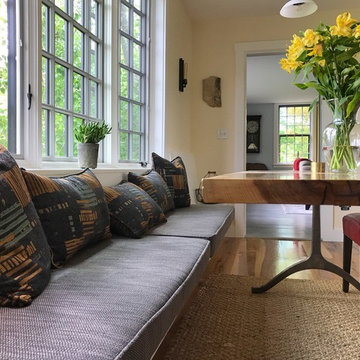
These changes (which involved significant structural interventions) resulted in a much more open space to accommodate a new kitchen with a view of the lush backyard and a new dining space defined by a new built-in banquette that comfortably seats six, and -- with the addition of a table extension -- up to eight people.
Upstairs in the den/office, replacing the low, board ceiling with a raised, plaster, tray ceiling that springs from above the original board-finish walls – newly painted a light color -- created a much more inviting, bright, and expansive space. Re-configuring the master bath to accommodate a larger shower and adding built-in storage cabinets in the master bedroom improved comfort and function. A new whole-house color palette rounds out the improvements.
Photos by Katie Hutchison
 Moss Yaw Design studio
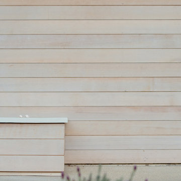
Engineered cedar siding creates beautiful gray-blue tones at the exterior of the home, while adding a textural element to activate the simple exterior design.
 HUNTER DOUGLAS-LNG BLINDS
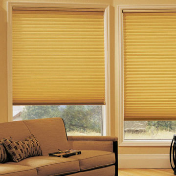
DUETTE® Honeycomb Shades
THE ORIGINAL ENERGY-EFFICIENT HONEYCOMB SHADE
An innovative window treatment that looks beautiful and insulates your home all year round, Duette® Honeycomb Shades were the first cellular shades, specially engineered to provide energy efficiency at the window in both cold and warm climates. Their specially engineered honeycomb construction traps air in distinct pockets, which creates insulation that can help lower your energy consumption and energy bills.
Decorate every kind of window you have—even tricky skylights and unusually shaped panes—with Duette. Our signature honeycomb shades are one of our most versatile options and beautify every kind of interior.
KEY FEATURES
Premium Design & Style—Explore the richness of texture and warmth offered by The Alustra® Collection of Duette, a thoughtfully curated suite of exclusive design-inspired fabrics, textures, colors and hardware created to meet the expectations of leading designers and discerning consumers who seek the best in design.
Largest Selection in the Industry—Explore the widest selection of cellular pleat sizes, opacities, colors, textures and operating systems. Duette shades can also accommodate many specialty shaped windows, even tricky skylights.
Energy-Efficiency—Studies show that windows are responsible for up to 50% of your home’s energy losses. Duette shades trap air in distinct pockets, creating exceptional insulation. Our latest innovation, Duette Architella®, features a honeycomb-within-a-honeycomb design for even greater energy efficiency.
Room Darkening—The LightLock™ system, the newest iteration from Duette, is the first operating system of its kind to offer unparalleled darkness. The secret lies within the patent-pending side channel design, optimized to absorb or deflect nearly all incoming light.
Durability—All of our high-performing fabrics are resistant to fading and will maintain their crisp, neat pleats over time.
Vertical Application—For doors that need extra insulation, the Duette Vertiglide™ operating system is the ideal option. It’s designed for vertical applications and uses the same fabrics as your horizontal Duette shades. Use one shade to cover the entire expanse of a sliding door, or, cover the door with a split stack Vertiglide shade, with each side operating independently.
Sound Absorption—Improve your room’s acoustics while reducing the intensity of outside sound. Duette Honeycomb Shades absorb up to 70% of sound energy, creating a more quiet, tranquil room.
LNG Blinds
19 Addison Pl
Valley Stream, NY 11580
Call Us (516) 593-0044
#homesweethome #homedecor #lovemyhome #barenecessities #windows #instastyle #instadesign #interiordesign#blinds #privacy #embellishment #instahomes #propertyowner #renovation #customblindsbydesign #showcase #displays #windowtreatments #windowcoverings #shades #shutters #drapery #interiors #decor

Sponsored
Columbus, OH
Wannemacher Interiors
Customized Award-Winning Interior Design Solutions in Franklin Cnty OH
 Alleylane Homes
Functionality of layout
Unique design elements
Choice of materials
Environmental considerations (energy, comfort, health)
Construction details/techniques to achieve industry best practices
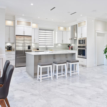
Open-concept and filled with sunshine, a culinary hub that’s designed to be the social heart of this home and a subtle reference to the engaged, family-first lifestyle that would have been found in the original, heritage farmhouse located on this property.
8x5-foot* island (with seating for 4-5 people) includes storage on each side plus convenient USB outlets to keep everyone’s electronics powered up and ready to go. Easy flow when entertaining is appreciated by family/guests alike who want to engage with chefs-at-work without intruding into their workspace.
Pendant lighting above island is purposefully absent. View-lines to adjacent great-room remains unobstructed, thus fulfilling clients desire to provide the entire family (from teen to grandparents) with welcoming space to simply hang out together.
Gas cooktop (with elegantly-curved, chimney hood-fan) and two, full-sized wall-ovens (regular and microwave/convection) conveniently located adjacent to each other on the back wall where it’s easy to transfer steaming dishes directly onto the island ready for your guests/family to help themselves.
Subway-tile (3x6-inch) quartz backsplash creates visual continuity with the solid-slab island surface and perimeter countertops.
Custom millwork (in contemporary white with brushed chrome handles) designed with full-height cabinets with upper shelves back-lit for warm night-time visual. Extra bonus storage and reduced dusting: always a winning combo.
Easy-access spice kitchen includes all the features today’s savvy buyers expect from their cooking space: full-sized range with induction* cooktop, fridge, dishwasher, and 36-inch* sink that’s deep enough to effortlessly handle the biggest spaghetti/corn pots. A caterer’s dream too.
Large format (3x3-foot) marble-inspired porcelain floor-tiling is extension of material used throughout main floor. Elegant, contemporary, dramatic. Warm on the feet, thanks to energy-efficient, in-floor radiant heating.
 Katie Hutchison Studio
The new owners of this house in Harvard, Massachusetts loved its location and authentic Shaker characteristics, but weren’t fans of its curious layout. A dated first-floor full bathroom could only be accessed by going up a few steps to a landing, opening the bathroom door and then going down the same number of steps to enter the room. The dark kitchen faced the driveway to the north, rather than the bucolic backyard fields to the south. The dining space felt more like an enlarged hall and could only comfortably seat four. Upstairs, a den/office had a woefully low ceiling; the master bedroom had limited storage, and a sad full bathroom featured a cramped shower.
KHS proposed a number of changes to create an updated home where the owners could enjoy cooking, entertaining, and being connected to the outdoors from the first-floor living spaces, while also experiencing more inviting and more functional private spaces upstairs.
On the first floor, the primary change was to capture space that had been part of an upper-level screen porch and convert it to interior space. To make the interior expansion seamless, we raised the floor of the area that had been the upper-level porch, so it aligns with the main living level, and made sure there would be no soffits in the planes of the walls we removed. We also raised the floor of the remaining lower-level porch to reduce the number of steps required to circulate from it to the newly expanded interior. New patio door systems now fill the arched openings that used to be infilled with screen. The exterior interventions (which also included some new casement windows in the dining area) were designed to be subtle, while affording significant improvements on the interior. Additionally, the first-floor bathroom was reconfigured, shifting one of its walls to widen the dining space, and moving the entrance to the bathroom from the stair landing to the kitchen instead.
These changes (which involved significant structural interventions) resulted in a much more open space to accommodate a new kitchen with a view of the lush backyard and a new dining space defined by a new built-in banquette that comfortably seats six, and -- with the addition of a table extension -- up to eight people.
Upstairs in the den/office, replacing the low, board ceiling with a raised, plaster, tray ceiling that springs from above the original board-finish walls – newly painted a light color -- created a much more inviting, bright, and expansive space. Re-configuring the master bath to accommodate a larger shower and adding built-in storage cabinets in the master bedroom improved comfort and function. A new whole-house color palette rounds out the improvements.
Photos by Katie Hutchison
 Katie Hutchison Studio
The new owners of this house in Harvard, Massachusetts loved its location and authentic Shaker characteristics, but weren’t fans of its curious layout. A dated first-floor full bathroom could only be accessed by going up a few steps to a landing, opening the bathroom door and then going down the same number of steps to enter the room. The dark kitchen faced the driveway to the north, rather than the bucolic backyard fields to the south. The dining space felt more like an enlarged hall and could only comfortably seat four. Upstairs, a den/office had a woefully low ceiling; the master bedroom had limited storage, and a sad full bathroom featured a cramped shower.
KHS proposed a number of changes to create an updated home where the owners could enjoy cooking, entertaining, and being connected to the outdoors from the first-floor living spaces, while also experiencing more inviting and more functional private spaces upstairs.
On the first floor, the primary change was to capture space that had been part of an upper-level screen porch and convert it to interior space. To make the interior expansion seamless, we raised the floor of the area that had been the upper-level porch, so it aligns with the main living level, and made sure there would be no soffits in the planes of the walls we removed. We also raised the floor of the remaining lower-level porch to reduce the number of steps required to circulate from it to the newly expanded interior. New patio door systems now fill the arched openings that used to be infilled with screen. The exterior interventions (which also included some new casement windows in the dining area) were designed to be subtle, while affording significant improvements on the interior. Additionally, the first-floor bathroom was reconfigured, shifting one of its walls to widen the dining space, and moving the entrance to the bathroom from the stair landing to the kitchen instead.
These changes (which involved significant structural interventions) resulted in a much more open space to accommodate a new kitchen with a view of the lush backyard and a new dining space defined by a new built-in banquette that comfortably seats six, and -- with the addition of a table extension -- up to eight people.
Upstairs in the den/office, replacing the low, board ceiling with a raised, plaster, tray ceiling that springs from above the original board-finish walls – newly painted a light color -- created a much more inviting, bright, and expansive space. Re-configuring the master bath to accommodate a larger shower and adding built-in storage cabinets in the master bedroom improved comfort and function. A new whole-house color palette rounds out the improvements.
Photos by Katie Hutchison
47