
Search results for "Reduce revealed" in Home Design Ideas

 ZeroEnergy Design
This modern green home offers both a vacation destination on Cape Cod near local family members and an opportunity for rental income.
FAMILY ROOTS. A West Coast couple living in the San Francisco Bay Area sought a permanent East Coast vacation home near family members living on Cape Cod. As academic professionals focused on sustainability, they sought a green, energy efficient home that was well-aligned with their values. With no green homes available for sale on Cape Cod, they decided to purchase land near their family and build their own.
SLOPED SITE. Comprised of a 3/4 acre lot nestled in the pines, the steeply sloping terrain called for a plan that embraced and took advantage of the slope. Of equal priority was optimizing solar exposure, preserving privacy from abutters, and creating outdoor living space. The design accomplished these goals with a simple, rectilinear form, offering living space on the both entry and lower/basement levels. The stepped foundation allows for a walk-out basement level with light-filled living space on the down-hill side of the home. The traditional basement on the eastern, up-hill side houses mechanical equipment and a home gym. The house welcomes natural light throughout, captures views of the forest, and delivers entertainment space that connects indoor living space to outdoor deck and dining patio.
MODERN VISION. The clean building form and uncomplicated finishes pay homage to the modern architectural legacy on the outer Cape. Durable and economical fiber cement panels, fixed with aluminum channels, clad the primary form. Cedar clapboards provide a visual accent at the south-facing living room, which extends a single roof plane to cover the entry porch.
SMART USE OF SPACE. On the entry level, the “L”-shaped living, dining, and kitchen space connects to the exterior living, dining, and grilling spaces to effectively double the home’s summertime entertainment area. Placed at the western end of the entry level (where it can retain privacy but still claim expansive downhill views) is the master suite with a built-in study. The lower level has two guest bedrooms, a second full bathroom, and laundry. The flexibility of the space—crucial in a house with a modest footprint—emerges in one of the guest bedrooms, which doubles as home office by opening the barn-style double doors to connect it to the bright, airy open stair leading up to the entry level. Thoughtful design, generous ceiling heights and large windows transform the modest 1,100 sf* footprint into a well-lit, spacious home. *(total finished space is 1800 sf)
RENTAL INCOME. The property works for its owners by netting rental income when the owners are home in San Francisco. The house especially caters to vacationers bound for nearby Mayo Beach and includes an outdoor shower adjacent to the lower level entry door. In contrast to the bare bones cottages that are typically available on the Cape, this home offers prospective tenants a modern aesthetic, paired with luxurious and green features. Durable finishes inside and out will ensure longevity with the heavier use that comes with a rental property.
COMFORT YEAR-ROUND. The home is super-insulated and air-tight, with mechanical ventilation to provide continuous fresh air from the outside. High performance triple-paned windows complement the building enclosure and maximize passive solar gain while ensuring a warm, draft-free winter, even when sitting close to the glass. A properly sized air source heat pump offers efficient heating & cooling, and includes a carefully designed the duct distribution system to provide even comfort throughout the house. The super-insulated envelope allows us to significantly reduce the equipment capacity, duct size, and airflow quantities, while maintaining unparalleled thermal comfort.
ENERGY EFFICIENT. The building’s shell and mechanical systems play instrumental roles in the home’s exceptional performance. The building enclosure reduces the most significant energy glutton: heating. Continuous super-insulation, thorough air sealing, triple-pane windows, and passive solar gain work together to yield a miniscule heating load. All active energy consumers are extremely efficient: an air source heat pump for heating and cooling, a heat pump hot water heater, LED lighting, energy recovery ventilation (ERV), and high efficiency appliances. The result is a home that uses 70% less energy than a similar new home built to code requirements.
OVERALL. The home embodies the owners’ goals and values while comprehensively enabling thermal comfort, energy efficiency, a vacation respite, and supplementary income.
PROJECT TEAM
ZeroEnergy Design - Architect & Mechanical Designer
A.F. Hultin & Co. - Contractor
Pamet Valley Landscape Design - Landscape & Masonry
Lisa Finch - Original Artwork
European Architectural Supply - Windows
Eric Roth Photography - Photography

 Dynia Architects
This residence is located on the banks of the Snake River. Drawing inspiration from the adjacent braided river channels, the precise layout form unique relationships to the site from each room, as well as dynamic views and spatial experiences. The sequence of interior spaces gradually unfolds to reveal views of the pond, river and mountains beyond. The skewed geometry creates shifting views between interior spaces and levels.
A three-story stair atrium brings light into the core of the house, gracefully connects floor levels, and creates a transition from the public to private zones of the house. The volume of the house cantilevers to cover an exterior dining area and spans to frame the entrance into the house and the river beyond. The exterior rain screen on the clean modern forms creates continuity with the surrounding cottonwood forest.
 Richard Best Architect, Inc.
Hillside Modernism In Context.
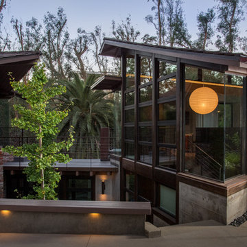
The owners of this modern hillside home sought to have a home in a nice Los Angeles neighborhood wherein they could raise their burgeoning family. The owners purchased a 1948 2000sf, single story, 2 bedroom English Cottage styled home (believed to have been originally owned by Yul Brynner) on a ½ acre hillside site in the exclusive Brentwood area of Los Angeles. The property slopes downward away from the street and overlooks a mini eucalyptus arroyo. The owners love their new location but are now faced-with having to raise their new and growing family on a hillside with extremely limited yard spaces for children to play and in a location where nature is very close – deer as well as coyotes wander the arroyo.
In 2000 the owners commissioned architect Richard Best to add 2500sf to the cottage and transform it into a home more fitting to their growing family’s needs. Subsequently, in 2014/15, the owners again commissioned Richard to create a 2-story master suite addition. Living in or visiting the completed project - the original 1948 home remodeled + the 2000 addition + the 2014/15 addition, one goes through an unexpected and delightful experience as the spaces of the home “unfold” to reveal intimacy and environmental immersion.
It was important to Richard and to the owners that their remodels and additions be appropriately designed to fit into the neighborhood and have the feel, scale, and soul of the original cottage. With this in-mind, Richard has interpreted the design intentions of the original cottage - “modernizing” the architectural vocabulary and creating open-plan, 2-story additions which promote site “engagement” at various floor levels and openness to the outdoors in a manner clearly inspired by the original cottage, yet modern.
At the front door of the original (still remains as it was) 1948 structure, one is presented with a quaint a low-slung entry which establishes a very comfortable sense of scale. Inside, the remodeled spaces of the original cottage exude comfort and a cozy sensibility evoked by the reuse of the original home’s exposed timber framing structure, open-plan circulation, and an inventive two-sided steel fireplace which acts as a room divider between the living room and a home office. Accordion wood doors connect these rooms to a newly formed outdoor rear patio. At this point one also gets ones first hint that something very interesting is happening just beyond – a glimpse of the 2000 & 2014/15 additions.
Moving from the original 1948 structure into the 2-story 2000 addition, one is greeted by a modern and open linear floor plan arrangement – a kitchen, casual dining and family room extend perpendicularly from the 1948 structure into the rear yard and down the hillside. The open framed cathedral ceiling and wood roof trusses establish a lofty feeling and a rhythm discretely separating the open rooms one from the other. Extensive use of windows and French doors connect the indoors to the outdoors and provide abundant natural lighting. This new appendage ends with a symmetrical family room which has no corners – it is a geometry composed of two overlapped squares - one rotated 45 degrees atop the other to create double opportunities for bay windows. The design not only connects the home to the desired exterior flat yards spaces, but it also takes full advantage of the sloping terrain by adding a floor below the original level so as to maintain a scale appropriate to the neighborhood. The exterior materials were chosen taking “hints” from the original 1948 structure – natural redwood siding, reused brick veneer and wood doors/windows all serving to aesthetically connect the addition back-to the spirit of the original structure.
By 2014/15 the owners’ family has fully blossomed - the children are now teenagers and there is a need for additional space. However, the owners are very content with their remodeled cottage and Richard’s 2000 addition – unsure how to add to a home which they feel is quite perfect as it is … wanting whatever changes are to be made to be sympathetic to it. They are also concerned about potential additions blocking-out their views of the eucalyptus arroyo. The owners approached Richard with trepidation – we love our perfect house but we need it to be a bit bigger and we don’t want to block-out the arroyo views or create a hemmed-in feeling – how can we add but still see the arroyo.
In response Richard created a private yet connected 2-story master suite, which by its positioning, dynamic geometries and extensive glazing create the fourth side of the former rear patio, making it into exterior courtyard with views around and through the new addition into the arroyo. A dynamic angularity in the new master addition (inspired by the 2000 addition) simultaneously reduces the apparent size/presence of the master suite addition on the edge of the eucalyptus arroyo while creating framed views into the arroyo from the newly formed courtyard. The new master suite - a master bathroom, master closet and a master sleeping loft each having exterior decks and/or patios, is connected back to the 2000 addition via a glazed hallway which provides a sense of connectedness and privacy. A modern rustic aesthetic of exposed board-formed concrete, natural finished Corten steel exterior cladding, frameless metal windows, and clear finished Douglas Fir planks serve to “extend” the soul of the original cottage into the master suite.
The project is a highly sustainable design as well. Energy use is reduced by employing a high efficiency heat pump heating and cooling system, dual paned/gasketed metal window/door systems, natural lighting through a Kalwall skylight and generous exterior glazing with extensive eaves for shading, rigid roof insulation, and earthen backing – the lower floor is up-against the hillside which tends to even-out the day/night temperature differential.
Credits:
Architecture & Interior Design: Richard Best Architect Inc.
Structural Engineering: Dan Echeto & David Choi Associates
Interior Decor: Noelle Schoop
Landscape: Connie Heitzman
Photos: Carmel McFayden and Adriano Sarmento / James Porschen
Find the right local pro for your project
 ZeroEnergy Design
 (ZED) created this modern home for a progressive family in the desirable community of Lexington.
Thoughtful Land Connection. The residence is carefully sited on the infill lot so as to create privacy from the road and neighbors, while cultivating a side yard that captures the southern sun. The terraced grade rises to meet the house, allowing for it to maintain a structured connection with the ground while also sitting above the high water table. The elevated outdoor living space maintains a strong connection with the indoor living space, while the stepped edge ties it back to the true ground plane. Siting and outdoor connections were completed by ZED in collaboration with landscape designer Soren Deniord Design Studio.
Exterior Finishes and Solar. The exterior finish materials include a palette of shiplapped wood siding, through-colored fiber cement panels and stucco. A rooftop parapet hides the solar panels above, while a gutter and site drainage system directs rainwater into an irrigation cistern and dry wells that recharge the groundwater.
Cooking, Dining, Living. Inside, the kitchen, fabricated by Henrybuilt, is located between the indoor and outdoor dining areas. The expansive south-facing sliding door opens to seamlessly connect the spaces, using a retractable awning to provide shade during the summer while still admitting the warming winter sun. The indoor living space continues from the dining areas across to the sunken living area, with a view that returns again to the outside through the corner wall of glass.
Accessible Guest Suite. The design of the first level guest suite provides for both aging in place and guests who regularly visit for extended stays. The patio off the north side of the house affords guests their own private outdoor space, and privacy from the neighbor. Similarly, the second level master suite opens to an outdoor private roof deck.
Light and Access. The wide open interior stair with a glass panel rail leads from the top level down to the well insulated basement. The design of the basement, used as an away/play space, addresses the need for both natural light and easy access. In addition to the open stairwell, light is admitted to the north side of the area with a high performance, Passive House (PHI) certified skylight, covering a six by sixteen foot area. On the south side, a unique roof hatch set flush with the deck opens to reveal a glass door at the base of the stairwell which provides additional light and access from the deck above down to the play space.
Energy. Energy consumption is reduced by the high performance building envelope, high efficiency mechanical systems, and then offset with renewable energy. All windows and doors are made of high performance triple paned glass with thermally broken aluminum frames. The exterior wall assembly employs dense pack cellulose in the stud cavity, a continuous air barrier, and four inches exterior rigid foam insulation. The 10kW rooftop solar electric system provides clean energy production. The final air leakage testing yielded 0.6 ACH 50 - an extremely air tight house, a testament to the well-designed details, progress testing and quality construction. When compared to a new house built to code requirements, this home consumes only 19% of the energy.
Architecture & Energy Consulting: ZeroEnergy Design
Landscape Design: Soren Deniord Design
Paintings: Bernd Haussmann Studio
Photos: Eric Roth Photography

 Kathleen Jennison
An Arts & Crafts Bungalow is one of my favorite styles of homes. We have quite a few of them in our Stockton Mid-Town area. And when C&L called us to help them remodel their 1923 American Bungalow, I was beyond thrilled.
As per usual, when we get a new inquiry, we quickly Google the project location while we are talking to you on the phone. My excitement escalated when I saw the Google Earth Image of the sweet Sage Green bungalow in Mid-Town Stockton. "Yes, we would be interested in working with you," I said trying to keep my cool.
But what made it even better was meeting C&L and touring their home, because they are the nicest young couple, eager to make their home period perfect. Unfortunately, it had been slightly molested by some bad house-flippers, and we needed to bring the bathroom back to it "roots."
We knew we had to banish the hideous brown tile and cheap vanity quickly. But C&L complained about the condensation problems and the constant fight with mold. This immediately told me that improper remodeling had occurred and we needed to remedy that right away.
The Before: Frustrations with a Botched Remodel
The bathroom needed to be brought back to period appropriate design with all the functionality of a modern bathroom. We thought of things like marble countertop, white mosaic floor tiles, white subway tile, board and batten molding, and of course a fabulous wallpaper.
This small (and only) bathroom on a tight budget required a little bit of design sleuthing to figure out how we could get the proper look and feel. Our goal was to determine where to splurge and where to economize and how to complete the remodel as quickly as possible because C&L would have to move out while construction was going on.
The Process: Hard Work to Remedy Design and Function
During our initial design study, (which included 2 hours in the owners’ home), we noticed framed images of William Morris Arts and Crafts textile patterns and knew this would be our design inspiration. We presented C&L with three options and they quickly selected the Pimpernel Design Concept.
We had originally selected the Black and Olive colors with a black vanity, mirror, and black and white floor tile. C&L liked it but weren’t quite sure about the black, We went back to the drawing board and decided the William & Co Pimpernel Wallpaper in Bayleaf and Manilla color with a softer gray painted vanity and mirror and white floor tile was more to their liking.
After the Design Concept was approved, we went to work securing the building permit, procuring all the elements, and scheduling our trusted tradesmen to perform the work.
We did uncover some shoddy work by the flippers such as live electrical wires hidden behind the wall, plumbing venting cut-off and buried in the walls (hence the constant dampness), the tub barely balancing on two fence boards across the floor joist, and no insulation on the exterior wall.
All of the previous blunders were fixed and the bathroom put back to its previous glory. We could feel the house thanking us for making it pretty again.
The After Reveal: Cohesive Design Decisions
We selected a simple white subway tile for the tub/shower. This is always classic and in keeping with the style of the house.
We selected a pre-fab vanity and mirror, but they look rich with the quartz countertop. There is much more storage in this small vanity than you would think.
The Transformation: A Period Perfect Refresh
We began the remodel just as the pandemic reared and stay-in-place orders went into effect. As C&L were already moved out and living with relatives, we got the go-ahead from city officials to get the work done (after all, how can you shelter in place without a bathroom?).
All our tradesmen were scheduled to work so that only one crew was on the job site at a time. We stayed on the original schedule with only a one week delay.
The end result is the sweetest little bathroom I've ever seen (and I can't wait to start work on C&L's kitchen next).
Thank you for joining me in this project transformation. I hope this inspired you to think about being creative with your design projects, determining what works best in keeping with the architecture of your space, and carefully assessing how you can have the best life in your home.
 ZeroEnergy Design
 (ZED) created this modern home for a progressive family in the desirable community of Lexington.
Thoughtful Land Connection. The residence is carefully sited on the infill lot so as to create privacy from the road and neighbors, while cultivating a side yard that captures the southern sun. The terraced grade rises to meet the house, allowing for it to maintain a structured connection with the ground while also sitting above the high water table. The elevated outdoor living space maintains a strong connection with the indoor living space, while the stepped edge ties it back to the true ground plane. Siting and outdoor connections were completed by ZED in collaboration with landscape designer Soren Deniord Design Studio.
Exterior Finishes and Solar. The exterior finish materials include a palette of shiplapped wood siding, through-colored fiber cement panels and stucco. A rooftop parapet hides the solar panels above, while a gutter and site drainage system directs rainwater into an irrigation cistern and dry wells that recharge the groundwater.
Cooking, Dining, Living. Inside, the kitchen, fabricated by Henrybuilt, is located between the indoor and outdoor dining areas. The expansive south-facing sliding door opens to seamlessly connect the spaces, using a retractable awning to provide shade during the summer while still admitting the warming winter sun. The indoor living space continues from the dining areas across to the sunken living area, with a view that returns again to the outside through the corner wall of glass.
Accessible Guest Suite. The design of the first level guest suite provides for both aging in place and guests who regularly visit for extended stays. The patio off the north side of the house affords guests their own private outdoor space, and privacy from the neighbor. Similarly, the second level master suite opens to an outdoor private roof deck.
Light and Access. The wide open interior stair with a glass panel rail leads from the top level down to the well insulated basement. The design of the basement, used as an away/play space, addresses the need for both natural light and easy access. In addition to the open stairwell, light is admitted to the north side of the area with a high performance, Passive House (PHI) certified skylight, covering a six by sixteen foot area. On the south side, a unique roof hatch set flush with the deck opens to reveal a glass door at the base of the stairwell which provides additional light and access from the deck above down to the play space.
Energy. Energy consumption is reduced by the high performance building envelope, high efficiency mechanical systems, and then offset with renewable energy. All windows and doors are made of high performance triple paned glass with thermally broken aluminum frames. The exterior wall assembly employs dense pack cellulose in the stud cavity, a continuous air barrier, and four inches exterior rigid foam insulation. The 10kW rooftop solar electric system provides clean energy production. The final air leakage testing yielded 0.6 ACH 50 - an extremely air tight house, a testament to the well-designed details, progress testing and quality construction. When compared to a new house built to code requirements, this home consumes only 19% of the energy.
Architecture & Energy Consulting: ZeroEnergy Design
Landscape Design: Soren Deniord Design
Paintings: Bernd Haussmann Studio
Photos: Eric Roth Photography

 Dream Kitchens
Imagine a lazy morning in this casually elegant kitchen, sipping your freshly brewed coffee as natural light pours through floor to ceiling windows. Then imagine being in this kitchen sipping your morning coffee and gazing out at the beautiful rolling landscape of one of New England’s prestigious golf clubs. Imagine . . .
The owner of this beautiful contemporary kitchen with its idyllic setting imagined ! And her kitchen designer captured her imagination and brought this inspired space to life in both style and function.
Columns of stainless steel are balanced by columns with the warmth of birch wood with just a hint of stain. On an adjacent wall one more wood column rises from floor to ceiling. A strong horizontal line of cabinetry seemingly intersects the vertical columns. While contemporary in design, the cabinetry in this kitchen found its beginnings with the Shakers and the designers of the Craftsman period. Increasing the size of the framing on the doors, accenting the cabinet shapes with square-edged trim and blocks of wood at varying depths, thinly slicing and randomly sizing the natural stone on the accent wall, and choosing oversized stainless steel handles definitively bring this kitchen forward in time. Recycled glass countertops in a soft, quiet color continue to help this kitchen live so harmoniously with its surroundings.
As the day unfolds and the lazy morning turns into ambitious meal preparation, it is clear that this kitchen is a chef’s delight. The stainless steel columns incorporate double ovens, a microwave and a steam oven. Two wood columns house a refrigerator and a freezer. The separate wood column reveals pantry storage, and a TV is hidden behind a lift-up door.
On the island with its clean, rectangular shape two dishwashers flank the sink. Imagine ! how much more pleasant the task of clean-up is when you overlook the family living space and vista beyond.
In the cook center, a complement of drawers provides excellent storage for pots and pans, utensils, spices and herbs around the 5-burner cooktop. A powerful vent with a rear exhaust maintains the horizontal design of the space. And the freshly-brewed coffee in the morning ? It comes from a built-in coffee maker that’s just around the corner from the refrigerator. Along with a wine refrigerator, it creates a beverage and serving center between the kitchen and the dining room.
The homeowner envisioned a kitchen that is as beautiful as its surroundings. Her kitchen designer wanted her kitchen to be as functional as it is beautiful. Both agree that this kitchen lives up to their expectations!
 Dominion Properties
Mike O'Connor
LEED points were also awarded for locally sourced appliances (Ohio) Cabinets (Milwaukee) And 15,000 square feet of up-cycled gymnasium flooring from WI high schools and colleges that were reclaimed by a savager in Wausau WI
 ZeroEnergy Design
 (ZED) created this modern home for a progressive family in the desirable community of Lexington.
Thoughtful Land Connection. The residence is carefully sited on the infill lot so as to create privacy from the road and neighbors, while cultivating a side yard that captures the southern sun. The terraced grade rises to meet the house, allowing for it to maintain a structured connection with the ground while also sitting above the high water table. The elevated outdoor living space maintains a strong connection with the indoor living space, while the stepped edge ties it back to the true ground plane. Siting and outdoor connections were completed by ZED in collaboration with landscape designer Soren Deniord Design Studio.
Exterior Finishes and Solar. The exterior finish materials include a palette of shiplapped wood siding, through-colored fiber cement panels and stucco. A rooftop parapet hides the solar panels above, while a gutter and site drainage system directs rainwater into an irrigation cistern and dry wells that recharge the groundwater.
Cooking, Dining, Living. Inside, the kitchen, fabricated by Henrybuilt, is located between the indoor and outdoor dining areas. The expansive south-facing sliding door opens to seamlessly connect the spaces, using a retractable awning to provide shade during the summer while still admitting the warming winter sun. The indoor living space continues from the dining areas across to the sunken living area, with a view that returns again to the outside through the corner wall of glass.
Accessible Guest Suite. The design of the first level guest suite provides for both aging in place and guests who regularly visit for extended stays. The patio off the north side of the house affords guests their own private outdoor space, and privacy from the neighbor. Similarly, the second level master suite opens to an outdoor private roof deck.
Light and Access. The wide open interior stair with a glass panel rail leads from the top level down to the well insulated basement. The design of the basement, used as an away/play space, addresses the need for both natural light and easy access. In addition to the open stairwell, light is admitted to the north side of the area with a high performance, Passive House (PHI) certified skylight, covering a six by sixteen foot area. On the south side, a unique roof hatch set flush with the deck opens to reveal a glass door at the base of the stairwell which provides additional light and access from the deck above down to the play space.
Energy. Energy consumption is reduced by the high performance building envelope, high efficiency mechanical systems, and then offset with renewable energy. All windows and doors are made of high performance triple paned glass with thermally broken aluminum frames. The exterior wall assembly employs dense pack cellulose in the stud cavity, a continuous air barrier, and four inches exterior rigid foam insulation. The 10kW rooftop solar electric system provides clean energy production. The final air leakage testing yielded 0.6 ACH 50 - an extremely air tight house, a testament to the well-designed details, progress testing and quality construction. When compared to a new house built to code requirements, this home consumes only 19% of the energy.
Architecture & Energy Consulting: ZeroEnergy Design
Landscape Design: Soren Deniord Design
Paintings: Bernd Haussmann Studio
Photos: Eric Roth Photography
 ZeroEnergy Design
 (ZED) created this modern home for a progressive family in the desirable community of Lexington.
Thoughtful Land Connection. The residence is carefully sited on the infill lot so as to create privacy from the road and neighbors, while cultivating a side yard that captures the southern sun. The terraced grade rises to meet the house, allowing for it to maintain a structured connection with the ground while also sitting above the high water table. The elevated outdoor living space maintains a strong connection with the indoor living space, while the stepped edge ties it back to the true ground plane. Siting and outdoor connections were completed by ZED in collaboration with landscape designer Soren Deniord Design Studio.
Exterior Finishes and Solar. The exterior finish materials include a palette of shiplapped wood siding, through-colored fiber cement panels and stucco. A rooftop parapet hides the solar panels above, while a gutter and site drainage system directs rainwater into an irrigation cistern and dry wells that recharge the groundwater.
Cooking, Dining, Living. Inside, the kitchen, fabricated by Henrybuilt, is located between the indoor and outdoor dining areas. The expansive south-facing sliding door opens to seamlessly connect the spaces, using a retractable awning to provide shade during the summer while still admitting the warming winter sun. The indoor living space continues from the dining areas across to the sunken living area, with a view that returns again to the outside through the corner wall of glass.
Accessible Guest Suite. The design of the first level guest suite provides for both aging in place and guests who regularly visit for extended stays. The patio off the north side of the house affords guests their own private outdoor space, and privacy from the neighbor. Similarly, the second level master suite opens to an outdoor private roof deck.
Light and Access. The wide open interior stair with a glass panel rail leads from the top level down to the well insulated basement. The design of the basement, used as an away/play space, addresses the need for both natural light and easy access. In addition to the open stairwell, light is admitted to the north side of the area with a high performance, Passive House (PHI) certified skylight, covering a six by sixteen foot area. On the south side, a unique roof hatch set flush with the deck opens to reveal a glass door at the base of the stairwell which provides additional light and access from the deck above down to the play space.
Energy. Energy consumption is reduced by the high performance building envelope, high efficiency mechanical systems, and then offset with renewable energy. All windows and doors are made of high performance triple paned glass with thermally broken aluminum frames. The exterior wall assembly employs dense pack cellulose in the stud cavity, a continuous air barrier, and four inches exterior rigid foam insulation. The 10kW rooftop solar electric system provides clean energy production. The final air leakage testing yielded 0.6 ACH 50 - an extremely air tight house, a testament to the well-designed details, progress testing and quality construction. When compared to a new house built to code requirements, this home consumes only 19% of the energy.
Architecture & Energy Consulting: ZeroEnergy Design
Landscape Design: Soren Deniord Design
Paintings: Bernd Haussmann Studio
Photos: Eric Roth Photography

 Woodwright Custom Builders LLC
Looking west past the pantry into the hallway and master bath. The hard maple breadboard from CuttingBoards.com, the countertop made from clear fir salvaged from our old kitchen floor. The drawer pulls are 100-year-old painted bin pulls we found on Ebay. The new oak floor matches the living room and dining room, bright white 3"x6" Daltile subway tile backsplash with Mapei "iron" grout, the brass "bow" style pulls from Van Dyke Restorers and the original brass ornamental butt hinges from the kitchen's east wall of cabinets. The cabinets above the fir counter were salvaged from above the fridge on the north wall of the original kitchen and their depth reduced from 20" to 15". The shelf beneath them is an ad lib to break up the space between the countertop and the bottom of the cabinets. Barely visible in this photo is a 20 amp combination LED light/power strip that runs the full length of the counter underneath the shelf. The tall cabinets on the far end of the pantry are for storing brooms, etc. The hinges on those cabinets are replica Half Surface hinges from House of Antique Hardware similar to the original cabinet hinges. The adjustable overhead light is a hold-over from when the pantry was used as a breakfast nook, a common feature of bungalows. The "Autumn Leaves" pattern of Pilkington obscure glass for the transom was something we had seen in our hotel in Edinburgh, Scotland and was obtained from GlassGurus.com. The pocket door was salvaged from the pantry and reinstalled to provide privacy for the living areas of the home. The pulls are Eastlake sash pulls we found on Ebay. The 20" deep cabinet above the fridge is new, modeled after existing cabinets. The fridge is a Samsung 18 cubic foot counter depth model with French doors and 6 cubic foot bottom freezer that tripled the capacity of our former apartment-sized fridge. The key to the entire remodel was finding a place to put the fridge. We ended up stealing this spot by sacrificing a hall closet. With the popularity of of stainless steel appliances, it was a challenge to find a white, French door, counter-depth, bottom-freezer refrigerator. We had our eyes on the Big Chill Classic fridge, but budget overruns put it on hold. The brick exterior wall of the pantry and chimney has been revealed for texture and color interest.
 Woodwright Custom Builders LLC
Looking west past the pantry into the hallway and master bath. The hard maple breadboard from CuttingBoards.com, the countertop made from clear fir salvaged from our old kitchen floor. The drawer pulls are 100-year-old painted bin pulls we found on Ebay. The new oak floor matches the living room and dining room, bright white 3"x6" Daltile subway tile backsplash with Mapei "iron" grout, the brass "bow" style pulls from Van Dyke Restorers and the original brass ornamental butt hinges from the kitchen's east wall of cabinets. The cabinets above the fir counter were salvaged from above the fridge on the north wall of the original kitchen and their depth reduced from 20" to 15". The shelf beneath them is an ad lib to break up the space between the countertop and the bottom of the cabinets. Barely visible in this photo is a 20 amp combination LED light/power strip that runs the full length of the counter underneath the shelf. The tall cabinets on the far end of the pantry are for storing brooms, etc. The hinges on those cabinets are replica Half Surface hinges from House of Antique Hardware similar to the original cabinet hinges. The adjustable overhead light is a hold-over from when the pantry was used as a breakfast nook, a common feature of bungalows. The "Autumn Leaves" pattern of Pilkington obscure glass for the transom was something we had seen in our hotel in Edinburgh, Scotland and was obtained from GlassGurus.com. The pocket door was salvaged from the pantry and reinstalled to provide privacy for the living areas of the home. The pulls are Eastlake sash pulls we found on Ebay. The 20" deep cabinet above the fridge is new, modeled after existing cabinets. The fridge is a Samsung 18 cubic foot counter depth model with French doors and 6 cubic foot bottom freezer that tripled the capacity of our former apartment-sized fridge. The key to the entire remodel was finding a place to put the fridge. We ended up stealing this spot by sacrificing a hall closet. With the popularity of of stainless steel appliances, it was a challenge to find a white, French door, counter-depth, bottom-freezer refrigerator. We had our eyes on the Big Chill Classic fridge, but budget overruns put it on hold. The brick exterior wall of the pantry and chimney has been revealed for texture and color interest.

 Serenity Design
There are few things we enjoy nearly as much as helping a homeowner create a statement that is so exclusively them that it’s all but impossible for another to duplicate what they’re creating in their home. Sure, there can be common colors and sometimes even common themes, but for as many homeowners as there are, there are as many individual tastes, thoughts, and ideas that can inspire creativity and design. Tapping into where each homeowner is coming from is what is what brings us so much joy and excitement.
Just imagine the excitement we felt when this homeowner asked us to help him with this unusual project! He received this Jack Daniels barrel as a gift from a close friend and wanted to create a new bar in his basement to entertain family and friends. The initial thought was to have the barrel as a stand alone conversation piece, but after some further discussion we suggested using it as a focal point and thus the project was born.
Jack was known to be a man of refinement and to pay him the appropriate respect it only made sense to approach this project with an equal sense of detail in the crafting of this project, if for no other reason, we hold the same values. To match all of this with our homeowner’s fondness of entertaining friends, the warm and relaxing feeling he was looking for and the aesthetics of the room, the use of reclaimed and live-edge wood made for a natural fit.
In fact aside from a few structural 2x4s beneath the surface, the entire project is built from reused, reclaimed, or re-purposed materials. The most obvious example would be the barrel itself. A bit of research revealed that Jack Daniels only uses their barrels one time before replacing them. Rather than simply destroying them or throwing them away, the barrels are made available to the public to use for other purposes. As a side note we appreciate seeing other companies taking this responsible and earth friendly approach to business.
As a part of our own mission to reduce, reuse, and recycle as often as we can, you’ll note the wall paneling is also re-purposed materials. These particular boards we retrieved from an old building that was being removed and rather than allowing all these materials to be bulldozed with the rest of the old structure, we took as much of the old building materials as we could to use elsewhere. For this project we had the old planks and beams them re-sawn into the wall paneling you see here. Look closely at the picture and you’ll see the original nail holes in the boards that made their new home in this project.
We even incorporated the reclaimed paneling into wrapping the column the previously exposed wood beams above bar area. It adds to the overall feel by incorporating the theme into an otherwise ungainly (and obviously necessary!) part of the house structure.
All the boards in the design of the bar itself come from re-purposed, urban Ash logs. These are either aging and at-risk trees that cities need removed. Ash trees can be subject to assorted infections and diseases and it’s an unfortunate truth that once the disease is discovered, the best way to reduce it’s spreading is to remove the trees in the surrounding area. To further our mission, we take these trees before they end up in a shredder and re-purpose as many of them as we can rather than seeing them simply turned to mulch. We believe this to be a much more responsible use of available materials and just as beautiful.
Each board has so much individual character with their natural knots and swirls. We particularly enjoyed the perfectly sized and shaped piece that became the support at the far end of the bar top. It’s as if nature knew we were going to make this project and grew that board to the perfect dimensions just for this purpose!
We also had a small leftover piece that was extra knotty and so full of character that we incorporated it as a small shelf just above the barrel. Just because it’s small doesn’t mean it can’t make a statement…
Of course no bar would be complete without the top itself. We had a few extra large pieces of Ash with live edges on both sides for the owner to choose from that fit the rough dimensions we needed. His decision made, we added just a very subtle hint of blue and green with our proprietary treatment before the final finishing with epoxy to a mirror finish. We added a few recessed lights to help highlight the natural patterns in the bar top and this bar is ready to serve.
This project was satisfying for several reasons. We were thrilled we were able to complete the project entirely out of reclaimed and re-purposed materials. The homeowner’s desire for a rustic feel made it easier to accomplish this and we appreciate that we can partake in projects like this, particularly one so unique.
Custom doesn’t come out of a catalog. At Serenity Design Studio our number one goal is to see your unique vision come to life.

 Dianne Davant and Associates
Master Bedroom with Red Bed Frame and custom drapery and bedding.
Bedroom - traditional master light wood floor bedroom idea in Charlotte
Bedroom - traditional master light wood floor bedroom idea in Charlotte

 Highland Builders LLC
Powder room with glam geometric wallpaper complimented with a vessel sink rustic vanity with riveted hardware. Counter top is quartz Viatera - Truffle. Mirror framed wall mirror.
Ryan Hainey
 CAST architecture
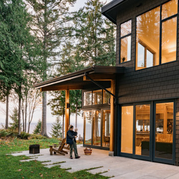
Just north of Seattle, this family home is tucked away on a magical parcel of land within the Edmonds city limits. Designed to maximize the site’s breathtaking views, it is carefully sited to blend into its wooded setting while opening fully to expansive views.
On our first visit, we found a secluded forest glade with stunning vistas of Puget Sound and the Olympic Mountains perched atop a high seaside bluff. Preserving and enhancing this singular landscape as the surrounding neighborhood fills in with development was central to our design.
The approach is intentionally restrained—the home does not reveal itself entirely upon arrival. The house is composed of two wings that cradle the meadow, making it the most important “room.” Interior spaces are oriented towards the lush landscape and impressive views framed by mature trees.
The structures are kept close to the perimeter, leaving the center of the site unbuilt. A covered bridge with a green roof acts as a front porch, linking the upslope garage/office with the main house. A gentle stair flows through the gap between the structures, drawing visitors into the clearing.
The floorplan is highly efficient, carefully tuned to the family’s daily routines. Each room is exactly suited to its purpose, yet no larger than needed.
An open corner with double-height windows creates a jewel-box dining room. Free of a corner structure, the home expands to encompass the covered patio for outdoor cooking and dining, plus easy access to the kitchen, encouraging year-round outdoor living.
Human-scale moments are intentionally created, from a stairway window seat with peekaboo views to a covered outdoor extension of the great room that fosters a cozy relationship between interior and exterior.
Much of the light-filled interior is wrapped in clear-finished fir, giving it a warm glow even on rainy winter days. White oak cabinets and black soapstone countertops add warmth to the kitchen. The built-in furniture in the library loft and the cold-rolled steel fireplace surround were crafted by the owner’s father, an expert woodworker, increasing the connection between the home and its occupants. The second story includes the primary suite with treehouse vibes.
Located on a steep slope in a landslide-prone area, the Edmonds Overlook overcame numerous technical and engineering challenges to address vehicle and fire access, stormwater and erosion mitigation, and potential earth movement.
Green Design:
Compact footprint and conditioned area compared to comparable homes, reducing carbon and ongoing energy use
Green roof at covered entry
Heat-pump air and water heating with multiple zones to maximize efficiency
Whole-house Heat Recovery Ventilation system
Engineered On-Site Stormwater Management System
Landscape restoration using 100% native species, added 47 trees to site, plus meadow plantings
 F9 Productions Inc.
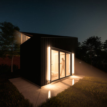
In an era when housing is becoming increasingly scarce, small structures are making a big difference. The Crystal ADU is one of them — a compact, beautifully detailed dwelling designed by F9 Productions to deliver both function and artistry within just 160 square feet.
The Idea
The client came to F9 with their own sketches — early ideas drawn from the fractured symmetry of natural crystals. They envisioned a minimalist refuge that was as expressive as it was efficient.
We took that spark and shaped it into a refined architectural statement: a simple rectangle capped by a striking, asymmetrical roof that catches the light like a cut gem.
Design and Craft
The defining detail — a roof so thin it appears almost weightless — demanded careful problem-solving. Standard framing would have compromised the delicate profile. Instead, our team engineered a custom edge detail that maintains the sleek form while ensuring structural integrity and energy performance.
This kind of precision is what transforms a small project into a showcase of design craft.
Inside the Space
Step inside, and the attention to detail continues.
Every square inch is intentional. Built-in cabinetry wraps the walls, and a fold-down Murphy bed disappears to reveal open living space. In the bathroom, clever storage niches and a tankless water heater make the most of every inch. A skylight above the shower floods the space with natural light — warm, private, and bright.
Efficiency in Every Sense
Compact living comes with natural advantages. The small volume of the Crystal ADU reduces energy use, while a ductless mini-split system maintains comfort year-round.
This simplicity makes the building both efficient and elegant — a perfect reflection of F9’s design philosophy: functional minimalism with a human touch.
The Result
The Crystal ADU shows that size doesn’t define quality — design does.
It’s a small footprint with a big message: that thoughtful architecture can solve real housing challenges while creating spaces people love to inhabit.
The future of housing may be smaller, but with projects like this, it’s infinitely brighter.
 CAST architecture
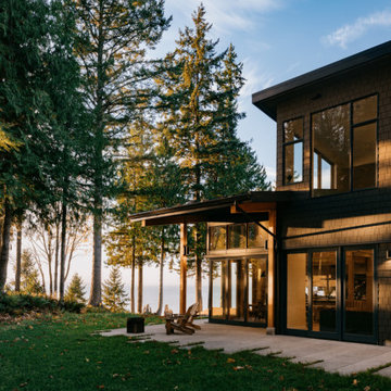
Just north of Seattle, this family home is tucked away on a magical parcel of land within the Edmonds city limits. Designed to maximize the site’s breathtaking views, it is carefully sited to blend into its wooded setting while opening fully to expansive views.
On our first visit, we found a secluded forest glade with stunning vistas of Puget Sound and the Olympic Mountains perched atop a high seaside bluff. Preserving and enhancing this singular landscape as the surrounding neighborhood fills in with development was central to our design.
The approach is intentionally restrained—the home does not reveal itself entirely upon arrival. The house is composed of two wings that cradle the meadow, making it the most important “room.” Interior spaces are oriented towards the lush landscape and impressive views framed by mature trees.
The structures are kept close to the perimeter, leaving the center of the site unbuilt. A covered bridge with a green roof acts as a front porch, linking the upslope garage/office with the main house. A gentle stair flows through the gap between the structures, drawing visitors into the clearing.
The floorplan is highly efficient, carefully tuned to the family’s daily routines. Each room is exactly suited to its purpose, yet no larger than needed.
An open corner with double-height windows creates a jewel-box dining room. Free of a corner structure, the home expands to encompass the covered patio for outdoor cooking and dining, plus easy access to the kitchen, encouraging year-round outdoor living.
Human-scale moments are intentionally created, from a stairway window seat with peekaboo views to a covered outdoor extension of the great room that fosters a cozy relationship between interior and exterior.
Much of the light-filled interior is wrapped in clear-finished fir, giving it a warm glow even on rainy winter days. White oak cabinets and black soapstone countertops add warmth to the kitchen. The built-in furniture in the library loft and the cold-rolled steel fireplace surround were crafted by the owner’s father, an expert woodworker, increasing the connection between the home and its occupants. The second story includes the primary suite with treehouse vibes.
Located on a steep slope in a landslide-prone area, the Edmonds Overlook overcame numerous technical and engineering challenges to address vehicle and fire access, stormwater and erosion mitigation, and potential earth movement.
Green Design:
Compact footprint and conditioned area compared to comparable homes, reducing carbon and ongoing energy use
Green roof at covered entry
Heat-pump air and water heating with multiple zones to maximize efficiency
Whole-house Heat Recovery Ventilation system
Engineered On-Site Stormwater Management System
Landscape restoration using 100% native species, added 47 trees to site, plus meadow plantings
 ZeroEnergy Design
 (ZED) created this modern home for a progressive family in the desirable community of Lexington.
Thoughtful Land Connection. The residence is carefully sited on the infill lot so as to create privacy from the road and neighbors, while cultivating a side yard that captures the southern sun. The terraced grade rises to meet the house, allowing for it to maintain a structured connection with the ground while also sitting above the high water table. The elevated outdoor living space maintains a strong connection with the indoor living space, while the stepped edge ties it back to the true ground plane. Siting and outdoor connections were completed by ZED in collaboration with landscape designer Soren Deniord Design Studio.
Exterior Finishes and Solar. The exterior finish materials include a palette of shiplapped wood siding, through-colored fiber cement panels and stucco. A rooftop parapet hides the solar panels above, while a gutter and site drainage system directs rainwater into an irrigation cistern and dry wells that recharge the groundwater.
Cooking, Dining, Living. Inside, the kitchen, fabricated by Henrybuilt, is located between the indoor and outdoor dining areas. The expansive south-facing sliding door opens to seamlessly connect the spaces, using a retractable awning to provide shade during the summer while still admitting the warming winter sun. The indoor living space continues from the dining areas across to the sunken living area, with a view that returns again to the outside through the corner wall of glass.
Accessible Guest Suite. The design of the first level guest suite provides for both aging in place and guests who regularly visit for extended stays. The patio off the north side of the house affords guests their own private outdoor space, and privacy from the neighbor. Similarly, the second level master suite opens to an outdoor private roof deck.
Light and Access. The wide open interior stair with a glass panel rail leads from the top level down to the well insulated basement. The design of the basement, used as an away/play space, addresses the need for both natural light and easy access. In addition to the open stairwell, light is admitted to the north side of the area with a high performance, Passive House (PHI) certified skylight, covering a six by sixteen foot area. On the south side, a unique roof hatch set flush with the deck opens to reveal a glass door at the base of the stairwell which provides additional light and access from the deck above down to the play space.
Energy. Energy consumption is reduced by the high performance building envelope, high efficiency mechanical systems, and then offset with renewable energy. All windows and doors are made of high performance triple paned glass with thermally broken aluminum frames. The exterior wall assembly employs dense pack cellulose in the stud cavity, a continuous air barrier, and four inches exterior rigid foam insulation. The 10kW rooftop solar electric system provides clean energy production. The final air leakage testing yielded 0.6 ACH 50 - an extremely air tight house, a testament to the well-designed details, progress testing and quality construction. When compared to a new house built to code requirements, this home consumes only 19% of the energy.
Architecture & Energy Consulting: ZeroEnergy Design
Landscape Design: Soren Deniord Design
Paintings: Bernd Haussmann Studio
Photos: Eric Roth Photography
 Tile Doctor Ltd
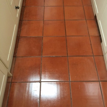
Terracotta is an interesting type of stone manufactured using a variety of techniques dependant on the country of origin which leads to a number of differences such as Spanish Terracotta being less porous than its Mexican counterpart: the former is semi-hand made and finished in a factory kiln, while the latter is completely handmade. Spanish Terracotta is therefore a lot less than porous and ultimately, of a higher quality.
But despite the Spanish Terracotta being less porous, and therefore being less prone to ingrained dirt, it still, like any other stone, needs regular maintenance to keep it looking smart. In the tiling trade, we quite often refer to this as a good old fashioned ‘Clean and Seal’ and this is exactly what was requested by this property owner in Halifax, for their Spanish Terracotta tiled floors in the kitchen and adjacent hallway.
I cleaned both sets of Terracotta tiles using the same process, which involved the application of our reliable alkaline cleaner known as Tile a Doctor Pro Clean, diluted with five parts of warm water. Once the solution had been left to dwell for a short period, it was scrubbed into the tiles to remove all dust, dirt, and general muck. This created a slurry of cleaning residue, which I promptly soaked up using a wet vac. A wet vac machine is an essential tool when it comes to cleaning porous tiles since, unlike a traditional mop and bucket, it sucks the excess trapped dirt out of the clay and thus provides a superior clean.
Following this, I applied a small amount of our heavy duty remover, known as Tile Doctor Remove & Go, to deal with some of the more stubborn stains and paint splashes, before rinsing with clean water and wet vaxing in a similar fashion to before.
Once the clean had been completed I left the tiles to dry completely. This can take 12 to 24 hours depending on numerous factors including whether a Damp proof Membrane and underfloor heating has been installed which can really help reduce drying times. Letting the tiles dry completely before sealing is paramount as moisture can cloud the sealer and affect its performance.
Upon my return to the property I ran some quick damp tests, which revealed the tiles were ready to be sealed. I then applied several coats of Tile Doctor Seal and Go, our topical sealer which provides a satin finish and accentuates colour. A new coat of this product is recommended every six months on Terracotta to ensure the continuous protection of the tiles’ soft clay particles.
My customer was extremely pleased with her refreshed Terracotta tiles. It goes to show what a big difference a bit of regular maintenance can make. I advised the customer that an everyday cleaner called Tile Doctor pH Neutral cleaner can also be used regularly to keep the tiles looking great without damaging the sealer.
Nigel Stoker
North West Yorkshire Tile Doctor
6