
Search results for "Reduce rug" in Home Design Ideas
 Everything Home
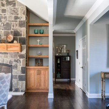
We closed off the open formal dining room, so it became a den with artistic barn doors, which created a more private entrance/foyer. We removed the wall between the kitchen and living room, including the fireplace, to create a great room. We also closed off an open staircase to build a wall with a dual focal point — it accommodates the TV and fireplace. We added a double-wide slider to the sunroom turning it into a happy play space that connects indoor and outdoor living areas.
We reduced the size of the entrance to the powder room to create mudroom lockers. The kitchen was given a double island to fit the family’s cooking and entertaining needs, and we used a balance of warm (e.g., beautiful blue cabinetry in the kitchen) and cool colors to add a happy vibe to the space. Our design studio chose all the furnishing and finishes for each room to enhance the space's final look.
Builder Partner – Parsetich Custom Homes
Photographer - Sarah Shields
---
Project completed by Wendy Langston's Everything Home interior design firm, which serves Carmel, Zionsville, Fishers, Westfield, Noblesville, and Indianapolis.
For more about Everything Home, click here: https://everythinghomedesigns.com/
To learn more about this project, click here:
https://everythinghomedesigns.com/portfolio/hard-working-haven/
 Everything Home
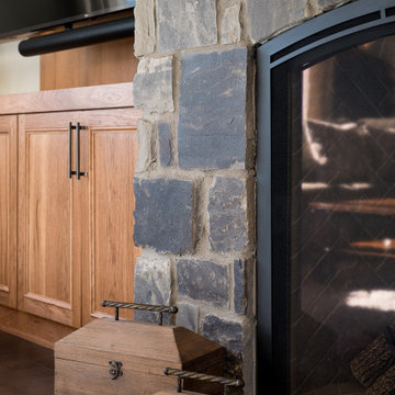
We closed off the open formal dining room, so it became a den with artistic barn doors, which created a more private entrance/foyer. We removed the wall between the kitchen and living room, including the fireplace, to create a great room. We also closed off an open staircase to build a wall with a dual focal point — it accommodates the TV and fireplace. We added a double-wide slider to the sunroom turning it into a happy play space that connects indoor and outdoor living areas.
We reduced the size of the entrance to the powder room to create mudroom lockers. The kitchen was given a double island to fit the family’s cooking and entertaining needs, and we used a balance of warm (e.g., beautiful blue cabinetry in the kitchen) and cool colors to add a happy vibe to the space. Our design studio chose all the furnishing and finishes for each room to enhance the space's final look.
Builder Partner – Parsetich Custom Homes
Photographer - Sarah Shields
---
Project completed by Wendy Langston's Everything Home interior design firm, which serves Carmel, Zionsville, Fishers, Westfield, Noblesville, and Indianapolis.
For more about Everything Home, click here: https://everythinghomedesigns.com/
To learn more about this project, click here:
https://everythinghomedesigns.com/portfolio/hard-working-haven/

 Custom Surface Solutions
 (www.css-tile.com) - Owner Craig Thompson (512) 430-1215. This project shows the remodel of a small 1950's vintage home master bathroom. 8"" x 18" Calcutta gold marble tile was used on the shower walls and floor wall base and ceramic gray penny tile on the floor. Shower includes curbless pan / floor, dual shower boxes, frameless glass slider, trough duel fixture sink and chrome fixtures.
Find the right local pro for your project
 Lighting EVER
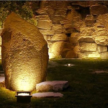
Save electricity bill. Replace 100W halogen bulb by 10W LED. Save 90% on electricity bill of lighting
Maintenance Free. Extremely long life reduces re-lamp frequency. Save labor cost to replace bulbs with short lifespan.
Wide beam angle. Create super bright, shadow-free security and wide beam distribution for general purpose flood lighting.
Waterproof. IP66.
Totally flexible solution. Fixtures come with a yoke-style arm can be positioned in almost any angle and a variety of application settings.
Ultra-compact size. One-piece housing measuring only 4.71 x 5 x 1.44 inches.
Durable housing. Rugged die-cast aluminum, scratch and fade resistant. Excellent appearance.
Tempered Glass. Safe and extremely high light transmittance.
Eco-Friendly. No lead or mercury.
No Hazardous Emissions. No UV or IR Radiation.
Input Voltage: 100-240 V AC.
Length of the cable: 5.9-11.8 inches.
Ideal for stadiums, squares, billboards, parking lots, building exterior wall, etc.

 Melinda Mandell Interior Design
This bedroom was designed to reduce stress and support healing for families and their children with critical illnesses. We used soothing blues, bright greens, and red accents to create a sense of home, of safety, and of hope. We referenced water, animals, and nature - universal themes. The star of this corner is the vintage writing desk which we sourced from Etsy and had refinished in a Benjamin Moore blue.
The furniture and fabrics are all durable and comfortable, and include: custom headboards in Romo fabric, Baker Furniture, McGuire Furniture, a vintage writing desk, Robert Allen Furniture and fabrics, Lee Jofa textiles, lighting from Circa Lighting and Sonneman, custom roman shades in Robert Allen fabric, a low-profile rug from J.D. Staron, and bedding from Serena & Lily.
We are honored that Melinda Mandell Interior Design was selected to participate in “Where Hope Has a Home” at the Stanford Ronald McDonald House.
We believe in creating safe, nurturing, and healing spaces for all families!
 Melinda Mandell Interior Design
This bedroom was designed to reduce stress and support healing for families and their children with critical illnesses. We used soothing blues, bright greens, and red accents to create a sense of home, of safety, and of hope. We referenced water, animals, and nature - universal themes. The star of this corner is the bright green chair - perfect for reading books with a little one - with a bright blue pillow in Lee Jofa fabric, and a gorgeous walnut side table by Dylan Design Co.
The furniture and fabrics are all durable and comfortable, and include: custom tufted headboard in Robert Allen fabric, Robert Allen bench, The New Traditionalists dresser via Chairish, lighting from Sonneman and Circa Lighting and custom drapery in Romo fabric, a low-profile rug from J.D. Staron, and bedding from Serena & Lily.
We are honored that Melinda Mandell Interior Design was selected to participate in “Where Hope Has a Home” at the Stanford Ronald McDonald House.
We believe in creating safe, nurturing, and healing spaces for all families!
 User
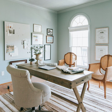
With all of the various entry-ways into the office, we took the opportunity to have the desk be free-standing. This desk in particular is one of our favorites because of the size and design.
Sponsored
Columbus, OH

Wannemacher Interiors
Customized Award-Winning Interior Design Solutions in Franklin Cnty OH
 User
Anchored by the homeowner’s 42-foot-long painting, the interiors of this Palm Springs residence were designed to showcase the owner’s art collection, and create functional spaces for daily living that can be easily adapted for large social gatherings.
Referencing the environment and architecture in both form and material, the finishes and custom furnishings bring the interior to life. Alluding to the roofs that suspend over the building, the sofas seem to hover above the carpets while the knife-edge table top appears to float above a metal base. Bleached and cerused wood mimic the “desert effect” that would naturally occur in this environment, while the textiles on the sofa are the same shade as the rocks of the landscape.
Monolithic concrete floors connect all of the spaces while concealing mechanical systems, and stone thresholds signal vertical level changes and exterior transitions. Large wall masses provide the optimal backdrop for the homeowner’s oversized art. The wall structures ground the interior, while the opposing expanses of glass frame the desert views. The location and use of operable doors and windows allows the house to naturally ventilate, reducing cooling loads. The furnishings create spaces in an architectural fashion.
Designed and fabricated for flexibility, the pieces easily accommodate the owners’ large social gatherings. The dining table can be split into two and the sofas can be pushed out along the walls, opening the center of the space to entertain. The design of the interior spaces and furnishings seamlessly integrates the setting, architecture, artwork and spaces into a cohesive whole.
 TKS Design Group
Download our free ebook, Creating the Ideal Kitchen. DOWNLOAD NOW
This family from Wheaton was ready to remodel their kitchen, dining room and powder room. The project didn’t call for any structural or space planning changes but the makeover still had a massive impact on their home. The homeowners wanted to change their dated 1990’s brown speckled granite and light maple kitchen. They liked the welcoming feeling they got from the wood and warm tones in their current kitchen, but this style clashed with their vision of a deVOL type kitchen, a London-based furniture company. Their inspiration came from the country homes of the UK that mix the warmth of traditional detail with clean lines and modern updates.
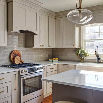
To create their vision, we started with all new framed cabinets with a modified overlay painted in beautiful, understated colors. Our clients were adamant about “no white cabinets.” Instead we used an oyster color for the perimeter and a custom color match to a specific shade of green chosen by the homeowner. The use of a simple color pallet reduces the visual noise and allows the space to feel open and welcoming. We also painted the trim above the cabinets the same color to make the cabinets look taller. The room trim was painted a bright clean white to match the ceiling.
In true English fashion our clients are not coffee drinkers, but they LOVE tea. We created a tea station for them where they can prepare and serve tea. We added plenty of glass to showcase their tea mugs and adapted the cabinetry below to accommodate storage for their tea items. Function is also key for the English kitchen and the homeowners. They requested a deep farmhouse sink and a cabinet devoted to their heavy mixer because they bake a lot. We then got rid of the stovetop on the island and wall oven and replaced both of them with a range located against the far wall. This gives them plenty of space on the island to roll out dough and prepare any number of baked goods. We then removed the bifold pantry doors and created custom built-ins with plenty of usable storage for all their cooking and baking needs.
The client wanted a big change to the dining room but still wanted to use their own furniture and rug. We installed a toile-like wallpaper on the top half of the room and supported it with white wainscot paneling. We also changed out the light fixture, showing us once again that small changes can have a big impact.
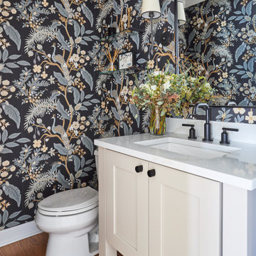
As the final touch, we also re-did the powder room to be in line with the rest of the first floor. We had the new vanity painted in the same oyster color as the kitchen cabinets and then covered the walls in a whimsical patterned wallpaper. Although the homeowners like subtle neutral colors they were willing to go a bit bold in the powder room for something unexpected. For more design inspiration go to: www.kitchenstudio-ge.com
 Melinda Mandell Interior Design
This sitting room was designed to reduce stress and support healing for families and their children with critical illnesses. We used neutral textures, bright blues and aquas, and muted reds to create a sense of home, of safety, and of hope. We referenced water, animals, and nature - universal themes. The star of the room is the Black Crow Studios custom mural watercolor wallpaper.
The furniture and fabrics are all durable and comfortable, and include: custom Kravet pierced sheer drapery, Kravet chrome lounge chair and narrow coffee table, custom curved back sofa, a J.D. Staron wool loop rug, floor lamp and desk lamp from Circa Lighting, floral photography art by Kari Herer, kids table and raffia console from Serena & Lily, and beautiful Italian desk from Modern Resale.
We are honored that Melinda Mandell Interior Design was selected to participate in “Where Hope Has a Home” at the Stanford Ronald McDonald House.
We believe in creating safe, nurturing, and healing spaces for all families!
 TKS Design Group
Download our free ebook, Creating the Ideal Kitchen. DOWNLOAD NOW
This family from Wheaton was ready to remodel their kitchen, dining room and powder room. The project didn’t call for any structural or space planning changes but the makeover still had a massive impact on their home. The homeowners wanted to change their dated 1990’s brown speckled granite and light maple kitchen. They liked the welcoming feeling they got from the wood and warm tones in their current kitchen, but this style clashed with their vision of a deVOL type kitchen, a London-based furniture company. Their inspiration came from the country homes of the UK that mix the warmth of traditional detail with clean lines and modern updates.
To create their vision, we started with all new framed cabinets with a modified overlay painted in beautiful, understated colors. Our clients were adamant about “no white cabinets.” Instead we used an oyster color for the perimeter and a custom color match to a specific shade of green chosen by the homeowner. The use of a simple color pallet reduces the visual noise and allows the space to feel open and welcoming. We also painted the trim above the cabinets the same color to make the cabinets look taller. The room trim was painted a bright clean white to match the ceiling.
In true English fashion our clients are not coffee drinkers, but they LOVE tea. We created a tea station for them where they can prepare and serve tea. We added plenty of glass to showcase their tea mugs and adapted the cabinetry below to accommodate storage for their tea items. Function is also key for the English kitchen and the homeowners. They requested a deep farmhouse sink and a cabinet devoted to their heavy mixer because they bake a lot. We then got rid of the stovetop on the island and wall oven and replaced both of them with a range located against the far wall. This gives them plenty of space on the island to roll out dough and prepare any number of baked goods. We then removed the bifold pantry doors and created custom built-ins with plenty of usable storage for all their cooking and baking needs.
The client wanted a big change to the dining room but still wanted to use their own furniture and rug. We installed a toile-like wallpaper on the top half of the room and supported it with white wainscot paneling. We also changed out the light fixture, showing us once again that small changes can have a big impact.
As the final touch, we also re-did the powder room to be in line with the rest of the first floor. We had the new vanity painted in the same oyster color as the kitchen cabinets and then covered the walls in a whimsical patterned wallpaper. Although the homeowners like subtle neutral colors they were willing to go a bit bold in the powder room for something unexpected. For more design inspiration go to: www.kitchenstudio-ge.com

 Dion Designs
Kitchen update/redesign. The goal with this kitchen was to unite both rooms, visually heighten the ceilings and to make the room feel inviting, interesting and larger. We accomplished this by neutralizing the walls and ceilings in both rooms. The original soffits were reduced and pushed back to the cabinets, trimmed and painted to match the cabinets and new can lights were placed in the ceiling. The before photo of the kitchen shows a hint of what the old soffits looked like. They originally extended about a foot beyond and in front of the cabinets. The original soffits were housing can lights. Because they lights were physically lower than the ceiling, the ceiling height felt right on top of you. By pushing back the soffits and installing the lights into the ceiling the room now feels much bigger and taller. We added visual weight and interest to the eat-in area and balanced both rooms. The beautiful outdoors is now framed with new sliding doors which replaced the bay window in the before shot. Using a dark color to frame the outside of the sliding doors lengthens the room and draws interest and visual weight to the eat-in side of the Kitchen. This kitchen and owner were truly a delight to work with.
Gary G. Schempp www.garygschempp.com
 TKS Design Group
Several years ago, Jill and Brian remodeled their kitchen with TKS Design Group and recently decided it was time to look at a primary bath remodel.
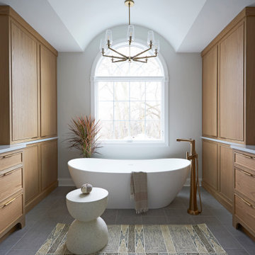
Jill and Brian wanted a completely fresh start. We tweaked the layout slightly by reducing the size of the enormous tub deck and expanding the vanities and storage into the old tub deck zone as well as pushing a bit into the awkward carpeted dressing area. By doing so, we were able to substantially expand the existing footprint of the shower. We also relocated the French doors so that the bath would take advantage of the light brought in by the skylight in that area. A large arched window was replaced with a similar but cleaner lined version, and we removed the large bulkhead and columns to open the space. A simple freestanding tub now punctuates the area under the window and makes for a pleasing focal point. Subtle but significant changes.
We chose a neutral gray tile for the floor to ground the space, and then white oak cabinetry and gold finishes bring warmth to the pallet. The large shower features a mix of white and gray tile where an electronic valve system offers a bit of modern technology and customization to bring some luxury to the everyday. The bathroom remodel also features plenty of storage that keeps the everyday necessities tucked away. The result feels modern, airy and restful!
Sponsored
Sunbury, OH

J.Holderby - Renovations
Franklin County's Leading General Contractors - 2X Best of Houzz!

 Margaret Wilson & Company Inc.
Classic design. Graceful, elegant, refined.
Living / Music Room.
Photo Credit: Laura S. Wilson http://lauraswilson.com

 Rodwin Architecture & Skycastle Construction
Rodwin Architecture and Skycastle Homes
Location: Boulder, CO, United States
We recently completed the design and construction of this beautiful 3800 s.f. contemporary Colorado mountain home, above the foothills of Boulder. We designed the house to maximize the sweeping views of Indian Peaks mountain range, while simultaneously optimizing passive solar design. The open floor plan brings natural light and passive cooling into every part of the house; the vaulted ceilings create an airy, sunny feeling. Every room opens to generous patios and decks to facilitate easy indoor/outdoor living. White Oak floors, granite counters and local flagstone finishes lend a warm modern texture to the home. We carefully preserved one hand-built quartz wall that was part of the house that formerly occupied the site, and restored the original adjacent homestead, successfully receiving Historic Landmark designation. This very energy efficient home (HERS 40 – uses 60% less energy than allowed by code), uses solar–photovoltaics, foam insulation, Energy Star windows & appliances, LED lighting, and a high-efficiency mechanical system. It uses EPA Watersense plumbing fixtures and Xeric landscaping to dramatically reduce water

 Storey Design
Photo Credit: Helynn Ospina
Inspiration for a mid-century modern living room remodel in San Francisco
Inspiration for a mid-century modern living room remodel in San Francisco
 Cornerstone Builders Inc.
Aging in Place Primary Living Suite
When designing their forever home, the owners envisioned a space that would adapt to their changing needs over time—a sanctuary where they could gracefully age in place without sacrificing comfort or independence. This vision came to life in a thoughtfully designed primary living suite that blends functionality, accessibility, and warmth.
Bedroom: The bedroom is a peaceful retreat, anchored by wide pathways and minimal thresholds to allow easy navigation—whether on foot, with a walker, or in a wheelchair. The flooring is smooth, non-slip hardwood with area rugs secured safely to avoid tripping hazards. The bed itself sits at a height optimized for ease of getting in and out, with plenty of clearance underneath for future lift systems if needed.
Living Area: The adjacent living space provides a cozy, flexible area for reading, television, and visiting with family or caregivers. Furniture is arranged to allow for clear walking paths and easy transfer from chairs. Windows bring in natural light, reducing eye strain and lifting the mood.
Bathroom: The en suite bathroom is the true heart of the aging-in-place design. A zero-threshold, roll-in shower with grab bars and a handheld showerhead allows for seated or standing use. The toilet is comfort-height with adjacent grab bars and enough surrounding space to accommodate mobility aids. Non-slip tile covers the floor.
Design Intent: The homeowners were deeply intentional about creating a space that allowed them to maintain independence and dignity as they aged. They consulted with a Certified Aging-in-Place Specialist (CAPS) and incorporated universal design principles throughout the suite.
Ultimately, this primary suite reflects the couple's commitment to staying in the home they love, surrounded by familiarity and comfort, with peace of mind knowing their space is ready for whatever the future brings.


 ZeroEnergy Design
This LEED Platinum certified house reflects the homeowner's desire for an exceptionally healthy and comfortable living environment, within a traditional neighborhood.
INFILL SITE. The family, who moved from another area of Wellesley, sought out this property to be within walking distance of the high school and downtown area. An existing structure on the tight lot was removed to make way for the new home. 84% of the construction waste, from both the previous structure and the new home, was diverted from a landfill. ZED designed to preserve the existing mature trees on the perimeter of the property to minimize site impacts, and to maintain the character of the neighborhood as well as privacy on the site.
EXTERIOR EXPRESSION. The street facade of the home relates to the local New England vernacular. The rear uses contemporary language, a nod to the family’s Californian roots, to incorporate a roof deck, solar panels, outdoor living space, and the backyard swimming pool. ZED’s careful planning avoided to the need to face the garage doors towards the street, a common syndrome of a narrow lot.
THOUGHTFUL SPACE. Homes with dual entries can often result in duplicate and unused spaces. In this home, the everyday and formal entry areas are one and the same; the front and garage doors share the entry program of coat closets, mudroom storage with bench for removing your shoes, and a laundry room with generous closets for the children's sporting equipment. The entry area leads directly to the living space, encompassing the kitchen, dining and sitting area areas in an L-shaped open plan arrangement. The kitchen is placed at the south-west corner of the space to allow for a strong connection to the dining, sitting and outdoor living spaces. A fire pit on the deck satisfies the family’s desire for an open flame while a sealed gas fireplace is used indoors - ZED’s preference after omitting gas burning appliances completely from an airtight home. A small study, with a window seat, is conveniently located just off of the living space. A first floor guest bedroom includes an accessible bathroom for aging visitors and can be used as a master suite to accommodate aging in place.
HEALTHY LIVING. The client requested a home that was easy to clean and would provide a respite from seasonal allergies and common contaminants that are found in many indoor spaces. ZED selected easy to clean solid surface flooring throughout, provided ample space for cleaning supplies on each floor, and designed a mechanical system with ventilation that provides a constant supply of fresh outdoor air. ZED selected durable materials, finishes, cabinetry, and casework with low or no volatile organic compounds (VOCs) and no added urea formaldehyde.
YEAR-ROUND COMFORT. The home is super insulated and air-tight, paired with high performance triple-paned windows, to ensure it is draft-free throughout the winter (even when in front of the large windows and doors). ZED designed a right-sized heating and cooling system to pair with the thermally improved building enclosure to ensure year-round comfort. The glazing on the home maximizes passive solar gains, and facilitates cross ventilation and daylighting.
ENERGY EFFICIENT. As one of the most energy efficient houses built to date in Wellesley, the home highlights a practical solution for Massachusetts. First, the building enclosure reduces the largest energy requirement for typical houses (heating). Super-insulation, exceptional air sealing, a thermally broken wall assembly, triple pane windows, and passive solar gain combine for a sizable heating load reduction. Second, within the house only efficient systems consume energy. These include an air source heat pump for heating & cooling, a heat pump hot water heater, LED lighting, energy recovery ventilation, and high efficiency appliances. Lastly, photovoltaics provide renewable energy help offset energy consumption. The result is an 89% reduction in energy use compared to a similar brand new home built to code requirements.
RESILIENT. The home will fare well in extreme weather events. During a winter power outage, heat loss will be very slow due to the super-insulated and airtight envelope– taking multiple days to drop to 60 degrees even with no heat source. An engineered drainage system, paired with careful the detailing of the foundation, will help to keep the finished basement dry. A generator will provide full operation of the all-electric house during a power outage.
OVERALL. The home is a reflection of the family goals and an expression of their values, beautifully enabling health, comfort, safety, resilience, and utility, all while respecting the planet.
ZED - Architect & Mechanical Designer
Bevilacqua Builders Inc - Contractor
Creative Land & Water Engineering - Civil Engineering
Barbara Peterson Landscape - Landscape Design
Nest & Company - Interior Furnishings
Eric Roth Photography - Photography

 Nathan Taylor for Obelisk Home
The interior of the home went from Colonial to Classic Lodge without changing the footprint of the home. Columns were removed, fur downs removed that defined space, fireplace relocated, kitchen layout and direction changed, breakfast room and sitting room flip flopped, study reduced in size, entry to master bedroom changed, master suite completely re-arranged and enlarged, custom hand railing designed to open up stairwell, hardwood added to stairs, solid knotty alder 8’ doors added, knotty alder crown moldings added, reclaimed beamed ceiling grid, tongue and groove ceiling in kitchen, knotty alder cabinetry, leather finish to granite, seeded glass insets, custom door to panty to showcase an antique stained glass window from childhood church, custom doors and handles made for study entry, shredded straw added to wall texture, custom glazing done to all walls, wood floor remnants created an antique quilt pattern for the back wall of the powder bath, custom wall treatment created by designer, and a mixture of new and antique furnishing were added, all to create a warm, yet lived in feeling for this special family.
A new central stone wall reversed with an over scaled fireplace and reclaimed flooring from the East became the anchor for this level of the home. Removing all the “divisions” of space and using a unified surface made unused rooms, part of the daily living for this family. The desire to entertain large group in a unified space, yet still feel like you are in a cozy environment was the driving force for removing divisions of space.
Photos by Randy Colwell

 Techo-Bloc
This backyard patio design is inspired by our Blu 60 Slate patio slab. The best-selling Blu slate patio slab was inspired by natural slate stone. This traditional patio stone comes in multiple sizes for your backyard pool decks, patios & walkways. The same lines and rugged texture as our thicker Blu paver, the same opulent colors and traditional look, Blu 60 Slate slab is the choice for pedestrian areas such as on walkways and patios. Check out our website to shop the look! https://www.techo-bloc.com/shop/slabs/blu-60-slate/
25