
Search results for "Reduce same origin" in Home Design Ideas
 HUNTER DOUGLAS-LNG BLINDS
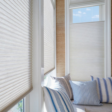
DUETTE® Honeycomb Shades
The Original Energy-Efficient Honeycomb Shade
An innovative window treatment that looks beautiful and insulates your home all year round, Duette® Honeycomb Shades were the first cellular shades, specially engineered to provide energy efficiency at the window in both cold and warm climates. Their specially engineered honeycomb construction traps air in distinct pockets, which creates insulation that can help lower your energy consumption and energy bills.
Decorate every kind of window you have—even tricky skylights and unusually shaped panes—with Duette. Our signature honeycomb shades are one of our most versatile options and beautify every kind of interior.
Key Features
Premium Design & Style—Explore the richness of texture and warmth offered by The Alustra® Collection of Duette, a thoughtfully curated suite of exclusive design-inspired fabrics, textures, colors and hardware created to meet the expectations of leading designers and discerning consumers who seek the best in design.
Largest Selection in the Industry—Explore the widest selection of cellular pleat sizes, opacities, colors, textures and operating systems. Duette shades can also accommodate many specialty shaped windows, even tricky skylights.
Energy-Efficiency—Studies show that windows are responsible for up to 30% of your home’s energy losses. Duette shades trap air in distinct pockets, creating exceptional insulation. Our latest innovation, Duette Architella®, features a honeycomb-within-a-honeycomb design for even greater energy efficiency.
Room Darkening—The LightLock™ system, the newest iteration from Duette, is the first operating system of its kind to offer unparalleled darkness. The secret lies within the patent-pending side channel design, optimized to absorb or deflect nearly all incoming light.
Durability—All of our high-performing fabrics are resistant to fading and will maintain their crisp, neat pleats over time.
Vertical Application—For doors that need extra insulation, the Duette Vertiglide™ operating system is the ideal option. It’s designed for vertical applications and uses the same fabrics as your horizontal Duette shades. Use one shade to cover the entire expanse of a sliding door, or, cover the door with a split stack Vertiglide shade, with each side operating independently.
Sound Absorption—Improve your room’s acoustics while reducing the intensity of outside sound. Duette Honeycomb Shades absorb up to 70% of sound energy, creating a more quiet, tranquil room.
LNG Blinds
19 Addison Pl
Valley Stream, NY 11580
Call Us (516) 593-0044
#homesweethome #homedecor #lovemyhome #barenecessities #windows #instastyle #instadesign #interiordesign
#blinds #privacy #embellishment #instahomes #propertyowner #renovation #customblindsbydesign #hunterdouglas #showcase #displays #windowtreatments #windowcoverings #shades #shutters #drapery #interiors #decor
 The Decorating Therapist
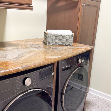
Like many modern homes, this family's primary entrance is through the garage, making the laundry and mudroom an essential part of everyday life. Rather than treating it as a purely utilitarian space, the renovation transformed the room into a beautiful, highly functional transition area that welcomes the homeowner with the same level of design and craftsmanship found throughout the rest of the home. Thoughtful cabinetry, durable finishes, and refined details prove that hardworking spaces can be both practical and luxurious.
In keeping with the project's commitment to sustainable luxury and thoughtful resourcefulness, the natural stone countertop from the original kitchen island was repurposed for the laundry room. Reusing this premium material not only reduced waste but also introduced the elegance and durability of natural stone into a hardworking space. The result is a custom laundry room that combines timeless design, environmental responsibility, and everyday functionality—demonstrating that luxury is as much about thoughtful planning as it is about beautiful materials.
 Ellen Farber Strategic Design
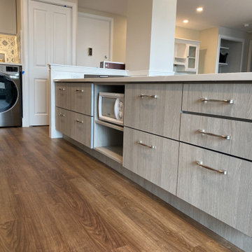
Pictured here is a closeup of the microwave and island storage which includes 4 pantry drawers, under cabinet microwave, drawers for pots and pans easily located near the cooktop and drawers for kitchen supplies, napkins, and other items. The kitchen was originally planned to mimic the location of appliances in her current kitchen to minimize re-learning of appliance locations. The only change was adding a trash cabinet between the fridge and the sink. A french door fridge allows someone in a wheelchair to easily access frozen and cold foods, while the water and ice dispenser on the outside of the door make it easy to stay hydrated rather than using the sink each time. She can roll up to the kitchen sink due to the recessed cabinetry under the sink or stand at counter height to put away dishes from the dishwasher. The dishwasher is ADA and very simple to use , and is raised off the floor so whether she is sitting or standing it's easier to reach. The gas cooktop has controls at the front making it easy to reach from the wheelchair and the exhaust fan above also has a control at the front. All cabinet door handles are D-shape, which makes them easy to grasp and there is plenty of electric outlets for charging phones, computers and small appliances. The kitchen island is table height at 30" so meal prep can be easily done in a wheelchair while guests and can be seated in a chair or wheelchair around the island. The dining chairs can also be turned around to add extra seating in the living room area. Pendant lights above the kitchen island light up the space, while recessed lighting in the kitchen and living room provide overall room lighting. There is also under cabinet lighting which makes the room glow at night! Wainscoting made of commercial grade material is strategically placed on sharp corners and exposed walls to reduce and minimize damage from the wheel chair, while creating a finished and complete look! We selected a free standing microwave to sit below the island, which is easy to use and is the same style as in her previous apartment. The island is 48" from the appliance wall, leaving ample space to open doors and maneuver around in the wheelchair and has easy access to the laundry area as well. We eliminated the pocket doors that had been in front of the laundry area for easy access, and since it was exposed, dressed it up with coordinating tile to the kitchen with additional cabinets above. There is a coordinating quartz counter on top of the washer and dryer for folding laundry or storing additional supplies.
Find the right local pro for your project
 The Decorating Therapist
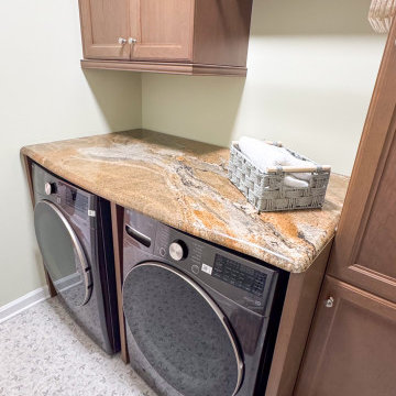
Like many modern homes, this family's primary entrance is through the garage, making the laundry and mudroom an essential part of everyday life. Rather than treating it as a purely utilitarian space, the renovation transformed the room into a beautiful, highly functional transition area that welcomes the homeowner with the same level of design and craftsmanship found throughout the rest of the home. Thoughtful cabinetry, durable finishes, and refined details prove that hardworking spaces can be both practical and luxurious.
In keeping with the project's commitment to sustainable luxury and thoughtful resourcefulness, the natural stone countertop from the original kitchen island was repurposed for the laundry room. Reusing this premium material not only reduced waste but also introduced the elegance and durability of natural stone into a hardworking space. The result is a custom laundry room that combines timeless design, environmental responsibility, and everyday functionality—demonstrating that luxury is as much about thoughtful planning as it is about beautiful materials.
 Katie Hutchison Studio
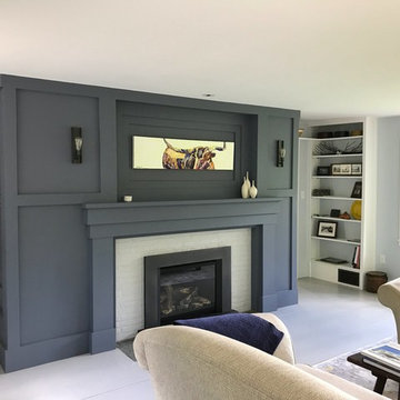
The new owners of this house in Harvard, Massachusetts loved its location and authentic Shaker characteristics, but weren’t fans of its curious layout. A dated first-floor full bathroom could only be accessed by going up a few steps to a landing, opening the bathroom door and then going down the same number of steps to enter the room. The dark kitchen faced the driveway to the north, rather than the bucolic backyard fields to the south. The dining space felt more like an enlarged hall and could only comfortably seat four. Upstairs, a den/office had a woefully low ceiling; the master bedroom had limited storage, and a sad full bathroom featured a cramped shower.
KHS proposed a number of changes to create an updated home where the owners could enjoy cooking, entertaining, and being connected to the outdoors from the first-floor living spaces, while also experiencing more inviting and more functional private spaces upstairs.
On the first floor, the primary change was to capture space that had been part of an upper-level screen porch and convert it to interior space. To make the interior expansion seamless, we raised the floor of the area that had been the upper-level porch, so it aligns with the main living level, and made sure there would be no soffits in the planes of the walls we removed. We also raised the floor of the remaining lower-level porch to reduce the number of steps required to circulate from it to the newly expanded interior. New patio door systems now fill the arched openings that used to be infilled with screen. The exterior interventions (which also included some new casement windows in the dining area) were designed to be subtle, while affording significant improvements on the interior. Additionally, the first-floor bathroom was reconfigured, shifting one of its walls to widen the dining space, and moving the entrance to the bathroom from the stair landing to the kitchen instead.
These changes (which involved significant structural interventions) resulted in a much more open space to accommodate a new kitchen with a view of the lush backyard and a new dining space defined by a new built-in banquette that comfortably seats six, and -- with the addition of a table extension -- up to eight people.
Upstairs in the den/office, replacing the low, board ceiling with a raised, plaster, tray ceiling that springs from above the original board-finish walls – newly painted a light color -- created a much more inviting, bright, and expansive space. Re-configuring the master bath to accommodate a larger shower and adding built-in storage cabinets in the master bedroom improved comfort and function. A new whole-house color palette rounds out the improvements.
Photos by Katie Hutchison
 HUNTER DOUGLAS-LNG BLINDS
DUETTE® Honeycomb Shades
THE ORIGINAL ENERGY-EFFICIENT HONEYCOMB SHADE
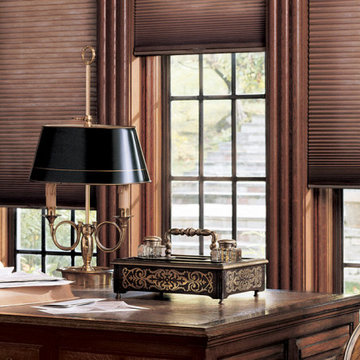
An innovative window treatment that looks beautiful and insulates your home all year round, Duette® Honeycomb Shades were the first cellular shades, specially engineered to provide energy efficiency at the window in both cold and warm climates. Their specially engineered honeycomb construction traps air in distinct pockets, which creates insulation that can help lower your energy consumption and energy bills.
Decorate every kind of window you have—even tricky skylights and unusually shaped panes—with Duette. Our signature honeycomb shades are one of our most versatile options and beautify every kind of interior.
KEY FEATURES
Room Darkening—The LightLock™ system, the newest iteration from Duette, is the first operating system of its kind to offer unparalleled darkness. The secret lies within the patent-pending side channel design, optimized to absorb or deflect nearly all incoming light.
Durability—All of our high-performing fabrics are resistant to fading and will maintain their crisp, neat pleats over time.
Vertical Application—For doors that need extra insulation, the Duette Vertiglide™ operating system is the ideal option. It’s designed for vertical applications and uses the same fabrics as your horizontal Duette shades. Use one shade to cover the entire expanse of a sliding door, or, cover the door with a split stack Vertiglide shade, with each side operating independently.
Sound Absorption—Improve your room’s acoustics while reducing the intensity of outside sound. Duette Honeycomb Shades absorb up to 70% of sound energy, creating a more quiet, tranquil room.
LNG Blinds
19 Addison Pl
Valley Stream, NY 11580
Call Us (516) 593-0044
#homesweethome #homedecor #lovemyhome #barenecessities #windows #instastyle #instadesign #interiordesign#blinds #privacy #embellishment #instahomes #propertyowner #renovation #customblindsbydesign #showcase #displays #windowtreatments #windowcoverings #shades #shutters #drapery #interiors #decor
 Katie Hutchison Studio
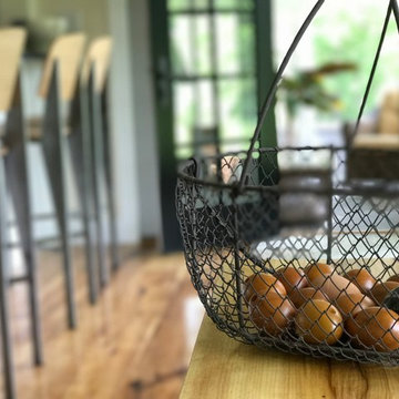
The new owners of this house in Harvard, Massachusetts loved its location and authentic Shaker characteristics, but weren’t fans of its curious layout. A dated first-floor full bathroom could only be accessed by going up a few steps to a landing, opening the bathroom door and then going down the same number of steps to enter the room. The dark kitchen faced the driveway to the north, rather than the bucolic backyard fields to the south. The dining space felt more like an enlarged hall and could only comfortably seat four. Upstairs, a den/office had a woefully low ceiling; the master bedroom had limited storage, and a sad full bathroom featured a cramped shower.
KHS proposed a number of changes to create an updated home where the owners could enjoy cooking, entertaining, and being connected to the outdoors from the first-floor living spaces, while also experiencing more inviting and more functional private spaces upstairs.
On the first floor, the primary change was to capture space that had been part of an upper-level screen porch and convert it to interior space. To make the interior expansion seamless, we raised the floor of the area that had been the upper-level porch, so it aligns with the main living level, and made sure there would be no soffits in the planes of the walls we removed. We also raised the floor of the remaining lower-level porch to reduce the number of steps required to circulate from it to the newly expanded interior. New patio door systems now fill the arched openings that used to be infilled with screen. The exterior interventions (which also included some new casement windows in the dining area) were designed to be subtle, while affording significant improvements on the interior. Additionally, the first-floor bathroom was reconfigured, shifting one of its walls to widen the dining space, and moving the entrance to the bathroom from the stair landing to the kitchen instead.
These changes (which involved significant structural interventions) resulted in a much more open space to accommodate a new kitchen with a view of the lush backyard and a new dining space defined by a new built-in banquette that comfortably seats six, and -- with the addition of a table extension -- up to eight people.
Upstairs in the den/office, replacing the low, board ceiling with a raised, plaster, tray ceiling that springs from above the original board-finish walls – newly painted a light color -- created a much more inviting, bright, and expansive space. Re-configuring the master bath to accommodate a larger shower and adding built-in storage cabinets in the master bedroom improved comfort and function. A new whole-house color palette rounds out the improvements.
Photos by Katie Hutchison

Sponsored
Columbus, OH

Wannemacher Interiors
Customized Award-Winning Interior Design Solutions in Franklin Cnty OH
 Katie Hutchison Studio
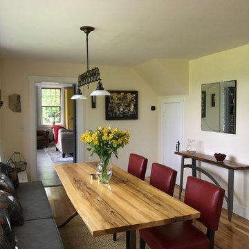
The new owners of this house in Harvard, Massachusetts loved its location and authentic Shaker characteristics, but weren’t fans of its curious layout. A dated first-floor full bathroom could only be accessed by going up a few steps to a landing, opening the bathroom door and then going down the same number of steps to enter the room. The dark kitchen faced the driveway to the north, rather than the bucolic backyard fields to the south. The dining space felt more like an enlarged hall and could only comfortably seat four. Upstairs, a den/office had a woefully low ceiling; the master bedroom had limited storage, and a sad full bathroom featured a cramped shower.
KHS proposed a number of changes to create an updated home where the owners could enjoy cooking, entertaining, and being connected to the outdoors from the first-floor living spaces, while also experiencing more inviting and more functional private spaces upstairs.
On the first floor, the primary change was to capture space that had been part of an upper-level screen porch and convert it to interior space. To make the interior expansion seamless, we raised the floor of the area that had been the upper-level porch, so it aligns with the main living level, and made sure there would be no soffits in the planes of the walls we removed. We also raised the floor of the remaining lower-level porch to reduce the number of steps required to circulate from it to the newly expanded interior. New patio door systems now fill the arched openings that used to be infilled with screen. The exterior interventions (which also included some new casement windows in the dining area) were designed to be subtle, while affording significant improvements on the interior. Additionally, the first-floor bathroom was reconfigured, shifting one of its walls to widen the dining space, and moving the entrance to the bathroom from the stair landing to the kitchen instead.
These changes (which involved significant structural interventions) resulted in a much more open space to accommodate a new kitchen with a view of the lush backyard and a new dining space defined by a new built-in banquette that comfortably seats six, and -- with the addition of a table extension -- up to eight people.
Upstairs in the den/office, replacing the low, board ceiling with a raised, plaster, tray ceiling that springs from above the original board-finish walls – newly painted a light color -- created a much more inviting, bright, and expansive space. Re-configuring the master bath to accommodate a larger shower and adding built-in storage cabinets in the master bedroom improved comfort and function. A new whole-house color palette rounds out the improvements.
Photos by Katie Hutchison
 Flying Dormer
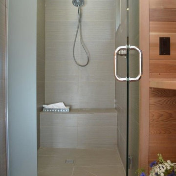
The European homeowners wanted to create a space for a new sauna and hot tub, as well as a place to relax afterwards. It needed to be light and bright, and have a warm but modern feel. We built this addition under the existing deck, and spruced up the deck at the same time to enjoy the nice territorial views.
The walls of the addition are cedar, with built-ins and deep cabinets for storage. There is a walk-in, tiled shower with built-in bench just off the sauna, and a seating area with tv for relaxing. The floor is stained concrete.
The 14-foot wall of windows (including a door to the hot tub), and the secondary window wall that includes french doors allows the maximum amount of light into the space and really creates that spa feeling.
The plans evolved during construction to include a larger sauna (thereby reducing the shower size somewhat) and a much larger hot tub than originally planned. The solution was to move the hot tub outside, which had the benefit of opening up more space inside for a yoga/ workout area. The hot tub is covered by a glass roof so it can be enjoyed year-round under the stars.
 Katie Hutchison Studio
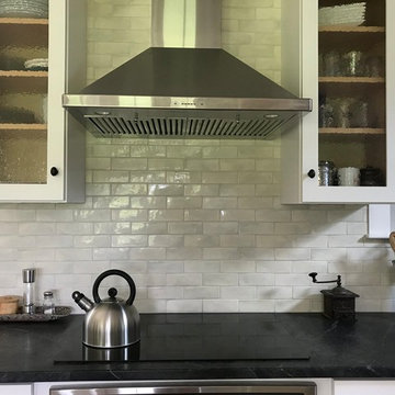
The new owners of this house in Harvard, Massachusetts loved its location and authentic Shaker characteristics, but weren’t fans of its curious layout. A dated first-floor full bathroom could only be accessed by going up a few steps to a landing, opening the bathroom door and then going down the same number of steps to enter the room. The dark kitchen faced the driveway to the north, rather than the bucolic backyard fields to the south. The dining space felt more like an enlarged hall and could only comfortably seat four. Upstairs, a den/office had a woefully low ceiling; the master bedroom had limited storage, and a sad full bathroom featured a cramped shower.
KHS proposed a number of changes to create an updated home where the owners could enjoy cooking, entertaining, and being connected to the outdoors from the first-floor living spaces, while also experiencing more inviting and more functional private spaces upstairs.
On the first floor, the primary change was to capture space that had been part of an upper-level screen porch and convert it to interior space. To make the interior expansion seamless, we raised the floor of the area that had been the upper-level porch, so it aligns with the main living level, and made sure there would be no soffits in the planes of the walls we removed. We also raised the floor of the remaining lower-level porch to reduce the number of steps required to circulate from it to the newly expanded interior. New patio door systems now fill the arched openings that used to be infilled with screen. The exterior interventions (which also included some new casement windows in the dining area) were designed to be subtle, while affording significant improvements on the interior. Additionally, the first-floor bathroom was reconfigured, shifting one of its walls to widen the dining space, and moving the entrance to the bathroom from the stair landing to the kitchen instead.
These changes (which involved significant structural interventions) resulted in a much more open space to accommodate a new kitchen with a view of the lush backyard and a new dining space defined by a new built-in banquette that comfortably seats six, and -- with the addition of a table extension -- up to eight people.
Upstairs in the den/office, replacing the low, board ceiling with a raised, plaster, tray ceiling that springs from above the original board-finish walls – newly painted a light color -- created a much more inviting, bright, and expansive space. Re-configuring the master bath to accommodate a larger shower and adding built-in storage cabinets in the master bedroom improved comfort and function. A new whole-house color palette rounds out the improvements.
Photos by Katie Hutchison
 Katie Hutchison Studio
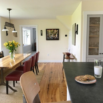
The new owners of this house in Harvard, Massachusetts loved its location and authentic Shaker characteristics, but weren’t fans of its curious layout. A dated first-floor full bathroom could only be accessed by going up a few steps to a landing, opening the bathroom door and then going down the same number of steps to enter the room. The dark kitchen faced the driveway to the north, rather than the bucolic backyard fields to the south. The dining space felt more like an enlarged hall and could only comfortably seat four. Upstairs, a den/office had a woefully low ceiling; the master bedroom had limited storage, and a sad full bathroom featured a cramped shower.
KHS proposed a number of changes to create an updated home where the owners could enjoy cooking, entertaining, and being connected to the outdoors from the first-floor living spaces, while also experiencing more inviting and more functional private spaces upstairs.
On the first floor, the primary change was to capture space that had been part of an upper-level screen porch and convert it to interior space. To make the interior expansion seamless, we raised the floor of the area that had been the upper-level porch, so it aligns with the main living level, and made sure there would be no soffits in the planes of the walls we removed. We also raised the floor of the remaining lower-level porch to reduce the number of steps required to circulate from it to the newly expanded interior. New patio door systems now fill the arched openings that used to be infilled with screen. The exterior interventions (which also included some new casement windows in the dining area) were designed to be subtle, while affording significant improvements on the interior. Additionally, the first-floor bathroom was reconfigured, shifting one of its walls to widen the dining space, and moving the entrance to the bathroom from the stair landing to the kitchen instead.
These changes (which involved significant structural interventions) resulted in a much more open space to accommodate a new kitchen with a view of the lush backyard and a new dining space defined by a new built-in banquette that comfortably seats six, and -- with the addition of a table extension -- up to eight people.
Upstairs in the den/office, replacing the low, board ceiling with a raised, plaster, tray ceiling that springs from above the original board-finish walls – newly painted a light color -- created a much more inviting, bright, and expansive space. Re-configuring the master bath to accommodate a larger shower and adding built-in storage cabinets in the master bedroom improved comfort and function. A new whole-house color palette rounds out the improvements.
Photos by Katie Hutchison
 Luxuriant Gardens
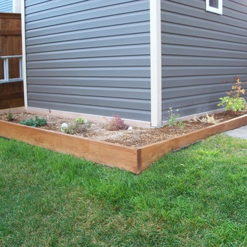
Raised Cedar Perennial Herb Beds were constructed on either side of an existing storage shed (close to the kitchen) to reduce bed maintenance (annual lawn edging) and add interest and functionality to a backyard which originally had only a lawn and fence. Note that two young pear trees were also planted along the opposite fence for the same reasons.
 Flying Dormer
The European homeowners wanted to create a space for a new sauna and hot tub, as well as a place to relax afterwards. It needed to be light and bright, and have a warm but modern feel. We built this addition under the existing deck, and spruced up the deck at the same time to enjoy the nice territorial views.
The walls of the addition are cedar, with built-ins and deep cabinets for storage. There is a walk-in, tiled shower with built-in bench just off the sauna, and a seating area with tv for relaxing. The floor is stained concrete.
The 14-foot wall of windows (including a door to the hot tub), and the secondary window wall that includes french doors allows the maximum amount of light into the space and really creates that spa feeling.
The plans evolved during construction to include a larger sauna (thereby reducing the shower size somewhat) and a much larger hot tub than originally planned. The solution was to move the hot tub outside, which had the benefit of opening up more space inside for a yoga/ workout area. The hot tub is covered by a glass roof so it can be enjoyed year-round under the stars.

Sponsored
Fredericksburg, OH

High Point Cabinets
Columbus' Experienced Custom Cabinet Builder | 4x Best of Houzz Winner
 Zola European Windows
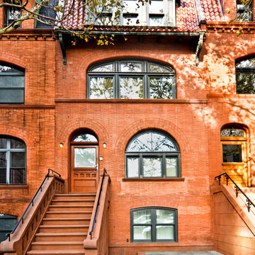
Zola Windows now offers the American Heritage SDH, a high-performance, all-wood simulated double hung window for landmarked and other historic buildings. This replica-quality window has been engineered to include a lower Zola Tilt & Turn and a Fixed upper that provide outstanding performance, all while maintaining the style and proportions of a traditional double hung window.
Today’s renovations of historic buildings are becoming increasingly focused on achieving maximum energy efficiency for reduced monthly utilities costs and a minimized carbon footprint. In energy efficient retrofits, air tightness and R-values of the windows become crucial, which cannot be achieved with sliding windows. Double hung windows, which are very common in older buildings, present a major challenge to architects and builders aiming to significantly improve energy efficiency of historic buildings while preserving their architectural heritage. The Zola American Heritage SDH features R-11 glass and triple air seals. At the same time, it maintains the original architectural aesthetic due to its historic style, proportions, and also the clever use of offset glass planes that create the shadow line that is characteristic of a historic double hung window.
With its triple seals and top of the line low-iron European glass, the American Heritage SDH offers superior acoustic performance. For increased sound protection, Zola also offers the window with custom asymmetrical glazing, which provides up to 51 decibels (dB) of sound deadening performance. The American Heritage SDH also boasts outstanding visible light transmittance of VT=0.71, allowing for maximum daylighting. Zola’s all-wood American Heritage SDH is available in a variety of furniture-grade species, including FSC-certified pine, oak, and meranti.
Photo Credit: Amiaga Architectural Photography
 Tacoma Moss Boss
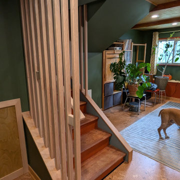
Every piece of this new hemlock balustrade is all cut from the same profile which reduces waste and therefore cost as well. The juxtaposition of the new wood in the classic styling against the original stair treads really makes a pop without feeling overworked.
 Katie Hutchison Studio
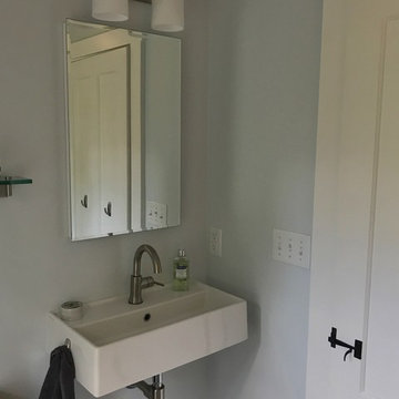
The new owners of this house in Harvard, Massachusetts loved its location and authentic Shaker characteristics, but weren’t fans of its curious layout. A dated first-floor full bathroom could only be accessed by going up a few steps to a landing, opening the bathroom door and then going down the same number of steps to enter the room. The dark kitchen faced the driveway to the north, rather than the bucolic backyard fields to the south. The dining space felt more like an enlarged hall and could only comfortably seat four. Upstairs, a den/office had a woefully low ceiling; the master bedroom had limited storage, and a sad full bathroom featured a cramped shower.
KHS proposed a number of changes to create an updated home where the owners could enjoy cooking, entertaining, and being connected to the outdoors from the first-floor living spaces, while also experiencing more inviting and more functional private spaces upstairs.
On the first floor, the primary change was to capture space that had been part of an upper-level screen porch and convert it to interior space. To make the interior expansion seamless, we raised the floor of the area that had been the upper-level porch, so it aligns with the main living level, and made sure there would be no soffits in the planes of the walls we removed. We also raised the floor of the remaining lower-level porch to reduce the number of steps required to circulate from it to the newly expanded interior. New patio door systems now fill the arched openings that used to be infilled with screen. The exterior interventions (which also included some new casement windows in the dining area) were designed to be subtle, while affording significant improvements on the interior. Additionally, the first-floor bathroom was reconfigured, shifting one of its walls to widen the dining space, and moving the entrance to the bathroom from the stair landing to the kitchen instead.
These changes (which involved significant structural interventions) resulted in a much more open space to accommodate a new kitchen with a view of the lush backyard and a new dining space defined by a new built-in banquette that comfortably seats six, and -- with the addition of a table extension -- up to eight people.
Upstairs in the den/office, replacing the low, board ceiling with a raised, plaster, tray ceiling that springs from above the original board-finish walls – newly painted a light color -- created a much more inviting, bright, and expansive space. Re-configuring the master bath to accommodate a larger shower and adding built-in storage cabinets in the master bedroom improved comfort and function. A new whole-house color palette rounds out the improvements.
Photos by Katie Hutchison
 Katie Hutchison Studio
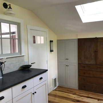
The new owners of this house in Harvard, Massachusetts loved its location and authentic Shaker characteristics, but weren’t fans of its curious layout. A dated first-floor full bathroom could only be accessed by going up a few steps to a landing, opening the bathroom door and then going down the same number of steps to enter the room. The dark kitchen faced the driveway to the north, rather than the bucolic backyard fields to the south. The dining space felt more like an enlarged hall and could only comfortably seat four. Upstairs, a den/office had a woefully low ceiling; the master bedroom had limited storage, and a sad full bathroom featured a cramped shower.
KHS proposed a number of changes to create an updated home where the owners could enjoy cooking, entertaining, and being connected to the outdoors from the first-floor living spaces, while also experiencing more inviting and more functional private spaces upstairs.
On the first floor, the primary change was to capture space that had been part of an upper-level screen porch and convert it to interior space. To make the interior expansion seamless, we raised the floor of the area that had been the upper-level porch, so it aligns with the main living level, and made sure there would be no soffits in the planes of the walls we removed. We also raised the floor of the remaining lower-level porch to reduce the number of steps required to circulate from it to the newly expanded interior. New patio door systems now fill the arched openings that used to be infilled with screen. The exterior interventions (which also included some new casement windows in the dining area) were designed to be subtle, while affording significant improvements on the interior. Additionally, the first-floor bathroom was reconfigured, shifting one of its walls to widen the dining space, and moving the entrance to the bathroom from the stair landing to the kitchen instead.
These changes (which involved significant structural interventions) resulted in a much more open space to accommodate a new kitchen with a view of the lush backyard and a new dining space defined by a new built-in banquette that comfortably seats six, and -- with the addition of a table extension -- up to eight people.
Upstairs in the den/office, replacing the low, board ceiling with a raised, plaster, tray ceiling that springs from above the original board-finish walls – newly painted a light color -- created a much more inviting, bright, and expansive space. Re-configuring the master bath to accommodate a larger shower and adding built-in storage cabinets in the master bedroom improved comfort and function. A new whole-house color palette rounds out the improvements.
Photos by Katie Hutchison
Sponsored
Sunbury, OH

J.Holderby - Renovations
Franklin County's Leading General Contractors - 2X Best of Houzz!
 Katie Hutchison Studio
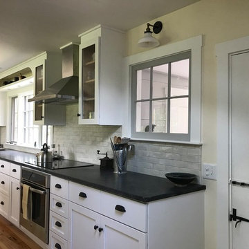
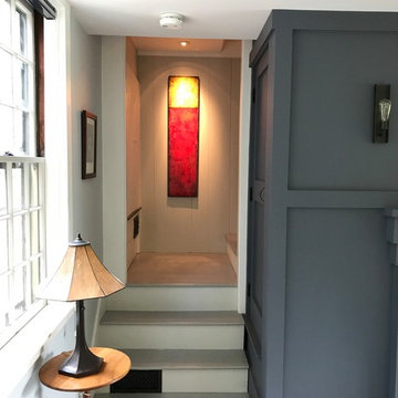
The new owners of this house in Harvard, Massachusetts loved its location and authentic Shaker characteristics, but weren’t fans of its curious layout. A dated first-floor full bathroom could only be accessed by going up a few steps to a landing, opening the bathroom door and then going down the same number of steps to enter the room. The dark kitchen faced the driveway to the north, rather than the bucolic backyard fields to the south. The dining space felt more like an enlarged hall and could only comfortably seat four. Upstairs, a den/office had a woefully low ceiling; the master bedroom had limited storage, and a sad full bathroom featured a cramped shower.
KHS proposed a number of changes to create an updated home where the owners could enjoy cooking, entertaining, and being connected to the outdoors from the first-floor living spaces, while also experiencing more inviting and more functional private spaces upstairs.
On the first floor, the primary change was to capture space that had been part of an upper-level screen porch and convert it to interior space. To make the interior expansion seamless, we raised the floor of the area that had been the upper-level porch, so it aligns with the main living level, and made sure there would be no soffits in the planes of the walls we removed. We also raised the floor of the remaining lower-level porch to reduce the number of steps required to circulate from it to the newly expanded interior. New patio door systems now fill the arched openings that used to be infilled with screen. The exterior interventions (which also included some new casement windows in the dining area) were designed to be subtle, while affording significant improvements on the interior. Additionally, the first-floor bathroom was reconfigured, shifting one of its walls to widen the dining space, and moving the entrance to the bathroom from the stair landing to the kitchen instead.
These changes (which involved significant structural interventions) resulted in a much more open space to accommodate a new kitchen with a view of the lush backyard and a new dining space defined by a new built-in banquette that comfortably seats six, and -- with the addition of a table extension -- up to eight people.
Upstairs in the den/office, replacing the low, board ceiling with a raised, plaster, tray ceiling that springs from above the original board-finish walls – newly painted a light color -- created a much more inviting, bright, and expansive space. Re-configuring the master bath to accommodate a larger shower and adding built-in storage cabinets in the master bedroom improved comfort and function. A new whole-house color palette rounds out the improvements.
Photos by Katie Hutchison
 Katie Hutchison Studio
The new owners of this house in Harvard, Massachusetts loved its location and authentic Shaker characteristics, but weren’t fans of its curious layout. A dated first-floor full bathroom could only be accessed by going up a few steps to a landing, opening the bathroom door and then going down the same number of steps to enter the room. The dark kitchen faced the driveway to the north, rather than the bucolic backyard fields to the south. The dining space felt more like an enlarged hall and could only comfortably seat four. Upstairs, a den/office had a woefully low ceiling; the master bedroom had limited storage, and a sad full bathroom featured a cramped shower.
KHS proposed a number of changes to create an updated home where the owners could enjoy cooking, entertaining, and being connected to the outdoors from the first-floor living spaces, while also experiencing more inviting and more functional private spaces upstairs.
On the first floor, the primary change was to capture space that had been part of an upper-level screen porch and convert it to interior space. To make the interior expansion seamless, we raised the floor of the area that had been the upper-level porch, so it aligns with the main living level, and made sure there would be no soffits in the planes of the walls we removed. We also raised the floor of the remaining lower-level porch to reduce the number of steps required to circulate from it to the newly expanded interior. New patio door systems now fill the arched openings that used to be infilled with screen. The exterior interventions (which also included some new casement windows in the dining area) were designed to be subtle, while affording significant improvements on the interior. Additionally, the first-floor bathroom was reconfigured, shifting one of its walls to widen the dining space, and moving the entrance to the bathroom from the stair landing to the kitchen instead.
These changes (which involved significant structural interventions) resulted in a much more open space to accommodate a new kitchen with a view of the lush backyard and a new dining space defined by a new built-in banquette that comfortably seats six, and -- with the addition of a table extension -- up to eight people.
Upstairs in the den/office, replacing the low, board ceiling with a raised, plaster, tray ceiling that springs from above the original board-finish walls – newly painted a light color -- created a much more inviting, bright, and expansive space. Re-configuring the master bath to accommodate a larger shower and adding built-in storage cabinets in the master bedroom improved comfort and function. A new whole-house color palette rounds out the improvements.
Photos by Katie Hutchison
 Katie Hutchison Studio
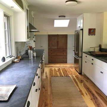
The new owners of this house in Harvard, Massachusetts loved its location and authentic Shaker characteristics, but weren’t fans of its curious layout. A dated first-floor full bathroom could only be accessed by going up a few steps to a landing, opening the bathroom door and then going down the same number of steps to enter the room. The dark kitchen faced the driveway to the north, rather than the bucolic backyard fields to the south. The dining space felt more like an enlarged hall and could only comfortably seat four. Upstairs, a den/office had a woefully low ceiling; the master bedroom had limited storage, and a sad full bathroom featured a cramped shower.
KHS proposed a number of changes to create an updated home where the owners could enjoy cooking, entertaining, and being connected to the outdoors from the first-floor living spaces, while also experiencing more inviting and more functional private spaces upstairs.
On the first floor, the primary change was to capture space that had been part of an upper-level screen porch and convert it to interior space. To make the interior expansion seamless, we raised the floor of the area that had been the upper-level porch, so it aligns with the main living level, and made sure there would be no soffits in the planes of the walls we removed. We also raised the floor of the remaining lower-level porch to reduce the number of steps required to circulate from it to the newly expanded interior. New patio door systems now fill the arched openings that used to be infilled with screen. The exterior interventions (which also included some new casement windows in the dining area) were designed to be subtle, while affording significant improvements on the interior. Additionally, the first-floor bathroom was reconfigured, shifting one of its walls to widen the dining space, and moving the entrance to the bathroom from the stair landing to the kitchen instead.
These changes (which involved significant structural interventions) resulted in a much more open space to accommodate a new kitchen with a view of the lush backyard and a new dining space defined by a new built-in banquette that comfortably seats six, and -- with the addition of a table extension -- up to eight people.
Upstairs in the den/office, replacing the low, board ceiling with a raised, plaster, tray ceiling that springs from above the original board-finish walls – newly painted a light color -- created a much more inviting, bright, and expansive space. Re-configuring the master bath to accommodate a larger shower and adding built-in storage cabinets in the master bedroom improved comfort and function. A new whole-house color palette rounds out the improvements.
Photos by Katie Hutchison
25