
Search results for "Reduce same origin" in Home Design Ideas
 House Doctors of Scotch Plains-Fanwood, NJ
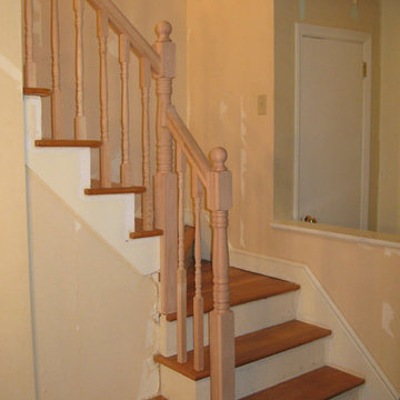
Stairways that have a baluster add beauty to a home. However, if the baluster is broken, then this can cause the stairs to look bad. Fortunately, it is not that difficult to replace a broken baluster. Below are some of the steps you will need to take:
Remove The End Cap
It is important to be very careful when you are replacing the baluster. You will need to keep the baluster intact so that a wood turner will be able to make an exact copy of it. You will most likely need to remove the end cap from the stairs. Break the seal that is between the tread and the end cap using a sturdy knife or pry bar.
Breaking The Baluster
If you do not want to salvage the baluster, then you do have other options. You can use a hammer to loosen the nails at the top of the baluster. Make sure that you do not damage the adjacent balusters or handrail. You can use your hands to loosen the bottom half of the baluster. Make sure you use gentle force.
Create A New Baluster
Unless you are fortunate enough to have the same baluster at a local home center, you are going to need a wood turner to make a new baluster. Make sure you tell your wood turner the specific type of wood you need. If you are not concerned about the original color, then you will need to select the wood that is the hardest. Ask the wood turner to leave the spindles intact. This may make it harder for you to fit the baluster into the staircase. However, this reduces the chances of getting a misfit from the wood turner.
Prepare The Stairs
It will likely take one or two weeks to turn a baluster. You can prepare the stairs during this time. Clean up the area around the stairs. Put the end cap back on the stair tread. Measure the tread to where the new baluster and handrail will meet on the upstairs side.
Prepare The Baluster
You can prepare the baluster by sanding it smooth. Measure from the bottom of the baluster to the bottom of the tenon joint. Cut the top end of the baluster so that it matches the handrail's slope. Hold a T-Bevel against the handrail's underside where the new baluster will go. Mark the angle with a pencil.
Install The Bottom Of The Baluster
Insert the tenon inside of the mortise. After that, position the top of it in the middle of the handrail's underside.
Install The Top Of The Baluster
Make sure the tenon is straight by using a carpenter's level. Have someone hold it in place in order to ensure that it matches the angle of the other balusters. Place one nail into the baluster's upstairs side. You most likely will not need more than two finishing nails. Remove dust by wiping off the baluster. Use painter's tape to mask off the handrail and stair tread. Stain or paint the new baluster.
Since this project involves a lot of work, you can save a lot of time and stress by contacting House Doctors to help. Thanks to our highly experienced team, you can depend on us to get the work done promptly and properly.
by Ken Benedetto, Owner of House Doctors of Scotch Plains - Fanwood
 Katie Hutchison Studio
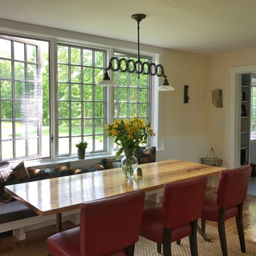
The new owners of this house in Harvard, Massachusetts loved its location and authentic Shaker characteristics, but weren’t fans of its curious layout. A dated first-floor full bathroom could only be accessed by going up a few steps to a landing, opening the bathroom door and then going down the same number of steps to enter the room. The dark kitchen faced the driveway to the north, rather than the bucolic backyard fields to the south. The dining space felt more like an enlarged hall and could only comfortably seat four. Upstairs, a den/office had a woefully low ceiling; the master bedroom had limited storage, and a sad full bathroom featured a cramped shower.
KHS proposed a number of changes to create an updated home where the owners could enjoy cooking, entertaining, and being connected to the outdoors from the first-floor living spaces, while also experiencing more inviting and more functional private spaces upstairs.
On the first floor, the primary change was to capture space that had been part of an upper-level screen porch and convert it to interior space. To make the interior expansion seamless, we raised the floor of the area that had been the upper-level porch, so it aligns with the main living level, and made sure there would be no soffits in the planes of the walls we removed. We also raised the floor of the remaining lower-level porch to reduce the number of steps required to circulate from it to the newly expanded interior. New patio door systems now fill the arched openings that used to be infilled with screen. The exterior interventions (which also included some new casement windows in the dining area) were designed to be subtle, while affording significant improvements on the interior. Additionally, the first-floor bathroom was reconfigured, shifting one of its walls to widen the dining space, and moving the entrance to the bathroom from the stair landing to the kitchen instead.
These changes (which involved significant structural interventions) resulted in a much more open space to accommodate a new kitchen with a view of the lush backyard and a new dining space defined by a new built-in banquette that comfortably seats six, and -- with the addition of a table extension -- up to eight people.
Upstairs in the den/office, replacing the low, board ceiling with a raised, plaster, tray ceiling that springs from above the original board-finish walls – newly painted a light color -- created a much more inviting, bright, and expansive space. Re-configuring the master bath to accommodate a larger shower and adding built-in storage cabinets in the master bedroom improved comfort and function. A new whole-house color palette rounds out the improvements.
Photos by Katie Hutchison
 Katie Hutchison Studio
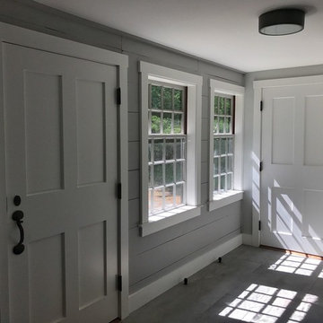
The new owners of this house in Harvard, Massachusetts loved its location and authentic Shaker characteristics, but weren’t fans of its curious layout. A dated first-floor full bathroom could only be accessed by going up a few steps to a landing, opening the bathroom door and then going down the same number of steps to enter the room. The dark kitchen faced the driveway to the north, rather than the bucolic backyard fields to the south. The dining space felt more like an enlarged hall and could only comfortably seat four. Upstairs, a den/office had a woefully low ceiling; the master bedroom had limited storage, and a sad full bathroom featured a cramped shower.
KHS proposed a number of changes to create an updated home where the owners could enjoy cooking, entertaining, and being connected to the outdoors from the first-floor living spaces, while also experiencing more inviting and more functional private spaces upstairs.
On the first floor, the primary change was to capture space that had been part of an upper-level screen porch and convert it to interior space. To make the interior expansion seamless, we raised the floor of the area that had been the upper-level porch, so it aligns with the main living level, and made sure there would be no soffits in the planes of the walls we removed. We also raised the floor of the remaining lower-level porch to reduce the number of steps required to circulate from it to the newly expanded interior. New patio door systems now fill the arched openings that used to be infilled with screen. The exterior interventions (which also included some new casement windows in the dining area) were designed to be subtle, while affording significant improvements on the interior. Additionally, the first-floor bathroom was reconfigured, shifting one of its walls to widen the dining space, and moving the entrance to the bathroom from the stair landing to the kitchen instead.
These changes (which involved significant structural interventions) resulted in a much more open space to accommodate a new kitchen with a view of the lush backyard and a new dining space defined by a new built-in banquette that comfortably seats six, and -- with the addition of a table extension -- up to eight people.
Upstairs in the den/office, replacing the low, board ceiling with a raised, plaster, tray ceiling that springs from above the original board-finish walls – newly painted a light color -- created a much more inviting, bright, and expansive space. Re-configuring the master bath to accommodate a larger shower and adding built-in storage cabinets in the master bedroom improved comfort and function. A new whole-house color palette rounds out the improvements.
Photos by Katie Hutchison
Find the right local pro for your project
 Ellen Farber Strategic Design
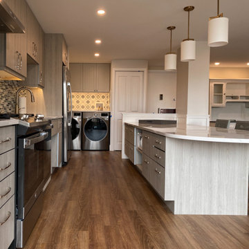
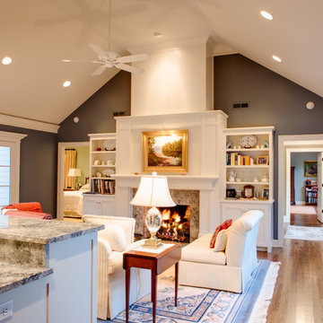
The kitchen was originally planned to mimic the location of appliances in her current kitchen to minimize re-learning of appliance locations. The only change was adding a trash cabinet between the fridge and the sink. A french door fridge allows someone in a wheelchair to easily access frozen and cold foods, while the water and ice dispenser on the outside of the door make it easy to stay hydrated rather than using the sink each time. She can roll up to the kitchen sink with recessed cabinetry or stand at counter height to put away dishes from the dishwasher. The dishwasher is ADA and very simple to use , and is raised off the floor so whether she is sitting or standing it's easier to reach. The gas cooktop has controls at the front making it easy to reach from the wheelchair and the exhaust fan above also has a control at the front. All cabinet door handles are D-shape, which makes them easy to grasp and there is plenty of electrical outlets for charging phones, computers and small appliances. The kitchen island is table height at 30" so meal prep can be easily done in a wheelchair while guests and can be seated in a chair or wheelchair around the island. The dining chairs can also be turned around to add extra seating in the living room area. Pendant lights above the kitchen island light up the space, while recessed lighting in the kitchen and living room provide overall room lighting. There is also under cabinet lighting which makes the room glow at night! Wainscoting made of commercial grade material is strategically placed on sharp corners and exposed walls to reduce and minimize damage from the wheel chair, while creating a finished and complete look! We selected a free standing microwave to sit below the island, which is easy to use and is the same style as in her previous apartment. The island is 48" from the appliance wall, leaving ample space to open doors and maneuver around in the wheelchair and has easy access to the laundry area as well. We eliminated the pocket doors that had been in front of the laundry area for easy access, and since it was exposed, dressed it up with coordinating tile to the kitchen with additional cabinets above. There is a coordinating quartz counter on top of the washer and dryer for folding laundry or storing additional supplies.
 Chapman Design Group, Inc.
Mark Hoyle
Originally, this 3700 SF two level eclectic farmhouse from the mid 1980’s underwent design changes to reflect a more colonial style. Now, after being completely renovated with additional 2800 SF living space, it’s combined total of 6500 SF boasts an Energy Star certification of 5 stars.
Approaching this completed home, you will meander along a new driveway through the dense buffer of trees until you reach the clearing, and then circle a tiered fountain on axis with the front entry accentuating the symmetrical main structure. Many of the exterior changes included enclosing the front porch and rear screened porch, replacing windows, replacing all the vinyl siding with and fiber cement siding, creating a new front stoop with winding brick stairs and wrought iron railings as will as other additions to the left and rear of the home.
The existing interior was completely fro the studs and included modifying uses of many of the existing rooms such as converting the original dining room into an oval shaped theater with reclining theater seats, fiber-optic starlight ceiling and an 80” television with built-in surround sound. The laundry room increased in size by taking in the porch and received all new cabinets and finishes. The screened porch across the back of the house was enclosed to create a new dining room, enlarged the kitchen, all of which allows for a commanding view of the beautifully landscaped pool. The upper master suite begins by entering a private office then leads to a newly vaulted bedroom, a new master bathroom with natural light and an enlarged closet.
The major portion of the addition space was added to the left side as a part time home for the owner’s brother. This new addition boasts an open plan living, dining and kitchen, a master suite with a luxurious bathroom and walk–in closet, a guest suite, a garage and its own private gated brick courtyard entry and direct access to the well appointed pool patio.
And finally the last part of the project is the sunroom and new lagoon style pool. Tucked tightly against the rear of the home. This room was created to feel like a gazebo including a metal roof and stained wood ceiling, the foundation of this room was constructed with the pool to insure the look as if it is floating on the water. The pool’s negative edge opposite side allows open views of the trees beyond. There is a natural stone waterfall on one side of the pool and a shallow area on the opposite side for lounge chairs to be placed in it along with a hot tub that spills into the pool. The coping completes the pool’s natural shape and continues to the patio utilizing the same stone but separated by Zoysia grass keeping the natural theme. The finishing touches to this backyard oasis is completed utilizing large boulders, Tempest Torches, architectural lighting and abundant variety of landscaping complete the oasis for all to enjoy.
 Nar Design Group
This kitchen proves small East sac bungalows can have high function and all the storage of a larger kitchen. A large peninsula overlooks the dining and living room for an open concept. A lower countertop areas gives prep surface for baking and use of small appliances. Geometric hexite tiles by fireclay are finished with pale blue grout, which complements the upper cabinets. The same hexite pattern was recreated by a local artist on the refrigerator panes. A textured striped linen fabric by Ralph Lauren was selected for the interior clerestory windows of the wall cabinets.
 Landis Architects | Builders
Photo: Michael K. Wilkinson
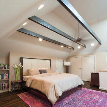
The original attic had wood paneling on the walls and ceiling and was mostly used for storage and as a retreat for the cats. The 7-foot walls did not capture the volume of the roof line, nor did it take advantage of the square footage. We removed the existing paneling and pushed the existing walls back so they had a lower height around the perimeter. This provides a dramatic contrast to the new high ceiling and dramatic angles of the roofline. We maintained an open floor plan and used glass panels and doors for privacy and separation of different functions. The finished square footage is 650 sq.ft. There is about 350 sq.ft. of unfinished the storage area.
The space needed some detailing to balance the large volume. The open plan also required a visual delineation of the different areas. Our designer added three beams across the ceiling over the bed to define the master bedroom. The beams were finished with the same dark stain used to refinish the attic’s original pine flooring. Dimmable recessed lights in the ceiling are placed in accordance with the beams location.
There are two good-size closets for the owners in the eaves, and additional storage, as well as the HVAC system is also located in the eaves and access through two doors—one next to the bed and one in the bathroom.

Sponsored
Columbus, OH

Wannemacher Interiors
Customized Award-Winning Interior Design Solutions in Franklin Cnty OH
 William Hoffman Architect
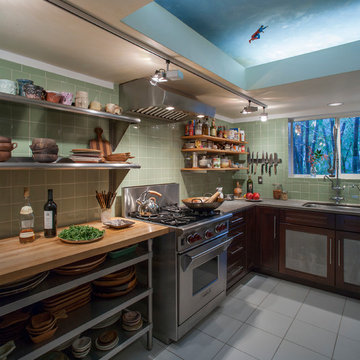
What simply started out as the purchase of a 30” Wolf gas stove to replace the old, turned into a complete kitchen renovation. The original intent was to replace the existing stove with the new. The new Wolf came other issues one being installing an adequate exhaust system to meet the needs of the stove. One thing led to the next and with that a new kitchen. The renovation included removing all existing fixtures, cabinetry and lighting. The existing tile floor remained the same but with some added area that was previously under existing base cabinets.
The goal of the project, once the decision was made to do a complete renovation, was to update the kitchen creating an eclectic aesthetic with all new fixtures of the best quality that could be afforded. Listed below are the changes that were made. All fixtures remained in their existing locations other than removing small piece of wall that allowed an extended length of the new bakers table to extend 24” into the existing dining and living room space to pull the spaces together and provide a small eating bar with adjoining bar stools. One stool was a custom design and fabrication (Marlin Stool)
Fixtures
1. Existing gas stove replaced with new 30” gas Wolf stove.
2. Existing Refrigerator replace with new 36” stainless steel Jen-Air refrigerator with bottom freezer.
3. Existing Dishwasher replace with new Jen-Air stainless steel interior and exterior dishwasher.
4. Existing base cabinets replaced with a combination of open and closed tables and cabinets. Two stainless steel commercial kitchen tables with an open bases and shelving. One with a stainless steel top the other a bakers table with a wood butcher block top. The cabinets were Kraft Made traditional wood base cabinets with a Kaffe finish and Fireslate counter surface. These cabinets were customized with stainless steel perforated door inserts and Mockett stainless steel drawer and door pulls.
5. Surface counter and table material included wood butcher block, stainless steel and Fireslate.
6. Overhead shelving included open commercial kitchen stainless steel shelves and open Appleply wood shelves with Rakks aluminum shelf brackets.
7. Existing lighting was replaced with Zumtobel track lighting with Ushio lamps, Lutron dimmers and an up lighted coffered ceiling (see Superman).
8. Existing kitchen sink was replaced with a large single compartment sink from Kindred with an In-Sinkerator Evolution garbage disposal. Filter water tap was added that connects to an Everprue water filter system.
9. Walls were tiled with Bottle Green 4 1/4” x 4 1/4” Daltile to staying consistent with existing original house tile.
10. The ceiling was reworked as required with a plaster finish
11. Marine grade caulk was used as required.
12. A soffit with up lighting was added to the periphery of kitchen facing the adjoining living and dining rooms.
13. Silver Masonite peg board storage wall adjacent to refrigerator.
Credits:
• Little Pete the Parakeet.....for being there
• Catalina Aguirre.....pots
• Many Friends....pots
• David D’Imperio.....Sputnik lamp
• Jose Maria Concha Sali.....painting
• Ron Meyers.....Plates on wall
• Bill Sanders.....Bunny screen painting
• William Hoffman....Beverly lamp
• William Hoffman.....marlin stool
• William Hoffman.....Gulfstream side chair
• William Hoffman.....Gulfstream dining table
• William Hoffman.....5 from 1 plywood chair
Problems
• A custom fabricated exhaust duct was required due to existing soffit framing conditions.
• The ceiling was not parallel to the floor so the intended full wall tile installation was held short of the ceiling.
• Return Air duct to A/C air handler required relocation
Project cost
• +/- $22,000
Fixtures, materials and appliances
Selection of fixtures, materials and fixtures were made based on quality, aesthetic and cost. Extensive research was done to find the best quality at a price point that was affordable. Items that were splurged on were the Wolf stove and Jen-Air refrigerator and dishwasher and the Zumtobel lighting
Bill Sanders Photography
 TKS Design Group
Free ebook, Creating the Ideal Kitchen. DOWNLOAD NOW
The Klimala’s and their three kids are no strangers to moving, this being their fifth house in the same town over the 20-year period they have lived there. “It must be the 7-year itch, because every seven years, we seem to find ourselves antsy for a new project or a new environment. I think part of it is being a designer, I see my own taste evolve and I want my environment to reflect that. Having easy access to wonderful tradesmen and a knowledge of the process makes it that much easier”.
This time, Klimala’s fell in love with a somewhat unlikely candidate. The 1950’s ranch turned cape cod was a bit of a mutt, but it’s location 5 minutes from their design studio and backing up to the high school where their kids can roll out of bed and walk to school, coupled with the charm of its location on a private road and lush landscaping made it an appealing choice for them.
“The bones of the house were really charming. It was typical 1,500 square foot ranch that at some point someone added a second floor to. Its sloped roofline and dormered bedrooms gave it some charm.” With the help of architect Maureen McHugh, Klimala’s gutted and reworked the layout to make the house work for them. An open concept kitchen and dining room allows for more frequent casual family dinners and dinner parties that linger. A dingy 3-season room off the back of the original house was insulated, given a vaulted ceiling with skylights and now opens up to the kitchen. This room now houses an 8’ raw edge white oak dining table and functions as an informal dining room. “One of the challenges with these mid-century homes is the 8’ ceilings. I had to have at least one room that had a higher ceiling so that’s how we did it” states Klimala.
The kitchen features a 10’ island which houses a 5’0” Galley Sink. The Galley features two faucets, and double tiered rail system to which accessories such as cutting boards and stainless steel bowls can be added for ease of cooking. Across from the large sink is an induction cooktop. “My two teen daughters and I enjoy cooking, and the Galley and induction cooktop make it so easy.” A wall of tall cabinets features a full size refrigerator, freezer, double oven and built in coffeemaker. The area on the opposite end of the kitchen features a pantry with mirrored glass doors and a beverage center below.
The rest of the first floor features an entry way, a living room with views to the front yard’s lush landscaping, a family room where the family hangs out to watch TV, a back entry from the garage with a laundry room and mudroom area, one of the home’s four bedrooms and a full bath. There is a double sided fireplace between the family room and living room. The home features pops of color from the living room’s peach grass cloth to purple painted wall in the family room. “I’m definitely a traditionalist at heart but because of the home’s Midcentury roots, I wanted to incorporate some of those elements into the furniture, lighting and accessories which also ended up being really fun. We are not formal people so I wanted a house that my kids would enjoy, have their friends over and feel comfortable.”
The second floor houses the master bedroom suite, two of the kids’ bedrooms and a back room nicknamed “the library” because it has turned into a quiet get away area where the girls can study or take a break from the rest of the family. The area was originally unfinished attic, and because the home was short on closet space, this Jack and Jill area off the girls’ bedrooms houses two large walk-in closets and a small sitting area with a makeup vanity. “The girls really wanted to keep the exposed brick of the fireplace that runs up the through the space, so that’s what we did, and I think they feel like they are in their own little loft space in the city when they are up there” says Klimala.
Designed by: Susan Klimala, CKD, CBD
Photography by: Carlos Vergara
For more information on kitchen and bath design ideas go to: www.kitchenstudio-ge.com
 Leigh Olive Mowry-Olive Interiors
Scobey Photography
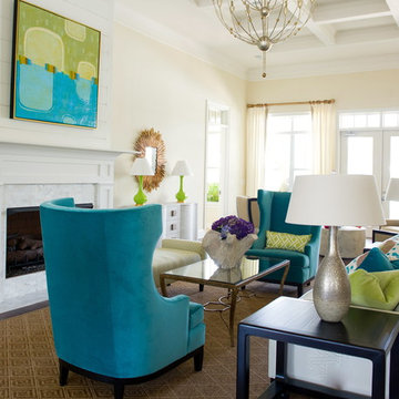
Living room - large contemporary living room idea in Atlanta with beige walls and a standard fireplace
Living room - large contemporary living room idea in Atlanta with beige walls and a standard fireplace
 Adrienne DeRosa
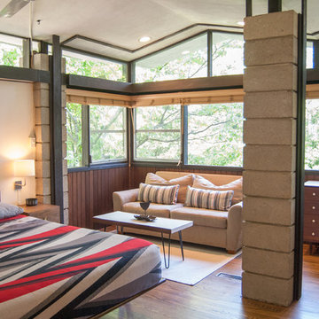
In the master bedroom, ample glass defines the space while promoting a tree-house-like environment.
While the bedroom was part of the original floor plan, it had gained some extra footage during the home's 1968 expansion project. "If you notice the concrete pillars," Bobbie points out, "You can see that that is where the original wall once was." The area beyond the pillars previously served as an outdoor patio until it was enclosed and converted.
Adrienne DeRosa Photography © 2013 Houzz
 TKS Design Group
Download our free ebook, Creating the Ideal Kitchen. DOWNLOAD NOW
This family from Wheaton was ready to remodel their kitchen, dining room and powder room. The project didn’t call for any structural or space planning changes but the makeover still had a massive impact on their home. The homeowners wanted to change their dated 1990’s brown speckled granite and light maple kitchen. They liked the welcoming feeling they got from the wood and warm tones in their current kitchen, but this style clashed with their vision of a deVOL type kitchen, a London-based furniture company. Their inspiration came from the country homes of the UK that mix the warmth of traditional detail with clean lines and modern updates.
To create their vision, we started with all new framed cabinets with a modified overlay painted in beautiful, understated colors. Our clients were adamant about “no white cabinets.” Instead we used an oyster color for the perimeter and a custom color match to a specific shade of green chosen by the homeowner. The use of a simple color pallet reduces the visual noise and allows the space to feel open and welcoming. We also painted the trim above the cabinets the same color to make the cabinets look taller. The room trim was painted a bright clean white to match the ceiling.
In true English fashion our clients are not coffee drinkers, but they LOVE tea. We created a tea station for them where they can prepare and serve tea. We added plenty of glass to showcase their tea mugs and adapted the cabinetry below to accommodate storage for their tea items. Function is also key for the English kitchen and the homeowners. They requested a deep farmhouse sink and a cabinet devoted to their heavy mixer because they bake a lot. We then got rid of the stovetop on the island and wall oven and replaced both of them with a range located against the far wall. This gives them plenty of space on the island to roll out dough and prepare any number of baked goods. We then removed the bifold pantry doors and created custom built-ins with plenty of usable storage for all their cooking and baking needs.
The client wanted a big change to the dining room but still wanted to use their own furniture and rug. We installed a toile-like wallpaper on the top half of the room and supported it with white wainscot paneling. We also changed out the light fixture, showing us once again that small changes can have a big impact.
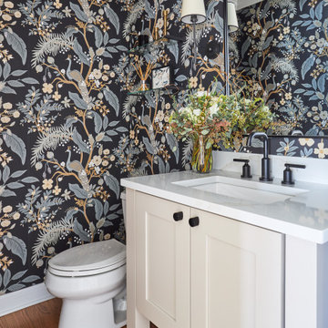
As the final touch, we also re-did the powder room to be in line with the rest of the first floor. We had the new vanity painted in the same oyster color as the kitchen cabinets and then covered the walls in a whimsical patterned wallpaper. Although the homeowners like subtle neutral colors they were willing to go a bit bold in the powder room for something unexpected. For more design inspiration go to: www.kitchenstudio-ge.com
 Roeser Home Remodeling
This Mid-Century home had been updated except for the kitchen and master bath. After a few years of being empty nesters, and with the neighborhood turning over drastically to infill property in the millions, this couple decided the time was right to update the last remaining rooms.
Starting in the Kitchen
Taking a dark, u-shaped kitchen out of the past and updating it for the future, was a dream come true for this family. They knew what they wanted in order to entertain their large extended family, which included their three kids; plus, his family, consisting of nine children, spouses, and now grandchildren. Requirements of an open space to hang out and help out, a banquet for food presentation without obstruction, bright and clean, easy storage, a place for her mother’s china decanters, and an instant hot for tea were all part of the “must haves” for this kitchen. We also needed to work around the homeowners’ existing appliances since many of them were practically new.
Vaulted ceilings, lots of high windows, and large openings to other spaces in the house, were challenges that only a galley style kitchen could address. Blending and lacing the hardwood floor with new flooring required both the new and existing to be sanded down and refinished. This provided a coherent look to the entire first floor of this home. Matching casings, baseboards and base shoe helped to make the updates look fresh, but original to the house.
In the kitchen, choosing the sandstone slate finish on our Wellborn Maple select series cabinets kept the space soft; but really opened it, making the space lighter and brighter. The Harmony style door choice blended with the décor in the rest of the house, while also giving straight clean lines the homeowner desired. Grounding the row of cabinets with their refrigerator and a pantry cabinet, gave symmetry to this side of the kitchen.
On the opposite side, a built-in pantry cabinet mirrors the refrigerator. A row of drawer cabinets expanded the storage and banquet space, to lay out food for entertaining. Also added were some much-needed wall cabinets with glass inserts to mirror the windows and keep the space open. This also allowed the taller canister to be displayed and admired. A few smaller shelves were added above the window space, to house the smaller canisters so loved by the homeowner.
An artist by trade, this homeowner added two narrow cabinets to the side of the pantry and the side of the refrigerator panel to house and create easy access to the various spices her husband loves to use while cooking. She painted them to blend with Wellborn’s Sandstone finish. The Caesarstone countertop with a 3cm eased edge in London Gray has a small pattern that is subtle and interesting. Cutting down the Caesarstone to 2 cm and carrying the same London Gray pattern up the backsplash area, lended to the clean lines and easy cleaning this homeowner requested.
Choosing chrome plumbing fixtures from Moen’s Brantford line is timeless choice. Chrome is always popular and yet in today’s market, also very trendy. The Brantford faucet has a pull-down spray and one side handle, leaving space for the all-important request of a Transcape hot water dispenser, also in chrome.
Scraping away the past included smoothing out the popcorn ceiling. Adding LED slope cans to the vaulted ceilings provided the necessary task lighting to elevate these homeowners’ joy of cooking. Removing the dated “popcorn look” enhanced the clean and spacious feel created by the architecture of the ceiling. Adding Top Knob chrome hardware was the final element that tied the kitchen all together.
Master Bathroom
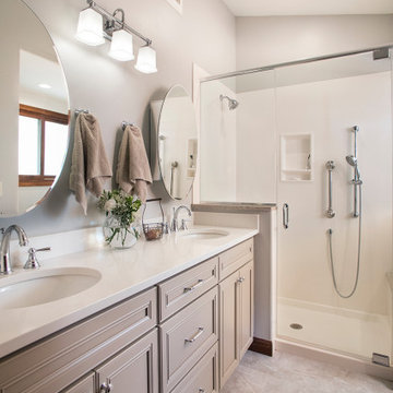
The original dated Master Bathroom had dark cabinets, a huge Jacuzzi tub and a small shower stall that provided barely enough room for even a child to shower. Removing the Jacuzzi tub that was never used, opened this floor plan to a grand shower that is comfortable and spacious. For easy cleaning, these homeowners opted for a panel system in their shower. Onyx shower walls with a shower seat and recess wide shower caddy were installed in place of the old Jacuzzi style tub.
The large panels were quite a challenge for our team, with an eight foot door and vaulted ceilings; but they were determined not to have a seam. These seamless panels are beautiful and very easy to clean. Keeping with the original floor plan, a double sink vanity from Wellborn’s select line with the Harmony door style in a pebble finish was installed. New Kohler Caxton under mount sinks were installed, along with the Moen Kinsley 8” wide spread faucets in chrome. Matching Kingsley 18” grab bars were added to the shower area, along with the Kohler Brantford fixed shower head and handheld slide bar.
The countertop was a beautiful Caesarstone in Frosty Carrina with an eased edge and 4” back and side splash. Matching Kinsley towel hooks were added, along with mirrors the homeowner purchased and we installed for her. Top Knobs chrome cabinet hardware finished the look along with a beautiful tile floor AO Mira 1224-S Silver Maple laid in a broken joint pattern. Matching marble sills were added on top of the knee walls and threshold in the doorway. A 3/8” frameless custom shower door with fixed panels surrounded the shower creating an open airy feel to the space.
Not shown: Kohler’s Wellworth highline toilet with a slow-close seat replaces the original toilet. The original shower stall became a space used to house a stackable washer and dryer, a top a safety pan and drain to slop sink in the basement. There was even enough room for small shelving to provide storage for laundry essentials. Adding a louver door keeps the laundry area behind the scene and opens the master area to multiple tasks needed.
Master Bedroom Fireplace
This homeowner really missed a bedroom fireplace they had in a previous home. Since we were going to be working on their master bathroom anyway; was there a way to create a fireplace without making it feel too odd in their large bedroom area? They had purchased a ventless gas fireplace and they had their original television as well.
Challenged by windows, a vaulted ceiling and the natural light streaming from the back window; this divided wall was created, keeping the lighting from the other side of the room and providing a dressing area opposite the fireplace. This was a perfect idea since the closets are now in the dressing area and the creative wall houses the fireplace and TV for cold winter nights of snuggling to a movie. Better yet, the fireplace and TV are all on remote control!

Sponsored
Delaware, OH

Buckeye Basements, Inc.
Central Ohio's Basement Finishing ExpertsBest Of Houzz '13-'21
 Dura Supreme Cabinetry
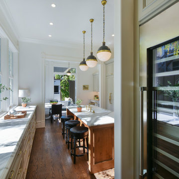
With an ideal location in the Pacific Heights neighborhood of San Francisco, this dated Victorian residence had "beautiful bones" but had been sitting on the market for a year before being purchased with plans to revitalize the interior. Interior designer, Noel Han, explained, "Historical Victorian homes in this area often have beautiful architectural elements that I aim to preserve, but the floor plan and layout tend to be stuffy, not live-able and not light filled. Modern families want bright, light-filled, spacious rooms that take advantage of outdoor views and living spaces, and function well for storage, meals and entertaining."
Preserving the architectural integrity and special features of the home was one of Han's goals but at the same time, she re-designed the space, moving walls and adding windows to create an open floorplan that flowed easily between the kitchen and outdoor living spaces. Where the range once stood in the original design, now an entire wall of windows provides panoramic views of the outdoors and fills the kitchen with light. Below the windows, Han designed a long bank of base cabinets with drawers to provide plenty of storage and work surface. Light now pours into the space even on foggy days. The range was moved to the opposite wall so that beautiful window views could be added to the kitchen.
Han selected a palette of finishes with an eye toward creating a "soft color aesthetic". "White painted finishes are very popular right now but would have felt stark and cold in this space," she explained. "The French grey paint from Dura Supreme was a perfect complement for this vintage Victorian home, to create a classic color scheme".
"This beautiful home already had hardware elements with a vintage brass finish, so I carefully selected antiqued, brushed brass hardware, plumbing and metal finishes to blend with the original elements," said Han. She continued, "The La Cornue French Range adds modern function with a French antique look."
"I appreciate working with Dura Supreme cabinetry because of the quality of the cabinetry, fast delivery and the custom options. I'm able to create beautiful architectural details like the pull-out columns on both sides of the range and the curved mullion doors on the furniture hutch, and they offer a stunning palette of finishes and styles," explained Han. For the bath cabinetry, Han created a similar palette of finishes and styles to create a complementary look throughout the entire home.
Product Details:
Perimeter: Dura Supreme Cabinetry shown in the St. Augustine door style and Mullion Pattern #15 door style with a “Zinc” painted finish.
Kitchen Island: Dura Supreme Cabinetry shown in the St. Augustine door style with a Clove stain and Black Accent finish on Cherry wood.
For more information about Noel Han, Interior Designer, click to her website here www.atelnoel.com.
For more information about Gilmans Kitchens and Baths, click to their website here www.gkandb.com.
Photography by: Ned Bonzi www.nedbonzi.com.
Request a FREE Dura Supreme Brochure Packet:
http://www.durasupreme.com/request-brochure
 GMT Home Designs Inc.
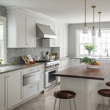
The original kitchen was dark and lacked storage space. It was cut off from the rest of the house and needed an update. We removed the wall between the dining room and kitchen and bumped the kitchen out in the rear of the house. We created lots of storage, a new island with seating and added windows bringing in much needed natural light. The kitchen is now a hub of activity for the whole family.
 TKS Design Group
Download our free ebook, Creating the Ideal Kitchen. DOWNLOAD NOW
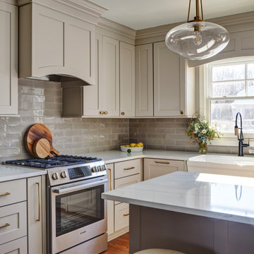
This family from Wheaton was ready to remodel their kitchen, dining room and powder room. The project didn’t call for any structural or space planning changes but the makeover still had a massive impact on their home. The homeowners wanted to change their dated 1990’s brown speckled granite and light maple kitchen. They liked the welcoming feeling they got from the wood and warm tones in their current kitchen, but this style clashed with their vision of a deVOL type kitchen, a London-based furniture company. Their inspiration came from the country homes of the UK that mix the warmth of traditional detail with clean lines and modern updates.
To create their vision, we started with all new framed cabinets with a modified overlay painted in beautiful, understated colors. Our clients were adamant about “no white cabinets.” Instead we used an oyster color for the perimeter and a custom color match to a specific shade of green chosen by the homeowner. The use of a simple color pallet reduces the visual noise and allows the space to feel open and welcoming. We also painted the trim above the cabinets the same color to make the cabinets look taller. The room trim was painted a bright clean white to match the ceiling.
In true English fashion our clients are not coffee drinkers, but they LOVE tea. We created a tea station for them where they can prepare and serve tea. We added plenty of glass to showcase their tea mugs and adapted the cabinetry below to accommodate storage for their tea items. Function is also key for the English kitchen and the homeowners. They requested a deep farmhouse sink and a cabinet devoted to their heavy mixer because they bake a lot. We then got rid of the stovetop on the island and wall oven and replaced both of them with a range located against the far wall. This gives them plenty of space on the island to roll out dough and prepare any number of baked goods. We then removed the bifold pantry doors and created custom built-ins with plenty of usable storage for all their cooking and baking needs.
The client wanted a big change to the dining room but still wanted to use their own furniture and rug. We installed a toile-like wallpaper on the top half of the room and supported it with white wainscot paneling. We also changed out the light fixture, showing us once again that small changes can have a big impact.
As the final touch, we also re-did the powder room to be in line with the rest of the first floor. We had the new vanity painted in the same oyster color as the kitchen cabinets and then covered the walls in a whimsical patterned wallpaper. Although the homeowners like subtle neutral colors they were willing to go a bit bold in the powder room for something unexpected. For more design inspiration go to: www.kitchenstudio-ge.com
 Tinted Timber Finishing
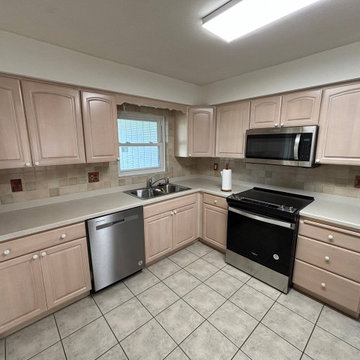
These kitchen cabinets were professionally refreshed in the same original color to restore a clean, like-new appearance. The existing finish was prepped and recoated to remove wear, improve durability, and create a smooth, consistent look while preserving the homeowner’s original design and color choice.

Sponsored
Columbus, OH
Wannemacher Interiors
Customized Award-Winning Interior Design Solutions in Franklin Cnty OH
 Mark Brand Architecture
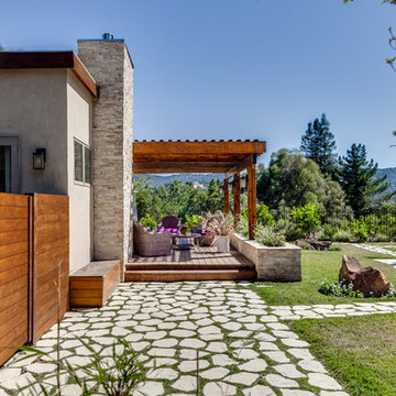
The original design of this late Mid-century Modern house featured a horrifically ugly entry which the owners needed our help to fix. In addition, they wanted to add a master suite, create a home theatre, and remodel the family room. Although they originally considered adding a second floor, our final design resulted in an extension of the house which accentuated its existing linear quality. Our solution to the entry problem included cutting back part of the vaulted roof to allow more light in and adding a cantilevered canopy instead. A new entry bridge crosses a koi pond, and new clerestory windows, stone planters and cedar trim complete the makeover of the previously bland plywood-clad box. The new master suite features 12 foot ceilings, clerestory windows, 8 foot high French doors and a fireplace. The exterior of the addition employs the same pallet of materials as the new façade but with a carefully composed composition of form and proportion. The new family room features the same stone cladding as we used on the exterior.
Photo by Christopher Stark Photography.
 TaylorPro Design and Remodeling, Inc.
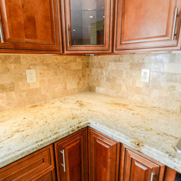
"TaylorPro remodeled our kitchen, replacing cabinets, countertops and appliances. Keeping with the same footprint of our original kitchen and keeping our original travertine floors, Kerry Taylor helped us select a palette of rich, natural colors and materials--mocha-maple glazed cabinets, handsome granite and polished travertine backsplash tiles--to create a warm and beautiful new kitchen. He offered excellent design suggestions for placements of cabinetry and appliances. He recommended and implemented window trim enhancements as well as paint color and lighting design that brought the kitchen and attached family room together with a modern and very warm look. He created a rich, textured backsplash behind the stovetop that enhances the modern stainless steel vent hood. We couldn't be more pleased with the character and design of the kitchen and family room suite.
To begin with, Kerry gave us a detailed estimate covering the likely costs of labor, cabinetry, granite, tile backsplash, construction materials and appliances. His estimate for labor, granite and tile turned out to be ""spot-on"" accurate. Much to our surprise, for example, the granite slabs we selected from Daltile turned out to be exactly the price Kerry had estimated when evaluating the level of materials we would likely install in our kitchen. Kerry kept to his original labor costs, to the penny. Each week, he provided us with an invoice that showed, in percentages, exactly how much labor had been performed that week and how much remained to be done in future weeks. The amounts he charged each week for his labor were exact percentages of the amount of labor his crew had performed to that point. Though these invoices invited us to do a little math to confirm the accuracy of these percentages, Kerry's figures were consistently accurate.
The only categories in which Kerry's original estimate did not conform to the actual costs were in the areas of supplies from Home Depot (needed for the remodeling) and supplies from paint and hardware stores (needed for painting). These materials ended up costing somewhat more that Kerry had estimated. However, Kerry did provide us with receipts for all of these supplies.
Kerry's cabinet man, Jerry, made a very workable design using pre-fabricated cabinets; he then customized the sizes of at least half of these cabinets to conform to the requirements of the center island, cooktop and pantry spaces. We are very happy with the quality of the cabinets. We found the installation expertise of Jerry's installer, Gil, to be top-rate. His installation achieved a custom look and all the cupboards and drawers worked flawlessly.
Kerry's crew, Jake, Randall and Kevin, were great guys to have on site. They respected our property (and our dog) and possessed both skill and integrity. They arrived daily at the time they specified and worked tirelessly to achieve what they set out to do. We couldn't have been happier with their work. Kerry was on site frequently to supervise and coordinate their work and the work of subcontractors.
The project went quickly and efficiently, and the final result was outstanding. We recommend TaylorPro very highly."
~ Judy & Ron C, Clients
Photo By: Kerry W. Taylor
 Urbanology Designs
A captivating transformation in the coveted neighborhood of University Park, Dallas
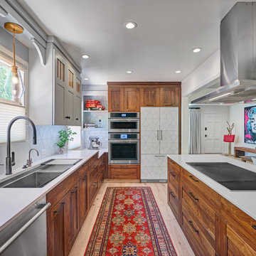
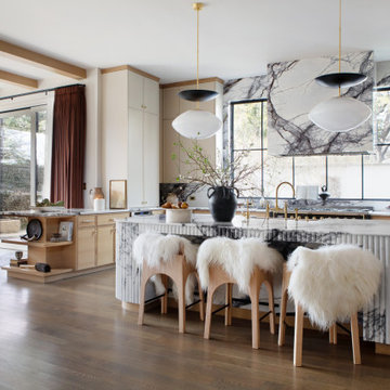
The heart of this home lies in the kitchen, where we embarked on a design endeavor that would leave anyone speechless. By opening up the main kitchen wall, we created a magnificent window system that floods the space with natural light and offers a breathtaking view of the picturesque surroundings. Suspended from the ceiling, a steel-framed marble vent hood floats a few inches from the window, showcasing a mesmerizing Lilac Marble. The same marble is skillfully applied to the backsplash and island, featuring a bold combination of color and pattern that exudes elegance.
Adding to the kitchen's allure is the Italian range, which not only serves as a showstopper but offers robust culinary features for even the savviest of cooks. However, the true masterpiece of the kitchen lies in the honed reeded marble-faced island. Each marble strip was meticulously cut and crafted by artisans to achieve a half-rounded profile, resulting in an island that is nothing short of breathtaking. This intricate process took several months, but the end result speaks for itself.
To complement the grandeur of the kitchen, we designed a combination of stain-grade and paint-grade cabinets in a thin raised panel door style. This choice adds an elegant yet simple look to the overall design. Inside each cabinet and drawer, custom interiors were meticulously designed to provide maximum functionality and organization for the day-to-day cooking activities. A vintage Turkish runner dating back to the 1960s, evokes a sense of history and character.
The breakfast nook boasts a stunning, vivid, and colorful artwork created by one of Dallas' top artist, Kyle Steed, who is revered for his mastery of his craft. Some of our favorite art pieces from the inspiring Haylee Yale grace the coffee station and media console, adding the perfect moment to pause and loose yourself in the story of her art.
The project extends beyond the kitchen into the living room, where the family's changing needs and growing children demanded a new design approach. Accommodating their new lifestyle, we incorporated a large sectional for family bonding moments while watching TV. The living room now boasts bolder colors, striking artwork a coffered accent wall, and cayenne velvet curtains that create an inviting atmosphere. Completing the room is a custom 22' x 15' rug, adding warmth and comfort to the space. A hidden coat closet door integrated into the feature wall adds an element of surprise and functionality.
This project is not just about aesthetics; it's about pushing the boundaries of design and showcasing the possibilities. By curating an out-of-the-box approach, we bring texture and depth to the space, employing different materials and original applications. The layered design achieved through repeated use of the same material in various forms, shapes, and locations demonstrates that unexpected elements can create breathtaking results.
The reason behind this redesign and remodel was the homeowners' desire to have a kitchen that not only provided functionality but also served as a beautiful backdrop to their cherished family moments. The previous kitchen lacked the "wow" factor they desired, prompting them to seek our expertise in creating a space that would be a source of joy and inspiration.
Inspired by well-curated European vignettes, sculptural elements, clean lines, and a natural color scheme with pops of color, this design reflects an elegant organic modern style. Mixing metals, contrasting textures, and utilizing clean lines were key elements in achieving the desired aesthetic. The living room introduces bolder moments and a carefully chosen color scheme that adds character and personality.
The client's must-haves were clear: they wanted a show stopping centerpiece for their home, enhanced natural light in the kitchen, and a design that reflected their family's dynamic. With the transformation of the range wall into a wall of windows, we fulfilled their desire for abundant natural light and breathtaking views of the surrounding landscape.
Our favorite rooms and design elements are numerous, but the kitchen remains a standout feature. The painstaking process of hand-cutting and crafting each reeded panel in the island to match the marble's veining resulted in a labor of love that emanates warmth and hospitality to all who enter.
In conclusion, this tastefully lux project in University Park, Dallas is an extraordinary example of a full gut remodel that has surpassed all expectations. The meticulous attention to detail, the masterful use of materials, and the seamless blend of functionality and aesthetics create an unforgettable space. It serves as a testament to the power of design and the transformative impact it can have on a home and its inhabitants.
Project by Texas' Urbanology Designs. Their North Richland Hills-based interior design studio serves Dallas, Highland Park, University Park, Fort Worth, and upscale clients nationwide.
28