
Search results for "Reduce same origin" in Home Design Ideas
 Southern Living
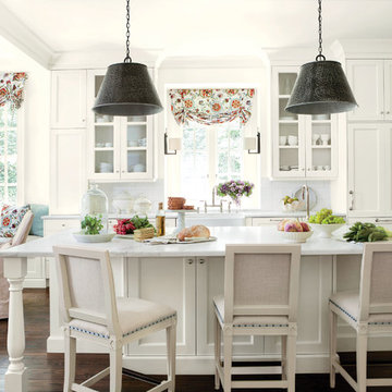
To create an elegant, light-filled look, Suzanne painted the walls and cabinetry the same creamy white and then continued the less-is-more palette with white marble countertops, a white tile backsplash, and linen barstools.
Suzanne worked with Matthew Quinn of Design Galleria to create new cabinetry while retaining the kitchen's original layout. "We strengthened the room's architectural envelope," she says. "Once that's in place, a room requires less decorating." Together, they designed Shaker-style cabinets topped with weighty molding and a handsome island with dining table-like legs. Photo by Erica George Dines for Southern Living
 Misiaszek Turpin pllc
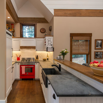
The 800 square-foot guest cottage is located on the footprint of a slightly smaller original cottage that was built three generations ago. With a failing structural system, the existing cottage had a very low sloping roof, did not provide for a lot of natural light and was not energy efficient. Utilizing high performing windows, doors and insulation, a total transformation of the structure occurred. A combination of clapboard and shingle siding, with standout touches of modern elegance, welcomes guests to their cozy retreat.
The cottage consists of the main living area, a small galley style kitchen, master bedroom, bathroom and sleeping loft above. The loft construction was a timber frame system utilizing recycled timbers from the Balsams Resort in northern New Hampshire. The stones for the front steps and hearth of the fireplace came from the existing cottage’s granite chimney. Stylistically, the design is a mix of both a “Cottage” style of architecture with some clean and simple “Tech” style features, such as the air-craft cable and metal railing system. The color red was used as a highlight feature, accentuated on the shed dormer window exterior frames, the vintage looking range, the sliding doors and other interior elements.
Photographer: John Hession
 Architect Heather Johnston
CASA 1O
Contemporary on a Mid-century Scaffold.
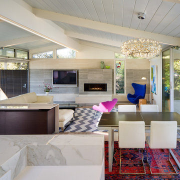
Largely unmodified since its design by Russell Forester and construction in 1957, the structure housed the original family until 2013. An intimate 1,910 square foot space, the house acquired a separate 600 square foot cottage in the 70’s designed by another architect. New owners purchased the house with the idea of keeping the original architect’s intent intact – the simple accommodation of everyday life with a focus on outdoor living only possible in Southern California. At the same time the house needed insulation, new electrical, plumbing, siding – everything but new studs and foundations.
A single roof beam travels south from the north fireplace wall all the way to the bedrooms in the back. Functions occur to either side, with private access to exterior courtyards. How do we accentuate the uncomplicated while enhancing the qualities of the chosen materials? Contemporary applied to a mid-century scaffold.
We focused on reduction, a few things performing many tasks. Each component, material or color performs more than one duty.
Lighting is paramount, enhancing the design’s procession from front to back, north to south, public to private. Strip LED’s reinforce the beam’s linear presence and spot LED’s make punctuation points of the roof purlins. Hidden up and down-lights in the cabinets and elsewhere provide the rooms with a quiet glow.
Exterior grass plantings give the only vertical dimension to the design, waving as the breeze moves them. All else is horizontal: caramelized bamboo siding, porcelain tile, roof line and ocean horizon.
Architect: Heather Johnston Architect
Landscaping: HJA
Photography: Brady Architectural Photography
Find the right local pro for your project
 Remodeling by Classic Homes
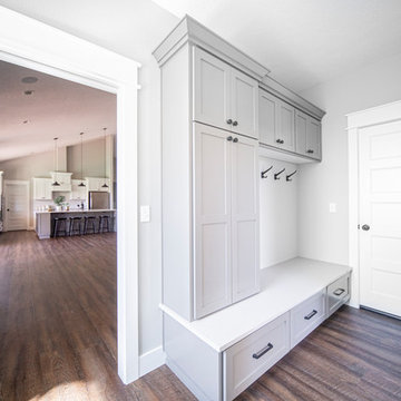
The original ranch style home was built in 1962 by the homeowner’s father. She grew up in this home; now her and her husband are only the second owners of the home. The existing foundation and a few exterior walls were retained with approximately 800 square feet added to the footprint along with a single garage to the existing two-car garage. The footprint of the home is almost the same with every room expanded. All the rooms are in their original locations; the kitchen window is in the same spot just bigger as well. The homeowners wanted a more open, updated craftsman feel to this ranch style childhood home. The once 8-foot ceilings were made into 9-foot ceilings with a vaulted common area. The kitchen was opened up and there is now a gorgeous 5 foot by 9 and a half foot Cambria Brittanicca slab quartz island.
 Che Bella Interiors Design + Remodeling
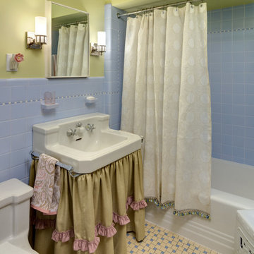
Our clients were looking for a way to update this original bathroom in their 1940's home for their twin girls. We had the challenge of keeping all of the original tile, and adding colors and frills to make the bathroom more girly. A custom roman treatment, shower curtain and sink skirt added softness to all of the tile. The sink was original to the home, and in great condition.
Photos by Ehlen Creative
 AquaTerra Outdoors
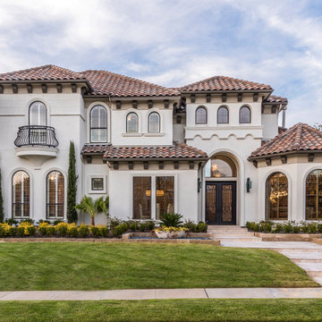
This Starwood home, located in Frisco, TX, was originally designed in the Mediterranean-Tuscan style, typical of the late 90’s and early 2k period. Over the past few years, the home’s interior had been fully renovated to reflect a more clean-transitional look. Aquaterra’s goal for this landscape, pool and outdoor living renovation project was to harmonize the exterior with the interior by creating that same timeless feel. Defining new gathering spots, enhancing flow and maximizing space, with a balance of form and function, was our top priority.
Wade Griffith Photography
 HAUS | Architecture For Modern Lifestyles
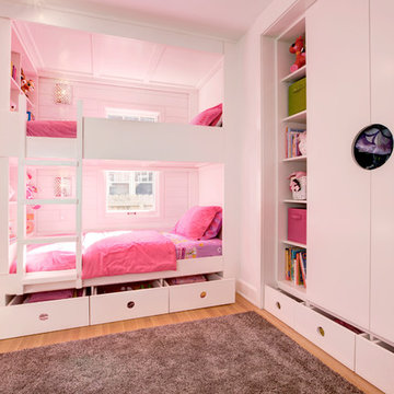
Custom Bunk Beds integrate storage cubbies within and roller-drawers beneath. Original storage closet to right opened-up to create full-integrated millwork closet system to match with bunks - Architect: HAUS | Architecture - Construction: WERK | Build - Photo: HAUS | Architecture

Sponsored
Fredericksburg, OH

High Point Cabinets
Columbus' Experienced Custom Cabinet Builder | 4x Best of Houzz Winner
 The Brooklyn Studio
This residence was a complete gut renovation of a 4-story row house in Park Slope, and included a new rear extension and penthouse addition. The owners wished to create a warm, family home using a modern language that would act as a clean canvas to feature rich textiles and items from their world travels. As with most Brooklyn row houses, the existing house suffered from a lack of natural light and connection to exterior spaces, an issue that Principal Brendan Coburn is acutely aware of from his experience re-imagining historic structures in the New York area. The resulting architecture is designed around moments featuring natural light and views to the exterior, of both the private garden and the sky, throughout the house, and a stripped-down language of detailing and finishes allows for the concept of the modern-natural to shine.
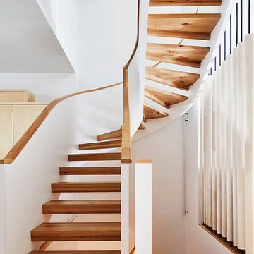
Upon entering the home, the kitchen and dining space draw you in with views beyond through the large glazed opening at the rear of the house. An extension was built to allow for a large sunken living room that provides a family gathering space connected to the kitchen and dining room, but remains distinctly separate, with a strong visual connection to the rear garden. The open sculptural stair tower was designed to function like that of a traditional row house stair, but with a smaller footprint. By extending it up past the original roof level into the new penthouse, the stair becomes an atmospheric shaft for the spaces surrounding the core. All types of weather – sunshine, rain, lightning, can be sensed throughout the home through this unifying vertical environment. The stair space also strives to foster family communication, making open living spaces visible between floors. At the upper-most level, a free-form bench sits suspended over the stair, just by the new roof deck, which provides at-ease entertaining. Oak was used throughout the home as a unifying material element. As one travels upwards within the house, the oak finishes are bleached to further degrees as a nod to how light enters the home.
The owners worked with CWB to add their own personality to the project. The meter of a white oak and blackened steel stair screen was designed by the family to read “I love you” in Morse Code, and tile was selected throughout to reference places that hold special significance to the family. To support the owners’ comfort, the architectural design engages passive house technologies to reduce energy use, while increasing air quality within the home – a strategy which aims to respect the environment while providing a refuge from the harsh elements of urban living.
This project was published by Wendy Goodman as her Space of the Week, part of New York Magazine’s Design Hunting on The Cut.
Photography by Kevin Kunstadt
 Kitchen Design Concepts
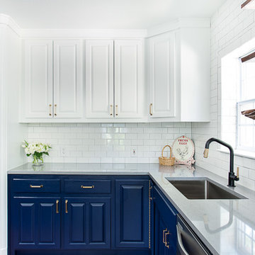
We introduce to you one of our newer services we are providing here at Kitchen Design Concepts: spaces that just need a little reviving! As of recent, we are taking on projects that are in need of minimal updating, as in, spaces that don’t need a full-on remodel. Yes, you heard right! If your space has good bones, you like the layout of your kitchen, and you just need a few cosmetic changes, then today’s feature is for you! Recently, we updated a space where we did just this! The kitchen was in need of a little love, some fresh paint, and new finishes. And if we’re being honest here, the result looks almost as if the kitchen had a full-on remodel! To learn more about this space and how we did our magic, continue reading below:
The Before and After
First, see what an impact new finishes can make! The “before” image shows a kitchen with outdated finishes such as the tile countertops, backsplash, and cabinetry finish. The “after” image, is a kitchen that looks almost as if its brand new, the image speaks for itself!
Cabinetry
With the wooden cabinetry in this kitchen already having great bones, all we needed to do was our refinishing process that involved removing door and drawer fronts, sanding, priming, and painting. The main color of the cabinetry is white (Sherwin Williams Pure White 7005) and as an accent, we applied a deep navy blue that really pops in this space (Sherwin Willaims Naval 6244). As a special design element, we incorporated a natural wooden band across the hood which is subtle but adds an element of surprise.
Countertops
The original countertops in this space were a 12×12 tile with cracks and discolored grout from all the wear and tear. To replace the countertops, we installed a clean and crisp quartz that is not only durable but easy to maintain (no grout here!). The 3cm countertops are a Cambria quartz in a grey-tone color (Carrick).
Backsplash
Keeping things simple, yet classic, we installed a 3×6 subway tile from Interceramic. The crisp white pairs well with all the other finishes of the space and really brighten the space up! To spice things up, we paired the white tile with a contrasting grout color (Cape Grey) that matches the countertop. This is a simple method to add interest to your white backsplash!
Fixtures and Fittings
For the fixtures and fittings of the kitchen, we wanted pieces that made a statement. That’s why we selected this industrial style faucet from Brizo! The faucet is a Brizo LITZE™ PULL-DOWN FAUCET WITH ARC SPOUT AND INDUSTRIAL HANDLE (63044LF-BLGL). The matte black paired with the luxe gold elements really make a statement! To match the gold elements of the faucet, we installed cabinetry hardware from Topknobs in the same gold finish. The hardware is a Channing pull TK743HB. Lastly, the large single bowl sink (who doesn’t want a large sink?!) is a great functional touch to the kitchen. The sink is a Blanco Precision 16″ R10 super single with 16″ Drainer in stainless steel (516216).
 Dura Supreme Cabinetry
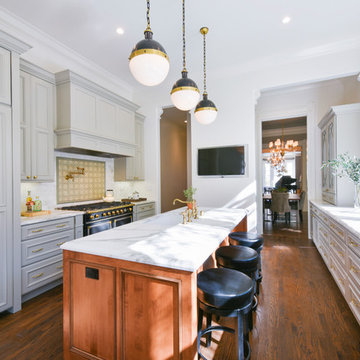
With an ideal location in the Pacific Heights neighborhood of San Francisco, this dated Victorian residence had "beautiful bones" but had been sitting on the market for a year before being purchased with plans to revitalize the interior. Interior designer, Noel Han, explained, "Historical Victorian homes in this area often have beautiful architectural elements that I aim to preserve, but the floor plan and layout tend to be stuffy, not live-able and not light filled. Modern families want bright, light-filled, spacious rooms that take advantage of outdoor views and living spaces, and function well for storage, meals and entertaining."
Preserving the architectural integrity and special features of the home was one of Han's goals but at the same time, she re-designed the space, moving walls and adding windows to create an open floorplan that flowed easily between the kitchen and outdoor living spaces. Where the range once stood in the original design, now an entire wall of windows provides panoramic views of the outdoors and fills the kitchen with light. Below the windows, Han designed a long bank of base cabinets with drawers to provide plenty of storage and work surface. Light now pours into the space even on foggy days. The range was moved to the opposite wall so that beautiful window views could be added to the kitchen.
Han selected a palette of finishes with an eye toward creating a "soft color aesthetic". "White painted finishes are very popular right now but would have felt stark and cold in this space," she explained. "The French grey paint from Dura Supreme was a perfect complement for this vintage Victorian home, to create a classic color scheme".
"This beautiful home already had hardware elements with a vintage brass finish, so I carefully selected antiqued, brushed brass hardware, plumbing and metal finishes to blend with the original elements," said Han. She continued, "The La Cornue French Range adds modern function with a French antique look."
"I appreciate working with Dura Supreme cabinetry because of the quality of the cabinetry, fast delivery and the custom options. I'm able to create beautiful architectural details like the pull-out columns on both sides of the range and the curved mullion doors on the furniture hutch, and they offer a stunning palette of finishes and styles," explained Han. For the bath cabinetry, Han created a similar palette of finishes and styles to create a complementary look throughout the entire home.
Product Details:
Perimeter: Dura Supreme Cabinetry shown in the St. Augustine door style and Mullion Pattern #15 door style with a “Zinc” painted finish.
Kitchen Island: Dura Supreme Cabinetry shown in the St. Augustine door style with a Clove stain and Black Accent finish on Cherry wood.
For more information about Noel Han, Interior Designer, click to her website here www.atelnoel.com.
For more information about Gilmans Kitchens and Baths, click to their website here www.gkandb.com.
Photography by: Ned Bonzi www.nedbonzi.com.
Request a FREE Dura Supreme Brochure Packet:
http://www.durasupreme.com/request-brochure
 David Heide Design Studio
Architecture & Interior Design: David Heide Design Studio
Photos: Susan Gilmore Photography
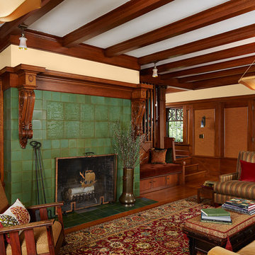
Living room - craftsman formal and enclosed medium tone wood floor living room idea in Minneapolis with beige walls, a standard fireplace, a tile fireplace and no tv
Living room - craftsman formal and enclosed medium tone wood floor living room idea in Minneapolis with beige walls, a standard fireplace, a tile fireplace and no tv
 Lee Meier Interiors
Designer: Barbara Stowe, Allied ASID
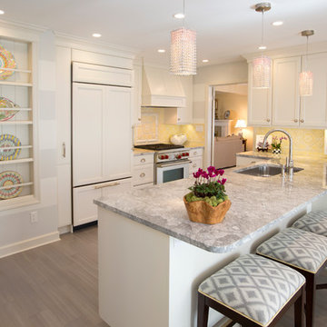
The clients were looking for a complete update of their original 1960's kitchen. They requested a clean and fresh look that would withstand the test of time. Although the footprint remained the same, eliminating soffits allowed for full height cabinets and made the space look larger. Brookhaven by Wood-Mode cabinetry, a narrow pull-out pantry cabinet and custom built-in plate rack provide plenty of storage and the dual-fuel Wolf range and Sub-Zero refrigerator are welcome upgrades.
Classic colors of gray and yellow are repeated in the handmade ceramic tile back splash, the granite counter tops, porcelain plank tile flooring, decorative valance and the numerous fabrics.
Antique chairs upholstered with new fabrics and a farmhouse table made from old doors add warmth, while polished nickel hardware and Schonbek crystal pendants add a bit of bling.
The result is a kitchen that is wonderful to cook in as well as being a lovely gathering place for family and friends.
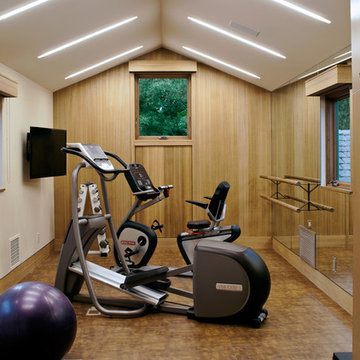
 Menendez Architects PC
A cozy space was transformed into an exercise room and enhanced for this purpose as follows: Fluorescent light fixtures recessed into the ceiling provide cool lighting without reducing headroom; windows on three walls balance the natural light and allow for cross ventilation; a mirrored wall widens the appearance of the space and the wood paneled end wall warms the space with the same richness found in the rest of the house.

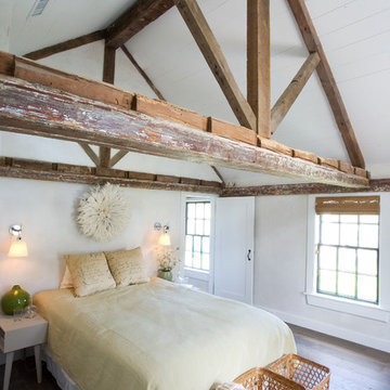
 Rosenberg Kolb Architects
Rosenberg Kolb Architects is proud to announce our renovation of a 1747 timber frame house on Nantucket Island, completed in 2011. The first historic renovation project in Nantucket to receive LEED Gold status. The project was given a Grand Award by Eco Home Magazine in July, 2011.
The project included:
Restructuring the foundations to align and stabilize the structure in addition to providing for a new insulated crawl space;
A 260 square foot addition for a kitchen, bath, and new entry;
New cedar shingles, roof shingles, and restored historic windows;
The house met the strict regulations of Nantucket's Historic District.
On the inside, LEED Gold certification was met through:
High R-value insulation and reduced air leakage;
High efficiency heating, air conditioning, plumbing fixtures, and appliances;
Low-emission paints and finishes as well as a clay wall finish;
Using reclaimed materials from the original house and other sites.
The project has been published in:
N Magazine July 2011
Eco Home Magazine July 2011
New England Home June 2011
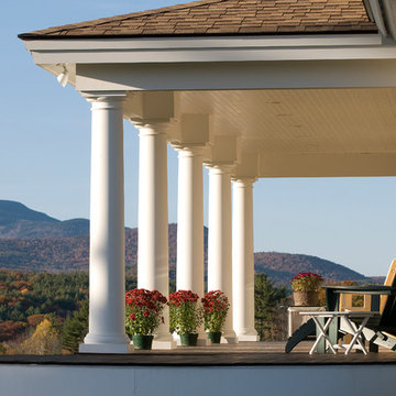 Misiaszek Turpin pllc
This 2,700 square-foot renovation of an existing brick structure has provided a stunning, year round vacation home in the Lake Sunapee region. Located on the same footprint as the original brick structure, the new, one-story residence is oriented on the site to take advantage of the expansive views of Mts. Sunapee and Kearsarge. By implementing a mix of siding treatments, textures and materials, and unique rooflines the home complements the surrounding site, and caps off the top of the grassy hill.
New entertainment rooms and porches are located so that the spectacular views of the surrounding mountains are always prominent. Dressed in bright and airy colors, the spaces welcome conversation and relaxation in spectacular settings. The design of three unique spaces, each of which experience the site differently, contributed to the overall layout of the residence. From the Adirondack chairs on the colonnaded porch to the cushioned sofas of the sunroom, personalized touches of exquisite taste provide an undeniably comforting atmosphere to the site.
Photographer: Joseph St. Pierre
 Rosenberg Kolb Architects
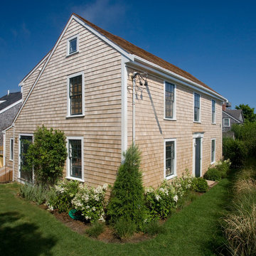
Rosenberg Kolb Architects is proud to announce our renovation of a 1747 timber frame house on Nantucket Island, completed in 2011. The first historic renovation project in Nantucket to receive LEED Gold status. The project was given a Grand Award by Eco Home Magazine in July, 2011.
The project included:
Restructuring the foundations to align and stabilize the structure in addition to providing for a new insulated crawl space;
A 260 square foot addition for a kitchen, bath, and new entry;
New cedar shingles, roof shingles, and restored historic windows;
The house met the strict regulations of Nantucket's Historic District.
On the inside, LEED Gold certification was met through:
High R-value insulation and reduced air leakage;
High efficiency heating, air conditioning, plumbing fixtures, and appliances;
Low-emission paints and finishes as well as a clay wall finish;
Using reclaimed materials from the original house and other sites.
The project has been published in:
N Magazine July 2011
Eco Home Magazine July 2011
New England Home June 2011
 Tammara Stroud Design
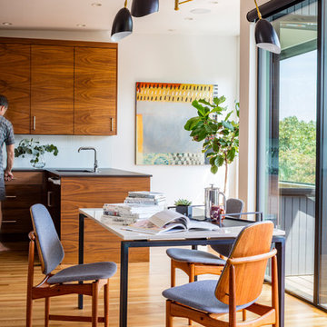
In 1949, one of mid-century modern’s most famous NW architects, Paul Hayden Kirk, built this early “glass house” in Hawthorne Hills. Rather than flattening the rolling hills of the Northwest to accommodate his structures, Kirk sought to make the least impact possible on the building site by making use of it natural landscape. When we started this project, our goal was to pay attention to the original architecture--as well as designing the home around the client’s eclectic art collection and African artifacts. The home was completely gutted, since most of the home is glass, hardly any exterior walls remained. We kept the basic footprint of the home the same—opening the space between the kitchen and living room. The horizontal grain matched walnut cabinets creates a natural continuous movement. The sleek lines of the Fleetwood windows surrounding the home allow for the landscape and interior to seamlessly intertwine. In our effort to preserve as much of the design as possible, the original fireplace remains in the home and we made sure to work with the natural lines originally designed by Kirk.

Sponsored
Columbus, OH

Wannemacher Interiors
Customized Award-Winning Interior Design Solutions in Franklin Cnty OH
 TKS Design Group
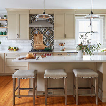
This vintage home was built in 1897 in Downers Grove. The homeowner is an avid chef and needed a better design work flow. She wanted to keep the same vintage feel in the kitchen as throughout the home. We added a work / dining island, new cabinetry and storage, upgraded the cooking equipment and widened and upgraded the windows for additional natural light. We added the archway into the dining room to repeat the original archway elsewhere in the home.
Designed by: Susan Klimala, CKD, CBD
Photography by: Michael Alan Kaskel
For more information on kitchen and bath design ideas go to: www.kitchenstudio-ge.com
 Carl Mattison Design
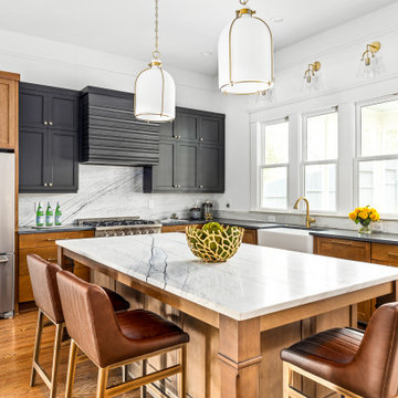
The kitchen is in the exact same place as the original kitchen but with a full new look and feel.
Kitchen - transitional kitchen idea in Atlanta
Kitchen - transitional kitchen idea in Atlanta
 Nance Lee
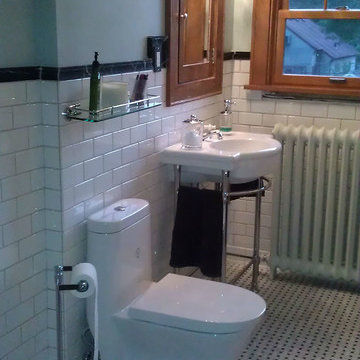
Same view afterwards. but before armoire was added in the place of the former linen closet. Also before window sash reinstalled. Note refinished original medicine cabinet and radiator.
6