
Search results for "Reduce same origin" in Home Design Ideas
 TVL Creative Ltd.
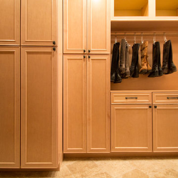
This closet project cleaned up a tight (but lengthy) closet space with gorgeous new cabinetry and maximized organization. The original space is housed inside of a true log home (same house as the gorgeous Evergreen Kitchen remodel we completed last year) and so the same challenges were present. Moreso than the kitchen, dealing with the logs was very difficult. The original closet had shelves and storage pieces attached to the logs, but over time the logs shifted and expanded, causing these shelving units to detach and break. Our plan for the new closet was to construct an independent framing structure to which the new cabinetry could be attached, preventing shifting and breaking over time. This reduced the overall depth of the clear closet space, but allowed for a multitude of gorgeous cabinet boxes to be integrated into the space where there was never true storage before. We shifted the depths of each cabinet moving down through the space to allow for as much walkable space as possible while still providing storage. With a mix of drawers, hanging bars, roll out trays, and open shelving, this closet is a true beauty with lots of storage opportunity!
 TVL Creative Ltd.
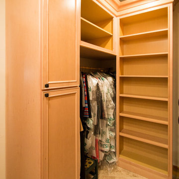
This closet project cleaned up a tight (but lengthy) closet space with gorgeous new cabinetry and maximized organization. The original space is housed inside of a true log home (same house as the gorgeous Evergreen Kitchen remodel we completed last year) and so the same challenges were present. Moreso than the kitchen, dealing with the logs was very difficult. The original closet had shelves and storage pieces attached to the logs, but over time the logs shifted and expanded, causing these shelving units to detach and break. Our plan for the new closet was to construct an independent framing structure to which the new cabinetry could be attached, preventing shifting and breaking over time. This reduced the overall depth of the clear closet space, but allowed for a multitude of gorgeous cabinet boxes to be integrated into the space where there was never true storage before. We shifted the depths of each cabinet moving down through the space to allow for as much walkable space as possible while still providing storage. With a mix of drawers, hanging bars, roll out trays, and open shelving, this closet is a true beauty with lots of storage opportunity!
 Adrienne DeRosa
Adrienne DeRosa © 2014 Houzz Inc.
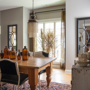
While the formal dining room takes on a different feeling than the living space, it maintains the same sense of curated detail. Jennifer goes on to explain, "When I decorate my home I don't feel I have a style. I believe what ever you put in your home is what you should love, and that way it creates its own style ... I've been collecting for so long that a lot of my treasures have come together because I love them and eventually it will all make sense. I don't like one 'way'; that's why all my rooms are different."
The dining table was found in an old flower shop. Originally it was a worktable with very tall legs, so Raymond and Jennifer cut them down to modify it for its current use. The chairs received Jennifer's creative touch as well. Purchased at a garage sale for $1 each, they are originally from an ice cream parlor in the basement of the historical Higbee's Company department store. Once she got them home, Jennifer reupholstered them with a cow-hide rug that she was no longer using.
Wall color: Modern Grey, Super Paint by Sherwin Williams
Photo: Adrienne DeRosa © 2014 Houzz
Find the right local pro for your project
 The Brooklyn Studio
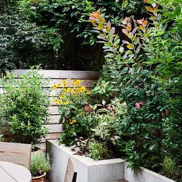
This residence was a complete gut renovation of a 4-story row house in Park Slope, and included a new rear extension and penthouse addition. The owners wished to create a warm, family home using a modern language that would act as a clean canvas to feature rich textiles and items from their world travels. As with most Brooklyn row houses, the existing house suffered from a lack of natural light and connection to exterior spaces, an issue that Principal Brendan Coburn is acutely aware of from his experience re-imagining historic structures in the New York area. The resulting architecture is designed around moments featuring natural light and views to the exterior, of both the private garden and the sky, throughout the house, and a stripped-down language of detailing and finishes allows for the concept of the modern-natural to shine.
Upon entering the home, the kitchen and dining space draw you in with views beyond through the large glazed opening at the rear of the house. An extension was built to allow for a large sunken living room that provides a family gathering space connected to the kitchen and dining room, but remains distinctly separate, with a strong visual connection to the rear garden. The open sculptural stair tower was designed to function like that of a traditional row house stair, but with a smaller footprint. By extending it up past the original roof level into the new penthouse, the stair becomes an atmospheric shaft for the spaces surrounding the core. All types of weather – sunshine, rain, lightning, can be sensed throughout the home through this unifying vertical environment. The stair space also strives to foster family communication, making open living spaces visible between floors. At the upper-most level, a free-form bench sits suspended over the stair, just by the new roof deck, which provides at-ease entertaining. Oak was used throughout the home as a unifying material element. As one travels upwards within the house, the oak finishes are bleached to further degrees as a nod to how light enters the home.
The owners worked with CWB to add their own personality to the project. The meter of a white oak and blackened steel stair screen was designed by the family to read “I love you” in Morse Code, and tile was selected throughout to reference places that hold special significance to the family. To support the owners’ comfort, the architectural design engages passive house technologies to reduce energy use, while increasing air quality within the home – a strategy which aims to respect the environment while providing a refuge from the harsh elements of urban living.
This project was published by Wendy Goodman as her Space of the Week, part of New York Magazine’s Design Hunting on The Cut.
Photography by Kevin Kunstadt
 Fernanda Zulzke Interiores
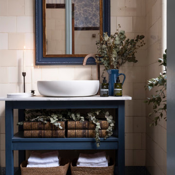
Fernanda Zulzke gifted São Paulo with an authentic experience by preserving the original 1920s tiles and architecture of the building. Many broken tiles were replaced, and missing ones were carefully sourced to breathe new life into a long-forgotten space. The floor tiles received the same care, though they posed an even greater challenge, as the original baseboard pieces could not be found even in the city’s largest tile archives. Beyond mere maintenance, the decoration aims to show visitors that history and its imperfections bring beauty, vitality, originality, and exclusivity to a space—a combination that can never be replicated, a luxury in its essence.
In the realm of restoration, the solid wood bathroom doors were personally tended to by Flávio Galli, a skilled designer and expert in raw materials, who followed the guidelines of the Parque da Água Branca manual. Four days of cleaning, sanding, and varnishing brought the doors back to life. In terms of carpentry, damaged baseboards and frames were crafted by Construverde using the building’s original wood—a true gift that Fernanda Zulzke was determined to offer the public and the park.
Completing the bathroom’s composition, imported wallpapers from Cordão Decor and a Roman curtain in cambric demonstrate the decorator’s ability to honor history while making bold, unexpected choices. Few can combine vintage, classic, and diverse colors and patterns in such a small space, transforming it into a light and fresh work of art, like the eucalyptus resting atop the marble and classic encyclopedias.

 Allen Construction
The original house was demolished to make way for a two-story house on the sloping lot, with an accessory dwelling unit below. The upper level of the house, at street level, has three bedrooms, a kitchen and living room. The “great room” opens onto an ocean-view deck through two large pocket doors. The master bedroom can look through the living room to the same view. The owners, acting as their own interior designers, incorporated lots of color with wallpaper accent walls in each bedroom, and brilliant tiles in the bathrooms, kitchen, and at the fireplace tiles in the bathrooms, kitchen, and at the fireplace.
Architect: Thompson Naylor Architects
Photographs: Jim Bartsch Photographer
 Alair Homes Plano
Our clients house was built in 2012, so it was not that outdated, it was just dark. The clients wanted to lighten the kitchen and create something that was their own, using more unique products. The master bath needed to be updated and they wanted the upstairs game room to be more functional for their family.
The original kitchen was very dark and all brown. The cabinets were stained dark brown, the countertops were a dark brown and black granite, with a beige backsplash. We kept the dark cabinets but lightened everything else. A new translucent frosted glass pantry door was installed to soften the feel of the kitchen. The main architecture in the kitchen stayed the same but the clients wanted to change the coffee bar into a wine bar, so we removed the upper cabinet door above a small cabinet and installed two X-style wine storage shelves instead. An undermount farm sink was installed with a 23” tall main faucet for more functionality. We replaced the chandelier over the island with a beautiful Arhaus Poppy large antique brass chandelier. Two new pendants were installed over the sink from West Elm with a much more modern feel than before, not to mention much brighter. The once dark backsplash was now a bright ocean honed marble mosaic 2”x4” a top the QM Calacatta Miel quartz countertops. We installed undercabinet lighting and added over-cabinet LED tape strip lighting to add even more light into the kitchen.
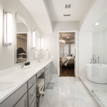
We basically gutted the Master bathroom and started from scratch. We demoed the shower walls, ceiling over tub/shower, demoed the countertops, plumbing fixtures, shutters over the tub and the wall tile and flooring. We reframed the vaulted ceiling over the shower and added an access panel in the water closet for a digital shower valve. A raised platform was added under the tub/shower for a shower slope to existing drain. The shower floor was Carrara Herringbone tile, accented with Bianco Venatino Honed marble and Metro White glossy ceramic 4”x16” tile on the walls. We then added a bench and a Kohler 8” rain showerhead to finish off the shower. The walk-in shower was sectioned off with a frameless clear anti-spot treated glass. The tub was not important to the clients, although they wanted to keep one for resale value. A Japanese soaker tub was installed, which the kids love! To finish off the master bath, the walls were painted with SW Agreeable Gray and the existing cabinets were painted SW Mega Greige for an updated look. Four Pottery Barn Mercer wall sconces were added between the new beautiful Distressed Silver leaf mirrors instead of the three existing over-mirror vanity bars that were originally there. QM Calacatta Miel countertops were installed which definitely brightened up the room!
Originally, the upstairs game room had nothing but a built-in bar in one corner. The clients wanted this to be more of a media room but still wanted to have a kitchenette upstairs. We had to remove the original plumbing and electrical and move it to where the new cabinets were. We installed 16’ of cabinets between the windows on one wall. Plank and Mill reclaimed barn wood plank veneers were used on the accent wall in between the cabinets as a backing for the wall mounted TV above the QM Calacatta Miel countertops. A kitchenette was installed to one end, housing a sink and a beverage fridge, so the clients can still have the best of both worlds. LED tape lighting was added above the cabinets for additional lighting. The clients love their updated rooms and feel that house really works for their family now.
Design/Remodel by Hatfield Builders & Remodelers | Photography by Versatile Imaging

Sponsored
Sunbury, OH

J.Holderby - Renovations
Franklin County's Leading General Contractors - 2X Best of Houzz!
 Balboa Design Group
Our clients wanted a REAL master bathroom with enough space for both of them to be in there at the same time. Their house, built in the 1940’s, still had plenty of the original charm, but also had plenty of its original tiny spaces that just aren’t very functional for modern life.
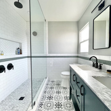
The original bathroom had a tiny stall shower, and just a single vanity with very limited storage and counter space. Not to mention kitschy pink subway tile on every wall. With some creative reconfiguring, we were able to reclaim about 25 square feet of space from the bedroom. Which gave us the space we needed to introduce a double vanity with plenty of storage, and a HUGE walk-in shower that spans the entire length of the new bathroom!
While we knew we needed to stay true to the original character of the house, we also wanted to bring in some modern flair! Pairing strong graphic floor tile with some subtle (and not so subtle) green tones gave us the perfect blend of classic sophistication with a modern glow up.
Our clients were thrilled with the look of their new space, and were even happier about how large and open it now feels!
 Simply Home Decorating
This beautiful North Vancouver home belongs to a nature-loving and health-conscious couple, Emma and Vince (names changed), their two young children, and their dog, Jasper. When they contacted us about renovating and furnishing their kitchen and family room, we walked in and saw a world of potential waiting to be uncovered.
Before: Larkhall Crescent Home:
Like many original North Vancouver homes, the interior was definitely dated. We encountered late ‘80s finishes in powder pink and teal green, old carpet, and a kitchen that wasn’t maximized to suit this family’s modern-day lifestyle. However, the size of the rooms offered us a ton of space with which to get creative.
Knowing our clients’ love of cooking, need for work spaces (Emma and Vince both work remotely), and growing family, we developed a design concept that would increase usable space, optimize storage, and create intimacy in this large area. As for the style, we were inspired by their European roots, inventing a new and modern take on “Belgian Farmhouse” style. Now, the home is truly one-of-a-kind.
After: Warm & Cozy Family Room:
Fresh, bright, and comfortable, this living area has been transformed! We started with the fireplace as a focal point, selecting aged brick tiles for added texture and a crisp wood mantle. The taupe-coloured sectional infuses the room with visual warmth and serves the added purpose of separating the family room from the kitchen.
Emma and Vince were also keen on using non-toxic materials in their home, and we were happy to oblige. To meet their needs, we sourced natural wood elements and sought out Canadian-made products - that adhere to high health standards - whenever possible.
Look closer at the elements of this space, and you will find this stunning, honeycomb-patterned rug in earthy gold, beige, and charcoal tones. It’s plush to the touch and full of visual texture that brings this room’s colour palette together. We sourced these two-tone chairs with caning, petrified wood side table, black sconces, and botanical prints in greyscale from local artist, Heather Johnston.
We topped off the space with this dark wood and rattan console that offers storage facing the kitchen and presents an opportunity to display cherished items. The result is a cozy lounging space brimming with comfort and functionality. It’s perfect for enjoying quality family time, or Emma can simply slide the coffee table away to make room for her morning yoga practice.
Now, let’s turn around and give some attention to the kitchen. Do you remember what the original kitchen looked like? If not, scroll back up, because the transformation is shocking…
Moody & Welcoming Kitchen for Healthy Living:
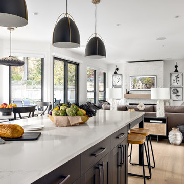
This kitchen looks very different from how it started, right? Though we didn’t touch any walls, the kitchen has almost doubled in usable space! We created a long, extended island with storage, an outlet for small appliances, and seating for comfortable prep, after-school snacking, or mingling among friends.
On the other side of the island, the family has even more storage and an integrated dishwasher within easy reach of the sink, perfect for quick clean-up. From this angle, you can also see the expansive custom Shaker cabinetry in white and the integrated double ovens. These facilitate their cooking experience and gave us the opportunity to add an additional surprise…
A coffee garage station and more hidden storage! Keeping these items located along the perimeter allows them to be accessed by the family or their guests without someone getting under the cook’s feet. These are the little details that make everyday life easier and more enjoyable.
Moving deeper into the kitchen, the seamless induction cooktop topped with a freestanding concealed hood fan commands attention in a soft yet prominent way. The natural wood accent mirrors the fireplace mantle, and the choice of off-black wood-grain cabinets not only continues our black-and-white colour palette but adds a sense of depth and contrast. The corner sink is located to the right and perfectly positioned with a view of their thriving backyard.
To invite more of this family’s character into the space, we mixed metals for interest — matte black, dark pewter, and warm brass — and created open shelves in white oak for their plants and decor. You can also glimpse the tumbled edge of the backsplash tile, which echoes the rustic brick of the fireplace. It adds that farmhouse charm while still feeling timeless and sophisticated.
Last but not least, we designed this dining banquette in the bay window (with integrated bench storage, of course), where the family can share a meal together, the kids can do homework, or Emma and Vince can work and enjoy a change of scenery from their offices. Like the other spaces in the home, it was designed to be beautiful, multi-functional, and long-lasting.
Praise from Our Clients:
It is clear that we love this home, but what did our clients have to say?
“Lori is a visionary and masters execution to the finest detail all at the same time. When she first met us to know more about who we are and how we live, she could right away envision how we could use the space in our kitchen and living room…The results exceeded our expectations.
Lori and her team were also a delight to work with — coordination with all the trades, fast problem-solving, regular updates, professional and friendly attitude of her entire team — made it the dream team. Thank you SHD for making our space so beautiful!”
In turn, we are so grateful for this family’s trust, their open communication, and for being wonderful people with whom to work. (So, thank you!)
 Serenity Design
There are few things we enjoy nearly as much as helping a homeowner create a statement that is so exclusively them that it’s all but impossible for another to duplicate what they’re creating in their home. Sure, there can be common colors and sometimes even common themes, but for as many homeowners as there are, there are as many individual tastes, thoughts, and ideas that can inspire creativity and design. Tapping into where each homeowner is coming from is what is what brings us so much joy and excitement.
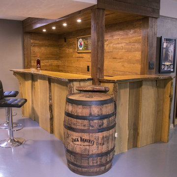
Just imagine the excitement we felt when this homeowner asked us to help him with this unusual project! He received this Jack Daniels barrel as a gift from a close friend and wanted to create a new bar in his basement to entertain family and friends. The initial thought was to have the barrel as a stand alone conversation piece, but after some further discussion we suggested using it as a focal point and thus the project was born.
Jack was known to be a man of refinement and to pay him the appropriate respect it only made sense to approach this project with an equal sense of detail in the crafting of this project, if for no other reason, we hold the same values. To match all of this with our homeowner’s fondness of entertaining friends, the warm and relaxing feeling he was looking for and the aesthetics of the room, the use of reclaimed and live-edge wood made for a natural fit.
In fact aside from a few structural 2x4s beneath the surface, the entire project is built from reused, reclaimed, or re-purposed materials. The most obvious example would be the barrel itself. A bit of research revealed that Jack Daniels only uses their barrels one time before replacing them. Rather than simply destroying them or throwing them away, the barrels are made available to the public to use for other purposes. As a side note we appreciate seeing other companies taking this responsible and earth friendly approach to business.
As a part of our own mission to reduce, reuse, and recycle as often as we can, you’ll note the wall paneling is also re-purposed materials. These particular boards we retrieved from an old building that was being removed and rather than allowing all these materials to be bulldozed with the rest of the old structure, we took as much of the old building materials as we could to use elsewhere. For this project we had the old planks and beams them re-sawn into the wall paneling you see here. Look closely at the picture and you’ll see the original nail holes in the boards that made their new home in this project.
We even incorporated the reclaimed paneling into wrapping the column the previously exposed wood beams above bar area. It adds to the overall feel by incorporating the theme into an otherwise ungainly (and obviously necessary!) part of the house structure.
All the boards in the design of the bar itself come from re-purposed, urban Ash logs. These are either aging and at-risk trees that cities need removed. Ash trees can be subject to assorted infections and diseases and it’s an unfortunate truth that once the disease is discovered, the best way to reduce it’s spreading is to remove the trees in the surrounding area. To further our mission, we take these trees before they end up in a shredder and re-purpose as many of them as we can rather than seeing them simply turned to mulch. We believe this to be a much more responsible use of available materials and just as beautiful.
Each board has so much individual character with their natural knots and swirls. We particularly enjoyed the perfectly sized and shaped piece that became the support at the far end of the bar top. It’s as if nature knew we were going to make this project and grew that board to the perfect dimensions just for this purpose!
We also had a small leftover piece that was extra knotty and so full of character that we incorporated it as a small shelf just above the barrel. Just because it’s small doesn’t mean it can’t make a statement…
Of course no bar would be complete without the top itself. We had a few extra large pieces of Ash with live edges on both sides for the owner to choose from that fit the rough dimensions we needed. His decision made, we added just a very subtle hint of blue and green with our proprietary treatment before the final finishing with epoxy to a mirror finish. We added a few recessed lights to help highlight the natural patterns in the bar top and this bar is ready to serve.
This project was satisfying for several reasons. We were thrilled we were able to complete the project entirely out of reclaimed and re-purposed materials. The homeowner’s desire for a rustic feel made it easier to accomplish this and we appreciate that we can partake in projects like this, particularly one so unique.
Custom doesn’t come out of a catalog. At Serenity Design Studio our number one goal is to see your unique vision come to life.
 Studio Z Architecture
The master suite in this 1970’s Frank Lloyd Wright-inspired home was transformed from open and awkward to clean and crisp. The original suite was one large room with a sunken tub, pedestal sink, and toilet just a few steps up from the bedroom, which had a full wall of patio doors. The roof was rebuilt so the bedroom floor could be raised so that it is now on the same level as the bathroom (and the rest of the house). Rebuilding the roof gave an opportunity for the bedroom ceilings to be vaulted, and wood trim, soffits, and uplighting enhance the Frank Lloyd Wright connection. The interior space was reconfigured to provide a private master bath with a soaking tub and a skylight, and a private porch was built outside the bedroom.
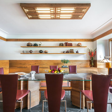
The dining room was given a face-lift by removing the old mirrored china built-in along the wall and adding simple shelves in its place.
Contractor: Meadowlark Design + Build
Interior Designer: Meadowlark Design + Build
Photographer: Emily Rose Imagery
 Remodeling by Classic Homes
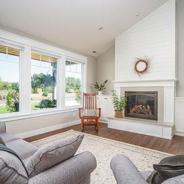
The original ranch style home was built in 1962 by the homeowner’s father. She grew up in this home; now her and her husband are only the second owners of the home. The existing foundation and a few exterior walls were retained with approximately 800 square feet added to the footprint along with a single garage to the existing two-car garage. The footprint of the home is almost the same with every room expanded. All the rooms are in their original locations; the kitchen window is in the same spot just bigger as well. The homeowners wanted a more open, updated craftsman feel to this ranch style childhood home. The once 8-foot ceilings were made into 9-foot ceilings with a vaulted common area. The kitchen was opened up and there is now a gorgeous 5 foot by 9 and a half foot Cambria Brittanicca slab quartz island.
 Rosenberg Kolb Architects
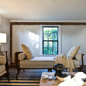
Rosenberg Kolb Architects is proud to announce our renovation of a 1747 timber frame house on Nantucket Island, completed in 2011. The first historic renovation project in Nantucket to receive LEED Gold status. The project was given a Grand Award by Eco Home Magazine in July, 2011.
The project included:
Restructuring the foundations to align and stabilize the structure in addition to providing for a new insulated crawl space;
A 260 square foot addition for a kitchen, bath, and new entry;
New cedar shingles, roof shingles, and restored historic windows;
The house met the strict regulations of Nantucket's Historic District.
On the inside, LEED Gold certification was met through:
High R-value insulation and reduced air leakage;
High efficiency heating, air conditioning, plumbing fixtures, and appliances;
Low-emission paints and finishes as well as a clay wall finish;
Using reclaimed materials from the original house and other sites.
The project has been published in:
N Magazine July 2011
Eco Home Magazine July 2011
New England Home June 2011

Sponsored
Sunbury, OH
J.Holderby - Renovations
Franklin County's Leading General Contractors - 2X Best of Houzz!
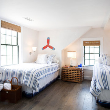 Rosenberg Kolb Architects
Rosenberg Kolb Architects is proud to announce our renovation of a 1747 timber frame house on Nantucket Island, completed in 2011. The first historic renovation project in Nantucket to receive LEED Gold status. The project was given a Grand Award by Eco Home Magazine in July, 2011.
The project included:
Restructuring the foundations to align and stabilize the structure in addition to providing for a new insulated crawl space;
A 260 square foot addition for a kitchen, bath, and new entry;
New cedar shingles, roof shingles, and restored historic windows;
The house met the strict regulations of Nantucket's Historic District.
On the inside, LEED Gold certification was met through:
High R-value insulation and reduced air leakage;
High efficiency heating, air conditioning, plumbing fixtures, and appliances;
Low-emission paints and finishes as well as a clay wall finish;
Using reclaimed materials from the original house and other sites.
The project has been published in:
N Magazine July 2011
Eco Home Magazine July 2011
New England Home June 2011
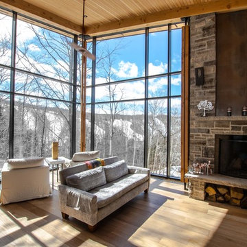
 BLDG Workshop Inc.
The owner of this Devil’s Glen Ski Resort chalet was determined to honour the original structure built by his father.
At the same time, a growing family created the need for an amplified space. The design for the enlarged chalet attempts to incorporate proportions and angles from the original craftsman styled structure while simultaneously taking cues from the challenging mountain site.
Stonework and timber beams create a framework for expansive glazing that affords sweeping views to the mountain, snow and sky. As a result, a new generation of skiers is engaged with the mountain and it’s community in the same way the owner’s father provided him.
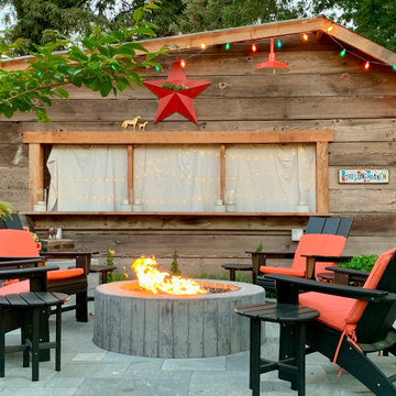
 Brad Cox, Architect, Inc.
This barn used to be the carriage house for an adjacent property, and was initially in pretty bad shape: no roof, sagging beams, and so much Redwood duff and ivy that the owner didn't realize there was a concrete floor underneath. A framer helped the owner reframe the barn from the inside, using dimensional lumber to keep the integrity of the original studs. (Back in the day, a 2 x 4 actually measured 2" x 4".) The siding seen here was originally on the inside of this same wall. Originally the barn had three "rooms", and when the third room collapsed the wall was replaced with plywood.
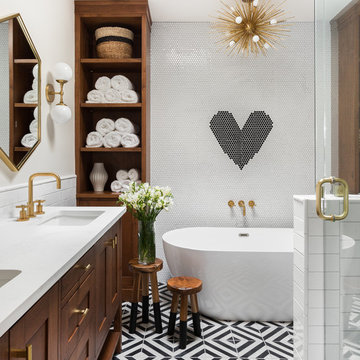
 BUILT Design Collective
photo credit: Haris Kenjar
Original Mission tile floor.
Arteriors lighting.
Newport Brass faucets.
West Elm mirror.
Victoria + Albert tub.
caesarstone countertops
custom tile bath surround

Sponsored
Fredericksburg, OH

High Point Cabinets
Columbus' Experienced Custom Cabinet Builder | 4x Best of Houzz Winner
 Clawson Cabinets
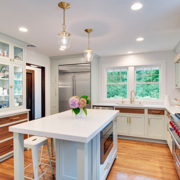
The existing kitchen had seen it’s day come and go. Relocating the hall closet and widening the connection to the dining room made room for an island and opened up the flow.
Window locations remained the same. The hall closet and existing cupboard/butlers pantry were removed to gain space for an island. New Custom Stainless hood with brass strapping pull the stainless appliances and brass details together.
Details for the original home like the original butlers pantry inspired the vision for the new look of glass cabinets over storage drawers.
Woodharbor cabinets custom made for Clawson Cabinets feature painted inset cabinets with contrasting walnut slab drawer heads. Brass hardware finishes the look.
 Alair Homes Plano
Our clients house was built in 2012, so it was not that outdated, it was just dark. The clients wanted to lighten the kitchen and create something that was their own, using more unique products. The master bath needed to be updated and they wanted the upstairs game room to be more functional for their family.
The original kitchen was very dark and all brown. The cabinets were stained dark brown, the countertops were a dark brown and black granite, with a beige backsplash. We kept the dark cabinets but lightened everything else. A new translucent frosted glass pantry door was installed to soften the feel of the kitchen. The main architecture in the kitchen stayed the same but the clients wanted to change the coffee bar into a wine bar, so we removed the upper cabinet door above a small cabinet and installed two X-style wine storage shelves instead. An undermount farm sink was installed with a 23” tall main faucet for more functionality. We replaced the chandelier over the island with a beautiful Arhaus Poppy large antique brass chandelier. Two new pendants were installed over the sink from West Elm with a much more modern feel than before, not to mention much brighter. The once dark backsplash was now a bright ocean honed marble mosaic 2”x4” a top the QM Calacatta Miel quartz countertops. We installed undercabinet lighting and added over-cabinet LED tape strip lighting to add even more light into the kitchen.
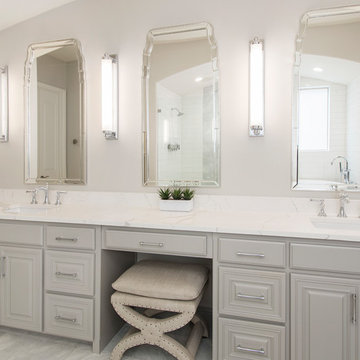
We basically gutted the Master bathroom and started from scratch. We demoed the shower walls, ceiling over tub/shower, demoed the countertops, plumbing fixtures, shutters over the tub and the wall tile and flooring. We reframed the vaulted ceiling over the shower and added an access panel in the water closet for a digital shower valve. A raised platform was added under the tub/shower for a shower slope to existing drain. The shower floor was Carrara Herringbone tile, accented with Bianco Venatino Honed marble and Metro White glossy ceramic 4”x16” tile on the walls. We then added a bench and a Kohler 8” rain showerhead to finish off the shower. The walk-in shower was sectioned off with a frameless clear anti-spot treated glass. The tub was not important to the clients, although they wanted to keep one for resale value. A Japanese soaker tub was installed, which the kids love! To finish off the master bath, the walls were painted with SW Agreeable Gray and the existing cabinets were painted SW Mega Greige for an updated look. Four Pottery Barn Mercer wall sconces were added between the new beautiful Distressed Silver leaf mirrors instead of the three existing over-mirror vanity bars that were originally there. QM Calacatta Miel countertops were installed which definitely brightened up the room!
Originally, the upstairs game room had nothing but a built-in bar in one corner. The clients wanted this to be more of a media room but still wanted to have a kitchenette upstairs. We had to remove the original plumbing and electrical and move it to where the new cabinets were. We installed 16’ of cabinets between the windows on one wall. Plank and Mill reclaimed barn wood plank veneers were used on the accent wall in between the cabinets as a backing for the wall mounted TV above the QM Calacatta Miel countertops. A kitchenette was installed to one end, housing a sink and a beverage fridge, so the clients can still have the best of both worlds. LED tape lighting was added above the cabinets for additional lighting. The clients love their updated rooms and feel that house really works for their family now.
Design/Remodel by Hatfield Builders & Remodelers | Photography by Versatile Imaging
 Studio 511
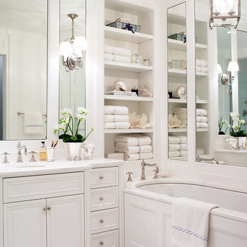
A beautiful, clean, cool, classic, white Master Bath. Interior Design by Ashley Whittaker.
Small elegant master white tile mosaic tile floor bathroom photo in New York with an undermount sink, white cabinets, marble countertops, an undermount tub, white walls, raised-panel cabinets and white countertops
Small elegant master white tile mosaic tile floor bathroom photo in New York with an undermount sink, white cabinets, marble countertops, an undermount tub, white walls, raised-panel cabinets and white countertops
10