
Search results for "Reduce same" in Home Design Ideas

 Harvey Windows and Doors
Great grids! The simulated divided lite grids (a.k.a. muntins) in these Harvey Tribute double hung windows are done in a 4-over-1 pattern, a great choice for smaller windows like this, or for when you want grids but don't want to obstruct too much of your view.

 TKS Design Group
Download our free ebook, Creating the Ideal Kitchen. DOWNLOAD NOW
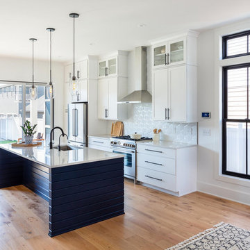
This family from Wheaton was ready to remodel their kitchen, dining room and powder room. The project didn’t call for any structural or space planning changes but the makeover still had a massive impact on their home. The homeowners wanted to change their dated 1990’s brown speckled granite and light maple kitchen. They liked the welcoming feeling they got from the wood and warm tones in their current kitchen, but this style clashed with their vision of a deVOL type kitchen, a London-based furniture company. Their inspiration came from the country homes of the UK that mix the warmth of traditional detail with clean lines and modern updates.
To create their vision, we started with all new framed cabinets with a modified overlay painted in beautiful, understated colors. Our clients were adamant about “no white cabinets.” Instead we used an oyster color for the perimeter and a custom color match to a specific shade of green chosen by the homeowner. The use of a simple color pallet reduces the visual noise and allows the space to feel open and welcoming. We also painted the trim above the cabinets the same color to make the cabinets look taller. The room trim was painted a bright clean white to match the ceiling.
In true English fashion our clients are not coffee drinkers, but they LOVE tea. We created a tea station for them where they can prepare and serve tea. We added plenty of glass to showcase their tea mugs and adapted the cabinetry below to accommodate storage for their tea items. Function is also key for the English kitchen and the homeowners. They requested a deep farmhouse sink and a cabinet devoted to their heavy mixer because they bake a lot. We then got rid of the stovetop on the island and wall oven and replaced both of them with a range located against the far wall. This gives them plenty of space on the island to roll out dough and prepare any number of baked goods. We then removed the bifold pantry doors and created custom built-ins with plenty of usable storage for all their cooking and baking needs.
The client wanted a big change to the dining room but still wanted to use their own furniture and rug. We installed a toile-like wallpaper on the top half of the room and supported it with white wainscot paneling. We also changed out the light fixture, showing us once again that small changes can have a big impact.
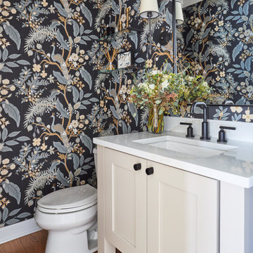
As the final touch, we also re-did the powder room to be in line with the rest of the first floor. We had the new vanity painted in the same oyster color as the kitchen cabinets and then covered the walls in a whimsical patterned wallpaper. Although the homeowners like subtle neutral colors they were willing to go a bit bold in the powder room for something unexpected. For more design inspiration go to: www.kitchenstudio-ge.com
Find the right local pro for your project
 ORIJIN STONE, LLC
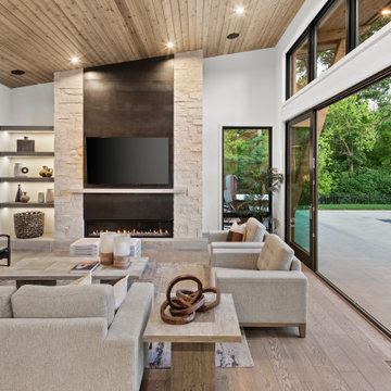
This Minnesota Artisan Tour showcase home features three exceptional natural stone fireplaces. A custom blend of ORIJIN STONE's Alder™ Split Face Limestone is paired with custom Indiana Limestone for the oversized hearths. Minnetrista, MN residence.
MASONRY: SJB Masonry + Concrete
BUILDER: Denali Custom Homes, Inc.
PHOTOGRAPHY: Landmark Photography
 Laney LA, Inc.
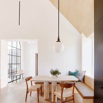
Rather than starting with an outcome in mind, this 1,400 square foot residence began from a polemic place - exploring shared conviction regarding the concentrated power of living with a smaller footprint. From the gabled silhouette to passive ventilation, the home captures the nostalgia for the past with the sustainable practices of the future.
While the exterior materials contrast a calm, minimal palette with the sleek lines of the gabled silhouette, the interior spaces embody a playful, artistic spirit. From the hand painted De Gournay wallpaper in the master bath to the rugged texture of the over-grouted limestone and Portuguese cobblestones, the home is an experience that encapsulates the unexpected and the timeless.
 Sloan Springer Architect
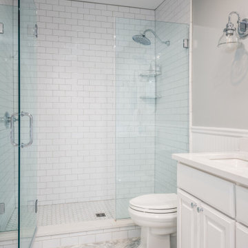
Located directly across from Knight Park in Collingswood, this Grand Center Hall Colonial home had been in the same family since it’s construction in 1875. While it was in great condition when the new owners purchased the home in 2018, there was much room for some fresh life for a new young family.
Through a series of additions in the mid-1900’s, the original kitchen had been relocated to a long and narrow space at the back of the house, with a small powder and laundry room. In place of the kitchen was a small guest room that was mainly used as a play area for the kids.
The main purview of the renovation was to restore the kitchen to its original location and open it up to the living room to allow for a larger and brighter space. That left the previous kitchen space free to be converted to a full-size laundry and mud room, complete with a new rear entry space. Lastly one of the four bedrooms upstairs was reduced to make room for a new ensuite owners’ bathroom to compliment the only other full bathroom in the house.
With bright colors and plenty of large original windows, the new layout allows for a more connected and open living flow while also greatly improving the functionality of each space, making the home ready for its next chapter and generations to come.
 Village Landscape Architecture
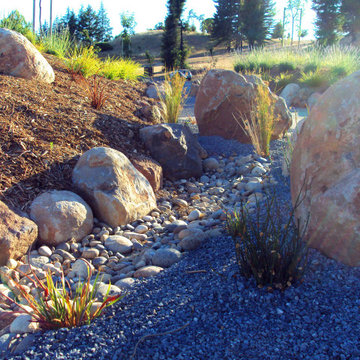
Cobbles with pebbles are blended to beautify a driveway swale (and also slow storm water, increase infiltration of storm water into soil and reduce downstream erosion issues). Evergreen rushes, irises and grasses soften the rock work and increase the riparian feel.
Sponsored
Fredericksburg, OH

High Point Cabinets
Columbus' Experienced Custom Cabinet Builder | 4x Best of Houzz Winner
 TKS Design Group
Download our free ebook, Creating the Ideal Kitchen. DOWNLOAD NOW
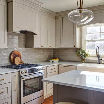
This family from Wheaton was ready to remodel their kitchen, dining room and powder room. The project didn’t call for any structural or space planning changes but the makeover still had a massive impact on their home. The homeowners wanted to change their dated 1990’s brown speckled granite and light maple kitchen. They liked the welcoming feeling they got from the wood and warm tones in their current kitchen, but this style clashed with their vision of a deVOL type kitchen, a London-based furniture company. Their inspiration came from the country homes of the UK that mix the warmth of traditional detail with clean lines and modern updates.
To create their vision, we started with all new framed cabinets with a modified overlay painted in beautiful, understated colors. Our clients were adamant about “no white cabinets.” Instead we used an oyster color for the perimeter and a custom color match to a specific shade of green chosen by the homeowner. The use of a simple color pallet reduces the visual noise and allows the space to feel open and welcoming. We also painted the trim above the cabinets the same color to make the cabinets look taller. The room trim was painted a bright clean white to match the ceiling.
In true English fashion our clients are not coffee drinkers, but they LOVE tea. We created a tea station for them where they can prepare and serve tea. We added plenty of glass to showcase their tea mugs and adapted the cabinetry below to accommodate storage for their tea items. Function is also key for the English kitchen and the homeowners. They requested a deep farmhouse sink and a cabinet devoted to their heavy mixer because they bake a lot. We then got rid of the stovetop on the island and wall oven and replaced both of them with a range located against the far wall. This gives them plenty of space on the island to roll out dough and prepare any number of baked goods. We then removed the bifold pantry doors and created custom built-ins with plenty of usable storage for all their cooking and baking needs.
The client wanted a big change to the dining room but still wanted to use their own furniture and rug. We installed a toile-like wallpaper on the top half of the room and supported it with white wainscot paneling. We also changed out the light fixture, showing us once again that small changes can have a big impact.
As the final touch, we also re-did the powder room to be in line with the rest of the first floor. We had the new vanity painted in the same oyster color as the kitchen cabinets and then covered the walls in a whimsical patterned wallpaper. Although the homeowners like subtle neutral colors they were willing to go a bit bold in the powder room for something unexpected. For more design inspiration go to: www.kitchenstudio-ge.com

 Main Line Kitchen Design
The best kitchen showroom in your area is closer than you think. The four designers there are some of the most experienced award winning kitchen designers in the Delaware Valley. They design in and sell 6 national cabinet lines. And their pricing for cabinetry is slightly less than at home centers in apples to apples comparisons. Where is this kitchen showroom and how come you don’t remember seeing it when it is so close by? It’s in your own home!
Main Line Kitchen Design brings all the same samples you select from when you travel to other showrooms to your home. We make design changes on our laptops in 20-20 CAD with you present usually in the very kitchen being renovated. Understanding what designs will look like and how sample kitchen cabinets, doors, and finishes will look in your home is easy when you are standing in the very room being renovated. Design changes can be emailed to you to print out and discuss with friends and family if you choose. Best of all our design time is free since it is incorporated into the very competitive pricing of your cabinetry when you purchase a kitchen from Main Line Kitchen Design.
Finally there is a kitchen business model and design team that carries the highest quality cabinetry, is experienced, convenient, and reasonably priced. Call us today and find out why we get the best reviews on the internet or Google us and check. We look forward to working with you.
As our company tag line says:
“The world of kitchen design is changing…”
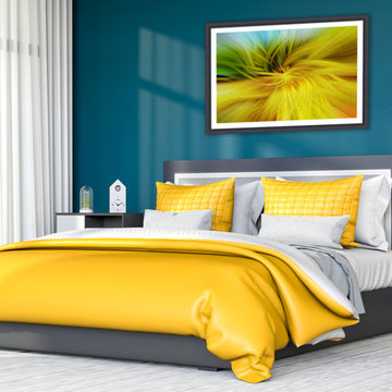
 Fine Art Expressions
"Whimsical Twirl" Fine Art Print
My fine art prints are just the way to add that beautiful finishing touch to a room! Each is printed on archival quality paper and a perfect matte finish for framing.
• Printed on Breathing Color Pura Smooth paper (archival quality)
• 300gsm weight
• Matte finish, no surface glare
• Printed using an eleven-color printer and archival inks
• Inks are museum quality and feature print permanence ratings of up to 200 years
• Resistant to humidity, UV and atmospheric ozone
*Various border options are available for all fine art prints. Note: Selecting on an option will reduce the image size and add more white space. The overall dimensions of the piece will remain the same. This will help ensure that all elements of the scene are visible when framed.

 Mottram Architecture
Timber frame homes offer unique challenges during a remodel. What often makes them beautiful and attractive to most homeowners, also makes them challenging for space requirements.
Context: The lovely couple that owned this home were struggling with some interesting floor plan challenges that just didn't work for their family. The loved the beautiful timbers and woodwork of their home, but the dramatically sloping ceilings on the second floor, particularly in the bathroom, just didn't work for this 1 1/2 bath home. Needing to use the skylight to approach the toilet was a less then ideal scenario. Although the bathroom footprint was more then adequate, the sloped ceiling only made half of the space useable. Check out the Before/After post on our blog to see the photos of the house pre-renovation. As much as they loved all the wood features in their home, another challenge they had was light. The wood ceiling made everything inside the house darker, even with a fantastic array of south facing windows, there were spaces in the home that felt dark and small. When they contacted us they wanted to know how could they make their brighter and more inviting, were there solutions to the 2nd floor sloped ceiling issues, and if they were going to do all of this work, how could they make their home more comfortable and efficient. A nagging water leak in the upstairs bathroom spurred them into action and here is how we solved their dilemma.
Conclusion: First, we added a little dormer to the rear of the house so we could get full headroom in nearly all of the upstairs bathroom! Then we decided to extend that dormer one more timber bay over to create a walk in closet with natural light and plenty of space. Since we were contemplating energy efficiency, we resolved a nagging issue that is present in a lot of timber frame construction, air tightness. Commonly found in timber frame construction, fiberglass insulation is installed in the rafter bays and board ceilings are installed over top. Unfortunately, board ceilings are anything but air tight, and fiberglass insulation needs to be in an airtight cavity for maximum effectiveness. So we were able to solve two issues at the same time for this homeowner. We removed the board ceiling and fiberglass insulation, we dense packed the rafter bays with cellulose insulation, and installed sheetrock in place of the boards. The boards were salvaged for re-use by the homeowner, and the space and light quality was dramatically improved. Some may think that losing the board ceiling took something away from the space, but what you'll see in the pictures is that it highly accentuates the heavy timbers and really makes them stand out in a beautiful way. Now with this added airtightness, better insulation, and brighter space, the homeowner hardly runs their wood stove, and it's so quiet in the space, an added bonus from changing the insulation. It became necessary to also add a sheetrock ceiling to the living room to hide the plumbing from the new bathroom layout above. Changing this ceiling gave the homeowner some real quality lighting that was lacking in the living room before. The brighter ceiling and new lighting layout completely transforms the living room into a space you want to hang out, even though the layout didn't change at all. When the homeowner saw the finished spaces she said "I can't believe this is my house, I want to live in this house"
Energy Efficiency: I touched a little on the efficiency above, but like all projects done with Mottram Architecture, we always want to leave you with a little extra. Timber frame construction with board ceilings and fiberglass insulation are notoriously leaky! If you want to know what we think about fiberglass insulation, check our our blog post on Why Fiberglass Insulation Sucks. By installing cellulose insulation and covering it with sheetrock we were able to greatly reduce the heat flowing out of this home. It not only improves cashflow it improves the comfort level in the space. Who wants to sit in their living room and feel a draft? Let us remind you, we are not saying cellulose insulation is an air barrier, we use the sheetrock to help with that, but it does significantly reduce the air flow over fiberglass insulation. And when we reduce the airflow, we reduce the heat flow. And when we reduce the heat flow, we reduce the need to re-heat that drafty air from outside. When it comes to energy efficiency the first and best place to start is air infiltration. We greatly reduced the air infiltration with the new insulation, but we also added a hat and warm boots. What I mean by that is, we improved the insulation in the roof, and we installed insulation in the basement. Maybe it's a silly analogy, but when you think about keeping warm, we always start with the hat and boots! With sustainability in mind, the next project will be to add a deck to the front of this house with rain catchment barrels from the metal roof. They are planning to plant a garden in the spring and the rain catchment system will help to irrigate the new garden.
Builder: East Shore Builders
Photographer: Michael Eric Berube
Michael Eric Berube, Maine Virtual Home Tours

 User
Anchored by the homeowner’s 42-foot-long painting, the interiors of this Palm Springs residence were designed to showcase the owner’s art collection, and create functional spaces for daily living that can be easily adapted for large social gatherings.
Referencing the environment and architecture in both form and material, the finishes and custom furnishings bring the interior to life. Alluding to the roofs that suspend over the building, the sofas seem to hover above the carpets while the knife-edge table top appears to float above a metal base. Bleached and cerused wood mimic the “desert effect” that would naturally occur in this environment, while the textiles on the sofa are the same shade as the rocks of the landscape.
Monolithic concrete floors connect all of the spaces while concealing mechanical systems, and stone thresholds signal vertical level changes and exterior transitions. Large wall masses provide the optimal backdrop for the homeowner’s oversized art. The wall structures ground the interior, while the opposing expanses of glass frame the desert views. The location and use of operable doors and windows allows the house to naturally ventilate, reducing cooling loads. The furnishings create spaces in an architectural fashion.
Designed and fabricated for flexibility, the pieces easily accommodate the owners’ large social gatherings. The dining table can be split into two and the sofas can be pushed out along the walls, opening the center of the space to entertain. The design of the interior spaces and furnishings seamlessly integrates the setting, architecture, artwork and spaces into a cohesive whole.

 Living Gardens Landscape Design
corrugated metal fence with turquoise trim
Design ideas for a mid-sized contemporary front yard gravel landscaping in Orange County.
Design ideas for a mid-sized contemporary front yard gravel landscaping in Orange County.
Sponsored
Sunbury, OH

J.Holderby - Renovations
Franklin County's Leading General Contractors - 2X Best of Houzz!

 In and Out Home
Evolve Stone is the first stone cladding that can be face nailed in the same fashion as traditional siding, reducing installation complexity and time dramatically. Shown here in “Morning Aspen” the Georgetown Run style features simple to follow pattern, making it our quickest installing style. Like real stone, it is colored throughout, allowing it to be cut to fit on-site while maintaining the highest appearance standards. The ease and workability of the product is unprecedented. No specialty tools and training are needed to install Evolve Stone. Easily manipulate, cut, and texture the product with your standard woodworking tools. This stone is lightweight, at just 2 lbs per square foot, but extremely durable, standing up to impossible wind speeds, salt spray, UV exposure, and freeze-thaw cycles. Each box is pre-portioned with engineered shapes allowing the pattern to appear naturally as you install. No need to sort and lay out the stones beforehand. We offer a class B fire rated product in each style and color.
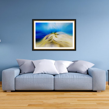 Fine Art Expressions
"Radical Embrace" Abstract Fine Art Print
My fine art prints are just the way to add that beautiful finishing touch to a room! Each is printed on archival quality paper and a perfect matte finish for framing.
• Printed on Breathing Color Pura Smooth paper (archival quality)
• 300gsm weight
• Matte finish, no surface glare
• Printed using an eleven-color printer and archival inks
• Inks are museum quality and feature print permanence ratings of up to 200 years
• Resistant to humidity, UV and atmospheric ozone
*Various border options are available for all fine art prints. Note: Selecting on an option will reduce the image size and add more white space. The overall dimensions of the piece will remain the same. This will help ensure that all elements of the scene are visible when framed.
 AIA Pittsburgh
SUSTAINABLE DESIGN: Award of Excellence
PROJECT: Hazelwood Neighborhood Center
CLIENT: ACTION-Housing, Inc.
ARCHITECTURE FIRM: Thoughtful Balance
ENGINEERS: Iams Consulting, LLC; WBCM Engineering
CONTRACTORS: Nelcon Construction
PHOTOGRAPHER: Denmarsh Photography
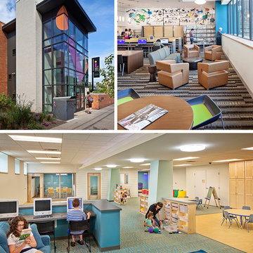
DESCRIPTION: This building is in the heart of Hazelwood’s main commercial area and has a deep history with the community. The ground level houses office space for local non-profit groups and the upper floor is the new home of the Hazelwood branch of the Carnegie Library of Pittsburgh. This project allowed the library to double the size of its space, providing a place to gather and come together. The renovation used the Passive House Retrofit Standard, focusing on a well-insulated building envelope with controlled ventilation, optimized passive solar heating, and energy efficiency.
JURY COMMENTS: The project demonstrates the potential in creative planning by increasing the useable size of an existing building and reducing the environmental impact at the same time. Metrics matter and this building made a point of demonstrating what the metrics of its sustainable design yielded.
 Sloan Springer Architect
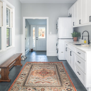
Located directly across from Knight Park in Collingswood, this Grand Center Hall Colonial home had been in the same family since it’s construction in 1875. While it was in great condition when the new owners purchased the home in 2018, there was much room for some fresh life for a new young family.
Through a series of additions in the mid-1900’s, the original kitchen had been relocated to a long and narrow space at the back of the house, with a small powder and laundry room. In place of the kitchen was a small guest room that was mainly used as a play area for the kids.
The main purview of the renovation was to restore the kitchen to its original location and open it up to the living room to allow for a larger and brighter space. That left the previous kitchen space free to be converted to a full-size laundry and mud room, complete with a new rear entry space. Lastly one of the four bedrooms upstairs was reduced to make room for a new ensuite owners’ bathroom to compliment the only other full bathroom in the house.
With bright colors and plenty of large original windows, the new layout allows for a more connected and open living flow while also greatly improving the functionality of each space, making the home ready for its next chapter and generations to come.
Sponsored
Delaware, OH

Buckeye Basements, Inc.
Central Ohio's Basement Finishing ExpertsBest Of Houzz '13-'21

 Kitchens by Good Guys
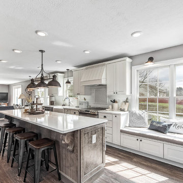
In order to make this kitchen more functional we had to play with the layout. We decided to switch the range and the fridge to better balance the space. We reduced the size of the bulky soffit to allow for taller cabinets and make the space feel more open. We shifted all the appliances down and added a built-in coffee machine & ice maker.
In choosing the finishes, our client decided to go with an accent island. The white perimeter and gray stained island really updated this kitchen. Previously, the back half of the island sat at bar height. To make efficient use of space, we made it all one height. Since we extended the entire kitchen, this deleted the dining table. To accommodate for this, the large island seats six & has additional storage underneath! We used a beautiful quartz throughout the kitchen and bar area.
We used a gray glass subway tile for the backsplash with an accent tile in a similar color over the range. We used that same accent tile for the bar adjacent to the kitchen. This area was previously a blank wall that our client didn't know what to do with. We added some storage, 2 wine fridges, and floating shelves with lighting to brighten up the space.
 Fine Art Expressions
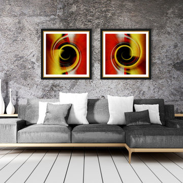
"Temporal Vortex" Collection Fine Art Prints
My fine art prints are just the way to add that beautiful finishing touch to a room! Each is printed on archival quality paper and a perfect matte finish for framing.
• Printed on Breathing Color Pura Smooth paper (archival quality)
• 300gsm weight
• Matte finish, no surface glare
• Printed using an eleven-color printer and archival inks
• Inks are museum quality and feature print permanence ratings of up to 200 years
• Resistant to humidity, UV and atmospheric ozone
*Various border options are available for all fine art prints. Note: Selecting on an option will reduce the image size and add more white space. The overall dimensions of the piece will remain the same. This will help ensure that all elements of the scene are visible when framed.

 Native Edge Landscape
Another fun Crestview project! This young couple wanted a back yard that reflected their bohemian-eclectic style and could add additional privacy from the ever climbing construction around them. A place for “hanging out and drinking coffee or beer in the backyard.” But what was most exciting, was the air stream they had just purchased and were in the process of restoring. With the end goal of using it as a guest home for family and friends, we were challenged with creating a space that was cohesive and connected this new living space with the rest of the yard.
In the front we had another quark to fix. The sidewalk from their front door to the street suddenly stopped 5 feet from the curb, making a less than inviting entry for guests. So, creating a new usable entryway with additional curb appeal was a top priority.
We managed the entertainment space by using modern poured concrete pad’s as a focal. A poured concrete wall serves as a bench as well as creates a visual anchor for the patio area. To soften the hard materials, small plantings of succulents and ground cover were planted in the spaces between the pads. For a backdrop, a custom Cedar Plank wall and trellis combined to soften the vertical space and add plenty of privacy. The trellis is anchored by a Coral Vine to add interest. Cafe style lighting was strung across the area create a sense of intimacy.
We also completed the fence transition, and eliminated the grass areas that were not being utilized to reduce the amount of water waste in the landscape, and replaced these areas with beneficial plantings for the wildlife.
Overall, this landscape was completed with a cohesive Austin-friendly design in mind for these busy young professionals!
Caleb Kerr - http://www.calebkerr.com
40