
Search results for "Reduce same" in Home Design Ideas
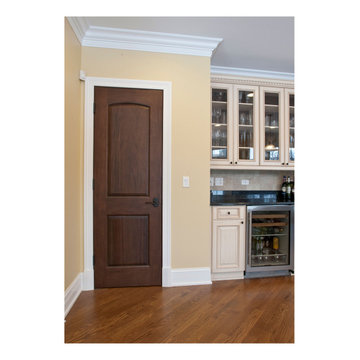
 Glenview Haus – Custom Doors & Wine Cellars
To enhance stability even further, the core of our mahogany doors contain the same solid mahogany species. For our engineered banded stiles and rails, each stile features a solid mahogany edge band. The engineered stiles and rails are stronger then single, solid wood pieces, reducing the possibility of the door warping or splitting. Our durable 3-ply wood panels will not twist, warp, shrink or expand. In our finished series, the panel is completely prefinished and sealed on all six sides before being installed, and as the panels are free to float between fixed edges, there is no unfinished part of the panel that may show up with time. There are no nails that hold panels in place
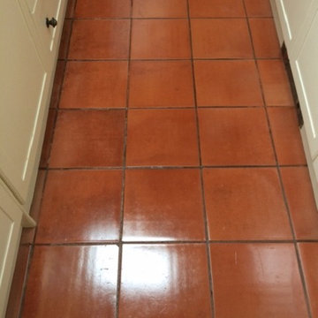
 Tile Doctor Ltd
Terracotta is an interesting type of stone manufactured using a variety of techniques dependant on the country of origin which leads to a number of differences such as Spanish Terracotta being less porous than its Mexican counterpart: the former is semi-hand made and finished in a factory kiln, while the latter is completely handmade. Spanish Terracotta is therefore a lot less than porous and ultimately, of a higher quality.
But despite the Spanish Terracotta being less porous, and therefore being less prone to ingrained dirt, it still, like any other stone, needs regular maintenance to keep it looking smart. In the tiling trade, we quite often refer to this as a good old fashioned ‘Clean and Seal’ and this is exactly what was requested by this property owner in Halifax, for their Spanish Terracotta tiled floors in the kitchen and adjacent hallway.
I cleaned both sets of Terracotta tiles using the same process, which involved the application of our reliable alkaline cleaner known as Tile a Doctor Pro Clean, diluted with five parts of warm water. Once the solution had been left to dwell for a short period, it was scrubbed into the tiles to remove all dust, dirt, and general muck. This created a slurry of cleaning residue, which I promptly soaked up using a wet vac. A wet vac machine is an essential tool when it comes to cleaning porous tiles since, unlike a traditional mop and bucket, it sucks the excess trapped dirt out of the clay and thus provides a superior clean.
Following this, I applied a small amount of our heavy duty remover, known as Tile Doctor Remove & Go, to deal with some of the more stubborn stains and paint splashes, before rinsing with clean water and wet vaxing in a similar fashion to before.
Once the clean had been completed I left the tiles to dry completely. This can take 12 to 24 hours depending on numerous factors including whether a Damp proof Membrane and underfloor heating has been installed which can really help reduce drying times. Letting the tiles dry completely before sealing is paramount as moisture can cloud the sealer and affect its performance.
Upon my return to the property I ran some quick damp tests, which revealed the tiles were ready to be sealed. I then applied several coats of Tile Doctor Seal and Go, our topical sealer which provides a satin finish and accentuates colour. A new coat of this product is recommended every six months on Terracotta to ensure the continuous protection of the tiles’ soft clay particles.
My customer was extremely pleased with her refreshed Terracotta tiles. It goes to show what a big difference a bit of regular maintenance can make. I advised the customer that an everyday cleaner called Tile Doctor pH Neutral cleaner can also be used regularly to keep the tiles looking great without damaging the sealer.
Nigel Stoker
North West Yorkshire Tile Doctor
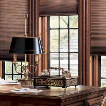
 HUNTER DOUGLAS-LNG BLINDS
DUETTE® Honeycomb Shades
THE ORIGINAL ENERGY-EFFICIENT HONEYCOMB SHADE
An innovative window treatment that looks beautiful and insulates your home all year round, Duette® Honeycomb Shades were the first cellular shades, specially engineered to provide energy efficiency at the window in both cold and warm climates. Their specially engineered honeycomb construction traps air in distinct pockets, which creates insulation that can help lower your energy consumption and energy bills.
Decorate every kind of window you have—even tricky skylights and unusually shaped panes—with Duette. Our signature honeycomb shades are one of our most versatile options and beautify every kind of interior.
KEY FEATURES
Room Darkening—The LightLock™ system, the newest iteration from Duette, is the first operating system of its kind to offer unparalleled darkness. The secret lies within the patent-pending side channel design, optimized to absorb or deflect nearly all incoming light.
Durability—All of our high-performing fabrics are resistant to fading and will maintain their crisp, neat pleats over time.
Vertical Application—For doors that need extra insulation, the Duette Vertiglide™ operating system is the ideal option. It’s designed for vertical applications and uses the same fabrics as your horizontal Duette shades. Use one shade to cover the entire expanse of a sliding door, or, cover the door with a split stack Vertiglide shade, with each side operating independently.
Sound Absorption—Improve your room’s acoustics while reducing the intensity of outside sound. Duette Honeycomb Shades absorb up to 70% of sound energy, creating a more quiet, tranquil room.
LNG Blinds
19 Addison Pl
Valley Stream, NY 11580
Call Us (516) 593-0044
#homesweethome #homedecor #lovemyhome #barenecessities #windows #instastyle #instadesign #interiordesign#blinds #privacy #embellishment #instahomes #propertyowner #renovation #customblindsbydesign #showcase #displays #windowtreatments #windowcoverings #shades #shutters #drapery #interiors #decor
Find the right local pro for your project
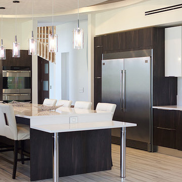
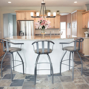
 Premium Kitchens
WHITE LACQUERED NICHE BETWEEN UPPERS
customer Choice: The fridge is the Professional series Frigidaire, side by side.
CARLOS ARISTOBAL, PHOTOGRAPHER
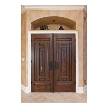 Glenview Haus – Custom Doors & Wine Cellars
To enhance stability even further, the core of our mahogany doors contain the same solid mahogany species. For our engineered banded stiles and rails, each stile features a solid mahogany edge band. The engineered stiles and rails are stronger then single, solid wood pieces, reducing the possibility of the door warping or splitting. Our durable 3-ply wood panels will not twist, warp, shrink or expand. In our finished series, the panel is completely prefinished and sealed on all six sides before being installed, and as the panels are free to float between fixed edges, there is no unfinished part of the panel that may show up with time. There are no nails that hold panels in place.
 INBOX BOOTHS USA
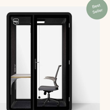
The ONE+ soundproof office pod has the same footprint as a typical desk and chair workstation—without all the noise and distractions. Step inside and you’ll find that this pod is surprisingly spacious. Open your laptop, get in the zone, and stay in it all day.
4 x 5 ft footprint
3 power outlets: 1 USB, 1 USBC, ethernet port
Automatic motion-sensor light and fan saves energy
Reduces sound by 26+ decibels
Monitor-mount-ready
Best price out there
 Studio41 Home Design Showroom
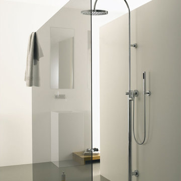
LET'S GET PHYSICAL. | TARA LOGIC takes up the form of the Tara Classic single-lever mixer and radically modernizes it, although it is still instantly recognizable. It is narrower, extends upwards – but still has the same reduced design based on a cylindrical structure. Whether as a shower stem or a free-standing single-lever mixer on the tub, TARA LOGIC reaches elegantly upwards. It looks well-toned and encourages us to emulate it. Because there is no rosette, it looks even more streamlined and aspiring.
This results in a progressive, minimalistic verticality that can be transferred to the architecture and design of the bathroom. | Available at www.shopstudio41.com
Sponsored
Plain City, OH

The Creative Kitchen Company
Columbus Area Kitchen Remodeling and Refacing Professional
 Aardvark Architecture
This proposal is for a new two-story home on the vacant heavily wooded lot with an existing 150-foot-long driveway lined by several beautiful oak trees culminating in a behemoth 43-inch oak tree where the driveway meets the main lot. The far end of the driveway terminates in a grove of three 43/40/43-inch redwoods and at the very center of the vacant lot stands a gargantuan V-twin 59-inch redwood tree paired with a “small” 29-inch redwood tree. The owners want to build a beautiful contemporary-styled home for their family that fully enjoys and embraces the mature trees on their cozy 65-foot by 100-foot lot.
As with all small, constrained lots, this project’s site design started first with meeting the relatively large parking and car maneuvering requirements. Menlo Park’s Department of Transportation typically requires side-facing garages to have 24-feet of backup space. So that they could give the largest feature redwood tree on site an added four feet (50%) of clearance outside of its critical root zone, the owners agreed to install a vehicle turntable at the end of their driveway to eliminate the extra four feet of space needed to back up and turnaround. This allowed them to pull their garage forward an additional four feet towards the front property line on the panhandle side, drastically reducing the rest of the home’s impact on the gargantuan V-Twin paired redwood tree at the center of the lot.
One of the owners has mobility issues, and accordingly, they first sought to design a one-story floor plan that incorporated all their family’s needs including plenty of covered patio and deck space to enjoy our fantastic California weather. But that single-story footprint spread too far into the critical root zones of several of the redwood trees on site, even despite the use of the vehicle turntable. During my interview process with the owners, they made it clear to me that one of their primary concerns is ensuring that the largest trees on site would thrive and become features of their new home after construction is complete. The single-story designs that removed the grove of three huge redwood trees were non-starters, as was the skimpy 5x10 master bath I designed when trying to squeeze the whole house program into an overly compromised single-story design. It was therefore deemed necessary to go with a two-story design despite the owner’s mobility issues. This two-story design has a much more compact ground floor footprint and has no bedrooms downstairs, other than the detached ADU. The owners must give up the floor area and incur the costs to install a residential elevator to access their upstairs master suite.
Our ground floor footprint is smaller due to the two-story design decision, and our foundation is pulled away from the trees thanks to the vehicle turntable. Yet, a tiny portion of the home’s ground floor footprint still encroaches into the critical root zones of the largest 59” redwood tree. Therefore, as outlined in the Arborist Report prepared by Aesculus Arboricultural Consulting, the structural engineers are incorporating an array of drilled piers and shallow-grade beams for the main home’s foundation and deck area nearest the redwood’s critical root zone. This drilled piers and grade beam foundation is a type of “bridging” foundation as outlined in Aesculus’ report to preserve the health of these trees that the property was designed around. The rest of the foundation will be constructed as an insulated slab-on-grade foundation to minimize the number of steps and ramps needed for the owners to enjoy their home and patio areas.
Despite the owner’s desire to keep as many trees as possible on site, and despite the smaller ground floor footprint and the advantage of the vehicle turntable, the need for a 20x20-foot garage and 20x20/25-foot guest parking space on our panhandle lot requires the removal of two heritage trees in the required driveway, a 16” coast redwood, and a 17” coast redwood. An alternate design, such as swapping the garage and guest parking locations north-to-south, still requires the removal of these two trees for vehicle maneuvering but has the added disadvantage of cutting off the home’s sightlines to the behemoth 43” oak tree just outside the currently proposed front patio space and living room. Jim Redman of Elements Landscape is proposing 13 new trees be planted on site to replace the lost value of these two heritage coast redwood trees.
This contemporary architectural design features clean lines, and an abundance of full-height windows and large skylights to best take in the immense trees on site. To blend in with the forest-like setting, the home boasts a mix of rich textures and features a color palette of natural wood tones contrasted with dark blue and black. Once through the new steel gate at the street and down the 150-foot tree-lined driveway, a large covered front patio becomes visible past the neighbor’s detached accessory structure. The covered patio is just across the driveway from the beautiful 43” behemoth coast live oak. The single plane of the covered patio roof is delicately supported by a pair of steel posts in a “V-twin” configuration much like the largest redwood trees that tower over the center of the lot and will still be visible above the new two-story home, even from the front yard. The patio is covered in a dark-colored standing seam roof, with steel C-channel fascias, and tongue-and-groove wood ceiling planks on the underside. Generously sized skylights on the patio roof and inside the living area allow for impressive views of the amazing oak canopy as well as precious natural light.
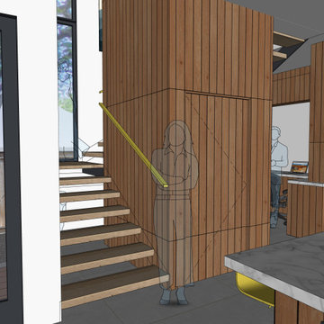
Supporting the sloped covered patio on the other side is the two-car garage with a secondary bedroom suite stacked above the garage. This two-story volume is to be clad in vertical clear-coated redwood siding, to tie in with the grove of three 43-inch redwood trees just beyond. The garage door, and the bank of windows for Bedroom#2 above feature a steel fascia eyebrow header feature to provide shade and overhang protection, as we are not proposing a large overhang at this “redwood trunk”. The garage and bedroom volume are pulled 16 feet away from the side property line, instead of the minimum required setback of 6’-6”, thus leaving plenty of room for the redwood grove and existing mature pear tree to continue to thrive. This existing mature green screen in this 16-foot-wide side yard is a feature worth soaking in, which is why tall windows with low sill heights are proposed for both the stairs and the upstairs hallway. Though it may be infrequent to approve side-facing 2nd floor windows with sill heights as low as what we’re proposing, we are confident that the mature green screen and the over 16-foot-wide side yard are sufficient to provide for the continued privacy of our neighbor’s rear yard space, especially considering theses windows are in walkway zones.
The covered patio at the front entry is also bound by the 10-foot-tall living room. The great room is clad in a dark blue brick veneer, which wraps around all three sides of the living room. Upon entering the home from the covered patio, you are immediately greeted with one of the most impressive features of the home’s design: a 10-foot-tall by 24-foot-wide set of sliding glass doors. From the entry, this huge opening gives merely an initial glimpse of the massive trunks of the gargantuan V-twin redwoods sitting at the center of the lot. All three sliding glass panels open directly out into the smaller partially covered deck in the rear. This roof overhang element matches the design of the front patio with a steel C-channel fascia and a large skylight. But the rear deck’s roof element is set flat at a ten-foot ceiling height so that the living room’s ceiling seems to float above and out beyond the expanse of full-height sliding doors, thus creating an indoor-outdoor living space that will feel much larger than the home’s actual footprint. This rear covered deck is smaller than the patio in the front and also has a mix of solid and open-slatted roofing to allow for more solar access for the relatively small amount of open sky available.
The downstairs living room is open to the dining and kitchen areas, as well as the stair-and-elevator tower beyond. The stair tower is very open and glassy, and the stairs wind up and around the redwood-clad elevator tower. From certain perspectives in the 16-foot-wide side yard, it will almost seem as if the grove of three redwoods has a fourth tree that the house and the stairs were carefully built around. Other than the 3-foot-wide windows, the exterior walls of the stair tower, downstairs utility spaces, and Bedroom#3 above are finished in cement plaster, painted dark blue and black. The sloped roof over the stair-and-elevator tower continues cleanly over the area of upstairs Bedroom#3. This roof level is set by the side daylight plane and only yields an inside wall height of just under 6 feet in height. The owners are satisfied that the rest of this upstairs room has a nice vaulted ceiling to make up for the one short wall under the daylight plane.
The rest of the ground floor adjacent to the stair tower consists of a small utility wing containing a half-bath, laundry, storage area, and an exterior alcove for the electric heat pump HVAC unit. This short wing also gives more accessible access to the rear yard deck, as well as a backdrop for an outdoor kitchen. The bright white stone backsplash for the outdoor kitchen provides contrast to the otherwise consistent use of cement plaster painted dark blue and black for the two-story wing closest to the detached ADU. Though Bedroom#3 is stacked directly above this small wing, it is relatively short to comply with the side daylight plane of this narrow lot. Still, to further help break up the scale of this wall, another steel fascia eyebrow element is set about 8 feet above the rear deck.
The master suite sits centered above the ten-foot-tall great room. The master bedroom and its balcony, as well as the master bathtub area, have a commanding view of the central redwood trees and their impressive canopy, though the balcony is mostly recessed and should pose no privacy concerns to the neighbor’s rear yards. The master balcony parapet is clad in the same brick veneer continuing up from the living room below. A dark-painted metal rail makes up the rest of the open guardrail height. The entire length of the master balcony is comprised of 9-foot-tall sliding glass doors, but the area above the doors, as well as the area below the master bathroom windows, is accented with more redwood siding. The remainder of the master suite bathroom and walk-in closet is finished in cement plaster painted dark blue. The master bathroom has one side yard-facing window but will be frosted glass for both the owner’s and the neighbor’s privacy.
The 2nd floor is capped under a simple gable roof design with one roof ridge and varying eave and rake overhangs depending on the 2nd-floor layout and solar orientation. Since these roof planes are quite difficult to see in the middle of the heavily wooded panhandle lot, we are proposing a white TPO roofing for these two upper roof planes as a more sustainable choice compared to more dark-colored roofing like the covered patios and detached ADU.
The owners also wish to build a detached 292-square-foot Accessory Dwelling Unit (ADU) as an office and guest suite. For the ADU foundation to be situated outside the central redwood tree’s critical root zone, this relatively tiny structure takes advantage of the narrower 4-foot side and rear setbacks allowed for ADUs smaller than 800 square feet. The small L-shaped detached ADU frames a wonderful quasi-courtyard around the gargantuan V-twin redwoods at the center of the lot. The ADU shares a matching material palette consisting of cement plaster painted blue and black, vertical redwood siding and soffits, and thin brick veneer. The ADU also features large full-height windows. The only difference between the main home and the ADU material palette is that the roofing will be a dark composition shingle roofing since it will be quite visible from the master balcony.
 Simply Home Decorating
The kitchen may be the heart of a home, but the dining room is where the family gathers to enjoy special occasions, create and pass on traditions, and savour each other’s company free from distractions. The family behind this particular dining room enjoys doing just that.
When they are not traveling the world, Matthew and Anna (names changed) love to cook meals at home with their teenage daughter, entertain family and friends, and live amongst their cherished travel souvenirs and heirlooms. Their dining room, however, was far from the perfect backdrop for these experiences.
Before: Dining Room:
When Matthew and Anna contacted us, they imagined a space that would comfortably seat 8 to 10 people and incorporate their beautiful inherited dining table and sideboard in a fresh, modern way. Above all, they wanted a dining room that they would feel proud to share.
They worked with us to design, lightly renovate, and furnish their dining room and adjacent living space. Now, the room is nothing short of inviting and elevated.
Classic Yet Contemporary Dining Room:
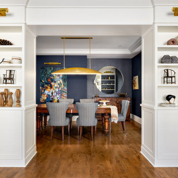
Viewed from the living area, the dining room is a hidden gem waiting to be discovered. Matthew and Anna wanted dark blue for the walls, and we couldn’t have been happier to find the perfect shade for them. By leaning darker, this rich blue creates the perception of depth, making the room feel enticing, comfortable and secluded.
The previous built-ins were underwhelming and lacked function, so we designed wider, taller, double sided cabinets that integrated the existing bulk-head, and then accessorized the shelves with the family’s travel finds, books, and decor. Topping these units with brass art lights not only blends contemporary and traditional styles, it also draws attention to the dining table’s modern show-stopping chandelier. You can’t miss it.
Inside the dining room, the effect is equally impressive: enveloping yet spacious, warm yet cool, classic yet contemporary. We incorporated their heirloom pieces seamlessly into the design thanks to the 1:2 ratio. For every traditional piece, we introduced two more modern or contemporary pieces — clean lines, subtle curves, and lustrous brass hardware. The result is a collected yet updated look.
In any room with dark walls, lighting is of the utmost importance. We placed a mirror adjacent to the window to reflect natural light throughout the room, and we kept the trim and ceiling white for brightness. To provide maximum versatility, we provided multiple light sources that can be adjusted to create different levels of light to suit any mood or occasion. These include: pot lights and a chandelier on dimmers, a sculptural trilight lamp on the sideboard, and art lights on the bookcases and above important art pieces.
The built-ins have another surprise waiting inside this special dining room:
Double-sided built-ins: dining room shelving and living room shelving.
Rather than keep them white like we did in the living room, we painted the back wall of the book cases the same dark blue as the walls in the rest of the room. This reduces the contrast with the surrounding walls and emphasizes the white outline of the cabinets. We also love the dark blue walls’ role as a beautiful backdrop for this family’s treasures. The brass accessories and hand-painted vases and bowls feel like part of the experience.
Of course, what is beauty without function? It may not look like it, but the base storage is only accessible from the dining room side. The units include deep cabinets for storing serving ware, as well as another delightful surprise: silverware drawers lined in luxurious navy velvet!
Lastly, we designed this beautiful nook for their heirloom sideboard. From afar, the wall looks as if it has texture and perhaps a touch of shine. Up close, you will notice that it is actually navy blue wallpaper with tiny golden dots. This unique touch accentuates the brass in the room touches throughout the space.. The room feels curated, contemporary, and full of character.
Words of Praise:
Anna and Matthew were thrilled with their new dining room and with the design process itself, which is always the highest compliment. They said:
“Working with Lori and her team at Simply Home Decorating was a great experience. The design they came up with was both beautiful and practical for our family. Renovations can be stressful but working with Simply Home made the process much more pleasant.
“Simply Home's project management and their longstanding relationships with reliable trades meant we could relax, knowing that everything was taken care of. If an issue arose, the entire Simply Home team was quick to address it. They were excellent at communicating with us—we never felt like we didn't know what was going on. We would highly recommend working with Simply Home Decorating.”
Thank you, Matthew and Anna! We are honoured to have been part of your journey and wish your family many happy memories in these new spaces.
Now, is it your turn? Are you ready to uncover the hidden potential in your home? If so, contact us here to start the conversation or download my guide Uncovering the Hidden Potential in Your Home below to learn more about what we can do for you.
 Skill Construction & Design, LLC
If you are looking for twice your normal bath experience, look no more. This master bath has plenty of room for two with double the storage, double the mirrors, sinks and faucets, and bathing is done two-way. The colors are warm and inviting, but it’s the subtle patterning that caught my eye. The overall effect is of a soft wash, yet on closer examination, the striations travel across the walls and criss-cross on the floor.
This expansive vanity was created with our homeowner’s needs in mind. Each “side” has a bank of drawers and under sink cabinet storage. A large undermount sink dips below the gorgeous stone counter top. Gently arching faucets in brushed nickel adorn each sink with a framed mirror above for reflection. Individual task lighting shine upon each sink and is reflected back into the room. For additional storage and to keep elbows from connecting, a large shared bank of drawers separate the two areas.
The vanities are rich with color and texture, from the swirling grain of the wood, to the raised panels and beading. The subtle beading is repeated on the drawers for a custom look. Our wood color is a deeper, more intense tone of the colors in our tiling.
Whether in a hurry or needing to relax and unwind, this bath can do both. Despite having two substantial pieces in the same area, the open glass panel that separate leaves each feeling open and airy.
This tub was made for soaking. The sides and back gently mold into arm and neck support for a truly relaxing experience. The lineal movement in the tile backsplash lend a long and lean feeling. For easy reach, toiletries are stored in a niche with accent multicolored mosaics.
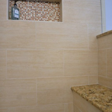
On the other side of the half wall a roomy shower awaits. The long tiles were installed in a brick pattern with striations of color wrapping the walls. The oversized tiles reduce the amount of grout, for a cleaner look. Here too we added a niche for maximum storage and a sprinkle more of the accenting mosaic. We capped the half wall and the generous bench with our vanity’s stone for a rich contrast.
We installed the tile up to the ceiling, which adds to the visual height of the room. We went with clean simple controls and showerhead, enhanced in a brushed nickel finish. So as to not obscure the view, we went frameless on our shower door and panels, using brushed nickel hinges and a simple handle.
At the end of our vanity, a half wall adds backsplash on the vanity side and a bit of privacy on the other. A simple toilet in crisp white is out of sight but functional in its own “alcove”.
Despite all the patterning, there is nothing busy about the room. For the floor we decided to change things up, using a large square version of the wall tiles. To keep the room from feeling too long, we installed them on the diagonal and then criss-crossed the lines for a dramatic look.
This bath is twice as nice and ready to be shared!
http://www.designsbyskill.com/
http://www.rjkconstructioninc.com/
 LEDVANS
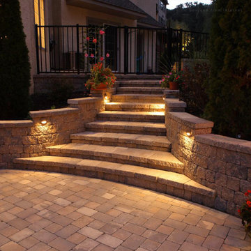
Stair lights can enhance safety, making it easier to identify stairs at night and reduce the risk of falling; at the same time, they add a decorative effect, beautifying the space; LED stair lights are energy-saving, environmentally friendly, with a long lifespan, and are simple and practical. Overall, the installation of stair lights not only improves comfort and safety, but also has the advantages of beautifying space, energy efficiency, and environmental protection, making it an ideal lighting choice.
 Fine Art Expressions
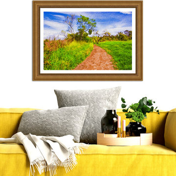
"The Path That Lies Ahead II" Fine Art Landscape Print
My fine art prints are just the way to add that beautiful finishing touch to a room! Each is printed on archival quality paper and a perfect matte finish for framing.
• Printed on Breathing Color Pura Smooth paper (archival quality)
• 300gsm weight
• Matte finish, no surface glare
• Printed using an eleven-color printer and archival inks
• Inks are museum quality and feature print permanence ratings of up to 200 years
• Resistant to humidity, UV and atmospheric ozone
*Various border options are available for all fine art prints. Note: Selecting on an option will reduce the image size and add more white space. The overall dimensions of the piece will remain the same. This will help ensure that all elements of the scene are visible when framed.

Sponsored
Sunbury, OH

J.Holderby - Renovations
Franklin County's Leading General Contractors - 2X Best of Houzz!
 Flying Dormer
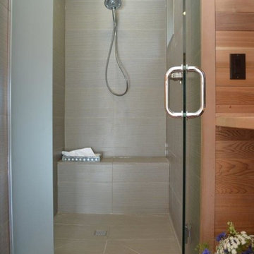
The European homeowners wanted to create a space for a new sauna and hot tub, as well as a place to relax afterwards. It needed to be light and bright, and have a warm but modern feel. We built this addition under the existing deck, and spruced up the deck at the same time to enjoy the nice territorial views.
The walls of the addition are cedar, with built-ins and deep cabinets for storage. There is a walk-in, tiled shower with built-in bench just off the sauna, and a seating area with tv for relaxing. The floor is stained concrete.
The 14-foot wall of windows (including a door to the hot tub), and the secondary window wall that includes french doors allows the maximum amount of light into the space and really creates that spa feeling.
The plans evolved during construction to include a larger sauna (thereby reducing the shower size somewhat) and a much larger hot tub than originally planned. The solution was to move the hot tub outside, which had the benefit of opening up more space inside for a yoga/ workout area. The hot tub is covered by a glass roof so it can be enjoyed year-round under the stars.
 Katie Hutchison Studio
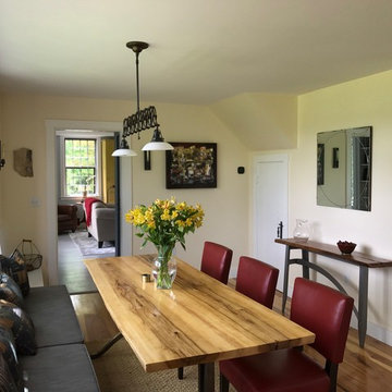
The new owners of this house in Harvard, Massachusetts loved its location and authentic Shaker characteristics, but weren’t fans of its curious layout. A dated first-floor full bathroom could only be accessed by going up a few steps to a landing, opening the bathroom door and then going down the same number of steps to enter the room. The dark kitchen faced the driveway to the north, rather than the bucolic backyard fields to the south. The dining space felt more like an enlarged hall and could only comfortably seat four. Upstairs, a den/office had a woefully low ceiling; the master bedroom had limited storage, and a sad full bathroom featured a cramped shower.
KHS proposed a number of changes to create an updated home where the owners could enjoy cooking, entertaining, and being connected to the outdoors from the first-floor living spaces, while also experiencing more inviting and more functional private spaces upstairs.
On the first floor, the primary change was to capture space that had been part of an upper-level screen porch and convert it to interior space. To make the interior expansion seamless, we raised the floor of the area that had been the upper-level porch, so it aligns with the main living level, and made sure there would be no soffits in the planes of the walls we removed. We also raised the floor of the remaining lower-level porch to reduce the number of steps required to circulate from it to the newly expanded interior. New patio door systems now fill the arched openings that used to be infilled with screen. The exterior interventions (which also included some new casement windows in the dining area) were designed to be subtle, while affording significant improvements on the interior. Additionally, the first-floor bathroom was reconfigured, shifting one of its walls to widen the dining space, and moving the entrance to the bathroom from the stair landing to the kitchen instead.
These changes (which involved significant structural interventions) resulted in a much more open space to accommodate a new kitchen with a view of the lush backyard and a new dining space defined by a new built-in banquette that comfortably seats six, and -- with the addition of a table extension -- up to eight people.
Upstairs in the den/office, replacing the low, board ceiling with a raised, plaster, tray ceiling that springs from above the original board-finish walls – newly painted a light color -- created a much more inviting, bright, and expansive space. Re-configuring the master bath to accommodate a larger shower and adding built-in storage cabinets in the master bedroom improved comfort and function. A new whole-house color palette rounds out the improvements.
Photos by Katie Hutchison
 Fine Art Expressions
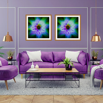
"Magnificent Wonder 2" Fine Art Print
My fine art prints are just the way to add that beautiful finishing touch to a room! Each is printed on archival quality paper and a perfect matte finish for framing.
• Printed on Breathing Color Pura Smooth paper (archival quality)
• 300gsm weight
• Matte finish, no surface glare
• Printed using an eleven-color printer and archival inks
• Inks are museum quality and feature print permanence ratings of up to 200 years
• Resistant to humidity, UV and atmospheric ozone
*Various border options are available for all fine art prints. Note: Selecting on an option will reduce the image size and add more white space. The overall dimensions of the piece will remain the same. This will help ensure that all elements of the scene are visible when framed.
 sirboom
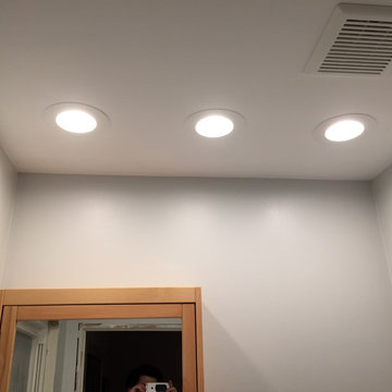
Owner designed and remodeled small half-bathroom in south Atlanta suburb. Gut remodel with updated (corrected) electrical, updated (corrected) plumbing, Kohler toilet, IKEA Silveran vanity (partial-wall mount; mounted to be 37" high to top of sink, my preference), IKEA Silveran medicine cabinet, IKEA Silveran cabinet, and retrofitted an IKEA Lillangen sink (which normally goes with a different vanity). Paint is Olympic One "Thin Ice" (paint not recommended, was disappointing for the "best" Olympic sells at Lowe's; color is great, though). Chrome fixtures with faucet by Glacier Bay (unknown model; Home Depot clearance find) and chrome door knobs (also from Home Depot). Blinds are from SelectBlinds.com and are Bamboo 1" faux wood. Wall art is from Etsy.com (look up dictionary prints if you want to find similar). Tile is from Lowe's, by Style Selections, and called Skyros Gray (highly recommended, good quality). Grout color is Silver by MAPEI (Lowe's). Silver MAPEI grout-look cauking along top and bottom of baseboard tiles (upper floor home so can't use grout). Unfortunately the sink and toilet were a different shade of white but the toilets were all fairly new and it's more noticeable in the photo than in real life. Used 3 LED new work IC recessed lights, LED under-cabinet light from Home Depot off of same switch as the lights but with a switch on-board, and a basic contractor-grade ceiling fan with some Dynamat-like material applied to the casing which reduces its noise significantly off of its own switch. GFCI outlet has a nightlight built in and, not shown, is another GFCI outlet retrofitted into the medicine cabinet. Don't worry, that silicone caulking around the toilet has been improved to a professional look with the Silver caulking over it to blend better since this photo, so don't hold that against me! In fact, don't hold anything you don't like against me... just posting this to give folks some ideas WITH the actual units used, unlike most postings on Houzz.
©Kil|Photography

Sponsored
Sunbury, OH
J.Holderby - Renovations
Franklin County's Leading General Contractors - 2X Best of Houzz!
 JRP Design & Remodel
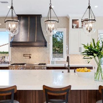
The main goal to reawaken the beauty of this outdated kitchen was to create more storage and make it a more functional space. This husband and wife love to host their large extended family of kids and grandkids. The JRP design team tweaked the floor plan by reducing the size of an unnecessarily large powder bath. Since storage was key this allowed us to turn a small pantry closet into a larger walk-in pantry.
Keeping with the Mediterranean style of the house but adding a contemporary flair, the design features two-tone cabinets. Walnut island and base cabinets mixed with off white full height and uppers create a warm, welcoming environment. With the removal of the dated soffit, the cabinets were extended to the ceiling. This allowed for a second row of upper cabinets featuring a walnut interior and lighting for display. Choosing the right countertop and backsplash such as this marble-like quartz and arabesque tile is key to tying this whole look together.
The new pantry layout features crisp off-white open shelving with a contrasting walnut base cabinet. The combined open shelving and specialty drawers offer greater storage while at the same time being visually appealing.
The hood with its dark metal finish accented with antique brass is the focal point. It anchors the room above a new 60” Wolf range providing ample space to cook large family meals. The massive island features storage on all sides and seating on two for easy conversation making this kitchen the true hub of the home.
 Karen Richmond, Neil Kelly Company
Neil Kelly Company - Aaron Ziltener
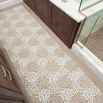
Bathroom - transitional bathroom idea in Portland
Bathroom - transitional bathroom idea in Portland
 Soft Square Naples
Knoll Inc
www.softsquare.com
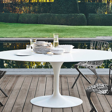
Washington Skeleton™ Aluminum Side Chair
Designer: David Adjaye 2013
David Adjaye's cantilevered chairs explore propping and balancing, so that they are simultaneously functional and sculptural. Washington Skeleton™ is reduced to a fine geometric lattice while its inverted counterpoint, Washington Skin™, offers a colorful envelope to the same form.
41