
Search results for "Reduce same" in Home Design Ideas
 Paterson Project Management
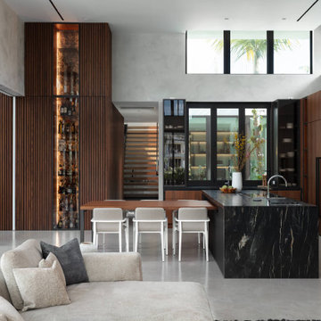
The kitchen is an exercise in scale and material precision—a 1.5 height soaring volume with clerestory windows is wrapped in rich, warm wood, creating a monumental space. The cabinetry, seamless and monolithic, extends upward, emphasizing verticality while maintaining a sense of warmth and tactility
The bar is a sculptural extension of the kitchen’s form that anchors the space. Crafted from the same warm tones, its clean lines and generous proportions offer both function and presence.


 User
Anchored by the homeowner’s 42-foot-long painting, the interiors of this Palm Springs residence were designed to showcase the owner’s art collection, and create functional spaces for daily living that can be easily adapted for large social gatherings.
Referencing the environment and architecture in both form and material, the finishes and custom furnishings bring the interior to life. Alluding to the roofs that suspend over the building, the sofas seem to hover above the carpets while the knife-edge table top appears to float above a metal base. Bleached and cerused wood mimic the “desert effect” that would naturally occur in this environment, while the textiles on the sofa are the same shade as the rocks of the landscape.
Monolithic concrete floors connect all of the spaces while concealing mechanical systems, and stone thresholds signal vertical level changes and exterior transitions. Large wall masses provide the optimal backdrop for the homeowner’s oversized art. The wall structures ground the interior, while the opposing expanses of glass frame the desert views. The location and use of operable doors and windows allows the house to naturally ventilate, reducing cooling loads. The furnishings create spaces in an architectural fashion.
Designed and fabricated for flexibility, the pieces easily accommodate the owners’ large social gatherings. The dining table can be split into two and the sofas can be pushed out along the walls, opening the center of the space to entertain. The design of the interior spaces and furnishings seamlessly integrates the setting, architecture, artwork and spaces into a cohesive whole.
Find the right local pro for your project
 Heidi Reis / Abode Agency LLC
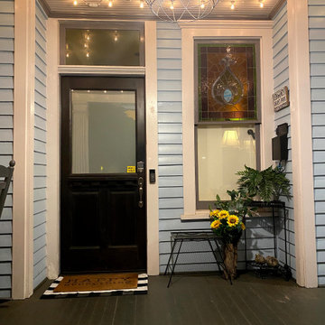
This porch, located in Grant Park, had been the same for many years with typical rocking chairs and a couch. The client wanted to make it feel more like an outdoor room and add much needed storage for gardening tools, an outdoor dining option, and a better flow for seating and conversation.
My thought was to add plants to provide a more cozy feel, along with the rugs, which are made from recycled plastic and easy to clean. To add curtains on the north and south sides of the porch; this reduces rain entry, wind exposure, and adds privacy.
This renovation was designed by Heidi Reis of Abode Agency LLC who serves clients in Atlanta including but not limited to Intown neighborhoods such as: Grant Park, Inman Park, Midtown, Kirkwood, Candler Park, Lindberg area, Martin Manor, Brookhaven, Buckhead, Decatur, and Avondale Estates.
For more information on working with Heidi Reis, click here: https://www.AbodeAgency.Net/
 User
Anchored by the homeowner’s 42-foot-long painting, the interiors of this Palm Springs residence were designed to showcase the owner’s art collection, and create functional spaces for daily living that can be easily adapted for large social gatherings.
Referencing the environment and architecture in both form and material, the finishes and custom furnishings bring the interior to life. Alluding to the roofs that suspend over the building, the sofas seem to hover above the carpets while the knife-edge table top appears to float above a metal base. Bleached and cerused wood mimic the “desert effect” that would naturally occur in this environment, while the textiles on the sofa are the same shade as the rocks of the landscape.
Monolithic concrete floors connect all of the spaces while concealing mechanical systems, and stone thresholds signal vertical level changes and exterior transitions. Large wall masses provide the optimal backdrop for the homeowner’s oversized art. The wall structures ground the interior, while the opposing expanses of glass frame the desert views. The location and use of operable doors and windows allows the house to naturally ventilate, reducing cooling loads. The furnishings create spaces in an architectural fashion.
Designed and fabricated for flexibility, the pieces easily accommodate the owners’ large social gatherings. The dining table can be split into two and the sofas can be pushed out along the walls, opening the center of the space to entertain. The design of the interior spaces and furnishings seamlessly integrates the setting, architecture, artwork and spaces into a cohesive whole.
 Heidi Reis / Abode Agency LLC
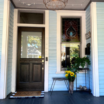
This porch, located in Grant Park, had been the same for many years with typical rocking chairs and a couch. The client wanted to make it feel more like an outdoor room and add much needed storage for gardening tools, an outdoor dining option, and a better flow for seating and conversation.
My thought was to add plants to provide a more cozy feel, along with the rugs, which are made from recycled plastic and easy to clean. To add curtains on the north and south sides of the porch; this reduces rain entry, wind exposure, and adds privacy.
This renovation was designed by Heidi Reis of Abode Agency LLC who serves clients in Atlanta including but not limited to Intown neighborhoods such as: Grant Park, Inman Park, Midtown, Kirkwood, Candler Park, Lindberg area, Martin Manor, Brookhaven, Buckhead, Decatur, and Avondale Estates.
For more information on working with Heidi Reis, click here: https://www.AbodeAgency.Net/
 User
Anchored by the homeowner’s 42-foot-long painting, the interiors of this Palm Springs residence were designed to showcase the owner’s art collection, and create functional spaces for daily living that can be easily adapted for large social gatherings.
Referencing the environment and architecture in both form and material, the finishes and custom furnishings bring the interior to life. Alluding to the roofs that suspend over the building, the sofas seem to hover above the carpets while the knife-edge table top appears to float above a metal base. Bleached and cerused wood mimic the “desert effect” that would naturally occur in this environment, while the textiles on the sofa are the same shade as the rocks of the landscape.
Monolithic concrete floors connect all of the spaces while concealing mechanical systems, and stone thresholds signal vertical level changes and exterior transitions. Large wall masses provide the optimal backdrop for the homeowner’s oversized art. The wall structures ground the interior, while the opposing expanses of glass frame the desert views. The location and use of operable doors and windows allows the house to naturally ventilate, reducing cooling loads. The furnishings create spaces in an architectural fashion.
Designed and fabricated for flexibility, the pieces easily accommodate the owners’ large social gatherings. The dining table can be split into two and the sofas can be pushed out along the walls, opening the center of the space to entertain. The design of the interior spaces and furnishings seamlessly integrates the setting, architecture, artwork and spaces into a cohesive whole.

Sponsored
Sunbury, OH

J.Holderby - Renovations
Franklin County's Leading General Contractors - 2X Best of Houzz!
 John Rogers Design
It is always a pleasure to work with a classic architectural firm like Jack Arnold Homes Tulsa, OK. Jack is an exceptional architect and this was my first opportunity to light one of his projects.
I was contracted by DES of Rogers, AR to create a lighting design plan for this contemporary residence in Tulsa, OK. The client requested I only create lighting design plans for the public areas of the house. That is typical when a client wants to reduce the lighting design fee expense.
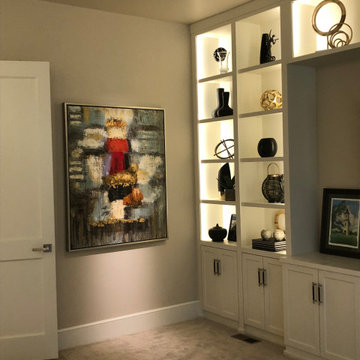
The interior architecture has very clean lines and I did not want to clutter the ceiling with recessed cans. I wanted to use the ceilings as a light reflector. The kitchen upper cabinets did not go to the ceiling so I used the upper cabinets to house linear LEDs to reflect light off the ceiling. To balance that light I suggested the owner add a shelf extension to the breakfast room ceiling for installation of another linear LED. This balanced the LED up-lights in the kitchen and lit the room. This allowed me to add accent lighting to feature the architecture.
I did the same up-lighting technique in the living room with sleek contemporary wall sconces to light the ceiling wooden beams. The reflected ceiling light accents the wood beams and minimizes the need for recessed cans to light the room. The recessed lighting is used to accent art, furnishings and architectural features.
Credits:
Architect: Jack Arnold Homes Tulsa, OK
http://jackarnold.com
Builder: Glen Rogers / Rogers & Associates Inc.
http://glenrogershomes.com
Client : DES Rogers Ar. https://www.des3s.com/
 yardscapes Inc.
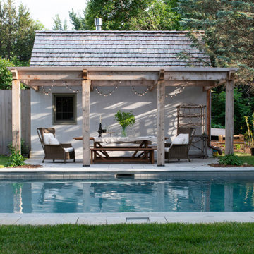
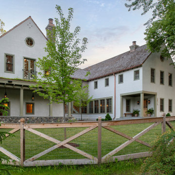
I was initially contacted by the builder and architect working on this Modern European Cottage to review the property and home design before construction began. Once the clients and I had the opportunity to meet and discuss what their visions were for the property, I started working on their wish list of items, which included a custom concrete pool, concrete spa, patios/walkways, custom fencing, and wood structures.
One of the largest challenges was that this property had a 30% (or less) hardcover surface requirement for the city location. With the lot size and square footage of the home I had limits to how much hardcover we could add to property. So, I had to get creative. We presented to the city the usage of the Live Green Roof plantings that would reduce the hardcover calculations for the site. Also, if we kept space between the Laurel Sandstones walkways, using them as steppers and planting groundcover or lawn between the stones that would also reduce the hard surface calculations. We continued that theme with the back patio as well. The client’s esthetic leaned towards the minimal style, so by adding greenery between stones work esthetically.
I chose the Laurel Tumbled Sandstone for the charm and character and thought it would lend well to the old world feel of this Modern European Cottage. We installed it on all the stone walkways, steppers, and patios around the home and pool.
I had several meetings with the client to discuss/review perennials, shrubs, and tree selections. Plant color and texture of the planting material were equally important to the clients when choosing. We grouped the plantings together and did not over-mix varieties of plants. Ultimately, we chose a variety of styles from natural groups of plantings to a touch of formal style, which all work cohesively together.
The custom fence design and installation was designed to create a cottage “country” feel. They gave us inspiration of a country style fence that you may find on a farm to keep the animals inside. We took those photos and ideas and elevated the design. We used a combination of cedar wood and sandwich the galvanized mesh between it. The fence also creates a space for the clients two dogs to roam freely around their property. We installed sod on the inside of the fence to the home and seeded the remaining areas with a Low Gro Fescue grass seed with a straw blanket for protection.
The minimal European style custom concrete pool was designed to be lined up in view from the porch and inside the home. The client requested the lawn around the edge of the pool, which helped reduce the hardcover calculations. The concrete spa is open year around. Benches are on all four sides of the spa to create enough seating for the whole family to use at the same time. Mortared field stone on the exterior of the spa mimics the stone on the exterior of the home. The spa equipment is installed in the lower level of the home to protect it from the cold winter weather.
Between the garage and the home’s entry is a pea rock sitting area and is viewed from several windows. I wanted it to be a quiet escape from the rest of the house with the minimal design. The Skyline Locust tree planted in the center of the space creates a canopy and softens the side of garage wall from the window views. The client will be installing a small water feature along the garage for serene noise ambience.
The client had very thoughtful design ideas styles, and our collaborations all came together and worked well to create the landscape design/installation. The result was everything they had dreamed of and more for their Modern European Cottage home and property.

 MLB Design Group
Simplifying the room included re-planning the ceiling over the tub and shower. Previously it was a small dropped soffit over the shower with a large angled section looming over the window. We minimized the angled section as much as possible, then extended the soffit all the way across the room. Now the kintsugi tile detail captures our interest and, of course, that natural light is magnificent. The platforms are polished porcelain tile, but the shower floor is the same tile in a matte finish. Don't tell anybody, but we've used both Kohler and Brizo fitings in the room! Notice the floor tile detail again -- you'll see this more clearly in an upcoming photo.

 Betz Pools Limited
The panoramic view is breathtaking from this home high above a lake in the Algonquin Highlands near Haliburton. To mesh with the natural surroundings, the dark gray Armorcoat interior of the pool and adjoining spa stand in soft contrast to the coping and massive deck in random-cut granite. Solar heating panels, discretely placed out of view, help to reduce energy use and add practicality to the year round enjoyment of the spa. What a soothing retreat from a busy world! (10 x 40, rectangular)

 JRP Design & Remodel
The main goal to reawaken the beauty of this outdated kitchen was to create more storage and make it a more functional space. This husband and wife love to host their large extended family of kids and grandkids. The JRP design team tweaked the floor plan by reducing the size of an unnecessarily large powder bath. Since storage was key this allowed us to turn a small pantry closet into a larger walk-in pantry.
Keeping with the Mediterranean style of the house but adding a contemporary flair, the design features two-tone cabinets. Walnut island and base cabinets mixed with off white full height and uppers create a warm, welcoming environment. With the removal of the dated soffit, the cabinets were extended to the ceiling. This allowed for a second row of upper cabinets featuring a walnut interior and lighting for display. Choosing the right countertop and backsplash such as this marble-like quartz and arabesque tile is key to tying this whole look together.
The new pantry layout features crisp off-white open shelving with a contrasting walnut base cabinet. The combined open shelving and specialty drawers offer greater storage while at the same time being visually appealing.
The hood with its dark metal finish accented with antique brass is the focal point. It anchors the room above a new 60” Wolf range providing ample space to cook large family meals. The massive island features storage on all sides and seating on two for easy conversation making this kitchen the true hub of the home.
 CO Interiors
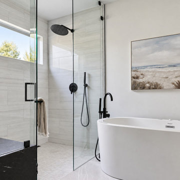
The shower was designed with a curbless entry, creating a clean, modern transition from the main bathroom floor into the bathing area. Large-format stone-look porcelain tile with a honed matte finish brings softness to the room, while the shower walls use a polished glaze to introduce subtle contrast and reflected light. Within the shower, the same stone color was repeated in a smaller-scale mosaic to provide additional grip underfoot without disrupting the cohesive palette.
The bathroom originally featured a larger, taller window. It was reconfigured as a high transom to improve privacy and position the sill farther from the water-prone area, reducing the potential for moisture accumulation while still allowing natural light into the shower.
A custom black stone bench provides both a comfortable place to sit and an additional ledge for bathing products. Its dramatic dark finish is repeated through the rainfall showerhead, handheld shower, tub filler, and other matte-black plumbing fixtures, creating a strong visual thread throughout the space.
Sponsored
Fredericksburg, OH

High Point Cabinets
Columbus' Experienced Custom Cabinet Builder | 4x Best of Houzz Winner
 John Rogers Design
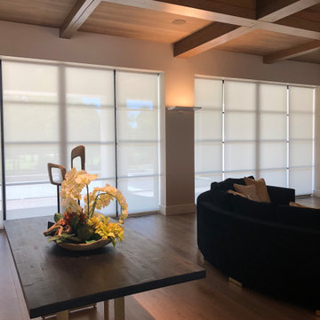
It is always a pleasure to work with a classic architectural firm like Jack Arnold Homes Tulsa, OK. Jack is an exceptional architect and this was my first opportunity to light one of his projects.
I was contracted by DES of Rogers, AR to create a lighting design plan for this contemporary residence in Tulsa, OK. The client requested I only create lighting design plans for the public areas of the house. That is typical when a client wants to reduce the lighting design fee expense.
The interior architecture has very clean lines and I did not want to clutter the ceiling with recessed cans. I wanted to use the ceilings as a light reflector. The kitchen upper cabinets did not go to the ceiling so I used the upper cabinets to house linear LEDs to reflect light off the ceiling. To balance that light I suggested the owner add a shelf extension to the breakfast room ceiling for installation of another linear LED. This balanced the LED up-lights in the kitchen and lit the room. This allowed me to add accent lighting to feature the architecture.
I did the same up-lighting technique in the living room with sleek contemporary wall sconces to light the ceiling wooden beams. The reflected ceiling light accents the wood beams and minimizes the need for recessed cans to light the room. The recessed lighting is used to accent art, furnishings and architectural features.
Credits:
Architect: Jack Arnold Homes Tulsa, OK
http://jackarnold.com
Builder: Glen Rogers / Rogers & Associates Inc.
http://glenrogershomes.com
Client : DES Rogers Ar. https://www.des3s.com/
 TKS Design Group
Download our free ebook, Creating the Ideal Kitchen. DOWNLOAD NOW
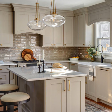
This family from Wheaton was ready to remodel their kitchen, dining room and powder room. The project didn’t call for any structural or space planning changes but the makeover still had a massive impact on their home. The homeowners wanted to change their dated 1990’s brown speckled granite and light maple kitchen. They liked the welcoming feeling they got from the wood and warm tones in their current kitchen, but this style clashed with their vision of a deVOL type kitchen, a London-based furniture company. Their inspiration came from the country homes of the UK that mix the warmth of traditional detail with clean lines and modern updates.
To create their vision, we started with all new framed cabinets with a modified overlay painted in beautiful, understated colors. Our clients were adamant about “no white cabinets.” Instead we used an oyster color for the perimeter and a custom color match to a specific shade of green chosen by the homeowner. The use of a simple color pallet reduces the visual noise and allows the space to feel open and welcoming. We also painted the trim above the cabinets the same color to make the cabinets look taller. The room trim was painted a bright clean white to match the ceiling.
In true English fashion our clients are not coffee drinkers, but they LOVE tea. We created a tea station for them where they can prepare and serve tea. We added plenty of glass to showcase their tea mugs and adapted the cabinetry below to accommodate storage for their tea items. Function is also key for the English kitchen and the homeowners. They requested a deep farmhouse sink and a cabinet devoted to their heavy mixer because they bake a lot. We then got rid of the stovetop on the island and wall oven and replaced both of them with a range located against the far wall. This gives them plenty of space on the island to roll out dough and prepare any number of baked goods. We then removed the bifold pantry doors and created custom built-ins with plenty of usable storage for all their cooking and baking needs.
The client wanted a big change to the dining room but still wanted to use their own furniture and rug. We installed a toile-like wallpaper on the top half of the room and supported it with white wainscot paneling. We also changed out the light fixture, showing us once again that small changes can have a big impact.
As the final touch, we also re-did the powder room to be in line with the rest of the first floor. We had the new vanity painted in the same oyster color as the kitchen cabinets and then covered the walls in a whimsical patterned wallpaper. Although the homeowners like subtle neutral colors they were willing to go a bit bold in the powder room for something unexpected. For more design inspiration go to: www.kitchenstudio-ge.com
 John Rogers Design
It is always a pleasure to work with a classic architectural firm like Jack Arnold Homes Tulsa, OK. Jack is an exceptional architect and this was my first opportunity to light one of his projects.
I was contracted by DES of Rogers, AR to create a lighting design plan for this contemporary residence in Tulsa, OK. The client requested I only create lighting design plans for the public areas of the house. That is typical when a client wants to reduce the lighting design fee expense.
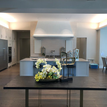
The interior architecture has very clean lines and I did not want to clutter the ceiling with recessed cans. I wanted to use the ceilings as a light reflector. The kitchen upper cabinets did not go to the ceiling so I used the upper cabinets to house linear LEDs to reflect light off the ceiling. To balance that light I suggested the owner add a shelf extension to the breakfast room ceiling for installation of another linear LED. This balanced the LED up-lights in the kitchen and lit the room. This allowed me to add accent lighting to feature the architecture.
I did the same up-lighting technique in the living room with sleek contemporary wall sconces to light the ceiling wooden beams. The reflected ceiling light accents the wood beams and minimizes the need for recessed cans to light the room. The recessed lighting is used to accent art, furnishings and architectural features.
Credits:
Architect: Jack Arnold Homes Tulsa, OK
http://jackarnold.com
Builder: Glen Rogers / Rogers & Associates Inc.
http://glenrogershomes.com
Client : DES Rogers Ar. https://www.des3s.com/
 MDT, Inc.
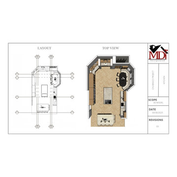
The top view shown in this design presentation provides a full-color, scaled 3D overview of the final kitchen layout. It allows clients and trade professionals to visualize the spatial relationships between key elements—such as the two islands, perimeter cabinetry, appliance zones, custom banquette, and bar area—in a single glance.
Why It’s Important:
Clarifies Functionality: The top view reveals how traffic will flow, how different zones (cooking, prep, dining, entertaining) interact, and how open the space feels after removing the dividing wall.
Enhances Communication: It serves as a bridge between the technical floor plan and the client’s understanding—making it easier for everyone from homeowners to electricians and cabinet installers to be on the same page.
Reduces Mistakes: With every element clearly placed and proportioned, it helps avoid on-site guesswork and ensures proper measurements and installations from day one.
Sets Expectations: It visually confirms the final design intent, so clients know exactly what to expect—eliminating surprises later in construction.
This top view is a vital part of MDT’s seamless preconstruction process, ensuring our vision is fully aligned with our clients’ goals before we even break ground.
Sponsored
Sunbury, OH
J.Holderby - Renovations
Franklin County's Leading General Contractors - 2X Best of Houzz!

 The Rinfret Group
Example of a mid-sized transitional freestanding desk dark wood floor and brown floor study room design in New York with beige walls and no fireplace
 yardscapes Inc.
I was initially contacted by the builder and architect working on this Modern European Cottage to review the property and home design before construction began. Once the clients and I had the opportunity to meet and discuss what their visions were for the property, I started working on their wish list of items, which included a custom concrete pool, concrete spa, patios/walkways, custom fencing, and wood structures.
One of the largest challenges was that this property had a 30% (or less) hardcover surface requirement for the city location. With the lot size and square footage of the home I had limits to how much hardcover we could add to property. So, I had to get creative. We presented to the city the usage of the Live Green Roof plantings that would reduce the hardcover calculations for the site. Also, if we kept space between the Laurel Sandstones walkways, using them as steppers and planting groundcover or lawn between the stones that would also reduce the hard surface calculations. We continued that theme with the back patio as well. The client’s esthetic leaned towards the minimal style, so by adding greenery between stones work esthetically.
I chose the Laurel Tumbled Sandstone for the charm and character and thought it would lend well to the old world feel of this Modern European Cottage. We installed it on all the stone walkways, steppers, and patios around the home and pool.
I had several meetings with the client to discuss/review perennials, shrubs, and tree selections. Plant color and texture of the planting material were equally important to the clients when choosing. We grouped the plantings together and did not over-mix varieties of plants. Ultimately, we chose a variety of styles from natural groups of plantings to a touch of formal style, which all work cohesively together.
The custom fence design and installation was designed to create a cottage “country” feel. They gave us inspiration of a country style fence that you may find on a farm to keep the animals inside. We took those photos and ideas and elevated the design. We used a combination of cedar wood and sandwich the galvanized mesh between it. The fence also creates a space for the clients two dogs to roam freely around their property. We installed sod on the inside of the fence to the home and seeded the remaining areas with a Low Gro Fescue grass seed with a straw blanket for protection.
The minimal European style custom concrete pool was designed to be lined up in view from the porch and inside the home. The client requested the lawn around the edge of the pool, which helped reduce the hardcover calculations. The concrete spa is open year around. Benches are on all four sides of the spa to create enough seating for the whole family to use at the same time. Mortared field stone on the exterior of the spa mimics the stone on the exterior of the home. The spa equipment is installed in the lower level of the home to protect it from the cold winter weather.
Between the garage and the home’s entry is a pea rock sitting area and is viewed from several windows. I wanted it to be a quiet escape from the rest of the house with the minimal design. The Skyline Locust tree planted in the center of the space creates a canopy and softens the side of garage wall from the window views. The client will be installing a small water feature along the garage for serene noise ambience.
The client had very thoughtful design ideas styles, and our collaborations all came together and worked well to create the landscape design/installation. The result was everything they had dreamed of and more for their Modern European Cottage home and property.

 Jon Allen Fine Metal Art
Blue Ribbon Dancer Contemporary Metal Art Sculpture
As seen on the ABC hit TV show "Nashville"!
A blue ribbon pirouettes around a central support in this freestanding contemporary metal art sculpture, an airy abstract composition that seems to float in space. The graceful spiral of the metal ribbon, which twists and tapers elegantly, is in contrast to its bold color, a deep cobalt blue that suggests passion and exuberance.
Dimensions:
- Approximately 76"H x 16"L x 12"D including the 14" artistically textured wooden base.
- Ready to secure to a patio, deck or garden stone with the included pre-drilled mounting plate for easy installation.(Screws not included)
Color: Brilliant Blue Jewel Tones with Black Finial
Pleae note: ustom pieces are available for your size and color specifications.
47