
Search results for "Reduce same" in Home Design Ideas
 Ellen Farber Strategic Design
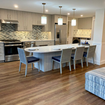
The kitchen was originally planned to mimic the location of appliances in her current kitchen to minimize re-learning of appliance locations. The only change was adding a trash cabinet between the fridge and the sink. A french door fridge allows someone in a wheelchair to easily access frozen and cold foods, while the water and ice dispenser on the outside of the door make it easy to stay hydrated rather than using the sink each time. She can roll up to the kitchen sink due to the recessed cabinetry under the sink or stand at counter height to put away dishes from the dishwasher. The dishwasher is ADA and very simple to use , and is raised off the floor so whether she is sitting or standing it's easier to reach. The gas cooktop has controls at the front making it easy to reach from the wheelchair and the exhaust fan above also has a control at the front. All cabinet door handles are D-shape, which makes them easy to grasp and there is plenty of electric outlets for charging phones, computers and small appliances. The kitchen island is table height at 30" so meal prep can be easily done in a wheelchair while guests and can be seated in a chair or wheelchair around the island. The dining chairs can also be turned around to add extra seating in the living room area. Pendant lights above the kitchen island light up the space, while recessed lighting in the kitchen and living room provide overall room lighting. There is also under cabinet lighting which makes the room glow at night! Wainscoting made of commercial grade material is strategically placed on sharp corners and exposed walls to reduce and minimize damage from the wheel chair, while creating a finished and complete look! We selected a free standing microwave to sit below the island, which is easy to use and is the same style as in her previous apartment. The island is 48" from the appliance wall, leaving ample space to open doors and maneuver around in the wheelchair and has easy access to the laundry area as well. We eliminated the pocket doors that had been in front of the laundry area for easy access, and since it was exposed, dressed it up with coordinating tile to the kitchen with additional cabinets above. There is a coordinating quartz counter on top of the washer and dryer for folding laundry or storing additional supplies.

 Katie Hutchison Studio
The new owners of this house in Harvard, Massachusetts loved its location and authentic Shaker characteristics, but weren’t fans of its curious layout. A dated first-floor full bathroom could only be accessed by going up a few steps to a landing, opening the bathroom door and then going down the same number of steps to enter the room. The dark kitchen faced the driveway to the north, rather than the bucolic backyard fields to the south. The dining space felt more like an enlarged hall and could only comfortably seat four. Upstairs, a den/office had a woefully low ceiling; the master bedroom had limited storage, and a sad full bathroom featured a cramped shower.
KHS proposed a number of changes to create an updated home where the owners could enjoy cooking, entertaining, and being connected to the outdoors from the first-floor living spaces, while also experiencing more inviting and more functional private spaces upstairs.
On the first floor, the primary change was to capture space that had been part of an upper-level screen porch and convert it to interior space. To make the interior expansion seamless, we raised the floor of the area that had been the upper-level porch, so it aligns with the main living level, and made sure there would be no soffits in the planes of the walls we removed. We also raised the floor of the remaining lower-level porch to reduce the number of steps required to circulate from it to the newly expanded interior. New patio door systems now fill the arched openings that used to be infilled with screen. The exterior interventions (which also included some new casement windows in the dining area) were designed to be subtle, while affording significant improvements on the interior. Additionally, the first-floor bathroom was reconfigured, shifting one of its walls to widen the dining space, and moving the entrance to the bathroom from the stair landing to the kitchen instead.
These changes (which involved significant structural interventions) resulted in a much more open space to accommodate a new kitchen with a view of the lush backyard and a new dining space defined by a new built-in banquette that comfortably seats six, and -- with the addition of a table extension -- up to eight people.
Upstairs in the den/office, replacing the low, board ceiling with a raised, plaster, tray ceiling that springs from above the original board-finish walls – newly painted a light color -- created a much more inviting, bright, and expansive space. Re-configuring the master bath to accommodate a larger shower and adding built-in storage cabinets in the master bedroom improved comfort and function. A new whole-house color palette rounds out the improvements.
Photos by Katie Hutchison
 Katie Hutchison Studio
The new owners of this house in Harvard, Massachusetts loved its location and authentic Shaker characteristics, but weren’t fans of its curious layout. A dated first-floor full bathroom could only be accessed by going up a few steps to a landing, opening the bathroom door and then going down the same number of steps to enter the room. The dark kitchen faced the driveway to the north, rather than the bucolic backyard fields to the south. The dining space felt more like an enlarged hall and could only comfortably seat four. Upstairs, a den/office had a woefully low ceiling; the master bedroom had limited storage, and a sad full bathroom featured a cramped shower.
KHS proposed a number of changes to create an updated home where the owners could enjoy cooking, entertaining, and being connected to the outdoors from the first-floor living spaces, while also experiencing more inviting and more functional private spaces upstairs.
On the first floor, the primary change was to capture space that had been part of an upper-level screen porch and convert it to interior space. To make the interior expansion seamless, we raised the floor of the area that had been the upper-level porch, so it aligns with the main living level, and made sure there would be no soffits in the planes of the walls we removed. We also raised the floor of the remaining lower-level porch to reduce the number of steps required to circulate from it to the newly expanded interior. New patio door systems now fill the arched openings that used to be infilled with screen. The exterior interventions (which also included some new casement windows in the dining area) were designed to be subtle, while affording significant improvements on the interior. Additionally, the first-floor bathroom was reconfigured, shifting one of its walls to widen the dining space, and moving the entrance to the bathroom from the stair landing to the kitchen instead.
These changes (which involved significant structural interventions) resulted in a much more open space to accommodate a new kitchen with a view of the lush backyard and a new dining space defined by a new built-in banquette that comfortably seats six, and -- with the addition of a table extension -- up to eight people.
Upstairs in the den/office, replacing the low, board ceiling with a raised, plaster, tray ceiling that springs from above the original board-finish walls – newly painted a light color -- created a much more inviting, bright, and expansive space. Re-configuring the master bath to accommodate a larger shower and adding built-in storage cabinets in the master bedroom improved comfort and function. A new whole-house color palette rounds out the improvements.
Photos by Katie Hutchison
Find the right local pro for your project

 Cadorin Group | Top Quality Wooden Flooring
Photo: Private ville
When wood takes on the warm colour of chocolate, we get Wengè-effect Oak, a new parquet from the Cadorin Group. Elegant and essential, this plank reflects the exclusive style of the Elite Collection, perfect for those with an eye to detail and wanting to play with different colour combinations.
The planks are made from three layers of solid wood, where the top layer is Select European Oak (one the most popular timbers for its fine flamed and streaked texture), with a brushed surface and finished with a varnish in a new colour: Wengè - the African black wood.
The planks are produced as both large planks and smaller blocks suitable for herringbone laying.
The intense and expressive black hue gives the parquet particularly warm nuances, making it perfect for both idiosyncratic ethnic interior décor and for more contemporary minimalist environments.
Wengè Oak is a beautiful “healthy” plank. Respect for the environment has always been a top priority for Cadorin, a Venetian company: the Select European Oak used is a select wood that Cadorin favours with its MORE WOOD - FEWER KM logo. This means that the timber is sourced within a relatively short distance from the Cadorin production site (300-700 km), thus helping to reduce the company’s carbon footprint by limiting the emission of CO2 from its means of transport.
THREE TOP-LAYER PLANKS
Cadorin planks are 100% made in Italy (the entire production cycle takes place in Cadorin’s production site in Possagno) and are Three Top-Layer planks (three layers of solid wood): the top layer is a single strip of solid wood some 5 mm thick; the core is formed using solid strips of Fir, laid crossways; the bottom layer is made from the same noble timber as that used for the top, visible layer. This crossed three-layer structure guarantees perfect plank balance even when produced in large dimensions (16 - 21mm thick, 14 - 33cm wide and up to 3m long as standard; also available in lengths of up 4 - 5 metres), as well as in the smaller format (10.5-12cm x 60-80cm) normally used for herringbone pattern parquet floors.
 Øesch Environmental Design
Energy Efficiency:
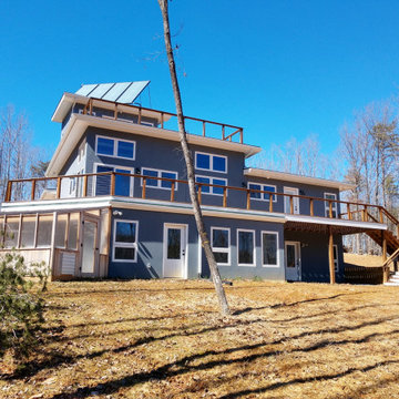
Every effort has been utilized to reduce and minimize energy use through an effective strategy of both passive heating and cooling, as well as state-of-the-art active solar thermal and photovoltaic on site off-grid energy production. Optimal solar orientation with an attached thermal mass food production greenhouse on the Lower Floor enables hot air to be introduced into the house during the winter, and rise via. a thermal chimney “stack effect” and distributed throughout the house. In the summer the same thermal chimney is used to channel hot air to rise up to the Upper Loft vegetated Roof Terrace, where it is exhausted. This condition provides a positive air pressure in the Winter, and a negative pressure in the summer, drawing in cooler outside air from every open window. In addition carefully proportioned roof eave overhangs provide deep passive solar gain and additional day lighting in the winter, and cooling shade in the summer.
Active mechanical systems include solar thermal which produces domestic hot water and is integrated into hydronic radiant heated floors. This is supplemented with a multi-split heatpump, on demand backup hot water, and an ERV, which collectively provide active heating, cooling, dehumidification, and healthful indoor air quality. The entire house and detached Barn are off-grid with a 14.4 kW solar array, whole-house batteries, and backup generator. Further, the home is super insulated and extremely tight with high energy performing windows and doors and LED lighting throughout, and even a high efficiency woodstove.
Integrated Design:
From the beginning and throughout construction, this home demonstrates a close collaboration between the Architect, Contractor, and Owners. Healthful materials and finishes standards, autonomy and energy efficiency, and environmental impact and sustainability were primary goals and stressed throughout. Careful attention was paid to finishes which will require minimal long term maintenance such as the galvalume metal roof (which also provides for rainwater harvesting) and fiber cement siding for longevity.
Resource Efficiency / Conservation:
Resource conservation began with Schematic Design which utilizes a 2 ft. grid of modular components, thereby optimizing construction efficiency and minimizing on site waste. The site was cleared with the trees stockpiled for future lumber harvesting and firewood. The foundation walls are “Ideal Walls” which use less than half the concrete of a conventional poured wall or block, and do not require extensive concrete footings, exterior insulation, or waterproofing. These panels are prefabricated off site and set in only a few days, which further reduces on site impact and construction lead time.
Resiliency:
Respect for climate change and mitigating its impact were primary considerations in the design and selection of materials and systems. The home is sited high on a south facing slope as protection from high water or flood and to optimize both passive and active solar opportunity. With remarkably tight construction and super insulation the interior is buffered from both outdoor heat and cold extremes. The metal roof and fiber cement siding are fireproof and resistant to the impact of high winds. And these materials are specified for minimal maintenance and longevity. Further, the attached Greenhouse and Upper Roof Terrace is landscaped and suitable for a vegetable garden with abundant sunshine, easy to water, and with no need for fencing to keep deer at bay. All this being a notable case study for Regenerative Design.
Innovation:
This home exemplifies Biophilic Design principles to facilitate symbiotic living in harmony with Nature. This incorporates careful attention to natural day lighting, indoor air quality, rainwater catchment and wastewater reclamation, garden food production with vegetated roofs, the home hearth and fire, and connected interaction with the weather and the surrounding natural ecosystems.
Community Impact:
This EcoHome project has already been presented at several Sustainable Building lectures as a model case study for “Green Building”, including USGBC at Brock Environmental Center in Virginia Beach, VA. Plans are underway for an Open House tour for area Architects and students.
 Øesch Environmental Design
Energy Efficiency:
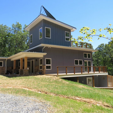
Every effort has been utilized to reduce and minimize energy use through an effective strategy of both passive heating and cooling, as well as state-of-the-art active solar thermal and photovoltaic on site off-grid energy production. Optimal solar orientation with an attached thermal mass food production greenhouse on the Lower Floor enables hot air to be introduced into the house during the winter, and rise via. a thermal chimney “stack effect” and distributed throughout the house. In the summer the same thermal chimney is used to channel hot air to rise up to the Upper Loft vegetated Roof Terrace, where it is exhausted. This condition provides a positive air pressure in the Winter, and a negative pressure in the summer, drawing in cooler outside air from every open window. In addition carefully proportioned roof eave overhangs provide deep passive solar gain and additional day lighting in the winter, and cooling shade in the summer.
Active mechanical systems include solar thermal which produces domestic hot water and is integrated into hydronic radiant heated floors. This is supplemented with a multi-split heatpump, on demand backup hot water, and an ERV, which collectively provide active heating, cooling, dehumidification, and healthful indoor air quality. The entire house and detached Barn are off-grid with a 14.4 kW solar array, whole-house batteries, and backup generator. Further, the home is super insulated and extremely tight with high energy performing windows and doors and LED lighting throughout, and even a high efficiency woodstove.
Integrated Design:
From the beginning and throughout construction, this home demonstrates a close collaboration between the Architect, Contractor, and Owners. Healthful materials and finishes standards, autonomy and energy efficiency, and environmental impact and sustainability were primary goals and stressed throughout. Careful attention was paid to finishes which will require minimal long term maintenance such as the galvalume metal roof (which also provides for rainwater harvesting) and fiber cement siding for longevity.
Resource Efficiency / Conservation:
Resource conservation began with Schematic Design which utilizes a 2 ft. grid of modular components, thereby optimizing construction efficiency and minimizing on site waste. The site was cleared with the trees stockpiled for future lumber harvesting and firewood. The foundation walls are “Ideal Walls” which use less than half the concrete of a conventional poured wall or block, and do not require extensive concrete footings, exterior insulation, or waterproofing. These panels are prefabricated off site and set in only a few days, which further reduces on site impact and construction lead time.
Resiliency:
Respect for climate change and mitigating its impact were primary considerations in the design and selection of materials and systems. The home is sited high on a south facing slope as protection from high water or flood and to optimize both passive and active solar opportunity. With remarkably tight construction and super insulation the interior is buffered from both outdoor heat and cold extremes. The metal roof and fiber cement siding are fireproof and resistant to the impact of high winds. And these materials are specified for minimal maintenance and longevity. Further, the attached Greenhouse and Upper Roof Terrace is landscaped and suitable for a vegetable garden with abundant sunshine, easy to water, and with no need for fencing to keep deer at bay. All this being a notable case study for Regenerative Design.
Innovation:
This home exemplifies Biophilic Design principles to facilitate symbiotic living in harmony with Nature. This incorporates careful attention to natural day lighting, indoor air quality, rainwater catchment and wastewater reclamation, garden food production with vegetated roofs, the home hearth and fire, and connected interaction with the weather and the surrounding natural ecosystems.
Community Impact:
This EcoHome project has already been presented at several Sustainable Building lectures as a model case study for “Green Building”, including USGBC at Brock Environmental Center in Virginia Beach, VA. Plans are underway for an Open House tour for area Architects and students.

 Bluworld HOMelements
If you're looking to make a statement with the decor of your home or office, you can't go wrong with the Large Horizon Falls fountain. This indoor water fall is in the tradition of the popular Nojoqui falls series, but with a horizontal rather than vertical orientation. The result is a cascade of water streaming down a four foot wide span of beautiful Indian Rajah Slate to slip past the included polished river rocks below--a sight that will command the attention of anyone who enters the room. These water fountains are a truly unique, engaging and an elegant addition to any indoor space.
Redesigned, the Large Horizon Falls fountain includes long-lasting super bright white LED lights rated for over 10,000 hours of use and an ergonomic finger slide remote control to easily dim or brighten the LED lights or turn them on and off. This water fountain glistens as water sheets over the genuine multi-color Indian Rajah Slate creating a soothing sound and beautiful focal point for any room. This fountain is engineered with Bluworld's clog-free, splash-free design and features the Water Wonders NSI™ genuine light weight Slate. Installation is super easy with the lightweight nature of the NSI™ slate panels. Simply hang on the wall per the instructions.
This water fountain can be customized with your logo. Etched and hand-painted logos start at only $395.00. Contact our sales department for more information at 1-888-499-5433.
The Large Horizon Falls fountain is the perfect size to hang on just about any wall, and it will instantly raise the level of class in any living room, foyer, office or lobby. These indoor water falls come with a choice of four finishes: Standard colors; Copper Vein and Black Onyx and premium finishes; Copper Patina,or Brushed Stainless Steel.
Water Wonders NSI™ Light Weight Slate™- Water fountains made with our NSI™ Light Weight Slate use our patent pending technology which sheers a layer of genuine Indian Raja Slate and fuses it to composite material with the same chipped edge technique as slab slate. They are indistinguishable from a thick slab of slate. All the beauty is retained and the weight is reduced by over 90% making it easier to hang a wall fountain. Once it's installed, your only concerns are setting the flow rate and turning on the accent light with your handy remote.
Please note that these units are handmade and measurements may vary slightly. Texture and color of aged rustic copper, metals and slate may also vary slightly with each fountain.
Sponsored
Fredericksburg, OH

High Point Cabinets
Columbus' Experienced Custom Cabinet Builder | 4x Best of Houzz Winner
 Katie Hutchison Studio
The new owners of this house in Harvard, Massachusetts loved its location and authentic Shaker characteristics, but weren’t fans of its curious layout. A dated first-floor full bathroom could only be accessed by going up a few steps to a landing, opening the bathroom door and then going down the same number of steps to enter the room. The dark kitchen faced the driveway to the north, rather than the bucolic backyard fields to the south. The dining space felt more like an enlarged hall and could only comfortably seat four. Upstairs, a den/office had a woefully low ceiling; the master bedroom had limited storage, and a sad full bathroom featured a cramped shower.
KHS proposed a number of changes to create an updated home where the owners could enjoy cooking, entertaining, and being connected to the outdoors from the first-floor living spaces, while also experiencing more inviting and more functional private spaces upstairs.
On the first floor, the primary change was to capture space that had been part of an upper-level screen porch and convert it to interior space. To make the interior expansion seamless, we raised the floor of the area that had been the upper-level porch, so it aligns with the main living level, and made sure there would be no soffits in the planes of the walls we removed. We also raised the floor of the remaining lower-level porch to reduce the number of steps required to circulate from it to the newly expanded interior. New patio door systems now fill the arched openings that used to be infilled with screen. The exterior interventions (which also included some new casement windows in the dining area) were designed to be subtle, while affording significant improvements on the interior. Additionally, the first-floor bathroom was reconfigured, shifting one of its walls to widen the dining space, and moving the entrance to the bathroom from the stair landing to the kitchen instead.
These changes (which involved significant structural interventions) resulted in a much more open space to accommodate a new kitchen with a view of the lush backyard and a new dining space defined by a new built-in banquette that comfortably seats six, and -- with the addition of a table extension -- up to eight people.
Upstairs in the den/office, replacing the low, board ceiling with a raised, plaster, tray ceiling that springs from above the original board-finish walls – newly painted a light color -- created a much more inviting, bright, and expansive space. Re-configuring the master bath to accommodate a larger shower and adding built-in storage cabinets in the master bedroom improved comfort and function. A new whole-house color palette rounds out the improvements.
Photos by Katie Hutchison

 Universal Appliance and Kitchen Center
Miele Appliances at Universal Appliance and Kitchen Center
26767 Agoura Road, Calabasas, CA 91302
Phone 818.880.0011 Fax 818.880.0411
12050 Ventura Blvd.,Studio City, CA 91604
Phone 818.755.1111 Fax 818.755.9111
www.uakc.com
Miele Generation 6000 is bringing design and innovation that exceed expectations. It includes two distinct design styles - PureLine and ContourLine - as well as several color options including Brilliant White and Truffle Brown.
Design for Miele is not simply the exterior. Like the design principle, form follows function; the true beauty of the Generation 6000 series is highlighted by its intuitive user interface, which ensures unsurpassed performance and convenience in the kitchen. With these new color options and the uniform design of the Generation 6000 series, Miele has created a series of appliances that will seamlessly integrate into any kitchen or lifestyle. Whether appliances are installed vertically, horizontally, as a square or in a T-shape configuration, the design is fully resolved.
M Touch – Top-class technology with a special touch
Whether it’s creating a double cappuccino at the touch of a single button, finding the desired MasterChef automatic program on the Combi-Steam Oven in an instant or selecting the operating mode and temperature in just a few simple steps – Miele eliminates the guesswork. All of these operations are easier than ever because of M Touch. Reminiscent of smart phones and tablets, M Touch is an intuitive user interface that allows the user to swipe or scroll through the menu with the tip of a finger. A new high resolution control panel with white TFT (Thin Film Transistor) text brings a brilliant display. And because the interface is universal across all Gen 6000 appliances, the transition from appliance to appliance is easier than ever.
Oven Innovations: Moisture Plus, Gourmet Center and MultiSteam
Developed exclusively for Miele USA, Moisture Plus is a truly unique steam injection system featured in Miele M Touch 30” Convection Ovens. Moisture Plus automatically injects a burst of steam into the oven cavity at pre-determined points during the cooking process. The addition of moisture improves results when proofing dough, gives loaves of bread a crisp crust and glossy finish and makes cuts of meat particularly crisp on the outside and succulent inside.
Also new to the 30” Convection Oven is the addition of MasterChef Plus programs. Ideal for the consummate baker at home, this exclusive new menu system houses 14 automatic bread programs and replicates results seen in artisan bakeries. Included are programs for sourdough, whole grain, rolls and baguettes.
A pioneer in steam oven technology, Generation 6000 Steam and Combi-Steam Ovens are equipped with MultiSteam technology, a revolutionary new steam cooking generation. The addition of six steam inlets in the Steam Oven and eight steam inlets in the Combi-Steam Oven, delivers fast, even steam distribution and incredibly quick heat-up times for even cooking results through a more powerful steam generator.
Long regarded for its ingredient-driven menu, Miele MasterChef programs are now located within the Gourmet Center. Choose from more than 100 easy to use programs for grains, vegetables, meats, fish and poultry. At just the touch of a button, the program will deliver menu options that guide the user step by step - from the desired oven mode to temperature - all resulting in the perfect dish.
Generation 6000 Coffee Systems impress with comfort and innovation
There are several new highlights to the Generation 6000 Whole Bean Coffee System including a new CupSensor, EasyClick Milk System and One Touch for Two features. Exclusive to Miele, the CupSensor automatically adjusts the height of the spout to the optimum position for different cup and glass sizes. Whether a tall latté macchiato or a dainty espresso is being prepared, the central spout automatically adjusts to the cup’s rim and eliminates splashing. The CupSensor even reacts precisely to beverages made with milk by raising the spout slightly to make room for the incoming espresso.
Also new is the EasyClick milk system which is a dishwasher safe glass, milk flask that effortlessly clicks into place at the front of the machine. And for easy maintenance, the new Miele Coffee Systems now automatically rinse all milk spouts and hoses with water after each use.
The One Touch for Two feature allows the user to prepare two coffee specialties such as cappuccino and latté macchiato at the same time, thus reducing prep time when two or more drinks are being served.
Miele Generation 6000 series is distinguished by its elegant design and remarkable innovations to deliver unmatched results that can be seen, touched and tasted. German engineered and tested to last 20 years, Generation 6000 reinforces the Miele Design for Life philosophy and solidifies Miele at the forefront of residential culinary appliances.
 Bluworld HOMelements
The Medium Horizon Falls fountain takes the Nojoqui Falls fountain concept and turns it quite literally on its side, creating a horizontal wall fountain that measures almost three feet across. This horizontal version of the original Large Nojoqui Falls wall fountain is named after the beautiful 164 foot tall Nojoqui Falls waterfall, located in central California where the Water Wonders line was originated. These water fountains are a truly unique, engaging and an elegant addition to any indoor space.
Redesigned, the Medium Horizon Falls fountain includes long-lasting super bright white LED lights rated for over 10,000 hours of use and an ergonomic finger slide remote control to easily dim or brighten the LED lights or turn them on and off. This water fountain glistens as water sheets over the genuine multi-color Indian Rajah Slate flowing passed polished river rock creating a soothing sound and beautiful focal point for any room. This fountain is engineered with Bluworld's clog-free, splash-free design and features the Water Wonders NSI™ genuine light weight Slate. Installation is super easy with the lightweight nature of the NSI™ slate panels. Simply hang on the wall per the instructions.
This water fountain can be customized with your logo. Etched and hand-painted logos start at only $395.00. Contact our sales department for more information at 1-888-499-5433.
The Medium Horizon Falls fountain is the perfect size to hang on just about any wall, and it will instantly raise the level of class in any living room, foyer, office or lobby. These indoor water falls come with a choice of four finishes: Standard colors; Copper Vein and Black Onyx and premium finishes; Copper Patina,or Brushed Stainless Steel.
Water Wonders NSI™ Light Weight Slate™- Water fountains made with our NSI™ Light Weight Slate use our patent pending technology which sheers a layer of genuine Indian Raja Slate and fuses it to composite material with the same chipped edge technique as slab slate. They are indistinguishable from a thick slab of slate. All the beauty is retained and the weight is reduced by over 90% making it easier to hang a wall fountain. Once it's installed, your only concerns are setting the flow rate and turning on the accent light with your handy remote.
Please note that these units are handmade and measurements may vary slightly. Texture and color of aged rustic copper, metals and slate may also vary slightly with each fountain.
 Katie Hutchison Studio
The new owners of this house in Harvard, Massachusetts loved its location and authentic Shaker characteristics, but weren’t fans of its curious layout. A dated first-floor full bathroom could only be accessed by going up a few steps to a landing, opening the bathroom door and then going down the same number of steps to enter the room. The dark kitchen faced the driveway to the north, rather than the bucolic backyard fields to the south. The dining space felt more like an enlarged hall and could only comfortably seat four. Upstairs, a den/office had a woefully low ceiling; the master bedroom had limited storage, and a sad full bathroom featured a cramped shower.
KHS proposed a number of changes to create an updated home where the owners could enjoy cooking, entertaining, and being connected to the outdoors from the first-floor living spaces, while also experiencing more inviting and more functional private spaces upstairs.
On the first floor, the primary change was to capture space that had been part of an upper-level screen porch and convert it to interior space. To make the interior expansion seamless, we raised the floor of the area that had been the upper-level porch, so it aligns with the main living level, and made sure there would be no soffits in the planes of the walls we removed. We also raised the floor of the remaining lower-level porch to reduce the number of steps required to circulate from it to the newly expanded interior. New patio door systems now fill the arched openings that used to be infilled with screen. The exterior interventions (which also included some new casement windows in the dining area) were designed to be subtle, while affording significant improvements on the interior. Additionally, the first-floor bathroom was reconfigured, shifting one of its walls to widen the dining space, and moving the entrance to the bathroom from the stair landing to the kitchen instead.
These changes (which involved significant structural interventions) resulted in a much more open space to accommodate a new kitchen with a view of the lush backyard and a new dining space defined by a new built-in banquette that comfortably seats six, and -- with the addition of a table extension -- up to eight people.
Upstairs in the den/office, replacing the low, board ceiling with a raised, plaster, tray ceiling that springs from above the original board-finish walls – newly painted a light color -- created a much more inviting, bright, and expansive space. Re-configuring the master bath to accommodate a larger shower and adding built-in storage cabinets in the master bedroom improved comfort and function. A new whole-house color palette rounds out the improvements.
Photos by Katie Hutchison
 Katie Hutchison Studio
The new owners of this house in Harvard, Massachusetts loved its location and authentic Shaker characteristics, but weren’t fans of its curious layout. A dated first-floor full bathroom could only be accessed by going up a few steps to a landing, opening the bathroom door and then going down the same number of steps to enter the room. The dark kitchen faced the driveway to the north, rather than the bucolic backyard fields to the south. The dining space felt more like an enlarged hall and could only comfortably seat four. Upstairs, a den/office had a woefully low ceiling; the master bedroom had limited storage, and a sad full bathroom featured a cramped shower.
KHS proposed a number of changes to create an updated home where the owners could enjoy cooking, entertaining, and being connected to the outdoors from the first-floor living spaces, while also experiencing more inviting and more functional private spaces upstairs.
On the first floor, the primary change was to capture space that had been part of an upper-level screen porch and convert it to interior space. To make the interior expansion seamless, we raised the floor of the area that had been the upper-level porch, so it aligns with the main living level, and made sure there would be no soffits in the planes of the walls we removed. We also raised the floor of the remaining lower-level porch to reduce the number of steps required to circulate from it to the newly expanded interior. New patio door systems now fill the arched openings that used to be infilled with screen. The exterior interventions (which also included some new casement windows in the dining area) were designed to be subtle, while affording significant improvements on the interior. Additionally, the first-floor bathroom was reconfigured, shifting one of its walls to widen the dining space, and moving the entrance to the bathroom from the stair landing to the kitchen instead.
These changes (which involved significant structural interventions) resulted in a much more open space to accommodate a new kitchen with a view of the lush backyard and a new dining space defined by a new built-in banquette that comfortably seats six, and -- with the addition of a table extension -- up to eight people.
Upstairs in the den/office, replacing the low, board ceiling with a raised, plaster, tray ceiling that springs from above the original board-finish walls – newly painted a light color -- created a much more inviting, bright, and expansive space. Re-configuring the master bath to accommodate a larger shower and adding built-in storage cabinets in the master bedroom improved comfort and function. A new whole-house color palette rounds out the improvements.
Photos by Katie Hutchison
 Katie Hutchison Studio
The new owners of this house in Harvard, Massachusetts loved its location and authentic Shaker characteristics, but weren’t fans of its curious layout. A dated first-floor full bathroom could only be accessed by going up a few steps to a landing, opening the bathroom door and then going down the same number of steps to enter the room. The dark kitchen faced the driveway to the north, rather than the bucolic backyard fields to the south. The dining space felt more like an enlarged hall and could only comfortably seat four. Upstairs, a den/office had a woefully low ceiling; the master bedroom had limited storage, and a sad full bathroom featured a cramped shower.
KHS proposed a number of changes to create an updated home where the owners could enjoy cooking, entertaining, and being connected to the outdoors from the first-floor living spaces, while also experiencing more inviting and more functional private spaces upstairs.
On the first floor, the primary change was to capture space that had been part of an upper-level screen porch and convert it to interior space. To make the interior expansion seamless, we raised the floor of the area that had been the upper-level porch, so it aligns with the main living level, and made sure there would be no soffits in the planes of the walls we removed. We also raised the floor of the remaining lower-level porch to reduce the number of steps required to circulate from it to the newly expanded interior. New patio door systems now fill the arched openings that used to be infilled with screen. The exterior interventions (which also included some new casement windows in the dining area) were designed to be subtle, while affording significant improvements on the interior. Additionally, the first-floor bathroom was reconfigured, shifting one of its walls to widen the dining space, and moving the entrance to the bathroom from the stair landing to the kitchen instead.
These changes (which involved significant structural interventions) resulted in a much more open space to accommodate a new kitchen with a view of the lush backyard and a new dining space defined by a new built-in banquette that comfortably seats six, and -- with the addition of a table extension -- up to eight people.
Upstairs in the den/office, replacing the low, board ceiling with a raised, plaster, tray ceiling that springs from above the original board-finish walls – newly painted a light color -- created a much more inviting, bright, and expansive space. Re-configuring the master bath to accommodate a larger shower and adding built-in storage cabinets in the master bedroom improved comfort and function. A new whole-house color palette rounds out the improvements.
Photos by Katie Hutchison

Sponsored
Sunbury, OH

J.Holderby - Renovations
Franklin County's Leading General Contractors - 2X Best of Houzz!
 Katie Hutchison Studio
The new owners of this house in Harvard, Massachusetts loved its location and authentic Shaker characteristics, but weren’t fans of its curious layout. A dated first-floor full bathroom could only be accessed by going up a few steps to a landing, opening the bathroom door and then going down the same number of steps to enter the room. The dark kitchen faced the driveway to the north, rather than the bucolic backyard fields to the south. The dining space felt more like an enlarged hall and could only comfortably seat four. Upstairs, a den/office had a woefully low ceiling; the master bedroom had limited storage, and a sad full bathroom featured a cramped shower.
KHS proposed a number of changes to create an updated home where the owners could enjoy cooking, entertaining, and being connected to the outdoors from the first-floor living spaces, while also experiencing more inviting and more functional private spaces upstairs.
On the first floor, the primary change was to capture space that had been part of an upper-level screen porch and convert it to interior space. To make the interior expansion seamless, we raised the floor of the area that had been the upper-level porch, so it aligns with the main living level, and made sure there would be no soffits in the planes of the walls we removed. We also raised the floor of the remaining lower-level porch to reduce the number of steps required to circulate from it to the newly expanded interior. New patio door systems now fill the arched openings that used to be infilled with screen. The exterior interventions (which also included some new casement windows in the dining area) were designed to be subtle, while affording significant improvements on the interior. Additionally, the first-floor bathroom was reconfigured, shifting one of its walls to widen the dining space, and moving the entrance to the bathroom from the stair landing to the kitchen instead.
These changes (which involved significant structural interventions) resulted in a much more open space to accommodate a new kitchen with a view of the lush backyard and a new dining space defined by a new built-in banquette that comfortably seats six, and -- with the addition of a table extension -- up to eight people.
Upstairs in the den/office, replacing the low, board ceiling with a raised, plaster, tray ceiling that springs from above the original board-finish walls – newly painted a light color -- created a much more inviting, bright, and expansive space. Re-configuring the master bath to accommodate a larger shower and adding built-in storage cabinets in the master bedroom improved comfort and function. A new whole-house color palette rounds out the improvements.
Photos by Katie Hutchison
 Katie Hutchison Studio
The new owners of this house in Harvard, Massachusetts loved its location and authentic Shaker characteristics, but weren’t fans of its curious layout. A dated first-floor full bathroom could only be accessed by going up a few steps to a landing, opening the bathroom door and then going down the same number of steps to enter the room. The dark kitchen faced the driveway to the north, rather than the bucolic backyard fields to the south. The dining space felt more like an enlarged hall and could only comfortably seat four. Upstairs, a den/office had a woefully low ceiling; the master bedroom had limited storage, and a sad full bathroom featured a cramped shower.
KHS proposed a number of changes to create an updated home where the owners could enjoy cooking, entertaining, and being connected to the outdoors from the first-floor living spaces, while also experiencing more inviting and more functional private spaces upstairs.
On the first floor, the primary change was to capture space that had been part of an upper-level screen porch and convert it to interior space. To make the interior expansion seamless, we raised the floor of the area that had been the upper-level porch, so it aligns with the main living level, and made sure there would be no soffits in the planes of the walls we removed. We also raised the floor of the remaining lower-level porch to reduce the number of steps required to circulate from it to the newly expanded interior. New patio door systems now fill the arched openings that used to be infilled with screen. The exterior interventions (which also included some new casement windows in the dining area) were designed to be subtle, while affording significant improvements on the interior. Additionally, the first-floor bathroom was reconfigured, shifting one of its walls to widen the dining space, and moving the entrance to the bathroom from the stair landing to the kitchen instead.
These changes (which involved significant structural interventions) resulted in a much more open space to accommodate a new kitchen with a view of the lush backyard and a new dining space defined by a new built-in banquette that comfortably seats six, and -- with the addition of a table extension -- up to eight people.
Upstairs in the den/office, replacing the low, board ceiling with a raised, plaster, tray ceiling that springs from above the original board-finish walls – newly painted a light color -- created a much more inviting, bright, and expansive space. Re-configuring the master bath to accommodate a larger shower and adding built-in storage cabinets in the master bedroom improved comfort and function. A new whole-house color palette rounds out the improvements.
Photos by Katie Hutchison

 Skill Construction & Design, LLC
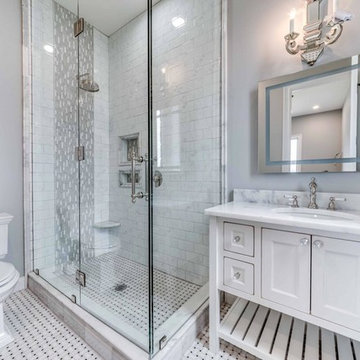
If you are looking for twice your normal bath experience, look no more. This master bath has plenty of room for two with double the storage, double the mirrors, sinks and faucets, and bathing is done two-way. The colors are warm and inviting, but it’s the subtle patterning that caught my eye. The overall effect is of a soft wash, yet on closer examination, the striations travel across the walls and criss-cross on the floor.
This expansive vanity was created with our homeowner’s needs in mind. Each “side” has a bank of drawers and under sink cabinet storage. A large undermount sink dips below the gorgeous stone counter top. Gently arching faucets in brushed nickel adorn each sink with a framed mirror above for reflection. Individual task lighting shine upon each sink and is reflected back into the room. For additional storage and to keep elbows from connecting, a large shared bank of drawers separate the two areas.
The vanities are rich with color and texture, from the swirling grain of the wood, to the raised panels and beading. The subtle beading is repeated on the drawers for a custom look. Our wood color is a deeper, more intense tone of the colors in our tiling.
Whether in a hurry or needing to relax and unwind, this bath can do both. Despite having two substantial pieces in the same area, the open glass panel that separate leaves each feeling open and airy.
This tub was made for soaking. The sides and back gently mold into arm and neck support for a truly relaxing experience. The lineal movement in the tile backsplash lend a long and lean feeling. For easy reach, toiletries are stored in a niche with accent multicolored mosaics.
On the other side of the half wall a roomy shower awaits. The long tiles were installed in a brick pattern with striations of color wrapping the walls. The oversized tiles reduce the amount of grout, for a cleaner look. Here too we added a niche for maximum storage and a sprinkle more of the accenting mosaic. We capped the half wall and the generous bench with our vanity’s stone for a rich contrast.
We installed the tile up to the ceiling, which adds to the visual height of the room. We went with clean simple controls and showerhead, enhanced in a brushed nickel finish. So as to not obscure the view, we went frameless on our shower door and panels, using brushed nickel hinges and a simple handle.
At the end of our vanity, a half wall adds backsplash on the vanity side and a bit of privacy on the other. A simple toilet in crisp white is out of sight but functional in its own “alcove”.
Despite all the patterning, there is nothing busy about the room. For the floor we decided to change things up, using a large square version of the wall tiles. To keep the room from feeling too long, we installed them on the diagonal and then criss-crossed the lines for a dramatic look.
This bath is twice as nice and ready to be shared!
http://www.designsbyskill.com/
http://www.rjkconstructioninc.com/
 Katie Hutchison Studio
The new owners of this house in Harvard, Massachusetts loved its location and authentic Shaker characteristics, but weren’t fans of its curious layout. A dated first-floor full bathroom could only be accessed by going up a few steps to a landing, opening the bathroom door and then going down the same number of steps to enter the room. The dark kitchen faced the driveway to the north, rather than the bucolic backyard fields to the south. The dining space felt more like an enlarged hall and could only comfortably seat four. Upstairs, a den/office had a woefully low ceiling; the master bedroom had limited storage, and a sad full bathroom featured a cramped shower.
KHS proposed a number of changes to create an updated home where the owners could enjoy cooking, entertaining, and being connected to the outdoors from the first-floor living spaces, while also experiencing more inviting and more functional private spaces upstairs.
On the first floor, the primary change was to capture space that had been part of an upper-level screen porch and convert it to interior space. To make the interior expansion seamless, we raised the floor of the area that had been the upper-level porch, so it aligns with the main living level, and made sure there would be no soffits in the planes of the walls we removed. We also raised the floor of the remaining lower-level porch to reduce the number of steps required to circulate from it to the newly expanded interior. New patio door systems now fill the arched openings that used to be infilled with screen. The exterior interventions (which also included some new casement windows in the dining area) were designed to be subtle, while affording significant improvements on the interior. Additionally, the first-floor bathroom was reconfigured, shifting one of its walls to widen the dining space, and moving the entrance to the bathroom from the stair landing to the kitchen instead.
These changes (which involved significant structural interventions) resulted in a much more open space to accommodate a new kitchen with a view of the lush backyard and a new dining space defined by a new built-in banquette that comfortably seats six, and -- with the addition of a table extension -- up to eight people.
Upstairs in the den/office, replacing the low, board ceiling with a raised, plaster, tray ceiling that springs from above the original board-finish walls – newly painted a light color -- created a much more inviting, bright, and expansive space. Re-configuring the master bath to accommodate a larger shower and adding built-in storage cabinets in the master bedroom improved comfort and function. A new whole-house color palette rounds out the improvements.
Photos by Katie Hutchison
Sponsored
Sunbury, OH
J.Holderby - Renovations
Franklin County's Leading General Contractors - 2X Best of Houzz!
 Bluworld HOMelements
This smaller lightweight version of the original Large Nojoqui Falls wall fountain is named after the beautiful 164 foot tall Nojoqui Falls waterfall, located in central California where the Water Wonders line was originated. These water fountains are a truly unique, engaging and an elegant addition to any indoor space. Redesigned, the Medium Nojoqui Falls fountain includes long-lasting super bright white LED lights rated for over 10,000 hours of use and an ergonomic finger slide remote control to easily dim or brighten the LED lights or turn them on and off. This water fountain glistens as water sheets over the genuine multi-color Indian Rajah Slate flowing past polished river rock creating a soothing sound and beautiful focal point for any room. This fountain is engineered with Bluworld's clog-free, splash-free design and features the Water Wonders NSI™ genuine light weight Slate. Installation is super easy with the lightweight nature of the NSI™ slate panels. Simply hang on the wall per the instructions.
This water fountain can be customized with your logo. Etched and hand-painted logos start at only $395.00. Contact our sales department for more information at 1-888-499-5433.
The Medium Nojoqui Falls fountain is the perfect size to hang on just about any wall, and it will instantly raise the level of class in any living room, foyer, office or lobby. These indoor water falls come with a choice of four finishes: Standard colors; Copper Vein and Black Onyx and premium finishes; Copper Patina,or Brushed Stainless Steel.
Water Wonders NSI™ Light Weight Slate™- Water fountains made with our NSI™ Light Weight Slate use our patent pending technology which sheers a layer of genuine Indian Raja Slate and fuses it to composite material with the same chipped edge technique as slab slate. They are indistinguishable from a thick slab of slate. All the beauty is retained and the weight is reduced by over 90% making it easier to hang a wall fountain. Once it's installed, your only concerns are setting the flow rate and turning on the accent light with your handy remote.
Please note that these units are handmade and measurements may vary slightly. Texture and color of aged rustic copper, metals and slate may also vary slightly with each fountain.
 Katie Hutchison Studio
The new owners of this house in Harvard, Massachusetts loved its location and authentic Shaker characteristics, but weren’t fans of its curious layout. A dated first-floor full bathroom could only be accessed by going up a few steps to a landing, opening the bathroom door and then going down the same number of steps to enter the room. The dark kitchen faced the driveway to the north, rather than the bucolic backyard fields to the south. The dining space felt more like an enlarged hall and could only comfortably seat four. Upstairs, a den/office had a woefully low ceiling; the master bedroom had limited storage, and a sad full bathroom featured a cramped shower.
KHS proposed a number of changes to create an updated home where the owners could enjoy cooking, entertaining, and being connected to the outdoors from the first-floor living spaces, while also experiencing more inviting and more functional private spaces upstairs.
On the first floor, the primary change was to capture space that had been part of an upper-level screen porch and convert it to interior space. To make the interior expansion seamless, we raised the floor of the area that had been the upper-level porch, so it aligns with the main living level, and made sure there would be no soffits in the planes of the walls we removed. We also raised the floor of the remaining lower-level porch to reduce the number of steps required to circulate from it to the newly expanded interior. New patio door systems now fill the arched openings that used to be infilled with screen. The exterior interventions (which also included some new casement windows in the dining area) were designed to be subtle, while affording significant improvements on the interior. Additionally, the first-floor bathroom was reconfigured, shifting one of its walls to widen the dining space, and moving the entrance to the bathroom from the stair landing to the kitchen instead.
These changes (which involved significant structural interventions) resulted in a much more open space to accommodate a new kitchen with a view of the lush backyard and a new dining space defined by a new built-in banquette that comfortably seats six, and -- with the addition of a table extension -- up to eight people.
Upstairs in the den/office, replacing the low, board ceiling with a raised, plaster, tray ceiling that springs from above the original board-finish walls – newly painted a light color -- created a much more inviting, bright, and expansive space. Re-configuring the master bath to accommodate a larger shower and adding built-in storage cabinets in the master bedroom improved comfort and function. A new whole-house color palette rounds out the improvements.
Photos by Katie Hutchison
 Katie Hutchison Studio
The new owners of this house in Harvard, Massachusetts loved its location and authentic Shaker characteristics, but weren’t fans of its curious layout. A dated first-floor full bathroom could only be accessed by going up a few steps to a landing, opening the bathroom door and then going down the same number of steps to enter the room. The dark kitchen faced the driveway to the north, rather than the bucolic backyard fields to the south. The dining space felt more like an enlarged hall and could only comfortably seat four. Upstairs, a den/office had a woefully low ceiling; the master bedroom had limited storage, and a sad full bathroom featured a cramped shower.
KHS proposed a number of changes to create an updated home where the owners could enjoy cooking, entertaining, and being connected to the outdoors from the first-floor living spaces, while also experiencing more inviting and more functional private spaces upstairs.
On the first floor, the primary change was to capture space that had been part of an upper-level screen porch and convert it to interior space. To make the interior expansion seamless, we raised the floor of the area that had been the upper-level porch, so it aligns with the main living level, and made sure there would be no soffits in the planes of the walls we removed. We also raised the floor of the remaining lower-level porch to reduce the number of steps required to circulate from it to the newly expanded interior. New patio door systems now fill the arched openings that used to be infilled with screen. The exterior interventions (which also included some new casement windows in the dining area) were designed to be subtle, while affording significant improvements on the interior. Additionally, the first-floor bathroom was reconfigured, shifting one of its walls to widen the dining space, and moving the entrance to the bathroom from the stair landing to the kitchen instead.
These changes (which involved significant structural interventions) resulted in a much more open space to accommodate a new kitchen with a view of the lush backyard and a new dining space defined by a new built-in banquette that comfortably seats six, and -- with the addition of a table extension -- up to eight people.
Upstairs in the den/office, replacing the low, board ceiling with a raised, plaster, tray ceiling that springs from above the original board-finish walls – newly painted a light color -- created a much more inviting, bright, and expansive space. Re-configuring the master bath to accommodate a larger shower and adding built-in storage cabinets in the master bedroom improved comfort and function. A new whole-house color palette rounds out the improvements.
Photos by Katie Hutchison
55