
Search results for "Reduce same" in Home Design Ideas

 ZeroEnergy Design
This LEED Platinum certified house reflects the homeowner's desire for an exceptionally healthy and comfortable living environment, within a traditional neighborhood.
INFILL SITE. The family, who moved from another area of Wellesley, sought out this property to be within walking distance of the high school and downtown area. An existing structure on the tight lot was removed to make way for the new home. 84% of the construction waste, from both the previous structure and the new home, was diverted from a landfill. ZED designed to preserve the existing mature trees on the perimeter of the property to minimize site impacts, and to maintain the character of the neighborhood as well as privacy on the site.
EXTERIOR EXPRESSION. The street facade of the home relates to the local New England vernacular. The rear uses contemporary language, a nod to the family’s Californian roots, to incorporate a roof deck, solar panels, outdoor living space, and the backyard swimming pool. ZED’s careful planning avoided to the need to face the garage doors towards the street, a common syndrome of a narrow lot.
THOUGHTFUL SPACE. Homes with dual entries can often result in duplicate and unused spaces. In this home, the everyday and formal entry areas are one and the same; the front and garage doors share the entry program of coat closets, mudroom storage with bench for removing your shoes, and a laundry room with generous closets for the children's sporting equipment. The entry area leads directly to the living space, encompassing the kitchen, dining and sitting area areas in an L-shaped open plan arrangement. The kitchen is placed at the south-west corner of the space to allow for a strong connection to the dining, sitting and outdoor living spaces. A fire pit on the deck satisfies the family’s desire for an open flame while a sealed gas fireplace is used indoors - ZED’s preference after omitting gas burning appliances completely from an airtight home. A small study, with a window seat, is conveniently located just off of the living space. A first floor guest bedroom includes an accessible bathroom for aging visitors and can be used as a master suite to accommodate aging in place.
HEALTHY LIVING. The client requested a home that was easy to clean and would provide a respite from seasonal allergies and common contaminants that are found in many indoor spaces. ZED selected easy to clean solid surface flooring throughout, provided ample space for cleaning supplies on each floor, and designed a mechanical system with ventilation that provides a constant supply of fresh outdoor air. ZED selected durable materials, finishes, cabinetry, and casework with low or no volatile organic compounds (VOCs) and no added urea formaldehyde.
YEAR-ROUND COMFORT. The home is super insulated and air-tight, paired with high performance triple-paned windows, to ensure it is draft-free throughout the winter (even when in front of the large windows and doors). ZED designed a right-sized heating and cooling system to pair with the thermally improved building enclosure to ensure year-round comfort. The glazing on the home maximizes passive solar gains, and facilitates cross ventilation and daylighting.
ENERGY EFFICIENT. As one of the most energy efficient houses built to date in Wellesley, the home highlights a practical solution for Massachusetts. First, the building enclosure reduces the largest energy requirement for typical houses (heating). Super-insulation, exceptional air sealing, a thermally broken wall assembly, triple pane windows, and passive solar gain combine for a sizable heating load reduction. Second, within the house only efficient systems consume energy. These include an air source heat pump for heating & cooling, a heat pump hot water heater, LED lighting, energy recovery ventilation, and high efficiency appliances. Lastly, photovoltaics provide renewable energy help offset energy consumption. The result is an 89% reduction in energy use compared to a similar brand new home built to code requirements.
RESILIENT. The home will fare well in extreme weather events. During a winter power outage, heat loss will be very slow due to the super-insulated and airtight envelope– taking multiple days to drop to 60 degrees even with no heat source. An engineered drainage system, paired with careful the detailing of the foundation, will help to keep the finished basement dry. A generator will provide full operation of the all-electric house during a power outage.
OVERALL. The home is a reflection of the family goals and an expression of their values, beautifully enabling health, comfort, safety, resilience, and utility, all while respecting the planet.
ZED - Architect & Mechanical Designer
Bevilacqua Builders Inc - Contractor
Creative Land & Water Engineering - Civil Engineering
Barbara Peterson Landscape - Landscape Design
Nest & Company - Interior Furnishings
Eric Roth Photography - Photography

 Wesley-Wayne Interiors, LLC
Detail in the backsplash complements the countertops and cabinetry splendidly.
Design: Wesley-Wayne Interiors
Photo: Dan Piassick
Kitchen - traditional kitchen idea
Kitchen - traditional kitchen idea
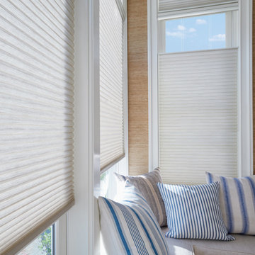
 HUNTER DOUGLAS-LNG BLINDS
DUETTE® Honeycomb Shades
The Original Energy-Efficient Honeycomb Shade
An innovative window treatment that looks beautiful and insulates your home all year round, Duette® Honeycomb Shades were the first cellular shades, specially engineered to provide energy efficiency at the window in both cold and warm climates. Their specially engineered honeycomb construction traps air in distinct pockets, which creates insulation that can help lower your energy consumption and energy bills.
Decorate every kind of window you have—even tricky skylights and unusually shaped panes—with Duette. Our signature honeycomb shades are one of our most versatile options and beautify every kind of interior.
Key Features
Premium Design & Style—Explore the richness of texture and warmth offered by The Alustra® Collection of Duette, a thoughtfully curated suite of exclusive design-inspired fabrics, textures, colors and hardware created to meet the expectations of leading designers and discerning consumers who seek the best in design.
Largest Selection in the Industry—Explore the widest selection of cellular pleat sizes, opacities, colors, textures and operating systems. Duette shades can also accommodate many specialty shaped windows, even tricky skylights.
Energy-Efficiency—Studies show that windows are responsible for up to 30% of your home’s energy losses. Duette shades trap air in distinct pockets, creating exceptional insulation. Our latest innovation, Duette Architella®, features a honeycomb-within-a-honeycomb design for even greater energy efficiency.
Room Darkening—The LightLock™ system, the newest iteration from Duette, is the first operating system of its kind to offer unparalleled darkness. The secret lies within the patent-pending side channel design, optimized to absorb or deflect nearly all incoming light.
Durability—All of our high-performing fabrics are resistant to fading and will maintain their crisp, neat pleats over time.
Vertical Application—For doors that need extra insulation, the Duette Vertiglide™ operating system is the ideal option. It’s designed for vertical applications and uses the same fabrics as your horizontal Duette shades. Use one shade to cover the entire expanse of a sliding door, or, cover the door with a split stack Vertiglide shade, with each side operating independently.
Sound Absorption—Improve your room’s acoustics while reducing the intensity of outside sound. Duette Honeycomb Shades absorb up to 70% of sound energy, creating a more quiet, tranquil room.
LNG Blinds
19 Addison Pl
Valley Stream, NY 11580
Call Us (516) 593-0044
#homesweethome #homedecor #lovemyhome #barenecessities #windows #instastyle #instadesign #interiordesign
#blinds #privacy #embellishment #instahomes #propertyowner #renovation #customblindsbydesign #hunterdouglas #showcase #displays #windowtreatments #windowcoverings #shades #shutters #drapery #interiors #decor
Find the right local pro for your project

 Katie Hutchison Studio
The new owners of this house in Harvard, Massachusetts loved its location and authentic Shaker characteristics, but weren’t fans of its curious layout. A dated first-floor full bathroom could only be accessed by going up a few steps to a landing, opening the bathroom door and then going down the same number of steps to enter the room. The dark kitchen faced the driveway to the north, rather than the bucolic backyard fields to the south. The dining space felt more like an enlarged hall and could only comfortably seat four. Upstairs, a den/office had a woefully low ceiling; the master bedroom had limited storage, and a sad full bathroom featured a cramped shower.
KHS proposed a number of changes to create an updated home where the owners could enjoy cooking, entertaining, and being connected to the outdoors from the first-floor living spaces, while also experiencing more inviting and more functional private spaces upstairs.
On the first floor, the primary change was to capture space that had been part of an upper-level screen porch and convert it to interior space. To make the interior expansion seamless, we raised the floor of the area that had been the upper-level porch, so it aligns with the main living level, and made sure there would be no soffits in the planes of the walls we removed. We also raised the floor of the remaining lower-level porch to reduce the number of steps required to circulate from it to the newly expanded interior. New patio door systems now fill the arched openings that used to be infilled with screen. The exterior interventions (which also included some new casement windows in the dining area) were designed to be subtle, while affording significant improvements on the interior. Additionally, the first-floor bathroom was reconfigured, shifting one of its walls to widen the dining space, and moving the entrance to the bathroom from the stair landing to the kitchen instead.
These changes (which involved significant structural interventions) resulted in a much more open space to accommodate a new kitchen with a view of the lush backyard and a new dining space defined by a new built-in banquette that comfortably seats six, and -- with the addition of a table extension -- up to eight people.
Upstairs in the den/office, replacing the low, board ceiling with a raised, plaster, tray ceiling that springs from above the original board-finish walls – newly painted a light color -- created a much more inviting, bright, and expansive space. Re-configuring the master bath to accommodate a larger shower and adding built-in storage cabinets in the master bedroom improved comfort and function. A new whole-house color palette rounds out the improvements.
Photos by Katie Hutchison
 Katie Hutchison Studio
The new owners of this house in Harvard, Massachusetts loved its location and authentic Shaker characteristics, but weren’t fans of its curious layout. A dated first-floor full bathroom could only be accessed by going up a few steps to a landing, opening the bathroom door and then going down the same number of steps to enter the room. The dark kitchen faced the driveway to the north, rather than the bucolic backyard fields to the south. The dining space felt more like an enlarged hall and could only comfortably seat four. Upstairs, a den/office had a woefully low ceiling; the master bedroom had limited storage, and a sad full bathroom featured a cramped shower.
KHS proposed a number of changes to create an updated home where the owners could enjoy cooking, entertaining, and being connected to the outdoors from the first-floor living spaces, while also experiencing more inviting and more functional private spaces upstairs.
On the first floor, the primary change was to capture space that had been part of an upper-level screen porch and convert it to interior space. To make the interior expansion seamless, we raised the floor of the area that had been the upper-level porch, so it aligns with the main living level, and made sure there would be no soffits in the planes of the walls we removed. We also raised the floor of the remaining lower-level porch to reduce the number of steps required to circulate from it to the newly expanded interior. New patio door systems now fill the arched openings that used to be infilled with screen. The exterior interventions (which also included some new casement windows in the dining area) were designed to be subtle, while affording significant improvements on the interior. Additionally, the first-floor bathroom was reconfigured, shifting one of its walls to widen the dining space, and moving the entrance to the bathroom from the stair landing to the kitchen instead.
These changes (which involved significant structural interventions) resulted in a much more open space to accommodate a new kitchen with a view of the lush backyard and a new dining space defined by a new built-in banquette that comfortably seats six, and -- with the addition of a table extension -- up to eight people.
Upstairs in the den/office, replacing the low, board ceiling with a raised, plaster, tray ceiling that springs from above the original board-finish walls – newly painted a light color -- created a much more inviting, bright, and expansive space. Re-configuring the master bath to accommodate a larger shower and adding built-in storage cabinets in the master bedroom improved comfort and function. A new whole-house color palette rounds out the improvements.
Photos by Katie Hutchison
 Katie Hutchison Studio
The new owners of this house in Harvard, Massachusetts loved its location and authentic Shaker characteristics, but weren’t fans of its curious layout. A dated first-floor full bathroom could only be accessed by going up a few steps to a landing, opening the bathroom door and then going down the same number of steps to enter the room. The dark kitchen faced the driveway to the north, rather than the bucolic backyard fields to the south. The dining space felt more like an enlarged hall and could only comfortably seat four. Upstairs, a den/office had a woefully low ceiling; the master bedroom had limited storage, and a sad full bathroom featured a cramped shower.
KHS proposed a number of changes to create an updated home where the owners could enjoy cooking, entertaining, and being connected to the outdoors from the first-floor living spaces, while also experiencing more inviting and more functional private spaces upstairs.
On the first floor, the primary change was to capture space that had been part of an upper-level screen porch and convert it to interior space. To make the interior expansion seamless, we raised the floor of the area that had been the upper-level porch, so it aligns with the main living level, and made sure there would be no soffits in the planes of the walls we removed. We also raised the floor of the remaining lower-level porch to reduce the number of steps required to circulate from it to the newly expanded interior. New patio door systems now fill the arched openings that used to be infilled with screen. The exterior interventions (which also included some new casement windows in the dining area) were designed to be subtle, while affording significant improvements on the interior. Additionally, the first-floor bathroom was reconfigured, shifting one of its walls to widen the dining space, and moving the entrance to the bathroom from the stair landing to the kitchen instead.
These changes (which involved significant structural interventions) resulted in a much more open space to accommodate a new kitchen with a view of the lush backyard and a new dining space defined by a new built-in banquette that comfortably seats six, and -- with the addition of a table extension -- up to eight people.
Upstairs in the den/office, replacing the low, board ceiling with a raised, plaster, tray ceiling that springs from above the original board-finish walls – newly painted a light color -- created a much more inviting, bright, and expansive space. Re-configuring the master bath to accommodate a larger shower and adding built-in storage cabinets in the master bedroom improved comfort and function. A new whole-house color palette rounds out the improvements.
Photos by Katie Hutchison

 Oran Remodeling Inc.
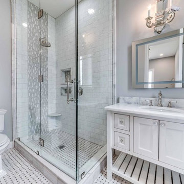
We began this project by having the client meet with our kitchen designer and coming up with the best use of their galley/wall style kitchen and bathroom. We ended on a layout that relocated some of the appliances and installed a new kitchen island and vanity for the bathroom. We also added electrical and gas lines for an oven, cook-top, outlets and hood vent.
In addition we also:
Demo all heater, cap, patch, and repair wall.
Replace 6 cans in small office space- customer to provide cans and lightbulbs.
Install new light fixture in the hall.
Move hall receptacle down.
Remove door, molding hinges between kitchen and front room. (NOT MAIN STUDIO. Enlarge opening/ move light switch and Recep. Remove molding around bath door and main studio door (one side), no patching needed- painters will do.
Demo all tile on walls and in shower in the bathroom, hand bars, soap dispenser, medicine cabinet, mirror, 4 light fixtures, paper towel holder, the cabinet on the wall over toilet, shelf over toilet, toilet paper holder, towel holder on door and walls.
Enlarge opening of the shower,- Ok to demo shower for all glass enclosure- If the cost is the same- as just enlarging opening with new glass door.
Install new tile on walls in bathroom from top to bottom (exclude floor and ceiling).
Create a place in the shower for shower niche and install niche.
Install tile on shower walls and floor.
Install shower door – customer to supply.
Install bath hardware- TP holder, towel rod, bath hooks, tower shelf.
Replace shower head and knobs (like for like).
New hot mop, new wood stud as necessary, replace fan to code install new shower door (customer will supply).
Install new toilet, vanity, mirrored medicine cabinet, replace 2 light fixtures.
Install in the kitchen faucet and sink.
Replace current light with chandelier light (like for like).
Replace kitchen track light with new track light.
Install 9 LED fluorescent lights in loft space (above small office)- customer to supply.
Build and install a 8’x10’ wall, drywall both sides. Reduced size of the wall- Revise Bid (was 12’x12).
Move 2 track lights in the main workspace.
Replace (4) fluorescents lights in the studio.
Install Polycarbonate cover over bath skylight.
Replace dimmer switches and timers (4).
Install vinyl cove base under kitchen cabinets.
Remove black cabinet conversing fire sprinkler pipes- install modify existing bookcase cabinets.
Bury electrical flexible conduit and box (next to back door).
Sponsored
Sunbury, OH

J.Holderby - Renovations
Franklin County's Leading General Contractors - 2X Best of Houzz!
 Katie Hutchison Studio
The new owners of this house in Harvard, Massachusetts loved its location and authentic Shaker characteristics, but weren’t fans of its curious layout. A dated first-floor full bathroom could only be accessed by going up a few steps to a landing, opening the bathroom door and then going down the same number of steps to enter the room. The dark kitchen faced the driveway to the north, rather than the bucolic backyard fields to the south. The dining space felt more like an enlarged hall and could only comfortably seat four. Upstairs, a den/office had a woefully low ceiling; the master bedroom had limited storage, and a sad full bathroom featured a cramped shower.
KHS proposed a number of changes to create an updated home where the owners could enjoy cooking, entertaining, and being connected to the outdoors from the first-floor living spaces, while also experiencing more inviting and more functional private spaces upstairs.
On the first floor, the primary change was to capture space that had been part of an upper-level screen porch and convert it to interior space. To make the interior expansion seamless, we raised the floor of the area that had been the upper-level porch, so it aligns with the main living level, and made sure there would be no soffits in the planes of the walls we removed. We also raised the floor of the remaining lower-level porch to reduce the number of steps required to circulate from it to the newly expanded interior. New patio door systems now fill the arched openings that used to be infilled with screen. The exterior interventions (which also included some new casement windows in the dining area) were designed to be subtle, while affording significant improvements on the interior. Additionally, the first-floor bathroom was reconfigured, shifting one of its walls to widen the dining space, and moving the entrance to the bathroom from the stair landing to the kitchen instead.
These changes (which involved significant structural interventions) resulted in a much more open space to accommodate a new kitchen with a view of the lush backyard and a new dining space defined by a new built-in banquette that comfortably seats six, and -- with the addition of a table extension -- up to eight people.
Upstairs in the den/office, replacing the low, board ceiling with a raised, plaster, tray ceiling that springs from above the original board-finish walls – newly painted a light color -- created a much more inviting, bright, and expansive space. Re-configuring the master bath to accommodate a larger shower and adding built-in storage cabinets in the master bedroom improved comfort and function. A new whole-house color palette rounds out the improvements.
Photos by Katie Hutchison
 Oran Remodeling Inc.
We began this project by having the client meet with our kitchen designer and coming up with the best use of their galley/wall style kitchen and bathroom. We ended on a layout that relocated some of the appliances and installed a new kitchen island and vanity for the bathroom. We also added electrical and gas lines for an oven, cook-top, outlets and hood vent.
In addition we also:
Demo all heater, cap, patch, and repair wall.
Replace 6 cans in small office space- customer to provide cans and lightbulbs.
Install new light fixture in the hall.
Move hall receptacle down.
Remove door, molding hinges between kitchen and front room. (NOT MAIN STUDIO. Enlarge opening/ move light switch and Recep. Remove molding around bath door and main studio door (one side), no patching needed- painters will do.
Demo all tile on walls and in shower in the bathroom, hand bars, soap dispenser, medicine cabinet, mirror, 4 light fixtures, paper towel holder, the cabinet on the wall over toilet, shelf over toilet, toilet paper holder, towel holder on door and walls.
Enlarge opening of the shower,- Ok to demo shower for all glass enclosure- If the cost is the same- as just enlarging opening with new glass door.
Install new tile on walls in bathroom from top to bottom (exclude floor and ceiling).
Create a place in the shower for shower niche and install niche.
Install tile on shower walls and floor.
Install shower door – customer to supply.
Install bath hardware- TP holder, towel rod, bath hooks, tower shelf.
Replace shower head and knobs (like for like).
New hot mop, new wood stud as necessary, replace fan to code install new shower door (customer will supply).
Install new toilet, vanity, mirrored medicine cabinet, replace 2 light fixtures.
Install in the kitchen faucet and sink.
Replace current light with chandelier light (like for like).
Replace kitchen track light with new track light.
Install 9 LED fluorescent lights in loft space (above small office)- customer to supply.
Build and install a 8’x10’ wall, drywall both sides. Reduced size of the wall- Revise Bid (was 12’x12).
Move 2 track lights in the main workspace.
Replace (4) fluorescents lights in the studio.
Install Polycarbonate cover over bath skylight.
Replace dimmer switches and timers (4).
Install vinyl cove base under kitchen cabinets.
Remove black cabinet conversing fire sprinkler pipes- install modify existing bookcase cabinets.
Bury electrical flexible conduit and box (next to back door).

 Fusion Interiors
The master bedroom furniture was a custom design concept that was created. The headboard is mounted on to the wall and it was made from a slab of solid walnut. The nightstands and platform bed frame were created from another piece of solid walnut. The headboard is not just a headboard, but a piece of art.
IlluminArts Photography
 Katie Hutchison Studio
The new owners of this house in Harvard, Massachusetts loved its location and authentic Shaker characteristics, but weren’t fans of its curious layout. A dated first-floor full bathroom could only be accessed by going up a few steps to a landing, opening the bathroom door and then going down the same number of steps to enter the room. The dark kitchen faced the driveway to the north, rather than the bucolic backyard fields to the south. The dining space felt more like an enlarged hall and could only comfortably seat four. Upstairs, a den/office had a woefully low ceiling; the master bedroom had limited storage, and a sad full bathroom featured a cramped shower.
KHS proposed a number of changes to create an updated home where the owners could enjoy cooking, entertaining, and being connected to the outdoors from the first-floor living spaces, while also experiencing more inviting and more functional private spaces upstairs.
On the first floor, the primary change was to capture space that had been part of an upper-level screen porch and convert it to interior space. To make the interior expansion seamless, we raised the floor of the area that had been the upper-level porch, so it aligns with the main living level, and made sure there would be no soffits in the planes of the walls we removed. We also raised the floor of the remaining lower-level porch to reduce the number of steps required to circulate from it to the newly expanded interior. New patio door systems now fill the arched openings that used to be infilled with screen. The exterior interventions (which also included some new casement windows in the dining area) were designed to be subtle, while affording significant improvements on the interior. Additionally, the first-floor bathroom was reconfigured, shifting one of its walls to widen the dining space, and moving the entrance to the bathroom from the stair landing to the kitchen instead.
These changes (which involved significant structural interventions) resulted in a much more open space to accommodate a new kitchen with a view of the lush backyard and a new dining space defined by a new built-in banquette that comfortably seats six, and -- with the addition of a table extension -- up to eight people.
Upstairs in the den/office, replacing the low, board ceiling with a raised, plaster, tray ceiling that springs from above the original board-finish walls – newly painted a light color -- created a much more inviting, bright, and expansive space. Re-configuring the master bath to accommodate a larger shower and adding built-in storage cabinets in the master bedroom improved comfort and function. A new whole-house color palette rounds out the improvements.
Photos by Katie Hutchison
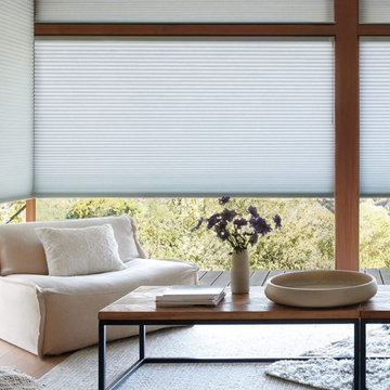 HUNTER DOUGLAS-LNG BLINDS
DUETTE® Honeycomb Shades
The Original Energy-Efficient Honeycomb Shade
An innovative window treatment that looks beautiful and insulates your home all year round, Duette® Honeycomb Shades were the first cellular shades, specially engineered to provide energy efficiency at the window in both cold and warm climates. Their specially engineered honeycomb construction traps air in distinct pockets, which creates insulation that can help lower your energy consumption and energy bills.
Decorate every kind of window you have—even tricky skylights and unusually shaped panes—with Duette. Our signature honeycomb shades are one of our most versatile options and beautify every kind of interior.
Key Features
Premium Design & Style—Explore the richness of texture and warmth offered by The Alustra® Collection of Duette, a thoughtfully curated suite of exclusive design-inspired fabrics, textures, colors and hardware created to meet the expectations of leading designers and discerning consumers who seek the best in design.
Largest Selection in the Industry—Explore the widest selection of cellular pleat sizes, opacities, colors, textures and operating systems. Duette shades can also accommodate many specialty shaped windows, even tricky skylights.
Energy-Efficiency—Studies show that windows are responsible for up to 30% of your home’s energy losses. Duette shades trap air in distinct pockets, creating exceptional insulation. Our latest innovation, Duette Architella®, features a honeycomb-within-a-honeycomb design for even greater energy efficiency.
Room Darkening—The LightLock™ system, the newest iteration from Duette, is the first operating system of its kind to offer unparalleled darkness. The secret lies within the patent-pending side channel design, optimized to absorb or deflect nearly all incoming light.
Durability—All of our high-performing fabrics are resistant to fading and will maintain their crisp, neat pleats over time.
Vertical Application—For doors that need extra insulation, the Duette Vertiglide™ operating system is the ideal option. It’s designed for vertical applications and uses the same fabrics as your horizontal Duette shades. Use one shade to cover the entire expanse of a sliding door, or, cover the door with a split stack Vertiglide shade, with each side operating independently.
Sound Absorption—Improve your room’s acoustics while reducing the intensity of outside sound. Duette Honeycomb Shades absorb up to 70% of sound energy, creating a more quiet, tranquil room.
LNG Blinds
19 Addison Pl
Valley Stream, NY 11580
Call Us (516) 593-0044
#homesweethome #homedecor #lovemyhome #barenecessities #windows #instastyle #instadesign #interiordesign
#blinds #privacy #embellishment #instahomes #propertyowner #renovation #customblindsbydesign #hunterdouglas #showcase #displays #windowtreatments #windowcoverings #shades #shutters #drapery #interiors #decor
 Katie Hutchison Studio
The new owners of this house in Harvard, Massachusetts loved its location and authentic Shaker characteristics, but weren’t fans of its curious layout. A dated first-floor full bathroom could only be accessed by going up a few steps to a landing, opening the bathroom door and then going down the same number of steps to enter the room. The dark kitchen faced the driveway to the north, rather than the bucolic backyard fields to the south. The dining space felt more like an enlarged hall and could only comfortably seat four. Upstairs, a den/office had a woefully low ceiling; the master bedroom had limited storage, and a sad full bathroom featured a cramped shower.
KHS proposed a number of changes to create an updated home where the owners could enjoy cooking, entertaining, and being connected to the outdoors from the first-floor living spaces, while also experiencing more inviting and more functional private spaces upstairs.
On the first floor, the primary change was to capture space that had been part of an upper-level screen porch and convert it to interior space. To make the interior expansion seamless, we raised the floor of the area that had been the upper-level porch, so it aligns with the main living level, and made sure there would be no soffits in the planes of the walls we removed. We also raised the floor of the remaining lower-level porch to reduce the number of steps required to circulate from it to the newly expanded interior. New patio door systems now fill the arched openings that used to be infilled with screen. The exterior interventions (which also included some new casement windows in the dining area) were designed to be subtle, while affording significant improvements on the interior. Additionally, the first-floor bathroom was reconfigured, shifting one of its walls to widen the dining space, and moving the entrance to the bathroom from the stair landing to the kitchen instead.
These changes (which involved significant structural interventions) resulted in a much more open space to accommodate a new kitchen with a view of the lush backyard and a new dining space defined by a new built-in banquette that comfortably seats six, and -- with the addition of a table extension -- up to eight people.
Upstairs in the den/office, replacing the low, board ceiling with a raised, plaster, tray ceiling that springs from above the original board-finish walls – newly painted a light color -- created a much more inviting, bright, and expansive space. Re-configuring the master bath to accommodate a larger shower and adding built-in storage cabinets in the master bedroom improved comfort and function. A new whole-house color palette rounds out the improvements.
Photos by Katie Hutchison
Sponsored
Fredericksburg, OH

High Point Cabinets
Columbus' Experienced Custom Cabinet Builder | 4x Best of Houzz Winner
 Oran Remodeling Inc.
We began this project by having the client meet with our kitchen designer and coming up with the best use of their galley/wall style kitchen and bathroom. We ended on a layout that relocated some of the appliances and installed a new kitchen island and vanity for the bathroom. We also added electrical and gas lines for an oven, cook-top, outlets and hood vent.
In addition we also:
Demo all heater, cap, patch, and repair wall.
Replace 6 cans in small office space- customer to provide cans and lightbulbs.
Install new light fixture in the hall.
Move hall receptacle down.
Remove door, molding hinges between kitchen and front room. (NOT MAIN STUDIO. Enlarge opening/ move light switch and Recep. Remove molding around bath door and main studio door (one side), no patching needed- painters will do.
Demo all tile on walls and in shower in the bathroom, hand bars, soap dispenser, medicine cabinet, mirror, 4 light fixtures, paper towel holder, the cabinet on the wall over toilet, shelf over toilet, toilet paper holder, towel holder on door and walls.
Enlarge opening of the shower,- Ok to demo shower for all glass enclosure- If the cost is the same- as just enlarging opening with new glass door.
Install new tile on walls in bathroom from top to bottom (exclude floor and ceiling).
Create a place in the shower for shower niche and install niche.
Install tile on shower walls and floor.
Install shower door – customer to supply.
Install bath hardware- TP holder, towel rod, bath hooks, tower shelf.
Replace shower head and knobs (like for like).
New hot mop, new wood stud as necessary, replace fan to code install new shower door (customer will supply).
Install new toilet, vanity, mirrored medicine cabinet, replace 2 light fixtures.
Install in the kitchen faucet and sink.
Replace current light with chandelier light (like for like).
Replace kitchen track light with new track light.
Install 9 LED fluorescent lights in loft space (above small office)- customer to supply.
Build and install a 8’x10’ wall, drywall both sides. Reduced size of the wall- Revise Bid (was 12’x12).
Move 2 track lights in the main workspace.
Replace (4) fluorescents lights in the studio.
Install Polycarbonate cover over bath skylight.
Replace dimmer switches and timers (4).
Install vinyl cove base under kitchen cabinets.
Remove black cabinet conversing fire sprinkler pipes- install modify existing bookcase cabinets.
Bury electrical flexible conduit and box (next to back door).
 Katie Hutchison Studio
The new owners of this house in Harvard, Massachusetts loved its location and authentic Shaker characteristics, but weren’t fans of its curious layout. A dated first-floor full bathroom could only be accessed by going up a few steps to a landing, opening the bathroom door and then going down the same number of steps to enter the room. The dark kitchen faced the driveway to the north, rather than the bucolic backyard fields to the south. The dining space felt more like an enlarged hall and could only comfortably seat four. Upstairs, a den/office had a woefully low ceiling; the master bedroom had limited storage, and a sad full bathroom featured a cramped shower.
KHS proposed a number of changes to create an updated home where the owners could enjoy cooking, entertaining, and being connected to the outdoors from the first-floor living spaces, while also experiencing more inviting and more functional private spaces upstairs.
On the first floor, the primary change was to capture space that had been part of an upper-level screen porch and convert it to interior space. To make the interior expansion seamless, we raised the floor of the area that had been the upper-level porch, so it aligns with the main living level, and made sure there would be no soffits in the planes of the walls we removed. We also raised the floor of the remaining lower-level porch to reduce the number of steps required to circulate from it to the newly expanded interior. New patio door systems now fill the arched openings that used to be infilled with screen. The exterior interventions (which also included some new casement windows in the dining area) were designed to be subtle, while affording significant improvements on the interior. Additionally, the first-floor bathroom was reconfigured, shifting one of its walls to widen the dining space, and moving the entrance to the bathroom from the stair landing to the kitchen instead.
These changes (which involved significant structural interventions) resulted in a much more open space to accommodate a new kitchen with a view of the lush backyard and a new dining space defined by a new built-in banquette that comfortably seats six, and -- with the addition of a table extension -- up to eight people.
Upstairs in the den/office, replacing the low, board ceiling with a raised, plaster, tray ceiling that springs from above the original board-finish walls – newly painted a light color -- created a much more inviting, bright, and expansive space. Re-configuring the master bath to accommodate a larger shower and adding built-in storage cabinets in the master bedroom improved comfort and function. A new whole-house color palette rounds out the improvements.
Photos by Katie Hutchison
 Katie Hutchison Studio
The new owners of this house in Harvard, Massachusetts loved its location and authentic Shaker characteristics, but weren’t fans of its curious layout. A dated first-floor full bathroom could only be accessed by going up a few steps to a landing, opening the bathroom door and then going down the same number of steps to enter the room. The dark kitchen faced the driveway to the north, rather than the bucolic backyard fields to the south. The dining space felt more like an enlarged hall and could only comfortably seat four. Upstairs, a den/office had a woefully low ceiling; the master bedroom had limited storage, and a sad full bathroom featured a cramped shower.
KHS proposed a number of changes to create an updated home where the owners could enjoy cooking, entertaining, and being connected to the outdoors from the first-floor living spaces, while also experiencing more inviting and more functional private spaces upstairs.
On the first floor, the primary change was to capture space that had been part of an upper-level screen porch and convert it to interior space. To make the interior expansion seamless, we raised the floor of the area that had been the upper-level porch, so it aligns with the main living level, and made sure there would be no soffits in the planes of the walls we removed. We also raised the floor of the remaining lower-level porch to reduce the number of steps required to circulate from it to the newly expanded interior. New patio door systems now fill the arched openings that used to be infilled with screen. The exterior interventions (which also included some new casement windows in the dining area) were designed to be subtle, while affording significant improvements on the interior. Additionally, the first-floor bathroom was reconfigured, shifting one of its walls to widen the dining space, and moving the entrance to the bathroom from the stair landing to the kitchen instead.
These changes (which involved significant structural interventions) resulted in a much more open space to accommodate a new kitchen with a view of the lush backyard and a new dining space defined by a new built-in banquette that comfortably seats six, and -- with the addition of a table extension -- up to eight people.
Upstairs in the den/office, replacing the low, board ceiling with a raised, plaster, tray ceiling that springs from above the original board-finish walls – newly painted a light color -- created a much more inviting, bright, and expansive space. Re-configuring the master bath to accommodate a larger shower and adding built-in storage cabinets in the master bedroom improved comfort and function. A new whole-house color palette rounds out the improvements.
Photos by Katie Hutchison
 Save home
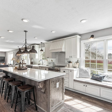
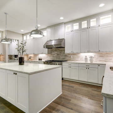
Why are White Shaker Cabinets Still Considered a Classic?
Every few years, if you remodel your kitchen because it feels old, then white shaker cabinets are what you need. Most homeowners feel the need to revamp their kitchen not because the cabinets have worn out but because the interior is a bit old-fashioned. One of the best solutions to this issue is to utilize white shaker cabinets. These are classic, timeless kitchen elements that last longer complements everything, and rarely make your kitchen look outdated.
For this reason, in this article, we have discussed why you need white shaker cabinets in your kitchen and how you can style them.
What is a White Shaker Cabinet?
White shaker cabinets are not new. In fact, these cabinets date back to 1700 when this style was found in every home. These cabinets have a classic look because of recessed door panels, a five-piece door, and a traditional look of pine, maple, or chestnut. Of course. white shaker cabinets are unique and attractive at the same time.
The material used to make these cabinets also makes them durable. You can easily purchase it in less pricing than other wood cabinets, and you can clean it easily. The simplistic structure of white shaker cabinets also makes them complement every type of kitchen; modern or traditional. You can find these cabinets in other light finishes as well, such as peach, off-white, brown, wood brown, etc. The reason we are focusing on white is that this color is timeless and the design of the shaker cabinet is too, which together makes the best combination. You can perfectly strike a chord between every kitchen element if you pair it with white shaker cabinets .
Why White?
The color which is always in style is white. It is highly unlikely to ruin your interior with this color if well-coordinated and properly lit. This is why white shaker cabinets are highly preferred by users.
Here are some reasons to choose white shaker cabinets over other options:
Timeless
Over years, our idea of perfect design changes, and our understanding of the interior also modify. This changes the way we want our kitchen interiors. Hence, if you select vibrant kitchen cabinets and off colors for your countertop, flooring, and paint, then you may end up changing it every few years.
To avoid that from happening, just use white shaker cabinets. In multiple decades, white shaker cabinets have never ceased being classic. White is timeless and it never goes out of trend. Even when you need to change the paint or fittings, you can reduce the cost of cabinets for multiple years.
Versatile
White shaker cabinets are versatile because you have an array of options. You can incorporate multiple elements in your kitchen and tweak color coding and design of countertop, flooring, and paint. For instance, with white shaker cabinets, you can pair white textured back tiles. You can even pair your white cabinets with a black marble countertop; two timeless interior elements together!
Clean
White is the color of clean. In hospitals, bathrooms, and hotel rooms, we find a lot of white because it is clean, fresh, and peaceful. This is why everyone is automatically attracted to this color; it looks clean.
However, you may actually have to make efforts to keep these white shaker cabinets clean from dust and dirt.
Complements Everything
Since cabinets form a big portion of your kitchen, it is necessary to make cabinets complement other interior elements. With white shaker cabinets, you don’t even need to worry about that. White compliments every choice of appliance, countertop, artwork, and flooring. If you decide to get marble grey flooring with white cabinets, you can make that work. If you want colorful kitchen furniture, white complements that too. If you wish to use artwork or warm lighting in your kitchen, white automatically goes well with it.
How to Style White Shaker Cabinets?
If you are styling your kitchen with new white shaker cabinets, here’s what you should keep in mind:
• If your kitchen is small, then white is definitely your color. It reflects more light, hence, makes your space look larger and shinier.
• When you have an open kitchen, you need to follow the same theme to the adjoining rooms and slowly phase it out. This consistency won’t make anything look odd.
• If the rest of the house is filled with artwork and colors, you need the same for your kitchen as well. All white may steal away the classic of shaker cabinets.
• Pair your wall textures and flooring choices with appliances, white cabinets, knobs, and other elements for the best look.
• If the theme for the rest of the house is subtle, then you can even design an all-white kitchen with white shaker cabinets.
Conclusion
Whether you are planning to revamp your kitchen/house or sell your property, white shaker cabinets are always classic. They make a statement in your kitchen and offer a new and clean look all the time. Just focus on coordinating other interior elements of your kitchen and stop worrying about cabinets. White shaker cabinets are durable, beautiful, and timeless! Purchase these classic units now.
For this reason, in this article, we have discussed why you need white shaker cabinets in your kitchen and how you can style them.
What is a White Shaker Cabinet?
White shaker cabinets are not new. In fact, these cabinets date back to 1700 when this style was found in every home. These cabinets have a classic look because of recessed door panels, a five-piece door, and a traditional look of pine, maple, or chestnut. Of course. white shaker cabinets are unique and attractive at the same time.
The material used to make these cabinets also makes them durable. You can easily purchase it in less pricing than other wood cabinets, and you can clean it easily. The simplistic structure of white shaker cabinets also makes them complement every type of kitchen; modern or traditional. You can find these cabinets in other light finishes as well, such as peach, off-white, brown, wood brown, etc. The reason we are focusing on white is that this color is timeless and the design of the shaker cabinet is too, which together makes the best combination. You can perfectly strike a chord between every kitchen element if you pair it with white shaker cabinets .
Why White?
The color which is always in style is white. It is highly unlikely to ruin your interior with this color if well-coordinated and properly lit. This is why white shaker cabinets are highly preferred by users.
Here are some reasons to choose white shaker cabinets over other options:
Timeless
Over years, our idea of perfect design changes, and our understanding of the interior also modify. This changes the way we want our kitchen interiors. Hence, if you select vibrant kitchen cabinets and off colors for your countertop, flooring, and paint, then you may end up changing it every few years.
To avoid that from happening, just use white shaker cabinets. In multiple decades, white shaker cabinets have never ceased being classic. White is timeless and it never goes out of trend. Even when you need to change the paint or fittings, you can reduce the cost of cabinets for multiple years.
Versatile
White shaker cabinets are versatile because you have an array of options. You can incorporate multiple elements in your kitchen and tweak color coding and design of countertop, flooring, and paint. For instance, with white shaker cabinets, you can pair white textured back tiles. You can even pair your white cabinets with a black marble countertop; two timeless interior elements together!
Clean
White is the color of clean. In hospitals, bathrooms, and hotel rooms, we find a lot of white because it is clean, fresh, and peaceful. This is why everyone is automatically attracted to this color; it looks clean.
However, you may actually have to make efforts to keep these white shaker cabinets clean from dust and dirt.
Complements Everything
Since cabinets form a big portion of your kitchen, it is necessary to make cabinets complement other interior elements. With white shaker cabinets, you don’t even need to worry about that. White compliments every choice of appliance, countertop, artwork, and flooring. If you decide to get marble grey flooring with white cabinets, you can make that work. If you want colorful kitchen furniture, white complements that too. If you wish to use artwork or warm lighting in your kitchen, white automatically goes well with it.
How to Style White Shaker Cabinets?
If you are styling your kitchen with new white shaker cabinets, here’s what you should keep in mind:
• If your kitchen is small, then white is definitely your color. It reflects more light, hence, makes your space look larger and shinier.
• When you have an open kitchen, you need to follow the same theme to the adjoining rooms and slowly phase it out. This consistency won’t make anything look odd.
• If the rest of the house is filled with artwork and colors, you need the same for your kitchen as well. All white may steal away the classic of shaker cabinets.
• Pair your wall textures and flooring choices with appliances, white cabinets, knobs, and other elements for the best look.
• If the theme for the rest of the house is subtle, then you can even design an all-white kitchen with white shaker cabinets.
Conclusion
Whether you are planning to revamp your kitchen/house or sell your property, white shaker cabinets are always classic. They make a statement in your kitchen and offer a new and clean look all the time. Just focus on coordinating other interior elements of your kitchen and stop worrying about cabinets. White shaker cabinets are durable, beautiful, and timeless! Purchase these classic units now.

Sponsored
Sunbury, OH
J.Holderby - Renovations
Franklin County's Leading General Contractors - 2X Best of Houzz!
 Ellen Farber Strategic Design
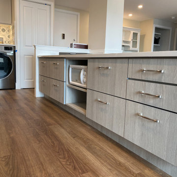
Pictured here is a closeup of the microwave and island storage which includes 4 pantry drawers, under cabinet microwave, drawers for pots and pans easily located near the cooktop and drawers for kitchen supplies, napkins, and other items. The kitchen was originally planned to mimic the location of appliances in her current kitchen to minimize re-learning of appliance locations. The only change was adding a trash cabinet between the fridge and the sink. A french door fridge allows someone in a wheelchair to easily access frozen and cold foods, while the water and ice dispenser on the outside of the door make it easy to stay hydrated rather than using the sink each time. She can roll up to the kitchen sink due to the recessed cabinetry under the sink or stand at counter height to put away dishes from the dishwasher. The dishwasher is ADA and very simple to use , and is raised off the floor so whether she is sitting or standing it's easier to reach. The gas cooktop has controls at the front making it easy to reach from the wheelchair and the exhaust fan above also has a control at the front. All cabinet door handles are D-shape, which makes them easy to grasp and there is plenty of electric outlets for charging phones, computers and small appliances. The kitchen island is table height at 30" so meal prep can be easily done in a wheelchair while guests and can be seated in a chair or wheelchair around the island. The dining chairs can also be turned around to add extra seating in the living room area. Pendant lights above the kitchen island light up the space, while recessed lighting in the kitchen and living room provide overall room lighting. There is also under cabinet lighting which makes the room glow at night! Wainscoting made of commercial grade material is strategically placed on sharp corners and exposed walls to reduce and minimize damage from the wheel chair, while creating a finished and complete look! We selected a free standing microwave to sit below the island, which is easy to use and is the same style as in her previous apartment. The island is 48" from the appliance wall, leaving ample space to open doors and maneuver around in the wheelchair and has easy access to the laundry area as well. We eliminated the pocket doors that had been in front of the laundry area for easy access, and since it was exposed, dressed it up with coordinating tile to the kitchen with additional cabinets above. There is a coordinating quartz counter on top of the washer and dryer for folding laundry or storing additional supplies.

 AirField Systems, LLC
AirField installed an AirPave grass fire lane for their porous flexible paving at Baptist Trinity Residential Hospice, creating a beautiful, functional, ecological friendly solution to facility access.
An installation of an AirField Systems grass fire lane at Baptist Trinity Residential Hospice brings green building benefits and incredible strength to a beautiful new facility. A time lapse photo series highlight the installation process of the 6,747 PSI sand filled 100% recycled geocell technology, providing the strength of asphalt and concrete while relieving some of the burden of costly storm sewers and drainage.
This new installation highlights the benefits of paving with grass, as well as the comparative ease of installation. Concrete and asphalt surfaces occupy twice the area of buildings and are the most detrimental to clean water. Concrete and asphalt surfaces dominate the landscape of our urban environments and prevent rainwater from being filtered naturally. They send harmful polluted water straight into our streams, rivers and lakes. In urban America, concrete and asphalt pavements produce two thirds of our excess water runoff. They are responsible for significant hydrocarbon pollutants on our ground and in our water, causing ground water decline, and resulting in local water shortages. These concrete and asphalt surfaces also create huge increases in temperature known as the urban “heat island effect”.
The pollution caused by impervious surfaces deteriorate the quality of our storm water runoff and create large overflows that our storm sewer systems cannot handle. It is also important to realize that the urban forest force is drastically diminishing, causing CO2 levels to rise, which in turn causes global warming. With all the negative influences of impervious pavements now is the time to turn our attention to alternatives for the benefit of the environment.
From fire lanes, overflow, and event parking, to temporary and stadium parking, reinforced grass parking systems deliver the same strength and durability of asphalt and concrete without the negative affects mentioned above. These incredibly strong geocells reinforce grass parking, prevent rutting from traffic, protect turf roots, and promote beautiful grass. Reinforced grass parking structures, also know as grass pavements, enhance the environment by naturally filtering auto and truck liquids such as oil drippings, antifreeze overflows and many other leaks and spills. They also help with air pollutants after they have been knocked to the ground by rainwater and greatly reduce hot surface temperatures thus fighting global warming and the “heat island effect”. Grass pavements allow our groundwater to be naturally replenished, the roots of trees to breathe, and they help our streams and rivers flow cleanly in dry hot summers. A large part of the solution to urban environmental problems is under our feet. By paying appropriate attention to the everyday materials on which we walk and drive, we can replenish renewable resources, restore the natural regenerative processes, and produce a cleaner, healthier, safer, more sustainable world in which we must live. Porous pavements are potentially the most important development in urban watersheds since the invention of storm sewers. By routing rainwater directly into the earth as nature intended, the need for costly storm water structures can be drastically reduced.
Reinforced grass parking has built in permeable spaces through which water and air can pass. Although some porous paving materials are nearly indistinguishable from nonporous materials in construction and superficial appearance, their environmental effects are qualitatively exponential. They allow air, water and heat to dissipate into the environment naturally helping to save the planet.
AirField reinforced grass parking provides beauty and comfort, and with the unbeatable price and performance of AirDrain you can’t go wrong. AirDrain is the reinforced grass pave system the industry has trusted for years !!!
Airfield Systems, LLC 8028 North May Avenue Oklahoma City, OK 73120 405-359-3775
Installer – GREENPRO Landscapes Kevin James 9847 Stewart Rd Arlington, TN 38002

 Bluworld HOMelements
If you're looking to make a statement with the decor of your home or office, you can't go wrong with the Large Horizon Falls fountain. This indoor water fall is in the tradition of the popular Nojoqui falls series, but with a horizontal rather than vertical orientation. The result is a cascade of water streaming down a four foot wide span of beautiful Indian Rajah Slate to slip past the included polished river rocks below--a sight that will command the attention of anyone who enters the room. These water fountains are a truly unique, engaging and an elegant addition to any indoor space.
Redesigned, the Large Horizon Falls fountain includes long-lasting super bright white LED lights rated for over 10,000 hours of use and an ergonomic finger slide remote control to easily dim or brighten the LED lights or turn them on and off. This water fountain glistens as water sheets over the genuine multi-color Indian Rajah Slate creating a soothing sound and beautiful focal point for any room. This fountain is engineered with Bluworld's clog-free, splash-free design and features the Water Wonders NSI™ genuine light weight Slate. Installation is super easy with the lightweight nature of the NSI™ slate panels. Simply hang on the wall per the instructions.
This water fountain can be customized with your logo. Etched and hand-painted logos start at only $395.00. Contact our sales department for more information at 1-888-499-5433.
The Large Horizon Falls fountain is the perfect size to hang on just about any wall, and it will instantly raise the level of class in any living room, foyer, office or lobby. These indoor water falls come with a choice of four finishes: Standard colors; Copper Vein and Black Onyx and premium finishes; Copper Patina,or Brushed Stainless Steel.
Water Wonders NSI™ Light Weight Slate™- Water fountains made with our NSI™ Light Weight Slate use our patent pending technology which sheers a layer of genuine Indian Raja Slate and fuses it to composite material with the same chipped edge technique as slab slate. They are indistinguishable from a thick slab of slate. All the beauty is retained and the weight is reduced by over 90% making it easier to hang a wall fountain. Once it's installed, your only concerns are setting the flow rate and turning on the accent light with your handy remote.
Please note that these units are handmade and measurements may vary slightly. Texture and color of aged rustic copper, metals and slate may also vary slightly with each fountain.
58