
Search results for "Reduce separate" in Home Design Ideas
 Kitchen & Bath Concepts of Pittsburgh
Craig Thompson Photography
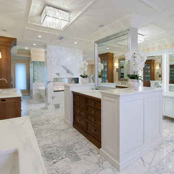
Example of a huge trendy master stone tile marble floor freestanding bathtub design with white cabinets, beige walls, an undermount sink, marble countertops and recessed-panel cabinets
Example of a huge trendy master stone tile marble floor freestanding bathtub design with white cabinets, beige walls, an undermount sink, marble countertops and recessed-panel cabinets
 osmosis architecture
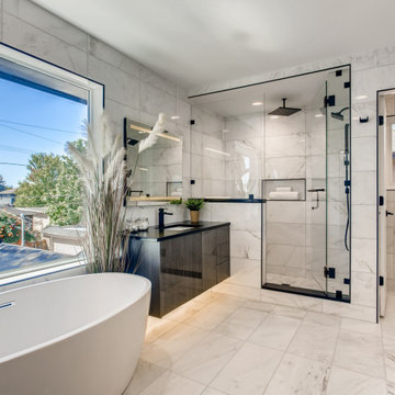
Owner's bath inspired by premium resort hotels.
Inspiration for a large contemporary master white tile white floor and double-sink freestanding bathtub remodel in Denver with a one-piece toilet, white walls, an undermount sink, a hinged shower door, black countertops and a floating vanity
Inspiration for a large contemporary master white tile white floor and double-sink freestanding bathtub remodel in Denver with a one-piece toilet, white walls, an undermount sink, a hinged shower door, black countertops and a floating vanity

Find the right local pro for your project
 mackmiller design+build
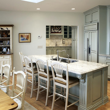
The new space creates a defined kitchen separate from the pantry/bar area by reducing the opening with a wall and pulling the refrigerator out of the doorway and pantry into the kitchen. The opening was reduced enough to separate the rooms while still keeping it large enough to address the dining room connection.
The raised panel, French blue cabinets are finished with a dark brown glazing. These are full overlay doors and drawers, constructed with high precision to maintain a 1/8” gap between every side of a door and drawer.
PHOTO CREDIT: John Ray
 Guthmann Construction
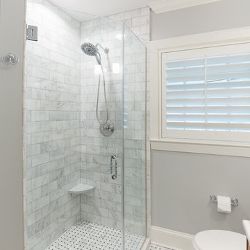
The hall bath was reduced significantly to make room for the laundry center. A tub was removed and this gorgeous shower enclosure was installed.
Jon Courville Photography



Sponsored
Columbus, OH

Structural Remodeling
Franklin County's Heavy Timber Specialists | Best of Houzz 2020!
 EDR Design Build
Integrated design-build services combining architectural design with construction management under single contract. EDR Design Build eliminates traditional separation between design and construction phases, reducing project delays and cost overruns. Services include conceptual design, permitting coordination, material selection, quality control, and budget management. Streamlined communication reduces change orders and accelerates project delivery compared to traditional general contracting methods.

 Architect Heather Johnston
CASA 1O
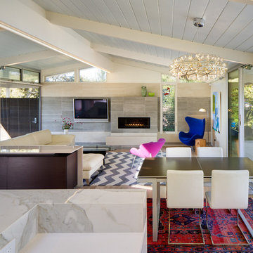
Contemporary on a Mid-century Scaffold.
Largely unmodified since its design by Russell Forester and construction in 1957, the structure housed the original family until 2013. An intimate 1,910 square foot space, the house acquired a separate 600 square foot cottage in the 70’s designed by another architect. New owners purchased the house with the idea of keeping the original architect’s intent intact – the simple accommodation of everyday life with a focus on outdoor living only possible in Southern California. At the same time the house needed insulation, new electrical, plumbing, siding – everything but new studs and foundations.
A single roof beam travels south from the north fireplace wall all the way to the bedrooms in the back. Functions occur to either side, with private access to exterior courtyards. How do we accentuate the uncomplicated while enhancing the qualities of the chosen materials? Contemporary applied to a mid-century scaffold.
We focused on reduction, a few things performing many tasks. Each component, material or color performs more than one duty.
Lighting is paramount, enhancing the design’s procession from front to back, north to south, public to private. Strip LED’s reinforce the beam’s linear presence and spot LED’s make punctuation points of the roof purlins. Hidden up and down-lights in the cabinets and elsewhere provide the rooms with a quiet glow.
Exterior grass plantings give the only vertical dimension to the design, waving as the breeze moves them. All else is horizontal: caramelized bamboo siding, porcelain tile, roof line and ocean horizon.
Architect: Heather Johnston Architect
Landscaping: HJA
Photography: Brady Architectural Photography
 Thyme & Place Design LLC
When my client had to move from her company office to work at home, she set up in the dining room. Despite her best efforts, this was not the long-term solution she was looking for. My client realized she needed a dedicated space not on the main floor of the home. On one hand, having your office space right next to the kitchen is handy. On the other hand, it made separating work and home life was not that easy.
The house was a ranch. In essence, the basement would run entire length of the home. As we came down the steps, we entered a time capsule. The house was built in the 1950’s. The walls were covered with original knotty pine paneling. There was a wood burning fireplace and considering this was a basement, high ceilings. In addition, there was everything her family could not store at their own homes. As we wound though the space, I though “wow this has potential”, Eventually, after walking through the laundry room we came to a small nicely lit room. This would be the office.
My client looked at me and asked what I thought. Undoubtedly, I said, this can be a great workspace, but do you really want to walk through this basement and laundry to get here? Without reservation, my client said where do we start?
Once the design was in place, we started the renovation. The knotty pine paneling had to go. Specifically, to add some insulation and control the dampness and humidity. The laundry room wall was relocated to create a hallway to the office.
At the far end of the room, we designated a workout zone. Weights, mats, exercise bike and television are at the ready for morning or afternoon workouts. The space can be concealed by a folding screen for party time. Doors to an old closet under the stairs were relocated to the workout area for hidden storage. Now we had nice wall for a beautiful console and mirror for storage and serving during parties.
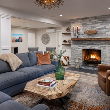
In order to add architectural details, we covered the old ugly support columns with simple recessed millwork panels. This detail created a visual division between the bar area and the seating area in front of the fireplace. The old red brick on the fireplace surround was replaced with stack stone. A mantle was made from reclaimed wood. Additional reclaimed wood floating shelves left and right of the fireplace provides decorative display while maintaining a rustic element balancing the copper end table and leather swivel rocker.
We found an amazing rug which tied all of the colors together further defining the gathering space. Russet and burnt orange became the accent color unifying each space. With a bit of whimsy, a rather unusual light fixture which looks like roots from a tree growing through the ceiling is a conversation piece.
The office space is quite and removed from the main part of the basement. There is a desk large enough for multiple screens, a small bookcase holding office supplies and a comfortable chair for conference calls. Because working from home requires many online meetings, we added a shiplap wall painted in Hale Navy to contrast with the orange fabric on the chair. We finished the décor with a painting from my client’s father. This is the background online visitors will see.
The last and best part of the renovation is the beautiful bar. My client is an avid collector of wine. She already had the EuroCave refrigerator, so I incorporated it into the design. The cabinets are painted Temptation Grey from Benjamin Moore. The counter tops are my favorite hard working quartzite Brown Fantasy. The backsplash is a combination of rustic wood and old tin ceiling like porcelain tiles. Together with the textures of the reclaimed wood and hide poofs balanced against the smooth finish of the cabinets, we created a comfortable luxury for relaxing.
There is ample storage for bottles, cans, glasses, and anything else you can think of for a great party. In addition to the wine storage, we incorporated a beverage refrigerator, an ice maker, and a sink. Floating shelves with integrated lighting illuminate the back bar. The raised height of the front bar provides the perfect wine tasting and paring spot. I especially love the pendant lights which look like wine glasses.
Finally, I selected carpet for the stairs and office. It is perfect for noise reduction. Meanwhile for the overall flooring, I specifically selected a high-performance vinyl plank floor. We often use this product as it is perfect to install on a concrete floor. It is soft to walk on, easy to clean and does not reduce the overall height of the space.

 Thomas Roszak Architecture, LLC
Photo credit: Scott McDonald @ Hedrich Blessing
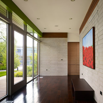
7RR-Ecohome:
The design objective was to build a house for a couple recently married who both had kids from previous marriages. How to bridge two families together?
The design looks forward in terms of how people live today. The home is an experiment in transparency and solid form; removing borders and edges from outside to inside the house, and to really depict “flowing and endless space”. The house floor plan is derived by pushing and pulling the house’s form to maximize the backyard and minimize the public front yard while welcoming the sun in key rooms by rotating the house 45-degrees to true north. The angular form of the house is a result of the family’s program, the zoning rules, the lot’s attributes, and the sun’s path. We wanted to construct a house that is smart and efficient in terms of construction and energy, both in terms of the building and the user. We could tell a story of how the house is built in terms of the constructability, structure and enclosure, with a nod to Japanese wood construction in the method in which the siding is installed and the exposed interior beams are placed in the double height space. We engineered the house to be smart which not only looks modern but acts modern; every aspect of user control is simplified to a digital touch button, whether lights, shades, blinds, HVAC, communication, audio, video, or security. We developed a planning module based on a 6-foot square room size and a 6-foot wide connector called an interstitial space for hallways, bathrooms, stairs and mechanical, which keeps the rooms pure and uncluttered. The house is 6,200 SF of livable space, plus garage and basement gallery for a total of 9,200 SF. A large formal foyer celebrates the entry and opens up to the living, dining, kitchen and family rooms all focused on the rear garden. The east side of the second floor is the Master wing and a center bridge connects it to the kid’s wing on the west. Second floor terraces and sunscreens provide views and shade in this suburban setting. The playful mathematical grid of the house in the x, y and z axis also extends into the layout of the trees and hard-scapes, all centered on a suburban one-acre lot.
Many green attributes were designed into the home; Ipe wood sunscreens and window shades block out unwanted solar gain in summer, but allow winter sun in. Patio door and operable windows provide ample opportunity for natural ventilation throughout the open floor plan. Minimal windows on east and west sides to reduce heat loss in winter and unwanted gains in summer. Open floor plan and large window expanse reduces lighting demands and maximizes available daylight. Skylights provide natural light to the basement rooms. Durable, low-maintenance exterior materials include stone, ipe wood siding and decking, and concrete roof pavers. Design is based on a 2' planning grid to minimize construction waste. Basement foundation walls and slab are highly insulated. FSC-certified walnut wood flooring was used. Light colored concrete roof pavers to reduce cooling loads by as much as 15%. 2x6 framing allows for more insulation and energy savings. Super efficient windows have low-E argon gas filled units, and thermally insulated aluminum frames. Permeable brick and stone pavers reduce the site’s storm-water runoff. Countertops use recycled composite materials. Energy-Star rated furnaces and smart thermostats are located throughout the house to minimize duct runs and avoid energy loss. Energy-Star rated boiler that heats up both radiant floors and domestic hot water. Low-flow toilets and plumbing fixtures are used to conserve water usage. No VOC finish options and direct venting fireplaces maintain a high interior air quality. Smart home system controls lighting, HVAC, and shades to better manage energy use. Plumbing runs through interior walls reducing possibilities of heat loss and freezing problems. A large food pantry was placed next to kitchen to reduce trips to the grocery store. Home office reduces need for automobile transit and associated CO2 footprint. Plan allows for aging in place, with guest suite than can become the master suite, with no need to move as family members mature.

Sponsored
Columbus, OH
Structural Remodeling
Franklin County's Heavy Timber Specialists | Best of Houzz 2020!
 Wyant Architecture
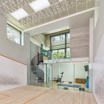
Views of trees and sky from the submerged squash court allow it to remain connected to the outdoors. Felt ceiling tiles reduce reverberation and echo.
Photo: Jeffrey Totaro
 Wendy O'Brien Interior Planning & Design
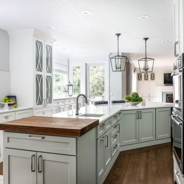
We breathed new life into this Hampton’s inspired kitchen with beautiful fresh materials in soft white and airy blue hues. We also redesigned the layout for optimal food prep, cooking and entertaining while keeping them separate from each other. By incorporating the nook area and removing the desk, we were able to give our client everything she ever wanted in a kitchen (see BEFORE pics). The lines and details of the custom hood and soft curved fretwork in the cabinetry create a sense of understated luxury and elegance. Oil rubbed bronze accents on the island legs, traditional lanterns and sconces, along with brushed nickel cabinet hardware complete the space. We also redesigned the fireplace and added built-ins to both sides for additional storage and unified, fresh new look.
For more photos of this project visit our website: https://wendyobrienid.com.
Photography by Valve Interactive: https://valveinteractive.com/
 ZeroEnergy Design
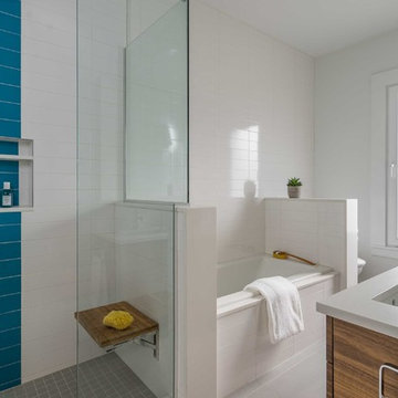
This renovated brick rowhome in Boston’s South End offers a modern aesthetic within a historic structure, creative use of space, exceptional thermal comfort, a reduced carbon footprint, and a passive stream of income.
DESIGN PRIORITIES. The goals for the project were clear - design the primary unit to accommodate the family’s modern lifestyle, rework the layout to create a desirable rental unit, improve thermal comfort and introduce a modern aesthetic. We designed the street-level entry as a shared entrance for both the primary and rental unit. The family uses it as their everyday entrance - we planned for bike storage and an open mudroom with bench and shoe storage to facilitate the change from shoes to slippers or bare feet as they enter their home. On the main level, we expanded the kitchen into the dining room to create an eat-in space with generous counter space and storage, as well as a comfortable connection to the living space. The second floor serves as master suite for the couple - a bedroom with a walk-in-closet and ensuite bathroom, and an adjacent study, with refinished original pumpkin pine floors. The upper floor, aside from a guest bedroom, is the child's domain with interconnected spaces for sleeping, work and play. In the play space, which can be separated from the work space with new translucent sliding doors, we incorporated recreational features inspired by adventurous and competitive television shows, at their son’s request.
MODERN MEETS TRADITIONAL. We left the historic front facade of the building largely unchanged - the security bars were removed from the windows and the single pane windows were replaced with higher performing historic replicas. We designed the interior and rear facade with a vision of warm modernism, weaving in the notable period features. Each element was either restored or reinterpreted to blend with the modern aesthetic. The detailed ceiling in the living space, for example, has a new matte monochromatic finish, and the wood stairs are covered in a dark grey floor paint, whereas the mahogany doors were simply refinished. New wide plank wood flooring with a neutral finish, floor-to-ceiling casework, and bold splashes of color in wall paint and tile, and oversized high-performance windows (on the rear facade) round out the modern aesthetic.
RENTAL INCOME. The existing rowhome was zoned for a 2-family dwelling but included an undesirable, single-floor studio apartment at the garden level with low ceiling heights and questionable emergency egress. In order to increase the quality and quantity of space in the rental unit, we reimagined it as a two-floor, 1 or 2 bedroom, 2 bathroom apartment with a modern aesthetic, increased ceiling height on the lowest level and provided an in-unit washer/dryer. The apartment was listed with Jackie O'Connor Real Estate and rented immediately, providing the owners with a source of passive income.
ENCLOSURE WITH BENEFITS. The homeowners sought a minimal carbon footprint, enabled by their urban location and lifestyle decisions, paired with the benefits of a high-performance home. The extent of the renovation allowed us to implement a deep energy retrofit (DER) to address air tightness, insulation, and high-performance windows. The historic front facade is insulated from the interior, while the rear facade is insulated on the exterior. Together with these building enclosure improvements, we designed an HVAC system comprised of continuous fresh air ventilation, and an efficient, all-electric heating and cooling system to decouple the house from natural gas. This strategy provides optimal thermal comfort and indoor air quality, improved acoustic isolation from street noise and neighbors, as well as a further reduced carbon footprint. We also took measures to prepare the roof for future solar panels, for when the South End neighborhood’s aging electrical infrastructure is upgraded to allow them.
URBAN LIVING. The desirable neighborhood location allows the both the homeowners and tenant to walk, bike, and use public transportation to access the city, while each charging their respective plug-in electric cars behind the building to travel greater distances.
OVERALL. The understated rowhouse is now ready for another century of urban living, offering the owners comfort and convenience as they live life as an expression of their values.
Eric Roth Photo
 DHD Architecture and Interior Design
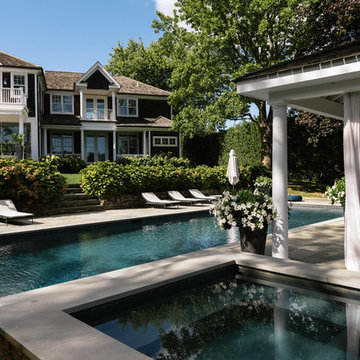
The Watermill House is a beautiful example of a classic Hamptons wood shingle style home. The design and renovation would maintain the character of the exterior while transforming the interiors to create an open and airy getaway for a busy and active family. The house comfortably sits within its one acre lot surrounded by tall hedges, old growth trees, and beautiful hydrangeas. The landscape influenced the design approach of the main floor interiors. Walls were removed and the kitchen was relocated to the front of the house to create an open plan for better flow and views to both the front and rear yards. The kitchen was designed to be both practical and beautiful. The u-shape design features modern appliances, white cabinetry and Corian countertops, and is anchored by a beautiful island with a knife-edge marble countertop. The island and the dining room table create a strong axis to the living room at the rear of the house. To further strengthen the connection to the outdoor decks and pool area of the rear yard, a full height sliding glass window system was installed. The clean lines and modern profiles of the window frames create unobstructed views and virtually remove the barrier between the interior and exterior spaces. The open plan allowed a new sitting area to be created between the dining room and stair. A screen, comprised of vertical fins, allows for a degree of openness, while creating enough separation to make the sitting area feel comfortable and nestled in its own area. The stair at the entry of the house was redesigned to match the new elegant and sophisticated spaces connected to it. New treads were installed to articulate and contrast the soft palette of finishes of the floors, walls, and ceilings. The new metal and glass handrail was intended to reduce visual noise and create subtle reflections of light.
Photo by Guillaume Gaudet

Sponsored
Sunbury, OH

J.Holderby - Renovations
Franklin County's Leading General Contractors - 2X Best of Houzz!
 Fluidesign Studio
Building Design, Plans, and Interior Finishes by: Fluidesign Studio I Builder: Anchor Builders I Photographer: sethbennphoto.com
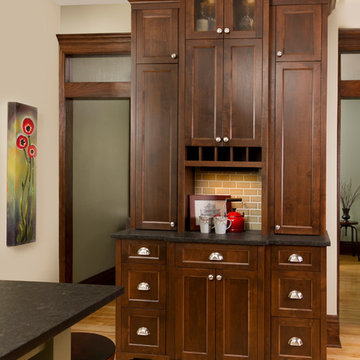
Eat-in kitchen - large traditional l-shaped light wood floor eat-in kitchen idea in Minneapolis with a farmhouse sink, flat-panel cabinets, dark wood cabinets, granite countertops, beige backsplash, subway tile backsplash, stainless steel appliances and an island
Eat-in kitchen - large traditional l-shaped light wood floor eat-in kitchen idea in Minneapolis with a farmhouse sink, flat-panel cabinets, dark wood cabinets, granite countertops, beige backsplash, subway tile backsplash, stainless steel appliances and an island
 Masa Studio Architects
ambiaphotographyhouston.com
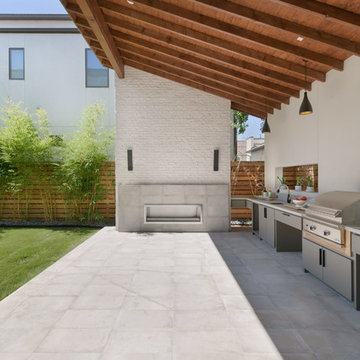
Inspiration for a contemporary backyard concrete paver patio kitchen remodel in Houston
Inspiration for a contemporary backyard concrete paver patio kitchen remodel in Houston
 Barton Phelps & Associates, Architects
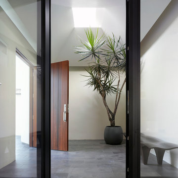
New atrium: The pyramidal ceiling allows for maximal reflectance and directs light off canted walls to reduce glare at the edges of the skylight shaft. The atrium separates the house from the street. It allowed installation of glass doors that help to naturally illuminate the formerly gloomy front hallway.
Photo by Benny Chan/Fotoworks
15