
Search results for "Reduce specific" in Home Design Ideas
 SENCE ARCHITECTS
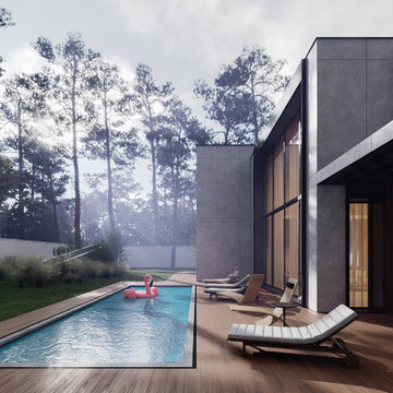
The Bunker House is a two-story house with a bomb shelter in the basement.
A bunker house is a two-story residential building with a basement bomb shelter. In a short time, we had to equip the basement, master the "two walls" principle and properly seal the windows to protect ourselves and our family from the impact of the shock wave. Our priorities have changed when choosing a home - proximity to the city center or transportation hubs no longer matters.
Moreover, SENCE ARCHITECTS also took care of other safety aspects. According to the rules, the storage has two distributed exits outside, each with light "hints" of the direction of evacuation. The basement area is sealed and equipped with a double ventilation system. This is a zone of guaranteed protection against missile attacks, poisonous or radioactive substances, combustion products, and bacteriological weapons. The first mode works on air recovery, providing a fresh flow of it in the absence of heat loss. The second is carried out by a filter ventilation unit — it cleans the outside air, and then distributes it to the compartments and creates excess pressure.
Thus, contaminated air will not penetrate inside even through small cracks in protective structures.
CONCEPTUAL SOLUTION
The structures of the building itself are made of strong reinforced concrete — this way SENCE ARCHITECTS suggests abandoning "glass" facades. The number of windows has also been reduced: they will have a protective anti-shock film, and in case of an explosive wave, they will be closed with reinforced shutters made of fire-resistant plywood. At the entrance to the house and bomb shelter, armored doors are installed.
Water is supplied from its own artesian well, electricity — from its own diesel power plant. This means that possible damage to infrastructure facilities will not affect the lives of residents in any way. The house is equipped with modern types of radio- and telephone communication, and satellite Internet, which will work even in the bomb shelter. The signaling and air-raid alert systems are to be installed too. The systems are powered autonomously and have backup channels. Overall, given its specificity, the house is designed for a family of 4-5 people.
Size / 733 sq.m.
Year / 2022
 TKS Design Group
Download our free ebook, Creating the Ideal Kitchen. DOWNLOAD NOW
This family from Wheaton was ready to remodel their kitchen, dining room and powder room. The project didn’t call for any structural or space planning changes but the makeover still had a massive impact on their home. The homeowners wanted to change their dated 1990’s brown speckled granite and light maple kitchen. They liked the welcoming feeling they got from the wood and warm tones in their current kitchen, but this style clashed with their vision of a deVOL type kitchen, a London-based furniture company. Their inspiration came from the country homes of the UK that mix the warmth of traditional detail with clean lines and modern updates.
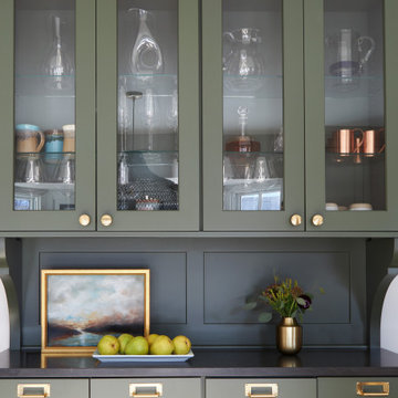
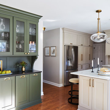
To create their vision, we started with all new framed cabinets with a modified overlay painted in beautiful, understated colors. Our clients were adamant about “no white cabinets.” Instead we used an oyster color for the perimeter and a custom color match to a specific shade of green chosen by the homeowner. The use of a simple color pallet reduces the visual noise and allows the space to feel open and welcoming. We also painted the trim above the cabinets the same color to make the cabinets look taller. The room trim was painted a bright clean white to match the ceiling.
In true English fashion our clients are not coffee drinkers, but they LOVE tea. We created a tea station for them where they can prepare and serve tea. We added plenty of glass to showcase their tea mugs and adapted the cabinetry below to accommodate storage for their tea items. Function is also key for the English kitchen and the homeowners. They requested a deep farmhouse sink and a cabinet devoted to their heavy mixer because they bake a lot. We then got rid of the stovetop on the island and wall oven and replaced both of them with a range located against the far wall. This gives them plenty of space on the island to roll out dough and prepare any number of baked goods. We then removed the bifold pantry doors and created custom built-ins with plenty of usable storage for all their cooking and baking needs.
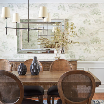
The client wanted a big change to the dining room but still wanted to use their own furniture and rug. We installed a toile-like wallpaper on the top half of the room and supported it with white wainscot paneling. We also changed out the light fixture, showing us once again that small changes can have a big impact.
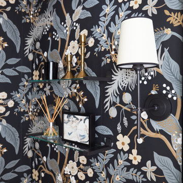
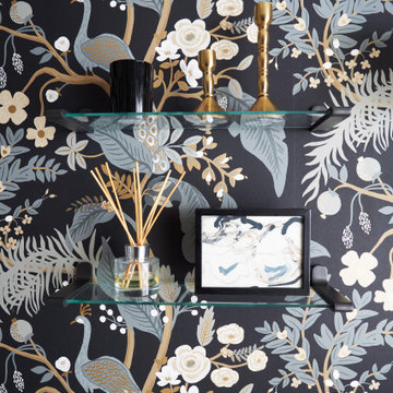
As the final touch, we also re-did the powder room to be in line with the rest of the first floor. We had the new vanity painted in the same oyster color as the kitchen cabinets and then covered the walls in a whimsical patterned wallpaper. Although the homeowners like subtle neutral colors they were willing to go a bit bold in the powder room for something unexpected. For more design inspiration go to: www.kitchenstudio-ge.com
 Designs by KS
Project: Pelton Avenue - Coquitlam
Builder: Furtado Contracting
About this Project
We partnered up with Furtado Contracting to transform the main floor and foyer of this Greater Vancouver classic home. Also referred to as the “Vancouver Special” this style of home was popular in the 60’s-80’s and has been re-decorated and renovated ever since.
Layout Details:
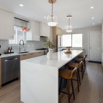
By eliminating the wall between the dining room and kitchen, and reducing the length of the hallway wall, we were able to create a large open concept space.
The previous u-shape kitchen turned into a large galley kitchen, which allowed us to incorporate an island with seating for four.
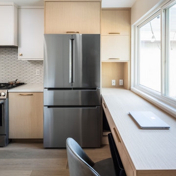
With the major appliances being housed on the window wall, we designed a large pantry space spanning from wall-to-wall to store all the necessities from food to cleaning supplies. Its niche not only breaks up the cabinets to add some personality but can be used as a wine/coffee area. On the far end of the kitchen, the pantry wall extends to a narrow cabinet that has been designed to act as a mudroom; a place for shoes and jackets near the back door. At the back of the kitchen you will also find a working space, that has been tied into the fridge area with some careful space planning.
Material Details:
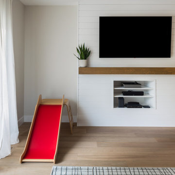
The living room and foyer received an upgrade with new flooring, light fixtures, paint, and a converted fireplace to A/V wall with a rustic wooden mantle.
In the kitchen, woodgrain cabinets made from durable laminate are paired with painted materials. A 1” shaker door painted in our favourite Benjamin Moore “Silver Satin” is seen on the upper cabinets only. This special detail is complimented with bronze knobs by Marathon Hardware. The same colour is seen on the pantry wall in a slab door, making it sleeker. The island is painted in Benjamin Moore “Black Pepper”, is paired with bronze hardware by Marathon Hardware and is clad in quartz, Silestone’s “Calcatta Gold” to be specific. Quartz is a go-to material if maintenance is not your thing!
Special Mentions:
There are so many amazing things about this project. All the light fixtures were supplied by Robinson Lighting, and include Canadian company Kuzco Lighting, as seen in the kitchen, entry and foyer. The black accents on the sink by Blanco and faucet by Grohe added some contrast against the backsplash by Julian Tile.
Find the right local pro for your project
 Designs by KS
Project: Pelton Avenue - Coquitlam
Builder: Furtado Contracting
About this Project
We partnered up with Furtado Contracting to transform the main floor and foyer of this Greater Vancouver classic home. Also referred to as the “Vancouver Special” this style of home was popular in the 60’s-80’s and has been re-decorated and renovated ever since.
Layout Details:
By eliminating the wall between the dining room and kitchen, and reducing the length of the hallway wall, we were able to create a large open concept space.
The previous u-shape kitchen turned into a large galley kitchen, which allowed us to incorporate an island with seating for four.
With the major appliances being housed on the window wall, we designed a large pantry space spanning from wall-to-wall to store all the necessities from food to cleaning supplies. Its niche not only breaks up the cabinets to add some personality but can be used as a wine/coffee area. On the far end of the kitchen, the pantry wall extends to a narrow cabinet that has been designed to act as a mudroom; a place for shoes and jackets near the back door. At the back of the kitchen you will also find a working space, that has been tied into the fridge area with some careful space planning.
Material Details:
The living room and foyer received an upgrade with new flooring, light fixtures, paint, and a converted fireplace to A/V wall with a rustic wooden mantle.
In the kitchen, woodgrain cabinets made from durable laminate are paired with painted materials. A 1” shaker door painted in our favourite Benjamin Moore “Silver Satin” is seen on the upper cabinets only. This special detail is complimented with bronze knobs by Marathon Hardware. The same colour is seen on the pantry wall in a slab door, making it sleeker. The island is painted in Benjamin Moore “Black Pepper”, is paired with bronze hardware by Marathon Hardware and is clad in quartz, Silestone’s “Calcatta Gold” to be specific. Quartz is a go-to material if maintenance is not your thing!
Special Mentions:
There are so many amazing things about this project. All the light fixtures were supplied by Robinson Lighting, and include Canadian company Kuzco Lighting, as seen in the kitchen, entry and foyer. The black accents on the sink by Blanco and faucet by Grohe added some contrast against the backsplash by Julian Tile.
 Janvrin & Co.
A transformation of a modest raised ranch into a modern oasis. I was the interior designer and general contractor from mechanicals to finishing. It’s also my personal home.
The interior design style is that of modern minimalist meets organic modern. I wanted a space that reduced distractions and let the eyes, head, and soul rest. Where everything inside the home has a specific use and purpose. The objects in our home are fewer but each hold a great personal value. You might expect to see this airy aesthetic, with its gallery white walls, in California or New York. Not nestled in a modest 50 year old neighborhood in Omaha, Nebraska. Creating a minimal aesthetic is one of the trickiest design styles to pull off. It is more than just less stuff and lots of white. It means sticking to these design principals:
-weaving in an abundance of textures
-incorporating natural finishes
-keenly curating art
-giving extra attention to scale
-limiting purely decorative items
-maximizing natural light
This style is not to be confused with the frugality of reductive design. I have incorporated many elevated basics that create an aesthetic of quiet luxury:
-architectural bead for trim-less doors
-first-of-its kind interior door hardware made of terrazzo
-historical marble found in landmark interiors like the NY Public Library
-premium flush air vents that disappear out of site
-luxury appliances from GE Café and Signature
-elegant and resilient terrazzo field tiles
Ours was not a simple interior remodel and addition:
-gutted and remodeled the existing 2,000 SF
-added on approximately another 1,000 SF
-moved and installed all new major mechanicals i.e. heating, plumbing and electrical.
-knocked through foundation walls to extend the space back
-dug down and built up
 Designs by KS
Project: Pelton Avenue - Coquitlam
Builder: Furtado Contracting
About this Project
We partnered up with Furtado Contracting to transform the main floor and foyer of this Greater Vancouver classic home. Also referred to as the “Vancouver Special” this style of home was popular in the 60’s-80’s and has been re-decorated and renovated ever since.
Layout Details:
By eliminating the wall between the dining room and kitchen, and reducing the length of the hallway wall, we were able to create a large open concept space.
The previous u-shape kitchen turned into a large galley kitchen, which allowed us to incorporate an island with seating for four.
With the major appliances being housed on the window wall, we designed a large pantry space spanning from wall-to-wall to store all the necessities from food to cleaning supplies. Its niche not only breaks up the cabinets to add some personality but can be used as a wine/coffee area. On the far end of the kitchen, the pantry wall extends to a narrow cabinet that has been designed to act as a mudroom; a place for shoes and jackets near the back door. At the back of the kitchen you will also find a working space, that has been tied into the fridge area with some careful space planning.
Material Details:
The living room and foyer received an upgrade with new flooring, light fixtures, paint, and a converted fireplace to A/V wall with a rustic wooden mantle.
In the kitchen, woodgrain cabinets made from durable laminate are paired with painted materials. A 1” shaker door painted in our favourite Benjamin Moore “Silver Satin” is seen on the upper cabinets only. This special detail is complimented with bronze knobs by Marathon Hardware. The same colour is seen on the pantry wall in a slab door, making it sleeker. The island is painted in Benjamin Moore “Black Pepper”, is paired with bronze hardware by Marathon Hardware and is clad in quartz, Silestone’s “Calcatta Gold” to be specific. Quartz is a go-to material if maintenance is not your thing!
Special Mentions:
There are so many amazing things about this project. All the light fixtures were supplied by Robinson Lighting, and include Canadian company Kuzco Lighting, as seen in the kitchen, entry and foyer. The black accents on the sink by Blanco and faucet by Grohe added some contrast against the backsplash by Julian Tile.
 SENCE ARCHITECTS
The Bunker House is a two-story house with a bomb shelter in the basement.
A bunker house is a two-story residential building with a basement bomb shelter. In a short time, we had to equip the basement, master the "two walls" principle and properly seal the windows to protect ourselves and our family from the impact of the shock wave. Our priorities have changed when choosing a home - proximity to the city center or transportation hubs no longer matters.
Moreover, SENCE ARCHITECTS also took care of other safety aspects. According to the rules, the storage has two distributed exits outside, each with light "hints" of the direction of evacuation. The basement area is sealed and equipped with a double ventilation system. This is a zone of guaranteed protection against missile attacks, poisonous or radioactive substances, combustion products, and bacteriological weapons. The first mode works on air recovery, providing a fresh flow of it in the absence of heat loss. The second is carried out by a filter ventilation unit — it cleans the outside air, and then distributes it to the compartments and creates excess pressure.
Thus, contaminated air will not penetrate inside even through small cracks in protective structures.
CONCEPTUAL SOLUTION
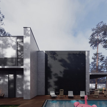
The structures of the building itself are made of strong reinforced concrete — this way SENCE ARCHITECTS suggests abandoning "glass" facades. The number of windows has also been reduced: they will have a protective anti-shock film, and in case of an explosive wave, they will be closed with reinforced shutters made of fire-resistant plywood. At the entrance to the house and bomb shelter, armored doors are installed.
Water is supplied from its own artesian well, electricity — from its own diesel power plant. This means that possible damage to infrastructure facilities will not affect the lives of residents in any way. The house is equipped with modern types of radio- and telephone communication, and satellite Internet, which will work even in the bomb shelter. The signaling and air-raid alert systems are to be installed too. The systems are powered autonomously and have backup channels. Overall, given its specificity, the house is designed for a family of 4-5 people.
Size / 733 sq.m.
Year / 2022
 Janvrin & Co.
A transformation of a modest raised ranch into a modern oasis. I was the interior designer and general contractor from mechanicals to finishing. It’s also my personal home.
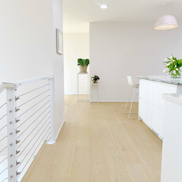
The interior design style is that of modern minimalist meets organic modern. I wanted a space that reduced distractions and let the eyes, head, and soul rest. Where everything inside the home has a specific use and purpose. The objects in our home are fewer but each hold a great personal value. You might expect to see this airy aesthetic, with its gallery white walls, in California or New York. Not nestled in a modest 50 year old neighborhood in Omaha, Nebraska. Creating a minimal aesthetic is one of the trickiest design styles to pull off. It is more than just less stuff and lots of white. It means sticking to these design principals:
-weaving in an abundance of textures
-incorporating natural finishes
-keenly curating art
-giving extra attention to scale
-limiting purely decorative items
-maximizing natural light
This style is not to be confused with the frugality of reductive design. I have incorporated many elevated basics that create an aesthetic of quiet luxury:
-architectural bead for trim-less doors
-first-of-its kind interior door hardware made of terrazzo
-historical marble found in landmark interiors like the NY Public Library
-premium flush air vents that disappear out of site
-luxury appliances from GE Café and Signature
-elegant and resilient terrazzo field tiles
Ours was not a simple interior remodel and addition:
-gutted and remodeled the existing 2,000 SF
-added on approximately another 1,000 SF
-moved and installed all new major mechanicals i.e. heating, plumbing and electrical.
-knocked through foundation walls to extend the space back
-dug down and built up
 China Chi Hardware Co.,Ltd.
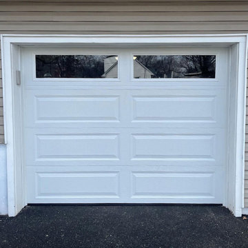
OEM/ODM 8'x7' traditional sectional garage door designed for wholesale distributors who need stable supply, consistent quality, and flexible private labeling. Ideal for standard residential openings, dealer stock programs, and installer-ready packages. As a world-renowned garage door manufacturer, China Chi Hardware supplies global garage door brands, wholesalers, and distributors with a wide variety of garage doors, as well as garage door hardware parts in different sizes.
Build your fast-moving SKU lineup with an OEM/ODM 8'x7' traditional sectional garage door designed for wholesale distribution. This size fits common residential openings and keeps inventory simple, while our factory program lets you customize panel design, window options, colors, packaging, labels, and private brand manuals. Choose non-insulated or PU-insulated constructions, match hardware grade to your market, and get consistent batches for easier warranty control and repeat orders.
————Key Specifications————
• Door size: 8'×7' (2438×2134mm)
• Door type: Steel sectional door, traditional styles (raised / recessed options)
• Panel thickness: non-insulated / insulated options (commonly 40mm / 50mm)
• Insulation: PU foam (optional)
• Surface: galvanized steel + primer/powder coat; woodgrain optional
• Hardware: tracks, hinges, rollers, torsion/extension spring system (optional as kits)
• Customization: windows, colors, embossing, packaging, private label
————Performance & Benefits————
• Smooth operation and accurate fit for faster installation
• Durable steel skins with corrosion-resistant finish
• Insulation options help improve comfort and reduce noise complaints
• Standardized production improves batch consistency for distributor inventory
————CHI Manufacturing & Process Strength————
• Coil-to-door controlled process: roll forming / stamping / foaming (if insulated) / coating
• Dimensional control on panel profile & end stile alignment for stable assembly
• In-house QC: thickness, coating adhesion, foam fill (if applicable), cycle checks
————Contact Us————
China Chi Hardware Co.,Ltd.
Website: https://www.chihw.com/
 Janvrin & Co.
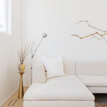
A transformation of a modest raised ranch into a modern oasis. I was the interior designer and general contractor from mechanicals to finishing. It’s also my personal home.
The interior design style is that of modern minimalist meets organic modern. I wanted a space that reduced distractions and let the eyes, head, and soul rest. Where everything inside the home has a specific use and purpose. The objects in our home are fewer but each hold a great personal value. You might expect to see this airy aesthetic, with its gallery white walls, in California or New York. Not nestled in a modest 50 year old neighborhood in Omaha, Nebraska. Creating a minimal aesthetic is one of the trickiest design styles to pull off. It is more than just less stuff and lots of white. It means sticking to these design principals:
-weaving in an abundance of textures
-incorporating natural finishes
-keenly curating art
-giving extra attention to scale
-limiting purely decorative items
-maximizing natural light
This style is not to be confused with the frugality of reductive design. I have incorporated many elevated basics that create an aesthetic of quiet luxury:
-architectural bead for trim-less doors
-first-of-its kind interior door hardware made of terrazzo
-historical marble found in landmark interiors like the NY Public Library
-premium flush air vents that disappear out of site
-luxury appliances from GE Café and Signature
-elegant and resilient terrazzo field tiles
Ours was not a simple interior remodel and addition:
-gutted and remodeled the existing 2,000 SF
-added on approximately another 1,000 SF
-moved and installed all new major mechanicals i.e. heating, plumbing and electrical.
-knocked through foundation walls to extend the space back
-dug down and built up


 TKS Design Group
Download our free ebook, Creating the Ideal Kitchen. DOWNLOAD NOW
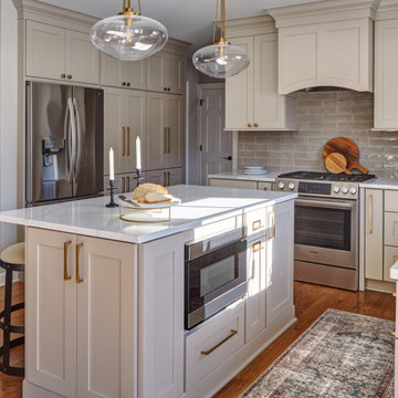
This family from Wheaton was ready to remodel their kitchen, dining room and powder room. The project didn’t call for any structural or space planning changes but the makeover still had a massive impact on their home. The homeowners wanted to change their dated 1990’s brown speckled granite and light maple kitchen. They liked the welcoming feeling they got from the wood and warm tones in their current kitchen, but this style clashed with their vision of a deVOL type kitchen, a London-based furniture company. Their inspiration came from the country homes of the UK that mix the warmth of traditional detail with clean lines and modern updates.
To create their vision, we started with all new framed cabinets with a modified overlay painted in beautiful, understated colors. Our clients were adamant about “no white cabinets.” Instead we used an oyster color for the perimeter and a custom color match to a specific shade of green chosen by the homeowner. The use of a simple color pallet reduces the visual noise and allows the space to feel open and welcoming. We also painted the trim above the cabinets the same color to make the cabinets look taller. The room trim was painted a bright clean white to match the ceiling.
In true English fashion our clients are not coffee drinkers, but they LOVE tea. We created a tea station for them where they can prepare and serve tea. We added plenty of glass to showcase their tea mugs and adapted the cabinetry below to accommodate storage for their tea items. Function is also key for the English kitchen and the homeowners. They requested a deep farmhouse sink and a cabinet devoted to their heavy mixer because they bake a lot. We then got rid of the stovetop on the island and wall oven and replaced both of them with a range located against the far wall. This gives them plenty of space on the island to roll out dough and prepare any number of baked goods. We then removed the bifold pantry doors and created custom built-ins with plenty of usable storage for all their cooking and baking needs.
The client wanted a big change to the dining room but still wanted to use their own furniture and rug. We installed a toile-like wallpaper on the top half of the room and supported it with white wainscot paneling. We also changed out the light fixture, showing us once again that small changes can have a big impact.
As the final touch, we also re-did the powder room to be in line with the rest of the first floor. We had the new vanity painted in the same oyster color as the kitchen cabinets and then covered the walls in a whimsical patterned wallpaper. Although the homeowners like subtle neutral colors they were willing to go a bit bold in the powder room for something unexpected. For more design inspiration go to: www.kitchenstudio-ge.com

 Liebherr Appliances North America
MONOLITH INCEPTION KITCHEN
designed by Richard T. Anuszkiewicz
Featured brands include
Premier Custom-Built Cabinetry
SUPERIORE ranges
KALLISTA Plumbing
Dekton by Cosentino countertops
Burchette & Burchette Hardwood Floors,
Bradley USA Bridget Beari Designs wallpaper
Grothouse Lumber Custom Wood Surfaces.
 TKS Design Group
Download our free ebook, Creating the Ideal Kitchen. DOWNLOAD NOW
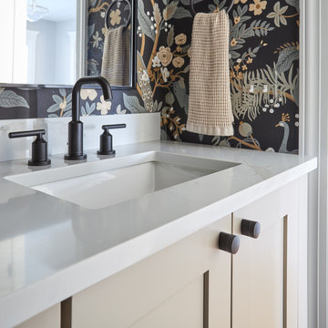
This family from Wheaton was ready to remodel their kitchen, dining room and powder room. The project didn’t call for any structural or space planning changes but the makeover still had a massive impact on their home. The homeowners wanted to change their dated 1990’s brown speckled granite and light maple kitchen. They liked the welcoming feeling they got from the wood and warm tones in their current kitchen, but this style clashed with their vision of a deVOL type kitchen, a London-based furniture company. Their inspiration came from the country homes of the UK that mix the warmth of traditional detail with clean lines and modern updates.
To create their vision, we started with all new framed cabinets with a modified overlay painted in beautiful, understated colors. Our clients were adamant about “no white cabinets.” Instead we used an oyster color for the perimeter and a custom color match to a specific shade of green chosen by the homeowner. The use of a simple color pallet reduces the visual noise and allows the space to feel open and welcoming. We also painted the trim above the cabinets the same color to make the cabinets look taller. The room trim was painted a bright clean white to match the ceiling.
In true English fashion our clients are not coffee drinkers, but they LOVE tea. We created a tea station for them where they can prepare and serve tea. We added plenty of glass to showcase their tea mugs and adapted the cabinetry below to accommodate storage for their tea items. Function is also key for the English kitchen and the homeowners. They requested a deep farmhouse sink and a cabinet devoted to their heavy mixer because they bake a lot. We then got rid of the stovetop on the island and wall oven and replaced both of them with a range located against the far wall. This gives them plenty of space on the island to roll out dough and prepare any number of baked goods. We then removed the bifold pantry doors and created custom built-ins with plenty of usable storage for all their cooking and baking needs.
The client wanted a big change to the dining room but still wanted to use their own furniture and rug. We installed a toile-like wallpaper on the top half of the room and supported it with white wainscot paneling. We also changed out the light fixture, showing us once again that small changes can have a big impact.
As the final touch, we also re-did the powder room to be in line with the rest of the first floor. We had the new vanity painted in the same oyster color as the kitchen cabinets and then covered the walls in a whimsical patterned wallpaper. Although the homeowners like subtle neutral colors they were willing to go a bit bold in the powder room for something unexpected. For more design inspiration go to: www.kitchenstudio-ge.com
 TKS Design Group
Download our free ebook, Creating the Ideal Kitchen. DOWNLOAD NOW
This family from Wheaton was ready to remodel their kitchen, dining room and powder room. The project didn’t call for any structural or space planning changes but the makeover still had a massive impact on their home. The homeowners wanted to change their dated 1990’s brown speckled granite and light maple kitchen. They liked the welcoming feeling they got from the wood and warm tones in their current kitchen, but this style clashed with their vision of a deVOL type kitchen, a London-based furniture company. Their inspiration came from the country homes of the UK that mix the warmth of traditional detail with clean lines and modern updates.
To create their vision, we started with all new framed cabinets with a modified overlay painted in beautiful, understated colors. Our clients were adamant about “no white cabinets.” Instead we used an oyster color for the perimeter and a custom color match to a specific shade of green chosen by the homeowner. The use of a simple color pallet reduces the visual noise and allows the space to feel open and welcoming. We also painted the trim above the cabinets the same color to make the cabinets look taller. The room trim was painted a bright clean white to match the ceiling.
In true English fashion our clients are not coffee drinkers, but they LOVE tea. We created a tea station for them where they can prepare and serve tea. We added plenty of glass to showcase their tea mugs and adapted the cabinetry below to accommodate storage for their tea items. Function is also key for the English kitchen and the homeowners. They requested a deep farmhouse sink and a cabinet devoted to their heavy mixer because they bake a lot. We then got rid of the stovetop on the island and wall oven and replaced both of them with a range located against the far wall. This gives them plenty of space on the island to roll out dough and prepare any number of baked goods. We then removed the bifold pantry doors and created custom built-ins with plenty of usable storage for all their cooking and baking needs.
The client wanted a big change to the dining room but still wanted to use their own furniture and rug. We installed a toile-like wallpaper on the top half of the room and supported it with white wainscot paneling. We also changed out the light fixture, showing us once again that small changes can have a big impact.
As the final touch, we also re-did the powder room to be in line with the rest of the first floor. We had the new vanity painted in the same oyster color as the kitchen cabinets and then covered the walls in a whimsical patterned wallpaper. Although the homeowners like subtle neutral colors they were willing to go a bit bold in the powder room for something unexpected. For more design inspiration go to: www.kitchenstudio-ge.com
 TKS Design Group
Download our free ebook, Creating the Ideal Kitchen. DOWNLOAD NOW
This family from Wheaton was ready to remodel their kitchen, dining room and powder room. The project didn’t call for any structural or space planning changes but the makeover still had a massive impact on their home. The homeowners wanted to change their dated 1990’s brown speckled granite and light maple kitchen. They liked the welcoming feeling they got from the wood and warm tones in their current kitchen, but this style clashed with their vision of a deVOL type kitchen, a London-based furniture company. Their inspiration came from the country homes of the UK that mix the warmth of traditional detail with clean lines and modern updates.
To create their vision, we started with all new framed cabinets with a modified overlay painted in beautiful, understated colors. Our clients were adamant about “no white cabinets.” Instead we used an oyster color for the perimeter and a custom color match to a specific shade of green chosen by the homeowner. The use of a simple color pallet reduces the visual noise and allows the space to feel open and welcoming. We also painted the trim above the cabinets the same color to make the cabinets look taller. The room trim was painted a bright clean white to match the ceiling.
In true English fashion our clients are not coffee drinkers, but they LOVE tea. We created a tea station for them where they can prepare and serve tea. We added plenty of glass to showcase their tea mugs and adapted the cabinetry below to accommodate storage for their tea items. Function is also key for the English kitchen and the homeowners. They requested a deep farmhouse sink and a cabinet devoted to their heavy mixer because they bake a lot. We then got rid of the stovetop on the island and wall oven and replaced both of them with a range located against the far wall. This gives them plenty of space on the island to roll out dough and prepare any number of baked goods. We then removed the bifold pantry doors and created custom built-ins with plenty of usable storage for all their cooking and baking needs.
The client wanted a big change to the dining room but still wanted to use their own furniture and rug. We installed a toile-like wallpaper on the top half of the room and supported it with white wainscot paneling. We also changed out the light fixture, showing us once again that small changes can have a big impact.
As the final touch, we also re-did the powder room to be in line with the rest of the first floor. We had the new vanity painted in the same oyster color as the kitchen cabinets and then covered the walls in a whimsical patterned wallpaper. Although the homeowners like subtle neutral colors they were willing to go a bit bold in the powder room for something unexpected. For more design inspiration go to: www.kitchenstudio-ge.com

 Chapman Design Group, Inc.
This rustic style home on Hartwell Lake was designed and built for the owners to enjoy with family and friends during their active weekend lifestyle. The home was built on a narrow, deep lot that was semi-level on the roadside and steep on the lakeside. The back half of the lot heavily wooded with mature oak and poplar trees reducing the harsh sun’s heat gain on the home.
The exterior utilizes fiber cement cedar shake and lap siding complimented by deep brown colors for the windows, soffit, trim and the large square columns. A nice balance of natural earth toned stacked stone rounds out the exterior materials completing the rustic casual lake living.
The home 5400 SF is designed and built on thee levels each having a primary focus. The main level creates primary daily living for the owners. This level features an open plan with an entry, stair, dining, kitchen and living areas leading to a large lakeside screened porch. A master suite is privately tucked off its own hallway and allowing it to enjoy the lakeside as well with its own private deck. On the opposite side are two bedrooms, a study and a shared bathroom for each to utilize. An open carport for two vehicles was created with the motor court and connects to the mudroom/utility room giving the owners direct entry into their home.
The upper level is for the grand children with an oversized bedroom, bathroom and loft area for play.
The lower level is the considered the party level. Its primary feature is an elevated stage for the owner’s band opened to a large seating area, dining and kitchen for viewing and listening with direct access to another screened porch. Flanking each side is a theater and two additional bedrooms and bathrooms.
Energy Efficient features include:
• The majority of the lower level sunk into the site below grade
• 6” thick walls utilizing advanced framing techniques
• Foil covered roof sheathing
• Extensive use of blown in cellulous
• All windows & doors are double paned low E argon filed glass
• Tank-less water heaters
• Three separate high efficiency HVAC units with programmable thermostats and a fresh air ERV.
Lastly the owner requested we make every effort to sound proof the home. Many materials and techniques gave a duel purpose and added to the energy efficiency.
These items include:
• 2x6 walls with staggered studs
• Extensive use if rock wool acoustic batting
• Tempered glass in all exterior doors and windows
• ¼ thick Mass Loaded Vinyl (MLV) was installed on the top and bottom of the floor trusses and on all lower level walls.
The combination of the design and detailing utilizing these specific materials enabled us to achieve a 5 Star Plus Energy Star Certification with a HERS Index Score of 50. This home received a the 2015 Pinnacle Award from the SC Home Builders Association for the “Best Achievement in Energy Efficiency” sponsored by the SC Department Commerce.
 TKS Design Group
Download our free ebook, Creating the Ideal Kitchen. DOWNLOAD NOW
This family from Wheaton was ready to remodel their kitchen, dining room and powder room. The project didn’t call for any structural or space planning changes but the makeover still had a massive impact on their home. The homeowners wanted to change their dated 1990’s brown speckled granite and light maple kitchen. They liked the welcoming feeling they got from the wood and warm tones in their current kitchen, but this style clashed with their vision of a deVOL type kitchen, a London-based furniture company. Their inspiration came from the country homes of the UK that mix the warmth of traditional detail with clean lines and modern updates.
To create their vision, we started with all new framed cabinets with a modified overlay painted in beautiful, understated colors. Our clients were adamant about “no white cabinets.” Instead we used an oyster color for the perimeter and a custom color match to a specific shade of green chosen by the homeowner. The use of a simple color pallet reduces the visual noise and allows the space to feel open and welcoming. We also painted the trim above the cabinets the same color to make the cabinets look taller. The room trim was painted a bright clean white to match the ceiling.
In true English fashion our clients are not coffee drinkers, but they LOVE tea. We created a tea station for them where they can prepare and serve tea. We added plenty of glass to showcase their tea mugs and adapted the cabinetry below to accommodate storage for their tea items. Function is also key for the English kitchen and the homeowners. They requested a deep farmhouse sink and a cabinet devoted to their heavy mixer because they bake a lot. We then got rid of the stovetop on the island and wall oven and replaced both of them with a range located against the far wall. This gives them plenty of space on the island to roll out dough and prepare any number of baked goods. We then removed the bifold pantry doors and created custom built-ins with plenty of usable storage for all their cooking and baking needs.
The client wanted a big change to the dining room but still wanted to use their own furniture and rug. We installed a toile-like wallpaper on the top half of the room and supported it with white wainscot paneling. We also changed out the light fixture, showing us once again that small changes can have a big impact.
As the final touch, we also re-did the powder room to be in line with the rest of the first floor. We had the new vanity painted in the same oyster color as the kitchen cabinets and then covered the walls in a whimsical patterned wallpaper. Although the homeowners like subtle neutral colors they were willing to go a bit bold in the powder room for something unexpected. For more design inspiration go to: www.kitchenstudio-ge.com
 highland
Renovating a home can completely transform the way a space looks, feels, and functions, but successful improvements require thoughtful planning rather than rushing into expensive changes. These renovation tips and tricks house ideas can help homeowners organize projects, control costs, select practical materials, and create rooms that remain useful for years. Start by identifying what genuinely needs improvement, such as outdated finishes, poor lighting, inefficient storage, damaged surfaces, or an inconvenient layout. Create a realistic budget that includes materials, labor, permits where applicable, and a contingency amount for unexpected issues. Taking measurements, collecting inspiration, and deciding priorities before work begins can prevent unnecessary purchases and make the renovation process much easier to manage.
One of the most useful renovation tips and tricks house projects can benefit from is improving the layout before focusing on decoration. A beautiful room will still feel inconvenient if furniture blocks walkways or storage is insufficient. Consider how people actually use each space and whether doors, windows, lighting, electrical outlets, and storage are positioned effectively. In kitchens, for example, practical work zones and accessible storage can make everyday tasks easier. In bedrooms and living rooms, built-in shelving, multifunctional furniture, and organized storage can reduce clutter without making the space feel crowded. Whenever possible, repair or improve the existing structure before replacing everything, because thoughtful upgrades can deliver significant results without creating unnecessary renovation costs.
Choosing materials carefully is another important part of renovation tips and tricks house planning. Look beyond appearance and consider durability, maintenance, safety, and suitability for the room. High-moisture areas require materials that can handle regular exposure to water, while frequently used floors and work surfaces should be selected for durability. Neutral foundations can also provide flexibility because wall colors, textiles, artwork, and accessories can be changed later without another major renovation. Lighting deserves equal attention: combine general illumination with task and accent lighting to make rooms more functional and visually comfortable. Energy-efficient lighting, improved insulation, weather sealing, and efficient fixtures may also contribute to better long-term household performance.
Before beginning major work, divide the project into manageable stages. A useful approach is to complete structural or repair work first, followed by electrical or plumbing updates when necessary, then walls, flooring, cabinetry, fixtures, and finally decorative details. This order can reduce the chance of damaging newly finished surfaces. Keep a record of measurements, product specifications, receipts, and important project decisions so replacements or future repairs are easier. For specialized work involving structural changes, electrical systems, plumbing, gas, or other regulated areas, consult appropriately qualified professionals and follow local requirements. Among the most practical renovation tips and tricks house owners can follow is to avoid changing too many things simultaneously; completing priority areas systematically makes budgets, timelines, and quality easier to control.
Finally, focus on improvements that combine appearance with everyday usefulness. Fresh paint, updated hardware, better organization, improved lighting, refreshed flooring, and carefully selected fixtures can make a noticeable difference without requiring a complete transformation. Outdoor areas can also benefit from simple maintenance, improved lighting, seating, planting, or repaired surfaces that extend the usable living space. Before declaring the project finished, inspect each room for functionality, storage, lighting, ventilation, safety, and finishing quality. The best renovation tips and tricks house approach is not necessarily about spending more it is about making informed choices that solve real problems and create a home that feels comfortable, practical, and personal.
One of the most useful renovation tips and tricks house projects can benefit from is improving the layout before focusing on decoration. A beautiful room will still feel inconvenient if furniture blocks walkways or storage is insufficient. Consider how people actually use each space and whether doors, windows, lighting, electrical outlets, and storage are positioned effectively. In kitchens, for example, practical work zones and accessible storage can make everyday tasks easier. In bedrooms and living rooms, built-in shelving, multifunctional furniture, and organized storage can reduce clutter without making the space feel crowded. Whenever possible, repair or improve the existing structure before replacing everything, because thoughtful upgrades can deliver significant results without creating unnecessary renovation costs.
Choosing materials carefully is another important part of renovation tips and tricks house planning. Look beyond appearance and consider durability, maintenance, safety, and suitability for the room. High-moisture areas require materials that can handle regular exposure to water, while frequently used floors and work surfaces should be selected for durability. Neutral foundations can also provide flexibility because wall colors, textiles, artwork, and accessories can be changed later without another major renovation. Lighting deserves equal attention: combine general illumination with task and accent lighting to make rooms more functional and visually comfortable. Energy-efficient lighting, improved insulation, weather sealing, and efficient fixtures may also contribute to better long-term household performance.
Before beginning major work, divide the project into manageable stages. A useful approach is to complete structural or repair work first, followed by electrical or plumbing updates when necessary, then walls, flooring, cabinetry, fixtures, and finally decorative details. This order can reduce the chance of damaging newly finished surfaces. Keep a record of measurements, product specifications, receipts, and important project decisions so replacements or future repairs are easier. For specialized work involving structural changes, electrical systems, plumbing, gas, or other regulated areas, consult appropriately qualified professionals and follow local requirements. Among the most practical renovation tips and tricks house owners can follow is to avoid changing too many things simultaneously; completing priority areas systematically makes budgets, timelines, and quality easier to control.
Finally, focus on improvements that combine appearance with everyday usefulness. Fresh paint, updated hardware, better organization, improved lighting, refreshed flooring, and carefully selected fixtures can make a noticeable difference without requiring a complete transformation. Outdoor areas can also benefit from simple maintenance, improved lighting, seating, planting, or repaired surfaces that extend the usable living space. Before declaring the project finished, inspect each room for functionality, storage, lighting, ventilation, safety, and finishing quality. The best renovation tips and tricks house approach is not necessarily about spending more it is about making informed choices that solve real problems and create a home that feels comfortable, practical, and personal.
 TKS Design Group
Download our free ebook, Creating the Ideal Kitchen. DOWNLOAD NOW
This family from Wheaton was ready to remodel their kitchen, dining room and powder room. The project didn’t call for any structural or space planning changes but the makeover still had a massive impact on their home. The homeowners wanted to change their dated 1990’s brown speckled granite and light maple kitchen. They liked the welcoming feeling they got from the wood and warm tones in their current kitchen, but this style clashed with their vision of a deVOL type kitchen, a London-based furniture company. Their inspiration came from the country homes of the UK that mix the warmth of traditional detail with clean lines and modern updates.
To create their vision, we started with all new framed cabinets with a modified overlay painted in beautiful, understated colors. Our clients were adamant about “no white cabinets.” Instead we used an oyster color for the perimeter and a custom color match to a specific shade of green chosen by the homeowner. The use of a simple color pallet reduces the visual noise and allows the space to feel open and welcoming. We also painted the trim above the cabinets the same color to make the cabinets look taller. The room trim was painted a bright clean white to match the ceiling.
In true English fashion our clients are not coffee drinkers, but they LOVE tea. We created a tea station for them where they can prepare and serve tea. We added plenty of glass to showcase their tea mugs and adapted the cabinetry below to accommodate storage for their tea items. Function is also key for the English kitchen and the homeowners. They requested a deep farmhouse sink and a cabinet devoted to their heavy mixer because they bake a lot. We then got rid of the stovetop on the island and wall oven and replaced both of them with a range located against the far wall. This gives them plenty of space on the island to roll out dough and prepare any number of baked goods. We then removed the bifold pantry doors and created custom built-ins with plenty of usable storage for all their cooking and baking needs.
The client wanted a big change to the dining room but still wanted to use their own furniture and rug. We installed a toile-like wallpaper on the top half of the room and supported it with white wainscot paneling. We also changed out the light fixture, showing us once again that small changes can have a big impact.
As the final touch, we also re-did the powder room to be in line with the rest of the first floor. We had the new vanity painted in the same oyster color as the kitchen cabinets and then covered the walls in a whimsical patterned wallpaper. Although the homeowners like subtle neutral colors they were willing to go a bit bold in the powder room for something unexpected. For more design inspiration go to: www.kitchenstudio-ge.com
20