
Search results for "Reduce table" in Home Design Ideas


 The Brooklyn Studio
This residence was a complete gut renovation of a 4-story row house in Park Slope, and included a new rear extension and penthouse addition. The owners wished to create a warm, family home using a modern language that would act as a clean canvas to feature rich textiles and items from their world travels. As with most Brooklyn row houses, the existing house suffered from a lack of natural light and connection to exterior spaces, an issue that Principal Brendan Coburn is acutely aware of from his experience re-imagining historic structures in the New York area. The resulting architecture is designed around moments featuring natural light and views to the exterior, of both the private garden and the sky, throughout the house, and a stripped-down language of detailing and finishes allows for the concept of the modern-natural to shine.
Upon entering the home, the kitchen and dining space draw you in with views beyond through the large glazed opening at the rear of the house. An extension was built to allow for a large sunken living room that provides a family gathering space connected to the kitchen and dining room, but remains distinctly separate, with a strong visual connection to the rear garden. The open sculptural stair tower was designed to function like that of a traditional row house stair, but with a smaller footprint. By extending it up past the original roof level into the new penthouse, the stair becomes an atmospheric shaft for the spaces surrounding the core. All types of weather – sunshine, rain, lightning, can be sensed throughout the home through this unifying vertical environment. The stair space also strives to foster family communication, making open living spaces visible between floors. At the upper-most level, a free-form bench sits suspended over the stair, just by the new roof deck, which provides at-ease entertaining. Oak was used throughout the home as a unifying material element. As one travels upwards within the house, the oak finishes are bleached to further degrees as a nod to how light enters the home.
The owners worked with CWB to add their own personality to the project. The meter of a white oak and blackened steel stair screen was designed by the family to read “I love you” in Morse Code, and tile was selected throughout to reference places that hold special significance to the family. To support the owners’ comfort, the architectural design engages passive house technologies to reduce energy use, while increasing air quality within the home – a strategy which aims to respect the environment while providing a refuge from the harsh elements of urban living.
This project was published by Wendy Goodman as her Space of the Week, part of New York Magazine’s Design Hunting on The Cut.
Photography by Kevin Kunstadt
 Ellen Farber Strategic Design
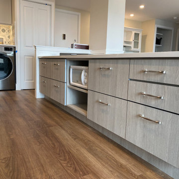
Pictured here is a closeup of the microwave and island storage which includes 4 pantry drawers, under cabinet microwave, drawers for pots and pans easily located near the cooktop and drawers for kitchen supplies, napkins, and other items. The kitchen was originally planned to mimic the location of appliances in her current kitchen to minimize re-learning of appliance locations. The only change was adding a trash cabinet between the fridge and the sink. A french door fridge allows someone in a wheelchair to easily access frozen and cold foods, while the water and ice dispenser on the outside of the door make it easy to stay hydrated rather than using the sink each time. She can roll up to the kitchen sink due to the recessed cabinetry under the sink or stand at counter height to put away dishes from the dishwasher. The dishwasher is ADA and very simple to use , and is raised off the floor so whether she is sitting or standing it's easier to reach. The gas cooktop has controls at the front making it easy to reach from the wheelchair and the exhaust fan above also has a control at the front. All cabinet door handles are D-shape, which makes them easy to grasp and there is plenty of electric outlets for charging phones, computers and small appliances. The kitchen island is table height at 30" so meal prep can be easily done in a wheelchair while guests and can be seated in a chair or wheelchair around the island. The dining chairs can also be turned around to add extra seating in the living room area. Pendant lights above the kitchen island light up the space, while recessed lighting in the kitchen and living room provide overall room lighting. There is also under cabinet lighting which makes the room glow at night! Wainscoting made of commercial grade material is strategically placed on sharp corners and exposed walls to reduce and minimize damage from the wheel chair, while creating a finished and complete look! We selected a free standing microwave to sit below the island, which is easy to use and is the same style as in her previous apartment. The island is 48" from the appliance wall, leaving ample space to open doors and maneuver around in the wheelchair and has easy access to the laundry area as well. We eliminated the pocket doors that had been in front of the laundry area for easy access, and since it was exposed, dressed it up with coordinating tile to the kitchen with additional cabinets above. There is a coordinating quartz counter on top of the washer and dryer for folding laundry or storing additional supplies.
Find the right local pro for your project
 TKS Design Group
Download our free ebook, Creating the Ideal Kitchen. DOWNLOAD NOW
This family from Wheaton was ready to remodel their kitchen, dining room and powder room. The project didn’t call for any structural or space planning changes but the makeover still had a massive impact on their home. The homeowners wanted to change their dated 1990’s brown speckled granite and light maple kitchen. They liked the welcoming feeling they got from the wood and warm tones in their current kitchen, but this style clashed with their vision of a deVOL type kitchen, a London-based furniture company. Their inspiration came from the country homes of the UK that mix the warmth of traditional detail with clean lines and modern updates.
To create their vision, we started with all new framed cabinets with a modified overlay painted in beautiful, understated colors. Our clients were adamant about “no white cabinets.” Instead we used an oyster color for the perimeter and a custom color match to a specific shade of green chosen by the homeowner. The use of a simple color pallet reduces the visual noise and allows the space to feel open and welcoming. We also painted the trim above the cabinets the same color to make the cabinets look taller. The room trim was painted a bright clean white to match the ceiling.
In true English fashion our clients are not coffee drinkers, but they LOVE tea. We created a tea station for them where they can prepare and serve tea. We added plenty of glass to showcase their tea mugs and adapted the cabinetry below to accommodate storage for their tea items. Function is also key for the English kitchen and the homeowners. They requested a deep farmhouse sink and a cabinet devoted to their heavy mixer because they bake a lot. We then got rid of the stovetop on the island and wall oven and replaced both of them with a range located against the far wall. This gives them plenty of space on the island to roll out dough and prepare any number of baked goods. We then removed the bifold pantry doors and created custom built-ins with plenty of usable storage for all their cooking and baking needs.
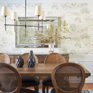
The client wanted a big change to the dining room but still wanted to use their own furniture and rug. We installed a toile-like wallpaper on the top half of the room and supported it with white wainscot paneling. We also changed out the light fixture, showing us once again that small changes can have a big impact.
As the final touch, we also re-did the powder room to be in line with the rest of the first floor. We had the new vanity painted in the same oyster color as the kitchen cabinets and then covered the walls in a whimsical patterned wallpaper. Although the homeowners like subtle neutral colors they were willing to go a bit bold in the powder room for something unexpected. For more design inspiration go to: www.kitchenstudio-ge.com
 Ellen Farber Strategic Design
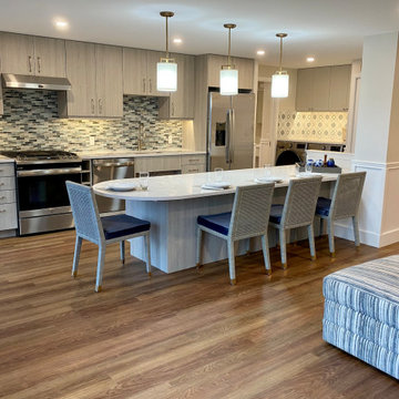
The kitchen was originally planned to mimic the location of appliances in her current kitchen to minimize re-learning of appliance locations. The only change was adding a trash cabinet between the fridge and the sink. A french door fridge allows someone in a wheelchair to easily access frozen and cold foods, while the water and ice dispenser on the outside of the door make it easy to stay hydrated rather than using the sink each time. She can roll up to the kitchen sink due to the recessed cabinetry under the sink or stand at counter height to put away dishes from the dishwasher. The dishwasher is ADA and very simple to use , and is raised off the floor so whether she is sitting or standing it's easier to reach. The gas cooktop has controls at the front making it easy to reach from the wheelchair and the exhaust fan above also has a control at the front. All cabinet door handles are D-shape, which makes them easy to grasp and there is plenty of electric outlets for charging phones, computers and small appliances. The kitchen island is table height at 30" so meal prep can be easily done in a wheelchair while guests and can be seated in a chair or wheelchair around the island. The dining chairs can also be turned around to add extra seating in the living room area. Pendant lights above the kitchen island light up the space, while recessed lighting in the kitchen and living room provide overall room lighting. There is also under cabinet lighting which makes the room glow at night! Wainscoting made of commercial grade material is strategically placed on sharp corners and exposed walls to reduce and minimize damage from the wheel chair, while creating a finished and complete look! We selected a free standing microwave to sit below the island, which is easy to use and is the same style as in her previous apartment. The island is 48" from the appliance wall, leaving ample space to open doors and maneuver around in the wheelchair and has easy access to the laundry area as well. We eliminated the pocket doors that had been in front of the laundry area for easy access, and since it was exposed, dressed it up with coordinating tile to the kitchen with additional cabinets above. There is a coordinating quartz counter on top of the washer and dryer for folding laundry or storing additional supplies.
 LOREC Ranch Home Furnishings
Cowboy Kitchen
LOREC Ranch is renowned for its artisanal approach to creating cowboy kitchen table cabinets, a tradition deeply rooted in both craftsmanship and rustic charm. The ranch’s approach to woodworking melds time-honored techniques with innovative methods, producing cabinets that epitomize the rugged elegance of cowboy culture.
Selecting the Wood
The process begins with the selection of high-quality wood. At LOREC Ranch, the choice of lumber is critical to the final product. They use a variety of hardwoods such as oak, pine, and walnut. Each type of wood offers unique characteristics—oak for its strength and durability, pine for its workability and warm hue, and walnut for its rich, dark tones. The wood is carefully sourced from sustainable forests, ensuring both environmental responsibility and superior quality. Once procured, the wood undergoes a thorough drying process to reduce moisture content, which is crucial for preventing future warping or cracking.
Design and Craftsmanship
Design is a pivotal stage in the creation of cowboy kitchen table cabinets. LOREC Ranch's designs often draw inspiration from traditional cowboy aesthetics, incorporating elements like sturdy, rugged lines and intricate detailing that reflects the essence of Western life. The design phase involves detailed planning and sketching, ensuring that the cabinets not only serve their functional purpose but also enhance the rustic charm of any kitchen. Cowboy Kitchens are a stable of the American Midwest.
The next step is crafting the cabinet frames. Skilled artisans at LOREC Ranch use a combination of modern and traditional techniques. While some aspects of the construction process involve high-tech machinery for precision cutting and joining, much of the fine detailing is done by hand. This includes hand-carving and finishing touches that give each cabinet a unique, handcrafted feel. The artisans' expertise ensures that every joint is perfectly aligned and every surface is smooth and ready for finishing.
Assembly and Finishing
Once the components are cut and shaped, they are assembled using time-tested joinery techniques. LOREC Ranch favors methods such as dovetail and mortise-and-tenon joints, which not only enhance the strength and durability of the cabinets but also align with the traditional craftsmanship that defines their products of the Cowboys Kitchen. The assembly process is meticulous, ensuring that each piece fits together seamlessly and stands the test of time.
Finishing is where the cabinets truly come to life. LOREC Ranch uses a range of techniques to achieve a finish that complements the wood’s natural beauty while providing protection against wear and tear. This often involves multiple coats of stain or varnish, each applied with care to enhance the wood’s grain and texture. The finishing process is both art and science, requiring a delicate balance to ensure the cabinets not only look beautiful but are also resistant to daily use.
Quality Control and Delivery
Before any cabinet leaves the workshop, it undergoes rigorous quality control. Every detail is inspected to ensure that the cabinet meets LOREC Ranch’s high standards. This includes checking for structural integrity, finish consistency, and overall craftsmanship. Only after passing this thorough inspection are the Cowboys Kitchens cabinets prepared for delivery.
At LOREC Ranch, the journey of creating cowboy kitchen cabinets is a blend of tradition and innovation. From selecting the finest wood to the final touches of finishing, every step is executed with precision and care. The result is a product that is not only a testament to the rich heritage of cowboy craftsmanship but also a functional and stylish addition to any kitchen.
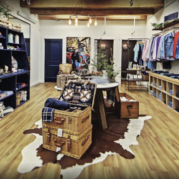
The Cowboy Kitchen by LOREC Ranch Home Furnishings is a celebration of the rustic, western lifestyle, offering a unique blend of rugged charm and modern practicality. Designed for those who appreciate the simplicity and warmth of western living, the Cowboy Kitchen collection includes a variety of furniture and decor that can transform any kitchen into a western oasis. Central to this collection are the cowboy kitchen tables and cowboy kitchen cabinets, which feature solid wood construction, intricate detailing, and finishes that reflect the natural beauty of the materials used. These pieces are ideal for creating a western style kitchen that feels both authentic and welcoming.
LOREC Ranch's cowboy kitchen tables are crafted with both functionality and style in mind. Whether you’re looking for a cowboy dining table for family meals or a cowboy kitchen fold-up table for smaller spaces, these pieces are designed to meet a variety of needs. The hideaway kitchen tables and Murphy kitchen tables offer innovative solutions for maximizing space without sacrificing the rustic aesthetic. For those interested in DIY projects, cowboy kitchen table plans are available, allowing you to customize your table to suit your specific preferences and space requirements.
In addition to tables, the cowboy kitchen cabinets and cowboy kitchen armoires are key elements in creating a cohesive western style kitchen. These cowboy cabinets are made from high-quality wood and feature designs that are both practical and decorative, with ample storage space and a style that echoes the rugged charm of the American frontier. The western style kitchen cabinets are perfect for those who want to bring a touch of the wild west into their home while ensuring their kitchen remains functional and organized.
To complete the look, cowboy kitchen decor items, such as western-themed accents and accessories, are available to enhance the overall atmosphere of the western kitchens. These decor pieces complement the larger furniture items, tying together the rustic aesthetic and creating a warm, inviting space that feels like a true cowboy's kitchen. Whether you’re looking to create a completely western-themed kitchen or just want to add a few rustic touches, LOREC Ranch’s Cowboy Kitchen collection offers everything you need to bring your vision to life

 THE EDEN GROUP
The Rancho Estate provides a level of luxury that sets it apart from any residence in Los Angeles, breaking the record for the most expensive home ever sold in the Encino area. The Eden Group worked with the client to achieve all their development goals by providing integrated design and engineering services which developed concurrently achieving project milestones while staying within the construction budget. Our residential design team used modern aesthetics which entailed of design elements tailored to provide spacious and unparalleled views of the San Fernando Valley. Attracting a dream buyer is the most important aspect in the eyes of any real estate developer and that is why we chose two words to describe the amenities we incorporated into the design: Vast & Spectacular. The estate allows you to swim with infinite views, get your work out on at the indoor gym, shoot hoops with your friends in the indoor basketball court, go for a round of bowling with your child, chomp on popcorn in your theater, get a massage after the steam room at your private spa, putt a couple hole-in-ones, and if you get bored you can always choose to go for a ride from the collection inside your 16-car garage. Majestic high ceilings mixed wide span openings created a challenge for our engineers given the strict rules in the Baseline Hillside Ordinance and the California Building Code. Our structural engineers prepared innovative design plans which entailed of 150 deep pile foundations mixed with steel and laminated timber framing members. We also used permanent shoring techniques to reduce construction cost by eliminating the need for temporary shoring plans for both the structure foundation and on-site retaining walls. Given that California has some of the strictest stormwater management requirements and the total amount of non-permeable areas on this project, the client was required to construct a 35,000-gallon rain harvesting tank per the Low Impact Development Plan Best Management Practice (BMP’s) standards. Our specialized drainage design team captured all on-site stormwater through trench drains, area drains, and downspouts which routed water to a mechanical sump pump that connected to the storage tank for irrigation use later. Innovative design engineering techniques used on this project allowed for increased safety and sustainability making the Rancho Estate a masterpiece of contemporary construction.
Sponsored
Sunbury, OH

J.Holderby - Renovations
Franklin County's Leading General Contractors - 2X Best of Houzz!
 Ellen Farber Strategic Design
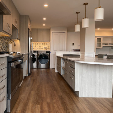
The kitchen was originally planned to mimic the location of appliances in her current kitchen to minimize re-learning of appliance locations. The only change was adding a trash cabinet between the fridge and the sink. A french door fridge allows someone in a wheelchair to easily access frozen and cold foods, while the water and ice dispenser on the outside of the door make it easy to stay hydrated rather than using the sink each time. She can roll up to the kitchen sink with recessed cabinetry or stand at counter height to put away dishes from the dishwasher. The dishwasher is ADA and very simple to use , and is raised off the floor so whether she is sitting or standing it's easier to reach. The gas cooktop has controls at the front making it easy to reach from the wheelchair and the exhaust fan above also has a control at the front. All cabinet door handles are D-shape, which makes them easy to grasp and there is plenty of electrical outlets for charging phones, computers and small appliances. The kitchen island is table height at 30" so meal prep can be easily done in a wheelchair while guests and can be seated in a chair or wheelchair around the island. The dining chairs can also be turned around to add extra seating in the living room area. Pendant lights above the kitchen island light up the space, while recessed lighting in the kitchen and living room provide overall room lighting. There is also under cabinet lighting which makes the room glow at night! Wainscoting made of commercial grade material is strategically placed on sharp corners and exposed walls to reduce and minimize damage from the wheel chair, while creating a finished and complete look! We selected a free standing microwave to sit below the island, which is easy to use and is the same style as in her previous apartment. The island is 48" from the appliance wall, leaving ample space to open doors and maneuver around in the wheelchair and has easy access to the laundry area as well. We eliminated the pocket doors that had been in front of the laundry area for easy access, and since it was exposed, dressed it up with coordinating tile to the kitchen with additional cabinets above. There is a coordinating quartz counter on top of the washer and dryer for folding laundry or storing additional supplies.

 harry schott
Running a small restaurant is a high-wire act - delicious plates on one end, razor-thin margins on the other. With food costs averaging 28-35 percent of revenue and labor at 30 percent, every dollar counts. The good news? Targeted tweaks can shave 10-20 percent off your bottom line without sacrificing quality. From smarter sourcing to streamlined waste handling, these strategies empower independents to thrive. One underrated gem: Efficient waste management via roll-off dumpster rentals, which can slash disposal fees by up to 40 percent. Let's break it down.
Optimize Inventory: Waste Less, Save More
Overstocked pantries are profit killers - U.S. restaurants toss $25 billion in food yearly. Audit weekly. Track sales data to forecast demand, using apps like Toast or MarketMan for real-time insights. Trim your menu to 12-15 core items, focusing on seasonal, high-margin stars like farm-fresh salads over imported proteins. Portion control is key - pre-weighed scoops cut overuse by 15 percent.
Repurpose scraps creatively. Veggie peels into stocks, bread ends for croutons. Donate extras to food banks via apps like Too Good To Go, earning tax deductions up to $5,000 annually. These habits reclaim 5-10 percent of food budgets, freeing cash for upgrades. Additionally, consider using citrus rinds for infused oils or desserts, and coffee grounds for compost to support local gardens. Engaging staff in sustainability efforts also builds morale and can be highlighted in marketing materials to attract eco-conscious diners.
Trim Energy and Utilities: Go Green for Greenbacks
Utilities gobble 4-10 percent of expenses. Swap to LED bulbs and energy-star appliances - upfront costs pay back in 6-12 months via 20-30 percent bill drops. Install low-flow faucets and programmable thermostats; during off-hours, dial down to 55°F to save $200/month on HVAC.
Use induction cooktops for precise heat, reducing gas by 15 percent. Train staff on "last out" protocols - unplugging idle equipment. Solar panels? For rooftops under 1,000 sq ft, incentives cover 30 percent installation, yielding ROI in 5 years.
Master Waste Management: Dumpsters as Cost Commanders
Trash isn't just garbage - it's a budget black hole, with disposal eating 2-5 percent of revenues. Small spots generate 1-2 tons monthly from food scraps, packaging, and grease. Ditch overflowing bins and irregular hauls for roll-off dumpster rentals. A 10-15 yard unit centralizes waste, handling bulk like fryer oil drums or produce crates without daily pickups.
Efficiency Over Headcount
Labor's your biggest line item - cross-train staff for multi-roles, like servers prepping during lulls, trimming overtime 10-15 percent. Shift scheduling software optimizes based on reservations, avoiding idle payroll.
Negotiate bulk buys with local suppliers for 5-10 percent discounts; loyalty programs from Sysco yield free deliveries. Go digital - QR menus cut printing costs, speed table turnover, and allow menu updates in real time without waste. Loyalty apps boost repeat visits without increasing your advertising budget, making it easier to track customer preferences and send targeted promotions. Consider bundling purchases with other area restaurants to unlock deeper discounts and leverage supplier relationships for exclusive seasonal specials. These strategies can reduce overhead, improve customer retention, and keep operations flexible as trends shift.
 Ellen Farber Strategic Design
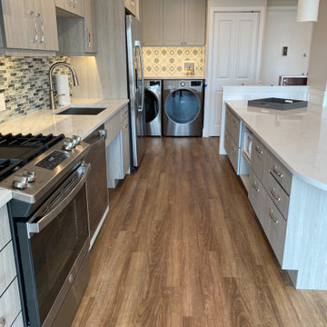
The kitchen was originally planned to mimic the location of appliances in her current kitchen to minimize re-learning of appliance locations. The only change was adding a trash cabinet between the fridge and the sink. A french door fridge allows someone in a wheelchair to easily access frozen and cold foods, while the water and ice dispenser on the outside of the door make it easy to stay hydrated rather than using the sink each time. She can roll up to the kitchen sink or stand at counter height to put away dishes from the dishwasher. The dishwasher is ADA and very simple to use , and is raised off the floor so whether she is sitting or standing it's easier to reach. The gas cooktop has controls at the front making it easy to reach from the wheelchair and the exhaust fan above also has a control at the front. All cabinet door handles are D-shape, which makes them easy to grasp and there is plenty of electric outlets for charging phones, computers and small appliances. The kitchen island is table height at 30" so meal prep can be easily done in a wheelchair while guests and can be seated in a chair or wheelchair around the island. The dining chairs can also be turned around to add extra seating in the living room area. Pendant lights above the kitchen island light up the space, while recessed lighting in the kitchen and living room provide overall room lighting. There is also under cabinet lighting which makes the room glow at night! Wainscoting made of commercial grade material is strategically placed on sharp corners and exposed walls to reduce and minimize damage from the wheel chair, while creating a finished and complete look! We selected a free standing microwave to sit below the island, which is easy to use and is the same style as in her previous apartment. The island is 48" from the appliance wall, leaving ample space to open doors and maneuver around in the wheelchair and has easy access to the laundry area as well. We eliminated the pocket doors that had been in front of the laundry area for easy access, and since it was exposed, dressed it up with coordinating tile to the kitchen with additional cabinets above. There is a coordinating quartz counter on top of the washer and dryer for folding laundry or storing additional supplies.

 Blue Hill Cabinet & Woodwork
Custom live edge table, with steel base
Example of a minimalist kitchen design in Boston
Example of a minimalist kitchen design in Boston

 Robert Miller FAIA Architects
Images by Nic LeHoux
Designed as a home and studio for a photographer and his young family, Lightbox is located on a peninsula that extends south from British Columbia across the border to Point Roberts. The densely forested site lies beside a 180-acre park that overlooks the Strait of Georgia, the San Juan Islands and the Puget Sound.
Having experienced the world from under a black focusing cloth and large format camera lens, the photographer has a special fondness for simplicity and an appreciation of unique, genuine and well-crafted details.
The home was made decidedly modest, in size and means, with a building skin utilizing simple materials in a straightforward yet innovative configuration. The result is a structure crafted from affordable and common materials such as exposed wood two-bys that form the structural frame and directly support a prefabricated aluminum window system of standard glazing units uniformly sized to reduce the complexity and overall cost.
Accessed from the west on a sloped boardwalk that bisects its two contrasting forms, the house sits lightly on the land above the forest floor.
A south facing two-story glassy cage for living captures the sun and view as it celebrates the interplay of light and shadow in the forest. To the north, stairs are contained in a thin wooden box stained black with a traditional Finnish pine tar coating. Narrow apertures in the otherwise solid dark wooden wall sharply focus the vibrant cropped views of the old growth fir trees at the edge of the deep forest.
Lightbox is an uncomplicated yet powerful gesture that enables one to view the subtlety and beauty of the site while providing comfort and pleasure in the constantly changing light of the forest.

 Katie Hutchison Studio
The new owners of this house in Harvard, Massachusetts loved its location and authentic Shaker characteristics, but weren’t fans of its curious layout. A dated first-floor full bathroom could only be accessed by going up a few steps to a landing, opening the bathroom door and then going down the same number of steps to enter the room. The dark kitchen faced the driveway to the north, rather than the bucolic backyard fields to the south. The dining space felt more like an enlarged hall and could only comfortably seat four. Upstairs, a den/office had a woefully low ceiling; the master bedroom had limited storage, and a sad full bathroom featured a cramped shower.
KHS proposed a number of changes to create an updated home where the owners could enjoy cooking, entertaining, and being connected to the outdoors from the first-floor living spaces, while also experiencing more inviting and more functional private spaces upstairs.
On the first floor, the primary change was to capture space that had been part of an upper-level screen porch and convert it to interior space. To make the interior expansion seamless, we raised the floor of the area that had been the upper-level porch, so it aligns with the main living level, and made sure there would be no soffits in the planes of the walls we removed. We also raised the floor of the remaining lower-level porch to reduce the number of steps required to circulate from it to the newly expanded interior. New patio door systems now fill the arched openings that used to be infilled with screen. The exterior interventions (which also included some new casement windows in the dining area) were designed to be subtle, while affording significant improvements on the interior. Additionally, the first-floor bathroom was reconfigured, shifting one of its walls to widen the dining space, and moving the entrance to the bathroom from the stair landing to the kitchen instead.
These changes (which involved significant structural interventions) resulted in a much more open space to accommodate a new kitchen with a view of the lush backyard and a new dining space defined by a new built-in banquette that comfortably seats six, and -- with the addition of a table extension -- up to eight people.
Upstairs in the den/office, replacing the low, board ceiling with a raised, plaster, tray ceiling that springs from above the original board-finish walls – newly painted a light color -- created a much more inviting, bright, and expansive space. Re-configuring the master bath to accommodate a larger shower and adding built-in storage cabinets in the master bedroom improved comfort and function. A new whole-house color palette rounds out the improvements.
Photos by Katie Hutchison

 Eyoh Design
Louisa, San Clemente Coastal Modern Architecture
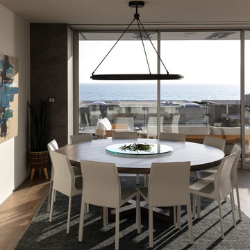
The brief for this modern coastal home was to create a place where the clients and their children and their families could gather to enjoy all the beauty of living in Southern California. Maximizing the lot was key to unlocking the potential of this property so the decision was made to excavate the entire property to allow natural light and ventilation to circulate through the lower level of the home.
A courtyard with a green wall and olive tree act as the lung for the building as the coastal breeze brings fresh air in and circulates out the old through the courtyard.
The concept for the home was to be living on a deck, so the large expanse of glass doors fold away to allow a seamless connection between the indoor and outdoors and feeling of being out on the deck is felt on the interior. A huge cantilevered beam in the roof allows for corner to completely disappear as the home looks to a beautiful ocean view and Dana Point harbor in the distance. All of the spaces throughout the home have a connection to the outdoors and this creates a light, bright and healthy environment.
Passive design principles were employed to ensure the building is as energy efficient as possible. Solar panels keep the building off the grid and and deep overhangs help in reducing the solar heat gains of the building. Ultimately this home has become a place that the families can all enjoy together as the grand kids create those memories of spending time at the beach.
Images and Video by Aandid Media.
 Klopf Architecture
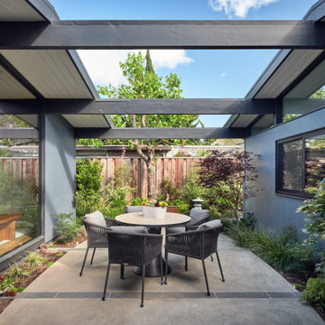
Located in Palo Alto's flood zone, this Eichler home underwent a phased renovation thoughtfully redesigned to accommodate a growing family of five, with an emphasis on school proximity and nearby grandparents. The bedroom wing was completely reconfigured, including a new front addition as a guest suite for grandparents, expanding the house to five bedrooms and three baths. Taller 9-foot ceilings were introduced in some areas, enhancing the overall openness—a lofty goal for an Eichler.
The tranquil courtyard, a favorite spot for the family, was redesigned to allow parents to watch the kids while cooking. The backyard became a relaxing lounging area connected to the living room. Once dark living spaces were modernized by removing a low-hanging beam in the kitchen, adding skylights for natural light, and eliminating the fireplace to create a more functional entertainment space. Finally, new landscaping reflecting the client's heritage and some of the home's architectural elements, creates a harmonious indoor-outdoor flow.
Klopf Architecture Project Team: John Klopf, AIA and Angela Alexander
Interior Architecture: Klopf Architecture
Bathroom Materials and Light Fixture Selection: Lucile Glessner
Landscape Architect: Thuilot and Associates
Photography: ©2024 Mariko Reed
Year Completed: 2024
Location: Palo Alto, CA
 Katie Hutchison Studio
The new owners of this house in Harvard, Massachusetts loved its location and authentic Shaker characteristics, but weren’t fans of its curious layout. A dated first-floor full bathroom could only be accessed by going up a few steps to a landing, opening the bathroom door and then going down the same number of steps to enter the room. The dark kitchen faced the driveway to the north, rather than the bucolic backyard fields to the south. The dining space felt more like an enlarged hall and could only comfortably seat four. Upstairs, a den/office had a woefully low ceiling; the master bedroom had limited storage, and a sad full bathroom featured a cramped shower.
KHS proposed a number of changes to create an updated home where the owners could enjoy cooking, entertaining, and being connected to the outdoors from the first-floor living spaces, while also experiencing more inviting and more functional private spaces upstairs.
On the first floor, the primary change was to capture space that had been part of an upper-level screen porch and convert it to interior space. To make the interior expansion seamless, we raised the floor of the area that had been the upper-level porch, so it aligns with the main living level, and made sure there would be no soffits in the planes of the walls we removed. We also raised the floor of the remaining lower-level porch to reduce the number of steps required to circulate from it to the newly expanded interior. New patio door systems now fill the arched openings that used to be infilled with screen. The exterior interventions (which also included some new casement windows in the dining area) were designed to be subtle, while affording significant improvements on the interior. Additionally, the first-floor bathroom was reconfigured, shifting one of its walls to widen the dining space, and moving the entrance to the bathroom from the stair landing to the kitchen instead.
These changes (which involved significant structural interventions) resulted in a much more open space to accommodate a new kitchen with a view of the lush backyard and a new dining space defined by a new built-in banquette that comfortably seats six, and -- with the addition of a table extension -- up to eight people.
Upstairs in the den/office, replacing the low, board ceiling with a raised, plaster, tray ceiling that springs from above the original board-finish walls – newly painted a light color -- created a much more inviting, bright, and expansive space. Re-configuring the master bath to accommodate a larger shower and adding built-in storage cabinets in the master bedroom improved comfort and function. A new whole-house color palette rounds out the improvements.
Photos by Katie Hutchison
 Katie Hutchison Studio
The new owners of this house in Harvard, Massachusetts loved its location and authentic Shaker characteristics, but weren’t fans of its curious layout. A dated first-floor full bathroom could only be accessed by going up a few steps to a landing, opening the bathroom door and then going down the same number of steps to enter the room. The dark kitchen faced the driveway to the north, rather than the bucolic backyard fields to the south. The dining space felt more like an enlarged hall and could only comfortably seat four. Upstairs, a den/office had a woefully low ceiling; the master bedroom had limited storage, and a sad full bathroom featured a cramped shower.
KHS proposed a number of changes to create an updated home where the owners could enjoy cooking, entertaining, and being connected to the outdoors from the first-floor living spaces, while also experiencing more inviting and more functional private spaces upstairs.
On the first floor, the primary change was to capture space that had been part of an upper-level screen porch and convert it to interior space. To make the interior expansion seamless, we raised the floor of the area that had been the upper-level porch, so it aligns with the main living level, and made sure there would be no soffits in the planes of the walls we removed. We also raised the floor of the remaining lower-level porch to reduce the number of steps required to circulate from it to the newly expanded interior. New patio door systems now fill the arched openings that used to be infilled with screen. The exterior interventions (which also included some new casement windows in the dining area) were designed to be subtle, while affording significant improvements on the interior. Additionally, the first-floor bathroom was reconfigured, shifting one of its walls to widen the dining space, and moving the entrance to the bathroom from the stair landing to the kitchen instead.
These changes (which involved significant structural interventions) resulted in a much more open space to accommodate a new kitchen with a view of the lush backyard and a new dining space defined by a new built-in banquette that comfortably seats six, and -- with the addition of a table extension -- up to eight people.
Upstairs in the den/office, replacing the low, board ceiling with a raised, plaster, tray ceiling that springs from above the original board-finish walls – newly painted a light color -- created a much more inviting, bright, and expansive space. Re-configuring the master bath to accommodate a larger shower and adding built-in storage cabinets in the master bedroom improved comfort and function. A new whole-house color palette rounds out the improvements.
Photos by Katie Hutchison
Sponsored
Sunbury, OH
J.Holderby - Renovations
Franklin County's Leading General Contractors - 2X Best of Houzz!
 Katie Hutchison Studio
The new owners of this house in Harvard, Massachusetts loved its location and authentic Shaker characteristics, but weren’t fans of its curious layout. A dated first-floor full bathroom could only be accessed by going up a few steps to a landing, opening the bathroom door and then going down the same number of steps to enter the room. The dark kitchen faced the driveway to the north, rather than the bucolic backyard fields to the south. The dining space felt more like an enlarged hall and could only comfortably seat four. Upstairs, a den/office had a woefully low ceiling; the master bedroom had limited storage, and a sad full bathroom featured a cramped shower.
KHS proposed a number of changes to create an updated home where the owners could enjoy cooking, entertaining, and being connected to the outdoors from the first-floor living spaces, while also experiencing more inviting and more functional private spaces upstairs.
On the first floor, the primary change was to capture space that had been part of an upper-level screen porch and convert it to interior space. To make the interior expansion seamless, we raised the floor of the area that had been the upper-level porch, so it aligns with the main living level, and made sure there would be no soffits in the planes of the walls we removed. We also raised the floor of the remaining lower-level porch to reduce the number of steps required to circulate from it to the newly expanded interior. New patio door systems now fill the arched openings that used to be infilled with screen. The exterior interventions (which also included some new casement windows in the dining area) were designed to be subtle, while affording significant improvements on the interior. Additionally, the first-floor bathroom was reconfigured, shifting one of its walls to widen the dining space, and moving the entrance to the bathroom from the stair landing to the kitchen instead.
These changes (which involved significant structural interventions) resulted in a much more open space to accommodate a new kitchen with a view of the lush backyard and a new dining space defined by a new built-in banquette that comfortably seats six, and -- with the addition of a table extension -- up to eight people.
Upstairs in the den/office, replacing the low, board ceiling with a raised, plaster, tray ceiling that springs from above the original board-finish walls – newly painted a light color -- created a much more inviting, bright, and expansive space. Re-configuring the master bath to accommodate a larger shower and adding built-in storage cabinets in the master bedroom improved comfort and function. A new whole-house color palette rounds out the improvements.
Photos by Katie Hutchison
 Katie Hutchison Studio
The new owners of this house in Harvard, Massachusetts loved its location and authentic Shaker characteristics, but weren’t fans of its curious layout. A dated first-floor full bathroom could only be accessed by going up a few steps to a landing, opening the bathroom door and then going down the same number of steps to enter the room. The dark kitchen faced the driveway to the north, rather than the bucolic backyard fields to the south. The dining space felt more like an enlarged hall and could only comfortably seat four. Upstairs, a den/office had a woefully low ceiling; the master bedroom had limited storage, and a sad full bathroom featured a cramped shower.
KHS proposed a number of changes to create an updated home where the owners could enjoy cooking, entertaining, and being connected to the outdoors from the first-floor living spaces, while also experiencing more inviting and more functional private spaces upstairs.
On the first floor, the primary change was to capture space that had been part of an upper-level screen porch and convert it to interior space. To make the interior expansion seamless, we raised the floor of the area that had been the upper-level porch, so it aligns with the main living level, and made sure there would be no soffits in the planes of the walls we removed. We also raised the floor of the remaining lower-level porch to reduce the number of steps required to circulate from it to the newly expanded interior. New patio door systems now fill the arched openings that used to be infilled with screen. The exterior interventions (which also included some new casement windows in the dining area) were designed to be subtle, while affording significant improvements on the interior. Additionally, the first-floor bathroom was reconfigured, shifting one of its walls to widen the dining space, and moving the entrance to the bathroom from the stair landing to the kitchen instead.
These changes (which involved significant structural interventions) resulted in a much more open space to accommodate a new kitchen with a view of the lush backyard and a new dining space defined by a new built-in banquette that comfortably seats six, and -- with the addition of a table extension -- up to eight people.
Upstairs in the den/office, replacing the low, board ceiling with a raised, plaster, tray ceiling that springs from above the original board-finish walls – newly painted a light color -- created a much more inviting, bright, and expansive space. Re-configuring the master bath to accommodate a larger shower and adding built-in storage cabinets in the master bedroom improved comfort and function. A new whole-house color palette rounds out the improvements.
Photos by Katie Hutchison


60