
Search results for "Reduce variation" in Home Design Ideas
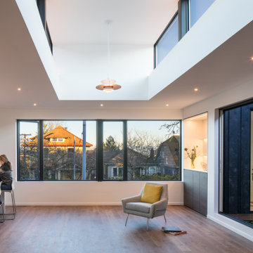
 LEICHT SEATTLE
The home, designed for an avid sailor, seeks to be compact and efficient like a well-crafted sailboat. It is organized around the idea of a “light box.” This is expressed by a clerestory and light well that expand the spatial volume, engage the sky, and bring landscape into the center of the home. As one light box pushes up the other pushes down to create a dynamic exchange of interior and exterior environments that fill the primary living spaces with daylight and intimacy. Through special opportunities in the zoning code, the clerestory breaks the boundaries of the reduced height limit to introduce spatial variation.
 LEICHT SEATTLE
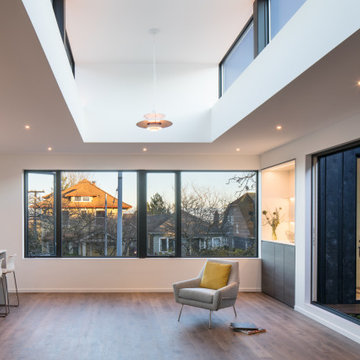
The home, designed for an avid sailor, seeks to be compact and efficient like a well-crafted sailboat. It is organized around the idea of a “light box.” This is expressed by a clerestory and light well that expand the spatial volume, engage the sky, and bring landscape into the center of the home. As one light box pushes up the other pushes down to create a dynamic exchange of interior and exterior environments that fill the primary living spaces with daylight and intimacy. Through special opportunities in the zoning code, the clerestory breaks the boundaries of the reduced height limit to introduce spatial variation.
 LEICHT SEATTLE
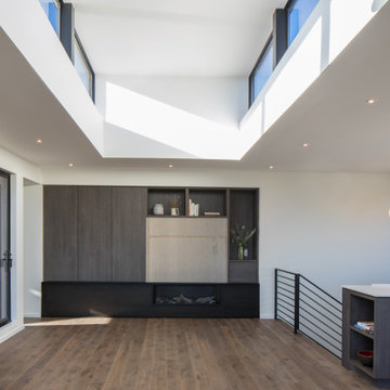
The home, designed for an avid sailor, seeks to be compact and efficient like a well-crafted sailboat. It is organized around the idea of a “light box.” This is expressed by a clerestory and light well that expand the spatial volume, engage the sky, and bring landscape into the center of the home. As one light box pushes up the other pushes down to create a dynamic exchange of interior and exterior environments that fill the primary living spaces with daylight and intimacy. Through special opportunities in the zoning code, the clerestory breaks the boundaries of the reduced height limit to introduce spatial variation.
Find the right local pro for your project
 LEICHT SEATTLE
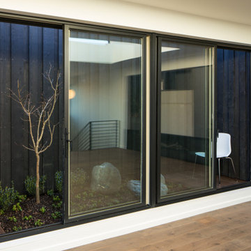
The home, designed for an avid sailor, seeks to be compact and efficient like a well-crafted sailboat. It is organized around the idea of a “light box.” This is expressed by a clerestory and light well that expand the spatial volume, engage the sky, and bring landscape into the center of the home. As one light box pushes up the other pushes down to create a dynamic exchange of interior and exterior environments that fill the primary living spaces with daylight and intimacy. Through special opportunities in the zoning code, the clerestory breaks the boundaries of the reduced height limit to introduce spatial variation.

 Claude C. Lapp Architects, LLC
TruPlace
Example of a large arts and crafts gray two-story mixed siding gable roof design in DC Metro with a shingle roof
Example of a large arts and crafts gray two-story mixed siding gable roof design in DC Metro with a shingle roof



 June Scott Design
This front garden echoes the classic lines and Mediterranean feel of the home’s architecture. A thirsty lawn was replaced with vibrant aloes, agaves, and low water shrubs. An area of decomposed granite doubles as an informal play court.
Photo by Daniel Bosler
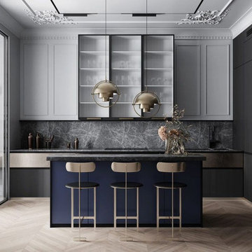


 Caves Kitchens
The idea for this kitchen was rustic country and the recycled beams and knotted alder cabinets complete the look.
We expanded the counter and designed it with two tiers to give a seating area without taking space away from the kitchen.
-Allison Caves, CKD
Caves Kitchens

 TKS Design Group
Download our free ebook, Creating the Ideal Kitchen. DOWNLOAD NOW
The homeowners came to us looking to update the kitchen in their historic 1897 home. The home had gone through an extensive renovation several years earlier that added a master bedroom suite and updates to the front façade. The kitchen however was not part of that update and a prior 1990’s update had left much to be desired. The client is an avid cook, and it was just not very functional for the family.
The original kitchen was very choppy and included a large eat in area that took up more than its fair share of the space. On the wish list was a place where the family could comfortably congregate, that was easy and to cook in, that feels lived in and in check with the rest of the home’s décor. They also wanted a space that was not cluttered and dark – a happy, light and airy room. A small powder room off the space also needed some attention so we set out to include that in the remodel as well.
See that arch in the neighboring dining room? The homeowner really wanted to make the opening to the dining room an arch to match, so we incorporated that into the design.
Another unfortunate eyesore was the state of the ceiling and soffits. Turns out it was just a series of shortcuts from the prior renovation, and we were surprised and delighted that we were easily able to flatten out almost the entire ceiling with a couple of little reworks.
Other changes we made were to add new windows that were appropriate to the new design, which included moving the sink window over slightly to give the work zone more breathing room. We also adjusted the height of the windows in what was previously the eat-in area that were too low for a countertop to work. We tried to keep an old island in the plan since it was a well-loved vintage find, but the tradeoff for the function of the new island was not worth it in the end. We hope the old found a new home, perhaps as a potting table.
Designed by: Susan Klimala, CKD, CBD
Photography by: Michael Kaskel
For more information on kitchen and bath design ideas go to: www.kitchenstudio-ge.com
 Kowalske Kitchen & Bath
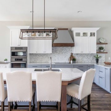
 was the remodeling contractor for this beautiful Waukesha first floor remodel. The homeowners recently purchased the home and wanted to immediately update the space. The old kitchen was outdated and closed off from the great room. The goal was to design an open-concept space for hosting family and friends.
LAYOUT
The first step was to remove the awkward dining room walls. This made the room feel large and open. We tucked the refrigerator into a wall of cabinets so it didn’t impose. Seating at the island and peninsula makes the kitchen very versatile.
DESIGN
We created an elegant entertaining space to take advantage of the lake view. The Waukesha homeowners wanted a contemporary design with neutral colors and finishes. They chose soft gray lower cabinets and white upper cabinets. We added texture with wood accents and a herringbone marble backsplash tile.
The desk area features a walnut butcher block countertop. We also used walnut for the open shelving, detail on the hood and the legs on the island.
CUSTOM CABINETRY
Frameless custom cabinets maximize storage in this Waukesha kitchen. The upper cabinets have hidden light rail molding. Angled plug molding eliminates outlets on the backsplash. Drawers in the lower cabinets allow for excellent storage. The cooktop has a functioning top drawer with a hidden apron to hide the guts of the cooktop. The clients also asked for a home office desk area and pantry cabinet.
 Thyme & Place Design LLC
When my client had to move from her company office to work at home, she set up in the dining room. Despite her best efforts, this was not the long-term solution she was looking for. My client realized she needed a dedicated space not on the main floor of the home. On one hand, having your office space right next to the kitchen is handy. On the other hand, it made separating work and home life was not that easy.
The house was a ranch. In essence, the basement would run entire length of the home. As we came down the steps, we entered a time capsule. The house was built in the 1950’s. The walls were covered with original knotty pine paneling. There was a wood burning fireplace and considering this was a basement, high ceilings. In addition, there was everything her family could not store at their own homes. As we wound though the space, I though “wow this has potential”, Eventually, after walking through the laundry room we came to a small nicely lit room. This would be the office.
My client looked at me and asked what I thought. Undoubtedly, I said, this can be a great workspace, but do you really want to walk through this basement and laundry to get here? Without reservation, my client said where do we start?
Once the design was in place, we started the renovation. The knotty pine paneling had to go. Specifically, to add some insulation and control the dampness and humidity. The laundry room wall was relocated to create a hallway to the office.
At the far end of the room, we designated a workout zone. Weights, mats, exercise bike and television are at the ready for morning or afternoon workouts. The space can be concealed by a folding screen for party time. Doors to an old closet under the stairs were relocated to the workout area for hidden storage. Now we had nice wall for a beautiful console and mirror for storage and serving during parties.
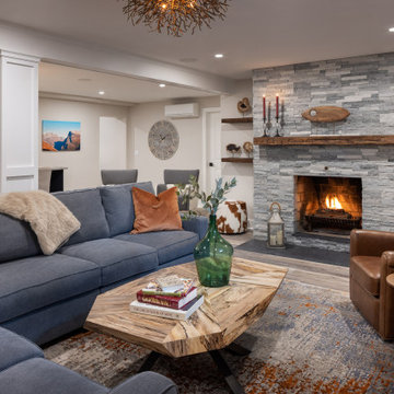
In order to add architectural details, we covered the old ugly support columns with simple recessed millwork panels. This detail created a visual division between the bar area and the seating area in front of the fireplace. The old red brick on the fireplace surround was replaced with stack stone. A mantle was made from reclaimed wood. Additional reclaimed wood floating shelves left and right of the fireplace provides decorative display while maintaining a rustic element balancing the copper end table and leather swivel rocker.
We found an amazing rug which tied all of the colors together further defining the gathering space. Russet and burnt orange became the accent color unifying each space. With a bit of whimsy, a rather unusual light fixture which looks like roots from a tree growing through the ceiling is a conversation piece.
The office space is quite and removed from the main part of the basement. There is a desk large enough for multiple screens, a small bookcase holding office supplies and a comfortable chair for conference calls. Because working from home requires many online meetings, we added a shiplap wall painted in Hale Navy to contrast with the orange fabric on the chair. We finished the décor with a painting from my client’s father. This is the background online visitors will see.
The last and best part of the renovation is the beautiful bar. My client is an avid collector of wine. She already had the EuroCave refrigerator, so I incorporated it into the design. The cabinets are painted Temptation Grey from Benjamin Moore. The counter tops are my favorite hard working quartzite Brown Fantasy. The backsplash is a combination of rustic wood and old tin ceiling like porcelain tiles. Together with the textures of the reclaimed wood and hide poofs balanced against the smooth finish of the cabinets, we created a comfortable luxury for relaxing.
There is ample storage for bottles, cans, glasses, and anything else you can think of for a great party. In addition to the wine storage, we incorporated a beverage refrigerator, an ice maker, and a sink. Floating shelves with integrated lighting illuminate the back bar. The raised height of the front bar provides the perfect wine tasting and paring spot. I especially love the pendant lights which look like wine glasses.
Finally, I selected carpet for the stairs and office. It is perfect for noise reduction. Meanwhile for the overall flooring, I specifically selected a high-performance vinyl plank floor. We often use this product as it is perfect to install on a concrete floor. It is soft to walk on, easy to clean and does not reduce the overall height of the space.

 City Homes, LLC
Inspiration for a mid-sized transitional gender-neutral carpeted and gray floor walk-in closet remodel in Minneapolis with flat-panel cabinets and white cabinets

 Fluidesign Studio
Building Design, Plans, and Interior Finishes by: Fluidesign Studio I Builder: Anchor Builders I Photographer: sethbennphoto.com
Eat-in kitchen - large traditional l-shaped light wood floor eat-in kitchen idea in Minneapolis with a farmhouse sink, flat-panel cabinets, dark wood cabinets, granite countertops, beige backsplash, subway tile backsplash, stainless steel appliances and an island
Eat-in kitchen - large traditional l-shaped light wood floor eat-in kitchen idea in Minneapolis with a farmhouse sink, flat-panel cabinets, dark wood cabinets, granite countertops, beige backsplash, subway tile backsplash, stainless steel appliances and an island

 By Design Landscapes, Inc.
Photography: Axial Creative
Inspiration for a mid-sized coastal stone front porch remodel in New York with a roof extension
Inspiration for a mid-sized coastal stone front porch remodel in New York with a roof extension

 User
This clean, contemporary home focuses on a lovely view of Lake Michigan, while featuring plenty of storage. Cabinets were done in a hickory wood, painted with white dove paint.
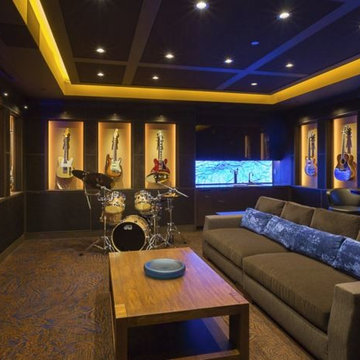


 Native Edge Landscape
We had a several challenges to face with this project. Not only did we need to update a dated landscape to accommodate two seemingly different design tastes (modern & minimalistic vs natural english garden), we were tasked with improving the property’s drainage, improving the driveway access, reducing water usage and plant maintenance, and fixing a crumbling wall.
To marry the two design tastes, we started with the more modern elements of metal planters and softened the landscape with mass plantings of ornamental grasses and native sedge. These grasses act as a turf replacement that do not need to be mowed and require less regular watering. On each side of the yard we constructed new cedar fences to provide updated and additional privacy. In addition, we poured a new concrete wall to replace the existing retaining wall and play off the new modern vibe.

 Architectural Surfaces
Island is PentalQuartz in Coastal Grey.
Perimeter countertops are PentalQuartz in Thassos.
Example of a mid-sized classic l-shaped dark wood floor and brown floor kitchen design in Boston with white cabinets, white backsplash, an island, an undermount sink, shaker cabinets, solid surface countertops, stone tile backsplash and paneled appliances
Example of a mid-sized classic l-shaped dark wood floor and brown floor kitchen design in Boston with white cabinets, white backsplash, an island, an undermount sink, shaker cabinets, solid surface countertops, stone tile backsplash and paneled appliances

Alcove shower - mid-sized contemporary master multicolored tile limestone floor alcove shower idea in DC Metro with an undermount sink, open cabinets, white cabinets, quartzite countertops, a two-piece toilet and white walls

 ZeroEnergy Design
This LEED Platinum certified house reflects the homeowner's desire for an exceptionally healthy and comfortable living environment, within a traditional neighborhood.
INFILL SITE. The family, who moved from another area of Wellesley, sought out this property to be within walking distance of the high school and downtown area. An existing structure on the tight lot was removed to make way for the new home. 84% of the construction waste, from both the previous structure and the new home, was diverted from a landfill. ZED designed to preserve the existing mature trees on the perimeter of the property to minimize site impacts, and to maintain the character of the neighborhood as well as privacy on the site.
EXTERIOR EXPRESSION. The street facade of the home relates to the local New England vernacular. The rear uses contemporary language, a nod to the family’s Californian roots, to incorporate a roof deck, solar panels, outdoor living space, and the backyard swimming pool. ZED’s careful planning avoided to the need to face the garage doors towards the street, a common syndrome of a narrow lot.
THOUGHTFUL SPACE. Homes with dual entries can often result in duplicate and unused spaces. In this home, the everyday and formal entry areas are one and the same; the front and garage doors share the entry program of coat closets, mudroom storage with bench for removing your shoes, and a laundry room with generous closets for the children's sporting equipment. The entry area leads directly to the living space, encompassing the kitchen, dining and sitting area areas in an L-shaped open plan arrangement. The kitchen is placed at the south-west corner of the space to allow for a strong connection to the dining, sitting and outdoor living spaces. A fire pit on the deck satisfies the family’s desire for an open flame while a sealed gas fireplace is used indoors - ZED’s preference after omitting gas burning appliances completely from an airtight home. A small study, with a window seat, is conveniently located just off of the living space. A first floor guest bedroom includes an accessible bathroom for aging visitors and can be used as a master suite to accommodate aging in place.
HEALTHY LIVING. The client requested a home that was easy to clean and would provide a respite from seasonal allergies and common contaminants that are found in many indoor spaces. ZED selected easy to clean solid surface flooring throughout, provided ample space for cleaning supplies on each floor, and designed a mechanical system with ventilation that provides a constant supply of fresh outdoor air. ZED selected durable materials, finishes, cabinetry, and casework with low or no volatile organic compounds (VOCs) and no added urea formaldehyde.
YEAR-ROUND COMFORT. The home is super insulated and air-tight, paired with high performance triple-paned windows, to ensure it is draft-free throughout the winter (even when in front of the large windows and doors). ZED designed a right-sized heating and cooling system to pair with the thermally improved building enclosure to ensure year-round comfort. The glazing on the home maximizes passive solar gains, and facilitates cross ventilation and daylighting.
ENERGY EFFICIENT. As one of the most energy efficient houses built to date in Wellesley, the home highlights a practical solution for Massachusetts. First, the building enclosure reduces the largest energy requirement for typical houses (heating). Super-insulation, exceptional air sealing, a thermally broken wall assembly, triple pane windows, and passive solar gain combine for a sizable heating load reduction. Second, within the house only efficient systems consume energy. These include an air source heat pump for heating & cooling, a heat pump hot water heater, LED lighting, energy recovery ventilation, and high efficiency appliances. Lastly, photovoltaics provide renewable energy help offset energy consumption. The result is an 89% reduction in energy use compared to a similar brand new home built to code requirements.
RESILIENT. The home will fare well in extreme weather events. During a winter power outage, heat loss will be very slow due to the super-insulated and airtight envelope– taking multiple days to drop to 60 degrees even with no heat source. An engineered drainage system, paired with careful the detailing of the foundation, will help to keep the finished basement dry. A generator will provide full operation of the all-electric house during a power outage.
OVERALL. The home is a reflection of the family goals and an expression of their values, beautifully enabling health, comfort, safety, resilience, and utility, all while respecting the planet.
ZED - Architect & Mechanical Designer
Bevilacqua Builders Inc - Contractor
Creative Land & Water Engineering - Civil Engineering
Barbara Peterson Landscape - Landscape Design
Nest & Company - Interior Furnishings
Eric Roth Photography - Photography
4