
Search results for "Rejection digital">rejection" in Home Design Ideas
 KURV Architecture DPC (Alex Hughes Architects)
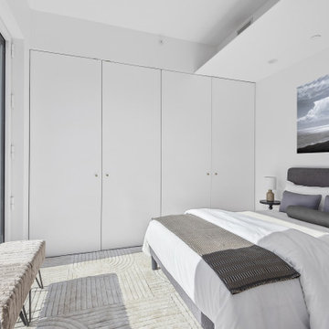
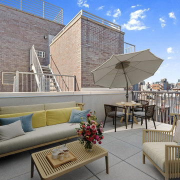
Located in the heart of Manhattan’s Lower East Side, the building was erected on a shallow commercial lot between two 120 year old masonry buildings and a new residential rental building. 330 Grand Street is a mix of 725 SF 1BRs and 1050 SF 2BR apartments. It also contains a 1100 SF two story duplex as well as private and public rooftop space, large private balconies for most units and two large private terraces for the ground floor units.
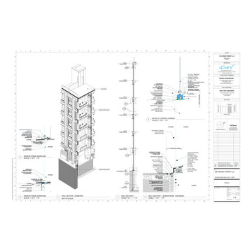
330 Grand Street was originally designed and approved at the NYC DOB as a prefabricated modular building. During the pandemic, as shipping costs skyrocketed putting the project at risk, we suggested redesigning the building as a reinforced cast-in-place concrete structure. Concrete was readily available and prices had not been affected by the demand increase that many other materials suffered in the pandemic. We took this opportunity to raise floor to ceiling heights, enlarge high performance windows and redistribute the buildings MEPFS and Structural Systems to create very open floor plans.
The challenge was to create a luxurious sensorial living experience with very limited means. In a city with very high construction costs, low cost residential buildings in the area are usually devoid of good quality, design and character. Our approach was to aim high for the end user, prioritizing natural light, open space with long visual perspectives, high ceilings and as always, rejecting the use of predefined building templates.
Our biggest challenge was to ensure that the small spaces feel as clean cut, large and bright as possible. Several unique design decisions were made to ensure low cost and high quality;
Floor plans were laid out so that spaces were wide open and free of clutter from mechanical or structural interruptions. Therefore all infrastructure was placed in lateral demising walls, which in turn act as the unit’s storage and kitchen. The apartments feel wide open, are super quiet and have more storage space than any other comparable apartment in the city.
To solve the problem of the site’s shallow commercial lot which is typically prone to dark interior spaces we focused our attention on the building’s envelope. Instead of the usual small punched window openings, oversized high performance windows were designed to ensure that light penetrated as far as possible into the units. In the smaller 1BR units, the full 50’ depth of the lot is perceived by partitioning spaces with sliding pocket doors that can be retracted to allow deep visual perspectives, making the sight lines in the space feel longer, larger, more ample than normal. In addition to the full height glazing, each unit above the 2nd floor receives a 7 foot covered balcony, adding 120 to 240 sf to each apartment, something unusual in New York City buildings. The space is large enough for a full size dining table, when the weather permits being outside.
We also worked hard to ensure modularity. For example, all kitchen units are all identical throughout the building. The idea of modularity and the economy of the repetitive unit is exercised to the maximum through the building.
Hardware, appliances, flooring, wall coverings and material finishes are all carefully selected to feel bespoke, high quality and unique.
It was important to KURV that the result of this work manifest into something that would deeply connect with the end user and sustain relationships with the consumers of this space.
All images by KURV Architecture ©
 Stairworks
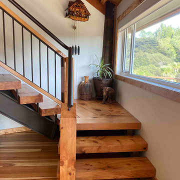
The client’s goal of this project was for Stairworks to produce a centrepiece staircase that kept with the rustic, ‘imperfect’ aesthetic of the home and appear as if it had always been there. This was quite the challenge as it takes a great deal of work to build a brand new staircase that is accurate but not flawless. However, this challenge made this a very enjoyable project to work on.
For the chunky timber, we hand selected 100mm oiled Macrocarpa with splits and knots that are normally rejected for use on new furniture, and both machined and fitted it on site. In addition, ‘working’ marks in the steel were left exposed and sometimes even added in certain places to achieve the client’s desired look.
 APWindow Film
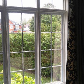
Vista SpectraSelect VS61: Rejecting 50% solar energy, this film helps reduce heat build[up and energy costs. While leaving the room with a clear view and natural light.
Find the right local pro for your project
 KURV Architecture DPC (Alex Hughes Architects)
Located in the heart of Manhattan’s Lower East Side, the building was erected on a shallow commercial lot between two 120 year old masonry buildings and a new residential rental building. 330 Grand Street is a mix of 725 SF 1BRs and 1050 SF 2BR apartments. It also contains a 1100 SF two story duplex as well as private and public rooftop space, large private balconies for most units and two large private terraces for the ground floor units.
330 Grand Street was originally designed and approved at the NYC DOB as a prefabricated modular building. During the pandemic, as shipping costs skyrocketed putting the project at risk, we suggested redesigning the building as a reinforced cast-in-place concrete structure. Concrete was readily available and prices had not been affected by the demand increase that many other materials suffered in the pandemic. We took this opportunity to raise floor to ceiling heights, enlarge high performance windows and redistribute the buildings MEPFS and Structural Systems to create very open floor plans.
The challenge was to create a luxurious sensorial living experience with very limited means. In a city with very high construction costs, low cost residential buildings in the area are usually devoid of good quality, design and character. Our approach was to aim high for the end user, prioritizing natural light, open space with long visual perspectives, high ceilings and as always, rejecting the use of predefined building templates.
Our biggest challenge was to ensure that the small spaces feel as clean cut, large and bright as possible. Several unique design decisions were made to ensure low cost and high quality;
Floor plans were laid out so that spaces were wide open and free of clutter from mechanical or structural interruptions. Therefore all infrastructure was placed in lateral demising walls, which in turn act as the unit’s storage and kitchen. The apartments feel wide open, are super quiet and have more storage space than any other comparable apartment in the city.
To solve the problem of the site’s shallow commercial lot which is typically prone to dark interior spaces we focused our attention on the building’s envelope. Instead of the usual small punched window openings, oversized high performance windows were designed to ensure that light penetrated as far as possible into the units. In the smaller 1BR units, the full 50’ depth of the lot is perceived by partitioning spaces with sliding pocket doors that can be retracted to allow deep visual perspectives, making the sight lines in the space feel longer, larger, more ample than normal. In addition to the full height glazing, each unit above the 2nd floor receives a 7 foot covered balcony, adding 120 to 240 sf to each apartment, something unusual in New York City buildings. The space is large enough for a full size dining table, when the weather permits being outside.
We also worked hard to ensure modularity. For example, all kitchen units are all identical throughout the building. The idea of modularity and the economy of the repetitive unit is exercised to the maximum through the building.
Hardware, appliances, flooring, wall coverings and material finishes are all carefully selected to feel bespoke, high quality and unique.
It was important to KURV that the result of this work manifest into something that would deeply connect with the end user and sustain relationships with the consumers of this space.
All images by KURV Architecture ©
 Stairworks
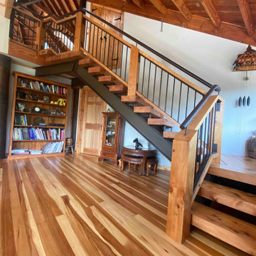
The client’s goal of this project was for Stairworks to produce a centrepiece staircase that kept with the rustic, ‘imperfect’ aesthetic of the home and appear as if it had always been there. This was quite the challenge as it takes a great deal of work to build a brand new staircase that is accurate but not flawless. However, this challenge made this a very enjoyable project to work on.
For the chunky timber, we hand selected 100mm oiled Macrocarpa with splits and knots that are normally rejected for use on new furniture, and both machined and fitted it on site. In addition, ‘working’ marks in the steel were left exposed and sometimes even added in certain places to achieve the client’s desired look.
 Stairworks
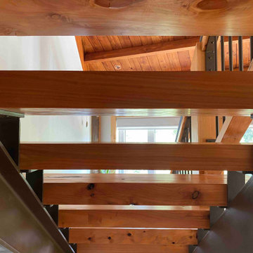
The client’s goal of this project was for Stairworks to produce a centrepiece staircase that kept with the rustic, ‘imperfect’ aesthetic of the home and appear as if it had always been there. This was quite the challenge as it takes a great deal of work to build a brand new staircase that is accurate but not flawless. However, this challenge made this a very enjoyable project to work on.
For the chunky timber, we hand selected 100mm oiled Macrocarpa with splits and knots that are normally rejected for use on new furniture, and both machined and fitted it on site. In addition, ‘working’ marks in the steel were left exposed and sometimes even added in certain places to achieve the client’s desired look.

 Suncrest Window Tinting
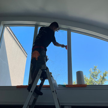
The client was having problems with their room getting too hot in the afternoon, so we installed clear ceramic window film blocking up to 97% infrared heat and 99.9% UV rays! Call 2148029656 to schedule your FREE consultation today!
 Stairworks
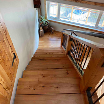
The client’s goal of this project was for Stairworks to produce a centrepiece staircase that kept with the rustic, ‘imperfect’ aesthetic of the home and appear as if it had always been there. This was quite the challenge as it takes a great deal of work to build a brand new staircase that is accurate but not flawless. However, this challenge made this a very enjoyable project to work on.
For the chunky timber, we hand selected 100mm oiled Macrocarpa with splits and knots that are normally rejected for use on new furniture, and both machined and fitted it on site. In addition, ‘working’ marks in the steel were left exposed and sometimes even added in certain places to achieve the client’s desired look.
 Great Choice Audio Video
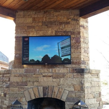
55" SunBrite over fireplace in outdoor patio/living area. Notice how nice an outdoor televisions looks - how it rejects sunlight and glare. Did you know regular flat panel TV's are safety hazards when used outdoors and have NO warranty when used outdoors?
 Haus Of Tre Li
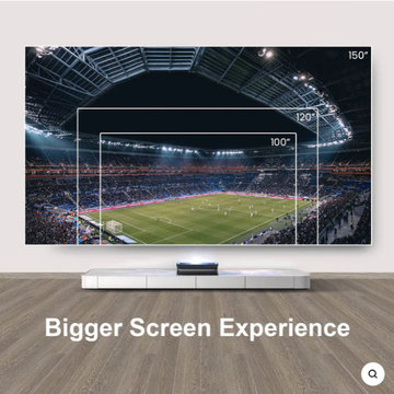
Maximizes Your Laser
TV Experience
AWOL VISION CINEMATIC ALR SCREEN
Overcoming Ceiling Light with Ease
Our Ceiling -Light Rejecting material absorbs 95% of overhead lighting. A micro-cirriform optical structure on the surface filters out ceiling light for superior picture quality.
 KURV Architecture DPC (Alex Hughes Architects)
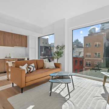
Located in the heart of Manhattan’s Lower East Side, the building was erected on a shallow commercial lot between two 120 year old masonry buildings and a new residential rental building. 330 Grand Street is a mix of 725 SF 1BRs and 1050 SF 2BR apartments. It also contains a 1100 SF two story duplex as well as private and public rooftop space, large private balconies for most units and two large private terraces for the ground floor units.
330 Grand Street was originally designed and approved at the NYC DOB as a prefabricated modular building. During the pandemic, as shipping costs skyrocketed putting the project at risk, we suggested redesigning the building as a reinforced cast-in-place concrete structure. Concrete was readily available and prices had not been affected by the demand increase that many other materials suffered in the pandemic. We took this opportunity to raise floor to ceiling heights, enlarge high performance windows and redistribute the buildings MEPFS and Structural Systems to create very open floor plans.
The challenge was to create a luxurious sensorial living experience with very limited means. In a city with very high construction costs, low cost residential buildings in the area are usually devoid of good quality, design and character. Our approach was to aim high for the end user, prioritizing natural light, open space with long visual perspectives, high ceilings and as always, rejecting the use of predefined building templates.
Our biggest challenge was to ensure that the small spaces feel as clean cut, large and bright as possible. Several unique design decisions were made to ensure low cost and high quality;
Floor plans were laid out so that spaces were wide open and free of clutter from mechanical or structural interruptions. Therefore all infrastructure was placed in lateral demising walls, which in turn act as the unit’s storage and kitchen. The apartments feel wide open, are super quiet and have more storage space than any other comparable apartment in the city.
To solve the problem of the site’s shallow commercial lot which is typically prone to dark interior spaces we focused our attention on the building’s envelope. Instead of the usual small punched window openings, oversized high performance windows were designed to ensure that light penetrated as far as possible into the units. In the smaller 1BR units, the full 50’ depth of the lot is perceived by partitioning spaces with sliding pocket doors that can be retracted to allow deep visual perspectives, making the sight lines in the space feel longer, larger, more ample than normal. In addition to the full height glazing, each unit above the 2nd floor receives a 7 foot covered balcony, adding 120 to 240 sf to each apartment, something unusual in New York City buildings. The space is large enough for a full size dining table, when the weather permits being outside.
We also worked hard to ensure modularity. For example, all kitchen units are all identical throughout the building. The idea of modularity and the economy of the repetitive unit is exercised to the maximum through the building.
Hardware, appliances, flooring, wall coverings and material finishes are all carefully selected to feel bespoke, high quality and unique.
It was important to KURV that the result of this work manifest into something that would deeply connect with the end user and sustain relationships with the consumers of this space.
All images by KURV Architecture ©
 KURV Architecture DPC (Alex Hughes Architects)
Located in the heart of Manhattan’s Lower East Side, the building was erected on a shallow commercial lot between two 120 year old masonry buildings and a new residential rental building. 330 Grand Street is a mix of 725 SF 1BRs and 1050 SF 2BR apartments. It also contains a 1100 SF two story duplex as well as private and public rooftop space, large private balconies for most units and two large private terraces for the ground floor units.
330 Grand Street was originally designed and approved at the NYC DOB as a prefabricated modular building. During the pandemic, as shipping costs skyrocketed putting the project at risk, we suggested redesigning the building as a reinforced cast-in-place concrete structure. Concrete was readily available and prices had not been affected by the demand increase that many other materials suffered in the pandemic. We took this opportunity to raise floor to ceiling heights, enlarge high performance windows and redistribute the buildings MEPFS and Structural Systems to create very open floor plans.
The challenge was to create a luxurious sensorial living experience with very limited means. In a city with very high construction costs, low cost residential buildings in the area are usually devoid of good quality, design and character. Our approach was to aim high for the end user, prioritizing natural light, open space with long visual perspectives, high ceilings and as always, rejecting the use of predefined building templates.
Our biggest challenge was to ensure that the small spaces feel as clean cut, large and bright as possible. Several unique design decisions were made to ensure low cost and high quality;
Floor plans were laid out so that spaces were wide open and free of clutter from mechanical or structural interruptions. Therefore all infrastructure was placed in lateral demising walls, which in turn act as the unit’s storage and kitchen. The apartments feel wide open, are super quiet and have more storage space than any other comparable apartment in the city.
To solve the problem of the site’s shallow commercial lot which is typically prone to dark interior spaces we focused our attention on the building’s envelope. Instead of the usual small punched window openings, oversized high performance windows were designed to ensure that light penetrated as far as possible into the units. In the smaller 1BR units, the full 50’ depth of the lot is perceived by partitioning spaces with sliding pocket doors that can be retracted to allow deep visual perspectives, making the sight lines in the space feel longer, larger, more ample than normal. In addition to the full height glazing, each unit above the 2nd floor receives a 7 foot covered balcony, adding 120 to 240 sf to each apartment, something unusual in New York City buildings. The space is large enough for a full size dining table, when the weather permits being outside.
We also worked hard to ensure modularity. For example, all kitchen units are all identical throughout the building. The idea of modularity and the economy of the repetitive unit is exercised to the maximum through the building.
Hardware, appliances, flooring, wall coverings and material finishes are all carefully selected to feel bespoke, high quality and unique.
It was important to KURV that the result of this work manifest into something that would deeply connect with the end user and sustain relationships with the consumers of this space.
All images by KURV Architecture ©
 Black Diamond Tint
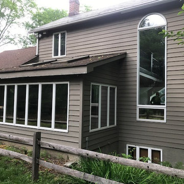
Exterior of Sunroom fully tinted for privacy
Sunroom - traditional sunroom idea in Philadelphia
Sunroom - traditional sunroom idea in Philadelphia
 KURV Architecture DPC (Alex Hughes Architects)
Located in the heart of Manhattan’s Lower East Side, the building was erected on a shallow commercial lot between two 120 year old masonry buildings and a new residential rental building. 330 Grand Street is a mix of 725 SF 1BRs and 1050 SF 2BR apartments. It also contains a 1100 SF two story duplex as well as private and public rooftop space, large private balconies for most units and two large private terraces for the ground floor units.
330 Grand Street was originally designed and approved at the NYC DOB as a prefabricated modular building. During the pandemic, as shipping costs skyrocketed putting the project at risk, we suggested redesigning the building as a reinforced cast-in-place concrete structure. Concrete was readily available and prices had not been affected by the demand increase that many other materials suffered in the pandemic. We took this opportunity to raise floor to ceiling heights, enlarge high performance windows and redistribute the buildings MEPFS and Structural Systems to create very open floor plans.
The challenge was to create a luxurious sensorial living experience with very limited means. In a city with very high construction costs, low cost residential buildings in the area are usually devoid of good quality, design and character. Our approach was to aim high for the end user, prioritizing natural light, open space with long visual perspectives, high ceilings and as always, rejecting the use of predefined building templates.
Our biggest challenge was to ensure that the small spaces feel as clean cut, large and bright as possible. Several unique design decisions were made to ensure low cost and high quality;
Floor plans were laid out so that spaces were wide open and free of clutter from mechanical or structural interruptions. Therefore all infrastructure was placed in lateral demising walls, which in turn act as the unit’s storage and kitchen. The apartments feel wide open, are super quiet and have more storage space than any other comparable apartment in the city.
To solve the problem of the site’s shallow commercial lot which is typically prone to dark interior spaces we focused our attention on the building’s envelope. Instead of the usual small punched window openings, oversized high performance windows were designed to ensure that light penetrated as far as possible into the units. In the smaller 1BR units, the full 50’ depth of the lot is perceived by partitioning spaces with sliding pocket doors that can be retracted to allow deep visual perspectives, making the sight lines in the space feel longer, larger, more ample than normal. In addition to the full height glazing, each unit above the 2nd floor receives a 7 foot covered balcony, adding 120 to 240 sf to each apartment, something unusual in New York City buildings. The space is large enough for a full size dining table, when the weather permits being outside.
We also worked hard to ensure modularity. For example, all kitchen units are all identical throughout the building. The idea of modularity and the economy of the repetitive unit is exercised to the maximum through the building.
Hardware, appliances, flooring, wall coverings and material finishes are all carefully selected to feel bespoke, high quality and unique.
It was important to KURV that the result of this work manifest into something that would deeply connect with the end user and sustain relationships with the consumers of this space.
All images by KURV Architecture ©
 VERMONT WOODS STUDIOS
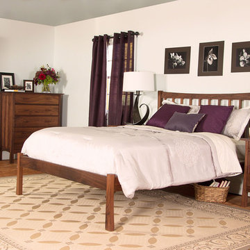
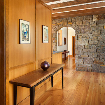
This solid wood Contemporary Craftsman Furniture has a distinctive Arts & Crafts design, using clean smooth lines with just a hint of curve. The finish is a hand-rubbed linseed oil and beeswax.
American Craftsman Furniture
Craftsman Furniture grew out of the Arts and Crafts movement promoted by Gustav Stickley and his family. In the early 1900s Stickley and fellow period designers like Greene and Greene, Roycroft and Limbert created a renaissance of honest workmanship and honest designs in their furniture. In contrast to designers of the preceding Victorian era, they rejected the cheaply made, mass-produced, ornate factory furniture of the time. They believed that beauty does not come from ornamentation, but from sturdy construction, simplicity of purpose, and optimal presentation of nature’s materials.
Vermont's Craftsman Furniture
In contemporary times, you’ll find some of the best Craftsman style designers building high end furniture right here in Vermont. Today’s Craftsman furniture retains the robust solid wood architecture and attention to detail of the originals by Stickley, Greene and Greene and others. But it often incorporates lighter, modern elements adapted from Asian furniture styles. Our Contemporary Craftsman furniture is handcrafted in Burlington, Vermont of solid cherry or maple wood with black walnut accents. The gentle curves in the legs and drawer pulls change the personality of Craftsman furniture from HEAVY and strong to light and cheerful.
Going green? Our natural, solid wood, American made furniture is handcrafted in Vermont from eco-friendly sustainably harvested woods. Customize any piece online in your choice of Solid Natural Cherry Wood, Solid Natural Walnut Wood or a two-tone combination of woods. Please note this furniture has an oil and wax finish which must be re-oiled periodically
 Denali Window Services
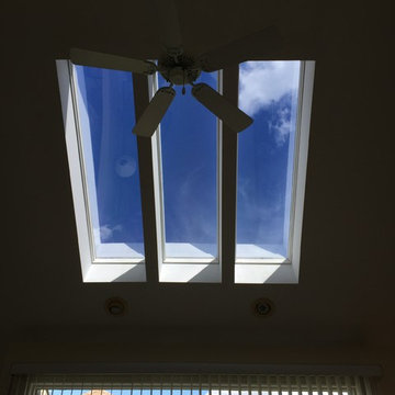
Home glare and heat rejection window film. Privacy and energy savings.
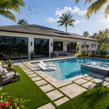
Inspiration for a timeless pool remodel in Tampa
Inspiration for a timeless pool remodel in Tampa
 SV Design
When full-time Massachusetts residents contemplate building a second home in Telluride, Colorado the question immediately arises; does it make most sense to hire a regionally based Rocky Mountain architect or a sea level architect conveniently located for all of the rigorous collaboration required for successful bespoke home design. Determined to prove the latter true, Siemasko + Verbridge accompanied the potential client as they scoured the undulating Telluride landscape in search of the perfect house site.
The selected site’s harmonious balance of untouched meadow rising up to meet the edge of an aspen grove and the opposing 180 degree view of Wilson’s Range spoke to everyone. A plateau just beyond a fork in the meadow provided a natural flatland, requiring little excavation and yet the right amount of upland slope to capture the views. The intrinsic character of the site was only enriched by an elk trail and snake-rail fence.
Establishing the expanse of Wilson’s range would be best served by rejecting the notion of selected views, the central sweeping curve of the roof inverts a small saddle in the range with which it is perfectly aligned. The soaring wave of custom windows and the open floor plan make the relatively modest house feel sizable despite its footprint of just under 2,000 square feet. Officially a two bedroom home, the bunk room and loft allow the home to comfortably sleep ten, encouraging large gatherings of family and friends. The home is completely off the grid in response to the unique and fragile qualities of the landscape. Great care was taken to respect the regions vernacular through the use of mostly native materials and a palette derived from the terrain found at 9,820 feet above sea level.
Photographer: Gibeon Photography
 Millard Enterprises
• Classic silver reflective film with excellent solar protection
• Great heat rejection helps provide energy savings and improved comfort
• Helps reduce glare and eye discomfort
• Increased reflection helps enhance exterior privacy
• Can create a more uniform exterior appearance
• Comprehensive warranty from 3M
 BARRETT STUDIO architects
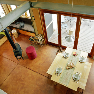
Embedded in a Colorado ski resort and accessible only via snowmobile during the winter season, this 1,000 square foot cabin rejects anything ostentatious and oversized, instead opting for a cozy and sustainable retreat from the elements.
This zero-energy grid-independent home relies greatly on passive solar siting and thermal mass to maintain a welcoming temperature even on the coldest days.
The Wee Ski Chalet was recognized as the Sustainability winner in the 2008 AIA Colorado Design Awards, and was featured in Colorado Homes & Lifestyles magazine’s Sustainability Issue.
Michael Shopenn Photography
10