
Search results for "Rejection digital">rejection" in Home Design Ideas
 Stairbuilders and Manufacturers Association
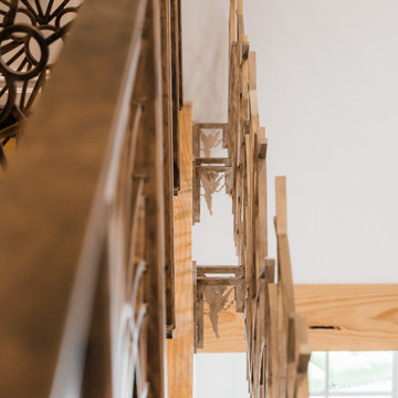
Aesthetic Value: The subtle lines and light color of the radiata pine stringer model spiral provide nice contrast with the eccentric iron balustrade. Laser cut Tinkerbells and abstract Mickey Mouse and fireworks elements contribute unique detail.
Stair Safety: The balustrade rejects a 4" sphere in all areas despite the complex detail of the components and floating rail above the laser cut elements.
Quality: The balustrade features predominantly laser cut sections fabricated with minimal visible welds and custom finished in-house with a three step guilders paste application.
Technical Challenge: Creating the complex ironwork design in a way that has aesthetically pleasing sections that fit the theme and space. Attention to meticulous details that convey the theme even at deepest levels of observing the stair.
 Suncrest Window Tinting
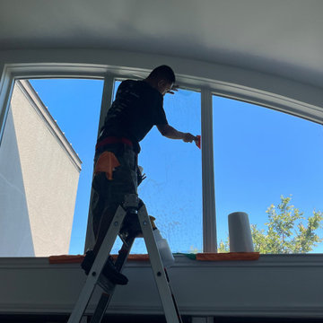
The client was having problems with their room getting too hot in the afternoon, so we installed clear ceramic window film blocking up to 97% infrared heat and 99.9% UV rays! Call 2148029656 to schedule your FREE consultation today!
 KURV Architecture DPC (Alex Hughes Architects)
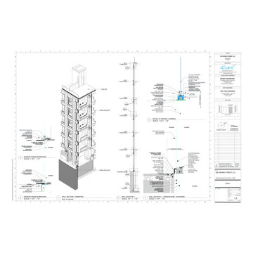
Located in the heart of Manhattan’s Lower East Side, the building was erected on a shallow commercial lot between two 120 year old masonry buildings and a new residential rental building. 330 Grand Street is a mix of 725 SF 1BRs and 1050 SF 2BR apartments. It also contains a 1100 SF two story duplex as well as private and public rooftop space, large private balconies for most units and two large private terraces for the ground floor units.
330 Grand Street was originally designed and approved at the NYC DOB as a prefabricated modular building. During the pandemic, as shipping costs skyrocketed putting the project at risk, we suggested redesigning the building as a reinforced cast-in-place concrete structure. Concrete was readily available and prices had not been affected by the demand increase that many other materials suffered in the pandemic. We took this opportunity to raise floor to ceiling heights, enlarge high performance windows and redistribute the buildings MEPFS and Structural Systems to create very open floor plans.
The challenge was to create a luxurious sensorial living experience with very limited means. In a city with very high construction costs, low cost residential buildings in the area are usually devoid of good quality, design and character. Our approach was to aim high for the end user, prioritizing natural light, open space with long visual perspectives, high ceilings and as always, rejecting the use of predefined building templates.
Our biggest challenge was to ensure that the small spaces feel as clean cut, large and bright as possible. Several unique design decisions were made to ensure low cost and high quality;
Floor plans were laid out so that spaces were wide open and free of clutter from mechanical or structural interruptions. Therefore all infrastructure was placed in lateral demising walls, which in turn act as the unit’s storage and kitchen. The apartments feel wide open, are super quiet and have more storage space than any other comparable apartment in the city.
To solve the problem of the site’s shallow commercial lot which is typically prone to dark interior spaces we focused our attention on the building’s envelope. Instead of the usual small punched window openings, oversized high performance windows were designed to ensure that light penetrated as far as possible into the units. In the smaller 1BR units, the full 50’ depth of the lot is perceived by partitioning spaces with sliding pocket doors that can be retracted to allow deep visual perspectives, making the sight lines in the space feel longer, larger, more ample than normal. In addition to the full height glazing, each unit above the 2nd floor receives a 7 foot covered balcony, adding 120 to 240 sf to each apartment, something unusual in New York City buildings. The space is large enough for a full size dining table, when the weather permits being outside.
We also worked hard to ensure modularity. For example, all kitchen units are all identical throughout the building. The idea of modularity and the economy of the repetitive unit is exercised to the maximum through the building.
Hardware, appliances, flooring, wall coverings and material finishes are all carefully selected to feel bespoke, high quality and unique.
It was important to KURV that the result of this work manifest into something that would deeply connect with the end user and sustain relationships with the consumers of this space.
All images by KURV Architecture ©
Find the right local pro for your project
 Lone Star Window Tinting
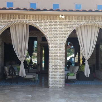
Client was looking for UV, Glare, and Solar heat rejection to protect furnishings and improve comfort level.
Privacy from neighbors was also a big concern.
Lone Star Window Tinting
Lone Star Window Tinting
 Denali Window Services
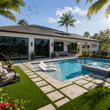
Home glare and heat rejection window film. Privacy and energy savings.
Inspiration for a timeless pool remodel in Tampa
Inspiration for a timeless pool remodel in Tampa
 Smartek Systems
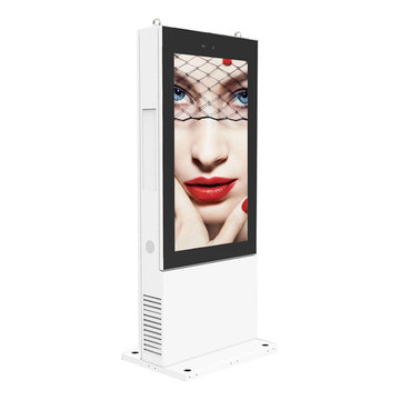
Outdoor Interactive kiosks are self-service solutions that provide wayfinding, pubic information, bill payment, ticketing, check-in, parking management, digital signage, product dispensing and more to interactive digital kiosk.
 KURV Architecture DPC (Alex Hughes Architects)
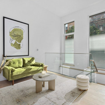
Located in the heart of Manhattan’s Lower East Side, the building was erected on a shallow commercial lot between two 120 year old masonry buildings and a new residential rental building. 330 Grand Street is a mix of 725 SF 1BRs and 1050 SF 2BR apartments. It also contains a 1100 SF two story duplex as well as private and public rooftop space, large private balconies for most units and two large private terraces for the ground floor units.
330 Grand Street was originally designed and approved at the NYC DOB as a prefabricated modular building. During the pandemic, as shipping costs skyrocketed putting the project at risk, we suggested redesigning the building as a reinforced cast-in-place concrete structure. Concrete was readily available and prices had not been affected by the demand increase that many other materials suffered in the pandemic. We took this opportunity to raise floor to ceiling heights, enlarge high performance windows and redistribute the buildings MEPFS and Structural Systems to create very open floor plans.
The challenge was to create a luxurious sensorial living experience with very limited means. In a city with very high construction costs, low cost residential buildings in the area are usually devoid of good quality, design and character. Our approach was to aim high for the end user, prioritizing natural light, open space with long visual perspectives, high ceilings and as always, rejecting the use of predefined building templates.
Our biggest challenge was to ensure that the small spaces feel as clean cut, large and bright as possible. Several unique design decisions were made to ensure low cost and high quality;
Floor plans were laid out so that spaces were wide open and free of clutter from mechanical or structural interruptions. Therefore all infrastructure was placed in lateral demising walls, which in turn act as the unit’s storage and kitchen. The apartments feel wide open, are super quiet and have more storage space than any other comparable apartment in the city.
To solve the problem of the site’s shallow commercial lot which is typically prone to dark interior spaces we focused our attention on the building’s envelope. Instead of the usual small punched window openings, oversized high performance windows were designed to ensure that light penetrated as far as possible into the units. In the smaller 1BR units, the full 50’ depth of the lot is perceived by partitioning spaces with sliding pocket doors that can be retracted to allow deep visual perspectives, making the sight lines in the space feel longer, larger, more ample than normal. In addition to the full height glazing, each unit above the 2nd floor receives a 7 foot covered balcony, adding 120 to 240 sf to each apartment, something unusual in New York City buildings. The space is large enough for a full size dining table, when the weather permits being outside.
We also worked hard to ensure modularity. For example, all kitchen units are all identical throughout the building. The idea of modularity and the economy of the repetitive unit is exercised to the maximum through the building.
Hardware, appliances, flooring, wall coverings and material finishes are all carefully selected to feel bespoke, high quality and unique.
It was important to KURV that the result of this work manifest into something that would deeply connect with the end user and sustain relationships with the consumers of this space.
All images by KURV Architecture ©
 KURV Architecture DPC (Alex Hughes Architects)
Located in the heart of Manhattan’s Lower East Side, the building was erected on a shallow commercial lot between two 120 year old masonry buildings and a new residential rental building. 330 Grand Street is a mix of 725 SF 1BRs and 1050 SF 2BR apartments. It also contains a 1100 SF two story duplex as well as private and public rooftop space, large private balconies for most units and two large private terraces for the ground floor units.
330 Grand Street was originally designed and approved at the NYC DOB as a prefabricated modular building. During the pandemic, as shipping costs skyrocketed putting the project at risk, we suggested redesigning the building as a reinforced cast-in-place concrete structure. Concrete was readily available and prices had not been affected by the demand increase that many other materials suffered in the pandemic. We took this opportunity to raise floor to ceiling heights, enlarge high performance windows and redistribute the buildings MEPFS and Structural Systems to create very open floor plans.
The challenge was to create a luxurious sensorial living experience with very limited means. In a city with very high construction costs, low cost residential buildings in the area are usually devoid of good quality, design and character. Our approach was to aim high for the end user, prioritizing natural light, open space with long visual perspectives, high ceilings and as always, rejecting the use of predefined building templates.
Our biggest challenge was to ensure that the small spaces feel as clean cut, large and bright as possible. Several unique design decisions were made to ensure low cost and high quality;
Floor plans were laid out so that spaces were wide open and free of clutter from mechanical or structural interruptions. Therefore all infrastructure was placed in lateral demising walls, which in turn act as the unit’s storage and kitchen. The apartments feel wide open, are super quiet and have more storage space than any other comparable apartment in the city.
To solve the problem of the site’s shallow commercial lot which is typically prone to dark interior spaces we focused our attention on the building’s envelope. Instead of the usual small punched window openings, oversized high performance windows were designed to ensure that light penetrated as far as possible into the units. In the smaller 1BR units, the full 50’ depth of the lot is perceived by partitioning spaces with sliding pocket doors that can be retracted to allow deep visual perspectives, making the sight lines in the space feel longer, larger, more ample than normal. In addition to the full height glazing, each unit above the 2nd floor receives a 7 foot covered balcony, adding 120 to 240 sf to each apartment, something unusual in New York City buildings. The space is large enough for a full size dining table, when the weather permits being outside.
We also worked hard to ensure modularity. For example, all kitchen units are all identical throughout the building. The idea of modularity and the economy of the repetitive unit is exercised to the maximum through the building.
Hardware, appliances, flooring, wall coverings and material finishes are all carefully selected to feel bespoke, high quality and unique.
It was important to KURV that the result of this work manifest into something that would deeply connect with the end user and sustain relationships with the consumers of this space.
All images by KURV Architecture ©
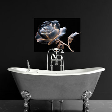
 PI Photography Wall Art & Fine Art
 https://pipafineart.com/pages/ghostly-bloom-x-ray-effect-illustration-digital-floral-artwork-prints-and-backgrounds
This mesmerizing digital artwork, "Ghostly Bloom," offers a truly unique and ethereal interpretation of a rose, presented with an intriguing X-ray effect. Against a stark, profound black background, the rose appears as if illuminated from within, its delicate petals and intricate structure rendered in translucent, ghostly whites and grays, highlighted by a captivating golden-orange luminescence along its edges. This glowing outline gives the impression of an internal light source, revealing the subtle veins and contours that define each petal and leaf, much like an actual X-ray would expose inner forms. The transparency allows for a captivating play of light and shadow, giving the bloom an almost holographic or spectral quality. The stem and leaves are similarly rendered, showcasing their delicate skeletal framework with an artistic blend of scientific precision and imaginative beauty. The contrast between the radiant bloom and the absolute darkness creates a powerful visual statement that is both delicate and dramatic. This piece transcends traditional floral art, offering a modern, almost futuristic perspective on natural beauty.
"Ghostly Bloom" would be an exceptional addition to several contemporary decorating styles. Its minimalist composition and high contrast make it a perfect fit for Modern and Minimalist interiors, where it can serve as a sophisticated focal point without overwhelming the space. In an Industrial setting, its raw yet refined aesthetic, combined with the glowing X-ray effect, would complement exposed elements and dark finishes. For Glam or Art Deco inspired rooms, the artwork's striking elegance and unique visual flair would add a touch of luxurious mystique and intrigue. It also resonates well with Sci-Fi or Futuristic themed spaces, bridging the gap between nature and technology. The artwork's unique approach to a classic subject allows it to stand out, sparking conversation and admiration.
 Progressive Design Build
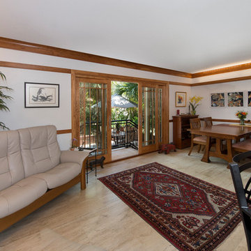
When a Historic District home was renovated in Fort Myers, a dream kitchen was created: open plan enough for gathering, with clearly delineated areas for cooking, reading and entertaining.
Challenge
Bill and Alison’s existing kitchen was small and dysfunctional. Each room seemed independent, and there was no flow through the house. The house felt small, with one entry and exit point.
As a planning consultant, Bill was no stranger to construction. He was a general contractor himself and had built several custom homes in years past. As a gardening enthusiast and professional educator, Alison also had an eye for design. They started with design, layout and planning on their own, but soon realized they needed help. After interviewing several contractors who seemed overwhelmed and unenthused by their project, they reached out to Progressive Design Build.
Solution
Mike was not only enthused about the project, but he established trust with Bill and Alison. Within a few short weeks he was hired to begin the planning phase, conducting thorough research on the project, meeting key subcontractors and establishing a realistic budget.
When the project began, internal walls were removed to open up the kitchen/dining areas and an island was built, giving the space an open and modern functionality. The eating area was enlarged, and a visual connection to the outside was established using Marvin insulated glass windows with Low E coatings—which rejects solar heat gain without reducing visible light passing through the glass.
In order to allow for the open concept layout that Bill and Alison desired, we built new structural beams to transfer the live load. The sliding patio doors opened onto a small terrace with a wrought iron handrail creating access to the private courtyard and garden area.
Finishing details included custom cherry cabinets and wood trimming, 16” x 32” natural stone flooring, granite countertops and historically correct plaster finishes.
Result
The project was completed within budget and two weeks ahead of schedule.
“That planning phase was the best money we spent on the project,” exclaimed Bill. “It was incredibly gratifying being able to watch the subcontractors and suppliers come and go with shared leadership and attention to details.”
 WindowTintLA.com
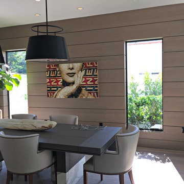
Huper Optik’s Ceramic 70 Window Film is a great film that provides 99.9% UV light Rejection and blocks 88% of Infrared Heat.
Dining room photo in Los Angeles
Dining room photo in Los Angeles
 WindowTintLA.com
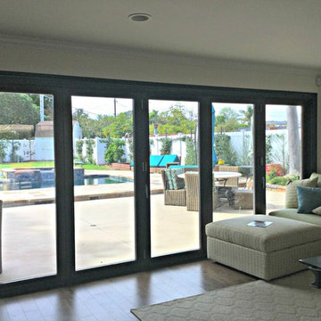
Hüper Optik Select films provide maximum protection with unrivaled high heat rejection performance. Due to the films’ spectrally selective technology, visibility is not compromised. These films reject damaging infra-red and ultra-violet light rays that cause heat and fading, all without significantly reducing visible light transmittance. They are also 100% dye-free and will not fade over time. Unlike conventional hybrid metallized films that use dyed polyester layers or apply dye in adhesives to tone down the metallic look, Hüper Optik Select films offer a neutral, soft tone that does not appear metallic or shiny.
 Hemphill's Rugs & Carpets
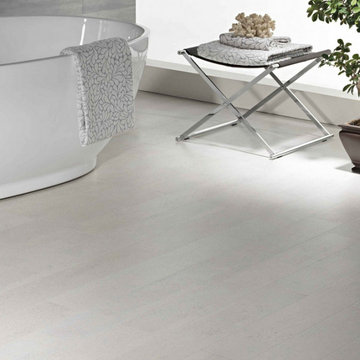
New product introduction. Digitally printed cork floors! Water resistant and offers some "cushion". 1000 DPI gives a very realistic visual translation with 20 plank variations per box.
 Suncrest Window Tinting
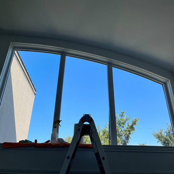
***Finished Product*** The client was having problems with their room getting too hot in the afternoon, so we installed clear ceramic window film blocking up to 97% infrared heat and 99.9% UV rays! Call 2148029656 to schedule your FREE consultation today!
 KURV Architecture DPC (Alex Hughes Architects)
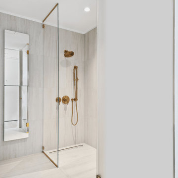
Located in the heart of Manhattan’s Lower East Side, the building was erected on a shallow commercial lot between two 120 year old masonry buildings and a new residential rental building. 330 Grand Street is a mix of 725 SF 1BRs and 1050 SF 2BR apartments. It also contains a 1100 SF two story duplex as well as private and public rooftop space, large private balconies for most units and two large private terraces for the ground floor units.
330 Grand Street was originally designed and approved at the NYC DOB as a prefabricated modular building. During the pandemic, as shipping costs skyrocketed putting the project at risk, we suggested redesigning the building as a reinforced cast-in-place concrete structure. Concrete was readily available and prices had not been affected by the demand increase that many other materials suffered in the pandemic. We took this opportunity to raise floor to ceiling heights, enlarge high performance windows and redistribute the buildings MEPFS and Structural Systems to create very open floor plans.
The challenge was to create a luxurious sensorial living experience with very limited means. In a city with very high construction costs, low cost residential buildings in the area are usually devoid of good quality, design and character. Our approach was to aim high for the end user, prioritizing natural light, open space with long visual perspectives, high ceilings and as always, rejecting the use of predefined building templates.
Our biggest challenge was to ensure that the small spaces feel as clean cut, large and bright as possible. Several unique design decisions were made to ensure low cost and high quality;
Floor plans were laid out so that spaces were wide open and free of clutter from mechanical or structural interruptions. Therefore all infrastructure was placed in lateral demising walls, which in turn act as the unit’s storage and kitchen. The apartments feel wide open, are super quiet and have more storage space than any other comparable apartment in the city.
To solve the problem of the site’s shallow commercial lot which is typically prone to dark interior spaces we focused our attention on the building’s envelope. Instead of the usual small punched window openings, oversized high performance windows were designed to ensure that light penetrated as far as possible into the units. In the smaller 1BR units, the full 50’ depth of the lot is perceived by partitioning spaces with sliding pocket doors that can be retracted to allow deep visual perspectives, making the sight lines in the space feel longer, larger, more ample than normal. In addition to the full height glazing, each unit above the 2nd floor receives a 7 foot covered balcony, adding 120 to 240 sf to each apartment, something unusual in New York City buildings. The space is large enough for a full size dining table, when the weather permits being outside.
We also worked hard to ensure modularity. For example, all kitchen units are all identical throughout the building. The idea of modularity and the economy of the repetitive unit is exercised to the maximum through the building.
Hardware, appliances, flooring, wall coverings and material finishes are all carefully selected to feel bespoke, high quality and unique.
It was important to KURV that the result of this work manifest into something that would deeply connect with the end user and sustain relationships with the consumers of this space.
All images by KURV Architecture ©
 Lone Star Window Tinting
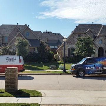
Client was looking for UV, Glare, and Solar heat rejection to protect furnishings and improve comfort level.
We have multiple insured employees to get your project done quickly
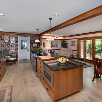 Progressive Design Build
When a Historic District home was renovated in Fort Myers, a dream kitchen was created: open plan enough for gathering, with clearly delineated areas for cooking, reading and entertaining.
Challenge
Bill and Alison’s existing kitchen was small and dysfunctional. Each room seemed independent, and there was no flow through the house. The house felt small, with one entry and exit point.
As a planning consultant, Bill was no stranger to construction. He was a general contractor himself and had built several custom homes in years past. As a gardening enthusiast and professional educator, Alison also had an eye for design. They started with design, layout and planning on their own, but soon realized they needed help. After interviewing several contractors who seemed overwhelmed and unenthused by their project, they reached out to Progressive Design Build.
Solution
Mike was not only enthused about the project, but he established trust with Bill and Alison. Within a few short weeks he was hired to begin the planning phase, conducting thorough research on the project, meeting key subcontractors and establishing a realistic budget.
When the project began, internal walls were removed to open up the kitchen/dining areas and an island was built, giving the space an open and modern functionality. The eating area was enlarged, and a visual connection to the outside was established using Marvin insulated glass windows with Low E coatings—which rejects solar heat gain without reducing visible light passing through the glass.
In order to allow for the open concept layout that Bill and Alison desired, we built new structural beams to transfer the live load. The sliding patio doors opened onto a small terrace with a wrought iron handrail creating access to the private courtyard and garden area.
Finishing details included custom cherry cabinets and wood trimming, 16” x 32” natural stone flooring, granite countertops and historically correct plaster finishes.
Result
The project was completed within budget and two weeks ahead of schedule.
“That planning phase was the best money we spent on the project,” exclaimed Bill. “It was incredibly gratifying being able to watch the subcontractors and suppliers come and go with shared leadership and attention to details.”

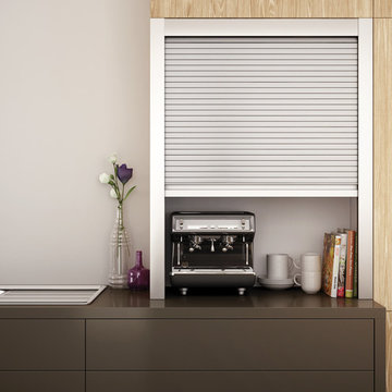
 Miralis
INSPIRATION:
Barn wood and naturally aged wood become trendy. Instead of creating a product with recuperated barn wood, we decided to design the perfect product by using new wood that is usually rejected, to create this high-end product within a production environment. We industrially designed and developed the machine utilized to create this product. We classify the wood to make sure the features and characteristics of the product are present. We have been inspired by the beauty of the marriage between the contemporary trends and the roughness of "barn wood". We created the rough chic for the kitchen.
UNIQUE PROPERTIES
This product enhances the features and characteristics of wood altered by the seasons. It is textured like barn wood. The beauty of this product lies in the details of a perfectly textured wood and the authenticity of each natural characteristic cleverly revealed such as knots, cracks, spalted wood, grub holes, termite holes and/or natural splinters. This design is available in 2 different models (slab and shaker) and six different colours including natural. This product allows designers to perfectly align the rough and the chic.
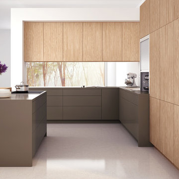 Miralis
INSPIRATION:
Barn wood and naturally aged wood become trendy. Instead of creating a product with recuperated barn wood, we decided to design the perfect product by using new wood that is usually rejected, to create this high-end product within a production environment. We industrially designed and developed the machine utilized to create this product. We classify the wood to make sure the features and characteristics of the product are present. We have been inspired by the beauty of the marriage between the contemporary trends and the roughness of "barn wood". We created the rough chic for the kitchen.
UNIQUE PROPERTIES
This product enhances the features and characteristics of wood altered by the seasons. It is textured like barn wood. The beauty of this product lies in the details of a perfectly textured wood and the authenticity of each natural characteristic cleverly revealed such as knots, cracks, spalted wood, grub holes, termite holes and/or natural splinters. This design is available in 2 different models (slab and shaker) and six different colours including natural. This product allows designers to perfectly align the rough and the chic.
6