
Search results for "Relieved" in Home Design Ideas


 Kaestner Designs - Kitchens, Baths & Interiors
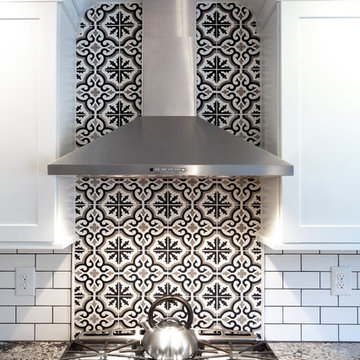
My concept for this kitchen was to collaborate with my client for this complete home renovation and ensure that the kitchen was the focal point of the open concept home. We strategically worked together to ensure proper wall dimensions, island placement and function, and symmetry to meet the wants and needs of my clients. White perimeter cabinetry helped to achieve a traditional feel for the space, while the gray stained island cabinetry allowed for a lovely transition to make the cozy kitchen work seamlessly with the distressed wide plank farmhouse style floating floor. In order to relieve the stark whiteness of the perimeter, I had suggested using contrast grout for the subway tile and the ultimate choice of cement tiles for the accent backsplash behind the range created a cathartic scene in this modestly stated design. Throw in some owls, books, and some fun pendant lighting and we were smiling through the finish line, together!!! My goal is to ensure that my client's needs are met and that their lives are improved through my designs. I hope you like the images of the new space!
Find the right local pro for your project
 Neumann & Rudy Architecture
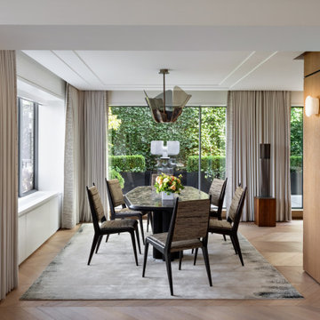
This dining room operates as a processional volume, choreographed along a deep axial sightline that terminates not in a wall but in a garden — an ivy-clad plane of green glimpsed through full-height glazing. The architecture is fundamentally additive rather than decorative: a coffered, stepped ceiling plane with recessed reveal channels floats above the seating zone, its subtle datum lines describing a rectangular "room within a room" that anchors the table without recourse to enclosing partitions. Flanking this central passage, two millwork pylons — one clad in pale limed oak on the right, one in a fine bone-toned wallcovering on the left — function as vestigial pilasters, compressing the entry threshold before releasing into the loftier dining volume. The floor reinforces this directionality through a wide-plank chevron parquet laid on the primary axis, its herringbone rhythm accelerating the eye toward the terrace. The furniture plan is deliberately non-orthogonal: an elongated oval table on twin cylindrical pedestals softens the room's rectilinear discipline, while the loosely arrayed chairs break parade-ground symmetry in favor of a more inhabited, gestural composition. Deep-set corner windows and a low banquette-height sill with integrated casework at left introduce a secondary spatial episode, a quieter alcove that relieves the room's axial insistence.
## II. Materiality, Color & Texture
The palette is a study in warm neutrality calibrated across a narrow tonal band, with contrast delivered through texture rather than hue. The foundational register is greige-to-oatmeal: floor-to-ceiling drapery in a heavy, densely gathered linen falls in pin-sharp cartridge pleats, its matte drape absorbing light and softening the glass wall's hard geometry. Against this, the dining chairs are upholstered in a slubbed, striated fabric — likely a raw silk or abaca-like bast fiber — whose horizontal grain reads almost as bark, and which is set in taut opposition to the ebonized, tapered hardwood frames in the Italian mid-century idiom of Gio Ponti or Ico Parisi. The tabletop, a mottled verdigris-and-bronze stone or fossilized surface, introduces the room's only earth-toned saturation, echoed by the burl-and-walnut plinth supporting a slender fluted bronze sculpture. The oak millwork is limed and open-grained, deliberately dry and tactile beside the high-polish patinated brass of the pendant. Underfoot, a hand-knotted silk rug in cloud-grey with charcoal ombré edges introduces atmospheric perspective — a painterly gradient that dematerializes the floor plane. Chromatic release arrives entirely from two sources: the framed abstract expressionist canvas at right, with its viridian, cobalt and violet gestural detonations, and the living wall of ivy beyond the glass. Both function as color events, not color schemes.
## III. Lighting, Atmosphere & Style Profile
Daylight is the primary luminaire here, entering as a broad, north-soft wash through the terrace glazing and diffused further by the ivy screen, which acts as a natural lambrequin filtering glare into a cool, even green-tinted light. Artificial sources are deployed sculpturally rather than functionally: the pendant — a folded, petal-form composition of smoked glass and patinated metal — reads as a suspended object of art, throwing a warm downward pool onto the table while its dark bronze silhouette provides essential visual weight against the white ceiling. Wall-mounted alabaster sconces bracket the room at both thresholds, their translucent stone glowing with a low-lumen, candle-adjacent warmth that establishes perimeter intimacy after dusk. The resulting atmosphere is serene, curated and quietly patrician — a room engineered for extended conversation rather than display. Stylistically, the project synthesizes a **contemporary Soft Minimalism** with a strongly collected **Mid-Century Italian** sensibility: the restraint of the architectural envelope and monochromatic textile program provides a gallery-like neutral ground, upon which a small number of high-character objects — the sculptural pendant, the Ponti-esque seating, the abstract canvas, the exterior stone sculpture — perform as museum-grade punctuation. It is an interior that achieves luxury through material integrity and negative space rather than ornament.
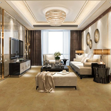
 iCork Floor
 https://bit.ly/2BXMQxo
The next benefit of using cork flooring is that this type of flooring offers a higher level of comfort. The structure of cork is such that it is made up of hundreds of millions of tiny cells packed closely together. These cells are air pockets can absorb shockwaves or pressure, so walking on this flooring not only relieves stress on your joints but also helps to reduce the weariness that is brought on when you walk a lot over a hard surface. If you suffer from knee pain or any joint pain, you will find that walking over a cork floor is so much easier than walking over, say a ceramic tile floor.
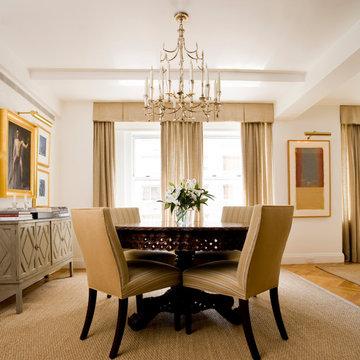 Neumann & Rudy Architecture
**I. Spatial Composition & Architectural Volume**
This is a pre-war Manhattan dining room whose proportions have been surgically clarified rather than reinvented. The room reads as a compressed rectilinear volume, its ceiling plane articulated by a shallow dropped soffit and a single exposed transverse beam — a candid acknowledgment of the building's structural grid, left legible rather than concealed behind a coved plaster surround. That beam performs a quiet spatial function: it registers the threshold between the dining zone and the adjoining passage at right, where a sliver of herringbone parquet and a second curtained aperture extend the sightline into a further room, relieving the enclosure and establishing a discreet enfilade. The composition is emphatically axial and symmetrical — chandelier, floral centerpiece, pedestal table and central window mullion align on a single spine — yet the symmetry is deliberately imperfect: the flanking chairs are turned inward on the diagonal, the sideboard weights the left wall, and the artwork on the right hangs off-axis. The result is a Beaux-Arts discipline softened by a decorator's asymmetry. Most consequential is the pelmet, a deep upholstered box valance carried nearly wall-to-wall, which annexes the window into a single monumental glazed field and visually raises the ceiling by drawing the eye above the actual head height of the sash.
**II. Materiality, Color & Texture**
The palette is a study in monochromatic warmth held within a narrow tonal band of buff, oatmeal, flax and champagne, with saturation kept deliberately low so that texture carries the burden of variety. Underfoot, a wall-to-wall seagrass or sisal matting with a coarse basketweave provides the room's tactile bass note — hard-wearing, faintly agricultural, and set in productive tension with the refined silk-and-linen sheen of the curtains and pelmet. The chairs are a masterstroke of dual upholstery: matte sand-toned fabric on the outside back and a subtle self-striped ottoman weave on the seat and inner face, a device that renders the seating both plush and graphic. Against this envelope of pale neutrals, two dark accents supply the necessary chromatic gravity: the deeply carved, pierced-apron rosewood or mahogany center table, almost Anglo-Indian in its fretwork and baluster pedestal, and the ebonized klismos-splayed chair legs that echo it. The left wall introduces a painted, dry-brushed Gustavian-style commode with lozenge-fretwork doors, its chalky grey-green a cool counterpoint, while gilt frames, a burnished picture light and the silvered chandelier thread a metallic warmth through the whole.
**III. Lighting, Atmosphere & Style Profile**
Daylight is the room's primary illuminant and it is handled with restraint: the curtains are dressed open but the roman-like sheer inner treatment diffuses the light into a milky, north-facing wash that flattens shadow and flatters the neutral surfaces. Artificial lighting is layered and entirely decorative in expression — the tall, attenuated candle-arm chandelier, hung low and generously scaled, functions as sculpture and as the room's compositional keystone, while two swing-arm brass picture lights provide directional accents that anchor the art as evening focal points. There is no visible downlighting or recessed apparatus; the mood is candlelit, hushed and faintly nocturnal even in daytime. Stylistically the room resolves into what might be termed **Refined Neutral Traditionalism** — an American-classical, Bilhuber-adjacent idiom that marries eighteenth-century Swedish and Anglo-colonial furniture archetypes with contemporary tailoring, tonal upholstery and humble natural-fiber flooring. Its sophistication lies precisely in that calibration: heirloom silhouettes stripped of pattern and color noise, so that carving, weave and gilding become the sole ornamental language.
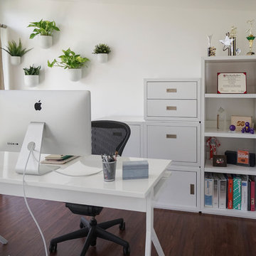
 Tetrachrome Design, LLC
When working from home, it's imperative to have a space where you can focus. With inspiration from the zen gardens and spa experiences, this home office is a true stress reliever. Removed from the main house, the auxiliary backyard space gives has it all -- the calming the effect from the numerous plants, an area to relax on the couch, a storage ottoman for blankets and pillows, plenty of storage for files, and a bookshelf to display achievements.
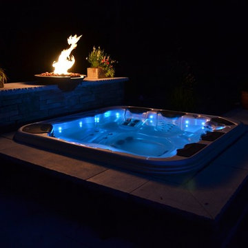
 Best Hot Tubs "Hot Tub and Spa Experts"
Many hot tub owners claim that they no longer feel the need to travel to exotic locations to unwind. All it takes is a stroll in a backyard, followed by a soothing soak in the spa, to feel rejuvenated, relaxed, and ready for whatever life brings.
Relaxing quietly in one's own backyard, stargazing as jets relieve muscle tension, can feel like being at an exclusive spa getaway -- just without the suitcases. Here, our clients set their hot tub within an attractive case and added a wall for privacy and a fire bowl fountain. www.besthottubs.com
 May Construction, Inc.
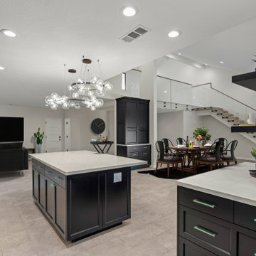
The outdated kitchen’s confining walls were torn down relieving this space from being cramped. Out were the oak senseless upper cabinets that looked over the peninsula blocking site lines. Rolling baby blue and jolly blue porcelain tiles enshroud the kitchen backsplash bringing forth a burst of color against the raven new cabinetry. An expansive island with the ability to seat six is the perfect place to entertain. All new stainless-steel appliances create a sleek modern feel to this renovated kitchen. A fine detail in this space are the seafoam green glass knobs and pulls delivering in a small yet significant ocean element.
 Allan Nichol, Architect
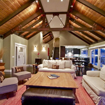
The residence was at the entrance to the harbor with the bay on two sides. Previously Interior walls and dropped ceilings obscured views, and the clients sought a great space that celebrated the views of water. and the parade of boats that passed by.
By adding a new muscular truss, structural concerns were relieved and permitted the removal of existing walls, and a great space is born. And with a muscular truss highlighting it all.
Karin Larson, photographer
 The Nelson Team
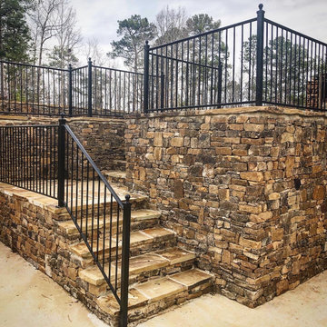
Amazing transformation of severely damaged retaining wall, Both return walls were cracked and we removed the enite section or steps and wall of the existing brick, reconstructed new all with proper drainage, and reconstructed the wall with mossrock stone to veneer. The structural part of the existing brick that remained was also veneered with mossrock, leaving the long section in the middle brick to balance with the house brick color. The entire wall was dug out from behind to install gravel and drainage, as well at to relieve pressure on wall and install weep holes not included in original wall construction. Irrigation was adjusted and a small seatwall was constructed behind existing wall to direct water away from the wall. Plantings were removed to open the view and replaced with metal railing
 Horizon Interior Design
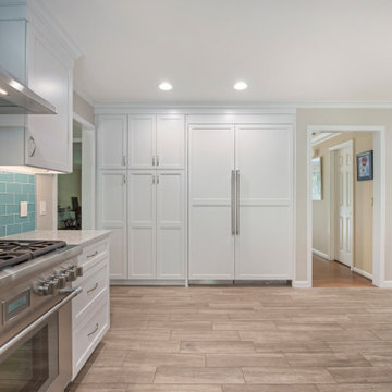
Rob and Danielle have three children and wanted a kitchen redesign that would function better for their active household. Their kitchen contained tight spaces with a narrow island that blocked flow through the room. Two cooks in the kitchen were one too many as the space wasn’t conducive for it. For entertaining, the island proved to be too small to set out all their food and have room around it for guests to congregate. The only way to walk to the great room, which was where the family hung out most often, was to go through the kitchen and dining area, proving to again congest the area. They are avid sailors, and wanted to bring in the color of the sea into their contemporary design.
I added a separate entry point directly from the kitchen to the great room, and created a work triangle in a separate area to relieve the congestion from people passing through the room. The island shape and size were uniquely designed to allow the person at the sink to be able to look directly into the great room, and provide ample space to spread out food for entertaining. A bookcase was integrated into the island to display cookbooks, and the paneled refrigerator made for a seamless wall of beautiful cabinetry. The entry into the formal dining was relocated to remove the necessity of having corner cabinetry. A separate bar area allows family and guests to make their drinks without needing to go into the chef’s space. The glass backsplash tile was selected to reflect the sea colors they love, with crystal pendants to add bling similar to the light that reflects off the water.
 Studio 34 Furniture and Design
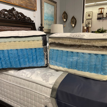
The Kingsdown "Vintage Collection® (seen here on the right) uses the finest natural materials exquisitely handcrafted by mattress artisans.
Elegant tufted damask cover
The ultra-luxurious sleep experience of a Vintage mattress is accentuated by a woven wool fabric and infused gel fibers for a cooling, pressure-relieving comfort.
Nature’s finest materials
The breathable and moisture wicking qualities of 100% cotton, Joma and alpaca wool and genuine horsehair combine for a remarkably soft and long-lasting sleep experience.
Specialized latex foam
Latex foam is known for its enhanced supportive qualities and resiliency and when combined with Kingsdown Airlfow technology, Vintage offers unmatched air circulation.
Tri-Zoned Wrapped Coils
Three unique zones with additional lumbar support and individually wrapped coils are designed to contour the body for personalized support to both sleep partners.
-Adjustable Base Friendly
A top of the line mattress, the Vintage collection offers full body support and comfort the embodies luxurious qualities and the ultimate in mattress technology with full body surround® construction
-Sizes: twin, full, queen, king and California king.
-Firm to ultra-plush made with natural sleep inducing material
-Premium latex and body conforming foam offer unmatched comfort
-10 year warranty.
~~~~~~~
Kingsdown "Passions" Mattress (seen on the left)
Fresh Comfort® quilt.
A luxurious touch with a beautifully handcrafted, quilted cover made with cooling gel fibers and cool quilting foam to regulate body temperature for comfort.
CoolActive memory foam
You’ll love the body conforming support a Passions mattress offers. The cooling gel memory foam pulls heat away from the body and airflow channels increases breathability.
Specialized latex comfort
Latex delivers the perfect balance of resiliency, pressure relief and cooling airflow.
Tri-zoned individually wrapped coils
A proprietary body of sleep knowledge informed a three zone innerspring design of individually wrapped coils. This body contouring system provides personalized support on each side of the bed with firm lumbar support where the body needs it most.
Motion separation foam
This undetectable foam divider mitigates partner disturbance throughout the night.
Adjustable Base Friendly
 Talon Construction Inc.
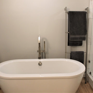
Relaxing master bathroom remodel in Frederick, MD 21703 with a custom glass shower encloser that has two niches for your toiletries and brushed nickel fixtures. there is also a stand alone soaking tub and a his and hers white cabinetry vanity

 Cheery Curtains
CHR58 Ivory Black curtain tracks is luxurious. There are 2 colours for you to choose. Ivory and Black. These curtain tracks will brighten your window. Strong sense of metal and 0.059 inches thickness let you more comfortable and relieved. This track can be used for more than 20 years.
 Katie Hutchison Studio
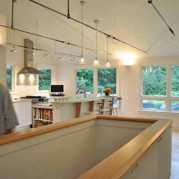
Constructed in two phases, this renovation, with a few small additions, touched nearly every room in this late ‘50’s ranch house. The owners raised their family within the original walls and love the house’s location, which is not far from town and also borders conservation land. But they didn’t love how chopped up the house was and the lack of exposure to natural daylight and views of the lush rear woods. Plus, they were ready to de-clutter for a more stream-lined look. As a result, KHS collaborated with them to create a quiet, clean design to support the lifestyle they aspire to in retirement.
To transform the original ranch house, KHS proposed several significant changes that would make way for a number of related improvements. Proposed changes included the removal of the attached enclosed breezeway (which had included a stair to the basement living space) and the two-car garage it partially wrapped, which had blocked vital eastern daylight from accessing the interior. Together the breezeway and garage had also contributed to a long, flush front façade. In its stead, KHS proposed a new two-car carport, attached storage shed, and exterior basement stair in a new location. The carport is bumped closer to the street to relieve the flush front facade and to allow access behind it to eastern daylight in a relocated rear kitchen. KHS also proposed a new, single, more prominent front entry, closer to the driveway to replace the former secondary entrance into the dark breezeway and a more formal main entrance that had been located much farther down the facade and curiously bordered the bedroom wing.
Inside, low ceilings and soffits in the primary family common areas were removed to create a cathedral ceiling (with rod ties) over a reconfigured semi-open living, dining, and kitchen space. A new gas fireplace serving the relocated dining area -- defined by a new built-in banquette in a new bay window -- was designed to back up on the existing wood-burning fireplace that continues to serve the living area. A shared full bath, serving two guest bedrooms on the main level, was reconfigured, and additional square footage was captured for a reconfigured master bathroom off the existing master bedroom. A new whole-house color palette, including new finishes and new cabinetry, complete the transformation. Today, the owners enjoy a fresh and airy re-imagining of their familiar ranch house.
Photos by Katie Hutchison
 Katie Hutchison Studio
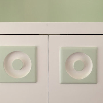
Constructed in two phases, this renovation, with a few small additions, touched nearly every room in this late ‘50’s ranch house. The owners raised their family within the original walls and love the house’s location, which is not far from town and also borders conservation land. But they didn’t love how chopped up the house was and the lack of exposure to natural daylight and views of the lush rear woods. Plus, they were ready to de-clutter for a more stream-lined look. As a result, KHS collaborated with them to create a quiet, clean design to support the lifestyle they aspire to in retirement.
To transform the original ranch house, KHS proposed several significant changes that would make way for a number of related improvements. Proposed changes included the removal of the attached enclosed breezeway (which had included a stair to the basement living space) and the two-car garage it partially wrapped, which had blocked vital eastern daylight from accessing the interior. Together the breezeway and garage had also contributed to a long, flush front façade. In its stead, KHS proposed a new two-car carport, attached storage shed, and exterior basement stair in a new location. The carport is bumped closer to the street to relieve the flush front facade and to allow access behind it to eastern daylight in a relocated rear kitchen. KHS also proposed a new, single, more prominent front entry, closer to the driveway to replace the former secondary entrance into the dark breezeway and a more formal main entrance that had been located much farther down the facade and curiously bordered the bedroom wing.
Inside, low ceilings and soffits in the primary family common areas were removed to create a cathedral ceiling (with rod ties) over a reconfigured semi-open living, dining, and kitchen space. A new gas fireplace serving the relocated dining area -- defined by a new built-in banquette in a new bay window -- was designed to back up on the existing wood-burning fireplace that continues to serve the living area. A shared full bath, serving two guest bedrooms on the main level, was reconfigured, and additional square footage was captured for a reconfigured master bathroom off the existing master bedroom. A new whole-house color palette, including new finishes and new cabinetry, complete the transformation. Today, the owners enjoy a fresh and airy re-imagining of their familiar ranch house.
Photos by Katie Hutchison
 Tile Doctor Ltd
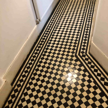
This property was in theLadbroke Grove area of West London near Kensington. The client had found an old and probably original black and white checkered pattern Victorian tiled floor under their cork tiled flooring. They also reported that it was badly damaged so I thought it would be best if I paid them a visit first to see how extensive the damage was and whether it was repairable. The floor was in a quite a state, the tiles were covered in glue from the cork and had several areas had been back filled with cement.
I reassured them that the damage could be rectified, and that it would be possible to completely restore the floor back to a good standard. I would have to remove the glue, remove the cement that had been used to level the floor and replace with reclaimed tiles to match. They were relieved to find out it could be done and happy with my quote I was instructed to go ahead with the work.
We started by taping up the skirting boards to protect the woodwork. With this done attention was turned to the glue which was softened using a strong dilution of Tile Doctor Remove and Go so it could be carefully scraped off. Multiple techniques and tools were needed to remove the glue including hand-held scrappers and a black pad fitted to a buffing machine. For the stubborn areas steam was applied to help lift the adhesive out the tile.
Once all the glue was removed the floor was rinsed and the alkaline cleaner neutralised with Tile Doctor Grout Clean Up which further cleaned the tiles and removed old traces of grout from the floor. Old floors like this generally don’t have a damp proof membrane underneath so the acids in the Grout Clean-up also counter any efflorescent salts trapped in the tile.
Once this was completed the slurry was removed with a wet vacuum and left to fully dry out overnight.
The following day focus turned to repairing the areas of the floor where the tiles were missing or broken. The main issue being the cemented areas, we see this a lot with Victorian Hallways and generally what happens is a heating engineer digs out the floor to install pipework. Not being tilers, your average plumber then repairs the floor with a self-levelling cement that brings the level up to the surface of the tile so it can be covered with lino, carpet of in this case cork.
The sub floor was then rebuilt with rapid setting self-levelling compound but this time to below the level of the tile.
Once the new base was dry it was a just a question of re-tiling with the replacement tiles to match the original checkered pattern. The replacement reproduction tiles were sourced from Original Features in Crouch End North London. After grouting we left the floor to dry out over the weekend.
When we returned to seal the floor our first step was to check the floor was dry using a moisture meter. This is critical as the sealant will not cure correctly if there is too much moisture in the floor. In this case the extra two days we had allowed had done its job and the test had confirmed it was ready to accept a sealer.
The client wanted the floor finish not to be too shiny once sealed so we opted to seal with two coats of Tile Doctor Seal and Go Extra. This is good choice for old Victorian floors such as this example as it’s special acrylic-based formula allows for moisture vapour transmission which as mentioned previously is a concern where no damp proof membrane has been installed.
I’m please to confirm my clients were delighted with the result, as you can see from the pictures the black and white floor restoration makes for a dramatic entrance well in keeping with the style of the property. For aftercare I recommended the use of Tile Doctor Neutral Tile Cleaner which will keep the tiles in good condition going forward without damaging the new sealer.
Jackson Davis
Central London Tile Doctor
 Curtains4Australia
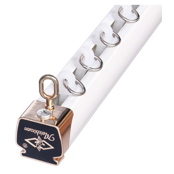
CHR25 big curtain tracks for large window. There are 2 colours for you choose. Ivory and Apple gold curtain tracks will brighten your window. Strong sense of metal and 1.2mm thickness let you more comfortable and relieved.
 Curtains4Australia
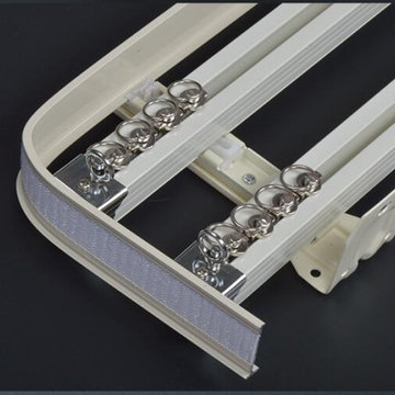
CHR26 super thick curtain tracks for large window. There are 2 colours for you choose. Ivory and Champagne curtain tracks will brighten your window. Strong sense of metal and 1.8mm thickness let you more comfortable and relieved.
11