
Search results for "Remainder" in Home Design Ideas
 Byggmeister Inc
Photo by Jim Raycroft
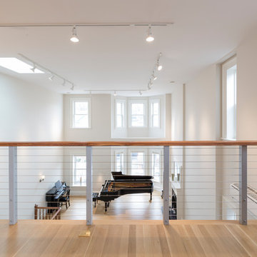
Our client for this project, an amateur pianist, wanted to create a music room for a nice new piano he was planning to purchase. The project scope would also include a new kitchen, bathroom, bedroom and living space, but the new piano was the priority.
LIFTING THE CEILING
The client was moving into a row house, and hoped to accommodate occasional gatherings of musician friends for informal recitals. Because acoustics were important we asked sound engineers from Acentech to visit the site. They noted that the ideal space would have higher ceilings and would be more like a cube than the “half a cube” we were dealing with. “How can we raise the ceiling and make the space a cube?” our client asked.
Designer Josy Raycroft started to explore the possibility of combining the second and third floor units by removing the front half of second floor ceiling, thereby opening up a 2-story music space in the shape of a nearly perfect cube. Thus, the project turned from a straightforward floor plan modification into a complete reimagining of the whole row house, with the client’s new Steinway D as the focal point. Josy and the client started with the piano and created the space around it.
ADDRESSING EVERYDAY NEEDS
For the client’s more mundane needs, Josy switched the location of the bathroom and kitchen—moving the bathroom towards the middle of the second floor where it would be convenient to the rest of the spaces, and placing the kitchen towards the back. The remainder of the third floor was transformed into bedroom and office space open to the music room below.
Products and finishes coordinator Karin Mahdavi worked with the client to select understated finishes for the living spaces so that they would support the piano room without competing with it. As a result the living spaces flow seamlessly into the piano space, creating a coherent whole out of the different parts, kind of like a Schubert piano sonata.
 Byggmeister Inc
Photo by Jim Raycroft
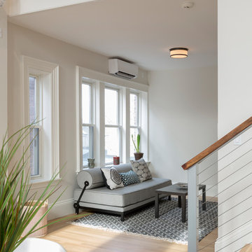
Our client for this project, an amateur pianist, wanted to create a music room for a nice new piano he was planning to purchase. The project scope would also include a new kitchen, bathroom, bedroom and living space, but the new piano was the priority.
LIFTING THE CEILING
The client was moving into a row house, and hoped to accommodate occasional gatherings of musician friends for informal recitals. Because acoustics were important we asked sound engineers from Acentech to visit the site. They noted that the ideal space would have higher ceilings and would be more like a cube than the “half a cube” we were dealing with. “How can we raise the ceiling and make the space a cube?” our client asked.
Designer Josy Raycroft started to explore the possibility of combining the second and third floor units by removing the front half of second floor ceiling, thereby opening up a 2-story music space in the shape of a nearly perfect cube. Thus, the project turned from a straightforward floor plan modification into a complete reimagining of the whole row house, with the client’s new Steinway D as the focal point. Josy and the client started with the piano and created the space around it.
ADDRESSING EVERYDAY NEEDS
For the client’s more mundane needs, Josy switched the location of the bathroom and kitchen—moving the bathroom towards the middle of the second floor where it would be convenient to the rest of the spaces, and placing the kitchen towards the back. The remainder of the third floor was transformed into bedroom and office space open to the music room below.
Products and finishes coordinator Karin Mahdavi worked with the client to select understated finishes for the living spaces so that they would support the piano room without competing with it. As a result the living spaces flow seamlessly into the piano space, creating a coherent whole out of the different parts, kind of like a Schubert piano sonata.
 Byggmeister Inc
Photo by Jim Raycroft
Our client for this project, an amateur pianist, wanted to create a music room for a nice new piano he was planning to purchase. The project scope would also include a new kitchen, bathroom, bedroom and living space, but the new piano was the priority.
LIFTING THE CEILING
The client was moving into a row house, and hoped to accommodate occasional gatherings of musician friends for informal recitals. Because acoustics were important we asked sound engineers from Acentech to visit the site. They noted that the ideal space would have higher ceilings and would be more like a cube than the “half a cube” we were dealing with. “How can we raise the ceiling and make the space a cube?” our client asked.
Designer Josy Raycroft started to explore the possibility of combining the second and third floor units by removing the front half of second floor ceiling, thereby opening up a 2-story music space in the shape of a nearly perfect cube. Thus, the project turned from a straightforward floor plan modification into a complete reimagining of the whole row house, with the client’s new Steinway D as the focal point. Josy and the client started with the piano and created the space around it.
ADDRESSING EVERYDAY NEEDS
For the client’s more mundane needs, Josy switched the location of the bathroom and kitchen—moving the bathroom towards the middle of the second floor where it would be convenient to the rest of the spaces, and placing the kitchen towards the back. The remainder of the third floor was transformed into bedroom and office space open to the music room below.
Products and finishes coordinator Karin Mahdavi worked with the client to select understated finishes for the living spaces so that they would support the piano room without competing with it. As a result the living spaces flow seamlessly into the piano space, creating a coherent whole out of the different parts, kind of like a Schubert piano sonata.
Find the right local pro for your project
 Byggmeister Inc
Photo by Jim Raycroft
Our client for this project, an amateur pianist, wanted to create a music room for a nice new piano he was planning to purchase. The project scope would also include a new kitchen, bathroom, bedroom and living space, but the new piano was the priority.
LIFTING THE CEILING
The client was moving into a row house, and hoped to accommodate occasional gatherings of musician friends for informal recitals. Because acoustics were important we asked sound engineers from Acentech to visit the site. They noted that the ideal space would have higher ceilings and would be more like a cube than the “half a cube” we were dealing with. “How can we raise the ceiling and make the space a cube?” our client asked.
Designer Josy Raycroft started to explore the possibility of combining the second and third floor units by removing the front half of second floor ceiling, thereby opening up a 2-story music space in the shape of a nearly perfect cube. Thus, the project turned from a straightforward floor plan modification into a complete reimagining of the whole row house, with the client’s new Steinway D as the focal point. Josy and the client started with the piano and created the space around it.
ADDRESSING EVERYDAY NEEDS
For the client’s more mundane needs, Josy switched the location of the bathroom and kitchen—moving the bathroom towards the middle of the second floor where it would be convenient to the rest of the spaces, and placing the kitchen towards the back. The remainder of the third floor was transformed into bedroom and office space open to the music room below.
Products and finishes coordinator Karin Mahdavi worked with the client to select understated finishes for the living spaces so that they would support the piano room without competing with it. As a result the living spaces flow seamlessly into the piano space, creating a coherent whole out of the different parts, kind of like a Schubert piano sonata.
 H2D Architecture + Design
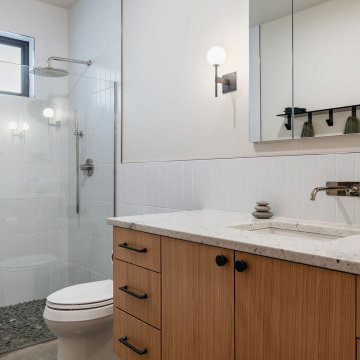
View of the vanity and curbless shower in the main bathroom.
---
The owners of this wooded property on Whidbey Island came to H2D Architecture + Design with a vision to build a high-performance compact new home on the site. The goal of the design was to limit the impact and footprint on the site in order to maintain as many of the trees as possible. A select number of trees were removed to accommodate the new driveway, house and shed location, and a small yard area. The remainder of the site has been left untouched to remain a wooded sanctuary around the home. The home design was developed around a desire for creating only the minimum amount of space necessary for this family of two. The final design is a one-story home with approximately 1350 sf including two bedrooms, two bathrooms, laundry, storage, mechanical, and open living area. The open living area has a vaulted ceiling, wall of windows looking out to the yard, and connection directly out to a covered patio area. The structure of the home was designed to be built with SIPS (Structurally Insulated Panel System). Both the walls and roof were built with the SIPS panels creating a highly energy efficient building envelope. The cabinetry in the home was built by the homeowner.
+ Architecture: H2D Architecture + Design
+ Interior Design: H2D Architecture + Design
www.h2darchitects.com
+ Green Consultantation and Built by: Zero Energy Homes and Clifton View Homes
+ Photography: Anastasiya Homes
 Kitchen Design Concepts
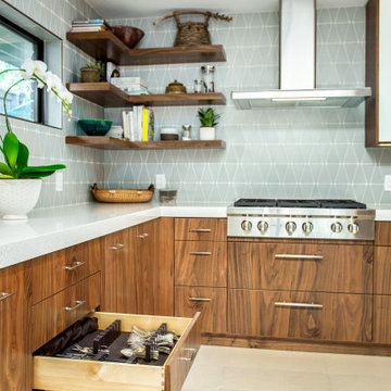
This 1950's kitchen hindered our client's cooking and bi-weekly entertaining and was inconsistent with the home's mid-century architecture. Additional key goals were to improve function for cooking and entertaining 6 to 12 people on a regular basis. Originally with only two entry points to the kitchen (from the entry/foyer and from the dining room) the kitchen wasn’t very open to the remainder of the home, or the living room at all. The door to the carport was never used and created a conflict with seating in the breakfast area. The new plans created larger openings to both rooms, and a third entry point directly into the living room. The “peninsula” manages the sight line between the kitchen and a large, brick fireplace while still creating an “island” effect in the kitchen and allowing seating on both sides. The television was also a “must have” utilizing it to watch cooking shows while prepping food, for news while getting ready for the day, and for background when entertaining.
Meticulously designed cabinets provide ample storage and ergonomically friendly appliance placement. Cabinets were previously laid out into two L-shaped spaces. On the “top” was the cooking area with a narrow pantry (read: scarce storage) and a water heater in the corner. On the “bottom” was a single 36” refrigerator/freezer, and sink. A peninsula separated the kitchen and breakfast room, truncating the entire space. We have now a clearly defined cool storage space spanning 60” width (over 150% more storage) and have separated the ovens and cooking surface to spread out prep/clean zones. True pantry storage was added, and a massive “peninsula” keeps seating for up to 6 comfortably, while still expanding the kitchen and gaining storage. The newly designed, oversized peninsula provides plentiful space for prepping and entertaining. Walnut paneling wraps the room making the kitchen a stunning showpiece.

 Bella Domicile
A 100 year old home gets a much needed kitchen renovation. The owner desperately needed a more functional space to suit their family of five. Adding stacked white cabinetry for added storage and a faux wall behind the refrigerator gives this kitchen a better layout and more storage. Upgrading the materials to cater to a more modern design while honoring the home's history was a task Bella Domicile was willing to help with.
S. Photography
Dura Supreme Cabinetry

 Care Free Homes, Inc.
A new sunroom looks beautiful on this waterfront cottage in Fairhaven, MA!
A Boston family has spent over a decade vacationing in their quaint summer cottage on West Island but when termites destroyed the sunroom in their home away from home – they called Care Free Homes to recreate their favorite room in the house. With the damage limited to the lower portion of the room, we were able to salvage the roof and completely rebuild the remainder of the sunroom. Here is a quick look at the products we used:
Harvey Windows: Floor to ceiling Harvey Classic picture windows provide an energy efficient, panoramic view of the ocean while inviting an abundance of natural light. Harvey Awning windows were installed above the picture windows on both sides of the room to allow a cross breeze on a warm summer day. A Harvey sliding glass/screen door allows ocean air to flow into the home and gives family members easy access to the outdoors.
AZEK Decking: A super cool, curved AZEK deck in Slate Gray gives the family an extra place to relax. AZEK decking is a bug, scratch, rot, fade, and mold resistant capped polymer decking that provides a lifetime of durable, maintenance free beauty. The homeowner requested the horizontal skirt board be flush with the decking and we LOVE the look! AZEK decking is a popular choice among our coastal customers – one of our favorite deck projects is a multi-tiered deck and balcony project on this Fairhaven, MA waterfront home.
Have you always wanted a sunroom for your home? Explore other projects in our online portfolio! We build conventionally framed sunrooms, like this Mattapoisett, MA project or we also offer Betterliving Sunrooms, like this year round room in Dennis, MA. When the time comes to build a sunroom, deck or install new windows in your home give us a call! We provide homeowners with professional grade products, quality craftsmanship, and outstanding customer service. Get a FREE quote! Call (508) 997-1111 and make your house a Care Free home!
 Care Free Homes, Inc.
A new sunroom looks beautiful on this waterfront cottage in Fairhaven, MA!
A Boston family has spent over a decade vacationing in their quaint summer cottage on West Island but when termites destroyed the sunroom in their home away from home – they called Care Free Homes to recreate their favorite room in the house. With the damage limited to the lower portion of the room, we were able to salvage the roof and completely rebuild the remainder of the sunroom. Here is a quick look at the products we used:
Harvey Windows: Floor to ceiling Harvey Classic picture windows provide an energy efficient, panoramic view of the ocean while inviting an abundance of natural light. Harvey Awning windows were installed above the picture windows on both sides of the room to allow a cross breeze on a warm summer day. A Harvey sliding glass/screen door allows ocean air to flow into the home and gives family members easy access to the outdoors.
AZEK Decking: A super cool, curved AZEK deck in Slate Gray gives the family an extra place to relax. AZEK decking is a bug, scratch, rot, fade, and mold resistant capped polymer decking that provides a lifetime of durable, maintenance free beauty. The homeowner requested the horizontal skirt board be flush with the decking and we LOVE the look! AZEK decking is a popular choice among our coastal customers – one of our favorite deck projects is a multi-tiered deck and balcony project on this Fairhaven, MA waterfront home.
Have you always wanted a sunroom for your home? Explore other projects in our online portfolio! We build conventionally framed sunrooms, like this Mattapoisett, MA project or we also offer Betterliving Sunrooms, like this year round room in Dennis, MA. When the time comes to build a sunroom, deck or install new windows in your home give us a call! We provide homeowners with professional grade products, quality craftsmanship, and outstanding customer service. Get a FREE quote! Call (508) 997-1111 and make your house a Care Free home!
 Kitchen Design Concepts
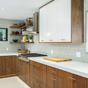
This 1950's kitchen hindered our client's cooking and bi-weekly entertaining and was inconsistent with the home's mid-century architecture. Additional key goals were to improve function for cooking and entertaining 6 to 12 people on a regular basis. Originally with only two entry points to the kitchen (from the entry/foyer and from the dining room) the kitchen wasn’t very open to the remainder of the home, or the living room at all. The door to the carport was never used and created a conflict with seating in the breakfast area. The new plans created larger openings to both rooms, and a third entry point directly into the living room. The “peninsula” manages the sight line between the kitchen and a large, brick fireplace while still creating an “island” effect in the kitchen and allowing seating on both sides. The television was also a “must have” utilizing it to watch cooking shows while prepping food, for news while getting ready for the day, and for background when entertaining.
Meticulously designed cabinets provide ample storage and ergonomically friendly appliance placement. Cabinets were previously laid out into two L-shaped spaces. On the “top” was the cooking area with a narrow pantry (read: scarce storage) and a water heater in the corner. On the “bottom” was a single 36” refrigerator/freezer, and sink. A peninsula separated the kitchen and breakfast room, truncating the entire space. We have now a clearly defined cool storage space spanning 60” width (over 150% more storage) and have separated the ovens and cooking surface to spread out prep/clean zones. True pantry storage was added, and a massive “peninsula” keeps seating for up to 6 comfortably, while still expanding the kitchen and gaining storage. The newly designed, oversized peninsula provides plentiful space for prepping and entertaining. Walnut paneling wraps the room making the kitchen a stunning showpiece.
 Care Free Homes, Inc.
A new sunroom looks beautiful on this waterfront cottage in Fairhaven, MA!
A Boston family has spent over a decade vacationing in their quaint summer cottage on West Island but when termites destroyed the sunroom in their home away from home – they called Care Free Homes to recreate their favorite room in the house. With the damage limited to the lower portion of the room, we were able to salvage the roof and completely rebuild the remainder of the sunroom. Here is a quick look at the products we used:
Harvey Windows: Floor to ceiling Harvey Classic picture windows provide an energy efficient, panoramic view of the ocean while inviting an abundance of natural light. Harvey Awning windows were installed above the picture windows on both sides of the room to allow a cross breeze on a warm summer day. A Harvey sliding glass/screen door allows ocean air to flow into the home and gives family members easy access to the outdoors.
AZEK Decking: A super cool, curved AZEK deck in Slate Gray gives the family an extra place to relax. AZEK decking is a bug, scratch, rot, fade, and mold resistant capped polymer decking that provides a lifetime of durable, maintenance free beauty. The homeowner requested the horizontal skirt board be flush with the decking and we LOVE the look! AZEK decking is a popular choice among our coastal customers – one of our favorite deck projects is a multi-tiered deck and balcony project on this Fairhaven, MA waterfront home.
Have you always wanted a sunroom for your home? Explore other projects in our online portfolio! We build conventionally framed sunrooms, like this Mattapoisett, MA project or we also offer Betterliving Sunrooms, like this year round room in Dennis, MA. When the time comes to build a sunroom, deck or install new windows in your home give us a call! We provide homeowners with professional grade products, quality craftsmanship, and outstanding customer service. Get a FREE quote! Call (508) 997-1111 and make your house a Care Free home!

 Hudson Place Realty
Extraordinary 28-foot wide Queen Anne mansion perched on historic Hudson Street, one of Hoboken’s most coveted blocks. Custom built in 1901, this home has been respectfully restored to showcase the original features and thoughtfully renovated to include an elevator servicing all four levels of this exceptional 6,600+ square foot, 7+ bedroom, 5½ bathroom home. Anchored on a 40×100 foot lot with a timeless façade and storybook stone turret, 925 Hudson Street’s appeal is further enhanced by beautifully scaled rooms, balanced with intimate spaces thus transforming this house into a true family home. The parlor level takes careful consideration to function and flow beginning at the dramatic foyer, flanked by an original fireplace mantle and pocket doors. The drawing room opens to a formal dining room, elevator and powder room. At the rear of the home, the great room provides a flexible, family friendly space with dining nook and an open kitchen with access to the rear yard. Glittering with natural light, the second floor master retreat encompasses a lounge warmed by a working gas fireplace with original mantle and surround, sleeping quarters, dressing hall and en-suite bath. Luxurious and functional, the master bathroom is well appointed with an oversized marble steam shower with barrel ceiling, free standing Victoria + Albert volcanic limestone bath, radiant heat flooring and separate water closet. The remainder of the second and third floors are comprised of five additional bedrooms, home office, three full baths and crowned by an original oval sky light and wide top floor corridor featuring a full wet bar with stone counter and refrigerator. From the terraced front area with mature plantings, to the newly finished side and back yards, the 925 Hudson Street is surrounded by greenery and inviting outdoor spaces. The rear lawn features an Ipé deck, low maintenance SynLawn, fire and water features. An automatic drip irrigation system services the planting beds and the wall of Hornbeam trees provide beauty in every season. Ideal for au pair suite, guest quarters or revenue generating rental, the garden level includes a private 1,000 sq. ft., 2 bedroom 1 bath apartment with a separate entrance. This floor is further outfitted with ample built-in storage, wine closet, and laundry room. Truly a one of a kind home with intricate hardwood flooring, classic plaster moldings, soaring ceilings, original pocket doors, shutters, 3 decorative fireplace mantles and 3 working gas fireplaces, 7 zone central heating and cooling system and a state of the art Control4 fully automated home with security, sound, lighting and HVAC controls. Call today to schedule a private viewing.
- See more at: 925hudson.com
 Kitchen Design Concepts
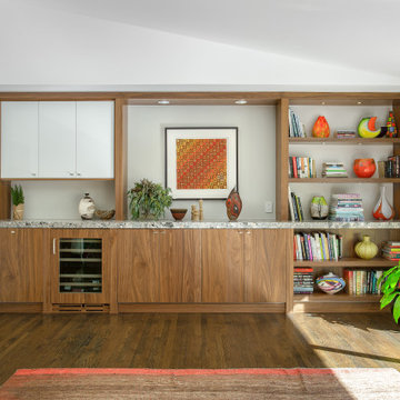
This 1950's kitchen hindered our client's cooking and bi-weekly entertaining and was inconsistent with the home's mid-century architecture. Additional key goals were to improve function for cooking and entertaining 6 to 12 people on a regular basis. Originally with only two entry points to the kitchen (from the entry/foyer and from the dining room) the kitchen wasn’t very open to the remainder of the home, or the living room at all. The door to the carport was never used and created a conflict with seating in the breakfast area. The new plans created larger openings to both rooms, and a third entry point directly into the living room. The “peninsula” manages the sight line between the kitchen and a large, brick fireplace while still creating an “island” effect in the kitchen and allowing seating on both sides. The television was also a “must have” utilizing it to watch cooking shows while prepping food, for news while getting ready for the day, and for background when entertaining.
Meticulously designed cabinets provide ample storage and ergonomically friendly appliance placement. Cabinets were previously laid out into two L-shaped spaces. On the “top” was the cooking area with a narrow pantry (read: scarce storage) and a water heater in the corner. On the “bottom” was a single 36” refrigerator/freezer, and sink. A peninsula separated the kitchen and breakfast room, truncating the entire space. We have now a clearly defined cool storage space spanning 60” width (over 150% more storage) and have separated the ovens and cooking surface to spread out prep/clean zones. True pantry storage was added, and a massive “peninsula” keeps seating for up to 6 comfortably, while still expanding the kitchen and gaining storage. The newly designed, oversized peninsula provides plentiful space for prepping and entertaining. Walnut paneling wraps the room making the kitchen a stunning showpiece.
 Kitchen Design Concepts
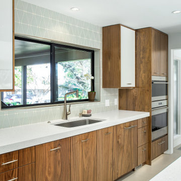
This 1950's kitchen hindered our client's cooking and bi-weekly entertaining and was inconsistent with the home's mid-century architecture. Additional key goals were to improve function for cooking and entertaining 6 to 12 people on a regular basis. Originally with only two entry points to the kitchen (from the entry/foyer and from the dining room) the kitchen wasn’t very open to the remainder of the home, or the living room at all. The door to the carport was never used and created a conflict with seating in the breakfast area. The new plans created larger openings to both rooms, and a third entry point directly into the living room. The “peninsula” manages the sight line between the kitchen and a large, brick fireplace while still creating an “island” effect in the kitchen and allowing seating on both sides. The television was also a “must have” utilizing it to watch cooking shows while prepping food, for news while getting ready for the day, and for background when entertaining.
Meticulously designed cabinets provide ample storage and ergonomically friendly appliance placement. Cabinets were previously laid out into two L-shaped spaces. On the “top” was the cooking area with a narrow pantry (read: scarce storage) and a water heater in the corner. On the “bottom” was a single 36” refrigerator/freezer, and sink. A peninsula separated the kitchen and breakfast room, truncating the entire space. We have now a clearly defined cool storage space spanning 60” width (over 150% more storage) and have separated the ovens and cooking surface to spread out prep/clean zones. True pantry storage was added, and a massive “peninsula” keeps seating for up to 6 comfortably, while still expanding the kitchen and gaining storage. The newly designed, oversized peninsula provides plentiful space for prepping and entertaining. Walnut paneling wraps the room making the kitchen a stunning showpiece.
 Kitchen Design Concepts
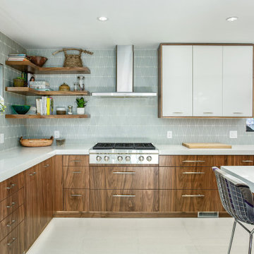
This 1950's kitchen hindered our client's cooking and bi-weekly entertaining and was inconsistent with the home's mid-century architecture. Additional key goals were to improve function for cooking and entertaining 6 to 12 people on a regular basis. Originally with only two entry points to the kitchen (from the entry/foyer and from the dining room) the kitchen wasn’t very open to the remainder of the home, or the living room at all. The door to the carport was never used and created a conflict with seating in the breakfast area. The new plans created larger openings to both rooms, and a third entry point directly into the living room. The “peninsula” manages the sight line between the kitchen and a large, brick fireplace while still creating an “island” effect in the kitchen and allowing seating on both sides. The television was also a “must have” utilizing it to watch cooking shows while prepping food, for news while getting ready for the day, and for background when entertaining.
Meticulously designed cabinets provide ample storage and ergonomically friendly appliance placement. Cabinets were previously laid out into two L-shaped spaces. On the “top” was the cooking area with a narrow pantry (read: scarce storage) and a water heater in the corner. On the “bottom” was a single 36” refrigerator/freezer, and sink. A peninsula separated the kitchen and breakfast room, truncating the entire space. We have now a clearly defined cool storage space spanning 60” width (over 150% more storage) and have separated the ovens and cooking surface to spread out prep/clean zones. True pantry storage was added, and a massive “peninsula” keeps seating for up to 6 comfortably, while still expanding the kitchen and gaining storage. The newly designed, oversized peninsula provides plentiful space for prepping and entertaining. Walnut paneling wraps the room making the kitchen a stunning showpiece.
 Kitchen Design Concepts
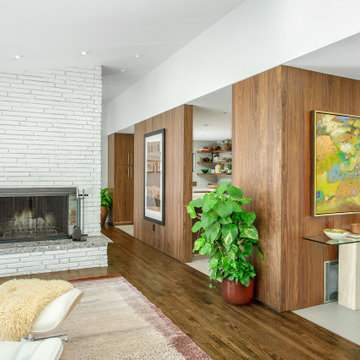
This 1950's kitchen hindered our client's cooking and bi-weekly entertaining and was inconsistent with the home's mid-century architecture. Additional key goals were to improve function for cooking and entertaining 6 to 12 people on a regular basis. Originally with only two entry points to the kitchen (from the entry/foyer and from the dining room) the kitchen wasn’t very open to the remainder of the home, or the living room at all. The door to the carport was never used and created a conflict with seating in the breakfast area. The new plans created larger openings to both rooms, and a third entry point directly into the living room. The “peninsula” manages the sight line between the kitchen and a large, brick fireplace while still creating an “island” effect in the kitchen and allowing seating on both sides. The television was also a “must have” utilizing it to watch cooking shows while prepping food, for news while getting ready for the day, and for background when entertaining.
Meticulously designed cabinets provide ample storage and ergonomically friendly appliance placement. Cabinets were previously laid out into two L-shaped spaces. On the “top” was the cooking area with a narrow pantry (read: scarce storage) and a water heater in the corner. On the “bottom” was a single 36” refrigerator/freezer, and sink. A peninsula separated the kitchen and breakfast room, truncating the entire space. We have now a clearly defined cool storage space spanning 60” width (over 150% more storage) and have separated the ovens and cooking surface to spread out prep/clean zones. True pantry storage was added, and a massive “peninsula” keeps seating for up to 6 comfortably, while still expanding the kitchen and gaining storage. The newly designed, oversized peninsula provides plentiful space for prepping and entertaining. Walnut paneling wraps the room making the kitchen a stunning showpiece.

 Windhill+Co.
The Timothy Hyde House, c. 1729, dear to the homeowners for its historic details, but long-lacking the family oriented spaces and living areas essential for today’s extended family lifestyle. Unwilling to compromise an ounce of character, this growing family longed for more practical amenities like a visitor’s private retreat with bedroom, living room and bath, garage parking, a proper master bedroom layout with full bath and walk-in closet, in addition to a new kitchen that would function as the heart of the home. Ultimately the total square footage was doubled and the entire flow of the home was reworked keeping all of the character details intact. The kitchen is the hub, serving up its center island topped off with reclaimed white oak once belonging to a barn built in the 1880’s; jet mist leather granite tops off the remainder of the kitchen. Custom cable lighting was the ingenious solution for the complicated preservation of the original exposed beams and posts in the kitchen. The barn door was custom crafted from original timbers. Many cups of coffee will be enjoyed at the cozy, sun-filled dining nook overlooking the family room and new adjacent deck. The rear, separate entry mudroom with step-up laundry was a long awaited luxury over the previous basement facilities. Moving upstairs, a centrally located bathroom was removed to create a wheelhouse style landing/passage hall, now home to a quiet workspace, featuring original wide plank floors and tailor-made sconces. Baths were added and upgraded including soapstone tops, marble, a glorious soaker tub in the generous master bath, all giving the home a taste of luxury. Bathing in sunlight rests the master suite starring the original beams, cathedral ceilings, and well-suited chandelier. Throughout the home strategically designed built-ins provide a plethora of storage and organization. This 280 year-old Colonial shines on brighter than ever. We are proud to have been part of its long history.
 Hudson Place Realty
Extraordinary 28-foot wide Queen Anne mansion perched on historic Hudson Street, one of Hoboken’s most coveted blocks. Custom built in 1901, this home has been respectfully restored to showcase the original features and thoughtfully renovated to include an elevator servicing all four levels of this exceptional 6,600+ square foot, 7+ bedroom, 5½ bathroom home. Anchored on a 40×100 foot lot with a timeless façade and storybook stone turret, 925 Hudson Street’s appeal is further enhanced by beautifully scaled rooms, balanced with intimate spaces thus transforming this house into a true family home. The parlor level takes careful consideration to function and flow beginning at the dramatic foyer, flanked by an original fireplace mantle and pocket doors. The drawing room opens to a formal dining room, elevator and powder room. At the rear of the home, the great room provides a flexible, family friendly space with dining nook and an open kitchen with access to the rear yard. Glittering with natural light, the second floor master retreat encompasses a lounge warmed by a working gas fireplace with original mantle and surround, sleeping quarters, dressing hall and en-suite bath. Luxurious and functional, the master bathroom is well appointed with an oversized marble steam shower with barrel ceiling, free standing Victoria + Albert volcanic limestone bath, radiant heat flooring and separate water closet. The remainder of the second and third floors are comprised of five additional bedrooms, home office, three full baths and crowned by an original oval sky light and wide top floor corridor featuring a full wet bar with stone counter and refrigerator. From the terraced front area with mature plantings, to the newly finished side and back yards, the 925 Hudson Street is surrounded by greenery and inviting outdoor spaces. The rear lawn features an Ipé deck, low maintenance SynLawn, fire and water features. An automatic drip irrigation system services the planting beds and the wall of Hornbeam trees provide beauty in every season. Ideal for au pair suite, guest quarters or revenue generating rental, the garden level includes a private 1,000 sq. ft., 2 bedroom 1 bath apartment with a separate entrance. This floor is further outfitted with ample built-in storage, wine closet, and laundry room. Truly a one of a kind home with intricate hardwood flooring, classic plaster moldings, soaring ceilings, original pocket doors, shutters, 3 decorative fireplace mantles and 3 working gas fireplaces, 7 zone central heating and cooling system and a state of the art Control4 fully automated home with security, sound, lighting and HVAC controls. Call today to schedule a private viewing.
- See more at: 925hudson.com
 Windhill+Co.
The Timothy Hyde House, c. 1729, dear to the homeowners for its historic details, but long-lacking the family oriented spaces and living areas essential for today’s extended family lifestyle. Unwilling to compromise an ounce of character, this growing family longed for more practical amenities like a visitor’s private retreat with bedroom, living room and bath, garage parking, a proper master bedroom layout with full bath and walk-in closet, in addition to a new kitchen that would function as the heart of the home. Ultimately the total square footage was doubled and the entire flow of the home was reworked keeping all of the character details intact. The kitchen is the hub, serving up its center island topped off with reclaimed white oak once belonging to a barn built in the 1880’s; jet mist leather granite tops off the remainder of the kitchen. Custom cable lighting was the ingenious solution for the complicated preservation of the original exposed beams and posts in the kitchen. The barn door was custom crafted from original timbers. Many cups of coffee will be enjoyed at the cozy, sun-filled dining nook overlooking the family room and new adjacent deck. The rear, separate entry mudroom with step-up laundry was a long awaited luxury over the previous basement facilities. Moving upstairs, a centrally located bathroom was removed to create a wheelhouse style landing/passage hall, now home to a quiet workspace, featuring original wide plank floors and tailor-made sconces. Baths were added and upgraded including soapstone tops, marble, a glorious soaker tub in the generous master bath, all giving the home a taste of luxury. Bathing in sunlight rests the master suite starring the original beams, cathedral ceilings, and well-suited chandelier. Throughout the home strategically designed built-ins provide a plethora of storage and organization. This 280 year-old Colonial shines on brighter than ever. We are proud to have been part of its long history.
Photo by Eric Roth
 Byggmeister Inc
Photo by Jim Raycroft
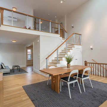
Our client for this project, an amateur pianist, wanted to create a music room for a nice new piano he was planning to purchase. The project scope would also include a new kitchen, bathroom, bedroom and living space, but the new piano was the priority.
LIFTING THE CEILING
The client was moving into a row house, and hoped to accommodate occasional gatherings of musician friends for informal recitals. Because acoustics were important we asked sound engineers from Acentech to visit the site. They noted that the ideal space would have higher ceilings and would be more like a cube than the “half a cube” we were dealing with. “How can we raise the ceiling and make the space a cube?” our client asked.
Designer Josy Raycroft started to explore the possibility of combining the second and third floor units by removing the front half of second floor ceiling, thereby opening up a 2-story music space in the shape of a nearly perfect cube. Thus, the project turned from a straightforward floor plan modification into a complete reimagining of the whole row house, with the client’s new Steinway D as the focal point. Josy and the client started with the piano and created the space around it.
ADDRESSING EVERYDAY NEEDS
For the client’s more mundane needs, Josy switched the location of the bathroom and kitchen—moving the bathroom towards the middle of the second floor where it would be convenient to the rest of the spaces, and placing the kitchen towards the back. The remainder of the third floor was transformed into bedroom and office space open to the music room below.
Products and finishes coordinator Karin Mahdavi worked with the client to select understated finishes for the living spaces so that they would support the piano room without competing with it. As a result the living spaces flow seamlessly into the piano space, creating a coherent whole out of the different parts, kind of like a Schubert piano sonata.
58