
Search results for "Repeatable compositions" in Home Design Ideas
 Simply Perfect
Advice on interior design is available everywhere—from TV shows and websites to books, magazines and apps.
We love seeing people become engaged in design and educated on the wide range of possibilities. But we hope you’ll proceed with caution.
It’s not that style errors are a matter of life and death. It’s just that it’s easy to choose designs that aren’t necessarily reflective of your own personality and character. And since you’re typically stuck with your interior design decisions for years, styles that don’t quite fit can tend to grate on you.
Interiors that give one person comfort may unleash chaos in someone else. This goes beyond favorite colors or hot trends, right to the heart of interior design, where you find questions of composition, balance, repetition, space and more.
The goal is to find that unique combination of design elements that gives you comfort, support and balance.
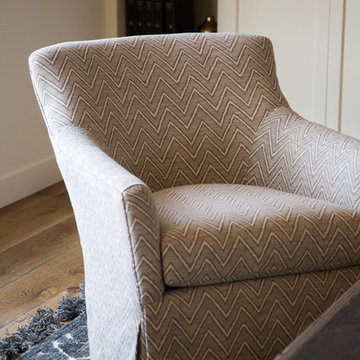
In one home, that perfect balance was struck through the use of symmetry. A pair of comfortable swivel chairs sit beneath matching indigo patterned paintings. Matching bookcases below the paintings contain similar, but not identical, arrangements of books, vases and bowls. Woods and bronzes help warm up the simple white bookcase shelving.
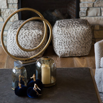
Two matching poufs in front of the fireplace provide additional seating. The sofa is accented with a pair of pillows with a blue pattern that echoes the artwork.
The effect of the symmetry is to achieve order and simplicity, which I promote at every opportunity. After all, your home interiors should be the setting or the backdrop of your life—not center stage.
Antique bronze and blue are complementary colors. Together, they offer a rich palette of richness and depth, which brings out the beauty of wood and stone.
In the home office, a unique, whitewash-stained wooden desk rests on metal, Sawhorse-inspired legs for a warm, rustic look. The black leather chair features a contemporary silhouette with an antique brass frame. An adjustable desk lamp has bronze accents.
The bookcase combines a sleek, black metal frame with concrete shelves, for another unusual pairing. It’s kept uncluttered for an orderly, peaceful look. Items on the shelves include a bronze-accented lamp and a pair
of high gloss-finished wooden bookends.
The elegant artwork behind the desk is a simple midnight-blue and bronze with mottled white. Deep blues are again picked up in the rug, which adds a stately vibe with a modern pattern and satisfying texture.
Within the framework of symmetry, the living room repeats the blue-and-bronze color scheme.
A large midcentury brass clock above the fireplace keeps the natural stone visible, rather than hidden behind a painting or television, while its straight lines and color create a beautiful contrast.
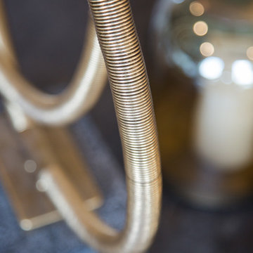
The sofa is a soft, neutral blue. The pattern on the round brass side table features echoes the darker blue-patterned rug, as well as the rug in the office, tying the rooms together.
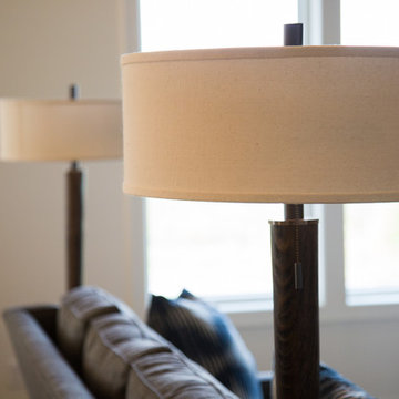
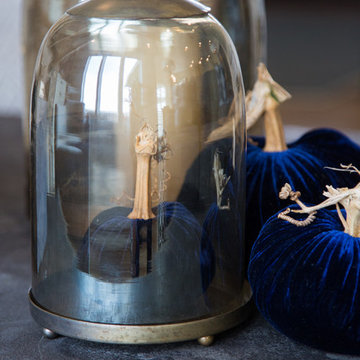
Indigo blue books adjacent to bronze vases on the shelves repeat the color scheme. The soapstone-topped coffee table echoes the shape of the fireplace. A pair of tall, matching floor lamps with long wooden bases, brass pulls and simple linen shades combine both the colors and symmetry found throughout the home.
 Simply Perfect
Advice on interior design is available everywhere—from TV shows and websites to books, magazines and apps.
We love seeing people become engaged in design and educated on the wide range of possibilities. But we hope you’ll proceed with caution.
It’s not that style errors are a matter of life and death. It’s just that it’s easy to choose designs that aren’t necessarily reflective of your own personality and character. And since you’re typically stuck with your interior design decisions for years, styles that don’t quite fit can tend to grate on you.
Interiors that give one person comfort may unleash chaos in someone else. This goes beyond favorite colors or hot trends, right to the heart of interior design, where you find questions of composition, balance, repetition, space and more.
The goal is to find that unique combination of design elements that gives you comfort, support and balance.
In one home, that perfect balance was struck through the use of symmetry. A pair of comfortable swivel chairs sit beneath matching indigo patterned paintings. Matching bookcases below the paintings contain similar, but not identical, arrangements of books, vases and bowls. Woods and bronzes help warm up the simple white bookcase shelving.
Two matching poufs in front of the fireplace provide additional seating. The sofa is accented with a pair of pillows with a blue pattern that echoes the artwork.
The effect of the symmetry is to achieve order and simplicity, which I promote at every opportunity. After all, your home interiors should be the setting or the backdrop of your life—not center stage.
Antique bronze and blue are complementary colors. Together, they offer a rich palette of richness and depth, which brings out the beauty of wood and stone.
In the home office, a unique, whitewash-stained wooden desk rests on metal, Sawhorse-inspired legs for a warm, rustic look. The black leather chair features a contemporary silhouette with an antique brass frame. An adjustable desk lamp has bronze accents.
The bookcase combines a sleek, black metal frame with concrete shelves, for another unusual pairing. It’s kept uncluttered for an orderly, peaceful look. Items on the shelves include a bronze-accented lamp and a pair
of high gloss-finished wooden bookends.
The elegant artwork behind the desk is a simple midnight-blue and bronze with mottled white. Deep blues are again picked up in the rug, which adds a stately vibe with a modern pattern and satisfying texture.
Within the framework of symmetry, the living room repeats the blue-and-bronze color scheme.
A large midcentury brass clock above the fireplace keeps the natural stone visible, rather than hidden behind a painting or television, while its straight lines and color create a beautiful contrast.
The sofa is a soft, neutral blue. The pattern on the round brass side table features echoes the darker blue-patterned rug, as well as the rug in the office, tying the rooms together.
Indigo blue books adjacent to bronze vases on the shelves repeat the color scheme. The soapstone-topped coffee table echoes the shape of the fireplace. A pair of tall, matching floor lamps with long wooden bases, brass pulls and simple linen shades combine both the colors and symmetry found throughout the home.
 Simply Perfect
Advice on interior design is available everywhere—from TV shows and websites to books, magazines and apps.
We love seeing people become engaged in design and educated on the wide range of possibilities. But we hope you’ll proceed with caution.
It’s not that style errors are a matter of life and death. It’s just that it’s easy to choose designs that aren’t necessarily reflective of your own personality and character. And since you’re typically stuck with your interior design decisions for years, styles that don’t quite fit can tend to grate on you.
Interiors that give one person comfort may unleash chaos in someone else. This goes beyond favorite colors or hot trends, right to the heart of interior design, where you find questions of composition, balance, repetition, space and more.
The goal is to find that unique combination of design elements that gives you comfort, support and balance.
In one home, that perfect balance was struck through the use of symmetry. A pair of comfortable swivel chairs sit beneath matching indigo patterned paintings. Matching bookcases below the paintings contain similar, but not identical, arrangements of books, vases and bowls. Woods and bronzes help warm up the simple white bookcase shelving.
Two matching poufs in front of the fireplace provide additional seating. The sofa is accented with a pair of pillows with a blue pattern that echoes the artwork.
The effect of the symmetry is to achieve order and simplicity, which I promote at every opportunity. After all, your home interiors should be the setting or the backdrop of your life—not center stage.
Antique bronze and blue are complementary colors. Together, they offer a rich palette of richness and depth, which brings out the beauty of wood and stone.
In the home office, a unique, whitewash-stained wooden desk rests on metal, Sawhorse-inspired legs for a warm, rustic look. The black leather chair features a contemporary silhouette with an antique brass frame. An adjustable desk lamp has bronze accents.
The bookcase combines a sleek, black metal frame with concrete shelves, for another unusual pairing. It’s kept uncluttered for an orderly, peaceful look. Items on the shelves include a bronze-accented lamp and a pair
of high gloss-finished wooden bookends.
The elegant artwork behind the desk is a simple midnight-blue and bronze with mottled white. Deep blues are again picked up in the rug, which adds a stately vibe with a modern pattern and satisfying texture.
Within the framework of symmetry, the living room repeats the blue-and-bronze color scheme.
A large midcentury brass clock above the fireplace keeps the natural stone visible, rather than hidden behind a painting or television, while its straight lines and color create a beautiful contrast.
The sofa is a soft, neutral blue. The pattern on the round brass side table features echoes the darker blue-patterned rug, as well as the rug in the office, tying the rooms together.
Indigo blue books adjacent to bronze vases on the shelves repeat the color scheme. The soapstone-topped coffee table echoes the shape of the fireplace. A pair of tall, matching floor lamps with long wooden bases, brass pulls and simple linen shades combine both the colors and symmetry found throughout the home.
Find the right local pro for your project
 Simply Perfect
Advice on interior design is available everywhere—from TV shows and websites to books, magazines and apps.
We love seeing people become engaged in design and educated on the wide range of possibilities. But we hope you’ll proceed with caution.
It’s not that style errors are a matter of life and death. It’s just that it’s easy to choose designs that aren’t necessarily reflective of your own personality and character. And since you’re typically stuck with your interior design decisions for years, styles that don’t quite fit can tend to grate on you.
Interiors that give one person comfort may unleash chaos in someone else. This goes beyond favorite colors or hot trends, right to the heart of interior design, where you find questions of composition, balance, repetition, space and more.
The goal is to find that unique combination of design elements that gives you comfort, support and balance.
In one home, that perfect balance was struck through the use of symmetry. A pair of comfortable swivel chairs sit beneath matching indigo patterned paintings. Matching bookcases below the paintings contain similar, but not identical, arrangements of books, vases and bowls. Woods and bronzes help warm up the simple white bookcase shelving.
Two matching poufs in front of the fireplace provide additional seating. The sofa is accented with a pair of pillows with a blue pattern that echoes the artwork.
The effect of the symmetry is to achieve order and simplicity, which I promote at every opportunity. After all, your home interiors should be the setting or the backdrop of your life—not center stage.
Antique bronze and blue are complementary colors. Together, they offer a rich palette of richness and depth, which brings out the beauty of wood and stone.
In the home office, a unique, whitewash-stained wooden desk rests on metal, Sawhorse-inspired legs for a warm, rustic look. The black leather chair features a contemporary silhouette with an antique brass frame. An adjustable desk lamp has bronze accents.
The bookcase combines a sleek, black metal frame with concrete shelves, for another unusual pairing. It’s kept uncluttered for an orderly, peaceful look. Items on the shelves include a bronze-accented lamp and a pair
of high gloss-finished wooden bookends.
The elegant artwork behind the desk is a simple midnight-blue and bronze with mottled white. Deep blues are again picked up in the rug, which adds a stately vibe with a modern pattern and satisfying texture.
Within the framework of symmetry, the living room repeats the blue-and-bronze color scheme.
A large midcentury brass clock above the fireplace keeps the natural stone visible, rather than hidden behind a painting or television, while its straight lines and color create a beautiful contrast.
The sofa is a soft, neutral blue. The pattern on the round brass side table features echoes the darker blue-patterned rug, as well as the rug in the office, tying the rooms together.
Indigo blue books adjacent to bronze vases on the shelves repeat the color scheme. The soapstone-topped coffee table echoes the shape of the fireplace. A pair of tall, matching floor lamps with long wooden bases, brass pulls and simple linen shades combine both the colors and symmetry found throughout the home.
 Simply Perfect
Advice on interior design is available everywhere—from TV shows and websites to books, magazines and apps.
We love seeing people become engaged in design and educated on the wide range of possibilities. But we hope you’ll proceed with caution.
It’s not that style errors are a matter of life and death. It’s just that it’s easy to choose designs that aren’t necessarily reflective of your own personality and character. And since you’re typically stuck with your interior design decisions for years, styles that don’t quite fit can tend to grate on you.
Interiors that give one person comfort may unleash chaos in someone else. This goes beyond favorite colors or hot trends, right to the heart of interior design, where you find questions of composition, balance, repetition, space and more.
The goal is to find that unique combination of design elements that gives you comfort, support and balance.
In one home, that perfect balance was struck through the use of symmetry. A pair of comfortable swivel chairs sit beneath matching indigo patterned paintings. Matching bookcases below the paintings contain similar, but not identical, arrangements of books, vases and bowls. Woods and bronzes help warm up the simple white bookcase shelving.
Two matching poufs in front of the fireplace provide additional seating. The sofa is accented with a pair of pillows with a blue pattern that echoes the artwork.
The effect of the symmetry is to achieve order and simplicity, which I promote at every opportunity. After all, your home interiors should be the setting or the backdrop of your life—not center stage.
Antique bronze and blue are complementary colors. Together, they offer a rich palette of richness and depth, which brings out the beauty of wood and stone.
In the home office, a unique, whitewash-stained wooden desk rests on metal, Sawhorse-inspired legs for a warm, rustic look. The black leather chair features a contemporary silhouette with an antique brass frame. An adjustable desk lamp has bronze accents.
The bookcase combines a sleek, black metal frame with concrete shelves, for another unusual pairing. It’s kept uncluttered for an orderly, peaceful look. Items on the shelves include a bronze-accented lamp and a pair
of high gloss-finished wooden bookends.
The elegant artwork behind the desk is a simple midnight-blue and bronze with mottled white. Deep blues are again picked up in the rug, which adds a stately vibe with a modern pattern and satisfying texture.
Within the framework of symmetry, the living room repeats the blue-and-bronze color scheme.
A large midcentury brass clock above the fireplace keeps the natural stone visible, rather than hidden behind a painting or television, while its straight lines and color create a beautiful contrast.
The sofa is a soft, neutral blue. The pattern on the round brass side table features echoes the darker blue-patterned rug, as well as the rug in the office, tying the rooms together.
Indigo blue books adjacent to bronze vases on the shelves repeat the color scheme. The soapstone-topped coffee table echoes the shape of the fireplace. A pair of tall, matching floor lamps with long wooden bases, brass pulls and simple linen shades combine both the colors and symmetry found throughout the home.
 Simply Perfect
Advice on interior design is available everywhere—from TV shows and websites to books, magazines and apps.
We love seeing people become engaged in design and educated on the wide range of possibilities. But we hope you’ll proceed with caution.
It’s not that style errors are a matter of life and death. It’s just that it’s easy to choose designs that aren’t necessarily reflective of your own personality and character. And since you’re typically stuck with your interior design decisions for years, styles that don’t quite fit can tend to grate on you.
Interiors that give one person comfort may unleash chaos in someone else. This goes beyond favorite colors or hot trends, right to the heart of interior design, where you find questions of composition, balance, repetition, space and more.
The goal is to find that unique combination of design elements that gives you comfort, support and balance.
In one home, that perfect balance was struck through the use of symmetry. A pair of comfortable swivel chairs sit beneath matching indigo patterned paintings. Matching bookcases below the paintings contain similar, but not identical, arrangements of books, vases and bowls. Woods and bronzes help warm up the simple white bookcase shelving.
Two matching poufs in front of the fireplace provide additional seating. The sofa is accented with a pair of pillows with a blue pattern that echoes the artwork.
The effect of the symmetry is to achieve order and simplicity, which I promote at every opportunity. After all, your home interiors should be the setting or the backdrop of your life—not center stage.
Antique bronze and blue are complementary colors. Together, they offer a rich palette of richness and depth, which brings out the beauty of wood and stone.
In the home office, a unique, whitewash-stained wooden desk rests on metal, Sawhorse-inspired legs for a warm, rustic look. The black leather chair features a contemporary silhouette with an antique brass frame. An adjustable desk lamp has bronze accents.
The bookcase combines a sleek, black metal frame with concrete shelves, for another unusual pairing. It’s kept uncluttered for an orderly, peaceful look. Items on the shelves include a bronze-accented lamp and a pair
of high gloss-finished wooden bookends.
The elegant artwork behind the desk is a simple midnight-blue and bronze with mottled white. Deep blues are again picked up in the rug, which adds a stately vibe with a modern pattern and satisfying texture.
Within the framework of symmetry, the living room repeats the blue-and-bronze color scheme.
A large midcentury brass clock above the fireplace keeps the natural stone visible, rather than hidden behind a painting or television, while its straight lines and color create a beautiful contrast.
The sofa is a soft, neutral blue. The pattern on the round brass side table features echoes the darker blue-patterned rug, as well as the rug in the office, tying the rooms together.
Indigo blue books adjacent to bronze vases on the shelves repeat the color scheme. The soapstone-topped coffee table echoes the shape of the fireplace. A pair of tall, matching floor lamps with long wooden bases, brass pulls and simple linen shades combine both the colors and symmetry found throughout the home.
 Simply Perfect
Advice on interior design is available everywhere—from TV shows and websites to books, magazines and apps.
We love seeing people become engaged in design and educated on the wide range of possibilities. But we hope you’ll proceed with caution.
It’s not that style errors are a matter of life and death. It’s just that it’s easy to choose designs that aren’t necessarily reflective of your own personality and character. And since you’re typically stuck with your interior design decisions for years, styles that don’t quite fit can tend to grate on you.
Interiors that give one person comfort may unleash chaos in someone else. This goes beyond favorite colors or hot trends, right to the heart of interior design, where you find questions of composition, balance, repetition, space and more.
The goal is to find that unique combination of design elements that gives you comfort, support and balance.
In one home, that perfect balance was struck through the use of symmetry. A pair of comfortable swivel chairs sit beneath matching indigo patterned paintings. Matching bookcases below the paintings contain similar, but not identical, arrangements of books, vases and bowls. Woods and bronzes help warm up the simple white bookcase shelving.
Two matching poufs in front of the fireplace provide additional seating. The sofa is accented with a pair of pillows with a blue pattern that echoes the artwork.
The effect of the symmetry is to achieve order and simplicity, which I promote at every opportunity. After all, your home interiors should be the setting or the backdrop of your life—not center stage.
Antique bronze and blue are complementary colors. Together, they offer a rich palette of richness and depth, which brings out the beauty of wood and stone.
In the home office, a unique, whitewash-stained wooden desk rests on metal, Sawhorse-inspired legs for a warm, rustic look. The black leather chair features a contemporary silhouette with an antique brass frame. An adjustable desk lamp has bronze accents.
The bookcase combines a sleek, black metal frame with concrete shelves, for another unusual pairing. It’s kept uncluttered for an orderly, peaceful look. Items on the shelves include a bronze-accented lamp and a pair
of high gloss-finished wooden bookends.
The elegant artwork behind the desk is a simple midnight-blue and bronze with mottled white. Deep blues are again picked up in the rug, which adds a stately vibe with a modern pattern and satisfying texture.
Within the framework of symmetry, the living room repeats the blue-and-bronze color scheme.
A large midcentury brass clock above the fireplace keeps the natural stone visible, rather than hidden behind a painting or television, while its straight lines and color create a beautiful contrast.
The sofa is a soft, neutral blue. The pattern on the round brass side table features echoes the darker blue-patterned rug, as well as the rug in the office, tying the rooms together.
Indigo blue books adjacent to bronze vases on the shelves repeat the color scheme. The soapstone-topped coffee table echoes the shape of the fireplace. A pair of tall, matching floor lamps with long wooden bases, brass pulls and simple linen shades combine both the colors and symmetry found throughout the home.
 Simply Perfect
Advice on interior design is available everywhere—from TV shows and websites to books, magazines and apps.
We love seeing people become engaged in design and educated on the wide range of possibilities. But we hope you’ll proceed with caution.
It’s not that style errors are a matter of life and death. It’s just that it’s easy to choose designs that aren’t necessarily reflective of your own personality and character. And since you’re typically stuck with your interior design decisions for years, styles that don’t quite fit can tend to grate on you.
Interiors that give one person comfort may unleash chaos in someone else. This goes beyond favorite colors or hot trends, right to the heart of interior design, where you find questions of composition, balance, repetition, space and more.
The goal is to find that unique combination of design elements that gives you comfort, support and balance.
In one home, that perfect balance was struck through the use of symmetry. A pair of comfortable swivel chairs sit beneath matching indigo patterned paintings. Matching bookcases below the paintings contain similar, but not identical, arrangements of books, vases and bowls. Woods and bronzes help warm up the simple white bookcase shelving.
Two matching poufs in front of the fireplace provide additional seating. The sofa is accented with a pair of pillows with a blue pattern that echoes the artwork.
The effect of the symmetry is to achieve order and simplicity, which I promote at every opportunity. After all, your home interiors should be the setting or the backdrop of your life—not center stage.
Antique bronze and blue are complementary colors. Together, they offer a rich palette of richness and depth, which brings out the beauty of wood and stone.
In the home office, a unique, whitewash-stained wooden desk rests on metal, Sawhorse-inspired legs for a warm, rustic look. The black leather chair features a contemporary silhouette with an antique brass frame. An adjustable desk lamp has bronze accents.
The bookcase combines a sleek, black metal frame with concrete shelves, for another unusual pairing. It’s kept uncluttered for an orderly, peaceful look. Items on the shelves include a bronze-accented lamp and a pair
of high gloss-finished wooden bookends.
The elegant artwork behind the desk is a simple midnight-blue and bronze with mottled white. Deep blues are again picked up in the rug, which adds a stately vibe with a modern pattern and satisfying texture.
Within the framework of symmetry, the living room repeats the blue-and-bronze color scheme.
A large midcentury brass clock above the fireplace keeps the natural stone visible, rather than hidden behind a painting or television, while its straight lines and color create a beautiful contrast.
The sofa is a soft, neutral blue. The pattern on the round brass side table features echoes the darker blue-patterned rug, as well as the rug in the office, tying the rooms together.
Indigo blue books adjacent to bronze vases on the shelves repeat the color scheme. The soapstone-topped coffee table echoes the shape of the fireplace. A pair of tall, matching floor lamps with long wooden bases, brass pulls and simple linen shades combine both the colors and symmetry found throughout the home.
 Simply Perfect
Advice on interior design is available everywhere—from TV shows and websites to books, magazines and apps.
We love seeing people become engaged in design and educated on the wide range of possibilities. But we hope you’ll proceed with caution.
It’s not that style errors are a matter of life and death. It’s just that it’s easy to choose designs that aren’t necessarily reflective of your own personality and character. And since you’re typically stuck with your interior design decisions for years, styles that don’t quite fit can tend to grate on you.
Interiors that give one person comfort may unleash chaos in someone else. This goes beyond favorite colors or hot trends, right to the heart of interior design, where you find questions of composition, balance, repetition, space and more.
The goal is to find that unique combination of design elements that gives you comfort, support and balance.
In one home, that perfect balance was struck through the use of symmetry. A pair of comfortable swivel chairs sit beneath matching indigo patterned paintings. Matching bookcases below the paintings contain similar, but not identical, arrangements of books, vases and bowls. Woods and bronzes help warm up the simple white bookcase shelving.
Two matching poufs in front of the fireplace provide additional seating. The sofa is accented with a pair of pillows with a blue pattern that echoes the artwork.
The effect of the symmetry is to achieve order and simplicity, which I promote at every opportunity. After all, your home interiors should be the setting or the backdrop of your life—not center stage.
Antique bronze and blue are complementary colors. Together, they offer a rich palette of richness and depth, which brings out the beauty of wood and stone.
In the home office, a unique, whitewash-stained wooden desk rests on metal, Sawhorse-inspired legs for a warm, rustic look. The black leather chair features a contemporary silhouette with an antique brass frame. An adjustable desk lamp has bronze accents.
The bookcase combines a sleek, black metal frame with concrete shelves, for another unusual pairing. It’s kept uncluttered for an orderly, peaceful look. Items on the shelves include a bronze-accented lamp and a pair
of high gloss-finished wooden bookends.
The elegant artwork behind the desk is a simple midnight-blue and bronze with mottled white. Deep blues are again picked up in the rug, which adds a stately vibe with a modern pattern and satisfying texture.
Within the framework of symmetry, the living room repeats the blue-and-bronze color scheme.
A large midcentury brass clock above the fireplace keeps the natural stone visible, rather than hidden behind a painting or television, while its straight lines and color create a beautiful contrast.
The sofa is a soft, neutral blue. The pattern on the round brass side table features echoes the darker blue-patterned rug, as well as the rug in the office, tying the rooms together.
Indigo blue books adjacent to bronze vases on the shelves repeat the color scheme. The soapstone-topped coffee table echoes the shape of the fireplace. A pair of tall, matching floor lamps with long wooden bases, brass pulls and simple linen shades combine both the colors and symmetry found throughout the home.
 Lola Cwikowski Studio
An Ohio family in search of a place to enjoy the Portuguese coast acquired a four-bedroom apartment just outside the center of Cascais. Our studio was engaged to turn a compartmented interior into a holiday residence for a household that gathers in numbers: one that could seat everyone at once and still hold the ease and lightness of a home by the beach.
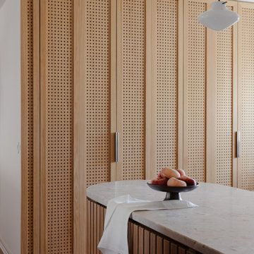
The original plan included a kitchen and laundry room sealed off from the living room, floor finishes and levels that changed from threshold to threshold, and bathrooms in varying styles. Work began by redefining the alignments and circulation. The principal transformation was the opening of the kitchen, creating a more generous social setting centered on a bespoke island fitted with storage and seating.
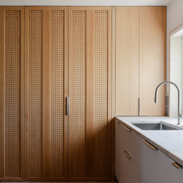
The interior takes its cues from the building’s geometric façade, which projects and recedes in volumes and voids. Bespoke joinery in oak and lacquer carries continuity and order through the apartment. Concealed storage runs throughout: at the entrance, in the dining area, along the living area, and beneath built-in benches. The laundry is merged into the kitchen behind perforated doors for ventilation while keeping the service area discreet. Behind the sofa, a console slips a workspace into the living area without conceding its openness.
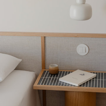
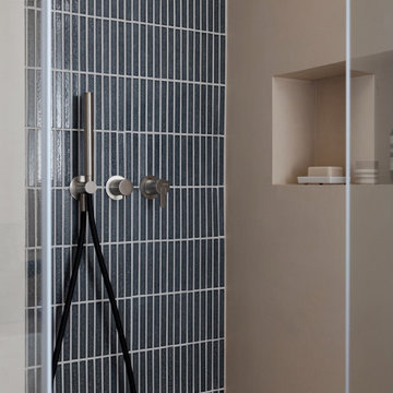
Curved elements answer the rectilinear architecture; artisanal glazed vertical tiles repeat from the backsplashes onto custom side tables. The palette stays deliberately narrow; the muted oak and lacquer are joined by a softened timber floor, Portuguese Lioz stone, and walls painted to the color of bare plaster. Existing doors and baseboards were repainted in a warm light gray that draws the original elements into the language of the new interior. Upholstery and decorative accents hint at the terracotta, sky blue, and yellow of the façade.
The bedrooms are set with upholstered headboards on oak frames, bedside tables that extend those outlines, and wardrobes fit for a long stay. Locally made rugs, bedcovers, and throw pillows soften the composition. In the bathrooms, the plans were reorganized and the showers enlarged. Lioz was used for the counters and sinks, shelves, shower bases, and bathtub surround, with microcement bringing a soothing warmth to the walls, and storage in floating cabinets. Deeper in tone than the rest of the apartment yet never dim, they are quietly elegant rooms made for lingering — taking one’s time getting ready, or unwinding at the end of a day.
PHOTOGRAPHY: © ALEXANDER BOGORODSKIY
 Lola Cwikowski Studio
An Ohio family in search of a place to enjoy the Portuguese coast acquired a four-bedroom apartment just outside the center of Cascais. Our studio was engaged to turn a compartmented interior into a holiday residence for a household that gathers in numbers: one that could seat everyone at once and still hold the ease and lightness of a home by the beach.
The original plan included a kitchen and laundry room sealed off from the living room, floor finishes and levels that changed from threshold to threshold, and bathrooms in varying styles. Work began by redefining the alignments and circulation. The principal transformation was the opening of the kitchen, creating a more generous social setting centered on a bespoke island fitted with storage and seating.
The interior takes its cues from the building’s geometric façade, which projects and recedes in volumes and voids. Bespoke joinery in oak and lacquer carries continuity and order through the apartment. Concealed storage runs throughout: at the entrance, in the dining area, along the living area, and beneath built-in benches. The laundry is merged into the kitchen behind perforated doors for ventilation while keeping the service area discreet. Behind the sofa, a console slips a workspace into the living area without conceding its openness.
Curved elements answer the rectilinear architecture; artisanal glazed vertical tiles repeat from the backsplashes onto custom side tables. The palette stays deliberately narrow; the muted oak and lacquer are joined by a softened timber floor, Portuguese Lioz stone, and walls painted to the color of bare plaster. Existing doors and baseboards were repainted in a warm light gray that draws the original elements into the language of the new interior. Upholstery and decorative accents hint at the terracotta, sky blue, and yellow of the façade.
The bedrooms are set with upholstered headboards on oak frames, bedside tables that extend those outlines, and wardrobes fit for a long stay. Locally made rugs, bedcovers, and throw pillows soften the composition. In the bathrooms, the plans were reorganized and the showers enlarged. Lioz was used for the counters and sinks, shelves, shower bases, and bathtub surround, with microcement bringing a soothing warmth to the walls, and storage in floating cabinets. Deeper in tone than the rest of the apartment yet never dim, they are quietly elegant rooms made for lingering — taking one’s time getting ready, or unwinding at the end of a day.
PHOTOGRAPHY: © ALEXANDER BOGORODSKIY
 Lola Cwikowski Studio
An Ohio family in search of a place to enjoy the Portuguese coast acquired a four-bedroom apartment just outside the center of Cascais. Our studio was engaged to turn a compartmented interior into a holiday residence for a household that gathers in numbers: one that could seat everyone at once and still hold the ease and lightness of a home by the beach.
The original plan included a kitchen and laundry room sealed off from the living room, floor finishes and levels that changed from threshold to threshold, and bathrooms in varying styles. Work began by redefining the alignments and circulation. The principal transformation was the opening of the kitchen, creating a more generous social setting centered on a bespoke island fitted with storage and seating.
The interior takes its cues from the building’s geometric façade, which projects and recedes in volumes and voids. Bespoke joinery in oak and lacquer carries continuity and order through the apartment. Concealed storage runs throughout: at the entrance, in the dining area, along the living area, and beneath built-in benches. The laundry is merged into the kitchen behind perforated doors for ventilation while keeping the service area discreet. Behind the sofa, a console slips a workspace into the living area without conceding its openness.
Curved elements answer the rectilinear architecture; artisanal glazed vertical tiles repeat from the backsplashes onto custom side tables. The palette stays deliberately narrow; the muted oak and lacquer are joined by a softened timber floor, Portuguese Lioz stone, and walls painted to the color of bare plaster. Existing doors and baseboards were repainted in a warm light gray that draws the original elements into the language of the new interior. Upholstery and decorative accents hint at the terracotta, sky blue, and yellow of the façade.
The bedrooms are set with upholstered headboards on oak frames, bedside tables that extend those outlines, and wardrobes fit for a long stay. Locally made rugs, bedcovers, and throw pillows soften the composition. In the bathrooms, the plans were reorganized and the showers enlarged. Lioz was used for the counters and sinks, shelves, shower bases, and bathtub surround, with microcement bringing a soothing warmth to the walls, and storage in floating cabinets. Deeper in tone than the rest of the apartment yet never dim, they are quietly elegant rooms made for lingering — taking one’s time getting ready, or unwinding at the end of a day.
PHOTOGRAPHY: © ALEXANDER BOGORODSKIY
 Lola Cwikowski Studio
An Ohio family in search of a place to enjoy the Portuguese coast acquired a four-bedroom apartment just outside the center of Cascais. Our studio was engaged to turn a compartmented interior into a holiday residence for a household that gathers in numbers: one that could seat everyone at once and still hold the ease and lightness of a home by the beach.
The original plan included a kitchen and laundry room sealed off from the living room, floor finishes and levels that changed from threshold to threshold, and bathrooms in varying styles. Work began by redefining the alignments and circulation. The principal transformation was the opening of the kitchen, creating a more generous social setting centered on a bespoke island fitted with storage and seating.
The interior takes its cues from the building’s geometric façade, which projects and recedes in volumes and voids. Bespoke joinery in oak and lacquer carries continuity and order through the apartment. Concealed storage runs throughout: at the entrance, in the dining area, along the living area, and beneath built-in benches. The laundry is merged into the kitchen behind perforated doors for ventilation while keeping the service area discreet. Behind the sofa, a console slips a workspace into the living area without conceding its openness.
Curved elements answer the rectilinear architecture; artisanal glazed vertical tiles repeat from the backsplashes onto custom side tables. The palette stays deliberately narrow; the muted oak and lacquer are joined by a softened timber floor, Portuguese Lioz stone, and walls painted to the color of bare plaster. Existing doors and baseboards were repainted in a warm light gray that draws the original elements into the language of the new interior. Upholstery and decorative accents hint at the terracotta, sky blue, and yellow of the façade.
The bedrooms are set with upholstered headboards on oak frames, bedside tables that extend those outlines, and wardrobes fit for a long stay. Locally made rugs, bedcovers, and throw pillows soften the composition. In the bathrooms, the plans were reorganized and the showers enlarged. Lioz was used for the counters and sinks, shelves, shower bases, and bathtub surround, with microcement bringing a soothing warmth to the walls, and storage in floating cabinets. Deeper in tone than the rest of the apartment yet never dim, they are quietly elegant rooms made for lingering — taking one’s time getting ready, or unwinding at the end of a day.
PHOTOGRAPHY: © ALEXANDER BOGORODSKIY
 Lola Cwikowski Studio
An Ohio family in search of a place to enjoy the Portuguese coast acquired a four-bedroom apartment just outside the center of Cascais. Our studio was engaged to turn a compartmented interior into a holiday residence for a household that gathers in numbers: one that could seat everyone at once and still hold the ease and lightness of a home by the beach.
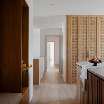
The original plan included a kitchen and laundry room sealed off from the living room, floor finishes and levels that changed from threshold to threshold, and bathrooms in varying styles. Work began by redefining the alignments and circulation. The principal transformation was the opening of the kitchen, creating a more generous social setting centered on a bespoke island fitted with storage and seating.
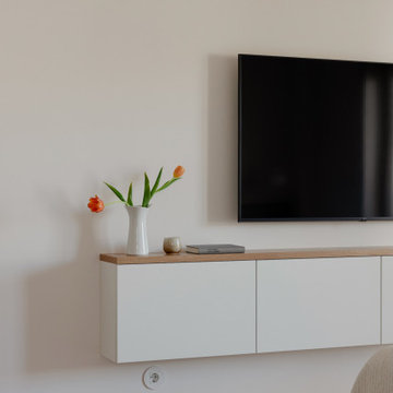
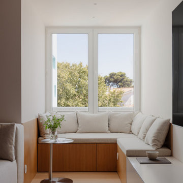
The interior takes its cues from the building’s geometric façade, which projects and recedes in volumes and voids. Bespoke joinery in oak and lacquer carries continuity and order through the apartment. Concealed storage runs throughout: at the entrance, in the dining area, along the living area, and beneath built-in benches. The laundry is merged into the kitchen behind perforated doors for ventilation while keeping the service area discreet. Behind the sofa, a console slips a workspace into the living area without conceding its openness.
Curved elements answer the rectilinear architecture; artisanal glazed vertical tiles repeat from the backsplashes onto custom side tables. The palette stays deliberately narrow; the muted oak and lacquer are joined by a softened timber floor, Portuguese Lioz stone, and walls painted to the color of bare plaster. Existing doors and baseboards were repainted in a warm light gray that draws the original elements into the language of the new interior. Upholstery and decorative accents hint at the terracotta, sky blue, and yellow of the façade.
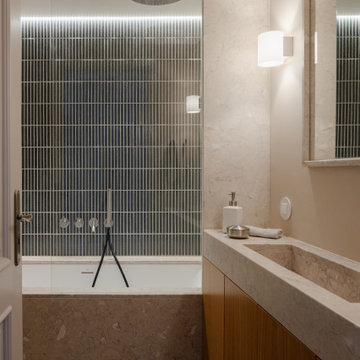
The bedrooms are set with upholstered headboards on oak frames, bedside tables that extend those outlines, and wardrobes fit for a long stay. Locally made rugs, bedcovers, and throw pillows soften the composition. In the bathrooms, the plans were reorganized and the showers enlarged. Lioz was used for the counters and sinks, shelves, shower bases, and bathtub surround, with microcement bringing a soothing warmth to the walls, and storage in floating cabinets. Deeper in tone than the rest of the apartment yet never dim, they are quietly elegant rooms made for lingering — taking one’s time getting ready, or unwinding at the end of a day.
PHOTOGRAPHY: © ALEXANDER BOGORODSKIY
 Lola Cwikowski Studio
An Ohio family in search of a place to enjoy the Portuguese coast acquired a four-bedroom apartment just outside the center of Cascais. Our studio was engaged to turn a compartmented interior into a holiday residence for a household that gathers in numbers: one that could seat everyone at once and still hold the ease and lightness of a home by the beach.
The original plan included a kitchen and laundry room sealed off from the living room, floor finishes and levels that changed from threshold to threshold, and bathrooms in varying styles. Work began by redefining the alignments and circulation. The principal transformation was the opening of the kitchen, creating a more generous social setting centered on a bespoke island fitted with storage and seating.
The interior takes its cues from the building’s geometric façade, which projects and recedes in volumes and voids. Bespoke joinery in oak and lacquer carries continuity and order through the apartment. Concealed storage runs throughout: at the entrance, in the dining area, along the living area, and beneath built-in benches. The laundry is merged into the kitchen behind perforated doors for ventilation while keeping the service area discreet. Behind the sofa, a console slips a workspace into the living area without conceding its openness.
Curved elements answer the rectilinear architecture; artisanal glazed vertical tiles repeat from the backsplashes onto custom side tables. The palette stays deliberately narrow; the muted oak and lacquer are joined by a softened timber floor, Portuguese Lioz stone, and walls painted to the color of bare plaster. Existing doors and baseboards were repainted in a warm light gray that draws the original elements into the language of the new interior. Upholstery and decorative accents hint at the terracotta, sky blue, and yellow of the façade.
The bedrooms are set with upholstered headboards on oak frames, bedside tables that extend those outlines, and wardrobes fit for a long stay. Locally made rugs, bedcovers, and throw pillows soften the composition. In the bathrooms, the plans were reorganized and the showers enlarged. Lioz was used for the counters and sinks, shelves, shower bases, and bathtub surround, with microcement bringing a soothing warmth to the walls, and storage in floating cabinets. Deeper in tone than the rest of the apartment yet never dim, they are quietly elegant rooms made for lingering — taking one’s time getting ready, or unwinding at the end of a day.
PHOTOGRAPHY: © ALEXANDER BOGORODSKIY
 Lola Cwikowski Studio
An Ohio family in search of a place to enjoy the Portuguese coast acquired a four-bedroom apartment just outside the center of Cascais. Our studio was engaged to turn a compartmented interior into a holiday residence for a household that gathers in numbers: one that could seat everyone at once and still hold the ease and lightness of a home by the beach.
The original plan included a kitchen and laundry room sealed off from the living room, floor finishes and levels that changed from threshold to threshold, and bathrooms in varying styles. Work began by redefining the alignments and circulation. The principal transformation was the opening of the kitchen, creating a more generous social setting centered on a bespoke island fitted with storage and seating.
The interior takes its cues from the building’s geometric façade, which projects and recedes in volumes and voids. Bespoke joinery in oak and lacquer carries continuity and order through the apartment. Concealed storage runs throughout: at the entrance, in the dining area, along the living area, and beneath built-in benches. The laundry is merged into the kitchen behind perforated doors for ventilation while keeping the service area discreet. Behind the sofa, a console slips a workspace into the living area without conceding its openness.
Curved elements answer the rectilinear architecture; artisanal glazed vertical tiles repeat from the backsplashes onto custom side tables. The palette stays deliberately narrow; the muted oak and lacquer are joined by a softened timber floor, Portuguese Lioz stone, and walls painted to the color of bare plaster. Existing doors and baseboards were repainted in a warm light gray that draws the original elements into the language of the new interior. Upholstery and decorative accents hint at the terracotta, sky blue, and yellow of the façade.
The bedrooms are set with upholstered headboards on oak frames, bedside tables that extend those outlines, and wardrobes fit for a long stay. Locally made rugs, bedcovers, and throw pillows soften the composition. In the bathrooms, the plans were reorganized and the showers enlarged. Lioz was used for the counters and sinks, shelves, shower bases, and bathtub surround, with microcement bringing a soothing warmth to the walls, and storage in floating cabinets. Deeper in tone than the rest of the apartment yet never dim, they are quietly elegant rooms made for lingering — taking one’s time getting ready, or unwinding at the end of a day.
PHOTOGRAPHY: © ALEXANDER BOGORODSKIY
 Lola Cwikowski Studio
An Ohio family in search of a place to enjoy the Portuguese coast acquired a four-bedroom apartment just outside the center of Cascais. Our studio was engaged to turn a compartmented interior into a holiday residence for a household that gathers in numbers: one that could seat everyone at once and still hold the ease and lightness of a home by the beach.
The original plan included a kitchen and laundry room sealed off from the living room, floor finishes and levels that changed from threshold to threshold, and bathrooms in varying styles. Work began by redefining the alignments and circulation. The principal transformation was the opening of the kitchen, creating a more generous social setting centered on a bespoke island fitted with storage and seating.
The interior takes its cues from the building’s geometric façade, which projects and recedes in volumes and voids. Bespoke joinery in oak and lacquer carries continuity and order through the apartment. Concealed storage runs throughout: at the entrance, in the dining area, along the living area, and beneath built-in benches. The laundry is merged into the kitchen behind perforated doors for ventilation while keeping the service area discreet. Behind the sofa, a console slips a workspace into the living area without conceding its openness.
Curved elements answer the rectilinear architecture; artisanal glazed vertical tiles repeat from the backsplashes onto custom side tables. The palette stays deliberately narrow; the muted oak and lacquer are joined by a softened timber floor, Portuguese Lioz stone, and walls painted to the color of bare plaster. Existing doors and baseboards were repainted in a warm light gray that draws the original elements into the language of the new interior. Upholstery and decorative accents hint at the terracotta, sky blue, and yellow of the façade.
The bedrooms are set with upholstered headboards on oak frames, bedside tables that extend those outlines, and wardrobes fit for a long stay. Locally made rugs, bedcovers, and throw pillows soften the composition. In the bathrooms, the plans were reorganized and the showers enlarged. Lioz was used for the counters and sinks, shelves, shower bases, and bathtub surround, with microcement bringing a soothing warmth to the walls, and storage in floating cabinets. Deeper in tone than the rest of the apartment yet never dim, they are quietly elegant rooms made for lingering — taking one’s time getting ready, or unwinding at the end of a day.
PHOTOGRAPHY: © ALEXANDER BOGORODSKIY
 Lola Cwikowski Studio
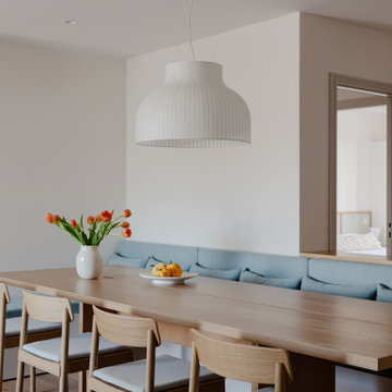
An Ohio family in search of a place to enjoy the Portuguese coast acquired a four-bedroom apartment just outside the center of Cascais. Our studio was engaged to turn a compartmented interior into a holiday residence for a household that gathers in numbers: one that could seat everyone at once and still hold the ease and lightness of a home by the beach.
The original plan included a kitchen and laundry room sealed off from the living room, floor finishes and levels that changed from threshold to threshold, and bathrooms in varying styles. Work began by redefining the alignments and circulation. The principal transformation was the opening of the kitchen, creating a more generous social setting centered on a bespoke island fitted with storage and seating.
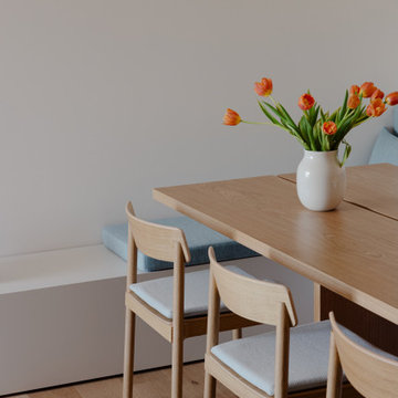
The interior takes its cues from the building’s geometric façade, which projects and recedes in volumes and voids. Bespoke joinery in oak and lacquer carries continuity and order through the apartment. Concealed storage runs throughout: at the entrance, in the dining area, along the living area, and beneath built-in benches. The laundry is merged into the kitchen behind perforated doors for ventilation while keeping the service area discreet. Behind the sofa, a console slips a workspace into the living area without conceding its openness.
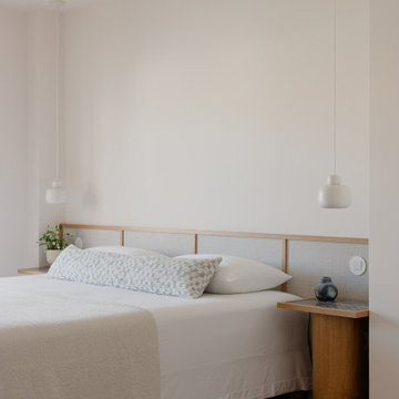
Curved elements answer the rectilinear architecture; artisanal glazed vertical tiles repeat from the backsplashes onto custom side tables. The palette stays deliberately narrow; the muted oak and lacquer are joined by a softened timber floor, Portuguese Lioz stone, and walls painted to the color of bare plaster. Existing doors and baseboards were repainted in a warm light gray that draws the original elements into the language of the new interior. Upholstery and decorative accents hint at the terracotta, sky blue, and yellow of the façade.
The bedrooms are set with upholstered headboards on oak frames, bedside tables that extend those outlines, and wardrobes fit for a long stay. Locally made rugs, bedcovers, and throw pillows soften the composition. In the bathrooms, the plans were reorganized and the showers enlarged. Lioz was used for the counters and sinks, shelves, shower bases, and bathtub surround, with microcement bringing a soothing warmth to the walls, and storage in floating cabinets. Deeper in tone than the rest of the apartment yet never dim, they are quietly elegant rooms made for lingering — taking one’s time getting ready, or unwinding at the end of a day.
PHOTOGRAPHY: © ALEXANDER BOGORODSKIY
 Lola Cwikowski Studio
An Ohio family in search of a place to enjoy the Portuguese coast acquired a four-bedroom apartment just outside the center of Cascais. Our studio was engaged to turn a compartmented interior into a holiday residence for a household that gathers in numbers: one that could seat everyone at once and still hold the ease and lightness of a home by the beach.
The original plan included a kitchen and laundry room sealed off from the living room, floor finishes and levels that changed from threshold to threshold, and bathrooms in varying styles. Work began by redefining the alignments and circulation. The principal transformation was the opening of the kitchen, creating a more generous social setting centered on a bespoke island fitted with storage and seating.
The interior takes its cues from the building’s geometric façade, which projects and recedes in volumes and voids. Bespoke joinery in oak and lacquer carries continuity and order through the apartment. Concealed storage runs throughout: at the entrance, in the dining area, along the living area, and beneath built-in benches. The laundry is merged into the kitchen behind perforated doors for ventilation while keeping the service area discreet. Behind the sofa, a console slips a workspace into the living area without conceding its openness.
Curved elements answer the rectilinear architecture; artisanal glazed vertical tiles repeat from the backsplashes onto custom side tables. The palette stays deliberately narrow; the muted oak and lacquer are joined by a softened timber floor, Portuguese Lioz stone, and walls painted to the color of bare plaster. Existing doors and baseboards were repainted in a warm light gray that draws the original elements into the language of the new interior. Upholstery and decorative accents hint at the terracotta, sky blue, and yellow of the façade.
The bedrooms are set with upholstered headboards on oak frames, bedside tables that extend those outlines, and wardrobes fit for a long stay. Locally made rugs, bedcovers, and throw pillows soften the composition. In the bathrooms, the plans were reorganized and the showers enlarged. Lioz was used for the counters and sinks, shelves, shower bases, and bathtub surround, with microcement bringing a soothing warmth to the walls, and storage in floating cabinets. Deeper in tone than the rest of the apartment yet never dim, they are quietly elegant rooms made for lingering — taking one’s time getting ready, or unwinding at the end of a day.
PHOTOGRAPHY: © ALEXANDER BOGORODSKIY
 Lola Cwikowski Studio
An Ohio family in search of a place to enjoy the Portuguese coast acquired a four-bedroom apartment just outside the center of Cascais. Our studio was engaged to turn a compartmented interior into a holiday residence for a household that gathers in numbers: one that could seat everyone at once and still hold the ease and lightness of a home by the beach.
The original plan included a kitchen and laundry room sealed off from the living room, floor finishes and levels that changed from threshold to threshold, and bathrooms in varying styles. Work began by redefining the alignments and circulation. The principal transformation was the opening of the kitchen, creating a more generous social setting centered on a bespoke island fitted with storage and seating.
The interior takes its cues from the building’s geometric façade, which projects and recedes in volumes and voids. Bespoke joinery in oak and lacquer carries continuity and order through the apartment. Concealed storage runs throughout: at the entrance, in the dining area, along the living area, and beneath built-in benches. The laundry is merged into the kitchen behind perforated doors for ventilation while keeping the service area discreet. Behind the sofa, a console slips a workspace into the living area without conceding its openness.
Curved elements answer the rectilinear architecture; artisanal glazed vertical tiles repeat from the backsplashes onto custom side tables. The palette stays deliberately narrow; the muted oak and lacquer are joined by a softened timber floor, Portuguese Lioz stone, and walls painted to the color of bare plaster. Existing doors and baseboards were repainted in a warm light gray that draws the original elements into the language of the new interior. Upholstery and decorative accents hint at the terracotta, sky blue, and yellow of the façade.
The bedrooms are set with upholstered headboards on oak frames, bedside tables that extend those outlines, and wardrobes fit for a long stay. Locally made rugs, bedcovers, and throw pillows soften the composition. In the bathrooms, the plans were reorganized and the showers enlarged. Lioz was used for the counters and sinks, shelves, shower bases, and bathtub surround, with microcement bringing a soothing warmth to the walls, and storage in floating cabinets. Deeper in tone than the rest of the apartment yet never dim, they are quietly elegant rooms made for lingering — taking one’s time getting ready, or unwinding at the end of a day.
PHOTOGRAPHY: © ALEXANDER BOGORODSKIY
11