
Search results for "Repeatable compositions" in Home Design Ideas
 Lola Cwikowski Studio
An Ohio family in search of a place to enjoy the Portuguese coast acquired a four-bedroom apartment just outside the center of Cascais. Our studio was engaged to turn a compartmented interior into a holiday residence for a household that gathers in numbers: one that could seat everyone at once and still hold the ease and lightness of a home by the beach.
The original plan included a kitchen and laundry room sealed off from the living room, floor finishes and levels that changed from threshold to threshold, and bathrooms in varying styles. Work began by redefining the alignments and circulation. The principal transformation was the opening of the kitchen, creating a more generous social setting centered on a bespoke island fitted with storage and seating.
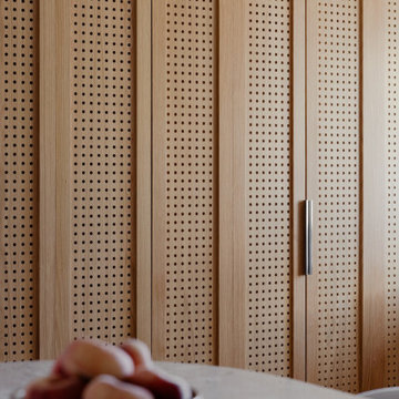
The interior takes its cues from the building’s geometric façade, which projects and recedes in volumes and voids. Bespoke joinery in oak and lacquer carries continuity and order through the apartment. Concealed storage runs throughout: at the entrance, in the dining area, along the living area, and beneath built-in benches. The laundry is merged into the kitchen behind perforated doors for ventilation while keeping the service area discreet. Behind the sofa, a console slips a workspace into the living area without conceding its openness.
Curved elements answer the rectilinear architecture; artisanal glazed vertical tiles repeat from the backsplashes onto custom side tables. The palette stays deliberately narrow; the muted oak and lacquer are joined by a softened timber floor, Portuguese Lioz stone, and walls painted to the color of bare plaster. Existing doors and baseboards were repainted in a warm light gray that draws the original elements into the language of the new interior. Upholstery and decorative accents hint at the terracotta, sky blue, and yellow of the façade.
The bedrooms are set with upholstered headboards on oak frames, bedside tables that extend those outlines, and wardrobes fit for a long stay. Locally made rugs, bedcovers, and throw pillows soften the composition. In the bathrooms, the plans were reorganized and the showers enlarged. Lioz was used for the counters and sinks, shelves, shower bases, and bathtub surround, with microcement bringing a soothing warmth to the walls, and storage in floating cabinets. Deeper in tone than the rest of the apartment yet never dim, they are quietly elegant rooms made for lingering — taking one’s time getting ready, or unwinding at the end of a day.
PHOTOGRAPHY: © ALEXANDER BOGORODSKIY

 Cassoni Furniture & Accessories
- SINAPSI SHELVE.
Sinapsi is the modular shelf system created by the Chilean artist Sebastian Errazuriz and inspired by the electrical impulses of brain cells. The result is a single lacquered-polyurethane element designed to organically decorate your wall without any constraints. Simply repeat the various Synapsi combinations, side by side, rotating, or mirroring them to create many different compositions and decorate walls using your own imagination.
51''1/8W x 8''1/4D x 23''5/8H.
http://ow.ly/3yzS5i
- CANARD TABLE.
The Canard table system features folded metal-sheet legs that surround the corners of the MDF-reinforced, panelled table top, creating a solid structure of highly contemporary design.
63''W x 35''3/8D x 28''3/8H.
78''3/4W x 39''3/8D x 28''3/8H.
98''3/8W x 39''3/8D x 28''3/8H.
53''1/8W x 53''1/8D x 28''3/8H.
http://ow.ly/3yA0yY
- RAY 02 DINING CHAIR.
The name and the ''X'' that distinguish the front of this collection structure are a clear reference to Charles and Ray Eames. The comfortable curved plywood seat is supported by a sled made of wood or chrome rod, giving the Ray chair a strong aesthetic presence.
17''3/8W x 19''5/8D x 33''1/2H.
Seat height: 17’’3/4.
http://ow.ly/3yzS3B
- HCB COAT STAND.
The joint pattern is the hallmark of HCB, an elegant solid beech hanger. The overall design, basic and linear, is composed of three orthogonal pairs of elements: three columns and the same number of short cylinders, arranged in a nearly horizontal position, because the slight incline ensures the mutual interweaving and balance of the parts.
17''3/4W x 17''3/4D x 67’’H.
http://ow.ly/3yzSdi
 Neumann & Rudy Architecture
## Spatial Composition & Architectural Volume
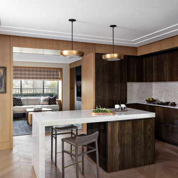
This is a kitchen conceived less as a service zone than as a precisely calibrated architectural volume, resolved through an L-configuration of full-height cabinetry that terminates against a monolithic island set on an intentional diagonal to the orthogonal grid of the herringbone flooring. The island's waterfall treatment — a slab returning to the floor in a single unbroken plane — functions as both a peninsular counter and a piece of quasi-sculptural infrastructure, its overhang generating a shallow banquette-adjacent seating zone without resorting to a conventional breakfast bar. Above, a coffered soffit executed in flush drywall with a continuous cove-lit reveal establishes a datum line that both compresses and defines the working core, while the adjacent tray ceiling reads as a distinct volume, spatially decoupling the kitchen from the living room beyond. That threshold is the composition's most disciplined gesture: a wide cased opening framed in mitered rift-cut oak paneling, its architrave articulated as a shadow-gapped reveal rather than applied trim, drawing a deep enfilade sightline through to the window wall, its Roman shades, and the mid-rise cityscape beyond. Millwork here performs structurally as well as visually — the oak-clad pilasters and the fluted, hand-carved textural panel at right operate as pseudo-columnar elements, organizing the plan into legible bays.
## Materiality, Color & Texture
The palette is constructed on a deliberate dialectic between two wood registers. The envelope employs a pale, quarter-sawn white oak with a honeyed, faintly amber undertone, its figure suppressed and its finish matte, functioning as a luminous neutral ground. Against this, the cabinetry deploys a deeply fumed or ebonized ash — likely a heavily lacquered, open-grain veneer — where the cathedral figuring is exaggerated into near-graphic striation and the high-gloss sheen produces a lacquered, almost Art Deco lustre. This contrast of value (blonde against bitter chocolate) and of sheen (matte against specular) is the project's principal tension. Mediating between them is the stone: a white quartzite or dolomitic marble with soft grey-taupe veining and a distinctly warm, cream-adjacent field, book-matched across the full-height backsplash and repeated on the island slab, its subtly honed surface refusing the glare of a polished finish. Metallic accents are restrained and consistently warm — satin brass on the pendant canopies and stool footrails, blackened bronze on the hardware, glazing frames, and the stools' slender tubular frames. Textiles introduce a low-frequency counterpoint: nubby bouclé upholstery on the sectional, a striated woven sheer at left, ikat-patterned cushions, and a tonal blue-grey geometric rug that supplies the only chromatic departure from the room's ochre-to-espresso spectrum.
## Lighting, Atmosphere & Style Profile
The lighting scheme is layered with unusual rigor. Daylight is admitted obliquely, filtered through the plaid-toned Roman shades of the adjacent living room, so the kitchen receives it secondhand — soft, directional, and already warmed. Artificial light works in three tiers: the recessed cove uplighting that grazes the soffit and dissolves the ceiling's edges; concealed under-cabinet illumination that renders the stone backsplash as a glowing plane; and the pair of spun-brass disc pendants suspended on slender blackened stems, whose downward-facing diffusers deliver a controlled pool of task light while their polished undersides register as small suns in the composition. The absence of visible downlight clutter is notable and disciplined. The resulting atmosphere is enveloping and low-glare — cosseting rather than clinical — with a distinctly residential, almost salon-like decorum reinforced by the framed genre painting hung casually on the oak paneling, a curatorial gesture that domesticates the kitchen decisively. Stylistically, the project reads as **Warm Modernist Luxe**, drawing on the vocabulary of high-craft European cabinetry and mid-century Milanese interiors: the grain-forward veneers, brass discs, and slender bronze seating carry a whisper of 1970s Italian sophistication, while the flush detailing, shadow-gap reveals, and rigorous suppression of ornament situate it firmly in contemporary practice. It is tailored rather than austere — a demonstration that minimalist discipline and material sensuality need not be adversaries.
Find the right local pro for your project
 SM Design
Bridle Path Residence — Formal Living & Music Room
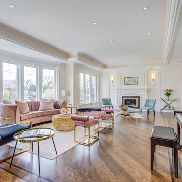
This Bridle Path Residence living room is conceived as an elegant, light-filled entertaining space where classical architectural structure meets contemporary glamour and collected residential comfort. Rather than relying on ornament alone, the design uses proportion, symmetry, material contrast, and carefully selected furniture to create a room that feels sophisticated yet genuinely livable.
The architecture establishes a strong sense of permanence. Extensive wall panelling, substantial crown moulding, layered ceiling details, and classical fireplace architecture give the room an established character reminiscent of a refined estate interior. At the same time, the clean white envelope keeps the architecture fresh and allows the furnishings and artwork to provide the personality.
The expansive bay windows are one of the defining features of the room. Their repeated vertical proportions bring abundant natural light deep into the space while creating a strong relationship with the surrounding landscape. The windows also soften the formal architecture, giving the room an open, airy quality rather than the heaviness often associated with traditional interiors.
The furniture introduces a deliberately more contemporary language. A blush-toned sofa and upholstered accent chairs bring softness and warmth, while deep navy seating adds contrast and visual depth. Slim brass frames on the chairs and occasional tables introduce a subtle metallic thread throughout the room, connecting the individual seating pieces into a cohesive composition.
The central seating arrangement is intentionally conversational. Rather than orienting every piece toward the fireplace, the furniture creates an intimate social zone within the much larger room. The mix of rounded forms, sculptural silhouettes, and geometric metal bases prevents the formal architecture from feeling rigid.
A sculptural gold-toned coffee table becomes an important visual anchor. Its organic texture contrasts with the linear architectural detailing and polished hardwood floor, adding a layer of tactile richness. Smaller glass and metal tables maintain visual openness and allow the expansive room to remain uncluttered.
The fireplace provides a secondary focal point at the far end of the room, framed by symmetrical architectural detailing and flanking sconces. Its position establishes a visual axis through the space, while the artwork above introduces a curated, contemporary note within the traditional setting.
The piano adds an important dimension to the room's identity. Rather than being treated as a separate musical installation, it is integrated naturally into the overall composition, reinforcing the idea of the room as a space for music, entertaining, conversation, and everyday enjoyment. It also adds a rich dark element that balances the lighter furnishings and architectural envelope.
The warm hardwood flooring provides continuity and grounds the predominantly white palette. Against it, the combination of blush, navy, muted green, brass, glass, and natural textures creates a sophisticated but approachable colour story.
Overall, the room demonstrates a modern interpretation of classic luxury. Traditional architectural detailing provides the foundation, while contemporary furniture, sculptural lighting, metallic accents, art, and layered upholstery bring freshness and personality. The result is an elegant Bridle Path living space that feels tailored, highly finished, and timeless without becoming overly formal.


 Simply Home Decorating
This tiny home is located on a treelined street in the Kitsilano neighborhood of Vancouver. We helped our client create a living and dining space with a beach vibe in this small front room that comfortably accommodates their growing family of four. The starting point for the decor was the client's treasured antique chaise (positioned under the large window) and the scheme grew from there. We employed a few important space saving techniques in this room... One is building seating into a corner that doubles as storage, the other is tucking a footstool, which can double as an extra seat, under the custom wood coffee table. The TV is carefully concealed in the custom millwork above the fireplace. Finally, we personalized this space by designing a family gallery wall that combines family photos and shadow boxes of treasured keepsakes. Interior Decorating by Lori Steeves of Simply Home Decorating. Photos by Tracey Ayton Photography


 SM Design
St. Andrews Project — Primary Bathroom & Spa Retreat
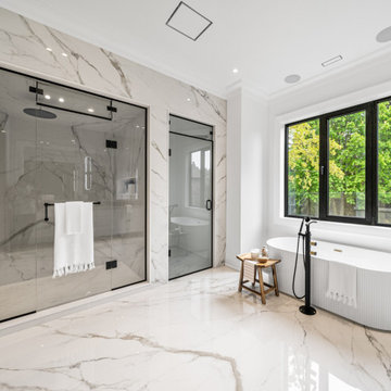
This St. Andrews primary bathroom is conceived as a private spa retreat, where material continuity, sculptural forms, and architectural restraint create a sense of understated luxury. The design intentionally avoids visual clutter, allowing the quality of the materials and precision of the detailing to define the space.
The room is anchored by a dramatic marble-look stone that extends continuously across the shower enclosure and floor, creating a seamless visual envelope. The expressive veining introduces movement and natural variation, transforming what could otherwise be a minimal white bathroom into a richly layered composition. Carrying the stone through multiple surfaces also gives the room a sense of scale and architectural cohesion.
The freestanding bathtub is treated as a sculptural object rather than simply a functional fixture. Its softly curved silhouette and vertically fluted exterior introduce an organic counterpoint to the linear geometry of the surrounding architecture. Positioned directly beneath the large black-framed window, the tub becomes a quiet focal point while taking advantage of abundant natural light and views toward the greenery beyond.
Black-framed glass creates another important layer of contrast. The expansive shower enclosure and adjacent glazed opening establish a crisp graphic framework against the pale stone, while black plumbing fixtures and hardware reinforce the same architectural language. This repeated use of black creates visual continuity without overwhelming the light palette.
The oversized window is particularly important to the atmosphere of the room. Instead of treating the bathroom as an enclosed, highly private environment, the design establishes a connection to nature, allowing daylight and greenery to become part of the experience. The result is a space that feels bright, open, and restorative.
A restrained wooden stool introduces warmth and an organic material note against the stone and glass. Its natural finish prevents the monochromatic palette from feeling overly clinical, while the simple form complements the sculptural bathtub.
The overall design is based on material continuity, contrast, and calm geometry. Veined stone provides movement, fluted surfaces provide texture, black metal provides definition, and natural wood introduces warmth. The result is a contemporary luxury bathroom that feels architectural, serene, and highly considered, more like a private wellness retreat than a conventional ensuite.
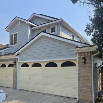
 5280 Exteriors
James Hardie Fiber Cement Siding Replacement — Littleton, Colorado
Project Summary:
Complete exterior transformation using James Hardie HardiePlank fiber cement siding in Light Mist with coordinating Arctic White trim. Installation completed to Elite Preferred Contractor specifications, qualifying for full 30-year James Hardie product warranty and 15-year ColorPlus finish warranty.
Materials Installed:
• James Hardie HardiePlank lap siding — Light Mist ColorPlus finish
• James Hardie trim and fascia — Arctic White
• Complete soffit integration with proper ventilation
• All flashing and water management details engineered to specification
Design & Aesthetic:
The Light Mist finish delivers a modern, sophisticated palette that complements Littleton's residential character. Arctic White trim creates crisp architectural definition and visual separation between walls and roof lines. The clean horizontal profile of HardiePlank lap siding provides classic curb appeal with contemporary minimalism.
Why Fiber Cement for Littleton Homes:
Littleton experiences Colorado's signature freeze-thaw climate — repeated daily temperature swings that challenge standard siding materials. James Hardie HZ5 formulation is engineered specifically for Colorado's elevation and weather extremes. The fiber cement composite is dimensionally stable through thousands of freeze-thaw cycles, resists moisture absorption and rot, and meets fire-resistant requirements for increasing home value and insurance considerations.
ColorPlus Technology:
The factory-applied ColorPlus finish is kiln-baked and UV-stabilized at the manufacturing facility — not field-painted. It resists fading, peeling, and chalking through 15+ years of Colorado's intense sun exposure. The warranty is realistic for Littleton's altitude and climate, not national averages.
Installation Quality:
This project was installed by 5280 Exteriors, a James Hardie Elite Preferred Contractor. Elite Preferred status requires verified installation quality, ongoing manufacturer training, and demonstrated track record. Only Elite Preferred Contractors can issue the full 30-year product warranty and 15-year ColorPlus warranty. Standard installation does not qualify.
Performance Advantages:
• Zero maintenance required — no annual painting, staining, or sealing
• Non-combustible material — meets fire-resistant standards
• Engineered for Colorado's freeze-thaw climate zones
• 30-year product warranty (Elite Preferred installation)
• 15-year ColorPlus finish warranty
• Increases resale value in competitive Littleton market
• Improves energy efficiency through proper wall air sealing
Before & After Transformation:
The before condition shows aging, weathered siding. The after transformation reveals a modern exterior with clean lines, architectural definition, and premium material quality. The Light Mist and Arctic White palette creates a cohesive, intentional aesthetic that enhances the home's curb appeal and overall property value.
About This Project:
Location: Littleton, Colorado (South Denver Metro)
Scope: Full siding replacement
Materials: James Hardie HardiePlank fiber cement
Colors: Light Mist (walls) + Arctic White (trim)
Installation: Elite Preferred Contractor specification
Warranty: 30-year product + 15-year finish
Contractor: 5280 Exteriors
5280 Exteriors is a James Hardie Elite Preferred Contractor serving Littleton, Denver metro, South Denver, and Colorado's Front Range. We specialize in premium exterior remodeling including fiber cement siding, energy-efficient windows, roofing systems, and composite decking. Our team has 20+ years of experience with Colorado's high-altitude and challenging climate conditions.

 McCullough's Flooring
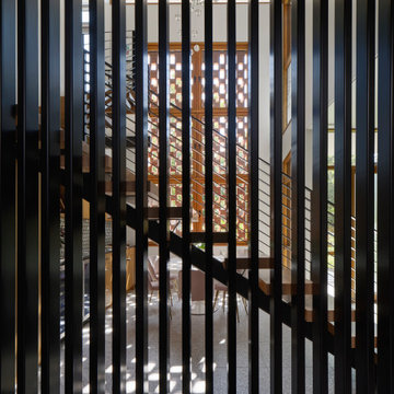
Gorgeous master bath finished with Dal-Tile's Fabrique porcelain tile in the color Noir Linen polished. Tile size is 12"x24" installed in a brick joint pattern. The floor boasts underfloor heating on a timed thermostat.

 highland
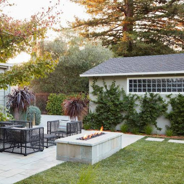
Your backyard has untapped potential. While lush lawns and colorful flower beds create a beautiful foundation, it's the hardscaping elements that truly define how you use and enjoy your outdoor space. For homeowners looking to elevate their property, understanding the art and function of hardscaping is the first step toward creating a backyard that works as hard as it looks.
What Is Hardscaping, Really?
Hardscaping refers to the non-living, structural components of landscape design. Think stone patios, retaining walls, fire pits, walkways, pergolas, and outdoor kitchens. These elements provide the bones of your outdoor living area, creating flow, function, and visual interest that softscaping alone cannot achieve.
Unlike planting beds that change with the seasons, hardscaping offers permanence. A well-designed stone walkway or paver patio will last decades with minimal maintenance, making it one of the smartest investments a homeowner can make in their property.
Defining Your Outdoor Lifestyle
Before breaking ground, consider how you actually want to live outdoors. Do you envision hosting summer dinner parties? A built-in outdoor kitchen and dining patio might be your priority. Prefer quiet evenings by the fire? A custom fire pit with built-in seating becomes your focal point. Families with children often gravitate toward expansive patios that leave room for play while maintaining sophisticated design.
The best hardscaping designs start with a clear purpose. Every wall, walkway, and surface should serve the way you intend to use the space. When function leads, beauty follows naturally.
Materials That Last
Choosing the right materials matters. Natural stone offers timeless elegance and unique character but comes at a premium. Concrete pavers provide versatility, durability, and cost-effectiveness, with styles that convincingly mimic stone or brick. For modern aesthetics, porcelain pavers deliver sleek lines and exceptional weather resistance.
Regardless of material, proper installation is non-negotiable. A poorly laid patio will shift, sink, and crack within a few seasons. That's why experienced homeowners know that hardscaping services from a qualified professional protect both the investment and the result.
Creating Visual Flow
Successful hardscaping connects your home to its surroundings. The transition from indoor to outdoor should feel intentional, not abrupt. Using complementary materials, repeating design motifs, and establishing clear pathways helps your backyard feel like a natural extension of your living space.
Retaining walls can terrace sloped yards into usable, dramatic spaces. Stepping stones can guide visitors through garden areas. A pergola can define an outdoor room without closing it off. Each element plays a role in the overall composition.
Starting Your Project
If you're considering a backyard transformation, begin with a site assessment and a professional design consultation. Experienced hardscaping professionals can identify drainage issues, recommend materials suited to your climate, and create a phased plan that fits your budget and timeline.
Hardscaping isn't just about aesthetics — it's about creating an outdoor environment that enhances how you live. With thoughtful design and quality craftsmanship, your backyard becomes the best room in the house.
What Is Hardscaping, Really?
Hardscaping refers to the non-living, structural components of landscape design. Think stone patios, retaining walls, fire pits, walkways, pergolas, and outdoor kitchens. These elements provide the bones of your outdoor living area, creating flow, function, and visual interest that softscaping alone cannot achieve.
Unlike planting beds that change with the seasons, hardscaping offers permanence. A well-designed stone walkway or paver patio will last decades with minimal maintenance, making it one of the smartest investments a homeowner can make in their property.
Defining Your Outdoor Lifestyle
Before breaking ground, consider how you actually want to live outdoors. Do you envision hosting summer dinner parties? A built-in outdoor kitchen and dining patio might be your priority. Prefer quiet evenings by the fire? A custom fire pit with built-in seating becomes your focal point. Families with children often gravitate toward expansive patios that leave room for play while maintaining sophisticated design.
The best hardscaping designs start with a clear purpose. Every wall, walkway, and surface should serve the way you intend to use the space. When function leads, beauty follows naturally.
Materials That Last
Choosing the right materials matters. Natural stone offers timeless elegance and unique character but comes at a premium. Concrete pavers provide versatility, durability, and cost-effectiveness, with styles that convincingly mimic stone or brick. For modern aesthetics, porcelain pavers deliver sleek lines and exceptional weather resistance.
Regardless of material, proper installation is non-negotiable. A poorly laid patio will shift, sink, and crack within a few seasons. That's why experienced homeowners know that hardscaping services from a qualified professional protect both the investment and the result.
Creating Visual Flow
Successful hardscaping connects your home to its surroundings. The transition from indoor to outdoor should feel intentional, not abrupt. Using complementary materials, repeating design motifs, and establishing clear pathways helps your backyard feel like a natural extension of your living space.
Retaining walls can terrace sloped yards into usable, dramatic spaces. Stepping stones can guide visitors through garden areas. A pergola can define an outdoor room without closing it off. Each element plays a role in the overall composition.
Starting Your Project
If you're considering a backyard transformation, begin with a site assessment and a professional design consultation. Experienced hardscaping professionals can identify drainage issues, recommend materials suited to your climate, and create a phased plan that fits your budget and timeline.
Hardscaping isn't just about aesthetics — it's about creating an outdoor environment that enhances how you live. With thoughtful design and quality craftsmanship, your backyard becomes the best room in the house.

 Didonè Comacchio Architects
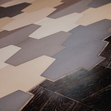
Staircase - mid-sized contemporary wooden l-shaped staircase idea in Venice with metal risers


 CHRISTIAN DEAN ARCHITECTURE, LLC
Photo by: Chad Holder
Inspiration for a modern wooden straight open staircase remodel in Minneapolis
Inspiration for a modern wooden straight open staircase remodel in Minneapolis
 Cassoni Furniture & Accessories
- SENDAI BOOKCASE. Sendai Crystal is the new glass version of the famous bookcase-sculpture that the architect Toyo Ito, winner of the 2013 Pritzker Prize, designed for Horm in 2004. Movement and flexibility express the emotional power of Toyo Ito, who in this domestic sculpture has captured the essence of the design of the Sendai Mediathèque in Japan, which he also designed.
48''7/8W x 18''7/8D x 76’’H.
Other width: 75’’5/8.
http://ow.ly/3yBxlk
- MILOS SOFA. Milos is a family of upholstered armchairs and sofas characterized by soft and seductive shapes. The Milos project is a collaboration of Horm with the Design Center of Orizzonti, a renowned brand from the Brianza region in Northern Italy, which offers a large and highly-specialized collection of upholstered beds for the sleeping area. Milos was born from the idea that every home is indeed unique and reflects the personality and lifestyle of its guests. For this reason, Milos sofas are removable and can be dressed and covered in a flash with over 240 fabrics from the Orizzonti collection, assuming a relaxed and playful yet elegant and sophisticated aspect, or that of great luxury and preciousness.
58''5/8W x 36''5/8D x 30’’H.
86''1/4W x 36''5/8D x 30’’H.
Seat Height: 18’’1/8.
http://ow.ly/3zwFbs
- COBRA TV STAND. Cobra is a dynamic TV stand, both from a visual and usage standpoint, built with curved plywood polished entirely by hand and featuring brake-fitted wheels and mood lighting, which is projected on the floor. Equipped with multiple sockets to power the eventual audio-visual components to set on the shelf, it features a hidden and discreet cable inlet that connects them to the video signal.
35''3/8W x 26''3/4D x 47''5/8H.
http://ow.ly/3yAqgy
- INFINITY SIDEBOARD. The Infinity series containers are made of square units of 19''5/8W x 18''7/8D x 19''5/8H with lacquered frame (11 Horm colors) and doors veneered with bois blond stained beech (Horm finish). The doors are covered with three elements of decorative lacquered laminate attached by means of hidden magnets and whose arrangement determines the line pattern shown on the front of each container. Interestingly enough, each line moves across doors in a continued and seemingly infinite pattern, regardless of the chosen arrangement. Furthermore, the magnetic attachment allows changing the element arrangement at will to produce dynamic, original designs.
59''W x 18''7/8D x 20''1/2H.
Other height: 40’’1/8.
http://ow.ly/3yAuZl
- SINAPSI SHELF. Sinapsi is the modular shelf system created by the Chilean artist Sebastian Errazuriz and inspired by the electrical impulses of brain cells. The result is a single lacquered-polyurethane element designed to organically decorate your wall without any constraints. Simply repeat the various Synapsi combinations, side by side, rotating, or mirroring them to create many different compositions and decorate walls using your own imagination.
51''1/8W x 8''1/4D x 23''5/8H.
http://ow.ly/3yzS5i
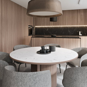
 STUDIO KONDE | Konrad Idaszewski Architect
Techplan house interior designed by STUDIO KONDE Konrad Idaszewski Architekt, bringing together warm timber, refined stone surfaces and soft upholstered furniture within a clean contemporary setting. Project details: https://conde.pl/portfolio/gotowy-projekt-wnetrz-domu-techplan/ . Techplan is part of the Modelowedomy collection of three individually configurable houses, distinguished by its flat-roof architecture and open connection between the living room, dining area and kitchen. The project also reflects the work of an interior architect in Poznań, with carefully planned proportions and materials supporting both everyday comfort and a cohesive visual identity.
Warm oak-toned cabinetry covers the kitchen wall and creates a calm architectural backdrop for the dining area. Natural timber is paired with a dark stone worktop and backsplash, while soft grey upholstery and a pale stone dining table introduce lighter elements. Large glazing on the right brings daylight into the room and visually connects the dining space with the garden.
At the centre, a large round dining table creates a generous setting for shared meals and gatherings. Its pale stone-effect top has delicate grey veining and is framed by a warm timber edge. A substantial cylindrical wooden base gives the table a sculptural appearance while keeping the floor area around it visually open. Six rounded dining chairs in textured grey fabric surround the tabletop, with curved backs and generously padded seats providing a comfortable contrast to the harder stone surface.
Behind the dining area, the kitchen is integrated almost entirely into a continuous wall of natural wood cabinetry. Tall vertical fronts extend across the wall, concealing storage and appliances within a uniform timber composition. A black stone backsplash runs horizontally across the working area, marked by expressive pale veining and illuminated from above by a continuous LED strip. The dark worktop creates a strong contrast with the oak fronts and visually connects the kitchen with the black details of the dining accessories.
A large textured pendant hangs directly above the dining table, its broad rounded shade adding warmth and scale to the room. Its ribbed fabric surface relates naturally to the tactile upholstery of the chairs, while a smaller black cylindrical pendant provides a discreet accent above the kitchen worktop. Together, the two fixtures establish distinct lighting zones without interrupting the clean geometry of the interior.
The dining table is styled with a restrained arrangement of dark ceramic vessels and a shallow round tray. Their black and charcoal tones repeat the colour of the kitchen backsplash, creating a subtle visual link between the two areas. Fine material contrasts are particularly visible here, from the veined stone surface and natural wood grain to the coarse chair upholstery and textured pendant shade.
Extensive glazing along the right-hand side fills the dining area with natural light and opens the interior towards the greenery outside. The pale floor and walls amplify the daylight, while the warm timber cabinetry prevents the space from feeling overly stark. This combination of oak, dark stone, textured upholstery, sculptural lighting and generous glazing gives the Techplan kitchen and dining area a sophisticated yet welcoming character, consistent with the contemporary residential interiors created by STUDIO KONDE in Poznań.

 Mercury Mosaics and Tile
We often come across clients looking for small space ideas. Our first recommendation is always to go bright. The depth of our glaze color adds visual interest and a bold color choice helps make a space appear larger. Posh and polished (just like the homeowner) this stunning sapphire blue bathroom will have you in awe. The owner of this amazing lake house is our friend Rachel Shingleton of Pencil Shavings Studio. Her refined design-eye coupled with our bright and bold tile transformed this small bathroom into the perfect master bath. And could you believe it? This is a super simple project! Read on to learn more about this design and how to achieve the look yourself.
Another great way to open up a small bathroom is by using smaller tile! Our regular Hexagons are the great example of this - approximately 2"x2" their small size maximizes the rest of the room, and their classic shape is perfect for a bathroom floor.

 JM Kitchen & Bath Design
Stone Mosaic Tile floors, marble countertops and backsplash and white painted raised panel cabinets in this luxurious master bathroom with freestanding soaking tub in Greenwood Village Colorado.

 Heritage Construction Companies, LLC.
Example of a huge trendy metal floating open staircase design in Minneapolis
13