
Search results for "Repeatable compositions" in Home Design Ideas
 SM Design
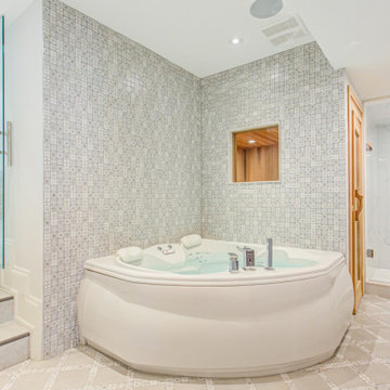
Bridle Path Residence — Luxury Wellness Bathroom & Hydrotherapy Suite
This Bridle Path Residence bathroom is conceived as a private hydrotherapy retreat, bringing a resort-like wellness experience into the home while maintaining the architectural detailing and craftsmanship of the residence. The design is less about creating a conventional bathroom and more about establishing a dedicated space for relaxation, recovery, and ritual.
The hydrotherapy tub becomes the central sculptural element of the room. Its generous curved profile creates a soft, organic focal point against the highly detailed wall treatment, while the integrated jets and ergonomic form emphasize the room's wellness-driven purpose. Positioning the tub within the main architectural composition gives it the presence of a luxury amenity rather than treating it as a standard fixture.
The walls are enveloped in a small-format decorative mosaic with an intricate, almost textile-like pattern. This repeated surface creates remarkable visual depth and gives the room a distinctly crafted quality. The subtle variation within the mosaic prevents the predominantly light palette from feeling flat, while its fine geometry provides a counterpoint to the smooth, sculptural tub.
A particularly thoughtful feature is the integrated sauna viewing window, which creates a visual relationship between the hydrotherapy area and the warm timber sauna beyond. The opening turns the sauna into part of the overall composition and establishes a clear sequence of wellness experiences—hydrotherapy, heat, and showering—within one cohesive suite.
The adjacent shower introduces a contrasting material language. Large-format marble-look surfaces create a cleaner, more serene backdrop, while the vertical patterned accent strip adds a strong decorative moment. This controlled use of pattern prevents the space from becoming visually overwhelming and gives the shower its own identity.
The sauna itself introduces warmth through natural timber, creating an immediate sensory contrast with the cool, pale surfaces surrounding it. The wood adds depth and reinforces the feeling of a private spa retreat, while the glass enclosure maintains openness and allows the different wellness zones to remain visually connected.
The flooring continues the decorative approach with a carefully patterned layout that complements the wall mosaic without simply repeating it. This creates a layered surface treatment in which scale, geometry, and texture work together to give the room a highly customized character.
Even the circulation area is treated as part of the design experience. The glass door and open stair connection allow light to move through the space, while the traditional architectural detailing visible beyond the bathroom establishes continuity with the broader residence.
The overall concept is residential wellness with an emphasis on craftsmanship and sensory experience. Decorative mosaic, natural timber, glass, stone-inspired surfaces, sculptural plumbing, and carefully integrated wellness features create a room that feels more like a private boutique spa than a conventional home bathroom.
 Lions Floor
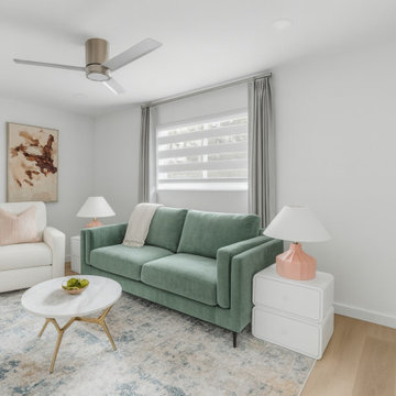
Lotus Clove is a SPC (stone polymer composite) floor from the Lions Floor Indoor Delight Collection.
It features a high-performance 20 mil wear layer, offering excellent scratch resistance, while its rigid SPC core ensures enhanced dimensional stability and long-lasting performance.
Like all flooring in our SPC lineup, Lotus Clove includes the following key features:
- Pet Friendly
- Indent-resistant
- Waterproof
- Sound tested
- Formaldehyde free
- Phthalate free
It's all in the details:
Material Type: Rigid Core SPC
Surface Type: Embossed in Register (EIR)
Plank Repeat: 10
Edge: Painted Bevel
Application: Residential, Commercial
Width: 9"
Length: 72"
Total Thickness: 6.5mm
Attached Pad: Premium Acoustic Padding
Finish Coating: UV Acrylic
Installation Method: Floating/Uniclic
| Space installed and designed by Brittany Lyons Interiors

Find the right local pro for your project

 Patterson Custom Homes
Chad Mellon
Example of a transitional l-shaped medium tone wood floor open concept kitchen design in Los Angeles with an undermount sink, shaker cabinets, white cabinets, gray backsplash, an island, white countertops and paneled appliances
Example of a transitional l-shaped medium tone wood floor open concept kitchen design in Los Angeles with an undermount sink, shaker cabinets, white cabinets, gray backsplash, an island, white countertops and paneled appliances

 SOLKOR | Creating Stunning Outdoor Living Spaces
A complete outdoor living space in mountainous Canmore, AB Canada. This backyard started with a client's concept. Our designer used a 3D design to add a fire table and timber frame pergola to create this custom space.
The features Included:
- Timber frame pergola
- Granite & live edge counter top
- Napoleon bbq
- Live edge and granite fire table
- Paving stone patio
- Rundle stone retaining wall & seating area
- Maintenance free shrubs, trees & bark nuggets
- Composite decking and stairs
- Complete underground drainage system to down-spout water from the home
- Large french drainage system
- Side yard rundle stone tailings
This project was a great collaboration between our Solkor team and this local client. We are grateful to be able to work together to create this amazing outdoor living space. Special thanks to our team, Derek, Rob, Kyle, Logan, Jakub & Liz, for the amazing work.

 Cassoni Furniture & Accessories
- INFINITY SIDEBOARD. The Infinity series containers are made of square units of 19''5/8W x 18''7/8D x 19''5/8H with lacquered frame (11 Horm colors) and doors veneered with bois blond stained beech (Horm finish). The doors are covered with three elements of decorative lacquered laminate attached by means of hidden magnets and whose arrangement determines the line pattern shown on the front of each container. Interestingly enough, each line moves across doors in a continued and seemingly infinite pattern, regardless of the chosen arrangement. Furthermore, the magnetic attachment allows changing the element arrangement at will to produce dynamic, original designs.
59''W x 18''7/8D x 20''1/2H.
Other height: 40’’1/8.
http://ow.ly/3yAuZl
- SINAPSI SHELF. Sinapsi is the modular shelf system created by the Chilean artist Sebastian Errazuriz and inspired by the electrical impulses of brain cells. The result is a single lacquered-polyurethane element designed to organically decorate your wall without any constraints. Simply repeat the various Synapsi combinations, side by side, rotating, or mirroring them to create many different compositions and decorate walls using your own imagination.
51''1/8W x 8''1/4D x 23''5/8H.
http://ow.ly/3yzS5i

 Dig Your Garden Landscape Design
Parrot's Beak (Lotus maculatus), cascading down the concrete wall. Pared with Euphorbia myrsinites and Blue Oat Grass. Lagoon-side property in the Bel Marin Keys, Novato, CA. Entertaining and enjoying the views were a primary design goal for this project. The project includes a large camaru deck with built-in seating. The concrete steps and pavers lead down to the water's edge. I included a sunken patio on one side and a beautiful Buddha statue on the other, surrounded by succulents and other low-water, contemporary plantings. I also used Dymondia ground cover to create a natural pathways within the garden. Photo: © Eileen Kelly, Dig Your Garden Landscape Design. Design Eileen Kelly


 Keene Interiors
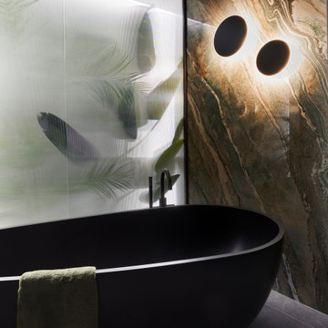
A sculptural matte black freestanding tub anchors the space, its curved silhouette contrasting beautifully against the dramatic, veined stone slab behind it. The natural movement in the stone reads almost like a landscape painting, adding depth and quiet intensity to the composition. Two circular wall sconces glow like soft halos, casting warm light across the surface and heightening the moody atmosphere.
To the side, backlit frosted glass panels create the illusion of a window, diffusing light through layered botanical silhouettes. Though the greenery is intentionally artificial, the effect is immersive and tranquil, giving the interior wall a sense of openness and calm. A minimalist black tub filler maintains the clean, contemporary language of the space.
This primary bathroom soaking area blends artful materiality with architectural restraint, creating a deeply atmospheric retreat designed for restoration and pause.
Inside the water closet, a geometric wood feature wall introduces warmth and texture, its repeating pattern adding sculptural interest to what is often a purely functional space. Soft, ambient lighting enhances the dimensional surfaces, creating a cohesive and elevated experience.
Beyond the doorway, a glimpse of the dramatic vanity area and sculptural lighting maintains continuity with the rest of the primary bathroom design. Every detail, even within the enclosed water closet, reflects the same intentional, art-forward aesthetic.
Functional, private, and visually impactful, this primary bathroom suite balances bold design with refined practicality.

 Taproot Garden Design
Patrick & Topaze McCaffery - Taproot Garden Design & Fine Gardening "UPDATE: April 2017 - Sesleria autumnalis (Autumn Moor Grass) and Calamagrostis foliosa (Mendocino Reed Grass) surround moss and lichen covered Sonoma Fieldstone Boulders throughout this garden."

 Moderne Builders
Gorgeous master bath with dramatic retro "wave" tile. Peak Photography
Example of a 1950s bathroom design in Los Angeles
Example of a 1950s bathroom design in Los Angeles

 Moss Yaw Design studio
Engineered cedar siding creates beautiful gray-blue tones at the exterior of the home, while adding a textural element to activate the simple exterior design.
 STUDIO KONDE | Konrad Idaszewski Architect
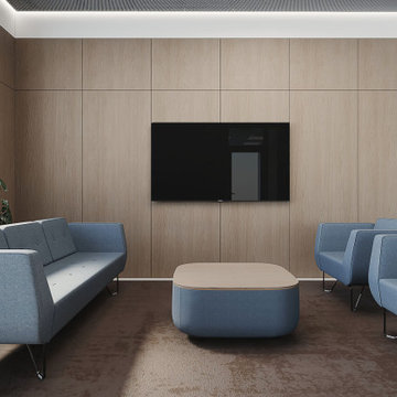
Reception seating at the Airoptic Research & Technology Office in Wysogotowo, designed by STUDIO KONDE Konrad Idaszewski Architekt, creates a dedicated lounge area for visitors, informal meetings and waiting.
Visit our page: https://conde.pl/portfolio/projekt-wnetrz-biurowych-siedziby-firmy-airoptic/
The reception area is part of a larger office interior design project near Poznań. It shows how an interior architect in Poznań can use furniture, materials and spatial proportions to give a commercial interior a distinct character.
Blue upholstered seating, natural oak wall panels and a dark rug establish the main visual language of the lounge. The composition is simple and symmetrical. A large media screen provides the central focal point, while the seating creates a clear area for conversations and informal meetings.
A three-seat sofa stands along the left side of the room. Its blue upholstery has broad side panels and softly rounded edges. Matching armchairs are positioned opposite and alongside it. Slim black metal legs lift the furniture above the floor and add a light detail to the substantial upholstered forms.
At the centre, a low coffee table combines a pale oak top with a rounded blue base. The softly curved corners repeat the geometry of the armchairs. Its compact form leaves a generous gap between the surrounding seats and keeps the circulation around the lounge unobstructed.
Behind the furniture, large oak panels cover the entire wall. Fine horizontal and vertical joints divide the surface into a regular grid. A black wall-mounted television sits centrally within the composition and creates a strong contrast against the light timber. The simple media wall gives the reception seating a clear visual focus without additional decorative elements.
A large dark brown rug defines the lounge area and visually connects the sofa, armchairs and coffee table. Its mottled surface adds subtle texture beneath the smooth upholstery. On the left, large green plants stand beside the glazing and bring natural colour into the restrained palette.
White door frames and glazed openings remain visible around the timber wall. They connect the seating area with the circulation routes and other parts of the office. Daylight entering through the glazed entrance brightens the space and highlights the natural grain of the oak.
The ceiling continues the office's restrained architectural language, combining a dark grid with integrated lighting. Linear illumination around the perimeter provides an even glow across the seating area. Oak panelling, blue contract furniture, a dark rug and carefully planned circulation create a cohesive reception lounge within the Airoptic workplace. The project reflects STUDIO KONDE Konrad Idaszewski Architekt's work in office interiors, commercial spaces and furniture arrangements for contemporary workplaces in the Poznań area.

 Simply Perfect
Advice on interior design is available everywhere—from TV shows and websites to books, magazines and apps.
We love seeing people become engaged in design and educated on the wide range of possibilities. But we hope you’ll proceed with caution.
It’s not that style errors are a matter of life and death. It’s just that it’s easy to choose designs that aren’t necessarily reflective of your own personality and character. And since you’re typically stuck with your interior design decisions for years, styles that don’t quite fit can tend to grate on you.
Interiors that give one person comfort may unleash chaos in someone else. This goes beyond favorite colors or hot trends, right to the heart of interior design, where you find questions of composition, balance, repetition, space and more.
The goal is to find that unique combination of design elements that gives you comfort, support and balance.
In one home, that perfect balance was struck through the use of symmetry. A pair of comfortable swivel chairs sit beneath matching indigo patterned paintings. Matching bookcases below the paintings contain similar, but not identical, arrangements of books, vases and bowls. Woods and bronzes help warm up the simple white bookcase shelving.
Two matching poufs in front of the fireplace provide additional seating. The sofa is accented with a pair of pillows with a blue pattern that echoes the artwork.
The effect of the symmetry is to achieve order and simplicity, which I promote at every opportunity. After all, your home interiors should be the setting or the backdrop of your life—not center stage.
Antique bronze and blue are complementary colors. Together, they offer a rich palette of richness and depth, which brings out the beauty of wood and stone.
In the home office, a unique, whitewash-stained wooden desk rests on metal, Sawhorse-inspired legs for a warm, rustic look. The black leather chair features a contemporary silhouette with an antique brass frame. An adjustable desk lamp has bronze accents.
The bookcase combines a sleek, black metal frame with concrete shelves, for another unusual pairing. It’s kept uncluttered for an orderly, peaceful look. Items on the shelves include a bronze-accented lamp and a pair
of high gloss-finished wooden bookends.
The elegant artwork behind the desk is a simple midnight-blue and bronze with mottled white. Deep blues are again picked up in the rug, which adds a stately vibe with a modern pattern and satisfying texture.
Within the framework of symmetry, the living room repeats the blue-and-bronze color scheme.
A large midcentury brass clock above the fireplace keeps the natural stone visible, rather than hidden behind a painting or television, while its straight lines and color create a beautiful contrast.
The sofa is a soft, neutral blue. The pattern on the round brass side table features echoes the darker blue-patterned rug, as well as the rug in the office, tying the rooms together.
Indigo blue books adjacent to bronze vases on the shelves repeat the color scheme. The soapstone-topped coffee table echoes the shape of the fireplace. A pair of tall, matching floor lamps with long wooden bases, brass pulls and simple linen shades combine both the colors and symmetry found throughout the home.
 Plain & Posh
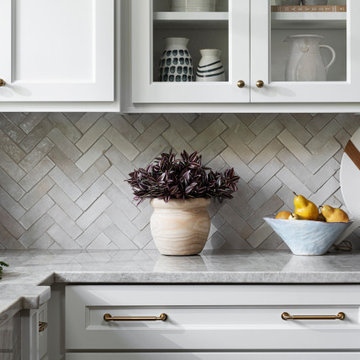
These homeowners were ready to update the home they had built when their girls were young. This was not a full gut remodel. The perimeter cabinetry mostly stayed but got new doors and height added at the top. The island and tall wood stained cabinet to the left of the sink are new and custom built and I hand-drew the design of the new range hood. The beautiful reeded detail came from our idea to add this special element to the new island and cabinetry. Bringing it over to the hood just tied everything together. We were so in love with this stunning Quartzite we chose for the countertops we wanted to feature it further in a custom apron-front sink. We were in love with the look of Zellige tile and it seemed like the perfect space to use it in.
 Simply Perfect
Advice on interior design is available everywhere—from TV shows and websites to books, magazines and apps.
We love seeing people become engaged in design and educated on the wide range of possibilities. But we hope you’ll proceed with caution.
It’s not that style errors are a matter of life and death. It’s just that it’s easy to choose designs that aren’t necessarily reflective of your own personality and character. And since you’re typically stuck with your interior design decisions for years, styles that don’t quite fit can tend to grate on you.
Interiors that give one person comfort may unleash chaos in someone else. This goes beyond favorite colors or hot trends, right to the heart of interior design, where you find questions of composition, balance, repetition, space and more.
The goal is to find that unique combination of design elements that gives you comfort, support and balance.
In one home, that perfect balance was struck through the use of symmetry. A pair of comfortable swivel chairs sit beneath matching indigo patterned paintings. Matching bookcases below the paintings contain similar, but not identical, arrangements of books, vases and bowls. Woods and bronzes help warm up the simple white bookcase shelving.
Two matching poufs in front of the fireplace provide additional seating. The sofa is accented with a pair of pillows with a blue pattern that echoes the artwork.
The effect of the symmetry is to achieve order and simplicity, which I promote at every opportunity. After all, your home interiors should be the setting or the backdrop of your life—not center stage.
Antique bronze and blue are complementary colors. Together, they offer a rich palette of richness and depth, which brings out the beauty of wood and stone.
In the home office, a unique, whitewash-stained wooden desk rests on metal, Sawhorse-inspired legs for a warm, rustic look. The black leather chair features a contemporary silhouette with an antique brass frame. An adjustable desk lamp has bronze accents.
The bookcase combines a sleek, black metal frame with concrete shelves, for another unusual pairing. It’s kept uncluttered for an orderly, peaceful look. Items on the shelves include a bronze-accented lamp and a pair
of high gloss-finished wooden bookends.
The elegant artwork behind the desk is a simple midnight-blue and bronze with mottled white. Deep blues are again picked up in the rug, which adds a stately vibe with a modern pattern and satisfying texture.
Within the framework of symmetry, the living room repeats the blue-and-bronze color scheme.
A large midcentury brass clock above the fireplace keeps the natural stone visible, rather than hidden behind a painting or television, while its straight lines and color create a beautiful contrast.
The sofa is a soft, neutral blue. The pattern on the round brass side table features echoes the darker blue-patterned rug, as well as the rug in the office, tying the rooms together.
Indigo blue books adjacent to bronze vases on the shelves repeat the color scheme. The soapstone-topped coffee table echoes the shape of the fireplace. A pair of tall, matching floor lamps with long wooden bases, brass pulls and simple linen shades combine both the colors and symmetry found throughout the home.
 Simply Perfect
Advice on interior design is available everywhere—from TV shows and websites to books, magazines and apps.
We love seeing people become engaged in design and educated on the wide range of possibilities. But we hope you’ll proceed with caution.
It’s not that style errors are a matter of life and death. It’s just that it’s easy to choose designs that aren’t necessarily reflective of your own personality and character. And since you’re typically stuck with your interior design decisions for years, styles that don’t quite fit can tend to grate on you.
Interiors that give one person comfort may unleash chaos in someone else. This goes beyond favorite colors or hot trends, right to the heart of interior design, where you find questions of composition, balance, repetition, space and more.
The goal is to find that unique combination of design elements that gives you comfort, support and balance.
In one home, that perfect balance was struck through the use of symmetry. A pair of comfortable swivel chairs sit beneath matching indigo patterned paintings. Matching bookcases below the paintings contain similar, but not identical, arrangements of books, vases and bowls. Woods and bronzes help warm up the simple white bookcase shelving.
Two matching poufs in front of the fireplace provide additional seating. The sofa is accented with a pair of pillows with a blue pattern that echoes the artwork.
The effect of the symmetry is to achieve order and simplicity, which I promote at every opportunity. After all, your home interiors should be the setting or the backdrop of your life—not center stage.
Antique bronze and blue are complementary colors. Together, they offer a rich palette of richness and depth, which brings out the beauty of wood and stone.
In the home office, a unique, whitewash-stained wooden desk rests on metal, Sawhorse-inspired legs for a warm, rustic look. The black leather chair features a contemporary silhouette with an antique brass frame. An adjustable desk lamp has bronze accents.
The bookcase combines a sleek, black metal frame with concrete shelves, for another unusual pairing. It’s kept uncluttered for an orderly, peaceful look. Items on the shelves include a bronze-accented lamp and a pair
of high gloss-finished wooden bookends.
The elegant artwork behind the desk is a simple midnight-blue and bronze with mottled white. Deep blues are again picked up in the rug, which adds a stately vibe with a modern pattern and satisfying texture.
Within the framework of symmetry, the living room repeats the blue-and-bronze color scheme.
A large midcentury brass clock above the fireplace keeps the natural stone visible, rather than hidden behind a painting or television, while its straight lines and color create a beautiful contrast.
The sofa is a soft, neutral blue. The pattern on the round brass side table features echoes the darker blue-patterned rug, as well as the rug in the office, tying the rooms together.
Indigo blue books adjacent to bronze vases on the shelves repeat the color scheme. The soapstone-topped coffee table echoes the shape of the fireplace. A pair of tall, matching floor lamps with long wooden bases, brass pulls and simple linen shades combine both the colors and symmetry found throughout the home.
 Simply Perfect
Advice on interior design is available everywhere—from TV shows and websites to books, magazines and apps.
We love seeing people become engaged in design and educated on the wide range of possibilities. But we hope you’ll proceed with caution.
It’s not that style errors are a matter of life and death. It’s just that it’s easy to choose designs that aren’t necessarily reflective of your own personality and character. And since you’re typically stuck with your interior design decisions for years, styles that don’t quite fit can tend to grate on you.
Interiors that give one person comfort may unleash chaos in someone else. This goes beyond favorite colors or hot trends, right to the heart of interior design, where you find questions of composition, balance, repetition, space and more.
The goal is to find that unique combination of design elements that gives you comfort, support and balance.
In one home, that perfect balance was struck through the use of symmetry. A pair of comfortable swivel chairs sit beneath matching indigo patterned paintings. Matching bookcases below the paintings contain similar, but not identical, arrangements of books, vases and bowls. Woods and bronzes help warm up the simple white bookcase shelving.
Two matching poufs in front of the fireplace provide additional seating. The sofa is accented with a pair of pillows with a blue pattern that echoes the artwork.
The effect of the symmetry is to achieve order and simplicity, which I promote at every opportunity. After all, your home interiors should be the setting or the backdrop of your life—not center stage.
Antique bronze and blue are complementary colors. Together, they offer a rich palette of richness and depth, which brings out the beauty of wood and stone.
In the home office, a unique, whitewash-stained wooden desk rests on metal, Sawhorse-inspired legs for a warm, rustic look. The black leather chair features a contemporary silhouette with an antique brass frame. An adjustable desk lamp has bronze accents.
The bookcase combines a sleek, black metal frame with concrete shelves, for another unusual pairing. It’s kept uncluttered for an orderly, peaceful look. Items on the shelves include a bronze-accented lamp and a pair
of high gloss-finished wooden bookends.
The elegant artwork behind the desk is a simple midnight-blue and bronze with mottled white. Deep blues are again picked up in the rug, which adds a stately vibe with a modern pattern and satisfying texture.
Within the framework of symmetry, the living room repeats the blue-and-bronze color scheme.
A large midcentury brass clock above the fireplace keeps the natural stone visible, rather than hidden behind a painting or television, while its straight lines and color create a beautiful contrast.
The sofa is a soft, neutral blue. The pattern on the round brass side table features echoes the darker blue-patterned rug, as well as the rug in the office, tying the rooms together.
Indigo blue books adjacent to bronze vases on the shelves repeat the color scheme. The soapstone-topped coffee table echoes the shape of the fireplace. A pair of tall, matching floor lamps with long wooden bases, brass pulls and simple linen shades combine both the colors and symmetry found throughout the home.
 Neumann & Rudy Architecture
**I. Spatial Composition & Architectural Volume**
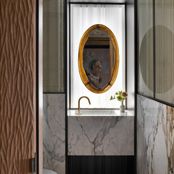
This powder room operates as a compressed, processional vestibule — a jewel-box volume whose narrowness is deliberately weaponized to intensify the encounter with a single focal event. The plan reads as a tight rectilinear corridor, entered obliquely past a pivoting sculptural door leaf at the left foreground, with the sightline funnelling directly to a recessed alcove at the terminal wall. That alcove is the compositional engine of the room: a deep, orthogonal reveal framed in slender blackened-metal profiles, within which a monolithic marble vanity cantilevers as a full-width plinth, its shadow-gap plinth detail dissolving the mass into apparent levitation. The full-height glazed screens flanking both side walls — divided into a disciplined grid of stile-and-rail metal mullions above a stone dado — introduce a Miesian rhythm of verticals that visually widen the space while preserving enclosure. Above, a crisp plaster soffit with a razor-thin perimeter reveal caps the volume, while the mullion grid's continuation across the ceiling plane and door surround creates a cage-like armature, an architectural drawing rendered in three dimensions. The suspended, wall-hung water closet at left is deliberately subordinated, half-concealed by the stone return, ensuring the axial procession terminates not on plumbing but on art.
**II. Materiality, Color & Texture**
The material palette is orchestrated as a controlled dialogue between the geologic, the vegetal, and the metallic. Book-matched Calacatta Viola — or a closely related Paonazzo — sheathes the dado and vanity in slabs whose oxblood, umber, and graphite veining reads as gestural brushwork, its cool bone-white ground counterweighted by the warm ferrous rust of its fissures; the veining on the right-hand wall is sequenced to cascade, treating stone as a continuous painterly field rather than a modular cladding. Against this, the foreground door presents a deeply carved, three-dimensional sculpted timber relief in a mid-tone oak or walnut, its undulating, plaited chevron texture introducing a haptic, almost textile-like tactility that provides the composition's most overtly artisanal register. The glazed screens deploy reeded or fluted glass in a smoky sage-olive cast, their striations diffusing and abstracting whatever lies beyond into vertical striae of light — a translucent counterpoint to the opacity of stone and wood. Blackened bronze or patinated steel mullions supply the graphic scaffolding, while unlacquered brass appears as accent punctuation: the gooseneck spout with exposed swivel collar, and, most emphatically, the flame-patinated bronze oval of the mirror frame, whose molten amber bloom is the single high-saturation event in an otherwise desaturated envelope of greys, greiges, and bone. Underfoot, chevron-laid oak parquet in a soft tobacco stain grounds the palette and repeats the door's zigzag geometry at a domestic scale.
**III. Lighting, Atmosphere & Style Profile**
Lighting is handled with theatrical restraint and a distinctly museological logic. The terminal alcove is backlit by a full-height plane of sheer, pinch-pleated linen sheers washed with daylight — an ambiguous, screened luminance that functions as a lightbox, silhouetting the mirror and reading as a window without conceding a view. Concealed cove or perimeter LED at the soffit reveal lifts the ceiling and grazes the plaster, while the reeded glass side screens capture and refract borrowed light along their flutes, producing a soft vertical shimmer that keeps the narrow volume from collapsing into gloom. The lower register is intentionally darker, the recessed shadow gap beneath the vanity and the bronze toe detail anchoring the composition in a low-key, chiaroscuro base. The atmosphere is hushed, contemplative, and faintly ecclesiastical — the alcove operating as a reredos, the framed portrait glimpsed in the mirror's reflection functioning as an unexpected, wry apparition that injects narrative and humor into an otherwise austere scheme. Stylistically, the room synthesizes into what might be termed *Tactile Luxe Modernism* or Refined Warm Modernism: the structural clarity and metal-gridded transparency of mid-century International Style, tempered by Italian post-war sensuality in the bronze and marble, and finally humanized by contemporary craft-forward texture. The result is a space of considerable discipline that nonetheless privileges touch, patina, and surprise over minimalist abstinence.
 Simply Perfect
Advice on interior design is available everywhere—from TV shows and websites to books, magazines and apps.
We love seeing people become engaged in design and educated on the wide range of possibilities. But we hope you’ll proceed with caution.
It’s not that style errors are a matter of life and death. It’s just that it’s easy to choose designs that aren’t necessarily reflective of your own personality and character. And since you’re typically stuck with your interior design decisions for years, styles that don’t quite fit can tend to grate on you.
Interiors that give one person comfort may unleash chaos in someone else. This goes beyond favorite colors or hot trends, right to the heart of interior design, where you find questions of composition, balance, repetition, space and more.
The goal is to find that unique combination of design elements that gives you comfort, support and balance.
In one home, that perfect balance was struck through the use of symmetry. A pair of comfortable swivel chairs sit beneath matching indigo patterned paintings. Matching bookcases below the paintings contain similar, but not identical, arrangements of books, vases and bowls. Woods and bronzes help warm up the simple white bookcase shelving.
Two matching poufs in front of the fireplace provide additional seating. The sofa is accented with a pair of pillows with a blue pattern that echoes the artwork.
The effect of the symmetry is to achieve order and simplicity, which I promote at every opportunity. After all, your home interiors should be the setting or the backdrop of your life—not center stage.
Antique bronze and blue are complementary colors. Together, they offer a rich palette of richness and depth, which brings out the beauty of wood and stone.
In the home office, a unique, whitewash-stained wooden desk rests on metal, Sawhorse-inspired legs for a warm, rustic look. The black leather chair features a contemporary silhouette with an antique brass frame. An adjustable desk lamp has bronze accents.
The bookcase combines a sleek, black metal frame with concrete shelves, for another unusual pairing. It’s kept uncluttered for an orderly, peaceful look. Items on the shelves include a bronze-accented lamp and a pair
of high gloss-finished wooden bookends.
The elegant artwork behind the desk is a simple midnight-blue and bronze with mottled white. Deep blues are again picked up in the rug, which adds a stately vibe with a modern pattern and satisfying texture.
Within the framework of symmetry, the living room repeats the blue-and-bronze color scheme.
A large midcentury brass clock above the fireplace keeps the natural stone visible, rather than hidden behind a painting or television, while its straight lines and color create a beautiful contrast.
The sofa is a soft, neutral blue. The pattern on the round brass side table features echoes the darker blue-patterned rug, as well as the rug in the office, tying the rooms together.
Indigo blue books adjacent to bronze vases on the shelves repeat the color scheme. The soapstone-topped coffee table echoes the shape of the fireplace. A pair of tall, matching floor lamps with long wooden bases, brass pulls and simple linen shades combine both the colors and symmetry found throughout the home.
9