
Search results for "Replacing items" in Home Design Ideas
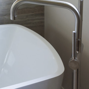
 Drury Design
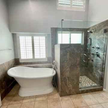
This update involved keeping the existing floorplan while using new materials to bring the space up to date.
Design objectives
-Modernize the space
-Use eye-catching tile
-Vanity with more storage
-Brighter finish on plumbing fixtures
Design challenges:
-Get more storage/functionality out of the same vanity space
-Tile selection – finding the right combination for the large the space
-Material selection – getting that wow-factor effect without being able to move walls or plumbing. This refresh was all about choosing materials with impact.
-Bringing in more light in a space somewhat defined by an existing vaulted ceiling.
Design solutions:
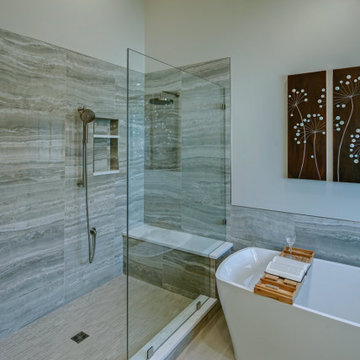
-Removed the old built-in tub look and replaced it with a sleek freestanding tub
-Continued the same tile from the shower walls behind the freestanding tub for a beautiful look on the back wall when you walk into the space
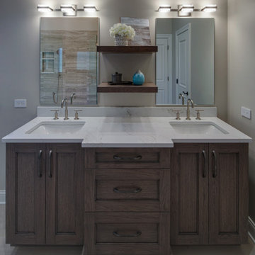
-Created a vanity with undermount sinks, all at one level to gain more countertop space
-Added floating shelves by the vanity – this added more options for decor and easy access to everyday items
-Large-format tile = less visible grout
 Aloha Kitchen, Bath & Design
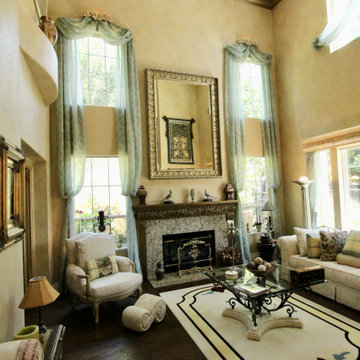
This beautiful estate is positioned with beautiful views and mountain sides around which is why the client loves it so much and never wants to leave. She has lots of pretty decor and treasures she had collected over the years of travelling and wanted to give the home a facelift and better display those items, including a Murano glass chandelier from Italy. The kitchen had a strange peninsula and dining nook that we removed and replaced with a kitchen continent (larger than an island) and built in around the patio door that hide outlets and controls and other supplies. We changed all the flooring, stairway and railing including the gallery area, fireplaces, entryway and many other touches, completely updating the downstairs. Upstairs we remodeled the master bathroom, walk-in closet and after everything was done, she loved it so much that she had us come back a few years later to add another patio door with built in downstairs and an elevator from the master suite to the great room and also opened to a spa outside. (Photo credit; Shawn Lober Construction)

 User
Our approach to the dining room wall was a key decision for the entire project. The wall was load bearing and the homeowners considered only removing half of it. In the end, keeping the overall open concept design was important to the homeowners, therefore we installed a load bearing beam in the ceiling. The beam was finished with drywall to be cohesive so it looked like it was a part of the original design. Now that the kitchen and dining room were open, paint colors were used to designate the spaces and create visual boundaries. This made each area feel like it’s its own space without using any structures.
The original L-shaped kitchen was cut short because of bay windows that overlooked the backyard patio. These windows were lost in the space and not functional; they were replaced with double French doors leading onto the patio. A brick layer was brought in to patch up the window swap and now it looks like the French doors always existed. New crown molding was installed throughout and painted to match the kitchen cabinets.
This window/door replacement allowed for a large pantry cabinet to be installed next to the refrigerator which was not in the old cabinet configuration. The replaced perimeter cabinets host custom storage solutions, like a mixer stand, spice organization, recycling center and functional corner cabinet with pull out shelving. The perimeter kitchen cabinets are painted with a glaze and the island is a cherry stain with glaze to amplify the raised panel door style.
We tripled the size of the kitchen island to expand countertop space. It seats five people and hosts charging stations for the family’s busy lifestyle. It was important that the cooktop in the island had a built in downdraft system because the homeowners did not want a ventilation hood in the center of the kitchen because it would obscure the open concept design.
The countertops are quartz and feature an under mount granite composite kitchen sink with a low divide center. The kitchen faucet, which features hands free and touch technology, and an instant hot water dispenser were added for convenience because of the homeowners’ busy lifestyle. The backsplash is a favorite, with a teal and red glass mosaic basket weave design. It stands out and holds its own among the expansive kitchen cabinets.
All recessed, under cabinet and decorative lights were installed on dimmer switches to allow the homeowners to adjust the lighting in each space of the project. All exterior and interior door hardware, hinges and knobs were replaced in oil rubbed bronze to match the dark stain throughout the space. The entire first floor remodel project uses 12x24 ceramic tile laid in a herringbone pattern. Since tile is typically cold, the flooring was also heated from below. This will also help with the homeowners’ original heating issues.
When accessorizing the kitchen, we used functional, everyday items the homeowners use like cutting boards, canisters for dry goods and place settings on the island. Ultimately, this project transformed their small, outdated kitchen into an expansive and functional workspace.
Find the right local pro for your project
 Homesquare
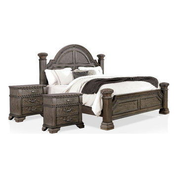
Embrace your love of classic details with the intricacies of this beautiful and grand wood three-piece bedroom set in gray finish with two nightstands. Stately corner posts are augmented with reeded vertical accents and beaded trim that introduce exceptional texture and dimension to the overall design. The headboard is a bell-shaped masterpiece that adds gorgeous trim to create a paneled look with architectural flair. Bedside storage is a plus and nightstands add the modern convenience of built-in USB ports.
Features :
• PLENTY OF STORAGE - 2 drawers per nightstand, providing you ample storage of your cell phone, books and other home items
• Includes: One (1) California King Bed and Two (2) Nightstands
• Style: Traditional
• Finish: Gray
• Materials: Solid Wood, Wood Veneer, MDF
• Arched, bell headboard with intricate trim
• Reeded posts and traditional nickel knobs and drawer pulls
• USB ports built into nightstand
• Easy to follow step by step assembly guide included
• Bed Weight Capacity: 500 lbs
• Nightstand Weight Capacity: 30 lbs
Specifications :
• Bed Dimensions : 97.75"L x 83.25"W x 68.5"H
• Nightstand Dimensions : 28"W x 17"D x 29"H
• Product Weight : 333 lbs
• Assembly Required : Yes
• Warranty Description : 1-Year Manufacture Limited Replacement Parts Warranty
 Drury Design
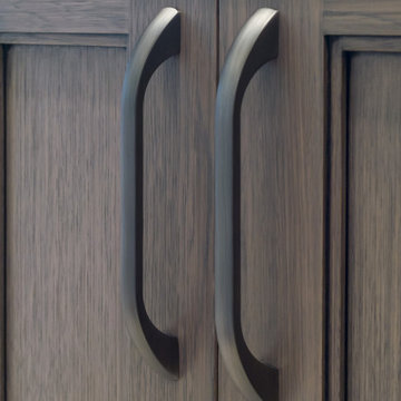
This update involved keeping the existing floorplan while using new materials to bring the space up to date.
Design objectives
-Modernize the space
-Use eye-catching tile
-Vanity with more storage
-Brighter finish on plumbing fixtures
Design challenges:
-Get more storage/functionality out of the same vanity space
-Tile selection – finding the right combination for the large the space
-Material selection – getting that wow-factor effect without being able to move walls or plumbing. This refresh was all about choosing materials with impact.
-Bringing in more light in a space somewhat defined by an existing vaulted ceiling.
Design solutions:
-Removed the old built-in tub look and replaced it with a sleek freestanding tub
-Continued the same tile from the shower walls behind the freestanding tub for a beautiful look on the back wall when you walk into the space
-Created a vanity with undermount sinks, all at one level to gain more countertop space
-Added floating shelves by the vanity – this added more options for decor and easy access to everyday items
-Large-format tile = less visible grout
 Phoenix Home Remodeling
We had a great time working with Rod & Patricia on their master bathroom remodel.
Here are some of the items they had us complete for the guest bathroom remodel:
- Removed the shower and installed a new custom shower with a Pony wall, 2 wall niches, and a new shower tile bench.
- Installed a Signature Hardware Socorro 60" Cast Iron Soaking Tub to replace the old shower bathtub.
- Changed the water closet door for a Lucia glass wood barn door.
- Used Dome Brown 16X16" porcelain for the shower wall tile also around the bathtub, which gives a wooden look to match the new vanity.
- For the shower floor, we used Flat Pebble Warm Blend 12x12" from Arizona Tile.
Vanity Section
The homeowners wanted to add wood details to their guest bathroom.
They chose designer series cabinets with a center pantry to have more storage.
They chose Azul Fantasy Countertops, which combine perfectly with the new cabinets and have some hints of blue which looks incredible. We also installed new sinks, framed mirrors, and vanity lights instead of the old can lights that were in the soffit.

 Adaptiv DC
THEME Created for a baby girl, this room is magical, feminine and very pink. At its heart is the Carriage Crib, surrounded by a large oak tree with delightful animals, baby blocks, a cozy window seat and an upholstered play area on the floor.
FOCUS The eye-catching size and detail of the Carriage Crib, with a dainty canopy held in place by woodland creatures immediately catches a visitor’s attention, and is enhanced by the piece’s fascinating colors and textures. Wall murals, fabrics, accent furniture and lighting accent the beauty of the crib. A handsome Dutch door with a minientrance just for her ensures that this princess feels at home as soon as she steps in the room.
STORAGE The room has closet organizers for everyday items, and cubicle storage is beautifully hidden behind the wall letter blocks.
GROWTH As the room’s occupant grows from baby to toddler to child and ‘tween, the room is easily transformed with age-appropriate toys, pictures, bedding and fabrics. The crib portion of the carriage can be removed and fitted with a larger mattress, saving both time and money in the future. Letter blocks are easily updated by simply removing the letters and replacing them with mirrors, colors or other images.
SAFETY Standard precautions are taken to secure power outlets and keep exposed shelving out of reach. Thickly padded upholstered squares featuring colors and patterns that coordinate with the fabrics on the window seat and valance create a visually inviting, comfortable and safe place to play.
Sponsored
Columbus, OH

Hope Restoration & General Contracting
Columbus Design-Build, Kitchen & Bath Remodeling, Historic Renovations
 Drury Design
This update involved keeping the existing floorplan while using new materials to bring the space up to date.
Design objectives
-Modernize the space
-Use eye-catching tile
-Vanity with more storage
-Brighter finish on plumbing fixtures
Design challenges:
-Get more storage/functionality out of the same vanity space
-Tile selection – finding the right combination for the large the space
-Material selection – getting that wow-factor effect without being able to move walls or plumbing. This refresh was all about choosing materials with impact.
-Bringing in more light in a space somewhat defined by an existing vaulted ceiling.
Design solutions:
-Removed the old built-in tub look and replaced it with a sleek freestanding tub
-Continued the same tile from the shower walls behind the freestanding tub for a beautiful look on the back wall when you walk into the space
-Created a vanity with undermount sinks, all at one level to gain more countertop space
-Added floating shelves by the vanity – this added more options for decor and easy access to everyday items
-Large-format tile = less visible grout
 Drury Design
This update involved keeping the existing floorplan while using new materials to bring the space up to date.
Design objectives
-Modernize the space
-Use eye-catching tile
-Vanity with more storage
-Brighter finish on plumbing fixtures
Design challenges:
-Get more storage/functionality out of the same vanity space
-Tile selection – finding the right combination for the large the space
-Material selection – getting that wow-factor effect without being able to move walls or plumbing. This refresh was all about choosing materials with impact.
-Bringing in more light in a space somewhat defined by an existing vaulted ceiling.
Design solutions:
-Removed the old built-in tub look and replaced it with a sleek freestanding tub
-Continued the same tile from the shower walls behind the freestanding tub for a beautiful look on the back wall when you walk into the space
-Created a vanity with undermount sinks, all at one level to gain more countertop space
-Added floating shelves by the vanity – this added more options for decor and easy access to everyday items
-Large-format tile = less visible grout

 OVOLO Interiors
Board and batten wainscoting was installed, the room was painted, shutters were installed, and new nightstands were purchased. Other accessories and pictures in the room came from the homeowner's existing collection.
Please see http://blog.ovolo.house/2016/02/cape-cod-inspired-bedroom.html for more details and the "before" photo.
 User
Our approach to the dining room wall was a key decision for the entire project. The wall was load bearing and the homeowners considered only removing half of it. In the end, keeping the overall open concept design was important to the homeowners, therefore we installed a load bearing beam in the ceiling. The beam was finished with drywall to be cohesive so it looked like it was a part of the original design. Now that the kitchen and dining room were open, paint colors were used to designate the spaces and create visual boundaries. This made each area feel like it’s its own space without using any structures.
The original L-shaped kitchen was cut short because of bay windows that overlooked the backyard patio. These windows were lost in the space and not functional; they were replaced with double French doors leading onto the patio. A brick layer was brought in to patch up the window swap and now it looks like the French doors always existed. New crown molding was installed throughout and painted to match the kitchen cabinets.
This window/door replacement allowed for a large pantry cabinet to be installed next to the refrigerator which was not in the old cabinet configuration. The replaced perimeter cabinets host custom storage solutions, like a mixer stand, spice organization, recycling center and functional corner cabinet with pull out shelving. The perimeter kitchen cabinets are painted with a glaze and the island is a cherry stain with glaze to amplify the raised panel door style.
We tripled the size of the kitchen island to expand countertop space. It seats five people and hosts charging stations for the family’s busy lifestyle. It was important that the cooktop in the island had a built in downdraft system because the homeowners did not want a ventilation hood in the center of the kitchen because it would obscure the open concept design.
The countertops are quartz and feature an under mount granite composite kitchen sink with a low divide center. The kitchen faucet, which features hands free and touch technology, and an instant hot water dispenser were added for convenience because of the homeowners’ busy lifestyle. The backsplash is a favorite, with a teal and red glass mosaic basket weave design. It stands out and holds its own among the expansive kitchen cabinets.
All recessed, under cabinet and decorative lights were installed on dimmer switches to allow the homeowners to adjust the lighting in each space of the project. All exterior and interior door hardware, hinges and knobs were replaced in oil rubbed bronze to match the dark stain throughout the space. The entire first floor remodel project uses 12x24 ceramic tile laid in a herringbone pattern. Since tile is typically cold, the flooring was also heated from below. This will also help with the homeowners’ original heating issues.
When accessorizing the kitchen, we used functional, everyday items the homeowners use like cutting boards, canisters for dry goods and place settings on the island. Ultimately, this project transformed their small, outdated kitchen into an expansive and functional workspace.
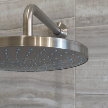 Drury Design
This update involved keeping the existing floorplan while using new materials to bring the space up to date.
Design objectives
-Modernize the space
-Use eye-catching tile
-Vanity with more storage
-Brighter finish on plumbing fixtures
Design challenges:
-Get more storage/functionality out of the same vanity space
-Tile selection – finding the right combination for the large the space
-Material selection – getting that wow-factor effect without being able to move walls or plumbing. This refresh was all about choosing materials with impact.
-Bringing in more light in a space somewhat defined by an existing vaulted ceiling.
Design solutions:
-Removed the old built-in tub look and replaced it with a sleek freestanding tub
-Continued the same tile from the shower walls behind the freestanding tub for a beautiful look on the back wall when you walk into the space
-Created a vanity with undermount sinks, all at one level to gain more countertop space
-Added floating shelves by the vanity – this added more options for decor and easy access to everyday items
-Large-format tile = less visible grout
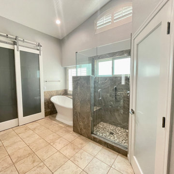 Phoenix Home Remodeling
We had a great time working with Rod & Patricia on their master bathroom remodel.
Here are some of the items they had us complete for the guest bathroom remodel:
- Removed the shower and installed a new custom shower with a Pony wall, 2 wall niches, and a new shower tile bench.
- Installed a Signature Hardware Socorro 60" Cast Iron Soaking Tub to replace the old shower bathtub.
- Changed the water closet door for a Lucia glass wood barn door.
- Used Dome Brown 16X16" porcelain for the shower wall tile also around the bathtub, which gives a wooden look to match the new vanity.
- For the shower floor, we used Flat Pebble Warm Blend 12x12" from Arizona Tile.
Vanity Section
The homeowners wanted to add wood details to their guest bathroom.
They chose designer series cabinets with a center pantry to have more storage.
They chose Azul Fantasy Countertops, which combine perfectly with the new cabinets and have some hints of blue which looks incredible. We also installed new sinks, framed mirrors, and vanity lights instead of the old can lights that were in the soffit.
Sponsored
Plain City, OH

Kuhns Contracting, Inc.
Central Ohio's Trusted Home Remodeler Specializing in Kitchens & Baths
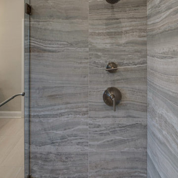 Drury Design
This update involved keeping the existing floorplan while using new materials to bring the space up to date.
Design objectives
-Modernize the space
-Use eye-catching tile
-Vanity with more storage
-Brighter finish on plumbing fixtures
Design challenges:
-Get more storage/functionality out of the same vanity space
-Tile selection – finding the right combination for the large the space
-Material selection – getting that wow-factor effect without being able to move walls or plumbing. This refresh was all about choosing materials with impact.
-Bringing in more light in a space somewhat defined by an existing vaulted ceiling.
Design solutions:
-Removed the old built-in tub look and replaced it with a sleek freestanding tub
-Continued the same tile from the shower walls behind the freestanding tub for a beautiful look on the back wall when you walk into the space
-Created a vanity with undermount sinks, all at one level to gain more countertop space
-Added floating shelves by the vanity – this added more options for decor and easy access to everyday items
-Large-format tile = less visible grout
 Homesquare
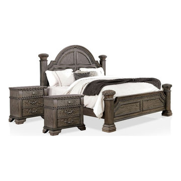
Embrace your love of classic details with the intricacies of this beautiful and grand wood three-piece bedroom set in gray finish with two nightstands. Stately corner posts are augmented with reeded vertical accents and beaded trim that introduce exceptional texture and dimension to the overall design. The headboard is a bell-shaped masterpiece that adds gorgeous trim to create a paneled look with architectural flair. Bedside storage is a plus and nightstands add the modern convenience of built-in USB ports.
Features :
• PLENTY OF STORAGE - 2 drawers per nightstand, providing you ample storage of your cell phone, books and other home items
• Includes: One (1) Queen Bed and Two (2) Nightstands
• Style: Traditional
• Finish: Gray
• Materials: Solid Wood, Wood Veneer, MDF
• Arched, bell headboard with intricate trim
• Reeded posts and traditional nickel knobs and drawer pulls
• USB ports built into nightstand
• Easy to follow step by step assembly guide included
• Bed Weight Capacity: 500 lbs
• Nightstand Weight Capacity: 30 lbs
Specifications :
• Bed Dimensions : 93.75"L x 67.63"W x 68.5"H
• Nightstand Dimensions : 28"W x 17"D x 29"H
• Product Weight : 306 lbs
• Assembly Required : Yes
• Warranty Description : 1-Year Manufacture Limited Replacement Parts Warranty
 User
Our approach to the dining room wall was a key decision for the entire project. The wall was load bearing and the homeowners considered only removing half of it. In the end, keeping the overall open concept design was important to the homeowners, therefore we installed a load bearing beam in the ceiling. The beam was finished with drywall to be cohesive so it looked like it was a part of the original design. Now that the kitchen and dining room were open, paint colors were used to designate the spaces and create visual boundaries. This made each area feel like it’s its own space without using any structures.
The original L-shaped kitchen was cut short because of bay windows that overlooked the backyard patio. These windows were lost in the space and not functional; they were replaced with double French doors leading onto the patio. A brick layer was brought in to patch up the window swap and now it looks like the French doors always existed. New crown molding was installed throughout and painted to match the kitchen cabinets.
This window/door replacement allowed for a large pantry cabinet to be installed next to the refrigerator which was not in the old cabinet configuration. The replaced perimeter cabinets host custom storage solutions, like a mixer stand, spice organization, recycling center and functional corner cabinet with pull out shelving. The perimeter kitchen cabinets are painted with a glaze and the island is a cherry stain with glaze to amplify the raised panel door style.
We tripled the size of the kitchen island to expand countertop space. It seats five people and hosts charging stations for the family’s busy lifestyle. It was important that the cooktop in the island had a built in downdraft system because the homeowners did not want a ventilation hood in the center of the kitchen because it would obscure the open concept design.
The countertops are quartz and feature an under mount granite composite kitchen sink with a low divide center. The kitchen faucet, which features hands free and touch technology, and an instant hot water dispenser were added for convenience because of the homeowners’ busy lifestyle. The backsplash is a favorite, with a teal and red glass mosaic basket weave design. It stands out and holds its own among the expansive kitchen cabinets.
All recessed, under cabinet and decorative lights were installed on dimmer switches to allow the homeowners to adjust the lighting in each space of the project. All exterior and interior door hardware, hinges and knobs were replaced in oil rubbed bronze to match the dark stain throughout the space. The entire first floor remodel project uses 12x24 ceramic tile laid in a herringbone pattern. Since tile is typically cold, the flooring was also heated from below. This will also help with the homeowners’ original heating issues.
When accessorizing the kitchen, we used functional, everyday items the homeowners use like cutting boards, canisters for dry goods and place settings on the island. Ultimately, this project transformed their small, outdated kitchen into an expansive and functional workspace.
 User
Our approach to the dining room wall was a key decision for the entire project. The wall was load bearing and the homeowners considered only removing half of it. In the end, keeping the overall open concept design was important to the homeowners, therefore we installed a load bearing beam in the ceiling. The beam was finished with drywall to be cohesive so it looked like it was a part of the original design. Now that the kitchen and dining room were open, paint colors were used to designate the spaces and create visual boundaries. This made each area feel like it’s its own space without using any structures.
The original L-shaped kitchen was cut short because of bay windows that overlooked the backyard patio. These windows were lost in the space and not functional; they were replaced with double French doors leading onto the patio. A brick layer was brought in to patch up the window swap and now it looks like the French doors always existed. New crown molding was installed throughout and painted to match the kitchen cabinets.
This window/door replacement allowed for a large pantry cabinet to be installed next to the refrigerator which was not in the old cabinet configuration. The replaced perimeter cabinets host custom storage solutions, like a mixer stand, spice organization, recycling center and functional corner cabinet with pull out shelving. The perimeter kitchen cabinets are painted with a glaze and the island is a cherry stain with glaze to amplify the raised panel door style.
We tripled the size of the kitchen island to expand countertop space. It seats five people and hosts charging stations for the family’s busy lifestyle. It was important that the cooktop in the island had a built in downdraft system because the homeowners did not want a ventilation hood in the center of the kitchen because it would obscure the open concept design.
The countertops are quartz and feature an under mount granite composite kitchen sink with a low divide center. The kitchen faucet, which features hands free and touch technology, and an instant hot water dispenser were added for convenience because of the homeowners’ busy lifestyle. The backsplash is a favorite, with a teal and red glass mosaic basket weave design. It stands out and holds its own among the expansive kitchen cabinets.
All recessed, under cabinet and decorative lights were installed on dimmer switches to allow the homeowners to adjust the lighting in each space of the project. All exterior and interior door hardware, hinges and knobs were replaced in oil rubbed bronze to match the dark stain throughout the space. The entire first floor remodel project uses 12x24 ceramic tile laid in a herringbone pattern. Since tile is typically cold, the flooring was also heated from below. This will also help with the homeowners’ original heating issues.
When accessorizing the kitchen, we used functional, everyday items the homeowners use like cutting boards, canisters for dry goods and place settings on the island. Ultimately, this project transformed their small, outdated kitchen into an expansive and functional workspace.

 User
Our approach to the dining room wall was a key decision for the entire project. The wall was load bearing and the homeowners considered only removing half of it. In the end, keeping the overall open concept design was important to the homeowners, therefore we installed a load bearing beam in the ceiling. The beam was finished with drywall to be cohesive so it looked like it was a part of the original design. Now that the kitchen and dining room were open, paint colors were used to designate the spaces and create visual boundaries. This made each area feel like it’s its own space without using any structures.
The original L-shaped kitchen was cut short because of bay windows that overlooked the backyard patio. These windows were lost in the space and not functional; they were replaced with double French doors leading onto the patio. A brick layer was brought in to patch up the window swap and now it looks like the French doors always existed. New crown molding was installed throughout and painted to match the kitchen cabinets.
This window/door replacement allowed for a large pantry cabinet to be installed next to the refrigerator which was not in the old cabinet configuration. The replaced perimeter cabinets host custom storage solutions, like a mixer stand, spice organization, recycling center and functional corner cabinet with pull out shelving. The perimeter kitchen cabinets are painted with a glaze and the island is a cherry stain with glaze to amplify the raised panel door style.
We tripled the size of the kitchen island to expand countertop space. It seats five people and hosts charging stations for the family’s busy lifestyle. It was important that the cooktop in the island had a built in downdraft system because the homeowners did not want a ventilation hood in the center of the kitchen because it would obscure the open concept design.
The countertops are quartz and feature an under mount granite composite kitchen sink with a low divide center. The kitchen faucet, which features hands free and touch technology, and an instant hot water dispenser were added for convenience because of the homeowners’ busy lifestyle. The backsplash is a favorite, with a teal and red glass mosaic basket weave design. It stands out and holds its own among the expansive kitchen cabinets.
All recessed, under cabinet and decorative lights were installed on dimmer switches to allow the homeowners to adjust the lighting in each space of the project. All exterior and interior door hardware, hinges and knobs were replaced in oil rubbed bronze to match the dark stain throughout the space. The entire first floor remodel project uses 12x24 ceramic tile laid in a herringbone pattern. Since tile is typically cold, the flooring was also heated from below. This will also help with the homeowners’ original heating issues.
When accessorizing the kitchen, we used functional, everyday items the homeowners use like cutting boards, canisters for dry goods and place settings on the island. Ultimately, this project transformed their small, outdated kitchen into an expansive and functional workspace.

 Jarrett Design
Many recent renovations had already taken place at this phenomenal old Tudor home. The kitchen redo was saved for last. Our mission, imposed by our client, was to create a jaw-dropping, ultra-functional space for family and friends to gather in for years to come. Naturally, the new kitchen would have to reflect the style of the home seamlessly.
One challenge was to incorporate very large professional style appliances into the space while keeping the feel of a stately, yet warm home. Custom wood panels were designed for the refrigerator units to give a furniture feel. A copper hood was designed to bring in an old world element. Wood panels were applied to all other appliances – two dishwashers, a wine refrigerator, and a beverage refrigerator.
An iron I-beam that separated the original kitchen from the butler’s pantry and back entry was covered in wood with chamfers to match the other ceiling beams in the home by a local woodworker.
Due to the age of the home, the outside walls are concrete block. This necessitated chiseling troughs into the concrete for electrical wiring. Ceilings were studded randomly, so finding openings for recessed lighting was hit or miss. A large cluster of wiring and plumbing to the second floor had to be hidden behind cabinetry to the left of and above the refrigerators. HVAC wasn’t straight forward either. Toe kick heaters from the old kitchen had to be replaced with other sources. A propane tank had to be added to fuel the large dual fuel, double oven range. The homeowner wanted to add a walk-in pantry for extra storage, so space was taken from an existing exterior space. This created the need for extra insulation, supplemental heat and added lighting. Needless to say, mechanicals were a big challenge.
Natural stone was added in backsplash areas to the ceiling to mimic the rectangular stone on the exterior of the home. Wood panels fill the backsplash areas under wall cabinets. Large chandeliers light the space. Open shelves at the wet bar/prep area offer convenient storage for grab and go service items. A built-in pantry with antique mirrored mullion doors hides a microwave, several other small appliances as well as dishes and food items. This pantry was tucked into an alcove for an added architectural element. Herringbone wood floors are classic and timeless. Wrought iron hardware and shelf brackets fit right in. Large Barley twist legs ground the island giving a nod to the Tudor style.
Mission accomplished.
Matt Villano Photography

 Fiorito Interior Design
A master bathroom should be a luxurious treat, a place to relax, refresh and renew. What my client had was anything but. A small footprint was made even smaller by an unnecessarily large tub and a separate water closet built at an awkward angle which cut into the space even more. By eliminating the water closet walls and replacing the tub with a smaller model, we were able to open up the bathroom and make it the airy, tranquil sanctuary it always should have been. My client’s love of Paris led us to design a bathroom that embraces a kind of chic, couture sensibility with a stylized floral tile of Carrara, Statuario and Bardiglio marble, white subway tiles, and a Calacatta countertop. French grey walls and a sparkling, petite chandelier lend the final touch to this classic ensemble.
Photo: Bernardo Grijalva
70