
Search results for "Replacing items" in Home Design Ideas
 7 Day Kitchens
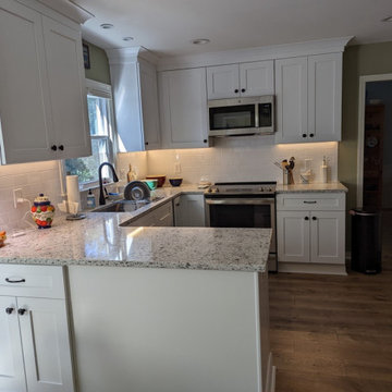
This family home in Charlotte was in need of a little TLC. The original builder-grade cabinets and countertops were outdated and ready for a change.
The kitchen had a classic U-shaped layout that was perfect for this couple. The work triangle was just right, but the honey toned wood cabinets and laminate countertops were definitely past their prime. So, we made some simple effective updates.
The biggest change was getting rid of the built-in desk area to create a brand new spacious full-height pantry and built-in trash can pullout. This gave them so much more storage space, and the roll-out trays made everyday items easily accessible. We also made the cabinets a little taller, going from 30 inches to 36 inches for even more storage space. The added benefit of taller cabinets gave the kitchen a fresh and modern look.
We also gave the powder room a makeover. New vanity, vanity top, faucet, and toilet. We also replaced the flooring on the first floor with durable LVP flooring elevating the overall look and feel of the home. The whole project was completed in just 7 days, from start to finish.

 Liza Nicole Interiors
Jon Friedrich
Example of a small classic master white tile and porcelain tile marble floor alcove shower design with furniture-like cabinets, dark wood cabinets, a one-piece toilet, a console sink, quartz countertops and a hinged shower door
Example of a small classic master white tile and porcelain tile marble floor alcove shower design with furniture-like cabinets, dark wood cabinets, a one-piece toilet, a console sink, quartz countertops and a hinged shower door
 Fixi Handyman Services
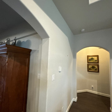
WHOLE-HOME REFRESH — HANDYMAN KATY TO PEARLAND, TX (77584)
Client: Joyce
Location: Pearland, TX 77584
Scope of Work: Hallway patch and paint, interior wall cleaning and painting with corner bead repair, master bathroom tile replacement, and smoke/CO alarm batteries
Joyce had a list that had been building for a while. We worked through all of it in one project.
The main hallway came first: 25 to 30 pinholes filled, sanded, spot-primed, then two coats of matching paint across both side walls, corner to corner.
From there we moved through the designated walls around the house, cleaning scuffs and buildup, degreasing near the bathroom switch, patching minor damage, and repairing a damaged corner bead near the living area with the texture restored to match before painting.
In the master bathroom, we pulled two mismatched cut tiles at the doorway, removed the old setting material, prepped the substrate, cut and set her matching tiles, and grouted, with the adjacent carpet and trim protected throughout.
Last item on the list: fresh batteries in eight smoke and CO alarms, covers back on, every unit tested.
Joyce, thank you for trusting our Katy handyman crew with this much of your home at once.
And thank you for the 5-star review! Wishing you’d found us five years ago is about the best thing we could read.
Got a list that keeps growing in Katy or Pearland? Text a handyman a photo and we’ll respond same day.
Find the right local pro for your project
 Aloha Kitchen, Bath & Design
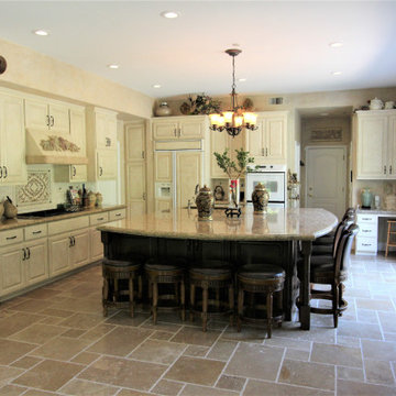
This beautiful estate is positioned with beautiful views and mountain sides around which is why the client loves it so much and never wants to leave. She has lots of pretty decor and treasures she had collected over the years of travelling and wanted to give the home a facelift and better display those items, including a Murano glass chandelier from Italy. The kitchen had a strange peninsula and dining nook that we removed and replaced with a kitchen continent (larger than an island) and built in around the patio door that hide outlets and controls and other supplies. We changed all the flooring, stairway and railing including the gallery area, fireplaces, entryway and many other touches, completely updating the downstairs. Upstairs we remodeled the master bathroom, walk-in closet and after everything was done, she loved it so much that she had us come back a few years later to add another patio door with built in downstairs and an elevator from the master suite to the great room and also opened to a spa outside. (Photo credit; Shawn Lober Construction)
 AMLD INTERIOR INC
AM70043-300
DESCRIPTION:
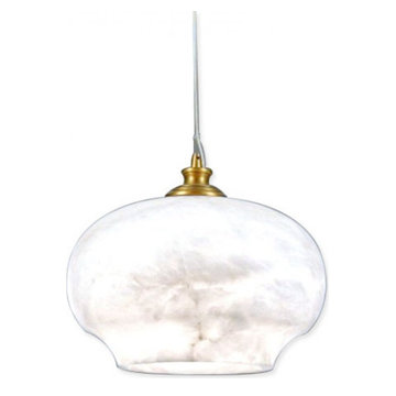
At Alan Mizrahi Lighting Design, we supply and manufacturer many highly sought after designer pieces. All Chandelier can be customized by number of lights, style, color and size to meet your specific needs. Every chandelier can also be combined with a matching table lamp and wall lamp to accomplish the best room design. Our company provide collections that can make all your project dreams come true. Lighting products play an important role in any room setting. Hence, you need to make sure that the items you choose should brighten the room while rendering it a relaxing and welcoming feel as well.
SPECIFICATIONS:
Collection:
Size: (Custom sizes also available)
Shape: Pendant
Metal Finished: Antique brass or black color (Different finish available at no additional cost)
Materials: Alabaster
Weight: N/A LBS.
Extension: Adjustable cord customizable up to 12 ft.
Bulbs: N/A
Assembly: Some assembly required.
Dimmer Switch Compatible: Optional
Shipping: Free Door-To-Door Shipping Worldwide!
Rush Order: 4-6 Weeks; 15% added to the total
Regular Lead Time: 6-10 Weeks
Warranty: 5 Years Full Coverage (includes replacement parts)
Custom Sizes, Finishes, Colors Available Upon Request

 User
This craftsman kitchen borrows natural elements from architect and design icon, Frank Lloyd Wright. A slate backsplash, soapstone counters, and wood cabinetry is a perfect throwback to midcentury design.
What ties this kitchen to present day design are elements such as stainless steel appliances and smart and hidden storage. This kitchen takes advantage of every nook and cranny to provide extra storage for pantry items and cookware.

 Alair Homes Plano
Our clients were living in a Northwood Hills home in Dallas that was built in 1968. Some updates had been done but none really to the main living areas in the front of the house. They love to entertain and do so frequently but the layout of their house wasn’t very functional. There was a galley kitchen, which was mostly shut off to the rest of the home. They were not using the formal living and dining room in front of your house, so they wanted to see how this space could be better utilized. They wanted to create a more open and updated kitchen space that fits their lifestyle. One idea was to turn part of this space into an office, utilizing the bay window with the view out of the front of the house. Storage was also a necessity, as they entertain often and need space for storing those items they use for entertaining. They would also like to incorporate a wet bar somewhere!
We demoed the brick and paneling from all of the existing walls and put up drywall. The openings on either side of the fireplace and through the entryway were widened and the kitchen was completely opened up. The fireplace surround is changed to a modern Emser Esplanade Trail tile, versus the chunky rock it was previously. The ceiling was raised and leveled out and the beams were removed throughout the entire area. Beautiful Olympus quartzite countertops were installed throughout the kitchen and butler’s pantry with white Chandler cabinets and Grace 4”x12” Bianco tile backsplash. A large two level island with bar seating for guests was built to create a little separation between the kitchen and dining room. Contrasting black Chandler cabinets were used for the island, as well as for the bar area, all with the same 6” Emtek Alexander pulls. A Blanco low divide metallic gray kitchen sink was placed in the center of the island with a Kohler Bellera kitchen faucet in vibrant stainless. To finish off the look three Iconic Classic Globe Small Pendants in Antiqued Nickel pendant lights were hung above the island. Black Supreme granite countertops with a cool leathered finish were installed in the wet bar, The backsplash is Choice Fawn gloss 4x12” tile, which created a little different look than in the kitchen. A hammered copper Hayden square sink was installed in the bar, giving it that cool bar feel with the black Chandler cabinets. Off the kitchen was a laundry room and powder bath that were also updated. They wanted to have a little fun with these spaces, so the clients chose a geometric black and white Bella Mori 9x9” porcelain tile. Coordinating black and white polka dot wallpaper was installed in the laundry room and a fun floral black and white wallpaper in the powder bath. A dark bronze Metal Mirror with a shelf was installed above the porcelain pedestal sink with simple floating black shelves for storage.
Their butlers pantry, the added storage space, and the overall functionality has made entertaining so much easier and keeps unwanted things out of sight, whether the guests are sitting at the island or at the wet bar! The clients absolutely love their new space and the way in which has transformed their lives and really love entertaining even more now!

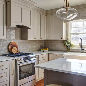
 TKS Design Group
Download our free ebook, Creating the Ideal Kitchen. DOWNLOAD NOW
This family from Wheaton was ready to remodel their kitchen, dining room and powder room. The project didn’t call for any structural or space planning changes but the makeover still had a massive impact on their home. The homeowners wanted to change their dated 1990’s brown speckled granite and light maple kitchen. They liked the welcoming feeling they got from the wood and warm tones in their current kitchen, but this style clashed with their vision of a deVOL type kitchen, a London-based furniture company. Their inspiration came from the country homes of the UK that mix the warmth of traditional detail with clean lines and modern updates.
To create their vision, we started with all new framed cabinets with a modified overlay painted in beautiful, understated colors. Our clients were adamant about “no white cabinets.” Instead we used an oyster color for the perimeter and a custom color match to a specific shade of green chosen by the homeowner. The use of a simple color pallet reduces the visual noise and allows the space to feel open and welcoming. We also painted the trim above the cabinets the same color to make the cabinets look taller. The room trim was painted a bright clean white to match the ceiling.
In true English fashion our clients are not coffee drinkers, but they LOVE tea. We created a tea station for them where they can prepare and serve tea. We added plenty of glass to showcase their tea mugs and adapted the cabinetry below to accommodate storage for their tea items. Function is also key for the English kitchen and the homeowners. They requested a deep farmhouse sink and a cabinet devoted to their heavy mixer because they bake a lot. We then got rid of the stovetop on the island and wall oven and replaced both of them with a range located against the far wall. This gives them plenty of space on the island to roll out dough and prepare any number of baked goods. We then removed the bifold pantry doors and created custom built-ins with plenty of usable storage for all their cooking and baking needs.
The client wanted a big change to the dining room but still wanted to use their own furniture and rug. We installed a toile-like wallpaper on the top half of the room and supported it with white wainscot paneling. We also changed out the light fixture, showing us once again that small changes can have a big impact.
As the final touch, we also re-did the powder room to be in line with the rest of the first floor. We had the new vanity painted in the same oyster color as the kitchen cabinets and then covered the walls in a whimsical patterned wallpaper. Although the homeowners like subtle neutral colors they were willing to go a bit bold in the powder room for something unexpected. For more design inspiration go to: www.kitchenstudio-ge.com

 TVL Creative Ltd.
This project was such an incredible design opportunity, and instilled inspiration and excitement at every turn! Our amazing clients came to us with the challenge of converting their beloved family home into a welcoming haven for all members of the family. At the time that we met our clients, they were struggling with the difficult personal decision of the fate of the home. Their father/father-in-law had passed away and their mother/mother-in-law had recently been admitted into a nursing facility and was fighting Alzheimer’s. Resistant to loss of the home now that both parents were out of it, our clients purchased the home to keep in in the family. Despite their permanent home currently being in New Jersey, these clients dedicated themselves to keeping and revitalizing the house. We were moved by the story and became immediately passionate about bringing this dream to life.
The home was built by the parents of our clients and was only ever owned by them, making this a truly special space to the family. Our goal was to revitalize the home and to bring new energy into every room without losing the special characteristics that were original to the home when it was built. In this way, we were able to develop a house that maintains its own unique personality while offering a space of welcoming neutrality for all members of the family to enjoy over time.
The renovation touched every part of the home: the exterior, foyer, kitchen, living room, sun room, garage, six bedrooms, three bathrooms, the laundry room, and everything in between. The focus was to develop a style that carried consistently from space to space, but allowed for unique expression in the small details in every room.
Starting at the entry, we renovated the front door and entry point to offer more presence and to bring more of the mid-century vibe to the home’s exterior. We integrated a new modern front door, cedar shingle accents, new exterior paint, and gorgeous contemporary house numbers that really allow the home to stand out. Just inside the entry, we renovated the foyer to create a playful entry point worthy of attention. Cement look tile adorns the foyer floor, and we’ve added new lighting and upgraded the entry coat storage.
Upon entering the home, one will immediately be captivated by the stunning kitchen just off the entry. We transformed this space in just about every way. While the footprint of the home ultimately remained almost identical, the aesthetics were completely turned on their head. We re-worked the kitchen to maximize storage and to create an informal dining area that is great for casual hosting or morning coffee.
We removed the entry to the garage that was once in the informal dining, and created a peninsula in its place that offers a unique division between the kitchen/informal dining and the formal dining and living areas. The simple light warm light gray cabinetry offers a bit of traditional elegance, along with the marble backsplash and quartz countertops. We extended the original wood flooring into the kitchen and stained all floors to match for a warmth that truly resonates through all spaces. We upgraded appliances, added lighting everywhere, and finished the space with some gorgeous mid century furniture pieces.
In the formal dining and living room, we really focused on maintaining the original marble fireplace as a focal point. We cleaned the marble, repaired the mortar, and refinished the original fireplace screen to give a new sleek look in black. We then integrated a new gas insert for modern heating and painted the upper portion in a rich navy blue; an accent that is carried through the home consistently as a nod to our client’s love of the color.
The former entry into the old covered porch is now an elegant glass door leading to a stunning finished sunroom. This room was completely upgraded as well. We wrapped the entire space in cozy white shiplap to keep a casual feel with brightness. We tiled the floor with large format concrete look tile, and painted the old brick fireplace a bright white. We installed a new gas burning unit, and integrated transitional style lighting to bring warmth and elegance into the space. The new black-frame windows are adorned with decorative shades that feature hand-sketched bird prints, and we’ve created a dedicated garden-ware “nook” for our client who loves to work in the yard. The far end of this space is completed with two oversized chaise loungers and overhead lights…the most perfect little reading nook!
Just off the dining room, we created an entirely new space to the home: a mudroom. The clients lacked this space and desperately needed a landing spot upon entering the home from the garage. We uniquely planned existing space in the garage to utilize for this purpose, and were able to create a small but functional entry point without losing the ability to park cars in the garage. This new space features cement-look tile, gorgeous deep brown cabinetry, and plenty of storage for all the small items one might need to store while moving in and out of the home.
The remainder of the upstairs level includes massive renovations to the guest hall bathroom and guest bedroom, upstairs master bed/bath suite, and a third bedroom that we converted into a home office for the client.
Some of the largest transformations were made in the basement, where unfinished space and lack of light were converted into gloriously lit, cozy, finished spaces. Our first task was to convert the massive basement living room into the new master bedroom for our clients. We removed existing built-ins, created an entirely new walk-in closet, painted the old brick fireplace, installed a new gas unit, added carpet, introduced new lighting, replaced windows, and upgraded every part of the aesthetic appearance. One of the most incredible features of this space is the custom double sliding barn door made by a Denver artisan. This space is truly a retreat for our clients!
We also completely transformed the laundry room, back storage room, basement master bathroom, and two bedrooms.
This home’s massive scope and ever-evolving challenges were thrilling and exciting to work with, and the result is absolutely amazing. At the end of the day, this home offers a look and feel that the clients love. Above all, though, the clients feel the spirit of their family home and have a welcoming environment for all members of the family to enjoy for years to come.

 Fiorito Interior Design
A master bathroom should be a luxurious treat, a place to relax, refresh and renew. What my client had was anything but. A small footprint was made even smaller by an unnecessarily large tub and a separate water closet built at an awkward angle which cut into the space even more. By eliminating the water closet walls and replacing the tub with a smaller model, we were able to open up the bathroom and make it the airy, tranquil sanctuary it always should have been. My client’s love of Paris led us to design a bathroom that embraces a kind of chic, couture sensibility with a stylized floral tile of Carrara, Statuario and Bardiglio marble, white subway tiles, and a Calacatta countertop. French grey walls and a sparkling, petite chandelier lend the final touch to this classic ensemble.
Photo: Bernardo Grijalva

 Joy Street Design
A gorgeous kitchen showcasing a brand new color palette of gray and bold blue! As this was the client’s childhood home, we wanted to preserve her memories while still refreshing the interior and bringing it up-to-date. We started with a new spatial layout and increased the size of wall openings to create the sense of an open plan without removing all the walls. By adding a more functional layout and pops of color throughout the space, we were able to achieve a youthful update to a cherished space without losing all the character and memories that the homeowner loved.
Designed by Joy Street Design serving Oakland, Berkeley, San Francisco, and the whole of the East Bay.
For more about Joy Street Design, click here: https://www.joystreetdesign.com/
To learn more about this project, click here: https://www.joystreetdesign.com/portfolio/randolph-street


 Wolfgang Pichler Design Inc.
The client wanted to have an existing apartment remodeled and the kitchen, the bathroom and the powder room redesigned on a large-scale. For this purpose, the existing kitchen was gutted and also the wall to the storeroom was removed, which created much more space. She wanted a central kitchen element as a meeting place for family, friends and guests, flanked by a simple kitchenette and a wall unit with maximum storage space. A two-sided
access to the kitchen makes it now easy to store purchases on short distances and to reach the nearby dining table in the open plan living area. White was chosen as the basic color for the cabinet furniture, which blends perfectly with the warm wooden elements of the surface material and the floor made of patterned ceramic tiles. All seems cozy and homely. Suspended lamps with vintage settings give the room a special touch.
The existing interior bathroom was also gutted. We replaced the bathtub with a generous shower facility. The vanity unit in a classic oak look provides a lot of storage space, even for a washing machine and a dryer. The opposite wall construction offers additional storage space for a variety of personal items, but also technical units such as a hot water tank. The generous mirror coating creates a greatly enlarged space that turns this small bathroom into a spa oasis.
The open-plan two-floor room concept was elegantly coordinated in terms of colors – white as the dominant color is alternated by delicate shades of gray. The existing wooden staircase was color-adapted with a special coating. Minimalist elements such as a fireplace in a concrete look give the room a modern touch, without neglecting the factor of coziness.
Sponsored
Columbus, OH

Hope Restoration & General Contracting
Columbus Design-Build, Kitchen & Bath Remodeling, Historic Renovations

 emily lauderback stewart design and renovation
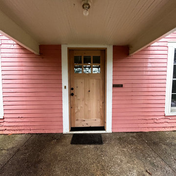
Mid-sized craftsman yellow two-story wood exterior home idea in Seattle

 Jarrett Design
Many recent renovations had already taken place at this phenomenal old Tudor home. The kitchen redo was saved for last. Our mission, imposed by our client, was to create a jaw-dropping, ultra-functional space for family and friends to gather in for years to come. Naturally, the new kitchen would have to reflect the style of the home seamlessly.
One challenge was to incorporate very large professional style appliances into the space while keeping the feel of a stately, yet warm home. Custom wood panels were designed for the refrigerator units to give a furniture feel. A copper hood was designed to bring in an old world element. Wood panels were applied to all other appliances – two dishwashers, a wine refrigerator, and a beverage refrigerator.
An iron I-beam that separated the original kitchen from the butler’s pantry and back entry was covered in wood with chamfers to match the other ceiling beams in the home by a local woodworker.
Due to the age of the home, the outside walls are concrete block. This necessitated chiseling troughs into the concrete for electrical wiring. Ceilings were studded randomly, so finding openings for recessed lighting was hit or miss. A large cluster of wiring and plumbing to the second floor had to be hidden behind cabinetry to the left of and above the refrigerators. HVAC wasn’t straight forward either. Toe kick heaters from the old kitchen had to be replaced with other sources. A propane tank had to be added to fuel the large dual fuel, double oven range. The homeowner wanted to add a walk-in pantry for extra storage, so space was taken from an existing exterior space. This created the need for extra insulation, supplemental heat and added lighting. Needless to say, mechanicals were a big challenge.
Natural stone was added in backsplash areas to the ceiling to mimic the rectangular stone on the exterior of the home. Wood panels fill the backsplash areas under wall cabinets. Large chandeliers light the space. Open shelves at the wet bar/prep area offer convenient storage for grab and go service items. A built-in pantry with antique mirrored mullion doors hides a microwave, several other small appliances as well as dishes and food items. This pantry was tucked into an alcove for an added architectural element. Herringbone wood floors are classic and timeless. Wrought iron hardware and shelf brackets fit right in. Large Barley twist legs ground the island giving a nod to the Tudor style.
Mission accomplished.
Matt Villano Photography
 Jarrett Design
Our clients came to us eager to remodel their outdated kitchen. Worn cabinetry, an oddly angled island and aging appliances were begging for help. It was time.
The kitchen in this home is open to the family room. Naturally, all family and friends gravitate to this hub for nourishment and comradery. The clients were generally happy with the layout, but wanted to add a focal point, elegant details, and better organization. The footprint, windows and doors were to remain the same. The microwave over the cooktop was replaced with a custom, wood hood tying in the traditional style of the home. The island was redesigned in a rectangular shape with large, classic corbels and posts, making it more functional as a workspace and much prettier overall. The new cabinetry interiors are chock full of accessories such as a double trash pull out, drawers under the cook top for pots and pans, roll outs behind doors for pantry items and other kitchen essentials, dividers for cutlery and utensils, spice pull out and tray dividers. Quartz counter tops were selected for their brightness and durability. A subtle border in the backsplash behind the cooktop proves that even the smallest details make a difference. An apron sink adds character to the window wall. Glass front cabinetry allows our client to display her favorite collectables.
Matt Villano Photography
 Hillcrest Construction
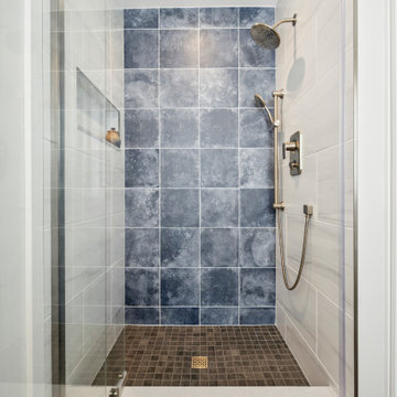
 designed and executed a complete facelift for these West Chester clients’ master bathroom. The sink/toilet/shower layout stayed relatively unchanged due to the limitations of the small space, but major changes were slated for the overall functionality and aesthetic appeal.
The bathroom was gutted completely, the wiring was updated, and minor plumbing alterations were completed for code compliance.
Bathroom waterproofing was installed utilizing the state-of-the-industry Schluter substrate products, and the feature wall of the shower is tiled with a striking blue 12x12 tile set in a stacked pattern, which is a departure of color and layout from the staggered gray-tome wall tile and floor tile.
The original bathroom lacked storage, and what little storage it had lacked practicality.
The original 1’ wide by 4’ deep “reach-in closet” was abandoned and replaced with a custom cabinetry unit that featured six 30” drawers to hold a world of personal bathroom items which could pulled out for easy access. The upper cubbie was shallower at 13” and was sized right to hold a few spare towels without the towels being lost to an unreachable area. The custom furniture-style vanity, also built and finished at the Hillcrest custom shop facilitated a clutter-free countertop with its two deep drawers, one with a u-shaped cut out for the sink plumbing. Considering the relatively small size of the bathroom, and the vanity’s proximity to the toilet, the drawer design allows for greater access to the storage area as compared to a vanity door design that would only be accessed from the front. The custom niche in the shower serves and a consolidated home for soap, shampoo bottles, and all other shower accessories.
Moen fixtures at the sink and in the shower and a Toto toilet complete the contemporary feel. The controls at the shower allow the user to easily switch between the fixed rain head, the hand shower, or both. And for a finishing touch, the client chose between a number for shower grate color and design options to complete their tailor-made sanctuary.
Sponsored
Columbus, OH
Hope Restoration & General Contracting
Columbus Design-Build, Kitchen & Bath Remodeling, Historic Renovations
 Jarrett Design
Many recent renovations had already taken place at this phenomenal old Tudor home. The kitchen redo was saved for last. Our mission, imposed by our client, was to create a jaw-dropping, ultra-functional space for family and friends to gather in for years to come. Naturally, the new kitchen would have to reflect the style of the home seamlessly.
One challenge was to incorporate very large professional style appliances into the space while keeping the feel of a stately, yet warm home. Custom wood panels were designed for the refrigerator units to give a furniture feel. A copper hood was designed to bring in an old world element. Wood panels were applied to all other appliances – two dishwashers, a wine refrigerator, and a beverage refrigerator.
An iron I-beam that separated the original kitchen from the butler’s pantry and back entry was covered in wood with chamfers to match the other ceiling beams in the home by a local woodworker.
Due to the age of the home, the outside walls are concrete block. This necessitated chiseling troughs into the concrete for electrical wiring. Ceilings were studded randomly, so finding openings for recessed lighting was hit or miss. A large cluster of wiring and plumbing to the second floor had to be hidden behind cabinetry to the left of and above the refrigerators. HVAC wasn’t straight forward either. Toe kick heaters from the old kitchen had to be replaced with other sources. A propane tank had to be added to fuel the large dual fuel, double oven range. The homeowner wanted to add a walk-in pantry for extra storage, so space was taken from an existing exterior space. This created the need for extra insulation, supplemental heat and added lighting. Needless to say, mechanicals were a big challenge.
Natural stone was added in backsplash areas to the ceiling to mimic the rectangular stone on the exterior of the home. Wood panels fill the backsplash areas under wall cabinets. Large chandeliers light the space. Open shelves at the wet bar/prep area offer convenient storage for grab and go service items. A built-in pantry with antique mirrored mullion doors hides a microwave, several other small appliances as well as dishes and food items. This pantry was tucked into an alcove for an added architectural element. Herringbone wood floors are classic and timeless. Wrought iron hardware and shelf brackets fit right in. Large Barley twist legs ground the island giving a nod to the Tudor style.
Mission accomplished.
Matt Villano Photography
 Cucina Bella Ltd. - Rebecca Gagne CKD
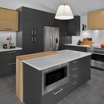
By removing the previous framed in corner pantry we were able to gain symmetry around the range and create a real modern look using black and gold wall sconces and a clean lined rift white oak composite hood. The tall storage houses the old pantry items and then some. The hickory eating bar and horizontal rift white oak cabinets add the warmth of wood and the bright backsplash with dark vein brings in soft, clean visual texture.
 gsylvest
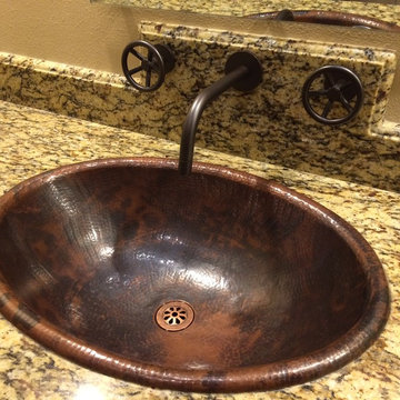
Link-a-sink copper sink.
Santa Cecilia granite.
Avoid the Watermark Designs faucets like the plague:
Wall mounted vanity faucet was loose. They shipped a replacement cartridge free of charge but took 4 weeks. Delta sent one for another bathroom and was received within a few days free of charge.
Mirror lacked instructions on how to put it up. When the mirror slipped, we tightened the 3mm set screws that press against the glass. The glass cracked. They said we tightened the screws too much. Well otherwise the glass slipped down. No torque spec. Additionally they blamed us for not installing the protective felt that did NOT come with the mirror. No mention of the felt in the instructions....in fact, no mention of the word "mirror" is in the instructions on how to put it up. They have since changed their instructions so why did they blame me? They finally supplied a replacement mirror but took 10 weeks (!!!) and countless phone calls.
They actually sent the mechanical engineering drawings with dimensions to me for the mirror holder. I was able to identify 13 *very* basic design flaws.
Hand shower tilts down by its own weight. They have a set screw to provide friction that presses against the threads of another screw. Horrible design likely to fail multiple times over the course of ownership.
Toilet paper holder has two pieces held together by a machine screw. Threads came stripped probably due to incorrect/short screw. Fortunately a large screw held it together.
Shower faucets have the cover plates attach by screwing a piece into an adapter that screws into yet another adapter that screws into the valve. Of course they all spin when you tighten them and you are supposed to set one of the inner adapters to within a millimeter of the outer trim. Horrible design.
Instructions for setting the depth of the shower faucet are extremely misleading (product lines and finishes using multiple codes and overlapping codes, poor part numbering scheme) to the contractors and do not follow GMP resulting in the wrong depth set by the contractor.
Finishes are beautiful but not all the pieces match.
Multiple phone calls to customer service promise return phone calls that never happen. Although if it weren't for one person, A.S., I would have returned everything. Thank you A.S.
No parts breakdown on any items so if you need something, you need to call them....and then wait 8-10 weeks as nothing is stocked.
I spent thousands of dollars expecting top of the line faucets. I feel like I got raped.
73