
Search results for "Repose" in Home Design Ideas
 Dale Cohen Designstudio
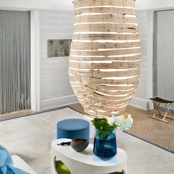
Dale was chosen to participate in the 2013 Hampton Designer Showhouse, sponsored by Traditional Home Magazine, because she has built a reputation for precise, elegant, and livable design work in Manhattan. The challenge of the showhouse, essentially a blank canvas with an imaginary client, was not beyond her. The room she was given is the Terrace Level Lounge; she chose a program to embrace a burgeoning art collection, and devise areas of repose to enjoy the work. And Ms. Cohen’s early training as a painter and photographer clearly are clearly a great asset in this particular room. Her method is to analyze the room as an architectural proposition. A Yale Architectural School graduate, she is able to cast a few intelligent moves to make the room a stage rather than a hallway. Creating a platform for her creative collaboration and designing the Monumental Lantern with artist John Houshmand.
The seating areas are a series of compressed compositions with shapes and forms of chairs, a Minotti sofa, a Valerie Goodman Gallery coffee table, and the Holland and Sherry geometric throw pillows that evoke the early modernist paintings of Jean Arp. Accented by ceiling panels covered in a Maharam wallpaper. Her next big move was enrolling the work of artist and furniture maker John Houshmand. Ms. Cohen thrives on creative collaboration and designing the Monumental Lantern that with Houshmand, that she boldly placed in one entire corner of the room. Few designers would welcome a giant rough sawn luminaire but Ms. Cohen’s early apprenticeship with Richard Serra is evident in this wonderful juxtaposition of scale. Ms. Cohen’s reputation as a brave designer has been established with the inclusion of Houshmand’s piece.
Ms. Cohen’s method is to analyze the room as an architectural proposition. A Yale Architectural School graduate, she is able to cast a few intelligent moves to make the room a stage rather than a hallway. The stairway was divided into two events, one behind a scrim and the other revealed. This gave the sitting area a theatrical backdrop as well as choreographing a Hollywood-style entrance for the visitor walking down the stairs. In fact Ms. Cohen uses a series of fabric backdrops throughout the space to denote different spatial conditions.
The color palette, if said aloud, is the prototypical Hamptons beach house cheery; though Ms. Cohen’s take is altogether different. With a sea blue as her base, she treats the envelope of the space with tinted whites and grays, and just as you are comfortable with this resolve she infuses the space with drops of chartreuse. The optic shock of an electric green is a sign of strength in Ms. Cohen’s tool box. The result is a perfect balance of whimsy and sophistication.
Whimsy, bravery, and compositional sophistication will not be evident or sufficient without Ms. Cohen’s razor sharp rigor. Her attention to detail is what makes one want to sit in the Fritz Hansen chair, under the reading light, with cashmere throw at its side. Ms. Cohen’s embrace of the luxury of detail is what makes for valuable moments in the design world and what sets her work apart.
 Dale Cohen Designstudio
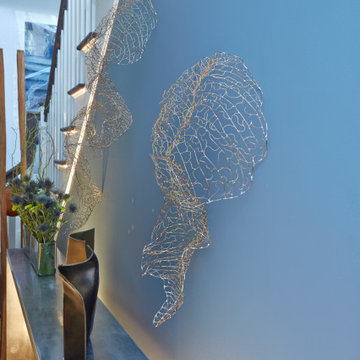
Dale was chosen to participate in the 2013 Hampton Designer Showhouse, sponsored by Traditional Home Magazine, because she has built a reputation for precise, elegant, and livable design work in Manhattan. The challenge of the showhouse, essentially a blank canvas with an imaginary client, was not beyond her. The room she was given is the Terrace Level Lounge; she chose a program to embrace a burgeoning art collection, and devise areas of repose to enjoy the work. And Ms. Cohen’s early training as a painter and photographer clearly are clearly a great asset in this particular room. Her method is to analyze the room as an architectural proposition. A Yale Architectural School graduate, she is able to cast a few intelligent moves to make the room a stage rather than a hallway. Creating a platform for her creative collaboration and designing the Monumental Lantern with artist John Houshmand.
The seating areas are a series of compressed compositions with shapes and forms of chairs, a Minotti sofa, a Valerie Goodman Gallery coffee table, and the Holland and Sherry geometric throw pillows that evoke the early modernist paintings of Jean Arp. Accented by ceiling panels covered in a Maharam wallpaper. Her next big move was enrolling the work of artist and furniture maker John Houshmand. Ms. Cohen thrives on creative collaboration and designing the Monumental Lantern that with Houshmand, that she boldly placed in one entire corner of the room. Few designers would welcome a giant rough sawn luminaire but Ms. Cohen’s early apprenticeship with Richard Serra is evident in this wonderful juxtaposition of scale. Ms. Cohen’s reputation as a brave designer has been established with the inclusion of Houshmand’s piece.
Ms. Cohen’s method is to analyze the room as an architectural proposition. A Yale Architectural School graduate, she is able to cast a few intelligent moves to make the room a stage rather than a hallway. The stairway was divided into two events, one behind a scrim and the other revealed. This gave the sitting area a theatrical backdrop as well as choreographing a Hollywood-style entrance for the visitor walking down the stairs. In fact Ms. Cohen uses a series of fabric backdrops throughout the space to denote different spatial conditions.
The color palette, if said aloud, is the prototypical Hamptons beach house cheery; though Ms. Cohen’s take is altogether different. With a sea blue as her base, she treats the envelope of the space with tinted whites and grays, and just as you are comfortable with this resolve she infuses the space with drops of chartreuse. The optic shock of an electric green is a sign of strength in Ms. Cohen’s tool box. The result is a perfect balance of whimsy and sophistication.
Whimsy, bravery, and compositional sophistication will not be evident or sufficient without Ms. Cohen’s razor sharp rigor. Her attention to detail is what makes one want to sit in the Fritz Hansen chair, under the reading light, with cashmere throw at its side. Ms. Cohen’s embrace of the luxury of detail is what makes for valuable moments in the design world and what sets her work apart.

 DKOR Interiors Inc.- Interior Designers Miami, FL
Miami Interior Designers - Residential Interior Design Project in Fort Lauderdale, FL. A classic Mediterranean home turns Contemporary by DKOR Interiors.
Photo: Alexia Fodere
Interior Design by Miami and Ft. Lauderdale Interior Designers, DKOR Interiors.
www.dkorinteriors.com
Find the right local pro for your project

 Growsgreen Landscape Design
Dolores Garden by Growsgreen Landscape Design
Inspiration for a mid-sized modern full sun backyard concrete paver landscaping in San Francisco.
Inspiration for a mid-sized modern full sun backyard concrete paver landscaping in San Francisco.
 TKS Design Group
Download our free ebook, Creating the Ideal Kitchen. DOWNLOAD NOW
The homeowners built their traditional Colonial style home 17 years’ ago. It was in great shape but needed some updating. Over the years, their taste had drifted into a more contemporary realm, and they wanted our help to bridge the gap between traditional and modern.
We decided the layout of the kitchen worked well in the space and the cabinets were in good shape, so we opted to do a refresh with the kitchen. The original kitchen had blond maple cabinets and granite countertops. This was also a great opportunity to make some updates to the functionality that they were hoping to accomplish.
After re-finishing all the first floor wood floors with a gray stain, which helped to remove some of the red tones from the red oak, we painted the cabinetry Benjamin Moore “Repose Gray” a very soft light gray. The new countertops are hardworking quartz, and the waterfall countertop to the left of the sink gives a bit of the contemporary flavor.
We reworked the refrigerator wall to create more pantry storage and eliminated the double oven in favor of a single oven and a steam oven. The existing cooktop was replaced with a new range paired with a Venetian plaster hood above. The glossy finish from the hood is echoed in the pendant lights. A touch of gold in the lighting and hardware adds some contrast to the gray and white. A theme we repeated down to the smallest detail illustrated by the Jason Wu faucet by Brizo with its similar touches of white and gold (the arrival of which we eagerly awaited for months due to ripples in the supply chain – but worth it!).
The original breakfast room was pleasant enough with its windows looking into the backyard. Now with its colorful window treatments, new blue chairs and sculptural light fixture, this space flows seamlessly into the kitchen and gives more of a punch to the space.
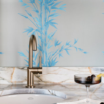
The original butler’s pantry was functional but was also starting to show its age. The new space was inspired by a wallpaper selection that our client had set aside as a possibility for a future project. It worked perfectly with our pallet and gave a fun eclectic vibe to this functional space. We eliminated some upper cabinets in favor of open shelving and painted the cabinetry in a high gloss finish, added a beautiful quartzite countertop and some statement lighting. The new room is anything but cookie cutter.
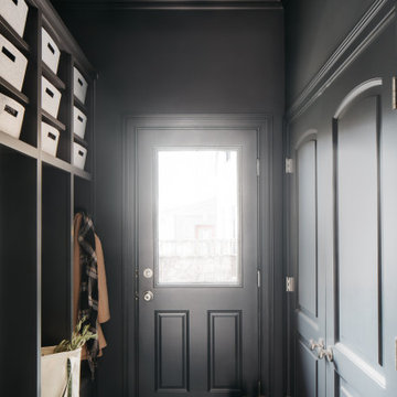
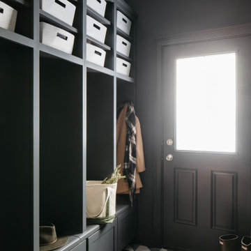
Next the mudroom. You can see a peek of the mudroom across the way from the butler’s pantry which got a facelift with new paint, tile floor, lighting and hardware. Simple updates but a dramatic change! The first floor powder room got the glam treatment with its own update of wainscoting, wallpaper, console sink, fixtures and artwork. A great little introduction to what’s to come in the rest of the home.
The whole first floor now flows together in a cohesive pallet of green and blue, reflects the homeowner’s desire for a more modern aesthetic, and feels like a thoughtful and intentional evolution. Our clients were wonderful to work with! Their style meshed perfectly with our brand aesthetic which created the opportunity for wonderful things to happen. We know they will enjoy their remodel for many years to come!
Photography by Margaret Rajic Photography
 TKS Design Group
Download our free ebook, Creating the Ideal Kitchen. DOWNLOAD NOW
The homeowners built their traditional Colonial style home 17 years’ ago. It was in great shape but needed some updating. Over the years, their taste had drifted into a more contemporary realm, and they wanted our help to bridge the gap between traditional and modern.
We decided the layout of the kitchen worked well in the space and the cabinets were in good shape, so we opted to do a refresh with the kitchen. The original kitchen had blond maple cabinets and granite countertops. This was also a great opportunity to make some updates to the functionality that they were hoping to accomplish.
After re-finishing all the first floor wood floors with a gray stain, which helped to remove some of the red tones from the red oak, we painted the cabinetry Benjamin Moore “Repose Gray” a very soft light gray. The new countertops are hardworking quartz, and the waterfall countertop to the left of the sink gives a bit of the contemporary flavor.
We reworked the refrigerator wall to create more pantry storage and eliminated the double oven in favor of a single oven and a steam oven. The existing cooktop was replaced with a new range paired with a Venetian plaster hood above. The glossy finish from the hood is echoed in the pendant lights. A touch of gold in the lighting and hardware adds some contrast to the gray and white. A theme we repeated down to the smallest detail illustrated by the Jason Wu faucet by Brizo with its similar touches of white and gold (the arrival of which we eagerly awaited for months due to ripples in the supply chain – but worth it!).
The original breakfast room was pleasant enough with its windows looking into the backyard. Now with its colorful window treatments, new blue chairs and sculptural light fixture, this space flows seamlessly into the kitchen and gives more of a punch to the space.
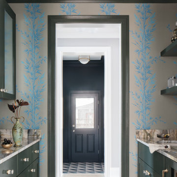
The original butler’s pantry was functional but was also starting to show its age. The new space was inspired by a wallpaper selection that our client had set aside as a possibility for a future project. It worked perfectly with our pallet and gave a fun eclectic vibe to this functional space. We eliminated some upper cabinets in favor of open shelving and painted the cabinetry in a high gloss finish, added a beautiful quartzite countertop and some statement lighting. The new room is anything but cookie cutter.
Next the mudroom. You can see a peek of the mudroom across the way from the butler’s pantry which got a facelift with new paint, tile floor, lighting and hardware. Simple updates but a dramatic change! The first floor powder room got the glam treatment with its own update of wainscoting, wallpaper, console sink, fixtures and artwork. A great little introduction to what’s to come in the rest of the home.
The whole first floor now flows together in a cohesive pallet of green and blue, reflects the homeowner’s desire for a more modern aesthetic, and feels like a thoughtful and intentional evolution. Our clients were wonderful to work with! Their style meshed perfectly with our brand aesthetic which created the opportunity for wonderful things to happen. We know they will enjoy their remodel for many years to come!
Photography by Margaret Rajic Photography
 TKS Design Group
Download our free ebook, Creating the Ideal Kitchen. DOWNLOAD NOW
The homeowners built their traditional Colonial style home 17 years’ ago. It was in great shape but needed some updating. Over the years, their taste had drifted into a more contemporary realm, and they wanted our help to bridge the gap between traditional and modern.
We decided the layout of the kitchen worked well in the space and the cabinets were in good shape, so we opted to do a refresh with the kitchen. The original kitchen had blond maple cabinets and granite countertops. This was also a great opportunity to make some updates to the functionality that they were hoping to accomplish.
After re-finishing all the first floor wood floors with a gray stain, which helped to remove some of the red tones from the red oak, we painted the cabinetry Benjamin Moore “Repose Gray” a very soft light gray. The new countertops are hardworking quartz, and the waterfall countertop to the left of the sink gives a bit of the contemporary flavor.
We reworked the refrigerator wall to create more pantry storage and eliminated the double oven in favor of a single oven and a steam oven. The existing cooktop was replaced with a new range paired with a Venetian plaster hood above. The glossy finish from the hood is echoed in the pendant lights. A touch of gold in the lighting and hardware adds some contrast to the gray and white. A theme we repeated down to the smallest detail illustrated by the Jason Wu faucet by Brizo with its similar touches of white and gold (the arrival of which we eagerly awaited for months due to ripples in the supply chain – but worth it!).
The original breakfast room was pleasant enough with its windows looking into the backyard. Now with its colorful window treatments, new blue chairs and sculptural light fixture, this space flows seamlessly into the kitchen and gives more of a punch to the space.
The original butler’s pantry was functional but was also starting to show its age. The new space was inspired by a wallpaper selection that our client had set aside as a possibility for a future project. It worked perfectly with our pallet and gave a fun eclectic vibe to this functional space. We eliminated some upper cabinets in favor of open shelving and painted the cabinetry in a high gloss finish, added a beautiful quartzite countertop and some statement lighting. The new room is anything but cookie cutter.
Next the mudroom. You can see a peek of the mudroom across the way from the butler’s pantry which got a facelift with new paint, tile floor, lighting and hardware. Simple updates but a dramatic change! The first floor powder room got the glam treatment with its own update of wainscoting, wallpaper, console sink, fixtures and artwork. A great little introduction to what’s to come in the rest of the home.
The whole first floor now flows together in a cohesive pallet of green and blue, reflects the homeowner’s desire for a more modern aesthetic, and feels like a thoughtful and intentional evolution. Our clients were wonderful to work with! Their style meshed perfectly with our brand aesthetic which created the opportunity for wonderful things to happen. We know they will enjoy their remodel for many years to come!
Photography by Margaret Rajic Photography


 Cuisines Turini
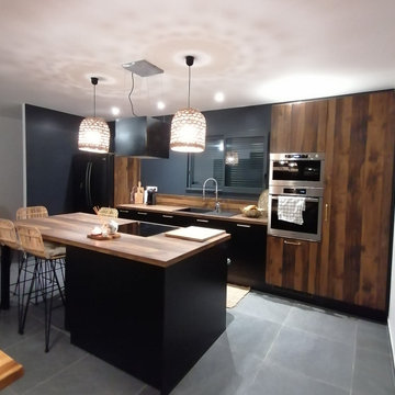
Projet de cuisine design noire et bois ouverte sur le séjour, et aménagée avec un îlot central, à Villemur-sur-Tarn.
De la cuisine traditionnelle, design, contemporaine aménagée en linéaire, en U, en parallèle, Cuisines Turini imagine avec vous depuis 1993 la cuisine qui vous ressemble.
Cuisines Turini s'adapte à vos envies, à l'espace dont vous disposez et à votre budget.
Voici une des dernières réalisations, un espace cuisine design noir et bois ouvert sur le séjour aménagé en parallèle avec un îlot central à Villemur-sur-Tarn.
Les façades sont noires onyx mats, les poignées étrier coloris laiton et le plan de travail en imitation bois chêne de chalet.
Le noir se marie très bien avec le bois, qui apporte une touche chaleureuse et naturelle dans cette réalisation à Villemur-sur-Tarn.
Ce mélange est indémodable et idéal pour aménager en parallèle une cuisine spacieuse et ouverte sur le séjour avec un îlot central.
Ces clients à Villemur-sur-Tarn ont misé sur l'aménagement d'une cuisine ouverte sur le séjour positionnée en parallèle avec un îlot central.
Deux linéaires de meubles qui épousent naturellement la pièce se font face et permettent comme ici dans cette cuisine design à Villemur-sur-Tarn de quasiment doubler la surface de travail mais aussi de rangement tout en respectant le triangle d'activité.
Lorsqu'une cuisine aménagée en parallèle est ouverte sur le séjour, il est indispensable qu'elle s'adapte au reste de la décoration.
Quant à l'îlot central en plus des rangements et de la surface de travail, il permet de se réunir pour manger.
Des luminaires ajourés au-dessus donnent un côté chaleureux et la hotte décorative noire en plus de sa fonctionnalité un côté design.
Zen et épurée, cette cuisine noire et bois ouverte sur le séjour s'impose comme un espace reposant.
Une cuisine design où il fait bon vivre tout en étant très fonctionnelle avec ses nombreux rangements et placards invisibles.
Polyvalente, la cuisine noire et bois s'adapte très bien aux petits comme aux grands espaces et se décline en de nombreux styles.
Vous êtes plutôt cuisine fermée ou ouverte avec ou sans îlot central.
Vous recherchez un professionnel de l'aménagement de cuisine, de salle de bains, de rangement sur Toulouse et son agglomération.
Contactez-nous aux 05-62-18-82-62 ou via le formulaire de contact.
Nos conseillers décorateurs réaliseront la cuisine de vos rêves...
 Cuisines Turini
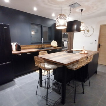
Projet de cuisine design noire et bois ouverte sur le séjour, et aménagée avec un îlot central, à Villemur-sur-Tarn.
De la cuisine traditionnelle, design, contemporaine aménagée en linéaire, en U, en parallèle, Cuisines Turini imagine avec vous depuis 1993 la cuisine qui vous ressemble.
Cuisines Turini s'adapte à vos envies, à l'espace dont vous disposez et à votre budget.
Voici une des dernières réalisations, un espace cuisine design noir et bois ouvert sur le séjour aménagé en parallèle avec un îlot central à Villemur-sur-Tarn.
Les façades sont noires onyx mats, les poignées étrier coloris laiton et le plan de travail en imitation bois chêne de chalet.
Le noir se marie très bien avec le bois, qui apporte une touche chaleureuse et naturelle dans cette réalisation à Villemur-sur-Tarn.
Ce mélange est indémodable et idéal pour aménager en parallèle une cuisine spacieuse et ouverte sur le séjour avec un îlot central.
Ces clients à Villemur-sur-Tarn ont misé sur l'aménagement d'une cuisine ouverte sur le séjour positionnée en parallèle avec un îlot central.
Deux linéaires de meubles qui épousent naturellement la pièce se font face et permettent comme ici dans cette cuisine design à Villemur-sur-Tarn de quasiment doubler la surface de travail mais aussi de rangement tout en respectant le triangle d'activité.
Lorsqu'une cuisine aménagée en parallèle est ouverte sur le séjour, il est indispensable qu'elle s'adapte au reste de la décoration.
Quant à l'îlot central en plus des rangements et de la surface de travail, il permet de se réunir pour manger.
Des luminaires ajourés au-dessus donnent un côté chaleureux et la hotte décorative noire en plus de sa fonctionnalité un côté design.
Zen et épurée, cette cuisine noire et bois ouverte sur le séjour s'impose comme un espace reposant.
Une cuisine design où il fait bon vivre tout en étant très fonctionnelle avec ses nombreux rangements et placards invisibles.
Polyvalente, la cuisine noire et bois s'adapte très bien aux petits comme aux grands espaces et se décline en de nombreux styles.
Vous êtes plutôt cuisine fermée ou ouverte avec ou sans îlot central.
Vous recherchez un professionnel de l'aménagement de cuisine, de salle de bains, de rangement sur Toulouse et son agglomération.
Contactez-nous aux 05-62-18-82-62 ou via le formulaire de contact.
Nos conseillers décorateurs réaliseront la cuisine de vos rêves...

 Anthony West
First thing first, we needed to recesses the living area as much as possible without it feeling overwhelming. Natural light from the windows was great, but LED's can make all the difference! We also went with our favorite "Grey" Passive by Sherwin Williams. It's very soft yet modern/transitional. And finally the fireplace; we were initially going to "white wash" the brick, but after priming it (by accident) we decided to go full white with black accents. *The mantle by the way, was $70 at an antique store. We found it in it's raw wood tone and painted it black. See the full renovation here on youtube: https://youtu.be/H84mYnVl_IA
 TKS Design Group
Download our free ebook, Creating the Ideal Kitchen. DOWNLOAD NOW
The homeowners built their traditional Colonial style home 17 years’ ago. It was in great shape but needed some updating. Over the years, their taste had drifted into a more contemporary realm, and they wanted our help to bridge the gap between traditional and modern.
We decided the layout of the kitchen worked well in the space and the cabinets were in good shape, so we opted to do a refresh with the kitchen. The original kitchen had blond maple cabinets and granite countertops. This was also a great opportunity to make some updates to the functionality that they were hoping to accomplish.
After re-finishing all the first floor wood floors with a gray stain, which helped to remove some of the red tones from the red oak, we painted the cabinetry Benjamin Moore “Repose Gray” a very soft light gray. The new countertops are hardworking quartz, and the waterfall countertop to the left of the sink gives a bit of the contemporary flavor.
We reworked the refrigerator wall to create more pantry storage and eliminated the double oven in favor of a single oven and a steam oven. The existing cooktop was replaced with a new range paired with a Venetian plaster hood above. The glossy finish from the hood is echoed in the pendant lights. A touch of gold in the lighting and hardware adds some contrast to the gray and white. A theme we repeated down to the smallest detail illustrated by the Jason Wu faucet by Brizo with its similar touches of white and gold (the arrival of which we eagerly awaited for months due to ripples in the supply chain – but worth it!).
The original breakfast room was pleasant enough with its windows looking into the backyard. Now with its colorful window treatments, new blue chairs and sculptural light fixture, this space flows seamlessly into the kitchen and gives more of a punch to the space.
The original butler’s pantry was functional but was also starting to show its age. The new space was inspired by a wallpaper selection that our client had set aside as a possibility for a future project. It worked perfectly with our pallet and gave a fun eclectic vibe to this functional space. We eliminated some upper cabinets in favor of open shelving and painted the cabinetry in a high gloss finish, added a beautiful quartzite countertop and some statement lighting. The new room is anything but cookie cutter.
Next the mudroom. You can see a peek of the mudroom across the way from the butler’s pantry which got a facelift with new paint, tile floor, lighting and hardware. Simple updates but a dramatic change! The first floor powder room got the glam treatment with its own update of wainscoting, wallpaper, console sink, fixtures and artwork. A great little introduction to what’s to come in the rest of the home.
The whole first floor now flows together in a cohesive pallet of green and blue, reflects the homeowner’s desire for a more modern aesthetic, and feels like a thoughtful and intentional evolution. Our clients were wonderful to work with! Their style meshed perfectly with our brand aesthetic which created the opportunity for wonderful things to happen. We know they will enjoy their remodel for many years to come!
Photography by Margaret Rajic Photography


 Valerie J Johnson Custom Tailored Home Furnishings
All of the drapery panels throughout the main level of the house were hand embroidered down the leading of edge of the ivory linen face panels with this moorish inspired pattern. A natural, open weave, sheer fabric is attached to the backs of the panels, exposed at the leading edges. This application adds lovely texture from the outside of the home, softening the ivory and blending with the stone and stucco exterior.



 Mayita Dinos Garden Design
mayitadinosphotography.com
Design ideas for a tropical landscaping in Los Angeles.
Design ideas for a tropical landscaping in Los Angeles.
 Neumann & Rudy Architecture
**Paragraph 1: Spatial Composition & Architectural Volume**
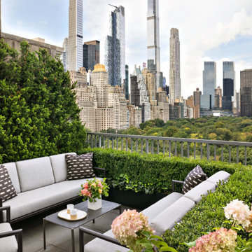
This terrace operates as an outdoor room in the fullest architectural sense — a compressed foreground plane opening onto one of the most consequential borrowed landscapes in the world. The composition is organized along a strong diagonal: an L-shaped seating arrangement anchors the lower left and right quadrants, its low-slung horizontality deliberately calibrated to sit beneath the sightline of the parapet rail so that the vista remains uninterrupted from a seated position. The spatial logic is one of layered thresholds. First, the intimate zone of the furniture group; second, the clipped boxwood hedge set within a matte-dark planter, functioning as a green datum line and soft balustrade; third, the slender vertical picket railing, whose rhythmic cadence reads as a fine-grained screen rather than a barrier; and finally the middle-ground canopy of Central Park and the distant supergraphic of the Billionaires' Row skyline. To the left, a mature juniper mass performs as a living pilaster, terminating the composition and screening the adjacent stone masonry wall — a rough-hewn ashlar remnant of the prewar building envelope that grounds the scheme in its architectural provenance. The stepped stone paving and the raked geometry of the railing as it descends to the right introduce a subtle asymmetry, preventing the picturesque from becoming static.
**Paragraph 2: Materiality, Color & Texture**
The material palette is disciplined to the point of austerity, precisely so the horticulture and the skyline may carry the chromatic load. Powder-coated aluminum in a deep graphite-bronze forms the furniture armature — slender, squared-section framing with an almost Miesian restraint — paired with performance-grade upholstery in a warm dove grey whose greige undertone reads neither cold nor sallow against the surrounding foliage. The single decorative gesture, ikat-patterned scatter cushions in charcoal and ecru, introduces a hand-loomed irregularity that humanizes the machined frames. Underfoot, large-format bluestone or cast-stone pavers in a cool grey provide a matte, granular ground plane, echoed in the honed surface of the low cocktail table. Against this monochrome scaffolding, the botanical register supplies saturation: the dense, glossy, small-leaf texture of the boxwood; the feathery, blue-green needling of the juniper; trailing ivy softening the planter edge; and, in the near foreground, the blowsy, dessicating panicles of hydrangea in blush, sage and antique rose. A ceramic vessel of coral-and-butter garden roses and a pair of banded stoneware cups on a rimmed tray introduce warm terracotta accents — small, deliberate points of chromatic heat within an otherwise tonal field.
**Paragraph 3: Lighting, Atmosphere & Style Profile**
The scheme is lit almost entirely by ambient, high-latitude daylight, diffused through a stratus-laced sky that acts as an enormous softbox. The result is shadowless modeling: the upholstery reads as luminous rather than glaring, the foliage retains full chromatic depth without specular hotspots, and the pale limestone and glass towers beyond are rendered in atmospheric perspective, receding into a silvered haze. No artificial fixtures assert themselves in the frame — a confident editorial choice that keeps the scheme legible as a daytime sanctuary and defers entirely to the natural theatre of the site. The prevailing mood is one of cultivated repose: urbane but unhurried, private without being hermetic. Stylistically, the project synthesizes into what might be termed **Refined Metropolitan Naturalism** — a hybrid of Soft Minimalism's tonal restraint and reductive geometry with the structured horticultural formality of a classical English terrace garden. The vocabulary is contemporary and materially honest, yet it observes the compositional manners of the prewar building it inhabits, treating the skyline not as backdrop but as the primary work of art around which the entire interior architecture of the terrace has been quietly framed.

 Charles R Schwartzapfel RA PC
Design ideas for a huge contemporary partial sun front yard gravel driveway in New York.
 Neumann & Rudy Architecture
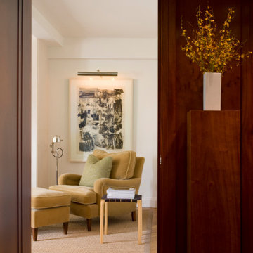
The photograph is constructed as a deliberate act of framing — an enfilade view captured through a threshold, in which the aperture of a doorway becomes both proscenium and compositional device. The image is organized around a strong vertical tripartite division: a dark stile of paneled millwork at the left edge, the luminous rectangle of the adjacent sitting room at center, and a substantial pier of figured hardwood joinery at right, terminating in a plinth-like pedestal. This asymmetrical clamping of the bright volume between two dark masses produces a pronounced sense of compression and release, a Wrightian sequencing in which the constricted, wood-lined passage funnels the eye toward the softer, higher-key room beyond. The architectural vocabulary within that inner volume is restrained and orthogonal: crisp painted plaster planes, a shallow soffit or dropped beam crossing the ceiling to modulate the overhead datum, and a simple flat-stock baseboard that reads as a quiet ground line rather than an ornamental flourish. The sightline is layered and telescopic — foreground jamb, mid-ground seating group, background artwork on the far wall — establishing depth through overlapping planes rather than perspectival theatrics. Underfoot, a herringbone-laid oak parquet in the passage gives way to a large-format sisal rug bound in linen tape, its rectilinear geometry reinforcing the axis while softening the transition between circulation and repose.
The material argument here is one of calibrated opposition: dense, saturated hardwood against pale, absorptive plaster and textile. The framing joinery — most plausibly a rich mahogany or stained cherry, its cathedral grain and ribbon figure fully legible under raking light — carries a deep oxblood-to-umber tonality and a satin, hand-rubbed sheen that lends the passage a library-like gravity. Against this, the interior room is rendered in a warm off-white with distinctly yellow-ochre undertones, avoiding the clinical chill of a true cool white and instead reading as parchment or unbleached linen. The upholstery — a rolled-arm wing chair and matching ottoman in a camel or buff-toned cotton velvet — supplies the tactile fulcrum of the composition: a napped, light-absorbing pile that contrasts against the coarse, tightly woven boucle of the sisal below and the smooth lacquer of the vertical joinery. Accent notes are sparing and precise: a pale celadon embroidered cushion introduces the only cool chromatic interruption; a rectilinear bench in blond ash with a woven black leather strap deck delivers a graphic, near-Nordic counterpoint; and a monolithic white ceramic vessel atop the pedestal provides a hard, matte punctuation. The abstract work on paper — a gestural monochrome in charcoal, ink and Payne's grey, generously matted behind glass — functions as the room's tonal anchor, its cool achromatics preventing the warm palette from tipping into sentimentality. Sprays of yellow oncidium orchid supply the single high-chroma gesture, echoing the ochre undertone of the walls.
The lighting strategy is layered, low-lumen and unapologetically warm, eschewing ambient wash in favor of discrete pools of illumination. A slim linear picture light, bronze-finished and cantilevered from the wall, grazes the artwork with a scalloped throw that reveals the tooth of the paper and establishes the far wall as the room's luminous terminus. A chrome-shaded articulating floor lamp — a modernist task fixture with a distinctly mid-century pedigree — provides a secondary, reflective glint and introduces the only cool metallic in the palette. Daylight enters obliquely and unseen from the left, softly modeling the plaster and the velvet nap without ever flattening the composition; the foreground joinery, meanwhile, sits in deep shadow, its grain caught only in a slow, specular gradient. The cumulative atmosphere is one of hushed, crepuscular intimacy — a room calibrated for reading and retreat rather than reception. Stylistically, the project resolves into a form of Transitional Warm Modernism: the classical proportioning, paneled millwork and rolled-arm seating are drawn from a traditional American vocabulary, yet they are stripped of applied ornament, edited to essentials, and disciplined by the graphic austerity of the abstract art and the blond-and-black bench. It is a sensibility best characterized as quiet luxury — tonal, textural, and materially honest, deriving its authority from the resonance of grain, nap and light rather than from any declarative gesture.

 Ehrlich Yanai Rhee Chaney Architects
The ground floor volumes wrapped in an elongated hand-fired brick, emphasizing the horizontality of the architecture that lays solidly on the land.
(Photography by: Matthew Millman)
169