
Search results for "Research driven institution" in Home Design Ideas
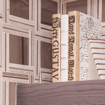
 Tanya Rynicke Interiors, LLC
Max Wedge Photography
Example of a large transitional home design design in Detroit with an undermount sink, distressed cabinets and beige walls
Example of a large transitional home design design in Detroit with an undermount sink, distressed cabinets and beige walls
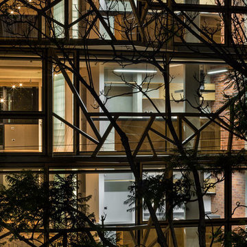


 Summers Design Group
Leon Summers, Galina Novick
Inspiration for a transitional deck remodel in San Francisco
Inspiration for a transitional deck remodel in San Francisco
Find the right local pro for your project
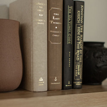

 Claude Clemaron Luxury Bespoke Furniture
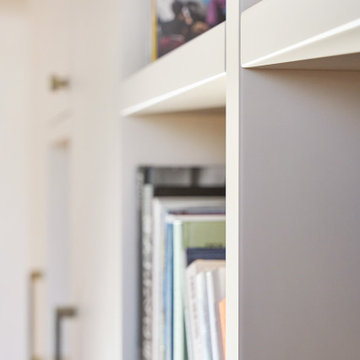
This bespoke, modern floor to ceiling media entertainment unit features made to
measure cupboards, drawers, TV cavity and open shelving. The fully fitted, custom-
built cabinets and shelving unit maximise and streamline the space and act as a focal
point in the room. The design has been tailored to accommodate all the household’s
entertainment needs with a mix of display niches and closed storage to keep clutter
and cables out of sight. The result is a seamless, integrated media unit that makes
our client’s living room highly functional and attractive.
Contemporary style, traditional construction
The handcrafted cabinetry features flat-faced streamline doors and drawer fronts.
Flat-faced cupboard doors, often called slab doors or flat panel doors, are single-
surface doors with no frames, bevels, or detailing for a clean, minimalist look. The
doors are fitted with concealed soft closing hinges and drawers are mounted on fully
extending concealed soft closing drawer slides.
The solidly fixed, square-edged, thick engineered shelves and uprights with a 42mm
visual front edge have exceptional strength, stability and a bold, chunky, consistent
aesthetic.
Beautifully finished for a high-end look
The cabinets feature knurled pull handles and knobs with a dark brushed brass
finish. The textured pattern of knurled hardware has a tactile feel and provides a
superior grip while hiding fingerprints. Knurled knobs and handles like these here
work well with modern cabinets, flat-panel doors and slab drawers and create a
high-end, detailed appearance.
The entire media unit has been flawlessly finished in an eco-friendly, water-based,
handcrafted paint from Farrow & Ball in Dimity No. 2008, a very pale taupe that is a
sophisticated, warm neutral. The surface has a beautiful, wipeable matt finish that is
exceptionally durable. This pale taupe colour creates a ‘quiet luxury’ look without the
harshness of pure white. While stark white can often feel cold or clinical, this very
light taupe is inherently warmer and more comforting, making the living room feel
instantly settled and inviting.

 User
Designed for the Royal Melbourne Hospital Home Lottery program, we incorporated a sunken courtyard at the rear of the property to sneak a borrowed vista of the beautiful street tree canopies. Hill’s fig and verdant green foliage soften the simplicity of the design to conjure a tapestry of tones and textures.
The swimming pool is designed to maximise views of the water from inside the house. Vivid mosaic tiles are a magnetising element, an exquisite contrast to the surrounding Australian bluestone paving.

 The Blind Guy of Kalispell
Inspiration for a mid-sized open concept medium tone wood floor living room remodel with white walls and no fireplace

 Century Stair Company
One of our commercial designs was selected for this beautiful clubhouse and fitness center. The design features square wooden newels and wooden stringers finished with grey semi-gloss paint to match the vertical metal rods and handrail. This particular staircase was designed for a complete metal balustrade system and carpeted treads, so that the stairs could meet code requirements for a commercial setting.
1976-2026 © Century Stair Company
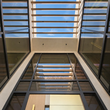
 Impact Precious Wood
double-height glass entry, custom pivot door, open beam pergola, black framed glazing, White Oak entry door, champagne metal finish, architectural entrance, modern glass facade, contemporary exterior, luxury residence, Surfside Florida


 User
This modern home is located in Northern Michigan close to the coast. It is a vertical design with three living levels, maximizing a small footprint.
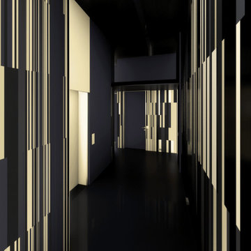
 KURV Architecture DPC (Alex Hughes Architects)
Located in the heart of Manhattan’s Lower East Side, the building was erected on a shallow commercial lot between two 120 year old masonry buildings and a new residential rental building. 330 Grand Street is a mix of 725 SF 1BRs and 1050 SF 2BR apartments. It also contains a 1100 SF two story duplex as well as private and public rooftop space, large private balconies for most units and two large private terraces for the ground floor units.
330 Grand Street was originally designed and approved at the NYC DOB as a prefabricated modular building. During the pandemic, as shipping costs skyrocketed putting the project at risk, we suggested redesigning the building as a reinforced cast-in-place concrete structure. Concrete was readily available and prices had not been affected by the demand increase that many other materials suffered in the pandemic. We took this opportunity to raise floor to ceiling heights, enlarge high performance windows and redistribute the buildings MEPFS and Structural Systems to create very open floor plans.
The challenge was to create a luxurious sensorial living experience with very limited means. In a city with very high construction costs, low cost residential buildings in the area are usually devoid of good quality, design and character. Our approach was to aim high for the end user, prioritizing natural light, open space with long visual perspectives, high ceilings and as always, rejecting the use of predefined building templates.
Our biggest challenge was to ensure that the small spaces feel as clean cut, large and bright as possible. Several unique design decisions were made to ensure low cost and high quality;
Floor plans were laid out so that spaces were wide open and free of clutter from mechanical or structural interruptions. Therefore all infrastructure was placed in lateral demising walls, which in turn act as the unit’s storage and kitchen. The apartments feel wide open, are super quiet and have more storage space than any other comparable apartment in the city.
To solve the problem of the site’s shallow commercial lot which is typically prone to dark interior spaces we focused our attention on the building’s envelope. Instead of the usual small punched window openings, oversized high performance windows were designed to ensure that light penetrated as far as possible into the units. In the smaller 1BR units, the full 50’ depth of the lot is perceived by partitioning spaces with sliding pocket doors that can be retracted to allow deep visual perspectives, making the sight lines in the space feel longer, larger, more ample than normal. In addition to the full height glazing, each unit above the 2nd floor receives a 7 foot covered balcony, adding 120 to 240 sf to each apartment, something unusual in New York City buildings. The space is large enough for a full size dining table, when the weather permits being outside.
We also worked hard to ensure modularity. For example, all kitchen units are all identical throughout the building. The idea of modularity and the economy of the repetitive unit is exercised to the maximum through the building.
Hardware, appliances, flooring, wall coverings and material finishes are all carefully selected to feel bespoke, high quality and unique.
It was important to KURV that the result of this work manifest into something that would deeply connect with the end user and sustain relationships with the consumers of this space.
All images by KURV Architecture ©
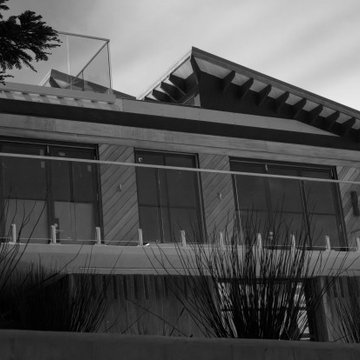
 Studio300A Architecture
Example of a tiny house design in San Francisco with a shed roof, a metal roof and a gray roof


 Artisan Custom Homes
Monica Galloway
Example of a large classic enclosed carpeted home design design in Charlotte with beige walls and a projector screen
Example of a large classic enclosed carpeted home design design in Charlotte with beige walls and a projector screen




![[IN]SIDE]OUT[ Design Studio](https://st.hzcdn.com/fimgs/39737907045d57f0_1156-w32-h32-b0-p0--.jpg)
77