
Search results for "Resolve" in Home Design Ideas
 Fiorito Interior Design
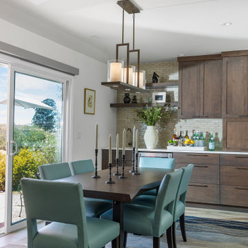
This gorgeous, nature-inspired Great Room—comprised of the kitchen, dining area, and sitting room—was reimagined for some wonderful repeat clients, beginning with a small, treasured piece of art.
Their large 1950s ranch house nestled into a gentle hill surrounded by orchards of fragrant orange, lemon, and cherry trees initially featured a too-small kitchen adjacent to a warren of small spaces with low ceilings serving as a dining and sitting area. They dreamed of a more spacious, light-filled layout.
A complete redesign of the home not only resolved spatial constraints but also embraced the beauty of the home’s natural surroundings. By removing walls and creating an open-plan layout, we enhanced the flow and connectivity between the kitchen, dining, and sitting areas, seamlessly integrating the outdoors with the indoors.
The relocated kitchen now faces the backyard, to facilitate outdoor entertaining and features a large island, serving as a welcoming focal point for both cooking and socializing. I designed a distinctive ceiling feature above the island, crafted from planks of the adjacent vaulted ceiling, mirroring the shape of the island below. This feature adds architectural interest and visually connects the flat kitchen plane with the vaulted plank ceiling of the sitting area, creating a harmonious sense of continuity and warmth.
A beautiful, prized painting of a bird on a branch created the direction for the color and texture palette. An intriguing yellow-green-tan background in the art guided my choices for the backsplash tile (an iridescent version mimics light glinting on water) and countertops. The kitchen's soothing color palette features various shades of natural green, while the dining area introduces feather-blue tones through chair upholstery and rug. Just steps away, the inviting sitting area features a rebuilt fireplace clad in cut, polished Haisa marble tiles in a vertical pattern. The soft, generous seating creates a comfortable spot for movie nights or cozying up by the fire on a cold winter evening. The elegant, simple silhouettes of the furniture enhance the serene and calming atmosphere of the space.
After photos: Bernardo Grijalva and Fiorito Interior Design
Cabinetry: custom by Schmitz Woodwork
Countertops: Primordia and Calcatta Maximus by Caesarstone
Backsplash: Elements in Miami Sand Pearl by Lunada Bay
Island pendants: Simple Sanders by Shades of Light
Stools: Essex by Lazar in Brisa fabric by Ultrafabrics
Dining table: Emerson Wave by Saloom
Dining chairs: Essex by Lazar
Dining lighting: Triad chandelier by Kichler
Dining rug: Soho Smoke by Jaunty Inc.
Sitting area sofa and ottoman: Corvo by Lazar
Sitting area swivel chair: Noah by Lazar
Sitting area rug: Soho Stone by Jaunty Inc.
Motorized shades: Hunter Douglas
Entry console: Reed by Uttermost
Entry light: Re by Visual Comfort
Fireplace: Haisa cut and polished marble by Icontile
Wall paint: Mascarpone by Benjamin Moore
 RWH Architect PLLC
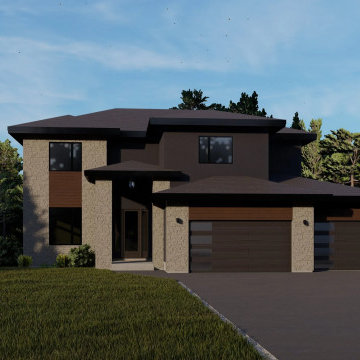
The Whistle Hill Lot 9 Residence is a defining example of RWH Architect’s vision for a new architectural era in Southern New Hampshire. With its bold geometry, refined material palette, and thoughtfully layered rooflines, this home embodies contemporary living while setting a fresh design standard for the region.
From the moment you approach the residence, the interplay of stone accents, vertical elements, and expansive windows establishes a striking yet inviting presence. Inside, a two-story entryway welcomes guests with light and volume, introducing an interior designed for both comfort and sophistication. The open-concept first floor seamlessly integrates the kitchen, great room, and dining/breakfast area, all flowing naturally toward a covered patio that extends the living space outdoors. A walk-in pantry, a private den, and a mudroom with built-in bench and hooks—conveniently located off the two-car attached garage, one bay featuring an oversized door—enhance the home’s functional rhythm. An expansive basement provides room for future recreation or storage, ensuring the home continues to evolve with the family who lives in it.
The second floor hosts four well-proportioned bedrooms, including a master suite designed as a private retreat. The suite features a generous walk-in closet and a luxurious soaking tub, paired with thoughtfully arranged natural light to create a sense of calm and rejuvenation. Two full bathrooms and one half bathroom support the needs of modern family living while maintaining architectural cohesion throughout the home.
Designing this residence presented several challenges that ultimately pushed the architectural expression forward. One key challenge was blending multiple rooflines into a unified modern aesthetic without losing the clarity of the home’s form. RWH resolved this by composing a series of carefully layered planes, each one calibrated to complement the others, resulting in a dynamic yet harmonious silhouette. Another challenge involved balancing the mix of exterior materials—such as stone, horizontal siding, and broad window openings—while maintaining a sense of order and visual stability. This was achieved by aligning materials with structural elements and strengthening vertical features, creating rhythm and cohesion across the façade. A further challenge was delivering an open, light-filled interior despite the structural demands of a two-story entry and several cantilevered forms. RWH overcame this through advanced framing techniques and discreet structural steel placement, allowing for expansive glazing and generous interior spans while preserving the home’s clean, uncluttered aesthetic.
The Whistle Hill Lot 9 Residence stands as a testament to forward-thinking residential design and the evolution of architectural expectations in the area. Through innovative solutions, intentional detailing, and a commitment to elevating everyday living, RWH Architect has created a home that not only meets the needs of modern families but also sets a new benchmark for contemporary architecture in the region.
 Fiorito Interior Design
This gorgeous, nature-inspired Great Room—comprised of the kitchen, dining area, and sitting room—was reimagined for some wonderful repeat clients, beginning with a small, treasured piece of art.
Their large 1950s ranch house nestled into a gentle hill surrounded by orchards of fragrant orange, lemon, and cherry trees initially featured a too-small kitchen adjacent to a warren of small spaces with low ceilings serving as a dining and sitting area. They dreamed of a more spacious, light-filled layout.
A complete redesign of the home not only resolved spatial constraints but also embraced the beauty of the home’s natural surroundings. By removing walls and creating an open-plan layout, we enhanced the flow and connectivity between the kitchen, dining, and sitting areas, seamlessly integrating the outdoors with the indoors.
The relocated kitchen now faces the backyard, to facilitate outdoor entertaining and features a large island, serving as a welcoming focal point for both cooking and socializing. I designed a distinctive ceiling feature above the island, crafted from planks of the adjacent vaulted ceiling, mirroring the shape of the island below. This feature adds architectural interest and visually connects the flat kitchen plane with the vaulted plank ceiling of the sitting area, creating a harmonious sense of continuity and warmth.
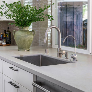
A beautiful, prized painting of a bird on a branch created the direction for the color and texture palette. An intriguing yellow-green-tan background in the art guided my choices for the backsplash tile (an iridescent version mimics light glinting on water) and countertops. The kitchen's soothing color palette features various shades of natural green, while the dining area introduces feather-blue tones through chair upholstery and rug. Just steps away, the inviting sitting area features a rebuilt fireplace clad in cut, polished Haisa marble tiles in a vertical pattern. The soft, generous seating creates a comfortable spot for movie nights or cozying up by the fire on a cold winter evening. The elegant, simple silhouettes of the furniture enhance the serene and calming atmosphere of the space.
After photos: Bernardo Grijalva and Fiorito Interior Design
Cabinetry: custom by Schmitz Woodwork
Countertops: Primordia and Calcatta Maximus by Caesarstone
Backsplash: Elements in Miami Sand Pearl by Lunada Bay
Island pendants: Simple Sanders by Shades of Light
Stools: Essex by Lazar in Brisa fabric by Ultrafabrics
Dining table: Emerson Wave by Saloom
Dining chairs: Essex by Lazar
Dining lighting: Triad chandelier by Kichler
Dining rug: Soho Smoke by Jaunty Inc.
Sitting area sofa and ottoman: Corvo by Lazar
Sitting area swivel chair: Noah by Lazar
Sitting area rug: Soho Stone by Jaunty Inc.
Motorized shades: Hunter Douglas
Entry console: Reed by Uttermost
Entry light: Re by Visual Comfort
Fireplace: Haisa cut and polished marble by Icontile
Wall paint: Mascarpone by Benjamin Moore
Find the right local pro for your project
 Tile Doctor Ltd
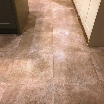
This request came from a client who lives in the Newcastle district of Jesmond who was unhappy with the appearance of their Textured Porcelain floor tiles. The problem was that the Porcelain Tiles were grouted in whilst the underfloor heating was switched on. This resulted in the grout drying out quicker than expected and the tiler struggled to get the excess grout off the tiles. To rectify the problem, the tiler tried to get the dried grout off with acid, but it didn’t work, and the floor was left looking dark and dull. Unable to rectify the problem the client was left with a disappointing pale floor and had searched around the internet for a solution.
Normally grout smears like these (aka Grout Haze) can be removed with an acidic product and Tile Doctor sell Grout Clean-up specially for this purpose. However, some grouts contain acid resistant polymers which need to broken down first. Fortunately, we have a solution for everything tile related and the system we use does not affect the main grout lines only the excess grout. I called in to do a site visit and having surveyed the problem I was confident it could resolved, I gave them a price for the work and agreed a date to return to do the job.
My first task was to spray the tiles with Tile Doctor Remove and Go, this was left to soak into the tile for around ten minutes before being scrubbed in. Remove and Go is a coatings remover that is safe to use on tile and grout; normally we use it to remove old sealers but in this case I applied it to break down the polymers. To work the product into the tile I use a buffing machine fitted with a black scrubbing pad, the mechanical advantage this gives makes the job a lot quicker. Then the slurry generated is rinsed off with water and removed with a wet vacuum. The floor was then left to dry for 30 minutes.
We were then able to remove the excess grout which was done by applying Tile Doctor Grout Clean-Up which I mentioned earlier. The process was the same, i.e. using the buffing machine and a wet vacuum to scrub the floor and extract the soil. The floor was rinsed with water to remove any trace of the products used and dried as much as possible using the wet vacuum. The underfloor heating really helped at this point to dry out the floor.
Once the floor was fully dry including the grout lines a single thin coat of Tile Doctor Colour Grow sealer was applied. The tiles were textured porcelain, so the dirt gets trapped into the textured surface if it is not sealed. We usually find one coat of Tile Doctor Colour Grow is more than enough for this, anything that hadn’t soaked in after three to five minutes was then polished off with clean dry cloths.
The client was very happy with the floor and pleased that the excess grout had been cleaned up and the floor looked as it should. Before leaving I recommended the use a pH Neutral tile cleaner for general cleaning such as Tile Doctor Neutral Tile Cleaner. There is no point sealing the tiles only to have it stripped off later with the use of a bleach based cleaner.
Raf Barrett
Tyneside Tile Doctor
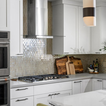 Fiorito Interior Design
This gorgeous, nature-inspired Great Room—comprised of the kitchen, dining area, and sitting room—was reimagined for some wonderful repeat clients, beginning with a small, treasured piece of art.
Their large 1950s ranch house nestled into a gentle hill surrounded by orchards of fragrant orange, lemon, and cherry trees initially featured a too-small kitchen adjacent to a warren of small spaces with low ceilings serving as a dining and sitting area. They dreamed of a more spacious, light-filled layout.
A complete redesign of the home not only resolved spatial constraints but also embraced the beauty of the home’s natural surroundings. By removing walls and creating an open-plan layout, we enhanced the flow and connectivity between the kitchen, dining, and sitting areas, seamlessly integrating the outdoors with the indoors.
The relocated kitchen now faces the backyard, to facilitate outdoor entertaining and features a large island, serving as a welcoming focal point for both cooking and socializing. I designed a distinctive ceiling feature above the island, crafted from planks of the adjacent vaulted ceiling, mirroring the shape of the island below. This feature adds architectural interest and visually connects the flat kitchen plane with the vaulted plank ceiling of the sitting area, creating a harmonious sense of continuity and warmth.
A beautiful, prized painting of a bird on a branch created the direction for the color and texture palette. An intriguing yellow-green-tan background in the art guided my choices for the backsplash tile (an iridescent version mimics light glinting on water) and countertops. The kitchen's soothing color palette features various shades of natural green, while the dining area introduces feather-blue tones through chair upholstery and rug. Just steps away, the inviting sitting area features a rebuilt fireplace clad in cut, polished Haisa marble tiles in a vertical pattern. The soft, generous seating creates a comfortable spot for movie nights or cozying up by the fire on a cold winter evening. The elegant, simple silhouettes of the furniture enhance the serene and calming atmosphere of the space.
After photos: Bernardo Grijalva and Fiorito Interior Design
Cabinetry: custom by Schmitz Woodwork
Countertops: Primordia and Calcatta Maximus by Caesarstone
Backsplash: Elements in Miami Sand Pearl by Lunada Bay
Island pendants: Simple Sanders by Shades of Light
Stools: Essex by Lazar in Brisa fabric by Ultrafabrics
Dining table: Emerson Wave by Saloom
Dining chairs: Essex by Lazar
Dining lighting: Triad chandelier by Kichler
Dining rug: Soho Smoke by Jaunty Inc.
Sitting area sofa and ottoman: Corvo by Lazar
Sitting area swivel chair: Noah by Lazar
Sitting area rug: Soho Stone by Jaunty Inc.
Motorized shades: Hunter Douglas
Entry console: Reed by Uttermost
Entry light: Re by Visual Comfort
Fireplace: Haisa cut and polished marble by Icontile
Wall paint: Mascarpone by Benjamin Moore
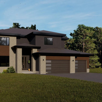 RWH Architect PLLC
The Whistle Hill Lot 9 Residence is a defining example of RWH Architect’s vision for a new architectural era in Southern New Hampshire. With its bold geometry, refined material palette, and thoughtfully layered rooflines, this home embodies contemporary living while setting a fresh design standard for the region.
From the moment you approach the residence, the interplay of stone accents, vertical elements, and expansive windows establishes a striking yet inviting presence. Inside, a two-story entryway welcomes guests with light and volume, introducing an interior designed for both comfort and sophistication. The open-concept first floor seamlessly integrates the kitchen, great room, and dining/breakfast area, all flowing naturally toward a covered patio that extends the living space outdoors. A walk-in pantry, a private den, and a mudroom with built-in bench and hooks—conveniently located off the two-car attached garage, one bay featuring an oversized door—enhance the home’s functional rhythm. An expansive basement provides room for future recreation or storage, ensuring the home continues to evolve with the family who lives in it.
The second floor hosts four well-proportioned bedrooms, including a master suite designed as a private retreat. The suite features a generous walk-in closet and a luxurious soaking tub, paired with thoughtfully arranged natural light to create a sense of calm and rejuvenation. Two full bathrooms and one half bathroom support the needs of modern family living while maintaining architectural cohesion throughout the home.
Designing this residence presented several challenges that ultimately pushed the architectural expression forward. One key challenge was blending multiple rooflines into a unified modern aesthetic without losing the clarity of the home’s form. RWH resolved this by composing a series of carefully layered planes, each one calibrated to complement the others, resulting in a dynamic yet harmonious silhouette. Another challenge involved balancing the mix of exterior materials—such as stone, horizontal siding, and broad window openings—while maintaining a sense of order and visual stability. This was achieved by aligning materials with structural elements and strengthening vertical features, creating rhythm and cohesion across the façade. A further challenge was delivering an open, light-filled interior despite the structural demands of a two-story entry and several cantilevered forms. RWH overcame this through advanced framing techniques and discreet structural steel placement, allowing for expansive glazing and generous interior spans while preserving the home’s clean, uncluttered aesthetic.
The Whistle Hill Lot 9 Residence stands as a testament to forward-thinking residential design and the evolution of architectural expectations in the area. Through innovative solutions, intentional detailing, and a commitment to elevating everyday living, RWH Architect has created a home that not only meets the needs of modern families but also sets a new benchmark for contemporary architecture in the region.
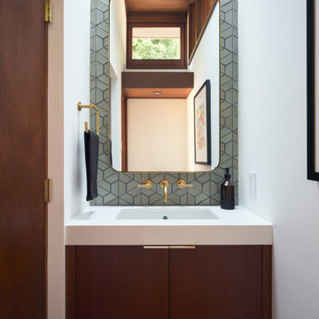
 Klopf Architecture
Nestled in the hills of Orinda, California, this 1951 residence is one of only seven extant homes, now known as “The Magnificent Seven”, designed by architect Olof Dahlstrand, a protégé of Frank Lloyd Wright. With its low-slung rooflines, natural materials, and deep integration with the sloping landscape, the home is a pristine example of mid-century modern design inspired by Wright’s organic principles. Over the years, prior homeowners have emphasized preservation, ensuring that the house remained relatively untouched. Each owner has respected the original architecture and stayed true to Dahlstrand’s intent. When a family of five—two college-aged sons and a middle school-aged daughter—acquired the property, they were captivated by its history, legacy of care, and architectural significance. While they appreciated Dahlstrand’s original vision, they also recognized the need to adapt the home for contemporary living while preserving its design integrity.
The remodel was conceived as a thoughtful response to the past—an effort to bring the house into the 21st century without compromising its soul. The primary mandate was to maintain architectural continuity while improving the functionality, comfort, and livability for a modern family. The design team—architects and contractor alike—worked with a shared reverence for the original architecture, allowing that mindset to guide even the most technical or pragmatic decisions.
A key objective was to increase natural light in the kitchen—a departure from Wrightian principles of enclosed, intimate cooking spaces—while maintaining the home’s architectural language. The kitchen was reconfigured to foster a stronger connection to adjacent living spaces while retaining the underlying concept of spatial separation. One of the most transformative architectural changes was the removal of a ridge beam that was originally planned to remain visible through the kitchen. During construction, the team collaborated on a better solution: a wide-flanged steel beam concealed within the roof envelope. This subtle move preserved the clean lines and ceiling continuity, a modern update carried out with utmost respect for the existing framework.
The home’s original powder room, previously accessible only through the kitchen, was relocated for better flow and privacy. A new powder room was carved out of former kitchen cabinetry—a narrow, interior space that could have felt dark and enclosed. To avoid this, the design extended the line of original transom windows into the new powder room and added a skylight above the vanity. The result is a bright and airy space that feels consistent with the rest of the home. Other updates included the installation of new solid-core interior doors with veneers carefully matched to the original mahogany, enhancing the continuity of the interiors. Even smaller decisions, such as placing the door knobs at 42 inches high, mirrored the original proportions. Every choice reflected a shared belief between the architect, contractor, and client: that new work should serve the integrity of the old.
The home’s extensive interior redwood millwork and paneling was meticulously restored. Where new materials were introduced—such as the replacement redwood soffit paneling—the contractor took pains to find finish nails that matched the original, rather than using modern equivalents. This level of craftsmanship and collaboration defined the project. It extended even to the detailing of a blind door to the new powder room, which had to disappear into the existing redwood board-and-batten wall. It was a team effort: the owner found a suitable handle, the architects devised the custom in-swing mechanism, and the contractor executed it so the door aligned precisely with the battens. Throughout, the homeowners were deeply engaged in the design process. One, a meticulous design enthusiast, focused on aesthetic integrity and historic detail. The other brought a practical and function-driven perspective, ensuring that new fixtures and materials would be durable and require minimal maintenance.
While the home’s location posed no major site challenges, sustainability was a key concern. The team upgraded the roof insulation, installed solar panels with battery storage, and added ductless mini-split cooling systems. Lighting was another area where modern technology was woven into a historic framework: new square LED fixtures echo the original custom perimeter soffit lights, maintaining the design language while offering advanced performance.
A planned expansion of a bedroom into suite with a bathroom had to be shelved due to budget constraints and the high cost of below-grade foundation work. Still, the team focused their efforts on making the most of the existing footprint, resolving constraints through design ingenuity rather than adding square footage. This renovation represents a collaborative achievement in preserving and evolving a historically significant home. Every decision was shaped by a shared ethos among clients, architects, and contractor: to maintain the home’s architectural soul while updating it for contemporary life. The result is a timeless modernist residence that continues Olof Dahlstrand’s legacy, remaining grounded in nature, craftsmanship, and human-scale design.
Klopf Architecture Team: John Klopf, AIA, Klara Kevane, Fernanda Bernardes
Interior Architectural Design: Klopf Architecture
Structural Engineer: Daniel Bastiao
Contractor: Don Larwood, Larwood Construction
Photography: Mariko Reed
Year Completed: 2022

 Universal Appliance and Kitchen Center
Miele Appliances at Universal Appliance and Kitchen Center
26767 Agoura Road, Calabasas, CA 91302
Phone 818.880.0011 Fax 818.880.0411
12050 Ventura Blvd.,Studio City, CA 91604
Phone 818.755.1111 Fax 818.755.9111
www.uakc.com
Miele Generation 6000 is bringing design and innovation that exceed expectations. It includes two distinct design styles - PureLine and ContourLine - as well as several color options including Brilliant White and Truffle Brown.
Design for Miele is not simply the exterior. Like the design principle, form follows function; the true beauty of the Generation 6000 series is highlighted by its intuitive user interface, which ensures unsurpassed performance and convenience in the kitchen. With these new color options and the uniform design of the Generation 6000 series, Miele has created a series of appliances that will seamlessly integrate into any kitchen or lifestyle. Whether appliances are installed vertically, horizontally, as a square or in a T-shape configuration, the design is fully resolved.
M Touch – Top-class technology with a special touch
Whether it’s creating a double cappuccino at the touch of a single button, finding the desired MasterChef automatic program on the Combi-Steam Oven in an instant or selecting the operating mode and temperature in just a few simple steps – Miele eliminates the guesswork. All of these operations are easier than ever because of M Touch. Reminiscent of smart phones and tablets, M Touch is an intuitive user interface that allows the user to swipe or scroll through the menu with the tip of a finger. A new high resolution control panel with white TFT (Thin Film Transistor) text brings a brilliant display. And because the interface is universal across all Gen 6000 appliances, the transition from appliance to appliance is easier than ever.
Oven Innovations: Moisture Plus, Gourmet Center and MultiSteam
Developed exclusively for Miele USA, Moisture Plus is a truly unique steam injection system featured in Miele M Touch 30” Convection Ovens. Moisture Plus automatically injects a burst of steam into the oven cavity at pre-determined points during the cooking process. The addition of moisture improves results when proofing dough, gives loaves of bread a crisp crust and glossy finish and makes cuts of meat particularly crisp on the outside and succulent inside.
Also new to the 30” Convection Oven is the addition of MasterChef Plus programs. Ideal for the consummate baker at home, this exclusive new menu system houses 14 automatic bread programs and replicates results seen in artisan bakeries. Included are programs for sourdough, whole grain, rolls and baguettes.
A pioneer in steam oven technology, Generation 6000 Steam and Combi-Steam Ovens are equipped with MultiSteam technology, a revolutionary new steam cooking generation. The addition of six steam inlets in the Steam Oven and eight steam inlets in the Combi-Steam Oven, delivers fast, even steam distribution and incredibly quick heat-up times for even cooking results through a more powerful steam generator.
Long regarded for its ingredient-driven menu, Miele MasterChef programs are now located within the Gourmet Center. Choose from more than 100 easy to use programs for grains, vegetables, meats, fish and poultry. At just the touch of a button, the program will deliver menu options that guide the user step by step - from the desired oven mode to temperature - all resulting in the perfect dish.
Generation 6000 Coffee Systems impress with comfort and innovation
There are several new highlights to the Generation 6000 Whole Bean Coffee System including a new CupSensor, EasyClick Milk System and One Touch for Two features. Exclusive to Miele, the CupSensor automatically adjusts the height of the spout to the optimum position for different cup and glass sizes. Whether a tall latté macchiato or a dainty espresso is being prepared, the central spout automatically adjusts to the cup’s rim and eliminates splashing. The CupSensor even reacts precisely to beverages made with milk by raising the spout slightly to make room for the incoming espresso.
Also new is the EasyClick milk system which is a dishwasher safe glass, milk flask that effortlessly clicks into place at the front of the machine. And for easy maintenance, the new Miele Coffee Systems now automatically rinse all milk spouts and hoses with water after each use.
The One Touch for Two feature allows the user to prepare two coffee specialties such as cappuccino and latté macchiato at the same time, thus reducing prep time when two or more drinks are being served.
Miele Generation 6000 series is distinguished by its elegant design and remarkable innovations to deliver unmatched results that can be seen, touched and tasted. German engineered and tested to last 20 years, Generation 6000 reinforces the Miele Design for Life philosophy and solidifies Miele at the forefront of residential culinary appliances.

 Bridgewater
The new owners were looking forward to living in their new home with an open floor plan, tall vaulted ceilings, and great views. It featured a large Great Room with two big French Doors separating the Dining Room from the Master Bedroom.
But after only a few months they identified a major design flaw: Each of the French Doors had ten glass windows with two large windows above each door. (Check out our before and after designs, traffic flow diagrams and photos of this project.) Glass windows and doors allowed sound and light from guests or the TV in the great room to easily sneak into the bedroom. With unique work and sleep schedules (he’s a pilot, she’s a registered nurse) this design wasn’t working.
Then there was a traffic flow design flaw: The Master Bedroom had a second entrance from a hallway. To get into the bedroom from the hallway you needed to walk down another claustrophobic hallway.
To get from the Master Bedroom to the Master Bath begin at the most remote corner of the bedroom and down a hallway between two closets. Once inside the bath, a huge triangular Jacuzzi dominating the space.
So, from a privacy and traffic flow perspective, this home had some major design issues.
When Craig Weber first met with the owners, he listened to their ideas and concerns. The owners trusted Craig to come up with the most efficient and most effective solution to this design dilemma. He offered a solution that resolved the bed-bath traffic flow problem, offered some bedroom room privacy, and updated the bath.
First, the two French Doors and windows were removed. A new wall was built with sound-absorbing materials, making the Great Room and Dining Room more comfortable spaces for entertaining while creating the bedroom privacy the owners craved.
Solving the Bedroom/Bath traffic flow problem began with removing the two existing closets. The bath door was relocated next to the hall entrance, and then a new walk-in closet was added adjacent to the hallway entrance. The solution offered easy access to and from the bath, closet and hallway without a hint of claustrophobia.
The Master Bath underwent a major transformation designed for convenience and comfort – especially during long, cold Minnesota winters.
Most everything from the former bath was torn out, beginning with the giant Jacuzzi.
A new bathtub that is wider and deeper than the standard size was installed with brushed Nickel fixtures. It’s the perfect place to relax with a glass of wine and candles.
Warm floors are a Minnesota “must have.” The bath’s new ceramic floor features in-floor electric heat. Getting in and out of the tub is easy and comfortable.
The new walk-in shower again features in-floor heating and a place to sit. The most interesting feature of this shower may the custom ceramic tile installed with unique patterns.
A new vanity Cambria Bradshaw countertops features two under-hung ceramic sinks with matching brushed Nickel fixtures.
Tall ceilings and three glass windows near the ceiling flood the room with natural light. A new energy-efficient window frames an ornamental stained glass window created by the owner’s father – a great personal touch.
A quiet place to sleep. A private dining room for entertaining. A Master Bath to die for. And easy traffic flow. The owners couldn’t have been more delighted with the outcome. And Lilly, their cat, loves it too.
 Bridgewater
The new owners were looking forward to living in their new home with an open floor plan, tall vaulted ceilings, and great views. It featured a large Great Room with two big French Doors separating the Dining Room from the Master Bedroom.
But after only a few months they identified a major design flaw: Each of the French Doors had ten glass windows with two large windows above each door. (Check out our before and after designs, traffic flow diagrams and photos of this project.) Glass windows and doors allowed sound and light from guests or the TV in the great room to easily sneak into the bedroom. With unique work and sleep schedules (he’s a pilot, she’s a registered nurse) this design wasn’t working.
Then there was a traffic flow design flaw: The Master Bedroom had a second entrance from a hallway. To get into the bedroom from the hallway you needed to walk down another claustrophobic hallway.
To get from the Master Bedroom to the Master Bath begin at the most remote corner of the bedroom and down a hallway between two closets. Once inside the bath, a huge triangular Jacuzzi dominating the space.
So, from a privacy and traffic flow perspective, this home had some major design issues.
When Craig Weber first met with the owners, he listened to their ideas and concerns. The owners trusted Craig to come up with the most efficient and most effective solution to this design dilemma. He offered a solution that resolved the bed-bath traffic flow problem, offered some bedroom room privacy, and updated the bath.
First, the two French Doors and windows were removed. A new wall was built with sound-absorbing materials, making the Great Room and Dining Room more comfortable spaces for entertaining while creating the bedroom privacy the owners craved.
Solving the Bedroom/Bath traffic flow problem began with removing the two existing closets. The bath door was relocated next to the hall entrance, and then a new walk-in closet was added adjacent to the hallway entrance. The solution offered easy access to and from the bath, closet and hallway without a hint of claustrophobia.
The Master Bath underwent a major transformation designed for convenience and comfort – especially during long, cold Minnesota winters.
Most everything from the former bath was torn out, beginning with the giant Jacuzzi.
A new bathtub that is wider and deeper than the standard size was installed with brushed Nickel fixtures. It’s the perfect place to relax with a glass of wine and candles.
Warm floors are a Minnesota “must have.” The bath’s new ceramic floor features in-floor electric heat. Getting in and out of the tub is easy and comfortable.
The new walk-in shower again features in-floor heating and a place to sit. The most interesting feature of this shower may the custom ceramic tile installed with unique patterns.
A new vanity Cambria Bradshaw countertops features two under-hung ceramic sinks with matching brushed Nickel fixtures.
Tall ceilings and three glass windows near the ceiling flood the room with natural light. A new energy-efficient window frames an ornamental stained glass window created by the owner’s father – a great personal touch.
A quiet place to sleep. A private dining room for entertaining. A Master Bath to die for. And easy traffic flow. The owners couldn’t have been more delighted with the outcome. And Lilly, their cat, loves it too.
 Bridgewater
The new owners were looking forward to living in their new home with an open floor plan, tall vaulted ceilings, and great views. It featured a large Great Room with two big French Doors separating the Dining Room from the Master Bedroom.
But after only a few months they identified a major design flaw: Each of the French Doors had ten glass windows with two large windows above each door. (Check out our before and after designs, traffic flow diagrams and photos of this project.) Glass windows and doors allowed sound and light from guests or the TV in the great room to easily sneak into the bedroom. With unique work and sleep schedules (he’s a pilot, she’s a registered nurse) this design wasn’t working.
Then there was a traffic flow design flaw: The Master Bedroom had a second entrance from a hallway. To get into the bedroom from the hallway you needed to walk down another claustrophobic hallway.
To get from the Master Bedroom to the Master Bath begin at the most remote corner of the bedroom and down a hallway between two closets. Once inside the bath, a huge triangular Jacuzzi dominating the space.
So, from a privacy and traffic flow perspective, this home had some major design issues.
When Craig Weber first met with the owners, he listened to their ideas and concerns. The owners trusted Craig to come up with the most efficient and most effective solution to this design dilemma. He offered a solution that resolved the bed-bath traffic flow problem, offered some bedroom room privacy, and updated the bath.
First, the two French Doors and windows were removed. A new wall was built with sound-absorbing materials, making the Great Room and Dining Room more comfortable spaces for entertaining while creating the bedroom privacy the owners craved.
Solving the Bedroom/Bath traffic flow problem began with removing the two existing closets. The bath door was relocated next to the hall entrance, and then a new walk-in closet was added adjacent to the hallway entrance. The solution offered easy access to and from the bath, closet and hallway without a hint of claustrophobia.
The Master Bath underwent a major transformation designed for convenience and comfort – especially during long, cold Minnesota winters.
Most everything from the former bath was torn out, beginning with the giant Jacuzzi.
A new bathtub that is wider and deeper than the standard size was installed with brushed Nickel fixtures. It’s the perfect place to relax with a glass of wine and candles.
Warm floors are a Minnesota “must have.” The bath’s new ceramic floor features in-floor electric heat. Getting in and out of the tub is easy and comfortable.
The new walk-in shower again features in-floor heating and a place to sit. The most interesting feature of this shower may the custom ceramic tile installed with unique patterns.
A new vanity Cambria Bradshaw countertops features two under-hung ceramic sinks with matching brushed Nickel fixtures.
Tall ceilings and three glass windows near the ceiling flood the room with natural light. A new energy-efficient window frames an ornamental stained glass window created by the owner’s father – a great personal touch.
A quiet place to sleep. A private dining room for entertaining. A Master Bath to die for. And easy traffic flow. The owners couldn’t have been more delighted with the outcome. And Lilly, their cat, loves it too.
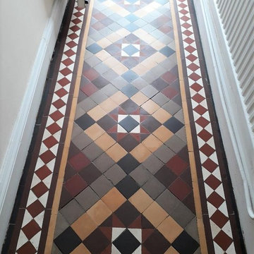 Tile Doctor Ltd
As is often the case in years past and for whatever reason many homeowners covered their decorative Victorian hallway tiles in a variety of products from carpet to laminate flooring. These days the trend has reversed and quite rightly many homeowners now realise the value a tiled floor can bring to a property and look to us to have it restored.
Our client had purchased a property in Norfolk seaport of Kings Lynn and, on lifting the dirty old carpet and decaying underlay in the hallway, discovered a beautiful tiled entrance hall. It was obvious that a previous owner had decided to lay carpet over the tiles as an easy way of hiding the result of careless renovation and decorating which had resulted in a thick coating of plaster, paint, carpet tape glue and various other contaminants which had become firmly stuck to the surface. There were also two small rectangular black and brown tiles missing behind the front door which had been damaged during the removal of some old lead pipes.
This was clearly a job which would need somewhat more than a scrubbing brush and a bottle of Flash!
Our first job was to remove as much of the solid contaminants as possible by hand with floor scrapers and a steamer which softened the more stubborn lumps. We then applied Tile Doctor Remove & Go which is a powerful alkaline stripper to the whole area, left it to dwell on the surface for twenty minutes and then scrubbed it in using a rotary machine fitted with a black scrubbing pad. The resulting slurry was then power rinsed and extracted away using our Ninja machine which is a high-power industrial vacuum. Any remaining patches where the carpet tape had been stuck down were spot treated using Tile Doctor Nanotech HBU which made short work of the hardened glue.
The result was a clean floor, but the surface still felt slightly rough and pitted, a problem which we resolved using the rotary machine fitted with a 200-grit diamond burnishing pad followed by a 400-grit pad with a little 400 grit honing powder which left the surface smooth, silky and ready for the application of a sealer.
Finally, we acid washed the whole area using Tile Doctor Acid Gel, a slow release product which would neutralise any remaining chemicals, improve new sealer adhesion and inhibit the future production of any efflorescence salts. We had used a fair amount of water during the cleaning process, so we left the floor to dry off thoroughly overnight with assistance from our commercial dehumidifier.
On our return the following day, we discussed the sealer options with the client and recommended using microporous Tile Doctor Colour Grow which is an impregnating sealer that seeps into the pores of the stone protecting it from within. It will provide an excellent fluid resistant seal whilst enhancing the natural colours in the stone, additionally it’s fully breathable thereby enabling any moisture trapped under the floor to rise through the floor and evaporate. This is important on old floors like this where no damp-proof membrane was installed. The sealer was applied with a paint pad in tow coats and allowed to dry for an hour before buffing the floor with a hog’s hair pad to give a rich natural-look sheen finish.
The Victorian tiles responded well to the treatments which were completed in two consecutive days. My client was extremely pleased with the results and left the following comment:
“My floor was in poor condition after being buried under carpet as well as many, many years of paint and muck. I enjoyed the time they spent at my home and wouldn’t hesitate to use (or recommend) the Tile Doctor service in the future.”
Nick White
Norfolk Tile Doctor
 USI Design & Remodeling
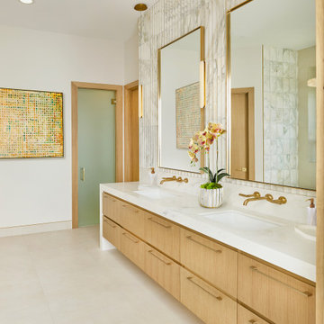
This master bathroom renovation in Frisco was completed for a repeat USI Design & Remodeling client as part of a larger first-floor transformation of the home. The original bathroom reflected a very typical North Texas layout of its era — dark stained cabinetry, granite countertops, compartmentalized vanities, a built-in tub adjoining a framed shower, and separated spaces that no longer aligned with how the homeowners wanted to live. As their aesthetic evolved toward a more transitional and contemporary direction, the goal became less about replacing finishes and more about redefining the experience of the room itself. The project needed to feel calmer, more architectural, and far more intentional in how the space functioned visually and emotionally.
One of the most important changes was removing the original shower curb and pony wall in favor of a fully open curbless shower with ultra-clear ½-inch heavy glass. Achieving that look required recessing the slab, re-floating the shower floor toward a linear drain, and engineering the space so the room would read as visually uninterrupted from end to end. Throughout the project, many of the design decisions were rooted in restraint rather than excess. The oversized 24x48 Porcelanosa flooring carries very little shade variation, creating a quieter visual field, while the cabinetry was executed in rift-sawn white oak specifically because it produces a far more controlled and consistent finish outcome than more common cuts of wood. In luxury projects, consistency itself becomes part of the refinement.
The floating vanity was designed more like custom furniture than traditional cabinetry, utilizing waterfall mitered edges and fully reworked plumbing locations so both homeowners could share in having generous functional countertop space. The original makeup station was repurposed into integrated storage with powered drawers and concealed organization for everyday items such as blow dryers and flat irons. Along the vanity wall, wall-mounted plumbing fixtures were paired with ribbed natural marble surfaces — a detail that required intentional planning long before construction began. Rather than allowing the ribbed material to terminate awkwardly behind the fixtures, the backsplash and stone transitions were specifically designed to resolve those conditions cleanly. Those are the types of details that distinguish highly coordinated design-build work from projects that simply assemble materials together.
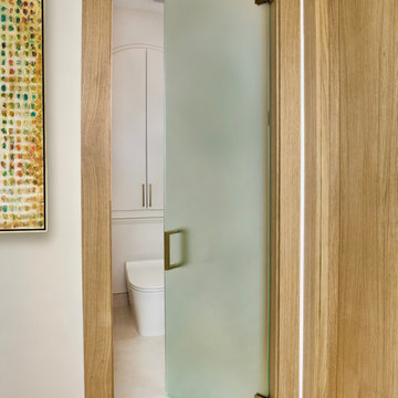
While the room contains a significant amount of luxury detailing — from the freestanding tub and geoprism marble focal wall to the custom rift-sawn white oak closet doors and elongated mirrors that leverage the 11-foot ceiling heights — the project was always guided by quiet luxury rather than visual competition. Even the water closet enclosure was handled with restraint through the use of a satin-etched glass door rather than another heavy solid opening. The intent throughout was to create a bathroom that feels restorative and serene rather than overdesigned. In our view, the best luxury spaces are the ones that feel composed long after the initial impression wears off.
 Bridgewater
The new owners were looking forward to living in their new home with an open floor plan, tall vaulted ceilings, and great views. It featured a large Great Room with two big French Doors separating the Dining Room from the Master Bedroom.
But after only a few months they identified a major design flaw: Each of the French Doors had ten glass windows with two large windows above each door. (Check out our before and after designs, traffic flow diagrams and photos of this project.) Glass windows and doors allowed sound and light from guests or the TV in the great room to easily sneak into the bedroom. With unique work and sleep schedules (he’s a pilot, she’s a registered nurse) this design wasn’t working.
Then there was a traffic flow design flaw: The Master Bedroom had a second entrance from a hallway. To get into the bedroom from the hallway you needed to walk down another claustrophobic hallway.
To get from the Master Bedroom to the Master Bath begin at the most remote corner of the bedroom and down a hallway between two closets. Once inside the bath, a huge triangular Jacuzzi dominating the space.
So, from a privacy and traffic flow perspective, this home had some major design issues.
When Craig Weber first met with the owners, he listened to their ideas and concerns. The owners trusted Craig to come up with the most efficient and most effective solution to this design dilemma. He offered a solution that resolved the bed-bath traffic flow problem, offered some bedroom room privacy, and updated the bath.
First, the two French Doors and windows were removed. A new wall was built with sound-absorbing materials, making the Great Room and Dining Room more comfortable spaces for entertaining while creating the bedroom privacy the owners craved.
Solving the Bedroom/Bath traffic flow problem began with removing the two existing closets. The bath door was relocated next to the hall entrance, and then a new walk-in closet was added adjacent to the hallway entrance. The solution offered easy access to and from the bath, closet and hallway without a hint of claustrophobia.
The Master Bath underwent a major transformation designed for convenience and comfort – especially during long, cold Minnesota winters.
Most everything from the former bath was torn out, beginning with the giant Jacuzzi.
A new bathtub that is wider and deeper than the standard size was installed with brushed Nickel fixtures. It’s the perfect place to relax with a glass of wine and candles.
Warm floors are a Minnesota “must have.” The bath’s new ceramic floor features in-floor electric heat. Getting in and out of the tub is easy and comfortable.
The new walk-in shower again features in-floor heating and a place to sit. The most interesting feature of this shower may the custom ceramic tile installed with unique patterns.
A new vanity Cambria Bradshaw countertops features two under-hung ceramic sinks with matching brushed Nickel fixtures.
Tall ceilings and three glass windows near the ceiling flood the room with natural light. A new energy-efficient window frames an ornamental stained glass window created by the owner’s father – a great personal touch.
A quiet place to sleep. A private dining room for entertaining. A Master Bath to die for. And easy traffic flow. The owners couldn’t have been more delighted with the outcome. And Lilly, their cat, loves it too.
 USI Design & Remodeling
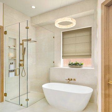
This master bathroom renovation in Frisco was completed for a repeat USI Design & Remodeling client as part of a larger first-floor transformation of the home. The original bathroom reflected a very typical North Texas layout of its era — dark stained cabinetry, granite countertops, compartmentalized vanities, a built-in tub adjoining a framed shower, and separated spaces that no longer aligned with how the homeowners wanted to live. As their aesthetic evolved toward a more transitional and contemporary direction, the goal became less about replacing finishes and more about redefining the experience of the room itself. The project needed to feel calmer, more architectural, and far more intentional in how the space functioned visually and emotionally.
One of the most important changes was removing the original shower curb and pony wall in favor of a fully open curbless shower with ultra-clear ½-inch heavy glass. Achieving that look required recessing the slab, re-floating the shower floor toward a linear drain, and engineering the space so the room would read as visually uninterrupted from end to end. Throughout the project, many of the design decisions were rooted in restraint rather than excess. The oversized 24x48 Porcelanosa flooring carries very little shade variation, creating a quieter visual field, while the cabinetry was executed in rift-sawn white oak specifically because it produces a far more controlled and consistent finish outcome than more common cuts of wood. In luxury projects, consistency itself becomes part of the refinement.
The floating vanity was designed more like custom furniture than traditional cabinetry, utilizing waterfall mitered edges and fully reworked plumbing locations so both homeowners could share in having generous functional countertop space. The original makeup station was repurposed into integrated storage with powered drawers and concealed organization for everyday items such as blow dryers and flat irons. Along the vanity wall, wall-mounted plumbing fixtures were paired with ribbed natural marble surfaces — a detail that required intentional planning long before construction began. Rather than allowing the ribbed material to terminate awkwardly behind the fixtures, the backsplash and stone transitions were specifically designed to resolve those conditions cleanly. Those are the types of details that distinguish highly coordinated design-build work from projects that simply assemble materials together.
While the room contains a significant amount of luxury detailing — from the freestanding tub and geoprism marble focal wall to the custom rift-sawn white oak closet doors and elongated mirrors that leverage the 11-foot ceiling heights — the project was always guided by quiet luxury rather than visual competition. Even the water closet enclosure was handled with restraint through the use of a satin-etched glass door rather than another heavy solid opening. The intent throughout was to create a bathroom that feels restorative and serene rather than overdesigned. In our view, the best luxury spaces are the ones that feel composed long after the initial impression wears off.
 USI Design & Remodeling
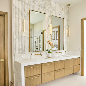
This master bathroom renovation in Frisco was completed for a repeat USI Design & Remodeling client as part of a larger first-floor transformation of the home. The original bathroom reflected a very typical North Texas layout of its era — dark stained cabinetry, granite countertops, compartmentalized vanities, a built-in tub adjoining a framed shower, and separated spaces that no longer aligned with how the homeowners wanted to live. As their aesthetic evolved toward a more transitional and contemporary direction, the goal became less about replacing finishes and more about redefining the experience of the room itself. The project needed to feel calmer, more architectural, and far more intentional in how the space functioned visually and emotionally.
One of the most important changes was removing the original shower curb and pony wall in favor of a fully open curbless shower with ultra-clear ½-inch heavy glass. Achieving that look required recessing the slab, re-floating the shower floor toward a linear drain, and engineering the space so the room would read as visually uninterrupted from end to end. Throughout the project, many of the design decisions were rooted in restraint rather than excess. The oversized 24x48 Porcelanosa flooring carries very little shade variation, creating a quieter visual field, while the cabinetry was executed in rift-sawn white oak specifically because it produces a far more controlled and consistent finish outcome than more common cuts of wood. In luxury projects, consistency itself becomes part of the refinement.
The floating vanity was designed more like custom furniture than traditional cabinetry, utilizing waterfall mitered edges and fully reworked plumbing locations so both homeowners could share in having generous functional countertop space. The original makeup station was repurposed into integrated storage with powered drawers and concealed organization for everyday items such as blow dryers and flat irons. Along the vanity wall, wall-mounted plumbing fixtures were paired with ribbed natural marble surfaces — a detail that required intentional planning long before construction began. Rather than allowing the ribbed material to terminate awkwardly behind the fixtures, the backsplash and stone transitions were specifically designed to resolve those conditions cleanly. Those are the types of details that distinguish highly coordinated design-build work from projects that simply assemble materials together.
While the room contains a significant amount of luxury detailing — from the freestanding tub and geoprism marble focal wall to the custom rift-sawn white oak closet doors and elongated mirrors that leverage the 11-foot ceiling heights — the project was always guided by quiet luxury rather than visual competition. Even the water closet enclosure was handled with restraint through the use of a satin-etched glass door rather than another heavy solid opening. The intent throughout was to create a bathroom that feels restorative and serene rather than overdesigned. In our view, the best luxury spaces are the ones that feel composed long after the initial impression wears off.
 USI Design & Remodeling
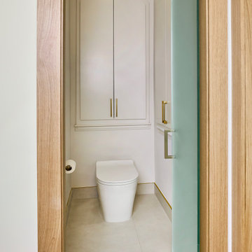
This master bathroom renovation in Frisco was completed for a repeat USI Design & Remodeling client as part of a larger first-floor transformation of the home. The original bathroom reflected a very typical North Texas layout of its era — dark stained cabinetry, granite countertops, compartmentalized vanities, a built-in tub adjoining a framed shower, and separated spaces that no longer aligned with how the homeowners wanted to live. As their aesthetic evolved toward a more transitional and contemporary direction, the goal became less about replacing finishes and more about redefining the experience of the room itself. The project needed to feel calmer, more architectural, and far more intentional in how the space functioned visually and emotionally.
One of the most important changes was removing the original shower curb and pony wall in favor of a fully open curbless shower with ultra-clear ½-inch heavy glass. Achieving that look required recessing the slab, re-floating the shower floor toward a linear drain, and engineering the space so the room would read as visually uninterrupted from end to end. Throughout the project, many of the design decisions were rooted in restraint rather than excess. The oversized 24x48 Porcelanosa flooring carries very little shade variation, creating a quieter visual field, while the cabinetry was executed in rift-sawn white oak specifically because it produces a far more controlled and consistent finish outcome than more common cuts of wood. In luxury projects, consistency itself becomes part of the refinement.
The floating vanity was designed more like custom furniture than traditional cabinetry, utilizing waterfall mitered edges and fully reworked plumbing locations so both homeowners could share in having generous functional countertop space. The original makeup station was repurposed into integrated storage with powered drawers and concealed organization for everyday items such as blow dryers and flat irons. Along the vanity wall, wall-mounted plumbing fixtures were paired with ribbed natural marble surfaces — a detail that required intentional planning long before construction began. Rather than allowing the ribbed material to terminate awkwardly behind the fixtures, the backsplash and stone transitions were specifically designed to resolve those conditions cleanly. Those are the types of details that distinguish highly coordinated design-build work from projects that simply assemble materials together.
While the room contains a significant amount of luxury detailing — from the freestanding tub and geoprism marble focal wall to the custom rift-sawn white oak closet doors and elongated mirrors that leverage the 11-foot ceiling heights — the project was always guided by quiet luxury rather than visual competition. Even the water closet enclosure was handled with restraint through the use of a satin-etched glass door rather than another heavy solid opening. The intent throughout was to create a bathroom that feels restorative and serene rather than overdesigned. In our view, the best luxury spaces are the ones that feel composed long after the initial impression wears off.

 BAUFORMAT
Wavy mother of pearl porcelain tile, wavy white tile for bathroom shower or backsplash. Perfect for fireplace or accent wall
Example of a trendy bathroom design in Los Angeles
Example of a trendy bathroom design in Los Angeles
 Universal Appliance and Kitchen Center
Miele Appliances at Universal Appliance and Kitchen Center
26767 Agoura Road, Calabasas, CA 91302
Phone 818.880.0011 Fax 818.880.0411
12050 Ventura Blvd.,Studio City, CA 91604
Phone 818.755.1111 Fax 818.755.9111
www.uakc.com
Miele Generation 6000 is bringing design and innovation that exceed expectations. It includes two distinct design styles - PureLine and ContourLine - as well as several color options including Brilliant White and Truffle Brown.
Design for Miele is not simply the exterior. Like the design principle, form follows function; the true beauty of the Generation 6000 series is highlighted by its intuitive user interface, which ensures unsurpassed performance and convenience in the kitchen. With these new color options and the uniform design of the Generation 6000 series, Miele has created a series of appliances that will seamlessly integrate into any kitchen or lifestyle. Whether appliances are installed vertically, horizontally, as a square or in a T-shape configuration, the design is fully resolved.
M Touch – Top-class technology with a special touch
Whether it’s creating a double cappuccino at the touch of a single button, finding the desired MasterChef automatic program on the Combi-Steam Oven in an instant or selecting the operating mode and temperature in just a few simple steps – Miele eliminates the guesswork. All of these operations are easier than ever because of M Touch. Reminiscent of smart phones and tablets, M Touch is an intuitive user interface that allows the user to swipe or scroll through the menu with the tip of a finger. A new high resolution control panel with white TFT (Thin Film Transistor) text brings a brilliant display. And because the interface is universal across all Gen 6000 appliances, the transition from appliance to appliance is easier than ever.
Oven Innovations: Moisture Plus, Gourmet Center and MultiSteam
Developed exclusively for Miele USA, Moisture Plus is a truly unique steam injection system featured in Miele M Touch 30” Convection Ovens. Moisture Plus automatically injects a burst of steam into the oven cavity at pre-determined points during the cooking process. The addition of moisture improves results when proofing dough, gives loaves of bread a crisp crust and glossy finish and makes cuts of meat particularly crisp on the outside and succulent inside.
Also new to the 30” Convection Oven is the addition of MasterChef Plus programs. Ideal for the consummate baker at home, this exclusive new menu system houses 14 automatic bread programs and replicates results seen in artisan bakeries. Included are programs for sourdough, whole grain, rolls and baguettes.
A pioneer in steam oven technology, Generation 6000 Steam and Combi-Steam Ovens are equipped with MultiSteam technology, a revolutionary new steam cooking generation. The addition of six steam inlets in the Steam Oven and eight steam inlets in the Combi-Steam Oven, delivers fast, even steam distribution and incredibly quick heat-up times for even cooking results through a more powerful steam generator.
Long regarded for its ingredient-driven menu, Miele MasterChef programs are now located within the Gourmet Center. Choose from more than 100 easy to use programs for grains, vegetables, meats, fish and poultry. At just the touch of a button, the program will deliver menu options that guide the user step by step - from the desired oven mode to temperature - all resulting in the perfect dish.
Generation 6000 Coffee Systems impress with comfort and innovation
There are several new highlights to the Generation 6000 Whole Bean Coffee System including a new CupSensor, EasyClick Milk System and One Touch for Two features. Exclusive to Miele, the CupSensor automatically adjusts the height of the spout to the optimum position for different cup and glass sizes. Whether a tall latté macchiato or a dainty espresso is being prepared, the central spout automatically adjusts to the cup’s rim and eliminates splashing. The CupSensor even reacts precisely to beverages made with milk by raising the spout slightly to make room for the incoming espresso.
Also new is the EasyClick milk system which is a dishwasher safe glass, milk flask that effortlessly clicks into place at the front of the machine. And for easy maintenance, the new Miele Coffee Systems now automatically rinse all milk spouts and hoses with water after each use.
The One Touch for Two feature allows the user to prepare two coffee specialties such as cappuccino and latté macchiato at the same time, thus reducing prep time when two or more drinks are being served.
Miele Generation 6000 series is distinguished by its elegant design and remarkable innovations to deliver unmatched results that can be seen, touched and tasted. German engineered and tested to last 20 years, Generation 6000 reinforces the Miele Design for Life philosophy and solidifies Miele at the forefront of residential culinary appliances.
 USI Design & Remodeling
This master bathroom renovation in Frisco was completed for a repeat USI Design & Remodeling client as part of a larger first-floor transformation of the home. The original bathroom reflected a very typical North Texas layout of its era — dark stained cabinetry, granite countertops, compartmentalized vanities, a built-in tub adjoining a framed shower, and separated spaces that no longer aligned with how the homeowners wanted to live. As their aesthetic evolved toward a more transitional and contemporary direction, the goal became less about replacing finishes and more about redefining the experience of the room itself. The project needed to feel calmer, more architectural, and far more intentional in how the space functioned visually and emotionally.
One of the most important changes was removing the original shower curb and pony wall in favor of a fully open curbless shower with ultra-clear ½-inch heavy glass. Achieving that look required recessing the slab, re-floating the shower floor toward a linear drain, and engineering the space so the room would read as visually uninterrupted from end to end. Throughout the project, many of the design decisions were rooted in restraint rather than excess. The oversized 24x48 Porcelanosa flooring carries very little shade variation, creating a quieter visual field, while the cabinetry was executed in rift-sawn white oak specifically because it produces a far more controlled and consistent finish outcome than more common cuts of wood. In luxury projects, consistency itself becomes part of the refinement.
The floating vanity was designed more like custom furniture than traditional cabinetry, utilizing waterfall mitered edges and fully reworked plumbing locations so both homeowners could share in having generous functional countertop space. The original makeup station was repurposed into integrated storage with powered drawers and concealed organization for everyday items such as blow dryers and flat irons. Along the vanity wall, wall-mounted plumbing fixtures were paired with ribbed natural marble surfaces — a detail that required intentional planning long before construction began. Rather than allowing the ribbed material to terminate awkwardly behind the fixtures, the backsplash and stone transitions were specifically designed to resolve those conditions cleanly. Those are the types of details that distinguish highly coordinated design-build work from projects that simply assemble materials together.
While the room contains a significant amount of luxury detailing — from the freestanding tub and geoprism marble focal wall to the custom rift-sawn white oak closet doors and elongated mirrors that leverage the 11-foot ceiling heights — the project was always guided by quiet luxury rather than visual competition. Even the water closet enclosure was handled with restraint through the use of a satin-etched glass door rather than another heavy solid opening. The intent throughout was to create a bathroom that feels restorative and serene rather than overdesigned. In our view, the best luxury spaces are the ones that feel composed long after the initial impression wears off.
59