
Search results for "Resolved" in Home Design Ideas
 Aris Keshishian
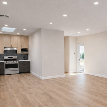
The Angelino ADU is a two-story ADU in Burbank, California, designed as a two-bedroom accessory dwelling unit that balances privacy, natural light, and efficient residential living on a constrained site. Positioned between two existing units, the project places a 1,000-square-foot upper-level residence above a generous three-car garage, creating a well-resolved living environment with two bedrooms, two bathrooms, and a full kitchen.
The design was shaped by the challenge of building alongside taller multifamily structures, where privacy, daylight, and ventilation all had to be carefully considered. Strategic window placement and thoughtfully located skylights bring natural light deep into the interior while maintaining a strong sense of seclusion. This approach also supports cross ventilation throughout the living spaces, contributing to a more comfortable and functional home.
Rather than treating the ADU as a secondary structure, the project was designed as a complete residential environment with a clear emphasis on livability, efficiency, and contemporary use. The result is a thoughtfully planned Burbank accessory dwelling unit that responds to site constraints with practical spatial organization, natural light, and everyday comfort.
 Betz Pools Limited
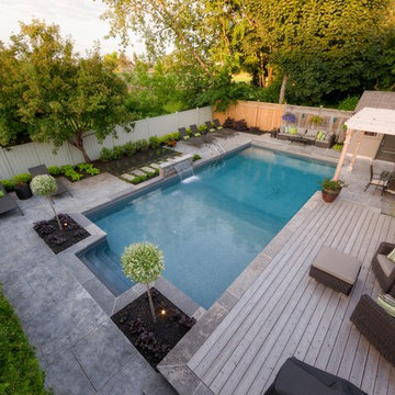
The backyard had persistent drainage issues, so Betz resolved the problem by adjusting the levels and slopes on all new surfaces. Another challenge was the overgrown hedge and shrubs which used up valuable space. They were removed from across the back and a portion of one side, then replaced with new fencing.
 Klopf Architecture
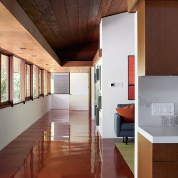
Nestled in the hills of Orinda, California, this 1951 residence is one of only seven extant homes, now known as “The Magnificent Seven”, designed by architect Olof Dahlstrand, a protégé of Frank Lloyd Wright. With its low-slung rooflines, natural materials, and deep integration with the sloping landscape, the home is a pristine example of mid-century modern design inspired by Wright’s organic principles. Over the years, prior homeowners have emphasized preservation, ensuring that the house remained relatively untouched. Each owner has respected the original architecture and stayed true to Dahlstrand’s intent. When a family of five—two college-aged sons and a middle school-aged daughter—acquired the property, they were captivated by its history, legacy of care, and architectural significance. While they appreciated Dahlstrand’s original vision, they also recognized the need to adapt the home for contemporary living while preserving its design integrity.
The remodel was conceived as a thoughtful response to the past—an effort to bring the house into the 21st century without compromising its soul. The primary mandate was to maintain architectural continuity while improving the functionality, comfort, and livability for a modern family. The design team—architects and contractor alike—worked with a shared reverence for the original architecture, allowing that mindset to guide even the most technical or pragmatic decisions.
A key objective was to increase natural light in the kitchen—a departure from Wrightian principles of enclosed, intimate cooking spaces—while maintaining the home’s architectural language. The kitchen was reconfigured to foster a stronger connection to adjacent living spaces while retaining the underlying concept of spatial separation. One of the most transformative architectural changes was the removal of a ridge beam that was originally planned to remain visible through the kitchen. During construction, the team collaborated on a better solution: a wide-flanged steel beam concealed within the roof envelope. This subtle move preserved the clean lines and ceiling continuity, a modern update carried out with utmost respect for the existing framework.
The home’s original powder room, previously accessible only through the kitchen, was relocated for better flow and privacy. A new powder room was carved out of former kitchen cabinetry—a narrow, interior space that could have felt dark and enclosed. To avoid this, the design extended the line of original transom windows into the new powder room and added a skylight above the vanity. The result is a bright and airy space that feels consistent with the rest of the home. Other updates included the installation of new solid-core interior doors with veneers carefully matched to the original mahogany, enhancing the continuity of the interiors. Even smaller decisions, such as placing the door knobs at 42 inches high, mirrored the original proportions. Every choice reflected a shared belief between the architect, contractor, and client: that new work should serve the integrity of the old.
The home’s extensive interior redwood millwork and paneling was meticulously restored. Where new materials were introduced—such as the replacement redwood soffit paneling—the contractor took pains to find finish nails that matched the original, rather than using modern equivalents. This level of craftsmanship and collaboration defined the project. It extended even to the detailing of a blind door to the new powder room, which had to disappear into the existing redwood board-and-batten wall. It was a team effort: the owner found a suitable handle, the architects devised the custom in-swing mechanism, and the contractor executed it so the door aligned precisely with the battens. Throughout, the homeowners were deeply engaged in the design process. One, a meticulous design enthusiast, focused on aesthetic integrity and historic detail. The other brought a practical and function-driven perspective, ensuring that new fixtures and materials would be durable and require minimal maintenance.
While the home’s location posed no major site challenges, sustainability was a key concern. The team upgraded the roof insulation, installed solar panels with battery storage, and added ductless mini-split cooling systems. Lighting was another area where modern technology was woven into a historic framework: new square LED fixtures echo the original custom perimeter soffit lights, maintaining the design language while offering advanced performance.
A planned expansion of a bedroom into suite with a bathroom had to be shelved due to budget constraints and the high cost of below-grade foundation work. Still, the team focused their efforts on making the most of the existing footprint, resolving constraints through design ingenuity rather than adding square footage. This renovation represents a collaborative achievement in preserving and evolving a historically significant home. Every decision was shaped by a shared ethos among clients, architects, and contractor: to maintain the home’s architectural soul while updating it for contemporary life. The result is a timeless modernist residence that continues Olof Dahlstrand’s legacy, remaining grounded in nature, craftsmanship, and human-scale design.
Klopf Architecture Team: John Klopf, AIA, Klara Kevane, Fernanda Bernardes
Interior Architectural Design: Klopf Architecture
Structural Engineer: Daniel Bastiao
Contractor: Don Larwood, Larwood Construction
Photography: Mariko Reed
Year Completed: 2022
Find the right local pro for your project
 EcoGreen Landscaping
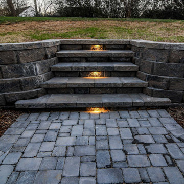
The customer wanted to replace an aging wooden deck and increase the usable space in the back yard. We decided to replace the deck with pavers and installed a retaining wall to allow us to increase the size of the patio. We added a fire pit and sitting bench to improve usability and put in low voltage light fixtures to offer night time ambience. Drainage and grading was the final touch to resolve the issue with standing water in the backyard and to keep the patio as dry as possible.
 Terri Symington, ASID
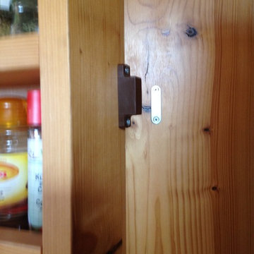
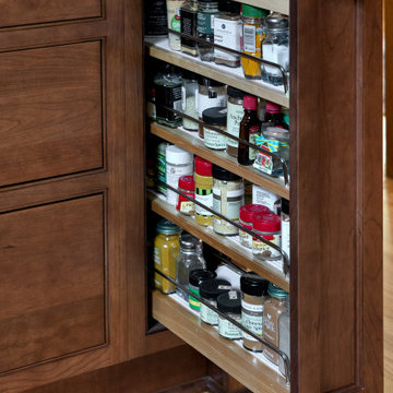
Problem solved!...The pantry doors could only be opened to 90 degrees due to the wall behind it and the shelves could therefore not be rolled completely out with the spice racks in their way. So to resolve the problem...the spice racks were given piano hinges along the left sides so that they could swing out of the way to allow the shelves to roll out... a magnet keeps it in place while closed.
 Derrick Dodge Interior Design
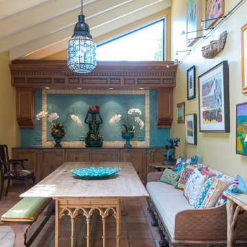
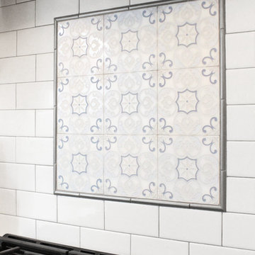
This breakfast room had one particular issue, the window at the back of the room. The client needed storage space and a serving area. We blocked the window off and designed cabinets and a beautiful tile wall to hide the window. There was an ugly air conditioning duct crossing under the triangular window that we wanted to hide. The designer and client resolved the issue with antique moldings to hide it, creating a beautiful focal point to the room. The client wanted a casual feel for this room so the large comfortable bench was designed to curl up in for morning coffee and muffins. Another focus to this room is the clients vast collection of art, some of her own is displayed on this wall. The table is made from various architectural elements.

 Michael Nash Design, Build & Homes
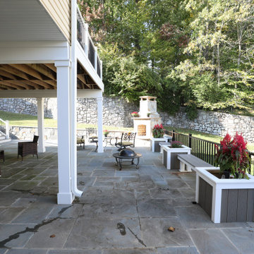
This couple desired to expand their horizon and maximize their outdoor living space. Their back yard was part of a big hill and a major amount of excavation needed to level up the ground for any kind of flat space use
• The homeowner’s goals where to have a big lower level patio to be able to walk out of their basement into stone patio
• Space for outdoor jacuzzi
• Space for outdoor wood burning fireplace and seating wall
• Outdoor lower bar
• Second floor large scale deck with a cooking bar
• A walkway ramp for wheelchair access (covered with roof)
• Lots of seating and entertainment space
Challenges:
The big backyard hill and big ground.
Big stone retaining walls needed.
Major excavation.
Run utilities, such as gas and water and sewer for bar area.
Resolve drainage.
The project started with breaking ground, and haul away major amount of dirt from back yard, implementing over 300 ft of retaining wall covered in stone to sunk in the patio
Cutting concrete walls in basement to create walk out into new patio
New flagstone patio over concrete slab was designed with outer radius to own a wood burning fireplace and seating walls. Right side was covered with tall stone wall and raining to adjacent neighbors
Under the deck area is a covered area for bar with stool seating wrapped with ledger stone and granite top and a secluded area for jacuzzi away from neighbors’ view
A double-sided staircase was built connecting lower patio to wrapped around upper deck,
The new Azak covered deck with listed rail system was equipped with cooking island, natural gas grill, sink and faucet, microwave and outdoor beverage center.
A covered walkway ramp has given an opportunity for elder mother in wheelchair to be able to visit them and spend time outdoor with them.
Beaded ceiling panels and hanging chandeliers has lid up this veranda.
This three-story addition into back of this dwelling stand tall in this community and now more than ever this family get to enjoy their backyard and outdoors with friends and family
The harmonizing choice of decking colors with ledger stone, granite tops, flagstone and veneer wall stones has given this outdoor project a standing ovation.
 Renovisions
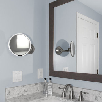
This master bath ‘Renovision’ came with three main requests from the homeowner: more storage, a larger shower and a luxurious look that feels like being at an upscale hotel. The Renovisions team accomplished these wishes and exceeded the clients expectations.
Request number 1: more storage. The existing closet was reconfigured to accommodate better storage for towels and bath supplies making it both functional and attractive. The custom built pull-out hamper was perfect. The long vanity and center tower offers much more cabinet space and drawer storage compared to what they had, especially with the increased vanity height.
Request number 2: A larger shower. Working within the existing footprint we were able to build a shower that is nearly a foot deeper as space was available. Creating a large rectangular cubby provides plenty of space for shampoos and soaps. The frameless sliding glass shower enclosure keeps the space open and airy while allowing the beautiful Carrera-look porcelain wall tiles to be the focus of this master bath.
Request number 3: a luxurious look. Turning their once boring, builder grade bathroom into an upscale hotel-like space was challenging, however, not a problem for the Renovisions team and their creative ways of resolving design snags along the way. Re-locating the doorway to the bathroom was one way to create a more spacious flow in and out of the space. Having the right design to start was half the battle – installing the beautiful products right the first time to ensure a proper fit and finish worthy of the upscale feel is the other half. The delicate tile detail in the shower cubby is the ‘jewelry’ in the room – the soft curves of this 2-tone wave design tile adds a dramatic feel and enlightened mood this client loves.
Overall, the homeowner was happy with every solution-based approach to all requests – their once dated builders bath is now bright, open and airy with a soft grey wall color adding to the soothing feel of this master bath.
 Stebnitz Builders, Inc.
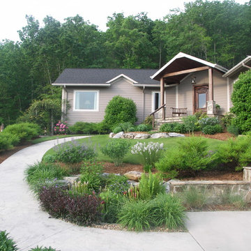
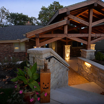
This East Troy home on Booth Lake had a few drainage issues that needed to be resolved, but one thing was clear, the homeowners knew with the proper design features, their property had amazing potential to be a fixture on the lake.
Starting with a redesign of the backyard, including retaining walls and other drainage features, the home was then ready for a radical facelift. We redesigned the entry of the home with a timber frame portico/entryway. The entire portico was built with the old-world artistry of a mortise and tenon framing method. We also designed and installed a new deck and patio facing the lake, installed an integrated driveway and sidewalk system throughout the property and added a splash of evening effects with some beautiful architectural lighting around the house.
A Timber Tech deck with Radiance cable rail system was added off the side of the house to increase lake viewing opportunities and a beautiful stamped concrete patio was installed at the lower level of the house for additional lounging.
Lastly, the original detached garage was razed and rebuilt with a new design that not only suits our client’s needs, but is designed to complement the home’s new look. The garage was built with trusses to create the tongue and groove wood cathedral ceiling and the storage area to the front of the garage. The secondary doors on the lakeside of the garage were installed to allow our client to drive his golf cart along the crushed granite pathways and to provide a stunning view of Booth Lake from the multi-purpose garage.
Terry Mayer http://www.terrymayerphotography.com/
 Tara Fust Design
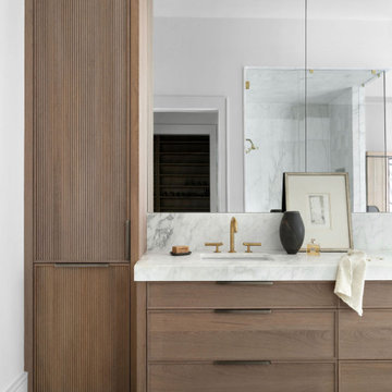
The primary bath was designed as a continuation of the home’s architectural language, prioritizing proportion, material restraint, and connection to the exterior landscape. A freestanding tub is positioned directly at the window to create a deliberate visual axis, allowing natural light and treetop views to become part of the bathing experience.
Millwork, stone surfaces, and flooring transitions were resolved during the design selection phase to maintain a clean material hierarchy. Warm wood tones soften the crispness of the stone and tile, while plumbing fixtures introduce subtle metal contrast without interrupting the tonal palette.
Negative space is used intentionally, allowing form, scale, and light to carry the composition rather than decorative layering. The result is a primary bath that reads as calm architectural space first — refined, grounded, and designed for daily ritual rather than visual excess.
 Michael Nash Design, Build & Homes
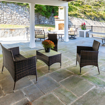
This couple desired to expand their horizon and maximize their outdoor living space. Their back yard was part of a big hill and a major amount of excavation needed to level up the ground for any kind of flat space use
• The homeowner’s goals where to have a big lower level patio to be able to walk out of their basement into stone patio
• Space for outdoor jacuzzi
• Space for outdoor wood burning fireplace and seating wall
• Outdoor lower bar
• Second floor large scale deck with a cooking bar
• A walkway ramp for wheelchair access (covered with roof)
• Lots of seating and entertainment space
Challenges:
The big backyard hill and big ground.
Big stone retaining walls needed.
Major excavation.
Run utilities, such as gas and water and sewer for bar area.
Resolve drainage.
The project started with breaking ground, and haul away major amount of dirt from back yard, implementing over 300 ft of retaining wall covered in stone to sunk in the patio
Cutting concrete walls in basement to create walk out into new patio
New flagstone patio over concrete slab was designed with outer radius to own a wood burning fireplace and seating walls. Right side was covered with tall stone wall and raining to adjacent neighbors
Under the deck area is a covered area for bar with stool seating wrapped with ledger stone and granite top and a secluded area for jacuzzi away from neighbors’ view
A double-sided staircase was built connecting lower patio to wrapped around upper deck,
The new Azak covered deck with listed rail system was equipped with cooking island, natural gas grill, sink and faucet, microwave and outdoor beverage center.
A covered walkway ramp has given an opportunity for elder mother in wheelchair to be able to visit them and spend time outdoor with them.
Beaded ceiling panels and hanging chandeliers has lid up this veranda.
This three-story addition into back of this dwelling stand tall in this community and now more than ever this family get to enjoy their backyard and outdoors with friends and family
The harmonizing choice of decking colors with ledger stone, granite tops, flagstone and veneer wall stones has given this outdoor project a standing ovation.
 HU-884212062
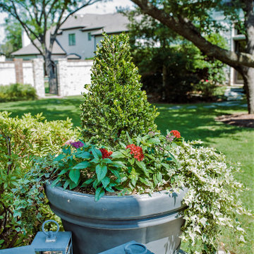
Nestled in the heart of Dallas, our clients enjoy a 4-acre estate where they have developed the property for a "park" and "garden" like feel with lots of privacy and sound barrier from the neighbors and busy street along the front. They travel a lot for work and want to be able to come home and enjoy their own backyard oasis that is properly maintained and cared for. They also have 4 grandchildren who live on part of the property and roam around everywhere, so having lots of manicured lawn space to drive their toys around on, explore, etc. is important too.
We service the property one day per week, since they retain a full-time porter. However, he is stretched thin as doesn't tend to much of the landscaping as needed as he's typically working on other side projects for the client. In order to complete our maintenance work within 5 hours on our service day, we work diligently with the client and the client’ assistant to constantly communicate issues we see and/or need to have resolved. Thankfully our client is very quick to respond and allows us an abundance of freedom to make necessary improvements when deemed necessary.
Additionally, last minute work functions and/or parties are often hosted at their house. We often times have to respond quickly with an extra service visit, service date change, seasonal color change, bed mulching, etc. to help get it ready for their company.
We value the trust and communication we have with this client and look forward to working with them for years to come!
 New Explode Construction
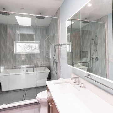
This Chicago modern bathroom remodel was designed to create a clean, calming space centered on comfort, functionality, and timeless design. The layout features a freestanding soaking tub, oversized walk-in shower, frameless glass enclosure, and large-format textured tile that adds depth and visual softness throughout the room.
The custom vanity and full-width illuminated mirror provide both practicality and a refined architectural presence, while carefully integrated lighting enhances the openness and simplicity of the space. Every detail was selected to support a spa-like experience while maintaining everyday durability.
This renovation reflects a design-build approach where layout, waterproofing, lighting, and finish coordination are resolved early, ensuring the final space feels seamless, elevated, and built for long-term living.
 Tile Doctor Ltd
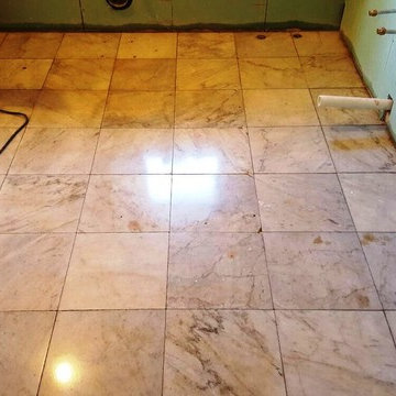
Windlestraw is a picturesque Edwardian manor hotel overlooking the Tweed Valley, near Walkerburn in the Scottish Borders area of Scotland. One of the bathrooms in the manor was in the process of being refurbished when two layers of floor tiles were removed, unveiling an original Marble tiled floor dating back to the 1920s.
After the top layers of tile had been removed the Marble was still covered in old adhesive and cement and although Marble is known for its quality and durability the hotel owner didn’t want the building contractor to proceed any further in case they damaged it. The owner was keen to restore the Marble floor as an original feature so we were called in to set the situation right.
To restore the floor I used two processes known as milling and burnishing. Milling literally involves grinding down uneven or rough surfaces using very coarse, diamond encrusted pads. The pads are usually used to resolve lippage issues on natural stone but in this case we needed to use the very coarse abrasive pads to grind off the adhesive and cement. I used a set of three coarse milling pads rinsing with water between each pad and starting with a 50 grit pad, before moving on to 100 and 200 grit pads. This process was very effective and ground off the cement and adhesive, while also removing any lippage in the tiles to leave a completely flat surface.
Milling leaves the surface of the Marble tiles clean but in a rough condition and this is where the second process Burnishing comes in. Similar to milling, burnishing focuses on achieving a polished finish with the application of ever finer grades of polishing pads and is often used to bring back the polish on Limestone and Travertine as well as Marble. Moving on to the burnishing, I worked my way through the four diamond encrusted pad system lubricating with a little water and again rinsing between each pad to remove the slurry. The grits go from Coarse (400 grit), Medium (800 grit), Fine (1500 grit) and then eventually Very Fine (3000 grit) and come in a 17” pad for use on a rotary floor machine and were applied twice in sequence to achieve a fantastic polished shine.
The floor was given a final rinse and then dried with a wet-vacuum before we proceeded to seal the floor using Tile Doctor Shine Powder which is a crystallizing powder that is applied directly to the floor and worked in using a buffing pad fitted to a rotary machine.
Shine Powder provides a very high shine (as you can see from the photos), along with a tough durable finish. On top of this, it is suitable for sealing all natural stone, including, of course, Marble, along with Limestone, Granite, Slate and Travertine.
The customer was absolutely delighted with the results as were we although it’s now up to them to ensure the bathroom fitters take appropriate care when completing the room which I’m sure will look absolutely fantastic when complete and no doubt add to the allure of this magnificent hotel in the Scottish Borders.
Thomas Wilson
Edinburgh Tile Doctor
 Saikley Architects
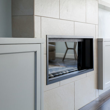
Our busy Silicon Valley clients asked us to convert their tight-quartered 1960’s ranch house to a gracious family home that would meet their long term needs. Ease of living was paramount, both in functionality and in ordered design.
The project was completed on a moderate budget.While retaining most of the structure of the existing house to avoid costly structural changes, we opened walls to improve the sight lines and flow of the house and bring in more light. We made small additions at the front and back bedrooms to gain space for the family and relatives. An existing underused patio area was improved with a simple outdoor kitchen and overhang to extend the living space to the outside. Costs were kept down with choices of modest materials.
Everything was made to be functional. Ample storage has been built into the right places. The details of the kitchen were carefully worked out to accommodate all the wishes of the various cooks in the family. The house is set up to be easy to keep clean. Acoustic walls separate living from bedroom spaces so adults can enjoy time together while children sleep. The outdoor kitchen has easy access to the indoor kitchen and the garage, and its setup promotes socializing while cooking outdoors.
A large part of the narrow back yard was previously unusable space due to a steep slope up to a neighbor’s higher fence. With a new retaining wall and some re-grading we took back more of the yard for the patio and play space on a new lawn.
The remodeled house is a mix of contemporary and traditional elements. Cool colors have a calming effect. Traditional items such as prairie style windows, trellis, mosaic tiles, and Shaker style cabinets, break down the scale in an otherwise streamlined, contemporary design. A new gabled roof with a broad arch at the front of the house marks the entry and resolves a challenging form where the central entry is set back from walls on both sides.
Photography: Kurt Manley
https://saikleyarchitects.com/portfolio/modern-ranch/
 Crystal Kitchen + Bath
The goal for this 1939 Tudor-style story-and-a-half home was to create a kitchen that offered the conveniences, storage, and performance of a modern workspace while preserving the warmth, craftsmanship, and vintage charm that made the home special. The client, an avid home cook, wanted the room to feel as though it had always belonged to the house, with thoughtful upgrades that respected the original architecture rather than competing with it. Just as important, she needed a more efficient layout with enough storage for small appliances, so everyday cooking would no longer require carrying items up from the lower level.
Several existing conditions shaped the design approach. The kitchen retained original, amber-stained birch woodwork that the client wished to keep, and the compact footprint was interrupted by six doorways and two windows, none of which were to be moved, altered, or replaced. A previous flooring update had left the door casings undercut too short, creating visible gaps where the casing met the floor. The existing vintage 40-inch range also lacked proper ventilation, yet the client wished to accommodate a refrigerator, dishwasher, cooktop, double ovens, built-in microwave, and effective venting above the cooktop into the new kitchen layout.
To honor the original millwork, beaded inset-style cherry cabinetry was selected in a soft, hand-rubbed finish that will deepen over time and develop a natural patina. Charcoal-gray soapstone countertops complement the cabinetry while reinforcing the historic character of the home with an organic, timeworn texture. The former breakfast nook was transformed into a butler’s pantry, adding valuable base cabinet storage and expanded work surfaces for frequently used small appliances. Also in the butler’s pantry, a single upper cabinet was paired with open shelves to give an open, airy feeling while adding character and practical storage. A classic single-bowl apron-front workstation sink contributes both period-appropriate character and practical prep and cleanup function.
Because the home’s openings were such a defining feature, the design worked within the existing architecture instead of altering it. Custom plinth blocks were created for each doorway to extend the original casing gracefully down to the new natural red oak flooring, resolving the earlier construction issue while adding a detail that feels authentic to the age of the house. Despite the number of door and window openings, the new layout provides a significantly more functional, built-in kitchen with an improved work triangle for serious cooking.
Appliance placement was carefully planned to deliver the requested performance without overwhelming the small room. Three cooking functions (double ovens & microwave) were consolidated into one location with a GE Café double oven featuring Advantium Technology, while the client’s compact 31-inch refrigerator was reused to preserve space. A sleek 30-inch induction cooktop provides efficient cooking, and a Vent-A-Hood ARS ductless vent hood supplies needed ventilation without requiring a duct run to the exterior.
The finish palette balances richness, texture, and historical sensitivity. A deeply textured navy backsplash tile adds depth and dramatic shadow play against the soapstone, while wallpaper in the back entry echoes the tile’s geometric pattern to visually connect the adjoining spaces. Oil-rubbed bronze cabinet hardware and light fixtures enhance the warmth of the cherry cabinetry and complete the antique-inspired feel.
Lighting was layered to make the compact kitchen brighter, more useful, and more inviting. Vintage-style semi-flush ceiling fixtures establish the overall tone, while dimmable puck lights highlight select areas and undercabinet task lighting keeps work surfaces well illuminated.
The completed kitchen now feels both highly functional and deeply rooted in the home’s history. Rich cherry cabinetry, velvety soapstone, natural red oak flooring, navy tile, bronze accents, and carefully preserved birch trim work together to create a warm, cohesive space that celebrates timeless craftsmanship. By increasing storage, improving workflow, integrating modern appliances, and respecting the Tudor home’s original character, the design achieves the client’s vision: a kitchen that feels personal, practical, historically appropriate, and as though it has always been there.
 Renovisions
This client requested that we design her new kitchen space to look and function with her and her family’s usage in mind. She was not happy with her existing kitchen due to builder-grade ceramic flooring, lack of countertop space, poor lighting, inadequate and unorganized storage and the closed off feel of the area. Renovisions resolved all of these issues by designing and building an impressive, transitional styled kitchen; delivering a beautifully well thought-out space that provides a multi-functional approach and meets the needs of this busy and dynamic household.
Typically, we encounter challenges in every project, and this was no different. The upstairs bathroom plumbing ran across the entire length of the kitchen sink wall and it was necessary to work with it by moving the plumbing as far up as possible and then building a soffit to hide it.
Creating a space that has a more open feel was top of mind for our client. Installing a new wood floor that matched the existing dining room floor helped with this and in addition, warmed up the room. By relocating the refrigerator to the opposite wall and adding a bar area at the end toward the family room, the flow of traffic for family members and guests became more managed.
The open floor plan allowed for additional island cabinets to accommodate smart storage and better functionality when prepping meals, sitting to eat or gathering with friends and family. We believe having ample countertop surface space is a critical improvement in any renovation and this particular project now boasts a large countertop area with a stunning wide vein pattern that accentuates the design instead of overpowering it. The soft look of the Blanco Arabescato quartz enhances the space and looks lovely with the white inset styled cabinetry.
Beauty and function go hand-in-hand in this kitchen with several exceptional elements such as under-cabinet lighting with dimmers to control the mood light. Glass doors were added to the wall cabinets which flank the wine rack for displaying their decorative glassware and a beverage cooler below provided added convenience and access to cold beverages. The GE Café line of appliances in ‘Slate’ and ‘Stainless Steel’ finishes are a stunning contrast here.
The sensational looking decorative marble 6”x6” backsplash tile over the gas range and in the bar area creates nice focal points by creating a unique look for her that family and guests love.
Convenient and functional elements were added such as a blind corner pull-out for easier pot/pan storage, a sweep-o-vac under cabinet vacuum system for those constant quick clean-ups, a pull-out caddy under the sink base for storage of cleaning products and a protective mat to collect potential spills.
Our client let us know it was time for a change and we listened. She shared a few pictures she loved from a home magazine, we shared our insight and then designed/built the kitchen of her dreams! … A fabulous and functional space.
 Michael Nash Design, Build & Homes
This four-story townhome in the heart of old town Alexandria, was recently purchased by a family of four.
The outdated galley kitchen with confined spaces, lack of powder room on main level, dropped down ceiling, partition walls, small bathrooms, and the main level laundry were a few of the deficiencies this family wanted to resolve before moving in.
Starting with the top floor, we converted a small bedroom into a master suite, which has an outdoor deck with beautiful view of old town. We reconfigured the space to create a walk-in closet and another separate closet.
We took some space from the old closet and enlarged the master bath to include a bathtub and a walk-in shower. Double floating vanities and hidden toilet space were also added.
The addition of lighting and glass transoms allows light into staircase leading to the lower level.
On the third level is the perfect space for a girl’s bedroom. A new bathroom with walk-in shower and added space from hallway makes it possible to share this bathroom.
A stackable laundry space was added to the hallway, a few steps away from a new study with built in bookcase, French doors, and matching hardwood floors.
The main level was totally revamped. The walls were taken down, floors got built up to add extra insulation, new wide plank hardwood installed throughout, ceiling raised, and a new HVAC was added for three levels.
The storage closet under the steps was converted to a main level powder room, by relocating the electrical panel.
The new kitchen includes a large island with new plumbing for sink, dishwasher, and lots of storage placed in the center of this open kitchen. The south wall is complete with floor to ceiling cabinetry including a home for a new cooktop and stainless-steel range hood, covered with glass tile backsplash.
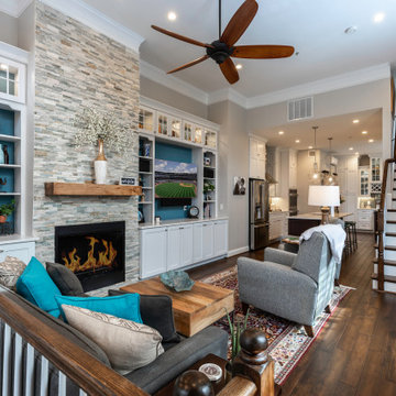
The dining room wall was taken down to combine the adjacent area with kitchen. The kitchen includes butler style cabinetry, wine fridge and glass cabinets for display. The old living room fireplace was torn down and revamped with a gas fireplace wrapped in stone.
Built-ins added on both ends of the living room gives floor to ceiling space provides ample display space for art. Plenty of lighting fixtures such as led lights, sconces and ceiling fans make this an immaculate remodel.
We added brick veneer on east wall to replicate the historic old character of old town homes.
The open floor plan with seamless wood floor and central kitchen has added warmth and with a desirable entertaining space.
 RWH Architect PLLC
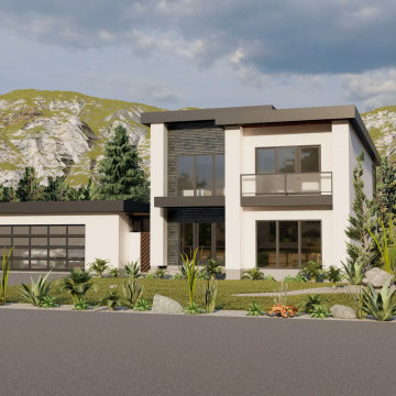
RWH Architect presents the Whistle Hill Lot 8 Residence, a statement home that reflects a bold shift toward modern, refined design. This contemporary residence is defined by its clean lines, dramatic vertical expressions, and a sophisticated mix of architectural forms that culminate in a truly forward-thinking home. From the moment visitors step into the central courtyard that connects the detached garage to the main house, the project introduces a new level of architectural intention rarely seen in the region.
The detached garage, featuring an expansive 18' x 8' door, creates a strong street presence and anchors the courtyard entry sequence. Passing through the courtyard leads to a welcoming entry foyer designed with built-in hooks and a bench, creating a comfortable—and functional—moment of arrival. Just beyond the entry is a private study with custom built-in bookshelves, a space tailored for work, reading, or quiet focus. The main floor unfolds into a sophisticated open-concept layout where the kitchen, great room, and dining areas flow effortlessly together. The kitchen includes a walk-in pantry, a pot filler for convenience, and a dedicated dog-feeding station that integrates seamlessly into the cabinetry. The great room stands as the heart of the home, featuring a built-in wood-burning fireplace and oversized sliding doors that extend the living space out to a covered patio. A centrally located half bath near the kitchen completes the first-floor program.
All bedrooms are located on the second floor to preserve privacy and capitalize on natural light. The master suite is designed as a luxurious retreat, offering a screened-in porch, a spacious walk-in closet, and a unique bathroom where the walk-in shower wraps around a freestanding tub, creating a spa-like environment that blends innovation with comfort. The laundry room is conveniently positioned on the same floor. Two additional bedrooms share a well-appointed bathroom, completing the second-floor layout.
Several design challenges shaped the evolution of this project and ultimately elevated its architectural clarity. One of the primary challenges was organizing the home around a detached garage while maintaining a cohesive architectural experience. RWH resolved this by creating a courtyard that acts as a transitional outdoor room, visually linking the structures and providing a dramatic yet functional entry sequence. Another challenge involved balancing large modern window systems with the bold vertical elements that define the façade. By carefully proportioning the glazing and framing it within thoughtful material changes, RWH maintained a strong contemporary identity while ensuring visual harmony. Integrating the built-in fireplace, open-concept layout, and large patio openings required complex structural solutions; RWH overcame this by using discreetly integrated structural steel that allowed for wide spans without compromising the home’s clean, minimalist interior aesthetic. Designing the master bathroom’s combined shower-and-tub layout also presented a unique challenge, requiring careful grading, waterproofing, and spatial planning. Through strategic detailing and 3D modeling, RWH delivered a seamless spa-like experience that feels both inventive and intuitively functional.
The Whistle Hill Lot 8 Residence stands as a testament to a new architectural direction in the area—one that embraces innovative forms, curated materials, and a lifestyle-driven floor plan. With its modern massing, intentional interior flow, and elevated details, this home reflects RWH Architect’s commitment to pushing residential design into its next era.
30