
Search results for "Respected dining" in Home Design Ideas
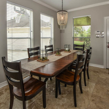
 InnovationLand
In this beautiful Houston remodel, we took on the exterior AND interior - with a new outdoor kitchen, patio cover and balcony outside and a Mid-Century Modern redesign on the inside:
"This project was really unique, not only in the extensive scope of it, but in the number of different elements needing to be coordinated with each other," says Outdoor Homescapes of Houston owner Wayne Franks. "Our entire team really rose to the challenge."
OUTSIDE
The new outdoor living space includes a 14 x 20-foot patio addition with an outdoor kitchen and balcony.
We also extended the roof over the patio between the house and the breezeway (the new section is 26 x 14 feet).
On the patio and balcony, we laid about 1,100-square foot of new hardscaping in the place of pea gravel. The new material is a gorgeous, honed-and-filled Nysa travertine tile in a Versailles pattern. We used the same tile for the new pool coping, too.
We also added French doors leading to the patio and balcony from a lower bedroom and upper game room, respectively:
The outdoor kitchen above features Southern Cream cobblestone facing and a Titanium granite countertop and raised bar.
The 8 x 12-foot, L-shaped kitchen island houses an RCS 27-inch grill, plus an RCS ice maker, lowered power burner, fridge and sink.
The outdoor ceiling is tongue-and-groove pine boards, done in the Minwax stain "Jacobean."
INSIDE
Inside, we repainted the entire house from top to bottom, including baseboards, doors, crown molding and cabinets. We also updated the lighting throughout.
"Their style before was really non-existent," says Lisha Maxey, senior designer with Outdoor Homescapes and owner of LGH Design Services in Houston.
"They did what most families do - got items when they needed them, worrying less about creating a unified style for the home."
Other than a new travertine tile floor the client had put in 6 months earlier, the space had never been updated. The drapery had been there for 15 years. And the living room had an enormous leather sectional couch that virtually filled the entire room.
In its place, we put all new, Mid-Century Modern furniture from World Market. The drapery fabric and chandelier came from High Fashion Home.
All the other new sconces and chandeliers throughout the house came from Pottery Barn and all décor accents from World Market.
The couple and their two teenaged sons got bedroom makeovers as well.
One of the sons, for instance, started with childish bunk beds and piles of books everywhere.
"We gave him a grown-up space he could enjoy well into his high school years," says Lisha.
The new bed is also from World Market.
We also updated the kitchen by removing all the old wallpaper and window blinds and adding new paint and knobs and pulls for the cabinets. (The family plans to update the backsplash later.)
The top handrail on the stairs got a coat of black paint, and we added a console table (from Kirkland's) in the downstairs hallway.
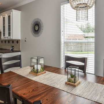
In the dining room, we painted the cabinet and mirror frames black and added new drapes, but kept the existing furniture and flooring.
"I'm just so pleased with how it turned out - especially Lisha's coordination of all the materials and finishes," says Wayne. "But as a full-service outdoor design team, this is what we do, and our all our great reviews are telling us we're doing it well."
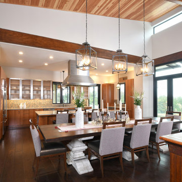
 Laura Manchee Designs
Our client’s desire was to have a country retreat that would be large enough to accommodate their sizable family and groups of friends. This primary space is an open plan which includes the kitchen, dining and living room central to the home. The architecture is modern but respectful of the natural surroundings.

Find the right local pro for your project
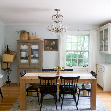
 Jordana Nicholson
Photo: Jordana Nicholson © 2016 Houzz
Example of a country dining room design in Kansas City
Example of a country dining room design in Kansas City
 InnovationLand
In this beautiful Houston remodel, we took on the exterior AND interior - with a new outdoor kitchen, patio cover and balcony outside and a Mid-Century Modern redesign on the inside:
"This project was really unique, not only in the extensive scope of it, but in the number of different elements needing to be coordinated with each other," says Outdoor Homescapes of Houston owner Wayne Franks. "Our entire team really rose to the challenge."
OUTSIDE
The new outdoor living space includes a 14 x 20-foot patio addition with an outdoor kitchen and balcony.
We also extended the roof over the patio between the house and the breezeway (the new section is 26 x 14 feet).
On the patio and balcony, we laid about 1,100-square foot of new hardscaping in the place of pea gravel. The new material is a gorgeous, honed-and-filled Nysa travertine tile in a Versailles pattern. We used the same tile for the new pool coping, too.
We also added French doors leading to the patio and balcony from a lower bedroom and upper game room, respectively:
The outdoor kitchen above features Southern Cream cobblestone facing and a Titanium granite countertop and raised bar.
The 8 x 12-foot, L-shaped kitchen island houses an RCS 27-inch grill, plus an RCS ice maker, lowered power burner, fridge and sink.
The outdoor ceiling is tongue-and-groove pine boards, done in the Minwax stain "Jacobean."
INSIDE
Inside, we repainted the entire house from top to bottom, including baseboards, doors, crown molding and cabinets. We also updated the lighting throughout.
"Their style before was really non-existent," says Lisha Maxey, senior designer with Outdoor Homescapes and owner of LGH Design Services in Houston.
"They did what most families do - got items when they needed them, worrying less about creating a unified style for the home."
Other than a new travertine tile floor the client had put in 6 months earlier, the space had never been updated. The drapery had been there for 15 years. And the living room had an enormous leather sectional couch that virtually filled the entire room.
In its place, we put all new, Mid-Century Modern furniture from World Market. The drapery fabric and chandelier came from High Fashion Home.
All the other new sconces and chandeliers throughout the house came from Pottery Barn and all décor accents from World Market.
The couple and their two teenaged sons got bedroom makeovers as well.
One of the sons, for instance, started with childish bunk beds and piles of books everywhere.
"We gave him a grown-up space he could enjoy well into his high school years," says Lisha.
The new bed is also from World Market.
We also updated the kitchen by removing all the old wallpaper and window blinds and adding new paint and knobs and pulls for the cabinets. (The family plans to update the backsplash later.)
The top handrail on the stairs got a coat of black paint, and we added a console table (from Kirkland's) in the downstairs hallway.
In the dining room, we painted the cabinet and mirror frames black and added new drapes, but kept the existing furniture and flooring.
"I'm just so pleased with how it turned out - especially Lisha's coordination of all the materials and finishes," says Wayne. "But as a full-service outdoor design team, this is what we do, and our all our great reviews are telling us we're doing it well."
 Wellborn + Wright
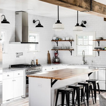
Wellborn + Wright has teamed up with Richmond native Cobblestone Development Group again for this incredible renovation. What was originally a constricting, one story brick ranch house from the mid 20th century is now a bright, soaring, three story home with a much more open and inviting floor plan. Be sure to flip through the slideshow above to the last 3 pictures which show the “before and after” versions of the kitchen and entryway.
Wellborn + Wright was happy to provide the smooth surface box beams that ran along the ceiling and “sectioned off” the individual living spaces on the first floor – kitchen, living room, dining room – without actually dividing the space itself. A mantle (not shown) and kitchen island counter top made from reclaimed white oak can be found in the kitchen and living room respectively. It should be noted that, while W+ didn’t provide the flooring for this project, what you see here is an exact match to our South Hampton oak flooring – so if you like what you see on the floors just as much as the ceiling, we can definitely help you there!
 Thompson Remodeling
The owners of this beautiful historic farmhouse had been painstakingly restoring it bit by bit. One of the last items on their list was to create a wrap-around front porch to create a more distinct and obvious entrance to the front of their home.
Aside from the functional reasons for the new porch, our client also had very specific ideas for its design. She wanted to recreate her grandmother’s porch so that she could carry on the same wonderful traditions with her own grandchildren someday.
Key requirements for this front porch remodel included:
- Creating a seamless connection to the main house.
- A floorplan with areas for dining, reading, having coffee and playing games.
- Respecting and maintaining the historic details of the home and making sure the addition felt authentic.
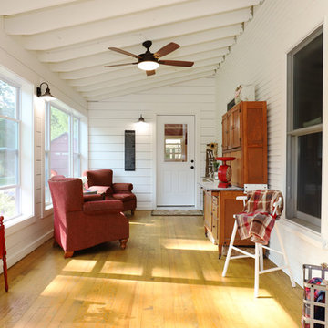
Upon entering, you will notice the authentic real pine porch decking.
Real windows were used instead of three season porch windows which also have molding around them to match the existing home’s windows.
The left wing of the porch includes a dining area and a game and craft space.
Ceiling fans provide light and additional comfort in the summer months. Iron wall sconces supply additional lighting throughout.
Exposed rafters with hidden fasteners were used in the ceiling.
Handmade shiplap graces the walls.
On the left side of the front porch, a reading area enjoys plenty of natural light from the windows.
The new porch blends perfectly with the existing home much nicer front facade. There is a clear front entrance to the home, where previously guests weren’t sure where to enter.
We successfully created a place for the client to enjoy with her future grandchildren that’s filled with nostalgic nods to the memories she made with her own grandmother.
"We have had many people who asked us what changed on the house but did not know what we did. When we told them we put the porch on, all of them made the statement that they did not notice it was a new addition and fit into the house perfectly.”
– Homeowner
Sponsored
Columbus, OH

Hope Restoration & General Contracting
Columbus Design-Build, Kitchen & Bath Remodeling, Historic Renovations
 Project Mint Developments
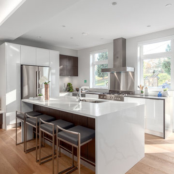
This Grandview development features a spacious 4-bedroom high-end home built over a 1-bed suite [accessible from the house] and an independent 2-bed/2-bath apartment.
It was constructed from pre-fabricated Structual Insulated Panels. This, and other highly innovative construction technologies put the building in a class of its own regarding performance and sustainability. The structure has been seismically-upgraded, and materials have been selected to stand the test of time. The design is strikingly modern but respectful, and the layout is expectionally practical and efficient.
The house is on a steep hill, providing views of the north-shore mountains from all floors. The large rooftop deck has panoramic views of the city. The open-plan living/dining room opens out onto a large south-facing deck.
Architecture: Nick Bray Architecture
Construction Management: Forte Projects
 Saikley Architects
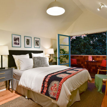
We updated this 1907 two-story family home for re-sale. We added modern design elements and amenities while retaining the home’s original charm in the layout and key details. The aim was to optimize the value of the property for a prospective buyer, within a reasonable budget.
New French doors from kitchen and a rear bedroom open out to a new bi-level deck that allows good sight lines, functional outdoor living space, and easy access to a garden full of mature fruit trees. French doors from an upstairs bedroom open out to a private high deck overlooking the garden. The garage has been converted to a family room that opens to the garden.
The bathrooms and kitchen were remodeled the kitchen with simple, light, classic materials and contemporary lighting fixtures. New windows and skylights flood the spaces with light. Stained wood windows and doors at the kitchen pick up on the original stained wood of the other living spaces.
New redwood picture molding was created for the living room where traces in the plaster suggested that picture molding has originally been. A sweet corner window seat at the living room was restored. At a downstairs bedroom we created a new plate rail and other redwood trim matching the original at the dining room. The original dining room hutch and woodwork were restored and a new mantel built for the fireplace.
We built deep shelves into space carved out of the attic next to upstairs bedrooms and added other built-ins for character and usefulness. Storage was created in nooks throughout the house. A small room off the kitchen was set up for efficient laundry and pantry space.
We provided the future owner of the house with plans showing design possibilities for expanding the house and creating a master suite with upstairs roof dormers and a small addition downstairs. The proposed design would optimize the house for current use while respecting the original integrity of the house.
Photography: John Hayes, Open Homes Photography
https://saikleyarchitects.com/portfolio/classic-craftsman-update/
 Advance Design Studio, Ltd.
Jennifer and Dan have lived in their Deer Park Illinois home for 15 years, slowly making minor fixes like painting and decorating; but they had a new plan for their kitchen the entire time. An awkwardly placed garage door, and an island cooktop with a terrible downdraft made a full-scale kitchen remodel an absolute must. Jennifer had many ideas in mind and wanted to work with a company that could provide high-end work, while partnering with a designer that would tailor the kitchen to her ideas.
She was intrigued by the phrase “Common Sense Remodeling” in Advance Design’s feature she discovered while perusing an issue of the community’s Quintessential Barrington Magazine. Doing further research on the company’s website, as she looked through project profiles and read about Advance Design’s “Common Sense Remodeling” philosophy, she promptly scheduled an appointment to see if the people and ideas she read about were truly who they said they were. The more she read, the more she knew that the “Common Sense” approach to remodeling they described was exactly the type of company she was looking for.
The partnership was sealed after an initial consultation with Owner Todd Jurs and Project Designer Michelle Lecinski. They displayed a combination of friendliness, professionalism and respect that was unmatched by any of the other companies Jennifer talked to. She knew that with Advance Design, she would be able to retain the vision that she had in mind with high-quality craftsmanship.
“I reached out to Advance Design because of the ‘Common Sense Remodeling’ tagline,” Jennifer said. “That’s what lingered for me”. “Advance Design was the most respectful- of the house and of my design ideas, and the most professional of the handful of companies that looked at my project”.
Soon after the meeting Jennifer began working with Michelle on the project design. They quickly developed chemistry. Jennifer loved how Michelle researched and located every detail that Jennifer wanted for the kitchen. Between the two of them, every concept and idea was worked through and perfected. “Jennifer had definite ideas about what she wanted the new kitchen to look like, she just didn’t know how to bring it all together. We worked together really well to make her ideas into the practical reality necessary for a well-functioning kitchen, with the look and feel that she had envisioned”, says Michelle.
“Michelle was wonderful in using the CAD system she would show me new drawings every time we changed the layout while working through the design,” Jennifer said. “She was a really wonderful partner in execution, she made sure everything happened quickly and easily.”
The finished design drew out elements of Jennifer’s style and personality. The pair call the look “sophisticated farmhouse” to describe the kitchen renovation to family and friends. The result was a beautifully crafted, authentic-feeling space that satisfied Jennifer’s dreams 15 years in the making. The whole project consisted of a kitchen remodel, mudroom upgrade with powder room, and garage entry relocation. “The projects I personally like the best, are the ones that put the client’s dreams on display,” Project Designer Michelle said. “And this is one of those projects.”
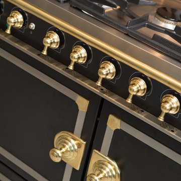
The main focal point of the kitchen is custom zinc and brass ventilation hood with a vintage sheen, which was hand made to order by a small company in Indiana named Vogler Metalworking. “It’s like sculpture, a true work of art”, says Jennifer. Your eye is immediately drawn towards this elegant yet practical hood that eliminated the home’s downdraft problem and added a striking conversation piece at the same time. The carpenters had to use special gloves when transporting and installing it, so they didn’t smudge it with fingerprints. The beautiful hood centers proudly over the stunning black enamel and brass LaCornue Range. “I had a friend who had a LaCornue range and after learning how easy it was to cook perfect meals, I was convinced I wanted to have one”, says Jennifer. This unique, breathtaking combination anchors the entire kitchen and is apparent immediately as you walk into the great room the surrounds the space.
DuraSupreme Crestwood cabinets with a Kendall Panel add function and sophistication. A custom gray paint color paired with a storm blue was developed so that the new kitchen looked like it belonged to the existing space. Unlacquered brass faucets and hardware were important to Jennifer because she wanted the living finishes to age over time. Remarkable brass diamond mesh cabinet door inserts imported from the UK continue to add this one-of-a-kind kitchen renovation; giving it a “you won’t see this everywhere” quality. The use of old railcar flooring for the coffee bar countertop and reclaimed oak for the open shelving gives an authenticity to the space uncommon in kitchens today.
Jennifer and Michelle fell in love with the Limestone Grey Stone while they were investigating unique island countertop ideas. They liked the fact that the limestone as a living finish will age and change over time. Calcutta Miel Quartz countertops made for an excellent pairing around the perimeter, as it’s durable and perfect for cooking preparations. A textured white subway tile backsplash that runs to the ceiling keeps your eye moving towards the open shelving, and to the main focal point of the stunning range hood combination.
“The kitchen functions beautifully, and it’s gorgeous,” beams Jennifer as she gestures with both hands while smiling ear to ear. “The most important thing was I wanted a kitchen that had a wonderful flow, cooked beautiful meals and was a great gathering place for family and friends, and this space does that perfectly! Beauty wise, it turned out exactly how I had envisioned. I felt the function part was the hardest part, and that was nailed”!
Relocating the garage entry to the new mudroom was a huge priority and has finally separated the family’s arriving home functions from their kitchen. Now coats and shoes and bags have their own area for dropping once members arrive home. Matching gray DuraSupreme cabinetry helped create gorgeous, purposeful lockers for the family. A reclaimed vintage sink and custom wall paper were added to the tiny powder room to beautify the once previously only functional space. Advance Design was even able to create a custom space for their dog to sleep while the family is away.
“It was unbelievable that a project of this size was completed in such a short time, and I think that’s because of the large amount of planning and preparation that went into it,” Jennifer marveled, “When we started, we were ready, and everything was prepared”.
When it came to execution, Project Manager Justin Davis and his crew were quick, accessible, and organized. Projects like this kitchen are typically completed in as little as 8-10 weeks. Jennifer’s kitchen however despite the relocation of some challenging HVAC in a soffit and moving of an exterior door was completed remarkably fast in part because the team was working with an existing tile floor that ran throughout the first floor that the client really loved.
“You get to know these people really well because they’re living in your house while you’re living in your house. They were so fast and really good, it didn’t take as long as even planned” reported Jennifer. “I would text Justin and he always responded almost immediately. I got to know all the guys who were working in our house and they were all wonderful people”.
Details in a customized kitchen like this one require skill and care from the people who install it. “All the guys on the job were skilled at what the did. I wanted small details like little feet to look like furniture, that is where their carpentry skill came in to make these all perfect”, said Jennifer. “The tile guys were wonderful. They even let me determine how I wanted the texture with the grout to appear for a salt and pepper look; now that is a very skilled trade person making it custom”.
In Jennifer’s interview, she continued to reference Advance Design’s “Common Sense Remodeling”, so I took a minute to ask her exactly what that phrase meant to her and how it played out in her experience with her project and the Advance Design team. Here is what she said: “I was intrigued about Common Sense Remodeling and in my head that there would be clear costs and prices, great communication between the design team, the execution team and me”, said Jennifer. They did deliver on that, it was so clear about the cost breakdown, what I could expect from everyone who came to my house, and everything that we had ordered. That to me is the Common Sense”!
It’s great to see a client take literally our assertion that a well-planned remodeling project is simply “Common Sense”! She anticipated each step of the way would be clear, concise, and predictable, all the while protecting the outcome due to the careful upfront planning. “Advance Design delivered on their ‘Common Sense Remodeling’ promise,” Jennifer said. “From the design team, to the execution team - everything was straight forward like I imagined. The project turned out exactly how I envisioned, I enjoyed this process and absolutely would recommend Advance Design Studio to anyone.”
 Dream Kitchens
Nick Vanderhovel - Dream Kitchens
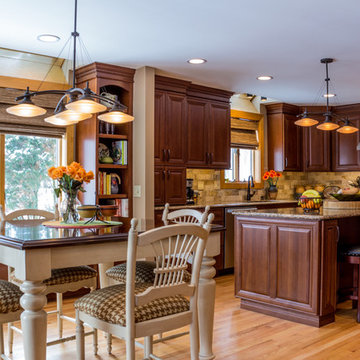
Large elegant u-shaped light wood floor eat-in kitchen photo in Detroit with an undermount sink, raised-panel cabinets, medium tone wood cabinets, quartz countertops, beige backsplash, subway tile backsplash, stainless steel appliances and an island
Large elegant u-shaped light wood floor eat-in kitchen photo in Detroit with an undermount sink, raised-panel cabinets, medium tone wood cabinets, quartz countertops, beige backsplash, subway tile backsplash, stainless steel appliances and an island
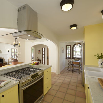
 ArtCraft Homes LLC
A traditional 1930 Spanish bungalow, re-imagined and respectfully updated by ArtCraft Homes to create a 3 bedroom, 2 bath home of over 1,300sf plus 400sf of bonus space in a finished detached 2-car garage. Authentic vintage tiles from Claycraft Potteries adorn the all-original Spanish-style fireplace. Remodel by Tim Braseth of ArtCraft Homes, Los Angeles. Photos by Larry Underhill.
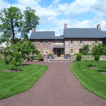
 River Valley Landscapes
This project presented unique opportunities that are not often found in residential landscaping. The homeowners were not only restoring their 1840's era farmhouse, a piece of their family’s history, but also enlarging and updating the home for modern living. The landscape designers continued this idea by creating a space that is a modern day interpretation of an 1840s era farm rather then a strict recreation. The resulting design combines elements of farm living from that time, as well as acknowledging the property’s history as a horse farm, with staples of 21st century landscapes such as space for outdoor living, lighting, and newer plant varieties.
Guests approach from the main driveway which winds through the property and ends at the main barn. There is secondary gated driveway just for the homeowners. Connected to this main driveway is a narrower gravel lane which leads directly to the residence. The lane passes near fruit trees planted in broken rows to give the illusion that they are the remains of an orchard that once existed on the site. The lane widens at the entrance to the gardens where there is a hitching post built into the fence that surrounds the gardens and a watering trough. The widened section is intended as a place to park a golf cart or, in a nod to the home’s past, tie up horses before entering. The gravel lane passes between two stone pillars and then ends at a square gravel court edged in cobblestones. The gravel court transitions into a wide flagstone walk bordered with yew hedges and lavender leading to the front door.
Directly to the right, upon entering the gravel court, is located a gravel and cobblestone edged walk leading to a secondary entrance into the residence. The walk is gated where it connects with the gravel court to close it off so as not to confuse visitors and guests to the main residence and to emphasize the primary entrance. An area for a bench is provided along this walk to encourage stopping to view and enjoy the gardens.
On either side of the front door, gravel and cobblestone walks branch off into the garden spaces. The one on the right leads to a flagstone with cobblestone border patio space. Since the home has no designated backyard like most modern suburban homes the outdoor living space had to be placed in what would traditionally be thought of as the front of the house. The patio is separated from the entrance walk by the yew hedge and further enclosed by three Amelanchiers and a variety of plantings including modern cultivars of old fashioned plants such as Itea and Hydrangea. A third entrance, the original front door to the 1840’s era section, connects to the patio from the home’s kitchen, making the space ideal for outdoor dining.
The gravel and cobblestone walk branching off to the left of the front door leads to the vegetable and perennial gardens. The idea for the vegetable garden was to recreate the tradition of a kitchen garden which would have been planted close to the residence for easy access. The vegetable garden is surrounded by mixed perennial beds along the inside of the wood picket fence which surrounds the entire garden space. Another area designated for a bench is provided here to encourage stopping and viewing. The home’s original smokehouse, completely restored and used as a garden shed, provides a strong architectural focal point to the vegetable garden. Behind the smokehouse is planted lilacs and other plants to give mass and balance to the corner and help screen the garden from the neighboring subdivision. At the rear corner of the garden a wood arbor was constructed to provide a structure on which to grow grapes or other vines should the homeowners choose to.
The landscape and gardens for this restored farmhouse and property are a thoughtfully designed and planned recreation of a historic landscape reinterpreted for modern living. The idea was to give a sense of timelessness when walking through the gardens as if they had been there for years but had possibly been updated and rejuvenated as lifestyles changed. The attention to materials and craftsmanship blend seamlessly with the residence and insure the gardens and landscape remain an integral part of the property. The farm has been in the homeowner’s family for many years and they are thrilled at the results and happy to see respect given to the home’s history and to its meticulous restoration.
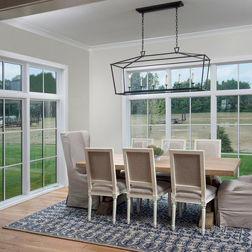

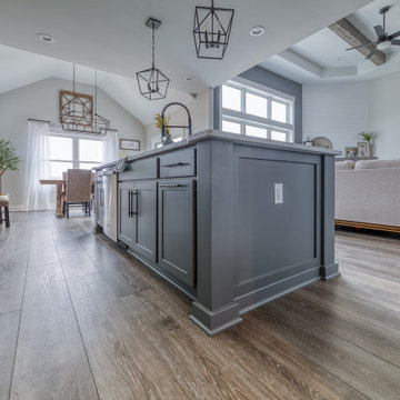
 Flooret
Deep tones of gently weathered grey and brown. A modern look that still respects the timelessness of natural wood.
Inspiration for a mid-sized 1950s galley vinyl floor and brown floor eat-in kitchen remodel in Other with a single-bowl sink, beaded inset cabinets, gray cabinets, granite countertops, white backsplash, ceramic backsplash, stainless steel appliances, an island and white countertops
Inspiration for a mid-sized 1950s galley vinyl floor and brown floor eat-in kitchen remodel in Other with a single-bowl sink, beaded inset cabinets, gray cabinets, granite countertops, white backsplash, ceramic backsplash, stainless steel appliances, an island and white countertops
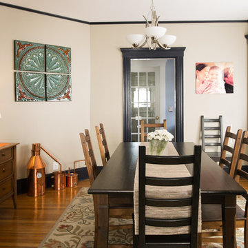
 Danielle Sykes
Photo: Danielle Sykes © 2015 Houzz
Dining room - traditional dining room idea in Boston
Dining room - traditional dining room idea in Boston
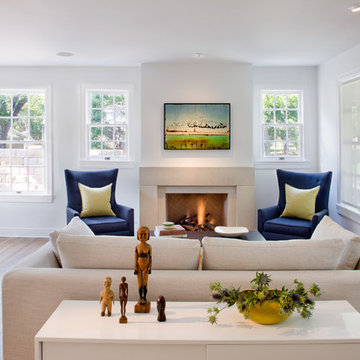
 FAB Architecture
Living room - transitional living room idea in Austin with white walls and a standard fireplace
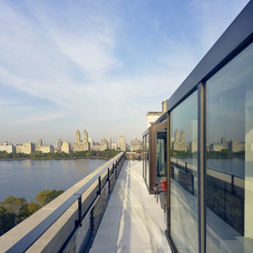
 Shenton Architects LLP
Built in 1925, this 15-story neo-Renaissance cooperative building is located on Fifth Avenue at East 93rd Street in Carnegie Hill. The corner penthouse unit has terraces on four sides, with views directly over Central Park and the city skyline beyond.
The project involved a gut renovation inside and out, down to the building structure, to transform the existing one bedroom/two bathroom layout into a two bedroom/three bathroom configuration which was facilitated by relocating the kitchen into the center of the apartment.
The new floor plan employs layers to organize space from living and lounge areas on the West side, through cooking and dining space in the heart of the layout, to sleeping quarters on the East side. A glazed entry foyer and steel clad “pod”, act as a threshold between the first two layers.
All exterior glazing, windows and doors were replaced with modern units to maximize light and thermal performance. This included erecting three new glass conservatories to create additional conditioned interior space for the Living Room, Dining Room and Master Bedroom respectively.
Materials for the living areas include bronzed steel, dark walnut cabinetry and travertine marble contrasted with whitewashed Oak floor boards, honed concrete tile, white painted walls and floating ceilings. The kitchen and bathrooms are formed from white satin lacquer cabinetry, marble, back-painted glass and Venetian plaster. Exterior terraces are unified with the conservatories by large format concrete paving and a continuous steel handrail at the parapet wall.
Photography by www.petermurdockphoto.com


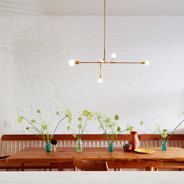
 The Brooklyn Studio
This residence was a complete gut renovation of a 4-story row house in Park Slope, and included a new rear extension and penthouse addition. The owners wished to create a warm, family home using a modern language that would act as a clean canvas to feature rich textiles and items from their world travels. As with most Brooklyn row houses, the existing house suffered from a lack of natural light and connection to exterior spaces, an issue that Principal Brendan Coburn is acutely aware of from his experience re-imagining historic structures in the New York area. The resulting architecture is designed around moments featuring natural light and views to the exterior, of both the private garden and the sky, throughout the house, and a stripped-down language of detailing and finishes allows for the concept of the modern-natural to shine.
Upon entering the home, the kitchen and dining space draw you in with views beyond through the large glazed opening at the rear of the house. An extension was built to allow for a large sunken living room that provides a family gathering space connected to the kitchen and dining room, but remains distinctly separate, with a strong visual connection to the rear garden. The open sculptural stair tower was designed to function like that of a traditional row house stair, but with a smaller footprint. By extending it up past the original roof level into the new penthouse, the stair becomes an atmospheric shaft for the spaces surrounding the core. All types of weather – sunshine, rain, lightning, can be sensed throughout the home through this unifying vertical environment. The stair space also strives to foster family communication, making open living spaces visible between floors. At the upper-most level, a free-form bench sits suspended over the stair, just by the new roof deck, which provides at-ease entertaining. Oak was used throughout the home as a unifying material element. As one travels upwards within the house, the oak finishes are bleached to further degrees as a nod to how light enters the home.
The owners worked with CWB to add their own personality to the project. The meter of a white oak and blackened steel stair screen was designed by the family to read “I love you” in Morse Code, and tile was selected throughout to reference places that hold special significance to the family. To support the owners’ comfort, the architectural design engages passive house technologies to reduce energy use, while increasing air quality within the home – a strategy which aims to respect the environment while providing a refuge from the harsh elements of urban living.
This project was published by Wendy Goodman as her Space of the Week, part of New York Magazine’s Design Hunting on The Cut.
Photography by Kevin Kunstadt
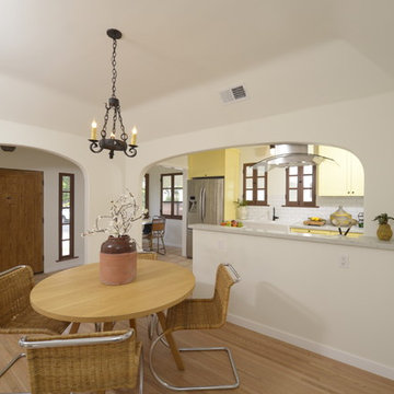 ArtCraft Homes LLC
A traditional 1930 Spanish bungalow, re-imagined and respectfully updated by ArtCraft Homes to create a 3 bedroom, 2 bath home of over 1,300sf plus 400sf of bonus space in a finished detached 2-car garage. Authentic vintage tiles from Claycraft Potteries adorn the all-original Spanish-style fireplace. Remodel by Tim Braseth of ArtCraft Homes, Los Angeles. Photos by Larry Underhill.
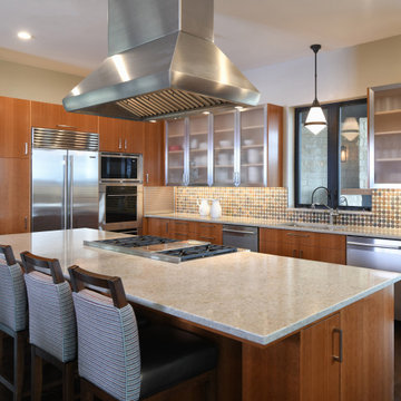 Laura Manchee Designs
Our client’s desire was to have a country retreat that would be large enough to accommodate their sizable family and groups of friends. This primary space is an open plan which includes the kitchen, dining and living room central to the home. The architecture is modern but respectful of the natural surroundings.
13