
Search results for "Resultant listing" in Home Design Ideas
 TradesGenie Contracting inc
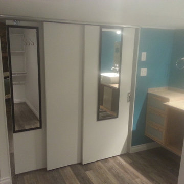
Great result for a very low budget basement renovation, income suite, Everything plumbing, electrical and environmental that needed to be changed in this old house was changed but nothing more. Then we finished all surfaces using materials on site, miss tint paint and materials that were on sale. Unit had multiple rental applications submitted on first day of listing.
check out the garage sale purchased 3 drawer shelving unit that we tiled to match vanity surface
 Alair Homes Milwaukee
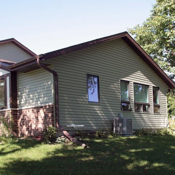
This Master Suite Addition project was initiated by our Clients’ desire to stay in their family home well into their golden years. Their wish list included a master suite and large open space for entertaining. With “Aging in Place” a main objective, our goal was to move all essential tasks to the first floor. Our design created a smooth transition between old house and new by expanding their dining room and adding a vestibule between the two spaces. This resulted in a much larger dining space and the larger entertaining area they were seeking. The master bedroom’s floor to ceiling windows on two of the walls frames picturesque views of their beloved garden outside. Vaulted ceilings, French doors to the bathroom with a transom window above express class and grandeur. Through the French doors the elegant master bathroom shines with reflections from the decorative crystal chandelier, white and grey tile, polished chrome fixtures and lighted glass bowls. A double headed shower, with dual temperature controls, and the air-jetted tub provide a true sanctuary for a relaxed bathing experience. “His and Her” elements are also fulfilled with dual vanities, and dual toilet areas. Upon completion, the homeowners passionately stated that this project turned out even better than they could have imagined. They truly love their new space in their long loved home and look forward to many more years in their new haven.
 Lista & Vidmar - Storage & Workspace Systems
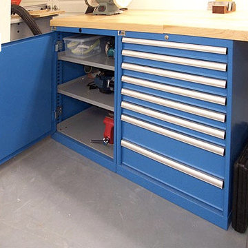
Richard's decision to go with Lista was made as methodically as his latest turned masterpiece. "I did some research, and Lista quickly moved to the top of the list, primarily because I was looking for flexibility in cabinet size, in drawer size to hold all my different size tools, and partitioning to keep them organized. I'm an engineer by training, and the high quality was obvious. I also liked the modular design, and have already swapped drawers between cabinets. I had my choice of color, and I think they came out looking really good."
Turns out he has a lot of great things to say about Lista support as well. "Dave Geller, my Lista distributor, was unbelievably helpful. He came over and spent several hours with me inventorying all my tools and designing the shop to have all the equipment I needed, where I needed it."
With Lista, Richard was able to make his favorite pastime even more enjoyable. "What I like about turning wood is that it's totally hands-on. You can feel the object take shape as you work it. And you see the results relatively quickly."
Find the right local pro for your project
 Truitt and White Window and Door Showroom
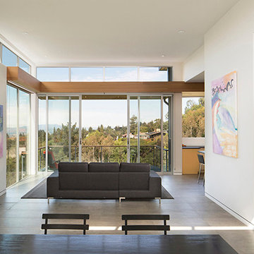
This hillside home in Piedmont, CA was remodeled to change the style from a 1940's rancher with eight foot ceilings and dark interiors, into a modern geometric composition with vast white interiors for casual living and generous daylighting for displaying the artist-owner's works.
In a city known for rigorous and difficult design review, an addition, two variances, and a full stylistic change were unanimously approved on the first round. All sloped roofs and attics were eliminated and replaced by a series of stacked and overlapping flat roofs. This made the house taller on the inside and shorter on the outside, which helped earn design review cooperation in the community. Windows were concentrated toward the rear yard views or moved up high on the side walls for daylight and privacy, benefitting the owners as well as the neighbors.
At the start, the owner husband was so enthusiastic and engaged in transforming his house into something modern that he presented the architect with a scaled foamcore model, rather than the usual magazine clippings and wish list. He participated in the design decisions throughout the process. The owner wife is the artist who did all the artwork in the house. She had been craving a display space with large walls and good natural light. Both of them loved the location and great views.
The project was an opportunity to transform the style of an older traditional home into a modern one, while solving numerous problems. By rebuilding the 1800 ft2 top of the 3-story home it was possible to change the style of the whole building, since the lower floors were a neutral base, and also to change the lifestyle of the owners, who wanted to move their master suite upstairs and live primarily on the top floor as empty nesters.
Going into the project, the architect knew there were multiple encroachments into the setbacks and potential privacy issues with close by neighbors. He approached this as a complex puzzle made up of architectural and political pieces which all had to fit together elegantly. It took many careful moves, small and large, to arrive at a serene and cohesive result that tied old and new together seamlessly.
The design-build contractor worked closely with the owners and handled all of the construction phase documents and design adjustments, adding ideas of their own to make the project really sing.
The project was a collaboration in three acts. The owner had a strong design concept from the start. The architect developed it into a realistic project and garnered the design approvals. Then the contractor executed brilliantly
 Drury Design
The Setup:
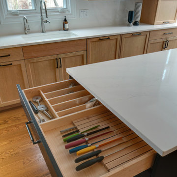
After purchasing this home, the homeowners faced a unique opportunity to reimagine their kitchen and nearby spaces. Water damage from a burst pipe had left much of the home’s interior in need of repair, and while the existing kitchen was functional and in relatively good shape, it didn’t align with the family’s vision for their new home. The layout included a peninsula that wasn’t ideal, and there were some druthers with the nearby pantry.
Since the space needed to be rebuilt anyway, the homeowners saw this as a chance to create a kitchen that was both highly functional for their four young children and timeless in its design. The project also included a refresh of the adjacent message center and dining room — spaces that play key roles in the family’s daily life. The goal was to create a cohesive flow between these areas, balancing modern functionality with the craftsman-inspired character of the rest of the home.
Design Objectives:
- Replace the outdated peninsula with a large island to maximize counter space and create new seating options.
- Open up the space visually by removing soffits and rethinking the cabinetry layout.
Incorporate concealed refrigeration and freezer units to provide significant storage for the family while maintaining a streamlined aesthetic.
- Integrate black cabinetry into the design without making the space feel harsh or heavy.
- Ensure the lighting plan balances functional task lighting with ambient accent lighting.
- Avoid visual clutter in the cabinetry design while still giving a nod to the craftsman aesthetic.
- Incorporate a slab backsplash as a key design feature.
Design Challenges:
- The outdated peninsula left dead space in the kitchen and lacked sufficient seating for the family.
- The cooktop wall was cramped, with small cabinets flanking the hood, limited storage, and soffits that made the space feel closed-in.
- The family needed significant refrigeration space (two refrigerators and a freezer) but wanted to avoid a cluttered look with visible stainless steel appliances.
- Adding black cabinetry risked making the space feel too dark or heavy.
- The original lighting plan was insufficient, particularly over the dining table where a decorative fixture proved too dim.
- The family wanted shaker-style drawer fronts to match the home’s arts-and-crafts design but worried that too much shaker cabinetry might look overly busy.
- Prioritizing a slab backsplash in the wish list priority planning.
The Renewed Space
Design Solutions:
- A functional island: The peninsula was replaced with a large island that provides continuous countertop space for prepping and serving. The island also features seating for four people, creating a central hub for informal meals and activities.
- Streamlined cooktop wall: The soffits were removed, and the upper cabinets on the cooktop wall were eliminated to create a more open, streamlined design. A custom oversized hood became the focal point of the wall, with the blower unit offset inside it to align with the cooktop while maintaining exterior visual symmetry.
- Concealed refrigeration: Two column refrigerators and one freezer were integrated into the cabinetry, concealing them behind wood paneling that blends seamlessly with the overall design.
- Warm black cabinetry: The black cabinetry was crafted from hickory with a visible grain, softening its appearance and adding warmth. The grain detail gives the cabinetry a rich, textured look that avoids feeling stark or overpowering.
- Additional lighting: In the dining area, recessed can lights were added during an additional installation phase to supplement the gorgeous decorative fixture’s dim output. The new lighting plan creates a layered effect, combining functional task lighting with softer ambient lighting.
- Simplified cabinetry details: Slab drawer fronts were used on the upper drawers, while five-piece shaker fronts (with slightly less prominent rail and stile pieces) were reserved for the middle and lower drawers. This approach simplified the overall look while maintaining the craftsman-inspired aesthetic.
- Slab backsplash priority: The slab backsplash was prioritized by making thoughtful adjustments elsewhere, like opting not to extend cabinetry to the ceiling, which also helped visually prioritize the gorgeous slab backsplash. This decision also enhanced the kitchen’s furniture-like feel, aligning with the home’s craftsman character.
- This kitchen perfectly balances practicality with timeless style. By addressing the family’s functional needs — ample seating, smart storage, and effective lighting — while incorporating thoughtful design elements like warm black cabinetry and a striking slab backsplash, Alicia created a space that works beautifully for a busy household. The result is a cohesive, inviting kitchen that honors the home’s craftsman roots and will serve the family well for years to come.
 Stephanie Charest Interior Design
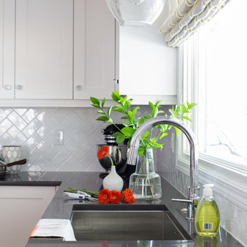
We completed this kitchen renovation for a SW. Calgary couple and as you’ll see, it was a much needed update after their 20+ years in the home.
Clearly the look of the cabinets needed to be brought up to date, but function was on the top of the list for this client. She enjoys cooking and often hosts several friends over for canning and other big cooking parties so countertop space was a priority. Seeing as they also host large family gatherings, the cook didn’t want to feel abandoned in the kitchen when everyone else was in the next room so opening up the space was crucial.
Here is what we did to change the way this space works for them…
We revised the layout of the appliances and cabinets and relocated the plumbing so she could look out the window while she stood at the sink. Taking the cabinets up to the ceiling also gave them more storage as does the large pantry next to the fridge. An island wouldn’t fit, so we added a peninsula which gave them a spot to sit to have their morning coffee and a significant amount of additional counter space. By removing the walls between the kitchen and dining room it eliminated a small hallway that separated the kitchen and dining room and allowed for an open concept in their 1960’s home.
To add visual interest to the space and to define the dining room, we added a coffered celing. Now, typically a coffered ceiling is done when you have three or four walls to anchor it in. It was a bit of a risk to add a “floating” coffered ceiling! However, it turned out beautifully. It wasn’t without it issues but I’m glad we added this element as it wouldn’t have been as interesting with a typical flat ceiling.
In the dining room, a buffet was added for additional storage as well as new drapery panels, lighting and furniture. The peacock blue end chairs are stunning! Without that punch of color the dining room just wouldn’t be as outstanding. They are so lovely and really pushed the client out of her comfort zone – but she loves them and is glad she trusted us with that design decision.
The result is a much more usable space that is also classic in style and just darn pretty to look at and be in! And I know this client is enjoying her new kitchen day to day and on special family occasions.
Adrian Shellard Photography
 Classic Kitchens Designs & Renovations Ltd.
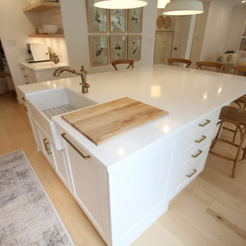
Among the list of improvements that our homeowner had in mind was a double loadbearing wall removal. The unusual existing upper floor design of the home made this one of the most challenging stuctural revisions in our company's history, but we rose to the task. Open the walls to create a large living space connected to the kitchen. After the structural revisions were complete, New Benjamin Moore painted Cabinetry was installed, complete with custom made and tiled hood to create a focal point and anchor for the look of the kitchen. A beautiful white Fireclay farm sink was then installed with Cambria quartz countertop and matching backsplash for a very clean look. White subway tile was used in key areas behind the stove and coffee bar. Natural wood floating shelves in the coffee bar area really tied the kitchen into the decor of the home. We also outfitted the family room fireplace with matching open bookshelves on both sides to really create some interest. The finished result is stunning to say the least!


 ALTER Design Studio
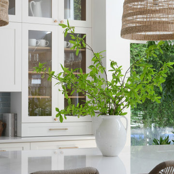
We met with our clients a few times over six months before we starting designing. They had an interesting existing layout and a very specific list of wants. We worked with their architect, re-working the home to achieve the open, light filled space they dreamed of. With roots in Australia, they wanted an elevated coastal vibe. We used muted blues, layered in texture and warm finishes - the results speak for themselves. Storage was a big challenge in the very small original kitchen. In addition to the large island and run of cabinets, we added a hidden pantry.
 Amazing Spaces
This project incorporated the main floor of the home. The existing kitchen was narrow and dated, and closed off from the rest of the common spaces. The client’s wish list included opening up the space to combine the dining room and kitchen, create a more functional entry foyer, and update the dark sunporch to be more inviting.
The concept resulted in swapping the kitchen and dining area, creating a perfect flow from the entry through to the sunporch.
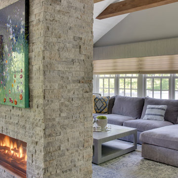
A double-sided stone-clad fireplace divides the great room and sunporch, highlighting the new vaulted ceiling. The old wood paneling on the walls was removed and reclaimed wood beams were added to the ceiling. The single door to the patio was replaced with a double door. New furniture and accessories in shades of blue and gray is at home in this bright and airy family room.
 yardscapes Inc.
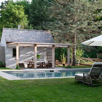
I was initially contacted by the builder and architect working on this Modern European Cottage to review the property and home design before construction began. Once the clients and I had the opportunity to meet and discuss what their visions were for the property, I started working on their wish list of items, which included a custom concrete pool, concrete spa, patios/walkways, custom fencing, and wood structures.
One of the largest challenges was that this property had a 30% (or less) hardcover surface requirement for the city location. With the lot size and square footage of the home I had limits to how much hardcover we could add to property. So, I had to get creative. We presented to the city the usage of the Live Green Roof plantings that would reduce the hardcover calculations for the site. Also, if we kept space between the Laurel Sandstones walkways, using them as steppers and planting groundcover or lawn between the stones that would also reduce the hard surface calculations. We continued that theme with the back patio as well. The client’s esthetic leaned towards the minimal style, so by adding greenery between stones work esthetically.
I chose the Laurel Tumbled Sandstone for the charm and character and thought it would lend well to the old world feel of this Modern European Cottage. We installed it on all the stone walkways, steppers, and patios around the home and pool.
I had several meetings with the client to discuss/review perennials, shrubs, and tree selections. Plant color and texture of the planting material were equally important to the clients when choosing. We grouped the plantings together and did not over-mix varieties of plants. Ultimately, we chose a variety of styles from natural groups of plantings to a touch of formal style, which all work cohesively together.
The custom fence design and installation was designed to create a cottage “country” feel. They gave us inspiration of a country style fence that you may find on a farm to keep the animals inside. We took those photos and ideas and elevated the design. We used a combination of cedar wood and sandwich the galvanized mesh between it. The fence also creates a space for the clients two dogs to roam freely around their property. We installed sod on the inside of the fence to the home and seeded the remaining areas with a Low Gro Fescue grass seed with a straw blanket for protection.
The minimal European style custom concrete pool was designed to be lined up in view from the porch and inside the home. The client requested the lawn around the edge of the pool, which helped reduce the hardcover calculations. The concrete spa is open year around. Benches are on all four sides of the spa to create enough seating for the whole family to use at the same time. Mortared field stone on the exterior of the spa mimics the stone on the exterior of the home. The spa equipment is installed in the lower level of the home to protect it from the cold winter weather.
Between the garage and the home’s entry is a pea rock sitting area and is viewed from several windows. I wanted it to be a quiet escape from the rest of the house with the minimal design. The Skyline Locust tree planted in the center of the space creates a canopy and softens the side of garage wall from the window views. The client will be installing a small water feature along the garage for serene noise ambience.
The client had very thoughtful design ideas styles, and our collaborations all came together and worked well to create the landscape design/installation. The result was everything they had dreamed of and more for their Modern European Cottage home and property.
 Amazing Spaces
This project incorporated the main floor of the home. The existing kitchen was narrow and dated, and closed off from the rest of the common spaces. The client’s wish list included opening up the space to combine the dining room and kitchen, create a more functional entry foyer, and update the dark sunporch to be more inviting.
The concept resulted in swapping the kitchen and dining area, creating a perfect flow from the entry through to the sunporch.
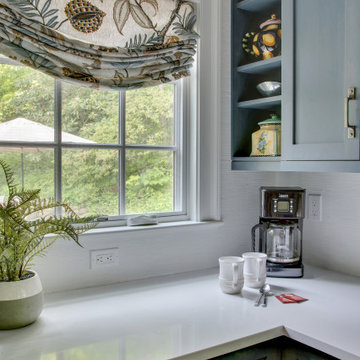
The new kitchen features blue-gray cabinets with polished white countertops and a white island with a dramatic Cielo Quartzite countertop. The soffit above features stained shiplap, helping to create the boundary of the kitchen. Custom window treatments and rattan chairs make the space feel casual and sophisticated.
 Alloy Architecture & Construction
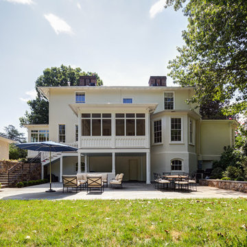
Originally built in 1859 by Justice William J. Robertson and listed on the National Register of Historic Places in 1999, this home has elements of both the Italianate and Gothic Revival styles which were taken into consideration during the design process.
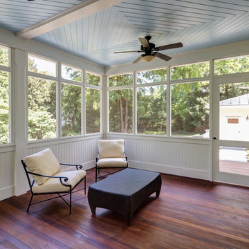
The project consisted of three main components: a basement renovation, a new screened in porch and a new two car garage.
For the basement renovation we removed the original brick floor which was causing moisture issues and replaced them with an insulated, colored concrete slab. The end result: a previously unusable space was transformed into a family room with a complete guest suite and an exercise room.
In the guest bedroom, low ceilings due to existing duct work were strategically wrapped with stained pine tongue and groove creating a cozy sleeping nook. In the bathroom, subway tiles and lightly stained wood are the background to a livelier tile accent in the shower and around the vanity.
The family room features floor to ceiling millwork piece that has several storage cubbies; some with doors to conceal and others open for display.
The screened porch is located at the back of the house overlooking a new stone patio at the lower level yard. The new porch takes cues from the existing sun room by matching materials, colors, and proportion. The new porch off the living room allows the clients to sit and relax while staying close to their children when inside or playing in the yard.
The garage was built using the same material palette and style of the house but set back so as to not to detract from the main house. With large sliding barn doors on the back, it opens up to a manicured lawn allowing the garage to double as a pavilion for outdoor entertaining and yard parties. Alloy worked with Water Street Studio, a local architectural landscaping firm, to create more inviting and usable spaces for the children and adults to enjoy.
Andrea Hubbel Photography
 Alloy Architecture & Construction
Originally built in 1859 by Justice William J. Robertson and listed on the National Register of Historic Places in 1999, this home has elements of both the Italianate and Gothic Revival styles which were taken into consideration during the design process.
The project consisted of three main components: a basement renovation, a new screened in porch and a new two car garage.
For the basement renovation we removed the original brick floor which was causing moisture issues and replaced them with an insulated, colored concrete slab. The end result: a previously unusable space was transformed into a family room with a complete guest suite and an exercise room.
In the guest bedroom, low ceilings due to existing duct work were strategically wrapped with stained pine tongue and groove creating a cozy sleeping nook. In the bathroom, subway tiles and lightly stained wood are the background to a livelier tile accent in the shower and around the vanity.
The family room features floor to ceiling millwork piece that has several storage cubbies; some with doors to conceal and others open for display.
The screened porch is located at the back of the house overlooking a new stone patio at the lower level yard. The new porch takes cues from the existing sun room by matching materials, colors, and proportion. The new porch off the living room allows the clients to sit and relax while staying close to their children when inside or playing in the yard.
The garage was built using the same material palette and style of the house but set back so as to not to detract from the main house. With large sliding barn doors on the back, it opens up to a manicured lawn allowing the garage to double as a pavilion for outdoor entertaining and yard parties. Alloy worked with Water Street Studio, a local architectural landscaping firm, to create more inviting and usable spaces for the children and adults to enjoy.
Andrea Hubbel Photography
 Kitchens by Good Guys
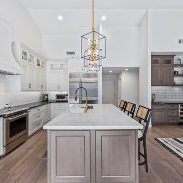
Our San Ricardo project was a massive remodel where we collaborated with the homeowner’s general contractor to complete our client’s vision. The client’s desire was to open the kitchen, extend the laundry room, install a large island, and have a beautiful bar.
We came alongside the contractor and designed a floor plan where we moved the laundry room wall and an exterior wall for new glass sliding doors. We also planned to clean up the bar area that housed more drywall than any functioning cabinetry. The homeowner’s contractor took care of the exterior walls and demolition of the project. They also took care of the whole house flooring as well.
By doing all these revisions, we were able to accomplish the client’s wish list. For the finishes, they chose soft white paint for the perimeter and an alder stain for the island and the bar. Both the island, perimeter, and bar are beaded inset shaker door. To add contrast, dark brown quartz countertops were installed on the perimeter with the painted cabinets and white marble like quartz were chosen to go on the island and bar. For texture, a square mosaic tile was picked for the kitchen that is a warm white with light distressing and the bar has a similar vibe but is a skinny rectangle shape. Gold accents in the hardware and plumbing add to the chic detailing of the design. In the pantry, we removed the doors of the new base cabinets and just kept the rollouts for easy access. Every detail in this kitchen adds just another layer to the timeless design.
Overall, we loved getting to help accomplish our clients dream kitchen and the result is gorgeous
 Housetrends Magazine
Since moving into her Dublin home two and a half years ago, Nancy Sanford has been peeling off the decades—quite literally. Built in the 1980s, the home was “very well-maintained, but very little had been done to it” in terms of updating the finishes or style, Sanford says. Plush white carpet ran from wall-to-wall-to-wall, almond-colored laminate coated the kitchen cabinets and wallpaper ran rampant—even covering some ceilings.
Despite her efforts, Sanford knew it was going to take more than cosmetic editing to shake the ‘80s and make the home her own. Although she lives in the traditional-leaning Muirfield community, Sanford adores a minimalist, contemporary style—and admits to devouring design magazines “ad nauseam.”
To implement her thoroughly modern vision, Sanford turned to Brigid Norton, an interior designer and family friend, and Kristi Youles, a kitchen designer with The JAE Company. Working together, the trio created a carefully considered contemporary design that’s easy on the eyes, and the body.
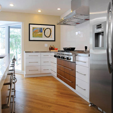
In addition to improving the flow of the kitchen—by removing a V-shaped peninsula that angled out into the room—and adding appliances like a stainless steel refrigerator, Sanford’s short list of must-haves included clean, uncluttered lines and no wall cabinets over the countertops. “I’ve found as I’ve aged, I’ve gotten shorter and just don’t use the upper cabinets,” Sanford explains.
Easy-access, smooth-slide drawers with clean slab fronts were the answer—resulting in strong visual lines, an open, airy feel and enhanced ergonomics. Starting with a “needs assessment,” Youles and Norton designed the space quite literally around Nancy. By looking at factors such as her height and which items she uses most frequently, they were able to determine the optimum placement for everything from canned goods in the pantry to cutlery, pans and plates in the customized drawers, all of which helped to achieve the ultimate kitchen organization.
But there’s more to the kitchen cabinets smooth façade than clean-lined storage. Walnut drawer fronts—found on the oven and the base of the island—are book-matched, allowing the grain to continue from drawer to drawer. And even in spaces where drawers weren’t feasible, beneath the sink and in a desk area, the designers continued the look with cabinet doors crafted to resemble drawers.
The visual continuity of these lines might not be as impactful if it weren’t for the careful selection of contrasting finishes. The designers filled the space with pure, glossy white—using a specific type of quartz, White Cliff by Cambria, to accent the bold rectangular design of the island. Then, to break up the expanse of accompanying white painted drawers, walnut was selected to bring the contrasting warmth and grain of wood without red undertones. It is commonly found in modern furniture design, as well as current productions of mid-century designs like the iconic Eames Lounge Chair from Herman Miller, Youles says.
 Tom Brzoskwinia
Reviving Unique Reclaimed Hardwood Floors in Homer Glen, Illinois.
We’re excited to share the successful completion of a stunning project: the refinishing of reclaimed hardwood floors and stairs by Tom & Peter Flooring, Inc.
This transformation was showcased by Lägler North America.
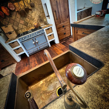
Using a custom color Bona stain combined with the Bona HD Traffic finish, we’ve created a breathtaking result.
The surface still bears the original saw marks and patina, showcasing a captivating blend of textures—from the rustic, dark tones of the original wood to the smooth, bright grains that emerge after refinishing.
This grade of wood is not only durable but also rich in character, adding an unparalleled charm to any space.
Another thrilled customer joins our list!
Our flooring services include a no-obligation site visit, prompt quotations, and expert advice—all at no cost to you.
Ready to breathe new life into your floors? Call us at (773) 805-2288 to speak with Tom, who can arrange a free assessment for your floor sanding or wood floor fitting service at a time that works for you. Let us help you revitalize your space!
 Tile Doctor Ltd
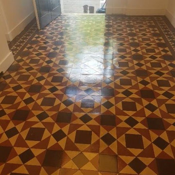
These are photos of a Victorian tiled floor we renovated at the new Scottish head office of the Peoples Postcode Lottery in the centre of Edinburgh City where the building was going through a multi million pound refurbishment. Edinburgh has a lot of Georgian and Victorian architecture, much of which is listed and as a result many still have original Victorian tiled flooring.
I’ve not really looked at the Postcode Lottery until now but put simply you give the lottery £10 a month and your postcode is your winning ticket number, there are prize draws every day and if your postcode comes up every one in the system with that postcode wins; they also give 31% to charity which is impressive.
You can see from the photograph that the floor was in good physical condition but was looking tired and dull. This is not unusual for Victorian tiles as once the sealer wears down dirt can penetrate into the pores of the tile causing it to lose its appearance.
On the first day we set about stripping the floor of what remained of the old sealant using a strong dilution of Tile Doctor Pro-Clean which is an industrial strength alkaline tile and grout cleaning product that is safe to use on Tile and Stone. The product is applied to the floor, left to soak in for ten minutes and the scrubbed into the tile using a black scrubbing pad fitted to a rotary bonnet machine. The floor was then rinsed and the now soiled cleaning solution extracted using a wet vacuum.
The process was repeated several times until we were happy the floor was clean and free of sealer and then given a final rinse with water. Before leaving for the day the floor was dried as much as possible using the wet vacuum to extract as much moisture as possible.
On the second day our first task was to check the floor with a damp meter in several places to ensure the tiles had dried off overnight. All was well and we began the process of sealing the floor with a Tile Doctor Seal and Go. This is a topical sealer which provides a high-quality low-sheen finish and protection against ingrained dirt and stains.
Victorian tiles are quite porous and five coats were needed to fully seal the floor. This took some time to complete as you have to wait until the first coat is dry before applying the next however it was well worth the effort as the floor looked fantastic afterwards.
Thomas Wilson
Edinburgh Tile Doctor
 yardscapes Inc.
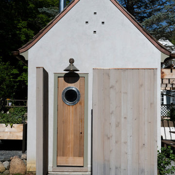
I was initially contacted by the builder and architect working on this Modern European Cottage to review the property and home design before construction began. Once the clients and I had the opportunity to meet and discuss what their visions were for the property, I started working on their wish list of items, which included a custom concrete pool, concrete spa, patios/walkways, custom fencing, and wood structures.
One of the largest challenges was that this property had a 30% (or less) hardcover surface requirement for the city location. With the lot size and square footage of the home I had limits to how much hardcover we could add to property. So, I had to get creative. We presented to the city the usage of the Live Green Roof plantings that would reduce the hardcover calculations for the site. Also, if we kept space between the Laurel Sandstones walkways, using them as steppers and planting groundcover or lawn between the stones that would also reduce the hard surface calculations. We continued that theme with the back patio as well. The client’s esthetic leaned towards the minimal style, so by adding greenery between stones work esthetically.
I chose the Laurel Tumbled Sandstone for the charm and character and thought it would lend well to the old world feel of this Modern European Cottage. We installed it on all the stone walkways, steppers, and patios around the home and pool.
I had several meetings with the client to discuss/review perennials, shrubs, and tree selections. Plant color and texture of the planting material were equally important to the clients when choosing. We grouped the plantings together and did not over-mix varieties of plants. Ultimately, we chose a variety of styles from natural groups of plantings to a touch of formal style, which all work cohesively together.
The custom fence design and installation was designed to create a cottage “country” feel. They gave us inspiration of a country style fence that you may find on a farm to keep the animals inside. We took those photos and ideas and elevated the design. We used a combination of cedar wood and sandwich the galvanized mesh between it. The fence also creates a space for the clients two dogs to roam freely around their property. We installed sod on the inside of the fence to the home and seeded the remaining areas with a Low Gro Fescue grass seed with a straw blanket for protection.
The minimal European style custom concrete pool was designed to be lined up in view from the porch and inside the home. The client requested the lawn around the edge of the pool, which helped reduce the hardcover calculations. The concrete spa is open year around. Benches are on all four sides of the spa to create enough seating for the whole family to use at the same time. Mortared field stone on the exterior of the spa mimics the stone on the exterior of the home. The spa equipment is installed in the lower level of the home to protect it from the cold winter weather.
Between the garage and the home’s entry is a pea rock sitting area and is viewed from several windows. I wanted it to be a quiet escape from the rest of the house with the minimal design. The Skyline Locust tree planted in the center of the space creates a canopy and softens the side of garage wall from the window views. The client will be installing a small water feature along the garage for serene noise ambience.
The client had very thoughtful design ideas styles, and our collaborations all came together and worked well to create the landscape design/installation. The result was everything they had dreamed of and more for their Modern European Cottage home and property.
 Inspired Interiors
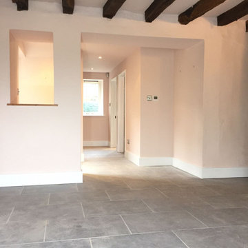
Over 400 years old, this Grade II listed thatched Cottage sprang a series of serious, under-floor leaks on the ground level – the result of poor under-floor heating pipework. All the central living area rooms were affected, making the cottage decidedly soggy and uninhabitable until fully repaired and restored.
Flooring and decorations complete.
 Simplicity by Hayden Homes
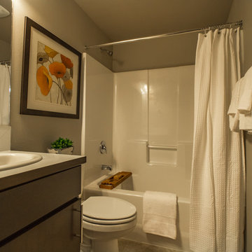
When this investor purchased the land that is now Turtle Creek, it was surrounded by multi-family house-like dwellings with great curb appeal. A large city park was adjacent as well. Simplicity was able to maximize the use of the land by building the single family dwellings in our signature “cottage community” style, creating a cozy space for renters that also made best use of the land available for the investor. The result was a 20-home subdivision with tiny homes ranging from 400-880sf that rented at 100% occupancy with a waiting list.
55