
Search results for "Resultant listing" in Home Design Ideas
 Truitt and White Window and Door Showroom
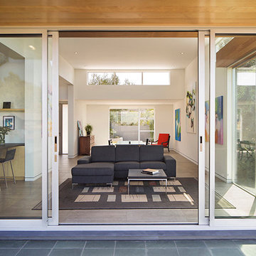
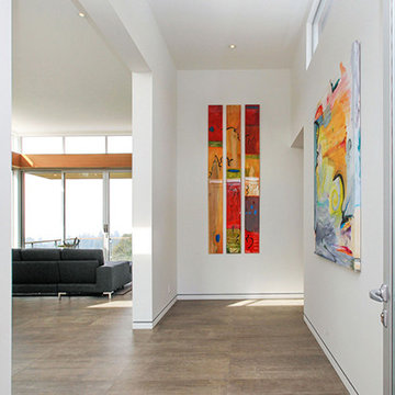
This hillside home in Piedmont, CA was remodeled to change the style from a 1940's rancher with eight foot ceilings and dark interiors, into a modern geometric composition with vast white interiors for casual living and generous daylighting for displaying the artist-owner's works.
In a city known for rigorous and difficult design review, an addition, two variances, and a full stylistic change were unanimously approved on the first round. All sloped roofs and attics were eliminated and replaced by a series of stacked and overlapping flat roofs. This made the house taller on the inside and shorter on the outside, which helped earn design review cooperation in the community. Windows were concentrated toward the rear yard views or moved up high on the side walls for daylight and privacy, benefitting the owners as well as the neighbors.
At the start, the owner husband was so enthusiastic and engaged in transforming his house into something modern that he presented the architect with a scaled foamcore model, rather than the usual magazine clippings and wish list. He participated in the design decisions throughout the process. The owner wife is the artist who did all the artwork in the house. She had been craving a display space with large walls and good natural light. Both of them loved the location and great views.
The project was an opportunity to transform the style of an older traditional home into a modern one, while solving numerous problems. By rebuilding the 1800 ft2 top of the 3-story home it was possible to change the style of the whole building, since the lower floors were a neutral base, and also to change the lifestyle of the owners, who wanted to move their master suite upstairs and live primarily on the top floor as empty nesters.
Going into the project, the architect knew there were multiple encroachments into the setbacks and potential privacy issues with close by neighbors. He approached this as a complex puzzle made up of architectural and political pieces which all had to fit together elegantly. It took many careful moves, small and large, to arrive at a serene and cohesive result that tied old and new together seamlessly.
The design-build contractor worked closely with the owners and handled all of the construction phase documents and design adjustments, adding ideas of their own to make the project really sing.
The project was a collaboration in three acts. The owner had a strong design concept from the start. The architect developed it into a realistic project and garnered the design approvals. Then the contractor executed brilliantly
 Drexel Building Supply
The Results:
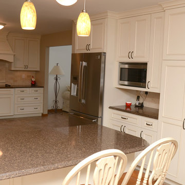
Our Drexel Designers provided an exceptionally functional kitchen that included every item on the wish list except the island. The Millers might consider a move-able island in the future.
Cabinetry
•Dura Supreme: Crest Wood
•Door & Drawer Style: Vintage panel
•Finish: Classic White with Accent
Counter Tops
•Hanstone: Auburn Abyss
 TradesGenie Contracting inc
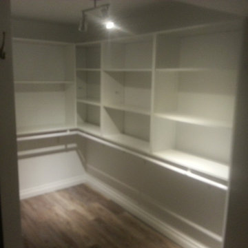
Great result for a very low budget basement renovation, income suite, Everything plumbing, electrical and environmental that needed to be changed in this old house was changed but nothing more. Then we finished all surfaces using materials on site, miss tint paint and materials that were on sale. Unit had multiple rental applications submitted on first day of listing.
Find the right local pro for your project
 Renovisions
The owners of this outdated 1960’s kitchen were ready for a change and sought out Renovisions after seeing one of their eye-catching ads in South Shore Living Magazine. It was time to start fresh with a cleaner and brighter look with more functional storage. The professionals at Renovisions worked as a team to accommodate their wishes while being mindful of their existing traditional styled furnishings.
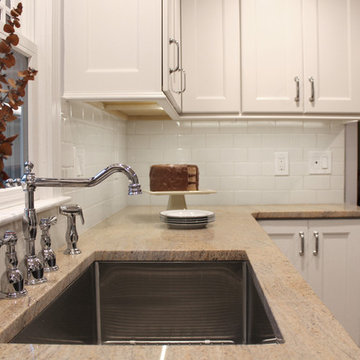
Keeping a similar layout, the old cabinets, flooring, countertops, door, window and appliances were removed as well as the wall between the kitchen and dining room to accommodate additional cabinets while creating an L for more useful countertop space. Replacing the worn stained wooden door and double hung window with a new prairie-style window and breezeway door in white finish was the first order of business. By replacing the tired vinyl floor with new oak wood floors the space became warm & inviting. The beautiful new white painted shaker-style cabinets look fabulous with the natural ivory-tan blend granite countertops and sleek stainless steel appliances. Simple, yet elegant white subway tiles provide a serene and open feel to the space. Creating a small niche area behind the slide-in range was also at the top of our clients list to accommodate the spices they use daily, turning an ordinary look to extraordinary.
Pesto change-o, as if by magic Renovisions transformed this dated tight-fit kitchen into a warm and inviting better functioning space that is definitely pleasing to the eyes of these homeowners who are thrilled with the end result and grateful for the high quality work along with the professional manner in which their project was completed.
“Thanks to you, Ed, Mike, and Liz for all your hard work. The kitchen is beautiful and I love the backsplash! The whole room looks beautiful, I'm so glad that we went with the white subway tiles in the end. They're light and clean and really pretty. Thanks for everything, Cathy. Your team has done a wonderful job! We appreciate all your help and hard work.”
- Bea R. (Hanson)
 CCdesign Partnerships
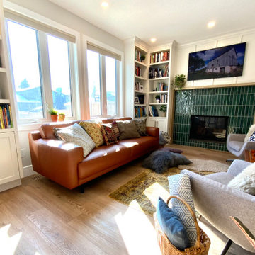
A modern country home for a busy family with young children. The home remodel included enlarging the footprint of the kitchen to allow a larger island for more seating and entertaining, as well as provide more storage and a desk area. The pocket door pantry and the full height corner pantry was high on the client's priority list. From the cabinetry to the green peacock wallpaper and vibrant blue tiles in the bathrooms, the colourful touches throughout the home adds to the energy and charm. The result is a modern, relaxed, eclectic aesthetic with practical and efficient design features to serve the needs of this family.
 3D Design Edge
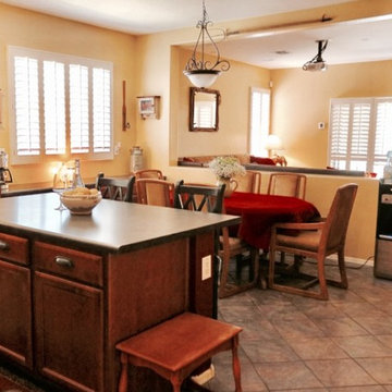
This transitional staging project was so much fun. For starters we generated a workable plan to get the client top dollar for their listing. Our clients decided to trust the process and moved forward with all of our staging suggestions per the written plan we generated for them. The successful Staging Resulted in a first showing offer, above asking! To get started we removed excess furniture and any items that might detract from the desired staging direction. The clients received full asking with a standard close date and all parties involved were very pleased with the outcome.
 Paradise Found Construction
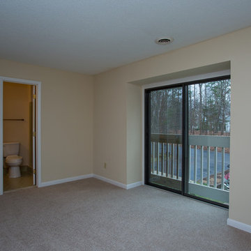
Jesse had inherited his townhome, and had lived there for several years. His career took him to another state, and the home was unoccupied for over a year. He decided that he would not return to Raleigh and that it was time to sell.
The 1975 home still had the original kitchen and baths, and was in need of general repair and new flooring. The HVAC system, water heater, and washer and dryer had been replaced as they aged and became non-functional, and the exterior had been maintained by the Home Owner’s Association. Jesse wanted to update the home and have it sell as quickly as possible, so we got to work determining what the best use of the budget would be to accomplish this goal.
We focused on updating the major interior design elements that would provide the most enjoyment, durability, and energy efficiency for the new homeowners.
We started with completely gutting the Kitchen and reconfiguring it by moving the refrigerator into the laundry area, and stacked the washer and dryer to save space. We replaced all of the old vinyl cabinets with durable natural wood cabinetry, and added granite counter tops and a stainless steel sink. We also removed the ceiling-hung cabinets over the counter peninsula to open up the Kitchen and bring in more light and facilitate better flow and interaction, and added a floor-to-ceiling Pantry Closet to make up for the lost storage space. All of the Kitchen appliances were replaced with new energy efficient models.
We next gutted the downstairs Powder Bath and replaced the vinyl vanity with matching cabinetry with the kitchen, and replaced the toilet (as well as all other toilets in the home) with an EPA WaterSense rated low-flow toilets. We removed the wallpaper and finished the walls smooth, replaced the lighting and mirror, and removed the carpet and installed a porcelain tile floor.
The second floor 2nd Bedroom had been left open to the Great Room with a balcony and accordion door for privacy, but it left the room open to all of the noise from the Great Room and Kitchen. In order to make the room function as a private bedroom, we removed the balcony and installed a full wall in its place.
Replacing all of the flooring was also at the top of the list, as was general repair on the walls and new paint throughout. We installed natural oak flooring in the Great Room and porcelain tile in the entry foyer. The seals on several of the exterior windows and the Master Bedroom sliding door had been compromised and needed to be replaced, as well as several interior doors and repair of all the louvered closet doors. The two upstairs Baths were functionally sound and the tile was in good shape. We replaced the toilets with EPA WaterSense rated low-flow toilets, and painted the vanities with a brighter color palette.
The end result was bright, open, and comfortable updated home ready for its new occupants.
Design Features
Durable and handsome natural wood cabinetry.
Granite Kitchen and Powder countertops.
Stainless Kitchen appliances and white refrigerator.
Stainless Kitchen sink and brushed nickel faucets.
Brushed Nickel cabinetry and door hardware.
Low-flow EPA WaterSense rated toilets.
Light and bright natural hardwood flooring.
Porcelain tile and luxury vinyl flooring.
New carpet.
Private 2nd Bedroom.
Light and bright No-VOC paints and finishes.
Energy Efficient and Green Features
Energy efficient EPA Energy Star appliances.
EPA WaterSense rated low-flow toilets.
Energy efficient EPA Energy Star windows and door.
Durable No-VOC cabinetry.
Durable porcelain tile flooring.
Low-flow faucets.
Energy efficient CFL lighting throughout.
No-VOC paints and finishes.


 Drury Design
The Setup:
After purchasing this home, the homeowners faced a unique opportunity to reimagine their kitchen and nearby spaces. Water damage from a burst pipe had left much of the home’s interior in need of repair, and while the existing kitchen was functional and in relatively good shape, it didn’t align with the family’s vision for their new home. The layout included a peninsula that wasn’t ideal, and there were some druthers with the nearby pantry.
Since the space needed to be rebuilt anyway, the homeowners saw this as a chance to create a kitchen that was both highly functional for their four young children and timeless in its design. The project also included a refresh of the adjacent message center and dining room — spaces that play key roles in the family’s daily life. The goal was to create a cohesive flow between these areas, balancing modern functionality with the craftsman-inspired character of the rest of the home.
Design Objectives:
- Replace the outdated peninsula with a large island to maximize counter space and create new seating options.
- Open up the space visually by removing soffits and rethinking the cabinetry layout.
Incorporate concealed refrigeration and freezer units to provide significant storage for the family while maintaining a streamlined aesthetic.
- Integrate black cabinetry into the design without making the space feel harsh or heavy.
- Ensure the lighting plan balances functional task lighting with ambient accent lighting.
- Avoid visual clutter in the cabinetry design while still giving a nod to the craftsman aesthetic.
- Incorporate a slab backsplash as a key design feature.
Design Challenges:
- The outdated peninsula left dead space in the kitchen and lacked sufficient seating for the family.
- The cooktop wall was cramped, with small cabinets flanking the hood, limited storage, and soffits that made the space feel closed-in.
- The family needed significant refrigeration space (two refrigerators and a freezer) but wanted to avoid a cluttered look with visible stainless steel appliances.
- Adding black cabinetry risked making the space feel too dark or heavy.
- The original lighting plan was insufficient, particularly over the dining table where a decorative fixture proved too dim.
- The family wanted shaker-style drawer fronts to match the home’s arts-and-crafts design but worried that too much shaker cabinetry might look overly busy.
- Prioritizing a slab backsplash in the wish list priority planning.
The Renewed Space
Design Solutions:
- A functional island: The peninsula was replaced with a large island that provides continuous countertop space for prepping and serving. The island also features seating for four people, creating a central hub for informal meals and activities.
- Streamlined cooktop wall: The soffits were removed, and the upper cabinets on the cooktop wall were eliminated to create a more open, streamlined design. A custom oversized hood became the focal point of the wall, with the blower unit offset inside it to align with the cooktop while maintaining exterior visual symmetry.
- Concealed refrigeration: Two column refrigerators and one freezer were integrated into the cabinetry, concealing them behind wood paneling that blends seamlessly with the overall design.
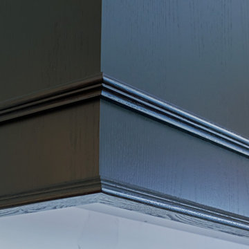
- Warm black cabinetry: The black cabinetry was crafted from hickory with a visible grain, softening its appearance and adding warmth. The grain detail gives the cabinetry a rich, textured look that avoids feeling stark or overpowering.
- Additional lighting: In the dining area, recessed can lights were added during an additional installation phase to supplement the gorgeous decorative fixture’s dim output. The new lighting plan creates a layered effect, combining functional task lighting with softer ambient lighting.
- Simplified cabinetry details: Slab drawer fronts were used on the upper drawers, while five-piece shaker fronts (with slightly less prominent rail and stile pieces) were reserved for the middle and lower drawers. This approach simplified the overall look while maintaining the craftsman-inspired aesthetic.
- Slab backsplash priority: The slab backsplash was prioritized by making thoughtful adjustments elsewhere, like opting not to extend cabinetry to the ceiling, which also helped visually prioritize the gorgeous slab backsplash. This decision also enhanced the kitchen’s furniture-like feel, aligning with the home’s craftsman character.
- This kitchen perfectly balances practicality with timeless style. By addressing the family’s functional needs — ample seating, smart storage, and effective lighting — while incorporating thoughtful design elements like warm black cabinetry and a striking slab backsplash, Alicia created a space that works beautifully for a busy household. The result is a cohesive, inviting kitchen that honors the home’s craftsman roots and will serve the family well for years to come.
 Classic Kitchens Designs & Renovations Ltd.
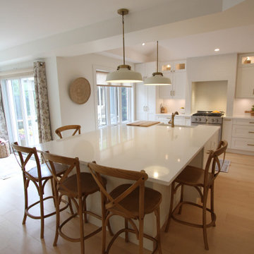
Among the list of improvements that our homeowner had in mind was a double loadbearing wall removal. The unusual existing upper floor design of the home made this one of the most challenging stuctural revisions in our company's history, but we rose to the task. Open the walls to create a large living space connected to the kitchen. After the structural revisions were complete, New Benjamin Moore painted Cabinetry was installed, complete with custom made and tiled hood to create a focal point and anchor for the look of the kitchen. A beautiful white Fireclay farm sink was then installed with Cambria quartz countertop and matching backsplash for a very clean look. White subway tile was used in key areas behind the stove and coffee bar. Natural wood floating shelves in the coffee bar area really tied the kitchen into the decor of the home. We also outfitted the family room fireplace with matching open bookshelves on both sides to really create some interest. The finished result is stunning to say the least!

 Bee Design
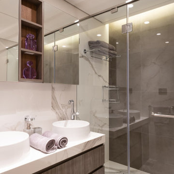
Renovating a new bathroom is quite a challenge when considering the importance of the performance and esthetics should be.
To keep all water stations in coherence and in function with each other while having that relaxing smooth feeling is the key substance for a successful new beautiful bathroom at your home.
Try Bee Design to renovate your bathroom.
Bee Design is a virtual interior design company.
It provides a selection of interior design packages from plan layout, mood board to visual images. The final outcome is a curated shopping list especially selected for the room with guidance to purchase and execute.
Bee Design is delegated to manage budget and time schedule to achieve better results and performance according to customer’s request.
It’s online collaboration with well-known brands and suppliers helps to enhance any space.
The website has an action button for a free consultation call with an email and portal tool for further communication.
Bee Design is across the U.K market making it possible for anyone to design their home through virtual communication.
www.beedesign.uk
#bathroomrenovation #bespokebathroom
#interiordesigncompaniesuk #virtualinterioirdesign #interiordesigninchiswick #moderninteriordesign #virtualdesignservices #bespokekitchendesign #bespokeinteriordesign #bespokebedroomdesignlondon #bespokeroomdesign #interiordesignservices #homeinteriordesignonline #roominteriordesignforairbnb #airbnbdecoratingservces #airbnbdecoratingservices #airbnbbedroomdesign #airbnbhomedecor #homedecorideas
 Alair Homes Milwaukee
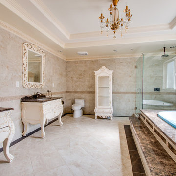
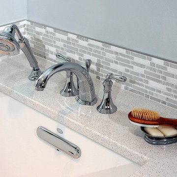
This Master Suite Addition project was initiated by our Clients’ desire to stay in their family home well into their golden years. Their wish list included a master suite and large open space for entertaining. With “Aging in Place” a main objective, our goal was to move all essential tasks to the first floor. Our design created a smooth transition between old house and new by expanding their dining room and adding a vestibule between the two spaces. This resulted in a much larger dining space and the larger entertaining area they were seeking. The master bedroom’s floor to ceiling windows on two of the walls frames picturesque views of their beloved garden outside. Vaulted ceilings, French doors to the bathroom with a transom window above express class and grandeur. Through the French doors the elegant master bathroom shines with reflections from the decorative crystal chandelier, white and grey tile, polished chrome fixtures and lighted glass bowls. A double headed shower, with dual temperature controls, and the air-jetted tub provide a true sanctuary for a relaxed bathing experience. “His and Her” elements are also fulfilled with dual vanities, and dual toilet areas. Upon completion, the homeowners passionately stated that this project turned out even better than they could have imagined. They truly love their new space in their long loved home and look forward to many more years in their new haven.
 User
UserThis hillside home in Piedmont, CA was remodeled to change the style from a 1940's rancher with eight foot ceilings and dark interiors, into a modern geometric composition with vast white interiors for casual living and generous daylighting for displaying the artist-owner's works.
In a city known for rigorous and difficult design review, an addition, two variances, and a full stylistic change were unanimously approved on the first round. All sloped roofs and attics were eliminated and replaced by a series of stacked and overlapping flat roofs. This made the house taller on the inside and shorter on the outside, which helped earn design review cooperation in the community. Windows were concentrated toward the rear yard views or moved up high on the side walls for daylight and privacy, benefitting the owners as well as the neighbors.
At the start, the owner husband was so enthusiastic and engaged in transforming his house into something modern that he presented the architect with a scaled foamcore model, rather than the usual magazine clippings and wish list. He participated in the design decisions throughout the process. The owner wife is the artist who did all the artwork in the house. She had been craving a display space with large walls and good natural light. Both of them loved the location and great views.
The project was an opportunity to transform the style of an older traditional home into a modern one, while solving numerous problems. By rebuilding the 1800 ft2 top of the 3-story home it was possible to change the style of the whole building, since the lower floors were a neutral base, and also to change the lifestyle of the owners, who wanted to move their master suite upstairs and live primarily on the top floor as empty nesters.
Going into the project, the architect knew there were multiple encroachments into the setbacks and potential privacy issues with close by neighbors. He approached this as a complex puzzle made up of architectural and political pieces which all had to fit together elegantly. It took many careful moves, small and large, to arrive at a serene and cohesive result that tied old and new together seamlessly.
The design-build contractor worked closely with the owners and handled all of the construction phase documents and design adjustments, adding ideas of their own to make the project really sing.
The project was a collaboration in three acts. The owner had a strong design concept from the start. The architect developed it into a realistic project and garnered the design approvals. Then the contractor executed brilliantly.
 Byggmeister Inc
Photo by Mike Casey
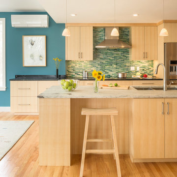
Cramped, uncomfortable, and out of date: when the owners of this home approached us about renovating their kitchen and adjoining sunroom, these were high on their list of complaints.
OPENING UP THE KITCHEN
Our plan kept the kitchen in the same location but took down the walls between both the dining room and the sunroom to create an expansive multi-purpose space with spectacular views to conservation land along the back of the property. We removed the powder room and in its place created a window-lined hallway to the living room—opening up direct access between these two previously disconnected spaces. We then built a new half bath between these two rooms, with a door along the back hallway. The result is a more private powder room that is easier to access than before.
Significantly improved cabinetry provides ample storage for both human and canine needs. An island countertop is functional and pleasant, enabling the owners to prep for and clean up from dinner all while enjoying the view of the woods behind their house.
CREATING COMFORT
We also completely rebuilt the sunroom, thickening the framing to allow for extra insulation and raising the roof to accommodate a higher ceiling and tall windows that let in as much natural light as the skylights they replaced, but much less of the solar gain that had made the room so intolerable in the summer.
We improved visual connections between spaces and admitted more natural light by converting the framing of the main stairway from full to half walls. We also insulated the attic and replaced an aging, inefficient central air conditioning system with ductless minisplit heat pumps, which can also be used as supplemental heat.
All in all, this was our kind of project: we made the home more attractive, more comfortable, and more energy-efficient—all over the course of a single, well-integrated project.
 Seacliff Construction & Design
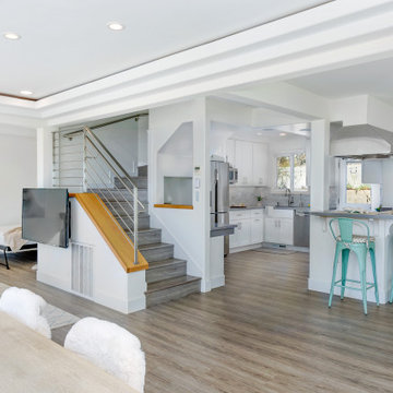
This beach home was originally built in 1936. It's a great property, just steps from the sand, but it needed a major overhaul from the foundation to a new copper roof. Inside, we designed and created an open concept living, kitchen and dining area, perfect for hosting or lounging. The result? A home remodel that surpassed the homeowner's dreams.
Outside, adding a custom shower and quality materials like Trex decking added function and style to the exterior. And with panoramic views like these, you want to spend as much time outdoors as possible!
 JRP Design & Remodel
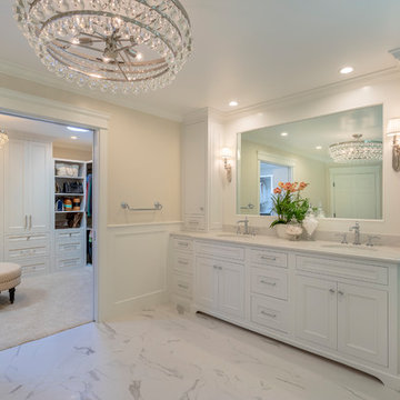
Our clients were living with outdated, dark bathrooms in their newly purchased Falling Star home. The dull palette of warm neutrals did not reflect the couple’s East Coast traditional style. They noticed several renovation projects by JRP in the neighborhood. The professionalism and the process impressed them. After receiving a Pardon Our Dust courtesy letter from JRP, the couple decided to call for a consultation. Their wish list was clear. They wanted the Falling Star design to be light, airy, and white. It had to reflect their East Coast roots. Working with the original footprint, JRP completely transformed the space, creating a tranquil primary suite rich with traditional detail. The result is an effusive celebration of classic style.
Now, the radiant rooms glow. To enlarge the primary closet, the JRP team removed a cluttered storage area. Inside, a separate dressing space is finished with upgraded storage and refined built-in cabinetry with recessed panels. Pops of glam such as Robert Abbey glass chandeliers and brilliant bits of chrome are moored by traditional elements like crown molding, porcelain tiles, and a quartz-clad drop-in soaking tub. Large windows in the primary bath and funnel skylights in the closet harness the natural light to stunning effect, sweeping the rooms with the cool feeling of fresh air. The “Sail Cloth” white paint adds soft depth to the uncomplicated elegance of both rooms.
PROJECT DETAILS:
• Style: Transitional
• Countertops: Vadara Quartz – Calacatta Dorado
• Cabinets: DeWils Recessed-panel, painted white
• Hardware/Plumbing Fixture Finish: Chrome
• Lighting Fixtures:
Master Closet: Skylight Sun Tunnel
Master Bath: Robert Abbey, Glass Chandelier
• Flooring:
Floor: Calacatta Dorado Porcelain Tiles w/Accent
• Tile/Backsplash: Shower Surround: Ceramic Blanc/Crackle
• Paint Colors:
Master Bath & Closet: Dunn Edwards Sail Cloth
Hall Bath: Benjamin Moore Ballet White
• Other Details: Drop-in soaking Tub
Photographer: J.R. Maddox
 TV Lift Cabinet by Cabinet Tronix
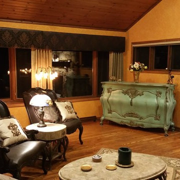
Being in business doing TV lift cabinet furniture for 13 years, the rewards of happy clients, building relationships and getting to be creative never gets old. This was a great project and as I, the client is very happy with their 100% hand carved pop up TV motorized designer piece.
We worked back and forth for months on getting the finish just perfect and so glad we all were patient and wanted the same outcome. The result from this piece was nothing short of exciting and stunning.
Cabinet Tronix, ship anywhere, specializes in tailor made pieces where we take all elements from furniture design, TV size, components, space constraints, custom and included finishes into consideration. Furniture pieces alone can be ordered.
Answers from a handful of questions sets the entire project scope up quickly. Any of our designs can be changed in size, finish, placed at the foot of the bed ... against as wall or window, next to a fire place and as a room divider or centrally located in the middle of the room.
We use Logitect Harmony Ultimate home as our remote or can be shipped our ready for your AV company to hook up with what they have.
Simple to complex, steam line modern to ornate hand carved pieces, our design or custom everything is possible.
Our US Made, quiet and durable, pop-up TV lift cabinet designs can be built with a component section to house your electronic equipment, positioned how you like and finished the way you require. Before your Pop up TV cabinet ships, each cabinet system goes through a thorough furniture, finish, TV lift, and technical quality control check list. To further increase your excitement, we provide detailed pictures of your furniture system before it ships.
We white glove ship the hidden TV furniture into your home by a professional furniture delivery company.
619-459-5037
 ALTER Design Studio
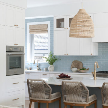
We met with our clients a few times over six months before we starting designing. They had an interesting existing layout and a very specific list of wants. We worked with their architect, re-working the home to achieve the open, light filled space they dreamed of. With roots in Australia, they wanted an elevated coastal vibe. We used muted blues, layered in texture and warm finishes - the results speak for themselves. Storage was a big challenge in the very small original kitchen. In addition to the large island and run of cabinets, we added a hidden pantry.

 Bakhtt Menn
Top 10 SEO Agencies in New York
1. Pearl Lemon: At the top of our list is Pearl Lemon, the epitome of SEO mastery. With a customized approach tailored to meet the specific needs of each client, Pearl Lemon crafts strategies that go beyond traditional paradigms. Their passionate team, driven by a relentless pursuit of innovation, ensures that clients not only achieve higher rankings but also soar above their competition. Through a commitment to long-lasting results and alignment with client objectives, Pearl Lemon emerges as the undisputed champion of New York's SEO landscape.
 yardscapes Inc.
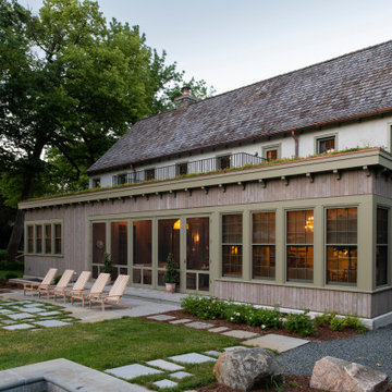
I was initially contacted by the builder and architect working on this Modern European Cottage to review the property and home design before construction began. Once the clients and I had the opportunity to meet and discuss what their visions were for the property, I started working on their wish list of items, which included a custom concrete pool, concrete spa, patios/walkways, custom fencing, and wood structures.
One of the largest challenges was that this property had a 30% (or less) hardcover surface requirement for the city location. With the lot size and square footage of the home I had limits to how much hardcover we could add to property. So, I had to get creative. We presented to the city the usage of the Live Green Roof plantings that would reduce the hardcover calculations for the site. Also, if we kept space between the Laurel Sandstones walkways, using them as steppers and planting groundcover or lawn between the stones that would also reduce the hard surface calculations. We continued that theme with the back patio as well. The client’s esthetic leaned towards the minimal style, so by adding greenery between stones work esthetically.
I chose the Laurel Tumbled Sandstone for the charm and character and thought it would lend well to the old world feel of this Modern European Cottage. We installed it on all the stone walkways, steppers, and patios around the home and pool.
I had several meetings with the client to discuss/review perennials, shrubs, and tree selections. Plant color and texture of the planting material were equally important to the clients when choosing. We grouped the plantings together and did not over-mix varieties of plants. Ultimately, we chose a variety of styles from natural groups of plantings to a touch of formal style, which all work cohesively together.
The custom fence design and installation was designed to create a cottage “country” feel. They gave us inspiration of a country style fence that you may find on a farm to keep the animals inside. We took those photos and ideas and elevated the design. We used a combination of cedar wood and sandwich the galvanized mesh between it. The fence also creates a space for the clients two dogs to roam freely around their property. We installed sod on the inside of the fence to the home and seeded the remaining areas with a Low Gro Fescue grass seed with a straw blanket for protection.
The minimal European style custom concrete pool was designed to be lined up in view from the porch and inside the home. The client requested the lawn around the edge of the pool, which helped reduce the hardcover calculations. The concrete spa is open year around. Benches are on all four sides of the spa to create enough seating for the whole family to use at the same time. Mortared field stone on the exterior of the spa mimics the stone on the exterior of the home. The spa equipment is installed in the lower level of the home to protect it from the cold winter weather.
Between the garage and the home’s entry is a pea rock sitting area and is viewed from several windows. I wanted it to be a quiet escape from the rest of the house with the minimal design. The Skyline Locust tree planted in the center of the space creates a canopy and softens the side of garage wall from the window views. The client will be installing a small water feature along the garage for serene noise ambience.
The client had very thoughtful design ideas styles, and our collaborations all came together and worked well to create the landscape design/installation. The result was everything they had dreamed of and more for their Modern European Cottage home and property.
54