
Search results for "Right angled triangles" in Home Design Ideas
 TKS Design Group
Free ebook, Creating the Ideal Kitchen. DOWNLOAD NOW
One of my very favorite parts of the design process is space planning and considering all the possible floor plan solutions at the beginning stages of the project. What works for one person as a solution may not be the best solution for the next. What you think you want going into the process, may change once all the space planning options are considered. This was exactly the case for this family. They thought they really wanted an island configuration.
Once we figured out the flow of the work triangle and saw how great a large peninsula would work for the family, we proceeded along those lines. The peninsula not only works great for food prep, it also allows more of a traditional table seating versus an island with everyone lined up in a row — not so great for daily dinner conversation.
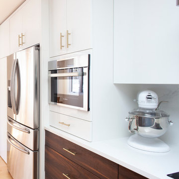
To the right of that is a counter depth fridge and a speed oven which gives some flexibility with cooking and reheating smaller meals instead of having to heat the entire oven. An induction cooktop with its easy to clean surface keeps the space looking clean and tidy. Induction heats very quickly to high temperatures so is also wonderful to cook on. To the right of cooktop is a long stretch of countertop perfect for prep space.
Storage was very important to the homeowners. We took our time discussing where spice pull outs and tray dividers would be located, how the corner storage would be addressed and the location of the other items such as trash and recycling cans. We worked as many drawers as possible into the space, as I always recommend drawers over doors and/or roll outs as they offer the most flexibility and ease of use. Customizing these details is time well spent as having a place for everything and everything in its place, just like Mom said, really is the key to a functional and professionally designed kitchen.
The talls and wall cabinets are white acrylic which combined with the white marble look quartz countertops and full height backsplash keep the room feeling light, bright and airy. The wood toned base cabinets are made of a textured laminate that has the look of wood but is a very easy to maintain product. Brushed gold metal on the hardware, faucet and chandelier add a warm touch and ties into the blond maple flooring. The neighboring breakfast room was also remodeled as part of the project and houses a small coffee station.
Designed by: Susan Klimala, CKBD
Photography by: Kari Firak
For more information on kitchen and bath design ideas go to: www.kitchenstudio-ge.com
 Seconds & Surplus Building Materials
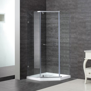
38" Chrome Semi-Frameless Neo-Angle Shower Enclosure from Seconds & Surplus
(PIC 1 of 4)
-----------------------------------------------------------
FEATURES:
Neo-Angle Shower Enclosure with Base
Pivot Style Door with Brass Pivots
Top and Bottom Stainless Steel Support Bars Reinforce Stability
Premium Clear 3/8" (10mm) Tempered Safety Glass - ANSI Z97.1 Certified
Chrome Hardware
Full-Length Clear Seals Included to Prevent Leakage
Full-Length Magnetized Door Channels for Secured Closure
Built-In Towel Bar on Door Handle
Reversible for Left and Right Handed Door Installation
Shown with Optional 2.5" Reinforced White Acrylic Shower Tray
-----------------------------------------------------------
DIMENSIONS:
36" W x 77.5" H x 36" D
 Pennsylvania Landscape & Nursery Association
Terren Landscapes http://www.terrenlandscapes.com
2014 PLNA Awards for Landscape Excellence Winner
Category: Residential $120,000 & Over
Award Level: Silver
Project Description:
The goal of the Vaccaro project was to change the existing non-functional landscape into multiple entertainment spaces while working within the tight confines of impervious coverage requirements. The project consisted of removing, redesigning and re-installing existing hardscaping, front and rear, reconfiguring the driveway to accommodate more parking, handling storm water on-site, and increasing the aesthetic appeal of the property.
The client was remodeling the home in the theme of a rustic French country estate and in our design we endeavored to adhere to this chosen theme. The existing driveway was a circular driveway located off of the main axis of the front door. Reconfiguring the driveway improved vehicular flow, provided additional parking, and reduced impervious space. By consolidating the parking to the side of the house where the garage is located, we maintained the French theme in encouraging arriving cars to pull up closer to the home's entry. We also worked with the architect in the renovation of the home to position the garage windows so that they were placed in the voids of the arbor we constructed over the parking spaces by the garage. The rustic arbor creates a vertical element and delineates the pedestrian walkway from vehicular traffic. The main walkway spans the front of the home so that it extends down to the parking area to guide visitors to the main entrance.
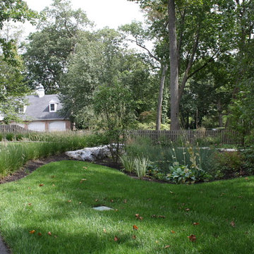
To handle the storm water generated by the driveway, we installed a rain garden, which was placed in the front right side yard. The rain garden area was excavated, the soil in the planting areas was heavily amended with compost, sand, and diatomaceous earth, and mostly native plant material was installed to help absorb excess water. In the bottom-most area of the basin filter fabric was laid to help prevent migration of the stone into the soil and decorative stone was spread to slow the flow of water. Storm water is held until it successfully infiltrates the soil, and the plant material provides a natural habitat that supports butterflies, birds, and beneficial insects.
The existing front patio was removed and the size increased to make the space more functional. To increase function and circulation we worked with the architect to create a dining room that extends to the out-of-doors by adding French doors to the front of the home, which open to the new gravel front terrace. The homeowner desired a planting scheme that would create delineation between the front yard and the gravel terrace without blocking the morning sunlight. To achieve this we chose standardized Physocarpus 'Diablo' to compliment the warm cream-colored stucco of the home and provide structure to the patio space.
In the rear of the property we removed the existing brick patio and installed a dry-laid quartzite patio that nicely compliments the cream-colored stucco. We redesigned the rear patio space using 45 degree angles to represent the old French design theory of bisecting spaces with diagonals. Utilizing this design theory created more interesting patio spaces and allowed us to soften the sharp angles by planting the negative spaces between the house and patio. Seat walls were also designed and installed to create more seating without sacrificing impervious space.
Per the homeowner's wishes, we also designed a separate area in the rear of the yard for a natural boulder fire pit, which is located along the axis of the kitchen window. Half of the ring utilizes boulders for seating for a small gathering while the other half
allowed the homeowner's addition of colorful Adirondack chairs to finish the fire circle.
Incorporating the French theme throughout, we also designed and installed a small vegetable garden in the side yard so the homeowner could grow her own vegetables and herbs.
Photo Credit:
Terren Landscapes
Find the right local pro for your project
 LaFauci Tile and Marble
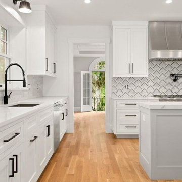
2"x9" Honed Italian Bianco Carrara White Angles Of Honed Italian Carrara Thassos and Polished Bardiglio to Accent the kitchen stove wall.
Eat-in kitchen - large transitional single-wall light wood floor and brown floor eat-in kitchen idea in Boston with an undermount sink, recessed-panel cabinets, white cabinets, quartz countertops, gray backsplash, marble backsplash, stainless steel appliances, an island and white countertops
Eat-in kitchen - large transitional single-wall light wood floor and brown floor eat-in kitchen idea in Boston with an undermount sink, recessed-panel cabinets, white cabinets, quartz countertops, gray backsplash, marble backsplash, stainless steel appliances, an island and white countertops
 Bay Area Kitchens
 http://www.BayAreaKitchens.com
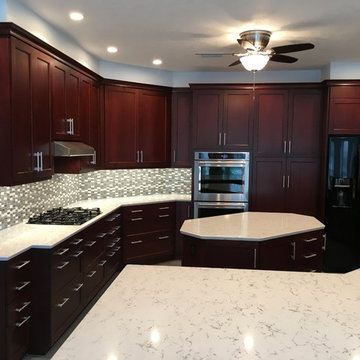
This Friendswood kitchen remodel features rich dark cherry custom Brookhaven cabinetry by Wood-Mode, and yet is light and bright due to its extensive lighting plan utilizing all high-efficiency LED lighting. Low maintenance Silestone Lyra countertops reflect the light to bolster the brightness of the kitchen. Drawers in most of the base cabinets offer the most efficient storage in all the right places. Concealed angled power strips provide lots of outlets that are tucked neatly out of sight below the upper cabinets so the glass backsplashes are not chopped up with traditional electrical outlets.
 LaFauci Tile and Marble
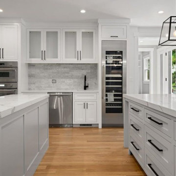
2"x9" Honed Italian Bianco Carrara White Angles Of Honed Italian Carrara Thassos and Polished Bardiglio to Accent the kitchen stove wall.
Example of a large transitional single-wall light wood floor and brown floor eat-in kitchen design in Boston with an undermount sink, recessed-panel cabinets, white cabinets, quartz countertops, gray backsplash, marble backsplash, stainless steel appliances, an island and white countertops
Example of a large transitional single-wall light wood floor and brown floor eat-in kitchen design in Boston with an undermount sink, recessed-panel cabinets, white cabinets, quartz countertops, gray backsplash, marble backsplash, stainless steel appliances, an island and white countertops
 Attinger Landscape Architecture
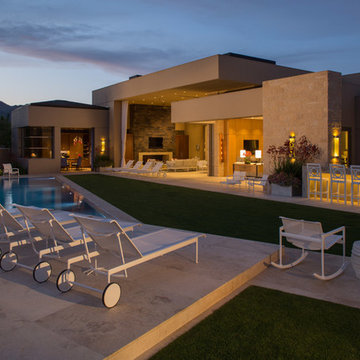
Daytime and evening activities are encouraged around the pool patio, complete with built in barbecue, outdoor living right off the kitchen. The raised patio for lounging, sun bathing and relaxing places you in a perfect vantage to look back at the gorgeous architecture (by Kristi Hanson Architects)
Photo by Ethan Kaminsky

Sponsored
Delaware, OH

Buckeye Basements, Inc.
Central Ohio's Basement Finishing ExpertsBest Of Houzz '13-'21
 InnovationLand
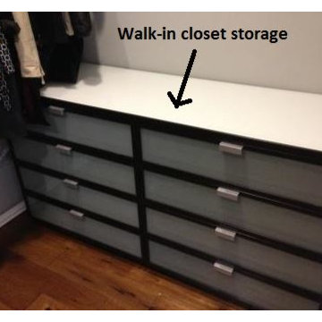
This Houston bathroom remodel has it all - from its contemporary, en suite design to its Carrara marble to its luxury spa shower and his-and-her closets!
It's just one example of Outdoor Homescapes of Houston's bathroom remodeling projects - known for their meticulous attention to beauty and perfection.
Like what you see and want your own Houston bathroom remodeled? Just contact us!
Check out the images for more project shots and details.
"You'll notice a lot of differences between the original renderings and the final project," notes Wayne Franks, owner of Outdoor Homescapes of Houston. "That's why our realistic, detailed 3D graphic renderings and virtual video tours are so useful to clients who can't visualize the end result in their heads. With us, they can preview the project from every angle and make sure they get exactly what they want."
Check out the new, 10-foot-long by 4-feet-deep closet for her. It was built along the wall of the new addition, as you can see in the 3D graphic created for the client below.
The first door on the left leads to this closet. The next two doors down lead to the original, 6-foot-long by 4-feet-long by 4-feet-deep closet shared by the couple, but now reserved for him.
As you can see in the graphic, a small, private commode was added onto the back of the new shower. Recessed lighting was also added for more ambient light, along with brushed nickel lighting fixtures.
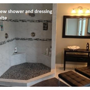
The closeup of the new shower and dressing suite, meanwhile, shows the black-and-grey border and accents in the shower. The border and accents are a stone-and-glass tile mix from Floor & Décor. The shower floor - a flat mosaic marble pebble - is also from Floor & Décor.
Also notice the view of the Houston bath remodel, looking toward the back yard from the master bedroom. On the right, after the towel hooks and before the French doors, a flat-screen TV has been added for viewing from the shower and dressing area.
This Houston bathroom remodel sprung out of a bachelor's engagement. The original, 300-square-foot master bathroom - still in the 80s with brass fixtures and wallpaper - desperately needed a redesign that could accommodate his future bride.
So Outdoor Homescapes gutted the original bathroom and doubled the size with a 300-square-foot addition off the back of the house.
Check out the full-on view of the project. (This is where our 3D graphic renderings, which allow clients to preview their project from every angle and make changes, come in handy. As you can see, the client went with white instead of dark-wood vanity cabinets, ditched the glass shower surround and scrapped the second vanity area).
 InnovationLand
This Houston bathroom remodel has it all - from its contemporary, en suite design to its Carrara marble to its luxury spa shower and his-and-her closets!
It's just one example of Outdoor Homescapes of Houston's bathroom remodeling projects - known for their meticulous attention to beauty and perfection.
Like what you see and want your own Houston bathroom remodeled? Just contact us!
Check out the images for more project shots and details.
"You'll notice a lot of differences between the original renderings and the final project," notes Wayne Franks, owner of Outdoor Homescapes of Houston. "That's why our realistic, detailed 3D graphic renderings and virtual video tours are so useful to clients who can't visualize the end result in their heads. With us, they can preview the project from every angle and make sure they get exactly what they want."
Check out the new, 10-foot-long by 4-feet-deep closet for her. It was built along the wall of the new addition, as you can see in the 3D graphic created for the client below.
The first door on the left leads to this closet. The next two doors down lead to the original, 6-foot-long by 4-feet-long by 4-feet-deep closet shared by the couple, but now reserved for him.
As you can see in the graphic, a small, private commode was added onto the back of the new shower. Recessed lighting was also added for more ambient light, along with brushed nickel lighting fixtures.
The closeup of the new shower and dressing suite, meanwhile, shows the black-and-grey border and accents in the shower. The border and accents are a stone-and-glass tile mix from Floor & Décor. The shower floor - a flat mosaic marble pebble - is also from Floor & Décor.
Also notice the view of the Houston bath remodel, looking toward the back yard from the master bedroom. On the right, after the towel hooks and before the French doors, a flat-screen TV has been added for viewing from the shower and dressing area.
This Houston bathroom remodel sprung out of a bachelor's engagement. The original, 300-square-foot master bathroom - still in the 80s with brass fixtures and wallpaper - desperately needed a redesign that could accommodate his future bride.
So Outdoor Homescapes gutted the original bathroom and doubled the size with a 300-square-foot addition off the back of the house.
Check out the full-on view of the project. (This is where our 3D graphic renderings, which allow clients to preview their project from every angle and make changes, come in handy. As you can see, the client went with white instead of dark-wood vanity cabinets, ditched the glass shower surround and scrapped the second vanity area).
 Casiano Fine Finishes Inc
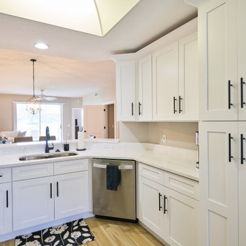
Kitchen Remodel, was completed as a result of a sewage backup incident. Prior layout was L shape Kitchen layout with awkward angle on dishwasher end, that ended straight into the wall. Cabinets right of dishwasher and above were added including a 24 inch pantry to the right. This added considerable amount of space to the kitchen even though it required the use of a vanity cabinet in order to make that happen. Project has received new drawers for that vanity box that needed to be custom made in order to make that cabinet work. Overall customer seems extremely happy at the results.
 Casiano Fine Finishes Inc
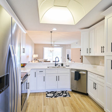
Kitchen Remodel, was completed as a result of a sewage backup incident. Prior layout was L shape Kitchen layout with awkward angle on dishwasher end, that ended straight into the wall. Cabinets right of dishwasher and above were added including a 24 inch pantry to the right. This added considerable amount of space to the kitchen even though it required the use of a vanity cabinet in order to make that happen. Project has received new drawers for that vanity box that needed to be custom made in order to make that cabinet work. Overall customer seems extremely happy at the results.
 Peak Custom Remodeling Corporation
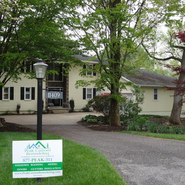
Installed 6" seamless gutters, bent on site, with jumbo 3"x4" downspouts. Gutters use an aesthetically pleasing hidden hangar system and utilize angled screw installation.The house originally had no gutters due to the inward angle of the rake boards. Triangle Braces were installed behind all gutters to allow for proper installation and drainage.
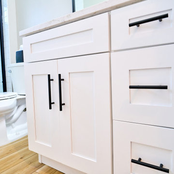 Casiano Fine Finishes Inc
Kitchen Remodel, was completed as a result of a sewage backup incident. Prior layout was L shape Kitchen layout with awkward angle on dishwasher end, that ended straight into the wall. Cabinets right of dishwasher and above were added including a 24 inch pantry to the right. This added considerable amount of space to the kitchen even though it required the use of a vanity cabinet in order to make that happen. Project has received new drawers for that vanity box that needed to be custom made in order to make that cabinet work. Overall customer seems extremely happy at the results.

 Irene Designs
Kitchen — Project Description (Bolton, CT)
(Full Renovation • Reconfiguration • Architectural Corrections)
The original kitchen suffered from spatial imbalance and limited functionality: the right side was visually and physically heavy with cabinetry and appliances, the 135-degree angled walls lacked symmetry due to a missing window on the driveway side, and the small island could only seat two. Circulation was obstructed by a desk positioned in the main traffic flow, and the low French door felt disproportionate in scale compared to the large windows and adjacent two-story Great Room.
Major Structural & Functional Improvements
Repositioned window on the front elevation to the right, creating a long-desired view to the driveway while freeing space for a centered cooktop and statement hood — visually aligning with the Great Room’s redesigned fireplace focal wall.
Installed a new custom sliding door, significantly taller and wider than the original French door. This upgrade enhances natural light, visually opens the kitchen to the deck, and provides unobstructed traffic flow thanks to its sliding operation.
New Kitchen Layout & Enhanced Functionality
Designed an entirely new layout centered around a 10' double-slab island, providing expansive workspace and a natural gathering zone.
Added conversational seating for the whole family, allowing comfortable interaction on all sides of the island.
Introduced purpose-designed storage solutions, including pullouts, rollouts, spice towers, tray organizers, and deep drawers to maximize usability.
Reallocated the desk area to a dedicated window spot overlooking the backyard, removing it from traffic paths and improving both functionality and comfort.
Cabinetry & Architectural Detailing
Custom two-tone cabinetry in soft white and a serene blue-green tone reflects the visual language of the adjacent Great Room, creating whole-home cohesion.
Installed lit upper glass cabinets along the entire perimeter, balancing vertical proportions and creating an elegant display band throughout the kitchen.
A custom range hood was designed and painted to match the base cabinetry, becoming a focal point framed by symmetrical windows.
Surfaces, Lighting & Finishes
The island features a double-thickness quartz slab with a soft ogee radius for a timeless, furniture-like feel.
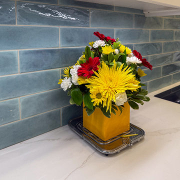
A full-height, handcrafted aqua subway tile backsplash introduces depth, texture, and a gentle reflective quality.
New layered lighting concept, including recessed lights, pendants, task lighting, and integrated cabinet lighting, ensures a warm and functional workspace at any time of day.
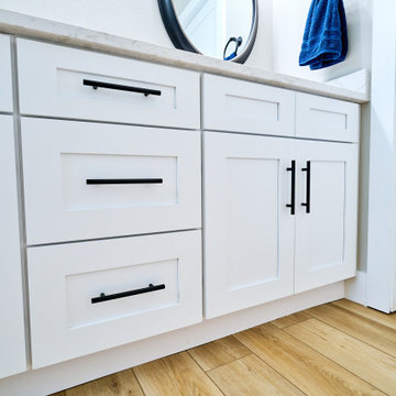 Casiano Fine Finishes Inc
Kitchen Remodel, was completed as a result of a sewage backup incident. Prior layout was L shape Kitchen layout with awkward angle on dishwasher end, that ended straight into the wall. Cabinets right of dishwasher and above were added including a 24 inch pantry to the right. This added considerable amount of space to the kitchen even though it required the use of a vanity cabinet in order to make that happen. Project has received new drawers for that vanity box that needed to be custom made in order to make that cabinet work. Overall customer seems extremely happy at the results.
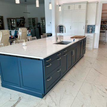 Bay Area Kitchens
This expansive blue island has a white CAMBRIA countertop with blue "3-D" veining. The Galley WashStation (sink) features a huge single bowl and numerous accessories to maximize usage and efficiency. There's a pull-out trash unit to the left of the sink, and a COVE dishwasher to the right, with lots of drawer storage, as well as door storage on the eating side. The Sub-Zero freezer and refrigerator in the background have matching wood door panels, as doest the COVE dishwasher. If you look closely, you can see the angled power strips on the ends of the island.
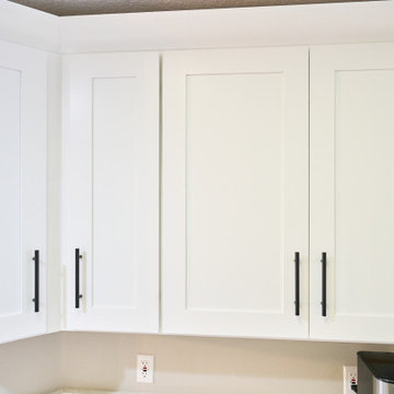 Casiano Fine Finishes Inc
Kitchen Remodel, was completed as a result of a sewage backup incident. Prior layout was L shape Kitchen layout with awkward angle on dishwasher end, that ended straight into the wall. Cabinets right of dishwasher and above were added including a 24 inch pantry to the right. This added considerable amount of space to the kitchen even though it required the use of a vanity cabinet in order to make that happen. Project has received new drawers for that vanity box that needed to be custom made in order to make that cabinet work. Overall customer seems extremely happy at the results.

Sponsored
Delaware, OH
Buckeye Basements, Inc.
Central Ohio's Basement Finishing ExpertsBest Of Houzz '13-'21
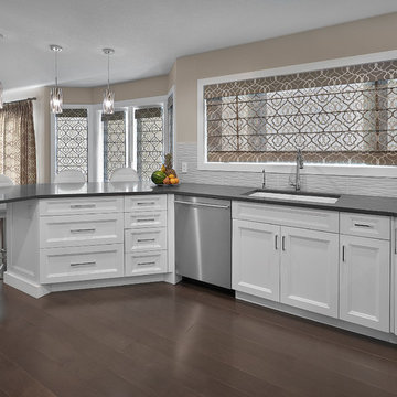
 Cucina Bella
Clean neutral finishes freshen up this kitchen. A sunken living room was built up to allow for great flow through the entire space. Corner windows were removed and a nice big window installed in their place which allowed for relocation of the work triangle. The dining nook became an extension of the kitchen with this clever angled peninsula. Leaving plenty of room to access the french door out to the homeowners lovely deck and backyard. Access to a formal dining space is between the fridge and wall ovens. The use of a wide frame flat panel door that has a small amount of detail, island back panels and the slightly detailed crown moulding really achieves a lovely clean classic look.
White transitional kitchens are so classic. We made great use of the old breakfast nook area to allow for loads more counter space as well as some informal seating. If you have another dining area it's a nice idea to expand the kitchen in this way.
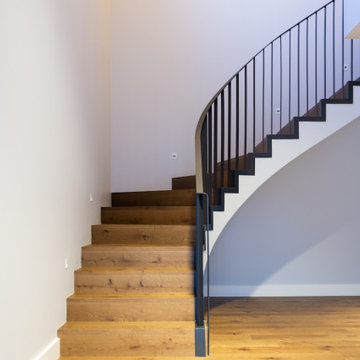
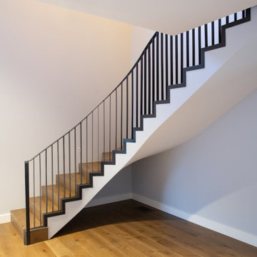
 Stairworks
Martins Avenue is a beautiful, curved staircase made out of steel as the base material. Curved stairs are a challenge because you need to get the soffit (the underside of the staircase) curved and twisted around the base of the stairs to get the nice flowing lines. And because the timber work was outsourced to other builders, we had to work closely alongside them in order to get the soffit curved just right and ensure everything matched the flooring.
The other big challenge was that the curved balustrade needed to be an identical match to the staircase and have a nice, smooth, curved line. In order to achieve this, we built both the steel stairs and balustrade in the shop at the same time and match drilled the balustrade through. Therefore when we brought it to site we knew it would fit perfectly. The angle on the bottom of the balustrade was designed to cover the junction or zig zag angle between the steel and the timber.
Because of how this staircase had to be designed and built, it was extremely heavy and a challenging install. Additionally, as the walls of the site were all finished, we had to take all the necessary precautions to get the stairs installed without causing any damage or leaving any markings. Afterwards, the builders covered the underside with gib and closed risers to hide the cladding underneath.
There was absolutely no room for error with this staircase and we at Stairworks, the builders and the clients are all extremely happy with the end result!
 Stairworks
Martins Avenue is a beautiful, curved staircase made out of steel as the base material. Curved stairs are a challenge because you need to get the soffit (the underside of the staircase) curved and twisted around the base of the stairs to get the nice flowing lines. And because the timber work was outsourced to other builders, we had to work closely alongside them in order to get the soffit curved just right and ensure everything matched the flooring.
The other big challenge was that the curved balustrade needed to be an identical match to the staircase and have a nice, smooth, curved line. In order to achieve this, we built both the steel stairs and balustrade in the shop at the same time and match drilled the balustrade through. Therefore when we brought it to site we knew it would fit perfectly. The angle on the bottom of the balustrade was designed to cover the junction or zig zag angle between the steel and the timber.
Because of how this staircase had to be designed and built, it was extremely heavy and a challenging install. Additionally, as the walls of the site were all finished, we had to take all the necessary precautions to get the stairs installed without causing any damage or leaving any markings. Afterwards, the builders covered the underside with gib and closed risers to hide the cladding underneath.
There was absolutely no room for error with this staircase and we at Stairworks, the builders and the clients are all extremely happy with the end result!
40