
Search results for "Running start" in Home Design Ideas
 CB Architecture + Design
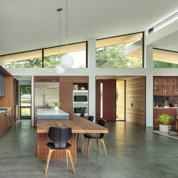
Great room interior of a new construction single-level home. The signature butterfly shed roofline is fully expressed inside as a series of black-framed clerestory windows running the full width of the great room, admitting a continuous band of natural light and redwood canopy views above the interior wall line while maintaining privacy at eye level. Warm walnut flat-front cabinetry runs the full perimeter of the kitchen at left, with slate blue upper cabinets visible beyond and a full-height walnut appliance tower with integrated stainless steel refrigerator and double oven anchoring the center. A blue kitchen island with white quartz countertop extends into a cantilevered walnut butcher block dining table with a distinctive slatted walnut fluted base. Black molded shell chairs with oak legs surround the dining extension. Single white globe pendant hangs above. The terracotta red front entry door with cedar-clad entry volume is visible through the interior opening at center, connecting the street threshold to the deepest interior space in one axial view. Family room with cognac leather sofa, walnut credenza, and slatted walnut room divider panels visible to the right. Charcoal polished concrete radiant slab floors extend throughout.
 Thyme & Place Design LLC
When my client had to move from her company office to work at home, she set up in the dining room. Despite her best efforts, this was not the long-term solution she was looking for. My client realized she needed a dedicated space not on the main floor of the home. On one hand, having your office space right next to the kitchen is handy. On the other hand, it made separating work and home life was not that easy.
The house was a ranch. In essence, the basement would run entire length of the home. As we came down the steps, we entered a time capsule. The house was built in the 1950’s. The walls were covered with original knotty pine paneling. There was a wood burning fireplace and considering this was a basement, high ceilings. In addition, there was everything her family could not store at their own homes. As we wound though the space, I though “wow this has potential”, Eventually, after walking through the laundry room we came to a small nicely lit room. This would be the office.
My client looked at me and asked what I thought. Undoubtedly, I said, this can be a great workspace, but do you really want to walk through this basement and laundry to get here? Without reservation, my client said where do we start?
Once the design was in place, we started the renovation. The knotty pine paneling had to go. Specifically, to add some insulation and control the dampness and humidity. The laundry room wall was relocated to create a hallway to the office.
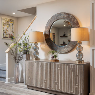
At the far end of the room, we designated a workout zone. Weights, mats, exercise bike and television are at the ready for morning or afternoon workouts. The space can be concealed by a folding screen for party time. Doors to an old closet under the stairs were relocated to the workout area for hidden storage. Now we had nice wall for a beautiful console and mirror for storage and serving during parties.
In order to add architectural details, we covered the old ugly support columns with simple recessed millwork panels. This detail created a visual division between the bar area and the seating area in front of the fireplace. The old red brick on the fireplace surround was replaced with stack stone. A mantle was made from reclaimed wood. Additional reclaimed wood floating shelves left and right of the fireplace provides decorative display while maintaining a rustic element balancing the copper end table and leather swivel rocker.
We found an amazing rug which tied all of the colors together further defining the gathering space. Russet and burnt orange became the accent color unifying each space. With a bit of whimsy, a rather unusual light fixture which looks like roots from a tree growing through the ceiling is a conversation piece.
The office space is quite and removed from the main part of the basement. There is a desk large enough for multiple screens, a small bookcase holding office supplies and a comfortable chair for conference calls. Because working from home requires many online meetings, we added a shiplap wall painted in Hale Navy to contrast with the orange fabric on the chair. We finished the décor with a painting from my client’s father. This is the background online visitors will see.
The last and best part of the renovation is the beautiful bar. My client is an avid collector of wine. She already had the EuroCave refrigerator, so I incorporated it into the design. The cabinets are painted Temptation Grey from Benjamin Moore. The counter tops are my favorite hard working quartzite Brown Fantasy. The backsplash is a combination of rustic wood and old tin ceiling like porcelain tiles. Together with the textures of the reclaimed wood and hide poofs balanced against the smooth finish of the cabinets, we created a comfortable luxury for relaxing.
There is ample storage for bottles, cans, glasses, and anything else you can think of for a great party. In addition to the wine storage, we incorporated a beverage refrigerator, an ice maker, and a sink. Floating shelves with integrated lighting illuminate the back bar. The raised height of the front bar provides the perfect wine tasting and paring spot. I especially love the pendant lights which look like wine glasses.
Finally, I selected carpet for the stairs and office. It is perfect for noise reduction. Meanwhile for the overall flooring, I specifically selected a high-performance vinyl plank floor. We often use this product as it is perfect to install on a concrete floor. It is soft to walk on, easy to clean and does not reduce the overall height of the space.

Find the right local pro for your project

 TKS Design Group
Download our free ebook, Creating the Ideal Kitchen. DOWNLOAD NOW
Lakefront property in the northwest suburbs of Chicago is hard to come by, so when we were hired by this young family with exactly that, we were immediately inspired by not just the unusually large footprint of this 1950’s colonial revival but also the lovely views of the manmade lake it was sited on. The large 5-bedroom home was solidly stuck in the 1980’s, but we saw tons of potential. We started out by updating the existing staircase with a fresh coat of paint and adding new herringbone slate to the entry hall.
The powder room off the entryway also got a refresh - new flooring, new cabinets and fixtures. We ran the new slate right through into this space for some consistency. A fun wallpaper and shiplap trim add a welcoming feel and set the tone for the home.
Next, we tackled the kitchen. Located away from the rest of the first floor, the kitchen felt a little isolated, so we immediately began planning for how to better connect it to the rest of the first floor. We landed on removing the wall between the kitchen and dining room and designed a modified galley style space with separate cooking and clean up zones. The cooking zone consists of the refrigerator, prep sink and cooktop, along with a nice long run of prep space at the island. The cleanup side of the kitchen consists of the main sink and dishwasher. Both areas are situated so that the user can view the lake during prep work and cleanup!
One of the home’s main puzzles was how to incorporate the mudroom and area in front of the patio doors at the back of the house. We already had a breakfast table area, so the space by the patio doors was a bit of a no man’s land. We decided to separate the kitchen proper from what became the new mudroom with a large set of barn doors. That way you can quickly hide any mudroom messes but have easy access to the light coming in through the patio doors as well as the outdoor grilling station. We also love the impact the barn doors add to the overall space.
The homeowners’ first words to us were “it’s time to ditch the brown,” so we did! We chose a lovely blue pallet that reflects the home’s location on the lake which is also vibrant yet easy on the eye. Countertops are white quartz, and the natural oak floor works well with the other honey accents. The breakfast table was given a refresh with new chairs, chandelier and window treatments that frame the gorgeous views of the lake out the back.
We coordinated the slate mudroom flooring with that used in the home’s main entrance for a consistent feel. The storage area consists of open and closed storage to allow for some clutter control as needed.
Next on our “to do” list was revamping the dated brown bar area in the neighboring dining room. We eliminated the clutter by adding some closed cabinets and did some easy updates to help the space feel more current. One snag we ran into here was the discovery of a beam above the existing open shelving that had to be modified with a smaller structural beam to allow for our new design to work. This was an unexpected surprise, but in the end we think it was well worth it!
We kept the colors here a bit more muted to blend with the homeowner’s existing furnishings. Open shelving and polished nickel hardware add some simple detail to the new entertainment zone which also looks out onto the lake!
Next we tackled the upstairs starting with the homeowner’s son’s bath. The bath originally had both a tub shower and a separate shower, so we decided to swap out the shower for a new laundry area. This freed up some space downstairs in what used to be the mudroom/laundry room and is much more convenient for daily laundry needs.
We continued the blue palette here with navy cabinetry and the navy tile in the shower. Porcelain floor tile and chrome fixtures keep maintenance to a minimum while matte black mirrors and lighting add some depth the design. A low maintenance runner adds some warmth underfoot and ties the whole space together.
We added a pocket door to the bathroom to minimize interference with the door swings. The left door of the laundry closet is on a 180 degree hinge to allow for easy full access to the machines. Next we tackled the master bath which is an en suite arrangement. The original was typical of the 1980’s with the vanity outside of the bathroom, situated near the master closet. And the brown theme continued here with multiple shades of brown.
Our first move was to segment off the bath and the closet from the master bedroom. We created a short hall from the bedroom to the bathroom with his and hers walk-in closets on the left and right as well as a separate toilet closet outside of the main bathroom for privacy and flexibility.
The original bathroom had a giant soaking tub with steps (dangerous!) as well as a small shower that did not work well for our homeowner who is 6’3”. With other bathtubs in the home, they decided to eliminate the tub and create an oversized shower which takes up the space where the old tub was located. The double vanity is on the opposite wall and a bench is located under the window for morning conversations and a place to set a couple of towels.
The pallet in here is light and airy with a mix of blond wood, creamy porcelain and marble tile, and brass accents. A simple roman shade adds some texture and it’s top-down mechanism allows for light and privacy.
This large whole house remodel gave our homeowners not only the ability to maximize the potential of their home but also created a lovely new frame from which to view their fabulous lake views.
Designed by: Susan Klimala, CKD, CBD
Photography by: Michael Kaskel
For more information on kitchen and bath design ideas go to: www.kitchenstudio-ge.com

 Thinkterior LLC
For a family who believes fitness is not only an essential part of life but also a fun opportunity for the whole family to connect, build and achieve greatness together there is nothing better than a custom designed obstacle course right in your back yard.
THEME
The theme of this half mile trail through the woods is evident in the fun, creative and all-inclusive obstacles hidden in the natural flow of the land around this amazing family home. The course was created with adults and children, advanced and beginner athletes, competitive and entertaining events all accounted for. Each of the 13 obstacles was designed to be challenging no matter the size, skill or ability of the athlete lucky enough to run the course.
FOCUS
The focus for this family was to create an outdoor adventure that could be an athletic, social and personal outlet for their entire family while maintaining the natural beauty of the landscape and without altering the sweeping views from the home. The large scale of the challenging obstacles is camouflaged within the landscape using the rolling hills and mature trees as a natural curtain in every season. The beauty of the course does not diminish the functional and demanding nature of the obstacles which are designed to focus on multiple strength, agility, and cardio fitness abilities and intensities.
STORAGE
The start of the trail includes a raised training area offering a dedicated space clear from the ground to place bags, mats and other equipment used during the run. A small all-terrain storage cart was provided for use with 6 yoga mats, 3 medicine balls of various weights, rings, sprinting cones, and a large digital timer to record laps.
GROWTH
The course was designed to provide an athletic and fun challenge for children, teens and adults no matter their experience or athletic prowess. This course offers competitive athletes a challenge and budding athletes an opportunity to experience and ignite their passion for physical activity. Initially the concept for the course was focused on the youngest of the family however as the design grew so did the obstacles and now it is a true family experience that will meet their adapting needs for years. Each obstacle is paired with an instructional sign directing the runners in proper use of the obstacle, adaptations for skill levels and tips on form. These signs are all customized for this course and are printed on metal to ensure they last for many years.
SAFETY
Safety is crucial for all physical activity and an obstacle course of this scale presents unique safety concerns. Children should always be supervised when participating in an adventure on the course however additional care was paid to details on the course to ensure everyone has a great time. All of the course obstacles have been created with pressure treated lumber that will withstand the seasonal poundings. All footer pilings that support obstacles have been placed into the ground between 3 to 4 feet (.9 to 1.2 meters) and each piling has 2 to 3 bags of concrete (totaling over 90 bags used throughout the course) ensuring stability of the structure and safety of the participants. Additionally, all obstacle lumber has been given rounded corners and sanded down offering less splintering and more time for everyone to enjoy the course.
This athletic and charismatic family strives to incorporate a healthy active lifestyle into their daily life and this obstacle course offers their family an opportunity to strengthen themselves and host some memorable and active events at their amazing home.
 Down To Basics
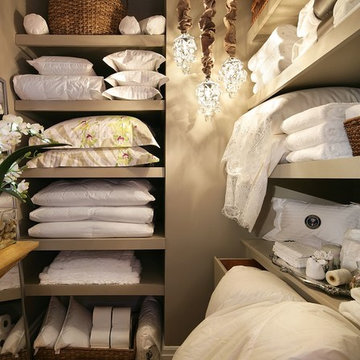
Linen closet in the VNA House Tour in Monmouth County NJ
Down to Basics.
Example of a classic laundry room design in New York
Example of a classic laundry room design in New York



 KitchenLab Interiors
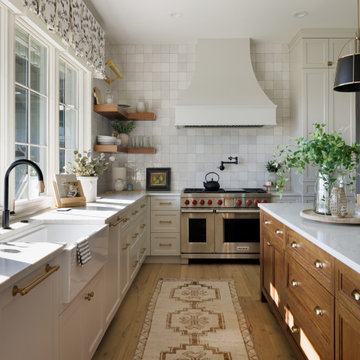
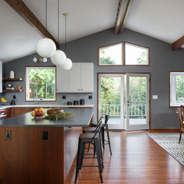
KitchenLab Interiors’ first, entirely new construction project in collaboration with GTH architects who designed the residence. KLI was responsible for all interior finishes, fixtures, furnishings, and design including the stairs, casework, interior doors, moldings and millwork. KLI also worked with the client on selecting the roof, exterior stucco and paint colors, stone, windows, and doors. The homeowners had purchased the existing home on a lakefront lot of the Valley Lo community in Glenview, thinking that it would be a gut renovation, but when they discovered a host of issues including mold, they decided to tear it down and start from scratch. The minute you look out the living room windows, you feel as though you're on a lakeside vacation in Wisconsin or Michigan. We wanted to help the homeowners achieve this feeling throughout the house - merging the causal vibe of a vacation home with the elegance desired for a primary residence. This project is unique and personal in many ways - Rebekah and the homeowner, Lorie, had grown up together in a small suburb of Columbus, Ohio. Lorie had been Rebekah's babysitter and was like an older sister growing up. They were both heavily influenced by the style of the late 70's and early 80's boho/hippy meets disco and 80's glam, and both credit their moms for an early interest in anything related to art, design, and style. One of the biggest challenges of doing a new construction project is that it takes so much longer to plan and execute and by the time tile and lighting is installed, you might be bored by the selections of feel like you've seen them everywhere already. “I really tried to pull myself, our team and the client away from the echo-chamber of Pinterest and Instagram. We fell in love with counter stools 3 years ago that I couldn't bring myself to pull the trigger on, thank god, because then they started showing up literally everywhere", Rebekah recalls. Lots of one of a kind vintage rugs and furnishings make the home feel less brand-spanking new. The best projects come from a team slightly outside their comfort zone. One of the funniest things Lorie says to Rebekah, "I gave you everything you wanted", which is pretty hilarious coming from a client to a designer.


 Jamie Loren Home
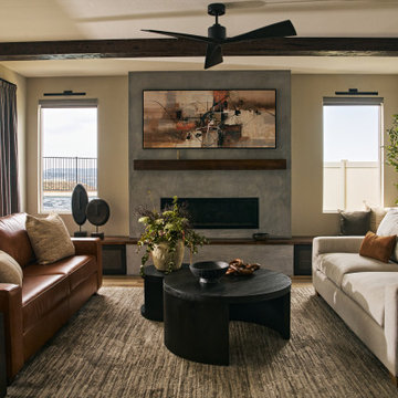
Living room - large transitional formal carpeted, brown floor and exposed beam living room idea in Los Angeles with gray walls, a standard fireplace, a concrete fireplace and a concealed tv
 TKS Design Group
Download our free ebook, Creating the Ideal Kitchen. DOWNLOAD NOW
Lakefront property in the northwest suburbs of Chicago is hard to come by, so when we were hired by this young family with exactly that, we were immediately inspired by not just the unusually large footprint of this 1950’s colonial revival but also the lovely views of the manmade lake it was sited on. The large 5-bedroom home was solidly stuck in the 1980’s, but we saw tons of potential. We started out by updating the existing staircase with a fresh coat of paint and adding new herringbone slate to the entry hall.
The powder room off the entryway also got a refresh - new flooring, new cabinets and fixtures. We ran the new slate right through into this space for some consistency. A fun wallpaper and shiplap trim add a welcoming feel and set the tone for the home.
Next, we tackled the kitchen. Located away from the rest of the first floor, the kitchen felt a little isolated, so we immediately began planning for how to better connect it to the rest of the first floor. We landed on removing the wall between the kitchen and dining room and designed a modified galley style space with separate cooking and clean up zones. The cooking zone consists of the refrigerator, prep sink and cooktop, along with a nice long run of prep space at the island. The cleanup side of the kitchen consists of the main sink and dishwasher. Both areas are situated so that the user can view the lake during prep work and cleanup!
One of the home’s main puzzles was how to incorporate the mudroom and area in front of the patio doors at the back of the house. We already had a breakfast table area, so the space by the patio doors was a bit of a no man’s land. We decided to separate the kitchen proper from what became the new mudroom with a large set of barn doors. That way you can quickly hide any mudroom messes but have easy access to the light coming in through the patio doors as well as the outdoor grilling station. We also love the impact the barn doors add to the overall space.
The homeowners’ first words to us were “it’s time to ditch the brown,” so we did! We chose a lovely blue pallet that reflects the home’s location on the lake which is also vibrant yet easy on the eye. Countertops are white quartz, and the natural oak floor works well with the other honey accents. The breakfast table was given a refresh with new chairs, chandelier and window treatments that frame the gorgeous views of the lake out the back.
We coordinated the slate mudroom flooring with that used in the home’s main entrance for a consistent feel. The storage area consists of open and closed storage to allow for some clutter control as needed.
Next on our “to do” list was revamping the dated brown bar area in the neighboring dining room. We eliminated the clutter by adding some closed cabinets and did some easy updates to help the space feel more current. One snag we ran into here was the discovery of a beam above the existing open shelving that had to be modified with a smaller structural beam to allow for our new design to work. This was an unexpected surprise, but in the end we think it was well worth it!
We kept the colors here a bit more muted to blend with the homeowner’s existing furnishings. Open shelving and polished nickel hardware add some simple detail to the new entertainment zone which also looks out onto the lake!
Next we tackled the upstairs starting with the homeowner’s son’s bath. The bath originally had both a tub shower and a separate shower, so we decided to swap out the shower for a new laundry area. This freed up some space downstairs in what used to be the mudroom/laundry room and is much more convenient for daily laundry needs.
We continued the blue palette here with navy cabinetry and the navy tile in the shower. Porcelain floor tile and chrome fixtures keep maintenance to a minimum while matte black mirrors and lighting add some depth the design. A low maintenance runner adds some warmth underfoot and ties the whole space together.
We added a pocket door to the bathroom to minimize interference with the door swings. The left door of the laundry closet is on a 180 degree hinge to allow for easy full access to the machines. Next we tackled the master bath which is an en suite arrangement. The original was typical of the 1980’s with the vanity outside of the bathroom, situated near the master closet. And the brown theme continued here with multiple shades of brown.
Our first move was to segment off the bath and the closet from the master bedroom. We created a short hall from the bedroom to the bathroom with his and hers walk-in closets on the left and right as well as a separate toilet closet outside of the main bathroom for privacy and flexibility.
The original bathroom had a giant soaking tub with steps (dangerous!) as well as a small shower that did not work well for our homeowner who is 6’3”. With other bathtubs in the home, they decided to eliminate the tub and create an oversized shower which takes up the space where the old tub was located. The double vanity is on the opposite wall and a bench is located under the window for morning conversations and a place to set a couple of towels.
The pallet in here is light and airy with a mix of blond wood, creamy porcelain and marble tile, and brass accents. A simple roman shade adds some texture and it’s top-down mechanism allows for light and privacy.
This large whole house remodel gave our homeowners not only the ability to maximize the potential of their home but also created a lovely new frame from which to view their fabulous lake views.
Designed by: Susan Klimala, CKD, CBD
Photography by: Michael Kaskel
For more information on kitchen and bath design ideas go to: www.kitchenstudio-ge.com

Sponsored
Columbus, OH

Trish Takacs Design
Award Winning & Highly Skilled Kitchen & Bath Designer in Columbus
 TKS Design Group
Download our free ebook, Creating the Ideal Kitchen. DOWNLOAD NOW
Lakefront property in the northwest suburbs of Chicago is hard to come by, so when we were hired by this young family with exactly that, we were immediately inspired by not just the unusually large footprint of this 1950’s colonial revival but also the lovely views of the manmade lake it was sited on. The large 5-bedroom home was solidly stuck in the 1980’s, but we saw tons of potential. We started out by updating the existing staircase with a fresh coat of paint and adding new herringbone slate to the entry hall.
The powder room off the entryway also got a refresh - new flooring, new cabinets and fixtures. We ran the new slate right through into this space for some consistency. A fun wallpaper and shiplap trim add a welcoming feel and set the tone for the home.
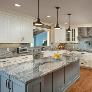
Next, we tackled the kitchen. Located away from the rest of the first floor, the kitchen felt a little isolated, so we immediately began planning for how to better connect it to the rest of the first floor. We landed on removing the wall between the kitchen and dining room and designed a modified galley style space with separate cooking and clean up zones. The cooking zone consists of the refrigerator, prep sink and cooktop, along with a nice long run of prep space at the island. The cleanup side of the kitchen consists of the main sink and dishwasher. Both areas are situated so that the user can view the lake during prep work and cleanup!
One of the home’s main puzzles was how to incorporate the mudroom and area in front of the patio doors at the back of the house. We already had a breakfast table area, so the space by the patio doors was a bit of a no man’s land. We decided to separate the kitchen proper from what became the new mudroom with a large set of barn doors. That way you can quickly hide any mudroom messes but have easy access to the light coming in through the patio doors as well as the outdoor grilling station. We also love the impact the barn doors add to the overall space.
The homeowners’ first words to us were “it’s time to ditch the brown,” so we did! We chose a lovely blue pallet that reflects the home’s location on the lake which is also vibrant yet easy on the eye. Countertops are white quartz, and the natural oak floor works well with the other honey accents. The breakfast table was given a refresh with new chairs, chandelier and window treatments that frame the gorgeous views of the lake out the back.
We coordinated the slate mudroom flooring with that used in the home’s main entrance for a consistent feel. The storage area consists of open and closed storage to allow for some clutter control as needed.
Next on our “to do” list was revamping the dated brown bar area in the neighboring dining room. We eliminated the clutter by adding some closed cabinets and did some easy updates to help the space feel more current. One snag we ran into here was the discovery of a beam above the existing open shelving that had to be modified with a smaller structural beam to allow for our new design to work. This was an unexpected surprise, but in the end we think it was well worth it!
We kept the colors here a bit more muted to blend with the homeowner’s existing furnishings. Open shelving and polished nickel hardware add some simple detail to the new entertainment zone which also looks out onto the lake!
Next we tackled the upstairs starting with the homeowner’s son’s bath. The bath originally had both a tub shower and a separate shower, so we decided to swap out the shower for a new laundry area. This freed up some space downstairs in what used to be the mudroom/laundry room and is much more convenient for daily laundry needs.
We continued the blue palette here with navy cabinetry and the navy tile in the shower. Porcelain floor tile and chrome fixtures keep maintenance to a minimum while matte black mirrors and lighting add some depth the design. A low maintenance runner adds some warmth underfoot and ties the whole space together.
We added a pocket door to the bathroom to minimize interference with the door swings. The left door of the laundry closet is on a 180 degree hinge to allow for easy full access to the machines. Next we tackled the master bath which is an en suite arrangement. The original was typical of the 1980’s with the vanity outside of the bathroom, situated near the master closet. And the brown theme continued here with multiple shades of brown.
Our first move was to segment off the bath and the closet from the master bedroom. We created a short hall from the bedroom to the bathroom with his and hers walk-in closets on the left and right as well as a separate toilet closet outside of the main bathroom for privacy and flexibility.
The original bathroom had a giant soaking tub with steps (dangerous!) as well as a small shower that did not work well for our homeowner who is 6’3”. With other bathtubs in the home, they decided to eliminate the tub and create an oversized shower which takes up the space where the old tub was located. The double vanity is on the opposite wall and a bench is located under the window for morning conversations and a place to set a couple of towels.
The pallet in here is light and airy with a mix of blond wood, creamy porcelain and marble tile, and brass accents. A simple roman shade adds some texture and it’s top-down mechanism allows for light and privacy.
This large whole house remodel gave our homeowners not only the ability to maximize the potential of their home but also created a lovely new frame from which to view their fabulous lake views.
Designed by: Susan Klimala, CKD, CBD
Photography by: Michael Kaskel
For more information on kitchen and bath design ideas go to: www.kitchenstudio-ge.com
 Infinite Home
Custom Home Built for Real Life
Our clients came to us with a clear vision: a home that could adapt to their lifestyle and growing family. They needed a home built with intention, designed with the future in mind, and built around the routines they loved and the people they loved more.
Open-Concept Living With Hosting in Mind
Our clients hosted often and lived actively, so the main level had to be flexible for all of life’s moments. The goal was a space that felt grand without losing its warmth.
Cooking together as a family mattered to our clients – the Wolf range, farmhouse sink, integrated appliances, and large island gave them a kitchen that flowed effortlessly while looking beautiful. This space also served as the bridge between other parts of the main level so that they would stay in view of the next. This created the perfect environment for gathering where everyone had their own spot without ever feeling apart from the whole group.
For the living room, our clients wanted space that felt open without losing its warmth. Soaring ceilings created that sense of scale, while warm tones and materials, like the wood coffered ceiling and fireplace wall, kept it grounded. That same warmth carried outside, where an outdoor lounge with a fireplace and dining area made sure guests felt welcomed the moment they stepped out.
A Backyard Built for Real Rest
Every corner of the backyard was designed with one goal: to be the ultimate outdoor retreat. The elevated, white-brick-framed pool and integrated spa hot tub gave them a place to truly exhale. As the sun set, the fire pit lounge next to the pool became the hangout spot when they hosted their youth groups and family gatherings.
Room to Grow
With kids in the house, “custom” had to also mean flexible. Our clients had 2 young sons and needed their rooms to grow with them through the years. The two bedrooms and a full bath sat beside a loft that served as both their hangout-and-homework spot. The guest suite sat on the same level where a four-poster bed, floor-to-ceiling wood-look tile, and a frameless glass shower welcomed their guests from day one.
A Retreat That’s Actually Theirs
Between hosting and raising kids, this couple needed a suite that felt like a true escape. The wood-planked tray ceiling and French doors grounded the room in warmth the moment you walked in, while the ensuite bathroom carried a spa-like feeling with a freestanding soaking tub, custom double vanity, and a glass-enclosed shower.
This Is What Approachable Luxury Looks Like
The approachable luxury experience meant starting with conversations about how they wanted their space to live with them – how they hosted, how their kids played, how they wanted to feel walking through their own front door, and how we took their goals and experience and used it as the foundation of every decision that was made from start to finish. We wanted our clients to feel taken care of through the process and, most importantly, feel heard.
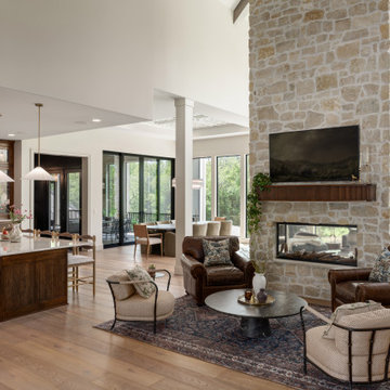
 Starr Homes
French country open concept medium tone wood floor, brown floor and vaulted ceiling living room photo in Kansas City with white walls, a two-sided fireplace, a stone fireplace and a wall-mounted tv
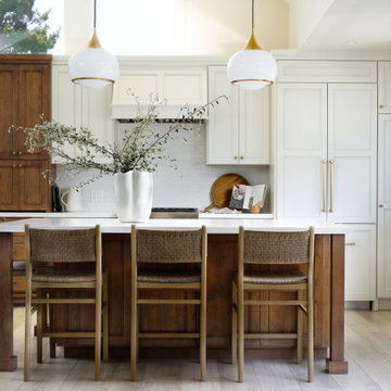
 Elegant Construction LLC
Kitchen - coastal l-shaped light wood floor and beige floor kitchen idea with recessed-panel cabinets, white cabinets, paneled appliances, an island and white countertops
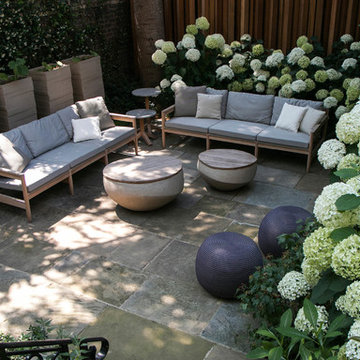
 Stefano Marinaz Landscape Architecture
19 July 2016 -
Plants: Hydrangea arborescens 'Annabelle', Trachelospermum jasminoides, Ficus carica
- Stefano Marinaz Landscape Architecture
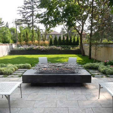
 ACRE landscape architecture + design studio
A lovely yard that started as a long bowling alley of lawn. We wanted to create a more human scale in the lounge area without building too many visual barriers. The overall effect is splashes of woodland across a contemporary canvas.
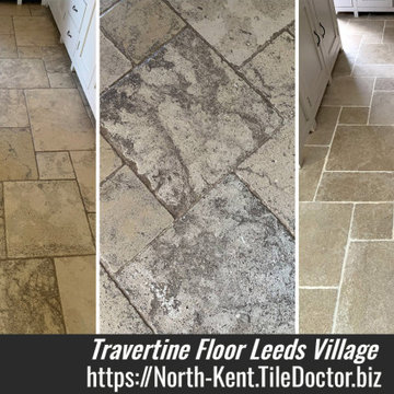
 Tile Doctor Ltd
I was contacted about a Georgian property in the Kent village of Leeds , to see if I could do anything to improve a Travertine tiled floor. The use of Travertine was extensive and had been installed throughout the ground floor including the kitchen, dining room, utility and bathroom WC. Travertine is probably my favourite stone, but it is acid sensitive and attracts dirt easily, due to its ‘holey’ composition.
Initially we discussed the floor over the phone where I got to know about the issues they were experiencing, and I detailed the renovation process I normally use to restore it including the products and timelines. Naturally they wanted to me to provide a quote for the work however its tricky to do that accurately without seeing the floor, so I arranged a date to pop over.
Upon arriving I could see the tiles and the wide grout joints had extensive, ingrained dirt indicating the previous sealer had long since worn away. This is a common issue with stone floors, and to re-assure myself and the client it could be resolved I cleaned a small area in the utility room with pleasing results!
This test clean helped me to understand which products and methods would work best on the floor and later that day I emailed over a detailed quote for the renovation. Happy with the quote I received a reply the same day asking when I could start.
My colleague and I arrived on the agreed date and work started with adding protection to all areas that required it. We use a lot of water during the cleaning process and some materials such as MDF can become damaged with water ingress, so it makes sense to do this.
To get the floor clean, a coarse Carbide Brush fitted to a rotary machine was run over the Travertine tiles to scrub in a strong solution of Tile Doctor Pro-Clean. This process generates a lot of slurry as the dirt was washed out of the stone and grout which is extracted with a wet vacuum as we progressed.
Next it was on hands and knees with more Tile Doctor Pro-Clean and handheld brushes run over stubborn areas and along the grout lines to take them from 80% up to 100%.
Happy with the results, the next step was to renovate the stone using a series of diamond encrusted burnishing pads. Using only water for lubrication this process starts with the application of a coarse 400-grit burnishing pad attached to the floor buffer. This produces a lot of slurry which again was removed with a wet vacuum.
This left the Travertine clean, but the pores of the stone had been opened giving the floor a matt finish and more absorbent than it was originally. To further refine the appearance of the stone the next two burnishing pads were applied which are 800 and 1500-grit. These pads polish the stone and close the pores, restoring the natural sheen in the process. After each pad was applied the slurry was rinsed off the floor with water and extracted with the wet vacuum. Once complete the floor was left to dry off fully overnight.
I arrived the next day and took several moisture readings from the floor to check that it had dried off sufficiently overnight. The results were good, so work moved onto sealing the Travertine with two coats of Tile Doctor Ultra Seal which is a natural look impregnating sealer. It works by soaking into the stone, occupying the pores and thereby preventing dirt from becoming ingrained there. This ensures dirt remains on the surface where it is easily cleaned away.
The final step in the floor’s renovation was to apply the last of the diamond polishing pads which is a very fine 3000-grit. This pad further improves the polished appearance of the stone resulting in a satisfying sheen.
The work made a massive difference to the floor, and I received an email the next day from one of the owners who was really pleased with the transformation:
”Floors look brilliant. Very pleased.”
For the care and maintenance of polished sealed floors I recommend the use of Tile Doctor’s Stone Soap which is a gentle but effective cleaning product that won’t impact the sealer and contains a patina enhancer. When it comes to sealed floors my mantra is:
“If you look after the sealer, the sealer will look after the floor!”
Graham Davis
North Kent Tile Doctor
14