
Search results for "Running start" in Home Design Ideas
 Mason Miller Architect
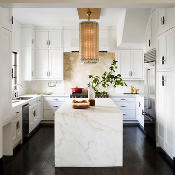
View into kitchen from family room
Douglas Friedman photography
Transitional kitchen photo in Chicago with recessed-panel cabinets, white cabinets, marble countertops, yellow backsplash, stone slab backsplash and an island
Transitional kitchen photo in Chicago with recessed-panel cabinets, white cabinets, marble countertops, yellow backsplash, stone slab backsplash and an island
 Plus Interiors
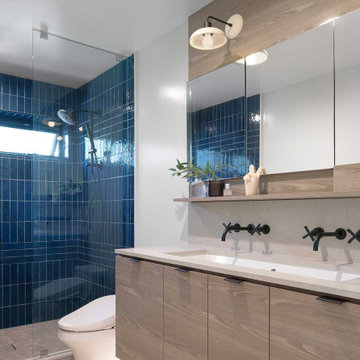
This gorgeous bathroom renovation features floating cabinets with a light beachwood finish.
Interior design by Mused Interiors
Architecture by Clifford Planning & Architecture
Featuring cabinetry by Plus Interiors
 Kirby Perkins
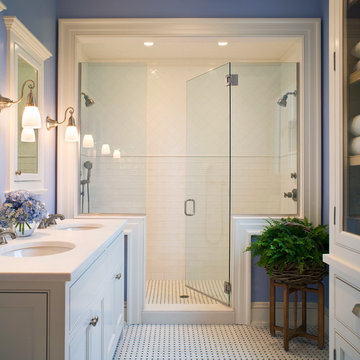
Beach style white tile mosaic tile floor double shower photo in Providence with beaded inset cabinets, white cabinets and blue walls
Find the right local pro for your project
 VanderHorn Architects
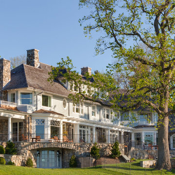
Puncturing the classic wood shingle roof, the rusticated chimneys are constructed on local Connecticut fieldstone.
Huge elegant blue three-story mixed siding house exterior photo with a hip roof and a shingle roof
Huge elegant blue three-story mixed siding house exterior photo with a hip roof and a shingle roof
 Heidi Caillier Design
Haris Kenjar
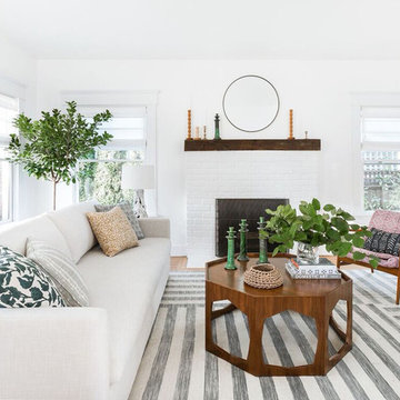
Inspiration for a mid-sized 1960s formal and enclosed light wood floor and beige floor living room remodel in Seattle with white walls, a standard fireplace, a brick fireplace and a wall-mounted tv
Inspiration for a mid-sized 1960s formal and enclosed light wood floor and beige floor living room remodel in Seattle with white walls, a standard fireplace, a brick fireplace and a wall-mounted tv
 Advance Design Studio, Ltd.
Jennifer and Dan have lived in their Deer Park Illinois home for 15 years, slowly making minor fixes like painting and decorating; but they had a new plan for their kitchen the entire time. An awkwardly placed garage door, and an island cooktop with a terrible downdraft made a full-scale kitchen remodel an absolute must. Jennifer had many ideas in mind and wanted to work with a company that could provide high-end work, while partnering with a designer that would tailor the kitchen to her ideas.
She was intrigued by the phrase “Common Sense Remodeling” in Advance Design’s feature she discovered while perusing an issue of the community’s Quintessential Barrington Magazine. Doing further research on the company’s website, as she looked through project profiles and read about Advance Design’s “Common Sense Remodeling” philosophy, she promptly scheduled an appointment to see if the people and ideas she read about were truly who they said they were. The more she read, the more she knew that the “Common Sense” approach to remodeling they described was exactly the type of company she was looking for.
The partnership was sealed after an initial consultation with Owner Todd Jurs and Project Designer Michelle Lecinski. They displayed a combination of friendliness, professionalism and respect that was unmatched by any of the other companies Jennifer talked to. She knew that with Advance Design, she would be able to retain the vision that she had in mind with high-quality craftsmanship.
“I reached out to Advance Design because of the ‘Common Sense Remodeling’ tagline,” Jennifer said. “That’s what lingered for me”. “Advance Design was the most respectful- of the house and of my design ideas, and the most professional of the handful of companies that looked at my project”.
Soon after the meeting Jennifer began working with Michelle on the project design. They quickly developed chemistry. Jennifer loved how Michelle researched and located every detail that Jennifer wanted for the kitchen. Between the two of them, every concept and idea was worked through and perfected. “Jennifer had definite ideas about what she wanted the new kitchen to look like, she just didn’t know how to bring it all together. We worked together really well to make her ideas into the practical reality necessary for a well-functioning kitchen, with the look and feel that she had envisioned”, says Michelle.
“Michelle was wonderful in using the CAD system she would show me new drawings every time we changed the layout while working through the design,” Jennifer said. “She was a really wonderful partner in execution, she made sure everything happened quickly and easily.”
The finished design drew out elements of Jennifer’s style and personality. The pair call the look “sophisticated farmhouse” to describe the kitchen renovation to family and friends. The result was a beautifully crafted, authentic-feeling space that satisfied Jennifer’s dreams 15 years in the making. The whole project consisted of a kitchen remodel, mudroom upgrade with powder room, and garage entry relocation. “The projects I personally like the best, are the ones that put the client’s dreams on display,” Project Designer Michelle said. “And this is one of those projects.”
The main focal point of the kitchen is custom zinc and brass ventilation hood with a vintage sheen, which was hand made to order by a small company in Indiana named Vogler Metalworking. “It’s like sculpture, a true work of art”, says Jennifer. Your eye is immediately drawn towards this elegant yet practical hood that eliminated the home’s downdraft problem and added a striking conversation piece at the same time. The carpenters had to use special gloves when transporting and installing it, so they didn’t smudge it with fingerprints. The beautiful hood centers proudly over the stunning black enamel and brass LaCornue Range. “I had a friend who had a LaCornue range and after learning how easy it was to cook perfect meals, I was convinced I wanted to have one”, says Jennifer. This unique, breathtaking combination anchors the entire kitchen and is apparent immediately as you walk into the great room the surrounds the space.
DuraSupreme Crestwood cabinets with a Kendall Panel add function and sophistication. A custom gray paint color paired with a storm blue was developed so that the new kitchen looked like it belonged to the existing space. Unlacquered brass faucets and hardware were important to Jennifer because she wanted the living finishes to age over time. Remarkable brass diamond mesh cabinet door inserts imported from the UK continue to add this one-of-a-kind kitchen renovation; giving it a “you won’t see this everywhere” quality. The use of old railcar flooring for the coffee bar countertop and reclaimed oak for the open shelving gives an authenticity to the space uncommon in kitchens today.
Jennifer and Michelle fell in love with the Limestone Grey Stone while they were investigating unique island countertop ideas. They liked the fact that the limestone as a living finish will age and change over time. Calcutta Miel Quartz countertops made for an excellent pairing around the perimeter, as it’s durable and perfect for cooking preparations. A textured white subway tile backsplash that runs to the ceiling keeps your eye moving towards the open shelving, and to the main focal point of the stunning range hood combination.
“The kitchen functions beautifully, and it’s gorgeous,” beams Jennifer as she gestures with both hands while smiling ear to ear. “The most important thing was I wanted a kitchen that had a wonderful flow, cooked beautiful meals and was a great gathering place for family and friends, and this space does that perfectly! Beauty wise, it turned out exactly how I had envisioned. I felt the function part was the hardest part, and that was nailed”!
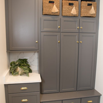
Relocating the garage entry to the new mudroom was a huge priority and has finally separated the family’s arriving home functions from their kitchen. Now coats and shoes and bags have their own area for dropping once members arrive home. Matching gray DuraSupreme cabinetry helped create gorgeous, purposeful lockers for the family. A reclaimed vintage sink and custom wall paper were added to the tiny powder room to beautify the once previously only functional space. Advance Design was even able to create a custom space for their dog to sleep while the family is away.
“It was unbelievable that a project of this size was completed in such a short time, and I think that’s because of the large amount of planning and preparation that went into it,” Jennifer marveled, “When we started, we were ready, and everything was prepared”.
When it came to execution, Project Manager Justin Davis and his crew were quick, accessible, and organized. Projects like this kitchen are typically completed in as little as 8-10 weeks. Jennifer’s kitchen however despite the relocation of some challenging HVAC in a soffit and moving of an exterior door was completed remarkably fast in part because the team was working with an existing tile floor that ran throughout the first floor that the client really loved.
“You get to know these people really well because they’re living in your house while you’re living in your house. They were so fast and really good, it didn’t take as long as even planned” reported Jennifer. “I would text Justin and he always responded almost immediately. I got to know all the guys who were working in our house and they were all wonderful people”.
Details in a customized kitchen like this one require skill and care from the people who install it. “All the guys on the job were skilled at what the did. I wanted small details like little feet to look like furniture, that is where their carpentry skill came in to make these all perfect”, said Jennifer. “The tile guys were wonderful. They even let me determine how I wanted the texture with the grout to appear for a salt and pepper look; now that is a very skilled trade person making it custom”.
In Jennifer’s interview, she continued to reference Advance Design’s “Common Sense Remodeling”, so I took a minute to ask her exactly what that phrase meant to her and how it played out in her experience with her project and the Advance Design team. Here is what she said: “I was intrigued about Common Sense Remodeling and in my head that there would be clear costs and prices, great communication between the design team, the execution team and me”, said Jennifer. They did deliver on that, it was so clear about the cost breakdown, what I could expect from everyone who came to my house, and everything that we had ordered. That to me is the Common Sense”!
It’s great to see a client take literally our assertion that a well-planned remodeling project is simply “Common Sense”! She anticipated each step of the way would be clear, concise, and predictable, all the while protecting the outcome due to the careful upfront planning. “Advance Design delivered on their ‘Common Sense Remodeling’ promise,” Jennifer said. “From the design team, to the execution team - everything was straight forward like I imagined. The project turned out exactly how I envisioned, I enjoyed this process and absolutely would recommend Advance Design Studio to anyone.”
 Minglewood, LLC
Angela Kearney, Minglewood, LLC
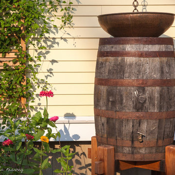
Design ideas for a small traditional full sun and drought-tolerant front yard stone and wood fence garden path in Boston for summer.
Design ideas for a small traditional full sun and drought-tolerant front yard stone and wood fence garden path in Boston for summer.



 Irons Brothers Construction Inc
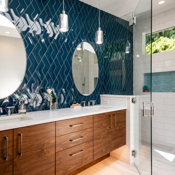
This stunning master bathroom started with a creative reconfiguration of space, but it’s the wall of shimmering blue dimensional tile that really makes this a “statement” bathroom.
The homeowners’, parents of two boys, wanted to add a master bedroom and bath onto the main floor of their classic mid-century home. Their objective was to be close to their kids’ rooms, but still have a quiet and private retreat.
To obtain space for the master suite, the construction was designed to add onto the rear of their home. This was done by expanding the interior footprint into their existing outside corner covered patio. To create a sizeable suite, we also utilized the current interior footprint of their existing laundry room, adjacent to the patio. The design also required rebuilding the exterior walls of the kitchen nook which was adjacent to the back porch. Our clients rounded out the updated rear home design by installing all new windows along the back wall of their living and dining rooms.
Once the structure was formed, our design team worked with the homeowners to fill in the space with luxurious elements to form their desired retreat with universal design in mind. The selections were intentional, mixing modern-day comfort and amenities with 1955 architecture.
The shower was planned to be accessible and easy to use at the couple ages in place. Features include a curb-less, walk-in shower with a wide shower door. We also installed two shower fixtures, a handheld unit and showerhead.
To brighten the room without sacrificing privacy, a clearstory window was installed high in the shower and the room is topped off with a skylight.
For ultimate comfort, heated floors were installed below the silvery gray wood-plank floor tiles which run throughout the entire room and into the shower! Additional features include custom cabinetry in rich walnut with horizontal grain and white quartz countertops. In the shower, oversized white subway tiles surround a mermaid-like soft-blue tile niche, and at the vanity the mirrors are surrounded by boomerang-shaped ultra-glossy marine blue tiles. These create a dramatic focal point. Serene and spectacular.
 Sogno Design Group
Photo by Langdon Clay
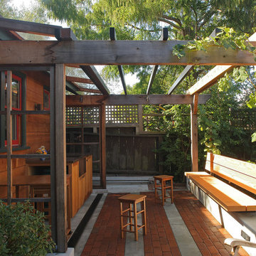
Inspiration for a small craftsman detached studio / workshop shed remodel in San Francisco
Inspiration for a small craftsman detached studio / workshop shed remodel in San Francisco
 Thyme & Place Design LLC
When my client had to move from her company office to work at home, she set up in the dining room. Despite her best efforts, this was not the long-term solution she was looking for. My client realized she needed a dedicated space not on the main floor of the home. On one hand, having your office space right next to the kitchen is handy. On the other hand, it made separating work and home life was not that easy.
The house was a ranch. In essence, the basement would run entire length of the home. As we came down the steps, we entered a time capsule. The house was built in the 1950’s. The walls were covered with original knotty pine paneling. There was a wood burning fireplace and considering this was a basement, high ceilings. In addition, there was everything her family could not store at their own homes. As we wound though the space, I though “wow this has potential”, Eventually, after walking through the laundry room we came to a small nicely lit room. This would be the office.
My client looked at me and asked what I thought. Undoubtedly, I said, this can be a great workspace, but do you really want to walk through this basement and laundry to get here? Without reservation, my client said where do we start?
Once the design was in place, we started the renovation. The knotty pine paneling had to go. Specifically, to add some insulation and control the dampness and humidity. The laundry room wall was relocated to create a hallway to the office.
At the far end of the room, we designated a workout zone. Weights, mats, exercise bike and television are at the ready for morning or afternoon workouts. The space can be concealed by a folding screen for party time. Doors to an old closet under the stairs were relocated to the workout area for hidden storage. Now we had nice wall for a beautiful console and mirror for storage and serving during parties.
In order to add architectural details, we covered the old ugly support columns with simple recessed millwork panels. This detail created a visual division between the bar area and the seating area in front of the fireplace. The old red brick on the fireplace surround was replaced with stack stone. A mantle was made from reclaimed wood. Additional reclaimed wood floating shelves left and right of the fireplace provides decorative display while maintaining a rustic element balancing the copper end table and leather swivel rocker.
We found an amazing rug which tied all of the colors together further defining the gathering space. Russet and burnt orange became the accent color unifying each space. With a bit of whimsy, a rather unusual light fixture which looks like roots from a tree growing through the ceiling is a conversation piece.
The office space is quite and removed from the main part of the basement. There is a desk large enough for multiple screens, a small bookcase holding office supplies and a comfortable chair for conference calls. Because working from home requires many online meetings, we added a shiplap wall painted in Hale Navy to contrast with the orange fabric on the chair. We finished the décor with a painting from my client’s father. This is the background online visitors will see.
The last and best part of the renovation is the beautiful bar. My client is an avid collector of wine. She already had the EuroCave refrigerator, so I incorporated it into the design. The cabinets are painted Temptation Grey from Benjamin Moore. The counter tops are my favorite hard working quartzite Brown Fantasy. The backsplash is a combination of rustic wood and old tin ceiling like porcelain tiles. Together with the textures of the reclaimed wood and hide poofs balanced against the smooth finish of the cabinets, we created a comfortable luxury for relaxing.
There is ample storage for bottles, cans, glasses, and anything else you can think of for a great party. In addition to the wine storage, we incorporated a beverage refrigerator, an ice maker, and a sink. Floating shelves with integrated lighting illuminate the back bar. The raised height of the front bar provides the perfect wine tasting and paring spot. I especially love the pendant lights which look like wine glasses.
Finally, I selected carpet for the stairs and office. It is perfect for noise reduction. Meanwhile for the overall flooring, I specifically selected a high-performance vinyl plank floor. We often use this product as it is perfect to install on a concrete floor. It is soft to walk on, easy to clean and does not reduce the overall height of the space.


Sponsored
Columbus, OH

Trish Takacs Design
Award Winning & Highly Skilled Kitchen & Bath Designer in Columbus
 CVI Design - Carly Visser
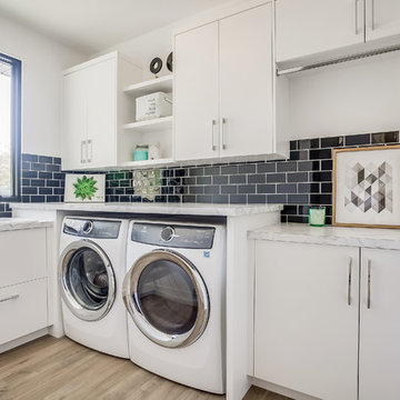
Example of a trendy l-shaped light wood floor dedicated laundry room design in Grand Rapids with a drop-in sink, flat-panel cabinets, white cabinets, white walls and a side-by-side washer/dryer
 Viewrail
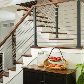
In the railing industry, there are many kinds of infill systems. Viewrail is thrilled to introduce a few new infill systems to the market. One of those new systems incorporates stainless steel rods. Like cable railing, rods run horizontally. Though they are thicker than cable, rods are also still able to provide a clean and clear view. Our rods are 3/8″, and give incredible strength to any system. In addition to strength, rods have a contemporary feel that pair well with modern designs.
This project uses our rods with a hard maple mission-style handrail to provide ample contrast and visual interest. Furthermore, we were able to design a custom starting post for the customer to keep the bottom rods from touching the tops of the treads. Finally, we provided the customer with split foot covers that could slide around the base of the posts. Here at Viewrail, we equipped and excited to help with customizations that help you achieve your dream design.
Our stainless steel rods will be available for purchase on the website soon. However, if you are interested in a stainless steel rod system, you may fill out this simple contact form to get an order started. We look forward to working with you!
 Blackband Design
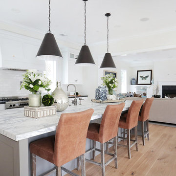
Interior Design by Blackband Design 949.872.2234 www.blackbanddesign.com
Home Build & Design by: Graystone Custom Builders, Inc. Newport Beach, CA (949) 466-0900
 Klopf Architecture
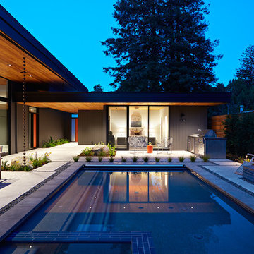
Klopf Architecture, Arterra Landscape Architects and Henry Calvert of Calvert Ventures Designed and built a new warm, modern, Eichler-inspired, open, indoor-outdoor home on a deeper-than-usual San Mateo Highlands property where an original Eichler house had burned to the ground.
The owners wanted multi-generational living and larger spaces than the original home offered, but all parties agreed that the house should respect the neighborhood and blend in stylistically with the other Eichlers. At first the Klopf team considered re-using what little was left of the original home and expanding on it. But after discussions with the owner and builder, all parties agreed that the last few remaining elements of the house were not practical to re-use, so Klopf Architecture designed a new home that pushes the Eichler approach in new directions.
One disadvantage of Eichler production homes is that the house designs were not optimized for each specific lot. A new custom home offered the team a chance to start over. In this case, a longer house that opens up sideways to the south fit the lot better than the original square-ish house that used to open to the rear (west). Accordingly, the Klopf team designed an L-shaped “bar” house with a large glass wall with large sliding glass doors that faces sideways instead of to the rear like a typical Eichler. This glass wall opens to a pool and landscaped yard designed by Arterra Landscape Architects.
Driving by the house, one might assume at first glance it is an Eichler because of the horizontality, the overhanging flat roof eaves, the dark gray vertical siding, and orange solid panel front door, but the house is designed for the 21st Century and is not meant to be a “Likeler.” You won't see any posts and beams in this home. Instead, the ceiling decking is a western red cedar that covers over all the beams. Like Eichlers, this cedar runs continuously from inside to out, enhancing the indoor / outdoor feeling of the house, but unlike Eichlers it conceals a cavity for lighting, wiring, and insulation. Ceilings are higher, rooms are larger and more open, the master bathroom is light-filled and more generous, with a separate tub and shower and a separate toilet compartment, and there is plenty of storage. The garage even easily fits two of today's vehicles with room to spare.
A massive 49-foot by 12-foot wall of glass and the continuity of materials from inside to outside enhance the inside-outside living concept, so the owners and their guests can flow freely from house to pool deck to BBQ to pool and back.
During construction in the rough framing stage, Klopf thought the front of the house appeared too tall even though the house had looked right in the design renderings (probably because the house is uphill from the street). So Klopf Architecture paid the framer to change the roofline from how we had designed it to be lower along the front, allowing the home to blend in better with the neighborhood. One project goal was for people driving up the street to pass the home without immediately noticing there is an "imposter" on this lot, and making that change was essential to achieve that goal.
This 2,606 square foot, 3 bedroom, 3 bathroom Eichler-inspired new house is located in San Mateo in the heart of the Silicon Valley.
Klopf Architecture Project Team: John Klopf, AIA, Klara Kevane
Landscape Architect: Arterra Landscape Architects
Contractor: Henry Calvert of Calvert Ventures
Photography ©2016 Mariko Reed
Location: San Mateo, CA
Year completed: 2016
 Thinkterior LLC
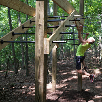
For a family who believes fitness is not only an essential part of life but also a fun opportunity for the whole family to connect, build and achieve greatness together there is nothing better than a custom designed obstacle course right in your back yard.
THEME
The theme of this half mile trail through the woods is evident in the fun, creative and all-inclusive obstacles hidden in the natural flow of the land around this amazing family home. The course was created with adults and children, advanced and beginner athletes, competitive and entertaining events all accounted for. Each of the 13 obstacles was designed to be challenging no matter the size, skill or ability of the athlete lucky enough to run the course.
FOCUS
The focus for this family was to create an outdoor adventure that could be an athletic, social and personal outlet for their entire family while maintaining the natural beauty of the landscape and without altering the sweeping views from the home. The large scale of the challenging obstacles is camouflaged within the landscape using the rolling hills and mature trees as a natural curtain in every season. The beauty of the course does not diminish the functional and demanding nature of the obstacles which are designed to focus on multiple strength, agility, and cardio fitness abilities and intensities.
STORAGE
The start of the trail includes a raised training area offering a dedicated space clear from the ground to place bags, mats and other equipment used during the run. A small all-terrain storage cart was provided for use with 6 yoga mats, 3 medicine balls of various weights, rings, sprinting cones, and a large digital timer to record laps.
GROWTH
The course was designed to provide an athletic and fun challenge for children, teens and adults no matter their experience or athletic prowess. This course offers competitive athletes a challenge and budding athletes an opportunity to experience and ignite their passion for physical activity. Initially the concept for the course was focused on the youngest of the family however as the design grew so did the obstacles and now it is a true family experience that will meet their adapting needs for years. Each obstacle is paired with an instructional sign directing the runners in proper use of the obstacle, adaptations for skill levels and tips on form. These signs are all customized for this course and are printed on metal to ensure they last for many years.
SAFETY
Safety is crucial for all physical activity and an obstacle course of this scale presents unique safety concerns. Children should always be supervised when participating in an adventure on the course however additional care was paid to details on the course to ensure everyone has a great time. All of the course obstacles have been created with pressure treated lumber that will withstand the seasonal poundings. All footer pilings that support obstacles have been placed into the ground between 3 to 4 feet (.9 to 1.2 meters) and each piling has 2 to 3 bags of concrete (totaling over 90 bags used throughout the course) ensuring stability of the structure and safety of the participants. Additionally, all obstacle lumber has been given rounded corners and sanded down offering less splintering and more time for everyone to enjoy the course.
This athletic and charismatic family strives to incorporate a healthy active lifestyle into their daily life and this obstacle course offers their family an opportunity to strengthen themselves and host some memorable and active events at their amazing home.
 dcap pllc
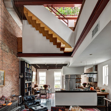
Adding a penthouse perch to this 1899 row house with a harbor view demanded unusual tactics. To circumvent municipal limitations on floor area, a section of floor was removed from one level and “transferred” to the roof as a new studio space. To comply with local height limitations, an innovative structure of solid wood studs was deployed to reduce floor and ceiling thicknesses to the bare minimum. Aside from creating the desired rooftop refuge, these gymnastics also created a dynamic cascade of interior living spaces for an urban designer and his family.
Photos by Bruce Buck

 HomeClick
Even experienced gardeners sometimes run into problems when starting seeds. Visit the website to recognize and resolve the most common trouble areas when starting seeds indoors.
10