
Search results for "Safe replacement" in Home Design Ideas

 Bill Fry Construction - Wm. H. Fry Const. Co.
Covid During Construction and Making Face Masks
Dear Houzz Folks,
We've started getting back to work and are educating everyone at our projects on how to be safe during COVID, posting signage, and we've been making masks for our employees, colleagues, friends, family etc... Here's some information on what I've learned so far in sewing the best fitting face mask for COVID.
1. Put in a wire at the nose bridge (about 3.5 inches) - it helps with fit and if you wear glasses, it keeps them from fogging up. I found that doorbell wire, available at the hardware store, seems to work well. It isn't too thin or too fat, bends easily and holds its shape. I attach it by using a zigzag stitch on the interior seam of the outside of the mask (so there's a bit more cushion on the inside).
2. For the shaped masks, I make a pocket in case my friends, family, colleagues, want to insert a filter - it also allows for three layers of fabric in the breathing area and less bulk where the ties go. For patterns that don't offer pockets, I just make my own pattern pocket. I also first baste the two inside pieces first and then sew the front on. This way, there's no worries about slipping. No pins are needed and no pins minimizes the number of extra air holes in the fabric.
3. So that the ties/loops can be replaced or modified, I make a channel for rather than sewing it in permanently. Many videos show using a safety pin to pull the elastic through. If you sew much, you might have a bodkin in your sewing box, but it might be a bit too wide. Instead, I use a long hairpin (you could probably make a long loop with a paper clip). I run the hairpin through the channel, loop the elastic through the end of the pin and pull through. That takes much less time than piercing it with a safety-pin.
4. For the inside of the masks, it is nice to have softer fabric inside, so high-thread-count sheets purchased on sale work great. Then you can easily tell what is inside as well.
5. For surgical-style masks, there's a pattern with a pocket on the inside and a wire. I like the ideas in this video but use 2 fabrics and make them bigger. About a 9x9 inch for the outside and 9x8 inch for the inside. 5/8 seam on the nose and 1/4 seam on the bottom.
6. For the fitted masks, there are two patterns that I like. For this one, https://moinliz.de/mundschutz-naehen-mit-schnittmuster it expects you to print on European-sized paper, so if you want to get the size right, print at 100%
I also really like this pattern and I added a pocket and lengthened the ends to make channels https://intermountainhealthcare.org/covid19-coronavirus/homemade-cloth-face-coverings/ (scroll down to a link to download the pdf) Lots of folks sew craftpassion, but I like the fit of these patterns better. There are still some other patterns I have left to try!
6. After breaking lots of needles, I realized that I really didn't need to topstich the fitted masks over the bridge, so I just started skipping the bridge.
7. If you're going to wear a face-covering for a really long time, you might want to skip the ear hangers and go for ties behind the head. Instead of two ties, I'll use one long one so that the bottom one is a loop and the top one ties. Bungee cord works nice.
Happy Sewing!
: ) Rhoda Fry, Bill Fry Construction
 Azimuth Works Inc.
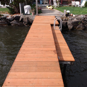
This cottage looking over to Kirkland has been in the client's family for a long time. Our client asked us to come up with an economical way to replace the rotted deck on her dock so it would be safe for her grandchildren to use. We removed all of the old lumber and nails and installed a pressure treated deck, secured with stainless steel hardware that should last for many years even out over the lake.
 Integrity Home Solutions
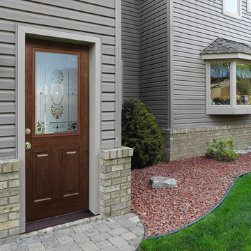
Custom Entry Doors in the St. Louis Area
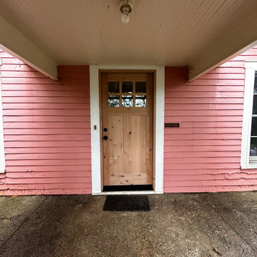
Your doors play a crucial twofold role in your home: to make a welcoming first impression on your guests and to keep your family safe from intruders and harsh weather elements alike. Striking the perfect balance of form and function doesn't have to be difficult, however! At Integrity Home Solutions, we have a comprehensive range of attractive and durable replacement doors that will perfectly compliment your home. With boosted thermal efficiency, security and curbside appeal this is one home improvement option that is too good to pass up!
Find the right local pro for your project
 Kitchens For Cooking
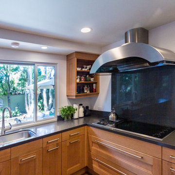
Creating the large cooking area--which houses both a high-BTU gas wok cooktop and a 36" induction cooktop--was created by replacing the old refrigerator with a counter-depth built-in SubZero refrigerator, which then allowed the door to be moved over and created the cooking area plus a safe amount of landing space to both sides.
 Renewal by Andersen Long Island
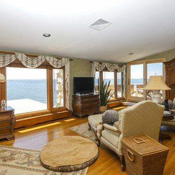
Imagine how relaxed you would feel sitting in one of these fine chairs looking at the view through these Renewal by Andersen picture and casement windows. Whether you’re reading a good book or watching a little TV, you’ll feel safe and secure protected by these energy-efficient Renewal by Andersen windows. Want to smell the salt air: just open the casement windows to let in a cool ocean breeze.
 Stable Works LLC
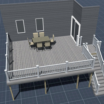
Stable Works will provide labor, material and equipment for the completion of the scope of work outlined below.
-Current (22'x8') New (22'x20' with 5'x'5 landing for stairs)
-Supply and install deck extension as pictured in rendering
- Remove current facia, soffet and header
- Temporarily support roof while work is being performed
- Move center support beam to against the house (Needed to carry the load of new LVL)
- Install new 5 1/2" x 11 7/8" x 22' LVL header
- Replace all facia and soffet
-All footings will use 4000psi concrete
-6"x6" pressure treated supports
-Decking will be Fiberon Good Life (Cottage) $2.49 per linear foot)
-Railing will be White vinyl "Safe-T-Rail"
-Gate at top of steps to be made same as railing.
-Fascia and risers will be PVC board to color match
-Fix all missing fasteners on current deck
-Relocate electrical under new stairs
-Add LED low voltage lighting to post caps and stair treads
-All trash and debris will be removed from site
-Deck area will be power washed after completion
 CuttingEdge Built LLC
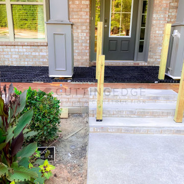
This beautiful new construction craftsman-style home had the typical builder's grade front porch with wood deck board flooring and painted wood steps. Also, there was a large unpainted wood board across the bottom front, and an opening remained that was large enough to be used as a crawl space underneath the porch which quickly became home to unwanted critters.
In order to beautify this space, we removed the wood deck boards and installed the proper floor joists. Atop the joists, we also added a permeable paver system. This is very important as this system not only serves as necessary support for the natural stone pavers but would also firmly hold the sand being used as grout between the pavers.
In addition, we installed matching brick across the bottom front of the porch to fill in the crawl space and painted the wood board to match hand rails and columns.
Next, we replaced the original wood steps by building new concrete steps faced with matching brick and topped with natural stone pavers.
Finally, we added new hand rails and cemented the posts on top of the steps for added stability.
WOW...not only was the outcome a gorgeous transformation but the front porch overall is now much more sturdy and safe!

 McCabe By Design LLC
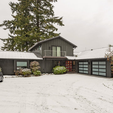
Our client purchased what had been a custom home built in 1973 on a high bank waterfront lot. They did their due diligence with respect to the septic system, well and the existing underground fuel tank but little did they know, they had purchased a house that would fit into the Three Little Pigs Story book.
The original idea was to do a thorough cosmetic remodel to bring the home up to date using all high durability/low maintenance materials and provide the homeowners with a flexible floor plan that would allow them to live in the home for as long as they chose to, not how long the home would allow them to stay safely. However, there was one structure element that had to change, the staircase.
The staircase blocked the beautiful water/mountain few from the kitchen and part of the dining room. It also bisected the second-floor master suite creating a maze of small dysfunctional rooms with a very narrow (and unsafe) top stair landing. In the process of redesigning the stairs and reviewing replacement options for the 1972 custom milled one inch thick cupped and cracked cedar siding, it was discovered that the house had no seismic support and that the dining/family room/hot tub room and been a poorly constructed addition and required significant structural reinforcement. It should be noted that it is not uncommon for this home to be subjected to 60-100 mile an hour winds and that the geographic area is in a known earthquake zone.
Once the structural engineering was complete, the redesign of the home became an open pallet. The homeowners top requests included: no additional square footage, accessibility, high durability/low maintenance materials, high performance mechanicals and appliances, water and energy efficient fixtures and equipment and improved lighting incorporated into: two master suites (one upstairs and one downstairs), a healthy kitchen (appliances that preserve fresh food nutrients and materials that minimize bacterial growth), accessible bathing and toileting, functionally designed closets and storage, a multi-purpose laundry room, an exercise room, a functionally designed home office, a catio (second floor balcony on the front of the home), with an exterior that was not just code compliant but beautiful and easy to maintain.
All of this was achieved and more. The finished project speaks for itself.
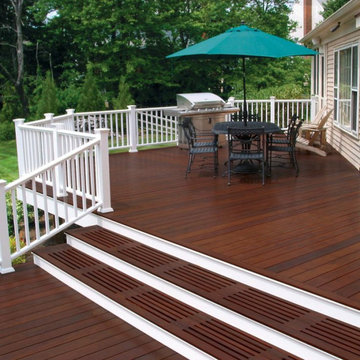
 Loudoun Decks
Beautiful composite deck project completed in Ashburn, VA. This deck features low-maintenance materials, clean lines, and a safe railing system — perfect for outdoor gatherings and year-round use. Built by LDN Decks, specializing in custom wood and composite decks across Loudoun County.
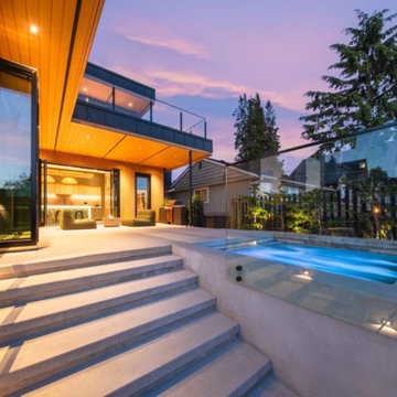 Loudoun Decks
Beautiful composite deck project completed in Ashburn, VA. This deck features low-maintenance materials, clean lines, and a safe railing system — perfect for outdoor gatherings and year-round use. Built by LDN Decks, specializing in custom wood and composite decks across Loudoun County.
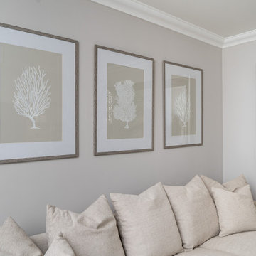
 Wooldridge Interiors
Earlier this year we completed a kitchen, lounge and bedroom refurbishment on behalf of our lovely client, and felt honoured to be called back to also refurbish their dining room into a cosy snug area recently.
When designing the space, we wanted to repeat similar materials, colours and themes that were in the other refurbished areas so that our client's property had flow and harmony.
We replaced the flooring throughout the house and incorporated a gorgeous sisal rug made from the same material as the main lounge and had the space painted in the same colour as the hallway and had a feature wall installed to provide tantalising texture.
Before doing this, we had the side window safely boarded up so that wall lights could be installed and so that the room regained it's symmetry.
Previously, the window provided only a restricted amount of day light due to the neighbouring property obstructing light, and hence, was redundant of it's primary function.
We decided to install wall lights each side of the television to provide additional lighting that did not obstruct the view of the TV.
Overall, the space was transformed into an indulgent yet gloriously cosy room, perfect for snuggling up, watching a film and welcoming those winter nights in.

 Skill Construction & Design, LLC
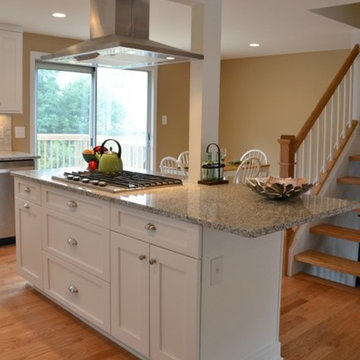
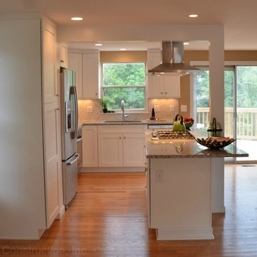
There are so many design elements to this kitchen, I almost don’t know where to start. Bright and airy with crisp clean white cabinets, the kitchen is open and welcoming. Still crisp but gently contrasting, the stainless steel appliance add depth amid the white. To keep this kitchen warm, natural oak covers the floors and a toasted wheat color washes the walls. And then there is the architectural elements. You know. That post and beam in the middle of the room. It’s the center of attention.
When you walk into a room your eyes roam around, establishing the size and shape of the room as your feet take you forward. From the front door of this home straight ahead you encountered this wall. The dining area to the right gives you a glimpse of things to come. Where there is a dining room you will usually find a kitchen.
The architecture of years gone by consistently hides the kitchen, the heart of the home, behind walls. I sympathize with my Mom, and all the other Moms, who have had to spend so much time tucked into a tight kitchen, away from the family. This wall had to go, but it was structural. We needed its support but not its bulk.
So we got rid of the bulk and only the bulk. Instead of a wall we have a post and beam, offering all of the structure we need. We could have installed a huge steel beam and reconfigure the joists to upset the beam, but why? The small beam and post add an incredible architectural element. It’s turning lemons into lemon, we simply made the most of what we had. It may be functional but it’s so fantastic. It looks like we created the effect just for the drama.
The original kitchen may have had a working triangle and some counter space, but it was fairly small, with each area only a step or two away. The dark cabinets made the space feel even smaller and the butcher block patterned laminate counter tops were very dated. The appliances were feeling their age as well, from a coil burner electric stove to a top freezer refrigerator. To keep this kitchen within its space, a half wall separated it from the dining area.
With the wall gone we borrowed some space from the living room and extended what was a U shaped kitchen into an L. At the living room window we start our new kitchen. We kept a small part of the wall to support the other end of our decorative beam. Sandwiched between a large pantry and our new French door refrigerator, the wall disappears. With our new open floor plan a sizable island was in order.
We split our cooking areas and installed a continuous grill gas cooktop into the island. A sleek island hood takes care of exhaust and adds an extra element to our architectural feature. Under the cooktop we added over-sized drawers for pots and pan storage. The frameless cabinets from New River Cabinetry are maple, painted white, with the Herndon door style. With the cooktop safely nestled into our island, we still had to add an oven.
We used the space where the old range sat for a large single oven of stainless steel and glass. If it worked for one, why not two? We created a home for a microwave in the wall cabinets. It’s perfect for heating leftovers so close to the refrigerator.
An important consideration for hot spots in your kitchen is landing zones. Each of our cooking areas have generous landing zones, one on each side of the cooktop and an entire counter area above or below the ovens, depending on which one you’re using.
We wanted to give the sink area more room so the half wall had to come out. We moved the trash and recycle cans into a cabinet, removed the heavy soffits and kept the sink under the window.
With that little bit of extra space we were able to add a larger cabinet above the dishwasher and slide it all down. This used to be where the carpeting met the vinyl floor, but all of it is gone. Long oak planks eliminate that final divide between the kitchen and the dining area, while adding visual length to the area. White wall cabinets on each side of the window reflect the sunlight for a brighter view.
With all of the darker cabinetry the backsplash walls had been painted white. Even still, there was a darkness in the corners and it wasn’t very exciting. We wanted to add visual interest and reflect the new under-cabinet lighting, eliminating the shadows in this corner.
With 1″x 2″ Arabescato Honed marble mosaics and those under-cabinet lights, we achieved the perfect balance. The marble has subtle swirls in gray and beige on a clean white background, but with the honed finish the light is softly reflected instead of glaring. For granite, we chose the soft gray tones of Luna Pearl. The speckles of gray and beige are a gentle contrast to the white cabinets and emulate the color of the stainless steel.
Between the carpet, red half wall, dark railing and dated light fixture, the dining area felt tired. Since the kitchen lacked sufficient storage, a large utility cabinet crowded the table space without adding any decorate elements.
Although it didn’t get any bigger, our dining area feels fresher and more open too. With the oak flooring joining the area to the rest of our space and the toasted wheat on the walls, the white table and chairs compliment the cabinetry while contrasting the warmer colors. We replaced the chandelier with recessed lighting and changed that railing too.
With our new open floor plan, we ended up with a fairly open area in between our foyer closet and the living room window. Not one to miss an opportunity, we filled the space with a multi-functional work space.
With the sunlight streaming in this bright corner works for anything this family needs.
There’s plenty of space for a chair under this large desk drawer. A closed cabinet below, glass doors above and lots of open shelving let you store and or showcase your belongings. We added a lite area at the top to keep away the darker corners.
The transformation is complete. This kitchen and all of its features are truly the center of attention in this home.
http://www.designsbyskill.com/
http://www.rjkconstructioninc.com/
Sponsored
Plain City, OH

Kuhns Contracting, Inc.
Central Ohio's Trusted Home Remodeler Specializing in Kitchens & Baths

 Landforms
Our clients in Bloomfield Michigan wanted their old wooden steps replaced with something safe, sturdy and beautiful. We installed 35 natural guillotine cut stone steps each weighing over 200 lbs. To soften the slope we incorporated tumbled paver landings. Along with a stepping stone pathway to the dock we installed a tumbled block seating wall. Both sides were enhanced with lots of perennials to add color and interest. Landscape lighting was installed to add beauty and safety in the evenings.
Landforms Inc.
 Colony Pool Service of Delaware, Inc.
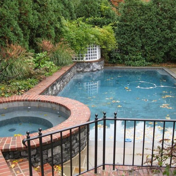
This North Wilmington, Delaware residential client will be choosing a custom Loop-Loc Safety Mesh Pool Cover for their in-ground swimming pool and spa which was custom-designed for their own specific swimming pool and spa providing safety and protection. The cover was designed and custom manufactured to accommodate the spa, pool steps, angles, and unique configurations to avoid compromising quality and safety.
A Mesh Pool Cover is manufactured of ultra-strong, super dense mesh that blocks virtually all sunlight but still lets rain and melting snow easily drain through. It's the perfect choice for customers who want less light and debris in their pools, but still want the one-of-a-kind protection of the only pool cover proven safe and strong enough to support an elephant.
 Homeowner Services of Michigan LLC
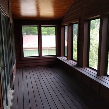
Our client loved their existing deck and used it whenever they could. Unfortunately, summer heat and pesky insects often cut their deck time short. We knew just what to do. With an outstanding design by Scott McElrath and Dangerous Architects, we rebuilt their deck's old substructure with all-new Wolmonized wood and weather-resistant fasteners. We resurfaced the deck with AKEK composite decking material, a new Westbury aluminum railing system with locking gates, built a new gabled roof -tying into the existing roof, and enclosed it with CRIMSAFE security screens. The new screened-in deck area features a vaulted stained cedar ceiling, ceiling fan, and locking screen security door. Now, our clients enjoy their safe, comfortable, bug-free outdoor deck environment any time of
 Skill Construction & Design, LLC
There are so many design elements to this kitchen, I almost don’t know where to start. Bright and airy with crisp clean white cabinets, the kitchen is open and welcoming. Still crisp but gently contrasting, the stainless steel appliance add depth amid the white. To keep this kitchen warm, natural oak covers the floors and a toasted wheat color washes the walls. And then there is the architectural elements. You know. That post and beam in the middle of the room. It’s the center of attention.
When you walk into a room your eyes roam around, establishing the size and shape of the room as your feet take you forward. From the front door of this home straight ahead you encountered this wall. The dining area to the right gives you a glimpse of things to come. Where there is a dining room you will usually find a kitchen.
The architecture of years gone by consistently hides the kitchen, the heart of the home, behind walls. I sympathize with my Mom, and all the other Moms, who have had to spend so much time tucked into a tight kitchen, away from the family. This wall had to go, but it was structural. We needed its support but not its bulk.
So we got rid of the bulk and only the bulk. Instead of a wall we have a post and beam, offering all of the structure we need. We could have installed a huge steel beam and reconfigure the joists to upset the beam, but why? The small beam and post add an incredible architectural element. It’s turning lemons into lemon, we simply made the most of what we had. It may be functional but it’s so fantastic. It looks like we created the effect just for the drama.
The original kitchen may have had a working triangle and some counter space, but it was fairly small, with each area only a step or two away. The dark cabinets made the space feel even smaller and the butcher block patterned laminate counter tops were very dated. The appliances were feeling their age as well, from a coil burner electric stove to a top freezer refrigerator. To keep this kitchen within its space, a half wall separated it from the dining area.
With the wall gone we borrowed some space from the living room and extended what was a U shaped kitchen into an L. At the living room window we start our new kitchen. We kept a small part of the wall to support the other end of our decorative beam. Sandwiched between a large pantry and our new French door refrigerator, the wall disappears. With our new open floor plan a sizable island was in order.
We split our cooking areas and installed a continuous grill gas cooktop into the island. A sleek island hood takes care of exhaust and adds an extra element to our architectural feature. Under the cooktop we added over-sized drawers for pots and pan storage. The frameless cabinets from New River Cabinetry are maple, painted white, with the Herndon door style. With the cooktop safely nestled into our island, we still had to add an oven.
We used the space where the old range sat for a large single oven of stainless steel and glass. If it worked for one, why not two? We created a home for a microwave in the wall cabinets. It’s perfect for heating leftovers so close to the refrigerator.
An important consideration for hot spots in your kitchen is landing zones. Each of our cooking areas have generous landing zones, one on each side of the cooktop and an entire counter area above or below the ovens, depending on which one you’re using.
We wanted to give the sink area more room so the half wall had to come out. We moved the trash and recycle cans into a cabinet, removed the heavy soffits and kept the sink under the window.
With that little bit of extra space we were able to add a larger cabinet above the dishwasher and slide it all down. This used to be where the carpeting met the vinyl floor, but all of it is gone. Long oak planks eliminate that final divide between the kitchen and the dining area, while adding visual length to the area. White wall cabinets on each side of the window reflect the sunlight for a brighter view.
With all of the darker cabinetry the backsplash walls had been painted white. Even still, there was a darkness in the corners and it wasn’t very exciting. We wanted to add visual interest and reflect the new under-cabinet lighting, eliminating the shadows in this corner.
With 1″x 2″ Arabescato Honed marble mosaics and those under-cabinet lights, we achieved the perfect balance. The marble has subtle swirls in gray and beige on a clean white background, but with the honed finish the light is softly reflected instead of glaring. For granite, we chose the soft gray tones of Luna Pearl. The speckles of gray and beige are a gentle contrast to the white cabinets and emulate the color of the stainless steel.
Between the carpet, red half wall, dark railing and dated light fixture, the dining area felt tired. Since the kitchen lacked sufficient storage, a large utility cabinet crowded the table space without adding any decorate elements.
Although it didn’t get any bigger, our dining area feels fresher and more open too. With the oak flooring joining the area to the rest of our space and the toasted wheat on the walls, the white table and chairs compliment the cabinetry while contrasting the warmer colors. We replaced the chandelier with recessed lighting and changed that railing too.
With our new open floor plan, we ended up with a fairly open area in between our foyer closet and the living room window. Not one to miss an opportunity, we filled the space with a multi-functional work space.
With the sunlight streaming in this bright corner works for anything this family needs.
There’s plenty of space for a chair under this large desk drawer. A closed cabinet below, glass doors above and lots of open shelving let you store and or showcase your belongings. We added a lite area at the top to keep away the darker corners.
The transformation is complete. This kitchen and all of its features are truly the center of attention in this home.
http://www.designsbyskill.com/
http://www.rjkconstructioninc.com/
Sponsored
Plain City, OH
Kuhns Contracting, Inc.
Central Ohio's Trusted Home Remodeler Specializing in Kitchens & Baths
 Gregory Contracting
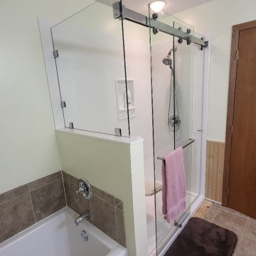
The elderly homeowner only wanted a safe clean material to replace her worn small neo-angle shower. Onyx material fit the bill for this project!
Color: Snowswirl
Her tub and vanity cabinet remained as is
 McCabe By Design LLC
Our client purchased what had been a custom home built in 1973 on a high bank waterfront lot. They did their due diligence with respect to the septic system, well and the existing underground fuel tank but little did they know, they had purchased a house that would fit into the Three Little Pigs Story book.
The original idea was to do a thorough cosmetic remodel to bring the home up to date using all high durability/low maintenance materials and provide the homeowners with a flexible floor plan that would allow them to live in the home for as long as they chose to, not how long the home would allow them to stay safely. However, there was one structure element that had to change, the staircase.
The staircase blocked the beautiful water/mountain few from the kitchen and part of the dining room. It also bisected the second-floor master suite creating a maze of small dysfunctional rooms with a very narrow (and unsafe) top stair landing. In the process of redesigning the stairs and reviewing replacement options for the 1972 custom milled one inch thick cupped and cracked cedar siding, it was discovered that the house had no seismic support and that the dining/family room/hot tub room and been a poorly constructed addition and required significant structural reinforcement. It should be noted that it is not uncommon for this home to be subjected to 60-100 mile an hour winds and that the geographic area is in a known earthquake zone.
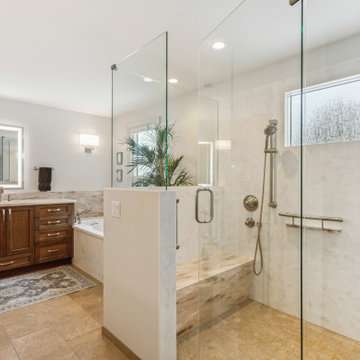
Once the structural engineering was complete, the redesign of the home became an open pallet. The homeowners top requests included: no additional square footage, accessibility, high durability/low maintenance materials, high performance mechanicals and appliances, water and energy efficient fixtures and equipment and improved lighting incorporated into: two master suites (one upstairs and one downstairs), a healthy kitchen (appliances that preserve fresh food nutrients and materials that minimize bacterial growth), accessible bathing and toileting, functionally designed closets and storage, a multi-purpose laundry room, an exercise room, a functionally designed home office, a catio (second floor balcony on the front of the home), with an exterior that was not just code compliant but beautiful and easy to maintain.
All of this was achieved and more. The finished project speaks for itself.
 Wooldridge Interiors
Earlier this year we completed a kitchen, lounge and bedroom refurbishment on behalf of our lovely client, and felt honoured to be called back to also refurbish their dining room into a cosy snug area recently.
When designing the space, we wanted to repeat similar materials, colours and themes that were in the other refurbished areas so that our client's property had flow and harmony.
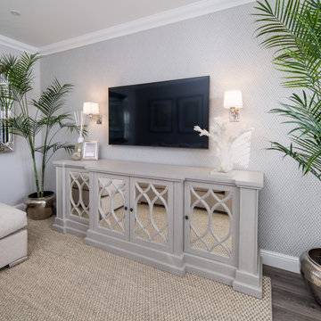
We replaced the flooring throughout the house and incorporated a gorgeous sisal rug made from the same material as the main lounge and had the space painted in the same colour as the hallway and had a feature wall installed to provide tantalising texture.
Before doing this, we had the side window safely boarded up so that wall lights could be installed and so that the room regained it's symmetry.
Previously, the window provided only a restricted amount of day light due to the neighbouring property obstructing light, and hence, was redundant of it's primary function.
We decided to install wall lights each side of the television to provide additional lighting that did not obstruct the view of the TV.
Overall, the space was transformed into an indulgent yet gloriously cosy room, perfect for snuggling up, watching a film and welcoming those winter nights in.
23