
Search results for "Safe replacement" in Home Design Ideas
 Toronto Bath Centre
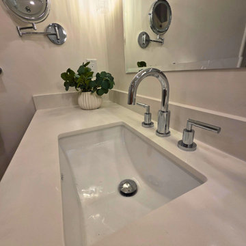
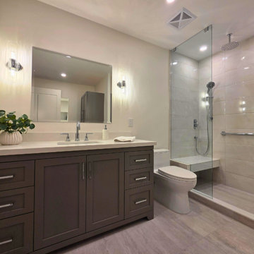
This Bayview and Eglinton condo bathroom renovation included replacing the bathtub with a spacious walk-in shower. Since the drain could not be relocated, we designed a floating shower bench above the Schluter Vario linear drain to keep the shower open, safe and functional.
The space also features Tenzo fixtures, a ceiling-mounted rain shower, handheld shower, custom frameless glass, a 60-inch AHM Designers vanity, custom storage and mirrors, upgraded lighting and a Panasonic exhaust fan. Almost all products used in this renovation were made in Canada.
 Pacific Garden Design
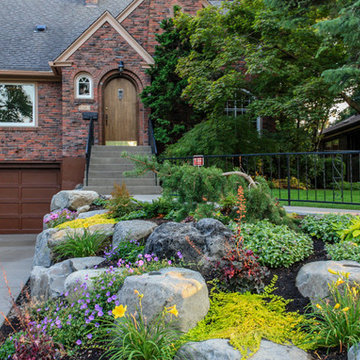
With a narrow driveway and leaning concrete retaining walls, parking was a major challenge at this 1938 brick Tudor on Spokane's South Hill. Crumbling concrete stairs added another layer of difficulty, and after a particularly rough winter, the homeowners were ready for a change. The failing concrete walls were replaced with stacked boulders, which created space for a new, wider driveway. Natural stone steps offer access to the backyard, while the new front stairs and sidewalk provide a safe route to the front door. The original iron railings were preserved and modified to be reused with the new stairs.
 Toronto Bath Centre
This Bayview and Eglinton condo bathroom renovation included replacing the bathtub with a spacious walk-in shower. Since the drain could not be relocated, we designed a floating shower bench above the Schluter Vario linear drain to keep the shower open, safe and functional.
The space also features Tenzo fixtures, a ceiling-mounted rain shower, handheld shower, custom frameless glass, a 60-inch AHM Designers vanity, custom storage and mirrors, upgraded lighting and a Panasonic exhaust fan. Almost all products used in this renovation were made in Canada.
Find the right local pro for your project
 Sosna Inc
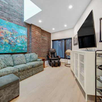
For years, this family felt like their main floor was working against them. The kitchen was a tight galley where only one person could comfortably stand at a time. An old addition felt disconnected and awkward, making everyday life a struggle.
Rethinking the Space
They thought the only solution was a big, expensive addition. But after walking through the home and completing a feasibility study, we found that the square footage was already there. It just needed a smarter plan.
Designing a Floor That Works
We reimagined how the home works day to day. The kitchen became a bright, open hub with a generous island perfect for cooking, homework, and family time. Awkward corners were given clear and useful purposes. A long steel span replaced an exterior wall that could not carry the load, opening the space safely and effectively.
Personal Touches
We made sure the house reflected the family. A custom basement door with a built-in cat door adds charm and function, and cat-shaped handles in the laundry room bring personality throughout the home. Even the piano room feels warm, inviting, and easy to live in.
A Home That Flows
Now, multiple people can cook together comfortably. The rooms feel connected and welcoming. The previously awkward addition feels fully integrated. Daily life flows naturally, and the house finally supports the family instead of working against them.
Discover the Potential in Your Home
If your kitchen does not work or a space feels off, there may be more potential than you realize. Sometimes the right solution is already within your walls. Reach out to us, and see what your home could become!
Sosna Incorporated
7250 Keele Street, Unit 372
Vaughan, ON L4K 1Z8
Phone: 416-888-7366 extension 1
Email: contact@sosna.ca
 Stable Works LLC
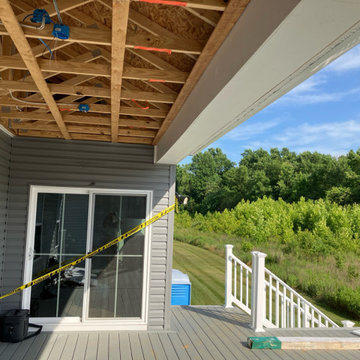
Stable Works will provide labor, material and equipment for the completion of the scope of work outlined below.
-Current (22'x8') New (22'x20' with 5'x'5 landing for stairs)
-Supply and install deck extension as pictured in rendering
- Remove current facia, soffet and header
- Temporarily support roof while work is being performed
- Move center support beam to against the house (Needed to carry the load of new LVL)
- Install new 5 1/2" x 11 7/8" x 22' LVL header
- Replace all facia and soffet
-All footings will use 4000psi concrete
-6"x6" pressure treated supports
-Decking will be Fiberon Good Life (Cottage) $2.49 per linear foot)
-Railing will be White vinyl "Safe-T-Rail"
-Gate at top of steps to be made same as railing.
-Fascia and risers will be PVC board to color match
-Fix all missing fasteners on current deck
-Relocate electrical under new stairs
-Add LED low voltage lighting to post caps and stair treads
-All trash and debris will be removed from site
-Deck area will be power washed after completion
 Pacific Garden Design
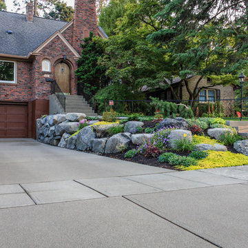
With a narrow driveway and leaning concrete retaining walls, parking was a major challenge at this 1938 brick Tudor on Spokane's South Hill. Crumbling concrete stairs added another layer of difficulty, and after a particularly rough winter, the homeowners were ready for a change. The failing concrete walls were replaced with stacked boulders, which created space for a new, wider driveway. Natural stone steps offer access to the backyard, while the new front stairs and sidewalk provide a safe route to the front door. The original iron railings were preserved and modified to be reused with the new stairs.
 CuttingEdge Built LLC
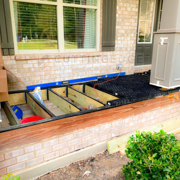
This beautiful new construction craftsman-style home had the typical builder's grade front porch with wood deck board flooring and painted wood steps. Also, there was a large unpainted wood board across the bottom front, and an opening remained that was large enough to be used as a crawl space underneath the porch which quickly became home to unwanted critters.
In order to beautify this space, we removed the wood deck boards and installed the proper floor joists. Atop the joists, we also added a permeable paver system. This is very important as this system not only serves as necessary support for the natural stone pavers but would also firmly hold the sand being used as grout between the pavers.
In addition, we installed matching brick across the bottom front of the porch to fill in the crawl space and painted the wood board to match hand rails and columns.
Next, we replaced the original wood steps by building new concrete steps faced with matching brick and topped with natural stone pavers.
Finally, we added new hand rails and cemented the posts on top of the steps for added stability.
WOW...not only was the outcome a gorgeous transformation but the front porch overall is now much more sturdy and safe!

 Loudoun Decks
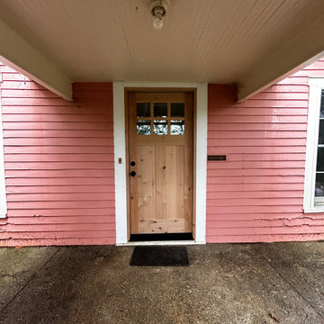
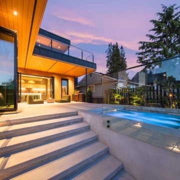
Beautiful composite deck project completed in Ashburn, VA. This deck features low-maintenance materials, clean lines, and a safe railing system — perfect for outdoor gatherings and year-round use. Built by LDN Decks, specializing in custom wood and composite decks across Loudoun County.
 Sosna Inc
For years, this family felt like their main floor was working against them. The kitchen was a tight galley where only one person could comfortably stand at a time. An old addition felt disconnected and awkward, making everyday life a struggle.
Rethinking the Space
They thought the only solution was a big, expensive addition. But after walking through the home and completing a feasibility study, we found that the square footage was already there. It just needed a smarter plan.
Designing a Floor That Works
We reimagined how the home works day to day. The kitchen became a bright, open hub with a generous island perfect for cooking, homework, and family time. Awkward corners were given clear and useful purposes. A long steel span replaced an exterior wall that could not carry the load, opening the space safely and effectively.
Personal Touches
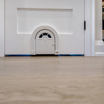
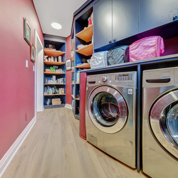
We made sure the house reflected the family. A custom basement door with a built-in cat door adds charm and function, and cat-shaped handles in the laundry room bring personality throughout the home. Even the piano room feels warm, inviting, and easy to live in.
A Home That Flows
Now, multiple people can cook together comfortably. The rooms feel connected and welcoming. The previously awkward addition feels fully integrated. Daily life flows naturally, and the house finally supports the family instead of working against them.
Discover the Potential in Your Home
If your kitchen does not work or a space feels off, there may be more potential than you realize. Sometimes the right solution is already within your walls. Reach out to us, and see what your home could become!
Sosna Incorporated
7250 Keele Street, Unit 372
Vaughan, ON L4K 1Z8
Phone: 416-888-7366 extension 1
Email: contact@sosna.ca
 Sosna Inc
For years, this family felt like their main floor was working against them. The kitchen was a tight galley where only one person could comfortably stand at a time. An old addition felt disconnected and awkward, making everyday life a struggle.
Rethinking the Space
They thought the only solution was a big, expensive addition. But after walking through the home and completing a feasibility study, we found that the square footage was already there. It just needed a smarter plan.
Designing a Floor That Works
We reimagined how the home works day to day. The kitchen became a bright, open hub with a generous island perfect for cooking, homework, and family time. Awkward corners were given clear and useful purposes. A long steel span replaced an exterior wall that could not carry the load, opening the space safely and effectively.
Personal Touches
We made sure the house reflected the family. A custom basement door with a built-in cat door adds charm and function, and cat-shaped handles in the laundry room bring personality throughout the home. Even the piano room feels warm, inviting, and easy to live in.
A Home That Flows
Now, multiple people can cook together comfortably. The rooms feel connected and welcoming. The previously awkward addition feels fully integrated. Daily life flows naturally, and the house finally supports the family instead of working against them.
Discover the Potential in Your Home
If your kitchen does not work or a space feels off, there may be more potential than you realize. Sometimes the right solution is already within your walls. Reach out to us, and see what your home could become!
Sosna Incorporated
7250 Keele Street, Unit 372
Vaughan, ON L4K 1Z8
Phone: 416-888-7366 extension 1
Email: contact@sosna.ca
 Dee Dee Lear
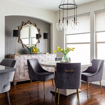
This kitchen and breakfast room underwent a MAJOR transformation. From the configuration and layout to every surface and fixture! We removed an eye sore of a post, replaced the ceramic tile floors with natural hardwoods which were continued from the living area to create better continuity and flow. The cabinets were refaced, where possible, we kept the existing cabinetry to save the budget and the Earth! Take a walk through of the space and look a the BEFORE to get the full WOW factor.
 Wooldridge Interiors
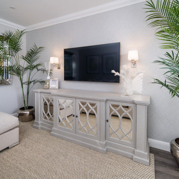
Earlier this year we completed a kitchen, lounge and bedroom refurbishment on behalf of our lovely client, and felt honoured to be called back to also refurbish their dining room into a cosy snug area recently.
When designing the space, we wanted to repeat similar materials, colours and themes that were in the other refurbished areas so that our client's property had flow and harmony.
We replaced the flooring throughout the house and incorporated a gorgeous sisal rug made from the same material as the main lounge and had the space painted in the same colour as the hallway and had a feature wall installed to provide tantalising texture.
Before doing this, we had the side window safely boarded up so that wall lights could be installed and so that the room regained it's symmetry.
Previously, the window provided only a restricted amount of day light due to the neighbouring property obstructing light, and hence, was redundant of it's primary function.
We decided to install wall lights each side of the television to provide additional lighting that did not obstruct the view of the TV.
Overall, the space was transformed into an indulgent yet gloriously cosy room, perfect for snuggling up, watching a film and welcoming those winter nights in.
 Skill Construction & Design, LLC
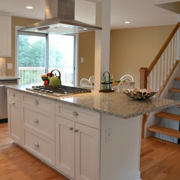
There are so many design elements to this kitchen, I almost don’t know where to start. Bright and airy with crisp clean white cabinets, the kitchen is open and welcoming. Still crisp but gently contrasting, the stainless steel appliance add depth amid the white. To keep this kitchen warm, natural oak covers the floors and a toasted wheat color washes the walls. And then there is the architectural elements. You know. That post and beam in the middle of the room. It’s the center of attention.
When you walk into a room your eyes roam around, establishing the size and shape of the room as your feet take you forward. From the front door of this home straight ahead you encountered this wall. The dining area to the right gives you a glimpse of things to come. Where there is a dining room you will usually find a kitchen.
The architecture of years gone by consistently hides the kitchen, the heart of the home, behind walls. I sympathize with my Mom, and all the other Moms, who have had to spend so much time tucked into a tight kitchen, away from the family. This wall had to go, but it was structural. We needed its support but not its bulk.
So we got rid of the bulk and only the bulk. Instead of a wall we have a post and beam, offering all of the structure we need. We could have installed a huge steel beam and reconfigure the joists to upset the beam, but why? The small beam and post add an incredible architectural element. It’s turning lemons into lemon, we simply made the most of what we had. It may be functional but it’s so fantastic. It looks like we created the effect just for the drama.
The original kitchen may have had a working triangle and some counter space, but it was fairly small, with each area only a step or two away. The dark cabinets made the space feel even smaller and the butcher block patterned laminate counter tops were very dated. The appliances were feeling their age as well, from a coil burner electric stove to a top freezer refrigerator. To keep this kitchen within its space, a half wall separated it from the dining area.
With the wall gone we borrowed some space from the living room and extended what was a U shaped kitchen into an L. At the living room window we start our new kitchen. We kept a small part of the wall to support the other end of our decorative beam. Sandwiched between a large pantry and our new French door refrigerator, the wall disappears. With our new open floor plan a sizable island was in order.
We split our cooking areas and installed a continuous grill gas cooktop into the island. A sleek island hood takes care of exhaust and adds an extra element to our architectural feature. Under the cooktop we added over-sized drawers for pots and pan storage. The frameless cabinets from New River Cabinetry are maple, painted white, with the Herndon door style. With the cooktop safely nestled into our island, we still had to add an oven.
We used the space where the old range sat for a large single oven of stainless steel and glass. If it worked for one, why not two? We created a home for a microwave in the wall cabinets. It’s perfect for heating leftovers so close to the refrigerator.
An important consideration for hot spots in your kitchen is landing zones. Each of our cooking areas have generous landing zones, one on each side of the cooktop and an entire counter area above or below the ovens, depending on which one you’re using.
We wanted to give the sink area more room so the half wall had to come out. We moved the trash and recycle cans into a cabinet, removed the heavy soffits and kept the sink under the window.
With that little bit of extra space we were able to add a larger cabinet above the dishwasher and slide it all down. This used to be where the carpeting met the vinyl floor, but all of it is gone. Long oak planks eliminate that final divide between the kitchen and the dining area, while adding visual length to the area. White wall cabinets on each side of the window reflect the sunlight for a brighter view.
With all of the darker cabinetry the backsplash walls had been painted white. Even still, there was a darkness in the corners and it wasn’t very exciting. We wanted to add visual interest and reflect the new under-cabinet lighting, eliminating the shadows in this corner.
With 1″x 2″ Arabescato Honed marble mosaics and those under-cabinet lights, we achieved the perfect balance. The marble has subtle swirls in gray and beige on a clean white background, but with the honed finish the light is softly reflected instead of glaring. For granite, we chose the soft gray tones of Luna Pearl. The speckles of gray and beige are a gentle contrast to the white cabinets and emulate the color of the stainless steel.
Between the carpet, red half wall, dark railing and dated light fixture, the dining area felt tired. Since the kitchen lacked sufficient storage, a large utility cabinet crowded the table space without adding any decorate elements.
Although it didn’t get any bigger, our dining area feels fresher and more open too. With the oak flooring joining the area to the rest of our space and the toasted wheat on the walls, the white table and chairs compliment the cabinetry while contrasting the warmer colors. We replaced the chandelier with recessed lighting and changed that railing too.
With our new open floor plan, we ended up with a fairly open area in between our foyer closet and the living room window. Not one to miss an opportunity, we filled the space with a multi-functional work space.
With the sunlight streaming in this bright corner works for anything this family needs.
There’s plenty of space for a chair under this large desk drawer. A closed cabinet below, glass doors above and lots of open shelving let you store and or showcase your belongings. We added a lite area at the top to keep away the darker corners.
The transformation is complete. This kitchen and all of its features are truly the center of attention in this home.
http://www.designsbyskill.com/
http://www.rjkconstructioninc.com/
Sponsored
Plain City, OH

Kuhns Contracting, Inc.
Central Ohio's Trusted Home Remodeler Specializing in Kitchens & Baths
 D2D Studio
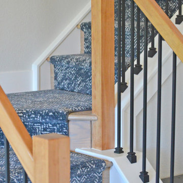
We replaced an outdated oak staircase with newly stained wood to match the new engineered flooring, poplar newel posts and handrails, and plain square iron balusters. We had a custom stair runner fabricated to keep the stairs safe.
 Pacific Garden Design
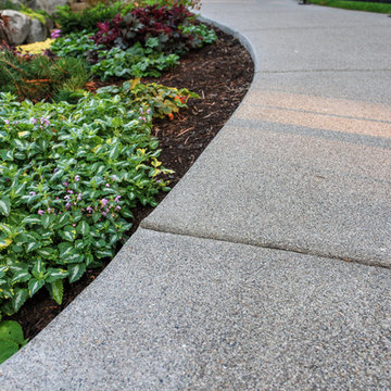
With a narrow driveway and leaning concrete retaining walls, parking was a major challenge at this 1938 brick Tudor on Spokane's South Hill. Crumbling concrete stairs added another layer of difficulty, and after a particularly rough winter, the homeowners were ready for a change. The failing concrete walls were replaced with stacked boulders, which created space for a new, wider driveway. Natural stone steps offer access to the backyard, while the new front stairs and sidewalk provide a safe route to the front door. The original iron railings were preserved and modified to be reused with the new stairs.

 illumine Landscape Lighting
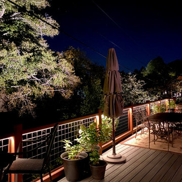
The homeowner had to replace the entire large deck (90ft long) due to a flash flood. We lit under the railing along the entire length with a LED outdoor rated strip light that is dimmable. We also suggested the light the large trees across the stream to create some depth and magic which it certainly did. We also installed many step lights to make it safe to move around at night.
Sponsored
Plain City, OH
Kuhns Contracting, Inc.
Central Ohio's Trusted Home Remodeler Specializing in Kitchens & Baths
 Sosna Inc
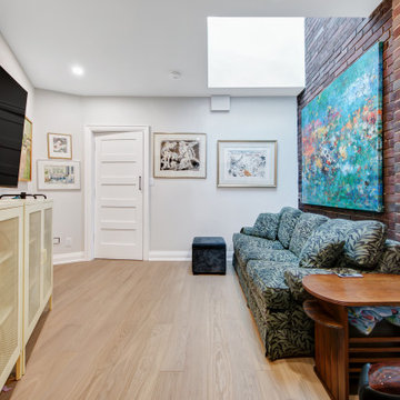
For years, this family felt like their main floor was working against them. The kitchen was a tight galley where only one person could comfortably stand at a time. An old addition felt disconnected and awkward, making everyday life a struggle.
Rethinking the Space
They thought the only solution was a big, expensive addition. But after walking through the home and completing a feasibility study, we found that the square footage was already there. It just needed a smarter plan.
Designing a Floor That Works
We reimagined how the home works day to day. The kitchen became a bright, open hub with a generous island perfect for cooking, homework, and family time. Awkward corners were given clear and useful purposes. A long steel span replaced an exterior wall that could not carry the load, opening the space safely and effectively.
Personal Touches
We made sure the house reflected the family. A custom basement door with a built-in cat door adds charm and function, and cat-shaped handles in the laundry room bring personality throughout the home. Even the piano room feels warm, inviting, and easy to live in.A Home That Flows
Now, multiple people can cook together comfortably. The rooms feel connected and welcoming. The previously awkward addition feels fully integrated. Daily life flows naturally, and the house finally supports the family instead of working against them.
Discover the Potential in Your Home
If your kitchen does not work or a space feels off, there may be more potential than you realize. Sometimes the right solution is already within your walls. Reach out to us, and see what your home could become!
Sosna Incorporated
7250 Keele Street, Unit 372
Vaughan, ON L4K 1Z8
Phone: 416-888-7366 extension 1
Email: contact@sosna.ca
 Skill Construction & Design, LLC
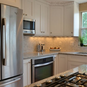
There are so many design elements to this kitchen, I almost don’t know where to start. Bright and airy with crisp clean white cabinets, the kitchen is open and welcoming. Still crisp but gently contrasting, the stainless steel appliance add depth amid the white. To keep this kitchen warm, natural oak covers the floors and a toasted wheat color washes the walls. And then there is the architectural elements. You know. That post and beam in the middle of the room. It’s the center of attention.
When you walk into a room your eyes roam around, establishing the size and shape of the room as your feet take you forward. From the front door of this home straight ahead you encountered this wall. The dining area to the right gives you a glimpse of things to come. Where there is a dining room you will usually find a kitchen.
The architecture of years gone by consistently hides the kitchen, the heart of the home, behind walls. I sympathize with my Mom, and all the other Moms, who have had to spend so much time tucked into a tight kitchen, away from the family. This wall had to go, but it was structural. We needed its support but not its bulk.
So we got rid of the bulk and only the bulk. Instead of a wall we have a post and beam, offering all of the structure we need. We could have installed a huge steel beam and reconfigure the joists to upset the beam, but why? The small beam and post add an incredible architectural element. It’s turning lemons into lemon, we simply made the most of what we had. It may be functional but it’s so fantastic. It looks like we created the effect just for the drama.
The original kitchen may have had a working triangle and some counter space, but it was fairly small, with each area only a step or two away. The dark cabinets made the space feel even smaller and the butcher block patterned laminate counter tops were very dated. The appliances were feeling their age as well, from a coil burner electric stove to a top freezer refrigerator. To keep this kitchen within its space, a half wall separated it from the dining area.
With the wall gone we borrowed some space from the living room and extended what was a U shaped kitchen into an L. At the living room window we start our new kitchen. We kept a small part of the wall to support the other end of our decorative beam. Sandwiched between a large pantry and our new French door refrigerator, the wall disappears. With our new open floor plan a sizable island was in order.
We split our cooking areas and installed a continuous grill gas cooktop into the island. A sleek island hood takes care of exhaust and adds an extra element to our architectural feature. Under the cooktop we added over-sized drawers for pots and pan storage. The frameless cabinets from New River Cabinetry are maple, painted white, with the Herndon door style. With the cooktop safely nestled into our island, we still had to add an oven.
We used the space where the old range sat for a large single oven of stainless steel and glass. If it worked for one, why not two? We created a home for a microwave in the wall cabinets. It’s perfect for heating leftovers so close to the refrigerator.
An important consideration for hot spots in your kitchen is landing zones. Each of our cooking areas have generous landing zones, one on each side of the cooktop and an entire counter area above or below the ovens, depending on which one you’re using.
We wanted to give the sink area more room so the half wall had to come out. We moved the trash and recycle cans into a cabinet, removed the heavy soffits and kept the sink under the window.
With that little bit of extra space we were able to add a larger cabinet above the dishwasher and slide it all down. This used to be where the carpeting met the vinyl floor, but all of it is gone. Long oak planks eliminate that final divide between the kitchen and the dining area, while adding visual length to the area. White wall cabinets on each side of the window reflect the sunlight for a brighter view.
With all of the darker cabinetry the backsplash walls had been painted white. Even still, there was a darkness in the corners and it wasn’t very exciting. We wanted to add visual interest and reflect the new under-cabinet lighting, eliminating the shadows in this corner.
With 1″x 2″ Arabescato Honed marble mosaics and those under-cabinet lights, we achieved the perfect balance. The marble has subtle swirls in gray and beige on a clean white background, but with the honed finish the light is softly reflected instead of glaring. For granite, we chose the soft gray tones of Luna Pearl. The speckles of gray and beige are a gentle contrast to the white cabinets and emulate the color of the stainless steel.
Between the carpet, red half wall, dark railing and dated light fixture, the dining area felt tired. Since the kitchen lacked sufficient storage, a large utility cabinet crowded the table space without adding any decorate elements.
Although it didn’t get any bigger, our dining area feels fresher and more open too. With the oak flooring joining the area to the rest of our space and the toasted wheat on the walls, the white table and chairs compliment the cabinetry while contrasting the warmer colors. We replaced the chandelier with recessed lighting and changed that railing too.
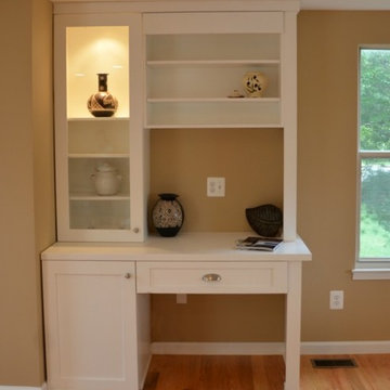
With our new open floor plan, we ended up with a fairly open area in between our foyer closet and the living room window. Not one to miss an opportunity, we filled the space with a multi-functional work space.
With the sunlight streaming in this bright corner works for anything this family needs.
There’s plenty of space for a chair under this large desk drawer. A closed cabinet below, glass doors above and lots of open shelving let you store and or showcase your belongings. We added a lite area at the top to keep away the darker corners.
The transformation is complete. This kitchen and all of its features are truly the center of attention in this home.
http://www.designsbyskill.com/
http://www.rjkconstructioninc.com/
 Skill Construction & Design, LLC
There are so many design elements to this kitchen, I almost don’t know where to start. Bright and airy with crisp clean white cabinets, the kitchen is open and welcoming. Still crisp but gently contrasting, the stainless steel appliance add depth amid the white. To keep this kitchen warm, natural oak covers the floors and a toasted wheat color washes the walls. And then there is the architectural elements. You know. That post and beam in the middle of the room. It’s the center of attention.
When you walk into a room your eyes roam around, establishing the size and shape of the room as your feet take you forward. From the front door of this home straight ahead you encountered this wall. The dining area to the right gives you a glimpse of things to come. Where there is a dining room you will usually find a kitchen.
The architecture of years gone by consistently hides the kitchen, the heart of the home, behind walls. I sympathize with my Mom, and all the other Moms, who have had to spend so much time tucked into a tight kitchen, away from the family. This wall had to go, but it was structural. We needed its support but not its bulk.
So we got rid of the bulk and only the bulk. Instead of a wall we have a post and beam, offering all of the structure we need. We could have installed a huge steel beam and reconfigure the joists to upset the beam, but why? The small beam and post add an incredible architectural element. It’s turning lemons into lemon, we simply made the most of what we had. It may be functional but it’s so fantastic. It looks like we created the effect just for the drama.
The original kitchen may have had a working triangle and some counter space, but it was fairly small, with each area only a step or two away. The dark cabinets made the space feel even smaller and the butcher block patterned laminate counter tops were very dated. The appliances were feeling their age as well, from a coil burner electric stove to a top freezer refrigerator. To keep this kitchen within its space, a half wall separated it from the dining area.
With the wall gone we borrowed some space from the living room and extended what was a U shaped kitchen into an L. At the living room window we start our new kitchen. We kept a small part of the wall to support the other end of our decorative beam. Sandwiched between a large pantry and our new French door refrigerator, the wall disappears. With our new open floor plan a sizable island was in order.
We split our cooking areas and installed a continuous grill gas cooktop into the island. A sleek island hood takes care of exhaust and adds an extra element to our architectural feature. Under the cooktop we added over-sized drawers for pots and pan storage. The frameless cabinets from New River Cabinetry are maple, painted white, with the Herndon door style. With the cooktop safely nestled into our island, we still had to add an oven.
We used the space where the old range sat for a large single oven of stainless steel and glass. If it worked for one, why not two? We created a home for a microwave in the wall cabinets. It’s perfect for heating leftovers so close to the refrigerator.
An important consideration for hot spots in your kitchen is landing zones. Each of our cooking areas have generous landing zones, one on each side of the cooktop and an entire counter area above or below the ovens, depending on which one you’re using.
We wanted to give the sink area more room so the half wall had to come out. We moved the trash and recycle cans into a cabinet, removed the heavy soffits and kept the sink under the window.
With that little bit of extra space we were able to add a larger cabinet above the dishwasher and slide it all down. This used to be where the carpeting met the vinyl floor, but all of it is gone. Long oak planks eliminate that final divide between the kitchen and the dining area, while adding visual length to the area. White wall cabinets on each side of the window reflect the sunlight for a brighter view.
With all of the darker cabinetry the backsplash walls had been painted white. Even still, there was a darkness in the corners and it wasn’t very exciting. We wanted to add visual interest and reflect the new under-cabinet lighting, eliminating the shadows in this corner.
With 1″x 2″ Arabescato Honed marble mosaics and those under-cabinet lights, we achieved the perfect balance. The marble has subtle swirls in gray and beige on a clean white background, but with the honed finish the light is softly reflected instead of glaring. For granite, we chose the soft gray tones of Luna Pearl. The speckles of gray and beige are a gentle contrast to the white cabinets and emulate the color of the stainless steel.
Between the carpet, red half wall, dark railing and dated light fixture, the dining area felt tired. Since the kitchen lacked sufficient storage, a large utility cabinet crowded the table space without adding any decorate elements.
Although it didn’t get any bigger, our dining area feels fresher and more open too. With the oak flooring joining the area to the rest of our space and the toasted wheat on the walls, the white table and chairs compliment the cabinetry while contrasting the warmer colors. We replaced the chandelier with recessed lighting and changed that railing too.
With our new open floor plan, we ended up with a fairly open area in between our foyer closet and the living room window. Not one to miss an opportunity, we filled the space with a multi-functional work space.
With the sunlight streaming in this bright corner works for anything this family needs.
There’s plenty of space for a chair under this large desk drawer. A closed cabinet below, glass doors above and lots of open shelving let you store and or showcase your belongings. We added a lite area at the top to keep away the darker corners.
The transformation is complete. This kitchen and all of its features are truly the center of attention in this home.
http://www.designsbyskill.com/
http://www.rjkconstructioninc.com/
24