
Search results for "Same origin policy" in Home Design Ideas
 Patio Pools and Spas
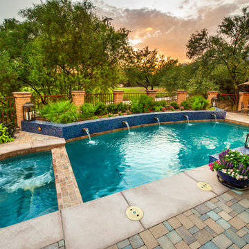
This gorgeous backyard project covered every square inch of this customer’s backyard and was nestled in to a tight backyard access without disturbing the existing trees or golf course. The customer had very contemporary and modern tastes and wanted that reflected in their pool and backyard design.
A stunning 1” blue glass tiled raised planter box* with 5 water features gracefully separates this geometrically perfect Pebble Sheen swimming pool from the golf course it overlooks and green low-maintenance Southwest plants & floral separate the view. A dam wall separates the roomy therapeutic in-ground semi-circle spa from the pool area. The side of the pool closest to the home is a straight parallel line, with the opposing side geometrically rounded with both the raised pattern pavers and the wrought iron fence matching patterns precisely.
The ( wireless EZ Touch remote operated ) pool equipment is on the side of the home allowing spacious deck space for those who enjoy this contemporary backyard.
Of note, the same 1” glass tiles from the raised planter were used throughout the home’s interior to integrate outdoor & indoor elements.
 Carlton Edwards
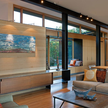
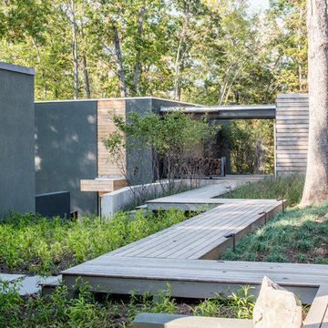
This modern lake house is located in the foothills of the Blue Ridge Mountains. The residence overlooks a mountain lake with expansive mountain views beyond. The design ties the home to its surroundings and enhances the ability to experience both home and nature together. The entry level serves as the primary living space and is situated into three groupings; the Great Room, the Guest Suite and the Master Suite. A glass connector links the Master Suite, providing privacy and the opportunity for terrace and garden areas.
Won a 2013 AIANC Design Award. Featured in the Austrian magazine, More Than Design. Featured in Carolina Home and Garden, Summer 2015.

Find the right local pro for your project
 New England Design Elements
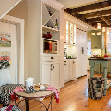
Eat-in kitchen - large cottage u-shaped medium tone wood floor eat-in kitchen idea in Boston with an undermount sink, shaker cabinets, green cabinets, granite countertops, multicolored backsplash, mosaic tile backsplash, paneled appliances and an island
 User
User http://mollywinnphotography.com
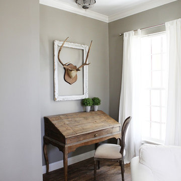
Bedroom - small farmhouse master medium tone wood floor bedroom idea in Austin with gray walls
Bedroom - small farmhouse master medium tone wood floor bedroom idea in Austin with gray walls
 Klopf Architecture
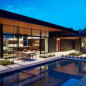
Klopf Architecture, Arterra Landscape Architects and Henry Calvert of Calvert Ventures Designed and built a new warm, modern, Eichler-inspired, open, indoor-outdoor home on a deeper-than-usual San Mateo Highlands property where an original Eichler house had burned to the ground.
The owners wanted multi-generational living and larger spaces than the original home offered, but all parties agreed that the house should respect the neighborhood and blend in stylistically with the other Eichlers. At first the Klopf team considered re-using what little was left of the original home and expanding on it. But after discussions with the owner and builder, all parties agreed that the last few remaining elements of the house were not practical to re-use, so Klopf Architecture designed a new home that pushes the Eichler approach in new directions.
One disadvantage of Eichler production homes is that the house designs were not optimized for each specific lot. A new custom home offered the team a chance to start over. In this case, a longer house that opens up sideways to the south fit the lot better than the original square-ish house that used to open to the rear (west). Accordingly, the Klopf team designed an L-shaped “bar” house with a large glass wall with large sliding glass doors that faces sideways instead of to the rear like a typical Eichler. This glass wall opens to a pool and landscaped yard designed by Arterra Landscape Architects.
Driving by the house, one might assume at first glance it is an Eichler because of the horizontality, the overhanging flat roof eaves, the dark gray vertical siding, and orange solid panel front door, but the house is designed for the 21st Century and is not meant to be a “Likeler.” You won't see any posts and beams in this home. Instead, the ceiling decking is a western red cedar that covers over all the beams. Like Eichlers, this cedar runs continuously from inside to out, enhancing the indoor / outdoor feeling of the house, but unlike Eichlers it conceals a cavity for lighting, wiring, and insulation. Ceilings are higher, rooms are larger and more open, the master bathroom is light-filled and more generous, with a separate tub and shower and a separate toilet compartment, and there is plenty of storage. The garage even easily fits two of today's vehicles with room to spare.
A massive 49-foot by 12-foot wall of glass and the continuity of materials from inside to outside enhance the inside-outside living concept, so the owners and their guests can flow freely from house to pool deck to BBQ to pool and back.
During construction in the rough framing stage, Klopf thought the front of the house appeared too tall even though the house had looked right in the design renderings (probably because the house is uphill from the street). So Klopf Architecture paid the framer to change the roofline from how we had designed it to be lower along the front, allowing the home to blend in better with the neighborhood. One project goal was for people driving up the street to pass the home without immediately noticing there is an "imposter" on this lot, and making that change was essential to achieve that goal.
This 2,606 square foot, 3 bedroom, 3 bathroom Eichler-inspired new house is located in San Mateo in the heart of the Silicon Valley.
Klopf Architecture Project Team: John Klopf, AIA, Klara Kevane
Landscape Architect: Arterra Landscape Architects
Contractor: Henry Calvert of Calvert Ventures
Photography ©2016 Mariko Reed
Location: San Mateo, CA
Year completed: 2016
 Coastal Signature Homes
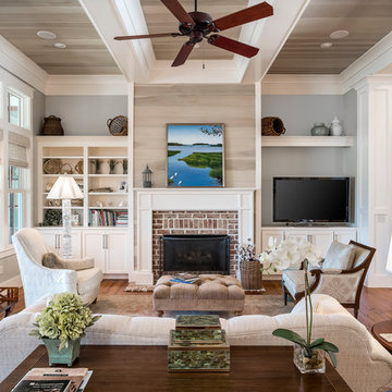
The family room opens up from the kitchen and then again onto the back, screened in porch for an open floor plan that makes a cottage home seem wide open. The gray walls with transom windows and white trim are soothing; the brick fireplace with white surround is a stunning focal point. The hardwood floors set off the room. And then we have the ceiling - wow, what a ceiling - washed butt board and coffered. What a great gathering place for family and friends.

Sponsored
Delaware, OH

Buckeye Basements, Inc.
Central Ohio's Basement Finishing ExpertsBest Of Houzz '13-'21
 FineLine Kitchens, Inc.
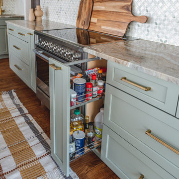
Hi everyone, I'm Sarah and Ogun we are here with fine line kitchens. So we are a couple working together. I do the interior design and remodeling of the space material selection meeting with the clients. And I handled operations outside, you know meaning all the construction work that is taking place the inside. The houses that we work in. I handle all the aspects of the construction, so today's project is very special. We're in Vienna and the client had a very big family. It's a family of seven that lives here. So we had a few aspects that we needed to keep in mind while designing this one. Having everybody be able to sit on the island. So we wanted plenty of seating all the way around. We didn't want anybody standing or anything like that. So what we did is we maximize the space. The center island is the biggest part of the kitchen. We use a natural stone to kind of give it a beautiful texture versus quartz. It's kind of standard white or kind of fabricated, so I wanted something very natural. We did this because I took my inspiration from the outside, so the inspiration if you look at the view right in front of me is there are so many greens there's a lot of brass accents and I wanted to bring this. Into this kitchen while designing it for my clients. She is very warm very. She wanted a very homey, comfy kind of look for the kitchen. So that's what we did today. As you can see, the cabinets are sage green, very light, so I still think it's a neutral, but it's a lighter color that again brings the outside in and we combine that with the oak right behind me so it's a slightly warm oak. It's not very dark. It's not very light. It's a medium brown and the same color went on the island. To kind of tie these two in and the backsplash, my favorite part is where you can see a little bit of design. It is, in my opinion still classic, but includes a pattern so the outside part is as we said in the beginning, is handled by my husband. I'd like him to speak a little bit about that. Thanks, Sarah, I want to talk to you guys a little bit about the construction part of this project. Originally this kitchen was located mostly in this area. They had their stove there sing. It was more of a peninsula layout in Sarah's and the customer vision they wanted. They wanted to get rid of the peninsula and they want to be able to have a huge island that can at least sit seven people because they're familiar with seven. So we wanted to make sure that we can achieve this design and bring it to life so that they can be happy with this layout. Some of the challenges we had, the house, the home being, you know, old home. There were a lot of you know the older electrical and plumbing that had to be replaced. We had to relocate the stove from here to this area. Over here we had put a nice foot fan that we had to relocate all the ductwork and the plumbing. Was being on the peninsula area. We had to relocate it to the center islands. So we achieved all this and kind of like bring it to bring in this kitchen up to date it looks beautiful. That's true, so yes, the old layout did not function for my clients because everything was kind of gathered on one side of the kitchen. So there was like a peninsula right there. So the end of this island kind of continued straight. And that was just the L shape. Kind of where everything was and there used to be another big table here, so they were using only kind of half of the space. So like I said at the beginning, our vision was to kind of feed everybody at the island, create some symmetry. 'cause I love that. So as you can see behind me, this is kind of the focal point symmetrical. Everything is kind of even we wanted to also panel the fridge here so it mimics the pantry and another size. So when you're looking at it, it is bringing again that symmetry back again. I hope you enjoyed this kitchen and this video and I'll see you soon. So how do you think this project turned out? It's nice. I like the color. I think it turned out nice. It's kind of like a little bit different color than what we always do. So I realize. Are you giving me a little bit of credit here that I did something different? Are you proud? I'm so proud of you. Other than that I like it. That they have kind of like a two sink. So if this was our kitchen, if we ever like you can have your own. I can have mine if we ever get into a fight then this can be like my own kitchen. Why are we gonna bring in a fight right now? So I'm cooking anyway. You're grilling most of the time, So what are you even talking about? My kitchen? That's my kitchen. You can just take the small sink. That's fine. It's always good to have your own space right there, so anyways. Thank you guys for watching. We hope to see you soon and if you have any questions please click the link below. It'll lead you to our website, house, YouTube and all of the social media is so nice to have you guys. We'll see you soon. Thanks bye bye-bye.
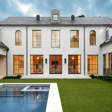
 Coats Homes
white house, two story house,
Huge transitional beige two-story stucco house exterior photo in Dallas with a hip roof and a shingle roof
Huge transitional beige two-story stucco house exterior photo in Dallas with a hip roof and a shingle roof
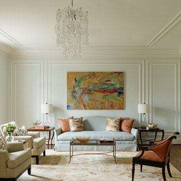
 Wilson Kelsey Design
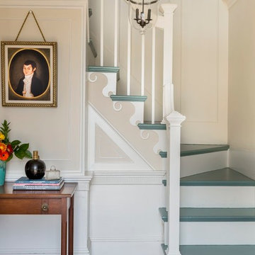
WKD’s design specialty in quality historic preservation ensured that the integrity of this home’s interior and exterior architecture was kept intact. The design mission was to preserve, restore and renovate the home in a manner that celebrated its heritage, while recognizing and accommodating today’s lifestyle and technology. Drawing from the home’s original details, WKD re-designed a friendly entry (including the exterior landscape approach) and kitchen area, integrating it into the existing hearth room. We also created a new stair to the second floor, eliminating the small, steep winding stair. New colors, wallpaper, furnishings and lighting make for a family friendly, welcoming home.
The project has been published several times. Click below to read:
October 2014 Northshore Magazine
Spring 2013 Kitchen Trends Magazine
Spring 2013 Bathroom Trends Magazine
Photographer: MIchael Lee

 Adrienne DeRosa
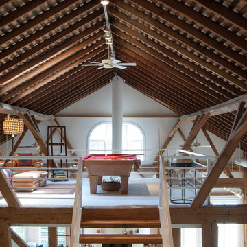
From the doorway of the master bedroom, the entertainment loft appears to hover over the living space below.
Franklin took advantage of the existing hay track in the peak of the ceiling, using it to conceal wiring needed to run the fan and lights. In order to preserve the quality of the ceiling, the architect covered the original slats with 6" insulated panels (SIP's).
While his children were younger, Franklin recognized the need to child-proof the space. "I installed Plexiglas on all the railings so the kids couldn’t climb over them when they were very small," he explains. While some of the sheeting was removed over time, Franklin laughs, " The Plexiglas on the railings by the pool table will always stay since we are so bad at pool! Too many balls fly off the table and could injure someone in the gathering room below."
Adrienne DeRosa Photography

Sponsored
Columbus, OH

Wannemacher Interiors
Customized Award-Winning Interior Design Solutions in Franklin Cnty OH
 FineLine Kitchens, Inc.
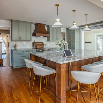
Hi everyone, I'm Sarah and Ogun we are here with fine line kitchens. So we are a couple working together. I do the interior design and remodeling of the space material selection meeting with the clients. And I handled operations outside, you know meaning all the construction work that is taking place the inside. The houses that we work in. I handle all the aspects of the construction, so today's project is very special. We're in Vienna and the client had a very big family. It's a family of seven that lives here. So we had a few aspects that we needed to keep in mind while designing this one. Having everybody be able to sit on the island. So we wanted plenty of seating all the way around. We didn't want anybody standing or anything like that. So what we did is we maximize the space. The center island is the biggest part of the kitchen. We use a natural stone to kind of give it a beautiful texture versus quartz. It's kind of standard white or kind of fabricated, so I wanted something very natural. We did this because I took my inspiration from the outside, so the inspiration if you look at the view right in front of me is there are so many greens there's a lot of brass accents and I wanted to bring this. Into this kitchen while designing it for my clients. She is very warm very. She wanted a very homey, comfy kind of look for the kitchen. So that's what we did today. As you can see, the cabinets are sage green, very light, so I still think it's a neutral, but it's a lighter color that again brings the outside in and we combine that with the oak right behind me so it's a slightly warm oak. It's not very dark. It's not very light. It's a medium brown and the same color went on the island. To kind of tie these two in and the backsplash, my favorite part is where you can see a little bit of design. It is, in my opinion still classic, but includes a pattern so the outside part is as we said in the beginning, is handled by my husband. I'd like him to speak a little bit about that. Thanks, Sarah, I want to talk to you guys a little bit about the construction part of this project. Originally this kitchen was located mostly in this area. They had their stove there sing. It was more of a peninsula layout in Sarah's and the customer vision they wanted. They wanted to get rid of the peninsula and they want to be able to have a huge island that can at least sit seven people because they're familiar with seven. So we wanted to make sure that we can achieve this design and bring it to life so that they can be happy with this layout. Some of the challenges we had, the house, the home being, you know, old home. There were a lot of you know the older electrical and plumbing that had to be replaced. We had to relocate the stove from here to this area. Over here we had put a nice foot fan that we had to relocate all the ductwork and the plumbing. Was being on the peninsula area. We had to relocate it to the center islands. So we achieved all this and kind of like bring it to bring in this kitchen up to date it looks beautiful. That's true, so yes, the old layout did not function for my clients because everything was kind of gathered on one side of the kitchen. So there was like a peninsula right there. So the end of this island kind of continued straight. And that was just the L shape. Kind of where everything was and there used to be another big table here, so they were using only kind of half of the space. So like I said at the beginning, our vision was to kind of feed everybody at the island, create some symmetry. 'cause I love that. So as you can see behind me, this is kind of the focal point symmetrical. Everything is kind of even we wanted to also panel the fridge here so it mimics the pantry and another size. So when you're looking at it, it is bringing again that symmetry back again. I hope you enjoyed this kitchen and this video and I'll see you soon. So how do you think this project turned out? It's nice. I like the color. I think it turned out nice. It's kind of like a little bit different color than what we always do. So I realize. Are you giving me a little bit of credit here that I did something different? Are you proud? I'm so proud of you. Other than that I like it. That they have kind of like a two sink. So if this was our kitchen, if we ever like you can have your own. I can have mine if we ever get into a fight then this can be like my own kitchen. Why are we gonna bring in a fight right now? So I'm cooking anyway. You're grilling most of the time, So what are you even talking about? My kitchen? That's my kitchen. You can just take the small sink. That's fine. It's always good to have your own space right there, so anyways. Thank you guys for watching. We hope to see you soon and if you have any questions please click the link below. It'll lead you to our website, house, YouTube and all of the social media is so nice to have you guys. We'll see you soon. Thanks bye bye-bye.
 Scott Pease Photography
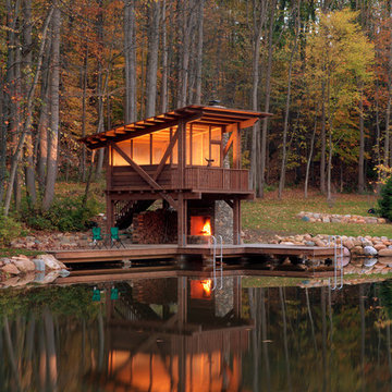
Architect: Peninsula Architects, Peninsula OH
Location: Hunting Valley, OH
Photographer: Scott Pease
Mountain style wood exterior home photo in Cleveland
Mountain style wood exterior home photo in Cleveland
 FineLine Kitchens, Inc.
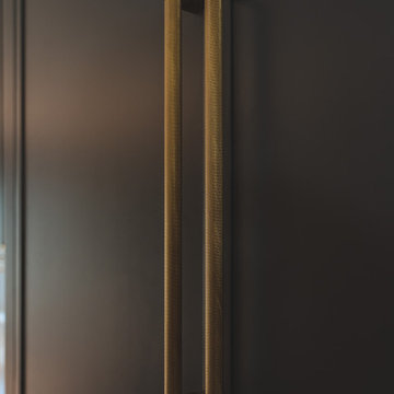
Our designer has achieved a stylish look by combining dark cabinets and light-colored marbles.
 SHM Architects
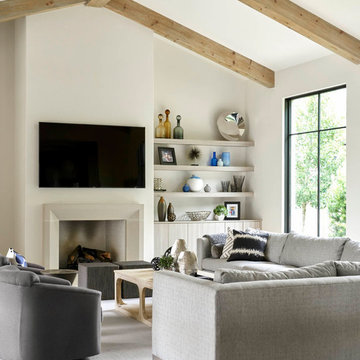
Example of a trendy carpeted and gray floor family room design in Dallas with white walls, a standard fireplace and a wall-mounted tv

Sponsored
Sunbury, OH

J.Holderby - Renovations
Franklin County's Leading General Contractors - 2X Best of Houzz!
 FineLine Kitchens, Inc.
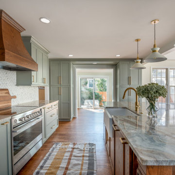
Hi everyone, I'm Sarah and Ogun we are here with fine line kitchens. So we are a couple working together. I do the interior design and remodeling of the space material selection meeting with the clients. And I handled operations outside, you know meaning all the construction work that is taking place the inside. The houses that we work in. I handle all the aspects of the construction, so today's project is very special. We're in Vienna and the client had a very big family. It's a family of seven that lives here. So we had a few aspects that we needed to keep in mind while designing this one. Having everybody be able to sit on the island. So we wanted plenty of seating all the way around. We didn't want anybody standing or anything like that. So what we did is we maximize the space. The center island is the biggest part of the kitchen. We use a natural stone to kind of give it a beautiful texture versus quartz. It's kind of standard white or kind of fabricated, so I wanted something very natural. We did this because I took my inspiration from the outside, so the inspiration if you look at the view right in front of me is there are so many greens there's a lot of brass accents and I wanted to bring this. Into this kitchen while designing it for my clients. She is very warm very. She wanted a very homey, comfy kind of look for the kitchen. So that's what we did today. As you can see, the cabinets are sage green, very light, so I still think it's a neutral, but it's a lighter color that again brings the outside in and we combine that with the oak right behind me so it's a slightly warm oak. It's not very dark. It's not very light. It's a medium brown and the same color went on the island. To kind of tie these two in and the backsplash, my favorite part is where you can see a little bit of design. It is, in my opinion still classic, but includes a pattern so the outside part is as we said in the beginning, is handled by my husband. I'd like him to speak a little bit about that. Thanks, Sarah, I want to talk to you guys a little bit about the construction part of this project. Originally this kitchen was located mostly in this area. They had their stove there sing. It was more of a peninsula layout in Sarah's and the customer vision they wanted. They wanted to get rid of the peninsula and they want to be able to have a huge island that can at least sit seven people because they're familiar with seven. So we wanted to make sure that we can achieve this design and bring it to life so that they can be happy with this layout. Some of the challenges we had, the house, the home being, you know, old home. There were a lot of you know the older electrical and plumbing that had to be replaced. We had to relocate the stove from here to this area. Over here we had put a nice foot fan that we had to relocate all the ductwork and the plumbing. Was being on the peninsula area. We had to relocate it to the center islands. So we achieved all this and kind of like bring it to bring in this kitchen up to date it looks beautiful. That's true, so yes, the old layout did not function for my clients because everything was kind of gathered on one side of the kitchen. So there was like a peninsula right there. So the end of this island kind of continued straight. And that was just the L shape. Kind of where everything was and there used to be another big table here, so they were using only kind of half of the space. So like I said at the beginning, our vision was to kind of feed everybody at the island, create some symmetry. 'cause I love that. So as you can see behind me, this is kind of the focal point symmetrical. Everything is kind of even we wanted to also panel the fridge here so it mimics the pantry and another size. So when you're looking at it, it is bringing again that symmetry back again. I hope you enjoyed this kitchen and this video and I'll see you soon. So how do you think this project turned out? It's nice. I like the color. I think it turned out nice. It's kind of like a little bit different color than what we always do. So I realize. Are you giving me a little bit of credit here that I did something different? Are you proud? I'm so proud of you. Other than that I like it. That they have kind of like a two sink. So if this was our kitchen, if we ever like you can have your own. I can have mine if we ever get into a fight then this can be like my own kitchen. Why are we gonna bring in a fight right now? So I'm cooking anyway. You're grilling most of the time, So what are you even talking about? My kitchen? That's my kitchen. You can just take the small sink. That's fine. It's always good to have your own space right there, so anyways. Thank you guys for watching. We hope to see you soon and if you have any questions please click the link below. It'll lead you to our website, house, YouTube and all of the social media is so nice to have you guys. We'll see you soon. Thanks bye bye-bye.
 User
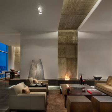
UserThe Clients contacted Cecil Baker + Partners to reconfigure and remodel the top floor of a prominent Philadelphia high-rise into an urban pied-a-terre. The forty-five story apartment building, overlooking Washington Square Park and its surrounding neighborhoods, provided a modern shell for this truly contemporary renovation. Originally configured as three penthouse units, the 8,700 sf interior, as well as 2,500 square feet of terrace space, was to become a single residence with sweeping views of the city in all directions.
The Client’s mission was to create a city home for collecting and displaying contemporary glass crafts. Their stated desire was to cast an urban home that was, in itself, a gallery. While they enjoy a very vital family life, this home was targeted to their urban activities - entertainment being a central element.
The living areas are designed to be open and to flow into each other, with pockets of secondary functions. At large social events, guests feel free to access all areas of the penthouse, including the master bedroom suite. A main gallery was created in order to house unique, travelling art shows.
Stemming from their desire to entertain, the penthouse was built around the need for elaborate food preparation. Cooking would be visible from several entertainment areas with a “show” kitchen, provided for their renowned chef. Secondary preparation and cleaning facilities were tucked away.
The architects crafted a distinctive residence that is framed around the gallery experience, while also incorporating softer residential moments. Cecil Baker + Partners embraced every element of the new penthouse design beyond those normally associated with an architect’s sphere, from all material selections, furniture selections, furniture design, and art placement.
Barry Halkin and Todd Mason Photography
 Silver Maple Construction LLC
Photography by Bob Schatz
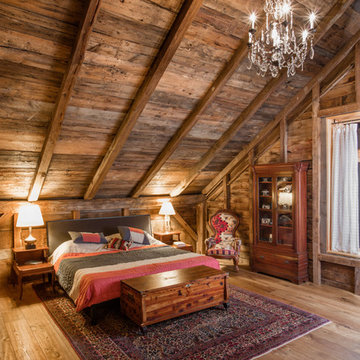
Bedroom - cottage medium tone wood floor bedroom idea in Burlington
Bedroom - cottage medium tone wood floor bedroom idea in Burlington
12