
Search results for "Satisfy" in Home Design Ideas

 Michael Nash Design, Build & Homes
For this couple, planning to move back to their rambler home in Arlington after living overseas for few years, they were ready to get rid of clutter, clean up their grown-up kids’ boxes, and transform their home into their dream home for their golden years.
The old home included a box-like 8 feet x 10 feet kitchen, no family room, three small bedrooms and two back to back small bathrooms. The laundry room was located in a small dark space of the unfinished basement.
This home is located in a cul-de-sac, on an uphill lot, of a very secluded neighborhood with lots of new homes just being built around them.
The couple consulted an architectural firm in past but never were satisfied with the final plans. They approached Michael Nash Custom Kitchens hoping for fresh ideas.
The backyard and side yard are wooded and the existing structure was too close to building restriction lines. We developed design plans and applied for special permits to achieve our client’s goals.
The remodel includes a family room, sunroom, breakfast area, home office, large master bedroom suite, large walk-in closet, main level laundry room, lots of windows, front porch, back deck, and most important than all an elevator from lower to upper level given them and their close relative a necessary easier access.
The new plan added extra dimensions to this rambler on all four sides. Starting from the front, we excavated to allow a first level entrance, storage, and elevator room. Building just above it, is a 12 feet x 30 feet covered porch with a leading brick staircase. A contemporary cedar rail with horizontal stainless steel cable rail system on both the front porch and the back deck sets off this project from any others in area. A new foyer with double frosted stainless-steel door was added which contains the elevator.
The garage door was widened and a solid cedar door was installed to compliment the cedar siding.
The left side of this rambler was excavated to allow a storage off the garage and extension of one of the old bedrooms to be converted to a large master bedroom suite, master bathroom suite and walk-in closet.
We installed matching brick for a seam-less exterior look.
The entire house was furnished with new Italian imported highly custom stainless-steel windows and doors. We removed several brick and block structure walls to put doors and floor to ceiling windows.
A full walk in shower with barn style frameless glass doors, double vanities covered with selective stone, floor to ceiling porcelain tile make the master bathroom highly accessible.
The other two bedrooms were reconfigured with new closets, wider doorways, new wood floors and wider windows. Just outside of the bedroom, a new laundry room closet was a major upgrade.
A second HVAC system was added in the attic for all new areas.
The back side of the master bedroom was covered with floor to ceiling windows and a door to step into a new deck covered in trex and cable railing. This addition provides a view to wooded area of the home.
By excavating and leveling the backyard, we constructed a two story 15’x 40’ addition that provided the tall ceiling for the family room just adjacent to new deck, a breakfast area a few steps away from the remodeled kitchen. Upscale stainless-steel appliances, floor to ceiling white custom cabinetry and quartz counter top, and fun lighting improved this back section of the house with its increased lighting and available work space. Just below this addition, there is extra space for exercise and storage room. This room has a pair of sliding doors allowing more light inside.
The right elevation has a trapezoid shape addition with floor to ceiling windows and space used as a sunroom/in-home office. Wide plank wood floors were installed throughout the main level for continuity.
The hall bathroom was gutted and expanded to allow a new soaking tub and large vanity. The basement half bathroom was converted to a full bathroom, new flooring and lighting in the entire basement changed the purpose of the basement for entertainment and spending time with grandkids.
Off white and soft tone were used inside and out as the color schemes to make this rambler spacious and illuminated.
Final grade and landscaping, by adding a few trees, trimming the old cherry and walnut trees in backyard, saddling the yard, and a new concrete driveway and walkway made this home a unique and charming gem in the neighborhood.

 TOM WILLIAMSON LANDSCAPING
Full back yard pool masonry and landscaping in Braircliff Manor, NY. Such a fun job. Thank you.
Tom Williamson Landscaping, Inc.
Simple. Elegant. Landscaping.
Whether you’re modeling your home into your creative inspiration place, your entertainment haven, or your read-a-book and recharge oasis, a landscaper is the person that you SHOULD pick with your emotions. A robust climbing garden, a mystical natural pathway, or a soothing waterfall-into-the-pool is finished when it feels PERSONAL.
Years of training and horticultural education doesn’t teach how to capture, build and own an emotion — it enhances our natural abilities. When comparing landscaping professionals, a few things need to be considered; do they process the ability to design your vision, the muscle to deliver on the plans, and whether they can provide the WOW factor in which great landscaper recognize as standard. The landscaper that will satisfy every client every time is the one with these characteristics.
Welcome to Tom Williamson Landscaping. We design ‘an experience’ not only through years of engineering our mixtures and techniques, but as understanding and working in symmetrical balance in eye-catching plant bed diversity, refreshing 3-season-blooming wrap gardens, and aged garden large tree installation — to name a few. Enjoyment of your gardens is really what you’re shopping for. Shop our gallery and see if it pushes your enjoyment button.
So, to all garden and home lovers and sharers in this philosophy, we are here, happy to answer questions to provide a reality to your landscaping ideas — Call us today at 914-762-4927 or email.
Services provided are everything great gardening:
Landscaping and Masonry; Bushes, Plantings, Trees, Seasonal plantings, Urns, Pruning, Fertilization, Lawn care & Maintenance, Mulching, Installation of Large Trees, Holiday Trimming, Snowplowing to keep your home enjoyable even in the winter. Landscape Design and construction
Areas cover:
10504, 10506, 10510, 10514, 10546, 10549, 10562, 10570, 10510
Servicing Chappaqua, Briarcliff Manor, Ossining, Scarborough, Pleasantville, Armonk, and Mt. Kisco
Chappaqua 10514 Landscaping: http://www.tomwilliamsonlandscaping.com/photos
Scarsdale landscaping: http://www.tomwilliamsonlandscaping.com/photos
Masonry in Chappaqua: http://www.tomwilliamsonlandscaping.com/photos
Masonry in Pleasantville: http://www.tomwilliamsonlandscaping.com/photos
Armonk landscaping specialists: http://www.tomwilliamsonlandscaping.com/photos
Mt. Kisco landscaping specialists: http://www.tomwilliamsonlandscaping.com/photos
Briarcliff Manor 10510 landscaping contractors: http://www.tomwilliamsonlandscaping.com/photos
Braircliff masonry 10510 contractors: http://www.tomwilliamsonlandscaping.com/photos
Armonk Masonry contractors: http://www.tomwilliamsonlandscaping.com/photos
Chappaqua rock wall specialists: http://www.tomwilliamsonlandscaping.com/photos
Ossining landscaping: http://www.tomwilliamsonlandscaping.com/photos
Ossining Masonry: http://www.tomwilliamsonlandscaping.com/photos
Scarborough Landscaper: http://www.tomwilliamsonlandscaping.com/photos
Scarborough Stone Wall and Mason: http://www.tomwilliamsonlandscaping.com/photos
Pleasantville land design and installation of large trees: http://www.tomwilliamsonlandscaping.com/photos
Pleasantville landscaper: http://www.tomwilliamsonlandscaping.com/photos
Mt. Kisco masonry contractors: http://www.tomwilliamsonlandscaping.com/photos
Armonk stone wall, driveway and pathway designer: http://www.tomwilliamsonlandscaping.com/photos
Best Landscaper in Westchester, NY : http://www.tomwilliamsonlandscaping.com/photos
Hottest landscape business in Westchester, NY: http://www.tomwilliamsonlandscaping.com/photos
Houzz.com Keywords:
Westchester landscaper, Best Landscaping, Masonry, Bushes, Plantings, Trees, Seasonal plantings, Urns, Pruning, Fertilization, Lawn care & Maintenance, Mulching, Installation of Large Trees, Holiday Trimming, Snowplowing, Green grass, Mums, Tulip planting, pond creation, pond aeration, Braircliff pool masonry, briarcliff stone wall around pools, Chappaqua masonry, Chappaqua landscaping, braircliff landscaping, Mt. Kisco masonry, Mt. Kisco Best landscaper, Armonk stone wall installation, Armonk Land Designer, Armonk Landscaper, Pleasantville Landscaper, Scarborough Older home landscaper, Scarborough traditional Landscaper, Scarborough landscaping, Ossining Luxury home landscaping, Ossining Masonry work, Ossining customized stone driveways, Armonk customized stone driveways

 Advance Design Studio, Ltd.
After six years of living in their Huntley IL home, Chris and Meghan were tired of their dark, dingy, outdated kitchen and it was finally time for a long-anticipated change. “The kitchen is the place where we live, it’s where we do everything,” Meghan said. “It was important that it be a space where we wanted to be.” Meghan loves cooking and enjoys including their girls in healthy meal prepping, this led them to want a brighter, more enjoyable kitchen with increased functionality and improved storage.
For Chris especially, the laundry room was an entirely dysfunctional eyesore. “We had a washer and a dryer, but it was all kind-of cobbled together!” Chris said. “There were always laundry piles everywhere, we weren’t really sure what we wanted to do in there, but it was time for us to make a change.” The mess of the space was stressful every time they walked in the door from the garage each day. Kids’ backpacks and shoes piled up haphazardly in the makeshift boot-bench closet left the family feeling disorganized and stressed. They needed space for folding clothes and locker cubbies to help keep the family organized.
Having known Christine and Todd in the Huntley community for years, Chris and Meghan were familiar with their work. “We already trusted them personally and having seen their projects for years we knew they did top notch work. After we reviewed the initial round of designs, we knew that hiring them was definitely the right choice,” Meghan and Chris said. Although Chris had done a lot of work in their home himself, the kitchen and laundry room renovation was such a large undertaking that he didn’t want to steal time away from his family to spend what would surely be many long weekends doing the job himself. “That would not have been a wise choice for us,” Chris laughed.
“Our designer, Michelle was very, very, easy to work with; anything we wanted to see or weren’t sure about, she went above and beyond to make this easy for us. She was easy to get hold of and always quick to respond,” the couple said. Michelle pulled ideas that mirrored the couple’s taste and style and was adept at directing the couple to limited choices that didn’t overwhelm them and kept the process moving. “I have a hard time making decisions. Michelle made the decision-making process so easy. I loved how she listened to what I liked and then presented three great options for me to choose from,” Meghan said.
The main objectives for the kitchen were better storage solutions, they wanted the space to reflect their lifestyle and taste, and they wanted it to last for years with low maintenance. One of the first steps in creating a more functional kitchen was relocating the refrigerator, creating an improved workflow for the busy family.
“We didn’t know that we could even move the refrigerator to a new location where it is now, that was something that we never would have thought of,” Chris said. “The new refrigerator location makes the kitchen feel so much bigger. We didn’t add any space, but our whole kitchen with the new design just seems like it’s so much larger than before!” Meghan said.
The perimeter mist colored cabinets helped warm and brighten the entire room, while the graphite colored cabinets on the island added contrast. Using this fresh, clean color palette satisfied the couple’s desire for a bright space that was the exact opposite of what they had before. Organization accessories were also added to the cabinets such as a spice drawer tray and roll outs to create hidden convenience.
“I absolutely love the hidden spices – it makes cooking so much more enjoyable!” Chris said. “And all the pull outs, and the double trash bin, who would think you could get so excited about organization!” the couple said in unison.
One thing they hated in their original kitchen was how dark the space felt. Added lighting on the ceiling with the new light fixtures combined with the lighter cabinetry colors throughout solved this problem. “Our new kitchen has this warm, almost cozy feeling that our old kitchen never had, it’s just a space that I love spending my time in now,” Meghan said. The light airy feeling was accentuated with the use of floating white shelves on either side of the decorative range hood. “We have so much cabinetry space, the new design is amazing we actually have more storage space than we will ever need,” Meghan said.
The island was extended to create more work surface and added space for stool seating. “The new island changes how we live. Now the kids can be in the kitchen with us, doing homework, eating breakfast, and the three of us have special dinners there when Chris is working late,” Meghan said.
The Carrara Marmi Quartz countertops were chosen because they are, not only beautiful, but are made from hard-working material that doesn’t require maintenance. The white subway tile backsplash that wraps to the ceiling behind the focal point cooktop range/hood compliments the crisp white countertops perfectly, while brushed brass hardware and light fixtures keep the design fresh and new.
The couple had a few fears at the beginning of the project, as most homeowners do. Their biggest fear was being out of their kitchen and laundry room for an extended time. The crew made it very easy for the family to work in a limited space keeping the washer and dryer hooked up the majority of the time, and also getting appliances working with minimal downtime.
“They above and beyond accommodated us to get us through the process,” Meghan said. “They did a great job making sure we were as comfortable as possible throughout the process,” Chris added.
“Our project manager DJ did a great job. He was very good at updating us on schedule changes, getting guys in as quickly as possible. Everyone that stepped in the house was nice and did great work,” said Chris. They thought Advance’s carpenter was phenomenal and were impressed when he took a conceptual idea from a photograph and worked with designer Michelle to create a one of a kind range/hood that has become the topic of conversation with friends and family who visit the new kitchen. “He was in our house literally every day for several weeks. He was easy to work with and good at what he did,” Meghan and Chris said.
The focal point of the kitchen; a hand-crafted, custom-built ventilation hood was clad with handpicked reclaimed barnwood. Advance Design’s carpenter built the framework and the cladding to create a one-of-a-kind design element that the couple loves.
“I think it was especially fun for him to create something unique from scratch, showcasing his talent in this area,” Meghan said. “I love that my kitchen is not like everyone else’s. I got to pick out the wood on my hood and watch it being built and was able to choose what pieces of wood went where on it. It’s totally unique.”
Red Oak flooring was toothed-in throughout the kitchen and the rest of the first floor anywhere changes were made. Then the whole floor was refinished to tone down the orange undertones in the existing floor stain, ultimately changing the color complexion of the entire first floor. The result is a completely new feeling to the entire home.
Renovating the laundry room was extremely important to Meghan and Chris, but they had trouble visualizing what the possibilities were for the seemingly small space. Michelle produced beautiful 3D illustrations that helped them envision the space in a whole new way.
“I must have told Michelle 100 times that I am a visual person, seeing the designs in 3D made it so easy to make decisions and see what we could really do with our space,” Meghan said.
A dividing wall and doorway were removed between the existing laundry room and hallway formerly containing a coat closet, providing space to design specialized graphite colored cabinetry matching the kitchen island to house custom storage cubbies for each family member. Adding the tall utility cabinetry in the new laundry area helped solve the storage issue, tucking away cleaning supplies, household items, and even the cat got its own cubby.
“I love how everything is now hidden in its own space. I can’t tell you how much I hated coming home and seeing everything sitting around on counters,” Chris said.
Electrical outlets were planned for the inside of utility cabinets, so devices could charge in hidden locations. Stacking the washer and dryer allowed for wider countertop space to provide a folding area and a special space for clothes to hang. “The way I do laundry has been completely transformed! I can actually fold clothes and hang them now right out of the washer and dryer,” Meghan said.
“The end result in the kitchen and the laundry/mud room was an updated light and bright space, with a smarter work flow that better meets the needs of this family,” Michelle said.
“I would totally recommend Advance Design,” Meghan said. “Sometimes I sit and just look at my kitchen and laundry room and think ‘Wow, I can’t believe I get to live here!’ It’s an understatement to say we love our new space.”
Find the right local pro for your project

 BLDG Workshop Inc.
The most beautiful lake in British Columbia creates the setting for a family home that integrates almost seamlessly into the landscape.
Interior Design by Adrianne Bailie Design and BLDG Workshop
Erin Bailie Photography

 RAJ Kitchen and Bath, LLC
“Full apartment design”.
IF you have not yet seen this apartment conversion before, we strongly urge you to go to the bottom left of this page and click on the short 2-minutes video. It would put a lot of things into perspective when you come back and continue reading this.
It is true we were literally handed the keys and told a list of things that they wanted to have happen and we were to go into the apartment, look at the space and come up with a design that would satisfy all of that need. UNTIL we showed up! The unit had really seen some better days but we knew we had to look past that and come up with a concept that would work for them.
The immediate challenges were centered around 3 big ideas:
1. Adding a second bedroom to the already small footprint
2. Figuring out a way to make the kitchen bigger, better and brighter
3. Creating a master room walk in closet
It’s always difficult to add new rooms into existing footprint without expanding out or up and not incurring any opportunity cost. In this case, that was exactly what we had to do. Item one and two above had to be tackled as one. We went ahead and switched out the location of the dining room and eliminating an area where there was a “nook” type eat-in area. By doing so, we were able to cut right into that footprint and change the layout of the kitchen.
That one move allowed us to dig into the kitchen design because it was now the main focal point in the apartment. It was no longer an option to keep it in that tiny hole where it was, so we had to ensure that this design was functional and aesthetically pleasing at the same time. By adding the table into the space where an Island typically would go, we were able to both cut cost and still provide a dining experience. The Table serves as an Island as well when cooking.
We then proceeded to block in the existing doorway to the dining room. By doing this, we were able to create a full room which allowed us to put a door on the other side and called that room Bedroom #2. This was easier to do because all of the mechanicals were already in that space (light, heater and windows). By shifting things around, we also achieved a huge wall to wall closet from inside. PERFECT!
Then we moved into the Single bedroom. We thought it was a big room with a small closet, so by creatively adding an L shaped wall and steal some footprint into the bedroom side, we were able to put a door on that new room and design it for the walk-in closet. Even after this, the bedroom still holds a queen size bed with 2 night stands, a TV on the wall, a sitting chair and plenty of room to walk around. This was done by rethinking the location for the bed and night stands.
The bathroom was gutted to make sure there was no leaks and rebuild from the ground up. We kept all of the plumbing where it was, added a new vanity, medicine cabinet, tiles and lighting and it was done.
From there, the rest of the unit had new flooring all throughout, paint, and lighting. After completion and walk through, this project was handed over back to the clients.
Execution and collaboration between all the trades were: Reggie and his team from Premier Interiors and Rohan from RD Mechanical Services.
p.s. Please see our website to see the video.
 RAJ Kitchen and Bath, LLC
“Full apartment design”.
IF you have not yet seen this apartment conversion before, we strongly urge you to go to the bottom left of this page and click on the short 2-minutes video. It would put a lot of things into perspective when you come back and continue reading this.
It is true we were literally handed the keys and told a list of things that they wanted to have happen and we were to go into the apartment, look at the space and come up with a design that would satisfy all of that need. UNTIL we showed up! The unit had really seen some better days but we knew we had to look past that and come up with a concept that would work for them.
The immediate challenges were centered around 3 big ideas:
1. Adding a second bedroom to the already small footprint
2. Figuring out a way to make the kitchen bigger, better and brighter
3. Creating a master room walk in closet
It’s always difficult to add new rooms into existing footprint without expanding out or up and not incurring any opportunity cost. In this case, that was exactly what we had to do. Item one and two above had to be tackled as one. We went ahead and switched out the location of the dining room and eliminating an area where there was a “nook” type eat-in area. By doing so, we were able to cut right into that footprint and change the layout of the kitchen.
That one move allowed us to dig into the kitchen design because it was now the main focal point in the apartment. It was no longer an option to keep it in that tiny hole where it was, so we had to ensure that this design was functional and aesthetically pleasing at the same time. By adding the table into the space where an Island typically would go, we were able to both cut cost and still provide a dining experience. The Table serves as an Island as well when cooking.
We then proceeded to block in the existing doorway to the dining room. By doing this, we were able to create a full room which allowed us to put a door on the other side and called that room Bedroom #2. This was easier to do because all of the mechanicals were already in that space (light, heater and windows). By shifting things around, we also achieved a huge wall to wall closet from inside. PERFECT!
Then we moved into the Single bedroom. We thought it was a big room with a small closet, so by creatively adding an L shaped wall and steal some footprint into the bedroom side, we were able to put a door on that new room and design it for the walk-in closet. Even after this, the bedroom still holds a queen size bed with 2 night stands, a TV on the wall, a sitting chair and plenty of room to walk around. This was done by rethinking the location for the bed and night stands.
The bathroom was gutted to make sure there was no leaks and rebuild from the ground up. We kept all of the plumbing where it was, added a new vanity, medicine cabinet, tiles and lighting and it was done.
From there, the rest of the unit had new flooring all throughout, paint, and lighting. After completion and walk through, this project was handed over back to the clients.
Execution and collaboration between all the trades were: Reggie and his team from Premier Interiors and Rohan from RD Mechanical Services.
p.s. Please see our website to see the video.

 A.B. Edward Enterprises, Inc.
http://www.abedward.com - Our home exteriors company just completed a project for our Deerfield, IL customers. Just look at this inviting home that had GAF Roofing shingles added, custom masonry, natural cedar siding and K-Style gutters to complete a new home look.
(847) 827-1605 - We are Chicagoland's Premier Roofing, Siding, Gutters and Windows Experts. We ALWAYS give FREE ESTIMATES!
We have an A+ Better Business Rating Since 2003 & are an Angie's List Super Service Award Company! Our company specializes in Roofing, Siding, Gutters, Windows Contractor
Your home is your single greatest investment, and so we strive to treat your home as our own, taking care to ensure top-quality products, distinctive design, and expert installation, all backed by comprehensive warranties. Let us create the home of your dreams and we'll take every step to be sure you're 100% satisfied with your project and become another one of our "lifetime customers."
###
About A.B. Edward Enterprises, Inc.
Since 2003 A.B. Edward Enterprises, Incorporated has been providing Chicagoland homeowners with products and installations in the roofing, siding, windows and gutters industry. A.B. Edward has an unblemished A+ Better Business Bureau rating, an Angie's List Super Service Award Company, and also delivers top industry leading products such as GAF, James Hardie Siding Products, Pella Windows and Doors, DaVinci Roofscapes, Mastic Exterior Siding and more. Today, the family-owned and operated business proudly employs more than 30 people, and our services go well beyond roofing to include, masonry, insulation, decks, exterior painting, stucco, carpentry and more.
Exterior Remodeling Deerfield IL
Home Exteriors Company Deerfield IL
Home Exteriors Contractor Deerfield IL
Exterior Home Repair Deerfield IL
Affordable Exterior Company Deerfield IL
Cedar Siding Deerfield IL
Natural Cedar Siding Deerfield IL
Cedar Siding Replacement Deerfield IL
Home Siding Contractor Deerfield IL
Local Siding Contractors Deerfield IL
Home Siding Company Deerfield IL
Siding Contractor Deerfield IL
Affordable Siding Deerfield IL
Siding Company Deerfield IL
Siding Repair Contractor Deerfield IL
Siding Repair Company Deerfield IL
Siding Ideas Deerfield IL
Fiber Cement Siding Deerfield IL
Custom Masonry Deerfield IL
Masonry Company Deerfield IL
Gutters Deerfield IL
Roofing Contractor Deerfield IL
Roofing Company Deerfield IL
Roofing Repair Contractor Deerfield IL
Roofing Repair Company Deerfield IL
Roofing Tiles Deerfield IL
Chicago Roofing Repair Deerfield IL
Residential Roofing Deerfield IL
New Home Roof Deerfield IL
Replace Roof Deerfield IL
Roof Installation Deerfield IL
Tile Roofing Deerfield IL
Specialty Roofing Deerfield IL
Top Roofing Companies Deerfield IL
Leading Roofing Company Deerfield IL
Gutter Company Deerfield, IL
Gutter Installation Deerfield IL
 A.B. Edward Enterprises, Inc.
http://www.abedward.com - Our home exteriors company just completed a project for our Deerfield, IL customers. Just look at this inviting home that had GAF Roofing shingles added, custom masonry, natural cedar siding and K-Style gutters to complete a new home look.
(847) 827-1605 - We are Chicagoland's Premier Roofing, Siding, Gutters and Windows Experts. We ALWAYS give FREE ESTIMATES!
We have an A+ Better Business Rating Since 2003 & are an Angie's List Super Service Award Company! Our company specializes in Roofing, Siding, Gutters, Windows Contractor
Your home is your single greatest investment, and so we strive to treat your home as our own, taking care to ensure top-quality products, distinctive design, and expert installation, all backed by comprehensive warranties. Let us create the home of your dreams and we'll take every step to be sure you're 100% satisfied with your project and become another one of our "lifetime customers."
###
About A.B. Edward Enterprises, Inc.
Since 2003 A.B. Edward Enterprises, Incorporated has been providing Chicagoland homeowners with products and installations in the roofing, siding, windows and gutters industry. A.B. Edward has an unblemished A+ Better Business Bureau rating, an Angie's List Super Service Award Company, and also delivers top industry leading products such as GAF, James Hardie Siding Products, Pella Windows and Doors, DaVinci Roofscapes, Mastic Exterior Siding and more. Today, the family-owned and operated business proudly employs more than 30 people, and our services go well beyond roofing to include, masonry, insulation, decks, exterior painting, stucco, carpentry and more.
Exterior Remodeling Deerfield IL
Home Exteriors Company Deerfield IL
Home Exteriors Contractor Deerfield IL
Exterior Home Repair Deerfield IL
Affordable Exterior Company Deerfield IL
Cedar Siding Deerfield IL
Natural Cedar Siding Deerfield IL
Cedar Siding Replacement Deerfield IL
Home Siding Contractor Deerfield IL
Local Siding Contractors Deerfield IL
Home Siding Company Deerfield IL
Siding Contractor Deerfield IL
Affordable Siding Deerfield IL
Siding Company Deerfield IL
Siding Repair Contractor Deerfield IL
Siding Repair Company Deerfield IL
Siding Ideas Deerfield IL
Fiber Cement Siding Deerfield IL
Custom Masonry Deerfield IL
Masonry Company Deerfield IL
Gutters Deerfield IL
Roofing Contractor Deerfield IL
Roofing Company Deerfield IL
Roofing Repair Contractor Deerfield IL
Roofing Repair Company Deerfield IL
Roofing Tiles Deerfield IL
Chicago Roofing Repair Deerfield IL
Residential Roofing Deerfield IL
New Home Roof Deerfield IL
Replace Roof Deerfield IL
Roof Installation Deerfield IL
Tile Roofing Deerfield IL
Specialty Roofing Deerfield IL
Top Roofing Companies Deerfield IL
Leading Roofing Company Deerfield IL
Gutter Company Deerfield, IL
Gutter Installation Deerfield IL
 Tile Doctor Ltd
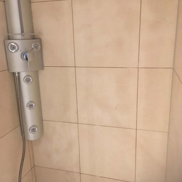
I was asked to look at renovating a shower cubicle at a property in in Manchester city centre that had been clad in White Limestone tiles. I understood the bathroom had been installed 12 years prior, but now the tiles were looking grubby, mouldy and dirty.
The client had lived at the property for the last two years and in an attempt to resolve the problems had used a few different household products such as flash and bleach, they had tried everything, and nothing had helped. I suspected that these strong acidic cleaners had actually made the problem worse by stripping off what was left of the sealer that was protecting the Limestone, allowing dirt to become ingrained in the stone.
I visited the property and ran a few cleaning tests in the shower cubicle with Tile Doctor products. This allows me to see which product will have the best results and gives the customer confidence that we can resolve their issues. The results were immediate, they could see the difference and they were happy to accept my quote and agree a date for my return to complete the work.
I arrived several weeks later and made a start. The tiles were scrubbed by hand with a strong dilution of Tile Doctor Remove and Go with excellent results. This product is designed to remove coatings and sealers, and in this case, it did a great job of drawing out the ingrained stains and dirt build-up. This removed what was left of the sealer and took off most of the dirt and mould. The Limestone tiles and grout were then rinsed with water to remove the soil.
Next I needed to restore the smooth surface of the limestone which had been etched by the use of strong acidic cleaning products. To do this I used a set of six-inch diamond burnishing pads attached to a hand buffer to hone and restore the stone.
I then dried the shower tiles and grout with a heat gun checking the moisture levels with damp meter until I was satisfied it was completely dry.
The last step was to re-seal the Limestone and Grout using a couple of coats of Tile Doctor Colour Grow. This is natural coloured intensifying sealer which provides durable protection to the surface allowing it to breathe and enhancing the colours.
The Customer was amazed with the difference and left the following feedback!
“Kamila was friendly, professional and kept me informed about what to expect before she took on the job and during the tile cleaning. The tiles look absolutely amazing after her work – I feel as though I have a brand new bathroom! Kamila also gave me helpful tips on looking after limestone tiles. I can’t recommend her highly enough.”
For future cleaning I recommended the use of Tile Doctor Aqua-Pro which is a pH neutral shower tile cleaner designed for use on sealed surfaces. Most cleaning products you find in supermarkets are overly strong and will erode the sealer prematurely, so when choosing a cleaning product always read the label and make sure it’s safe to use on Sealed Stone tiles.
Alex Logonzy
Greater Manchester Tile Doctor
 TOM WILLIAMSON LANDSCAPING
Beautiful Armonk Home Masonry and Yearly Landscaping and Urn Project.
About us:
Tom Williamson Landscaping, Inc.
Simple. Elegant. Landscaping.
Whether you’re modeling your home into your creative inspiration place, your entertainment haven, or your read-a-book and recharge oasis, a landscaper is the person that you SHOULD pick with your emotions. A robust climbing garden, a mystical natural pathway, or a soothing waterfall-into-the-pool is finished when it feels PERSONAL.
Years of training and horticultural education doesn’t teach how to capture, build and own an emotion — it enhances our natural abilities. When comparing landscaping professionals, a few things need to be considered; do they process the ability to design your vision, the muscle to deliver on the plans, and whether they can provide the WOW factor in which great landscaper recognize as standard. The landscaper that will satisfy every client every time is the one with these characteristics.
Welcome to Tom Williamson Landscaping. We design ‘an experience’ not only through years of engineering our mixtures and techniques, but as understanding and working in symmetrical balance in eye-catching plant bed diversity, refreshing 3-season-blooming wrap gardens, and aged garden large tree installation — to name a few. Enjoyment of your gardens is really what you’re shopping for. Shop our gallery and see if it pushes your enjoyment button.
So, to all garden and home lovers and sharers in this philosophy, we are here, happy to answer questions to provide a reality to your landscaping ideas — Call us today at 914-762-4927 or email.
Services provided are everything great gardening:
Landscaping and Masonry; Bushes, Plantings, Trees, Seasonal plantings, Urns, Pruning, Fertilization, Lawn care & Maintenance, Mulching, Installation of Large Trees, Holiday Trimming, Snowplowing to keep your home enjoyable even in the winter. Landscape Design and construction
Areas cover:
10504, 10506, 10510, 10514, 10546, 10549, 10562, 10570, 10510
Servicing Chappaqua, Briarcliff Manor, Ossining, Scarborough, Pleasantville, Armonk, and Mt. Kisco
Chappaqua 10514 Landscaping: http://www.tomwilliamsonlandscaping.com/photos
Scarsdale landscaping: http://www.tomwilliamsonlandscaping.com/photos
Masonry in Chappaqua: http://www.tomwilliamsonlandscaping.com/photos
Masonry in Pleasantville: http://www.tomwilliamsonlandscaping.com/photos
Armonk landscaping specialists: http://www.tomwilliamsonlandscaping.com/photos
Mt. Kisco landscaping specialists: http://www.tomwilliamsonlandscaping.com/photos
Briarcliff Manor 10510 landscaping contractors: http://www.tomwilliamsonlandscaping.com/photos
Braircliff masonry 10510 contractors: http://www.tomwilliamsonlandscaping.com/photos
Armonk Masonry contractors: http://www.tomwilliamsonlandscaping.com/photos
Chappaqua rock wall specialists: http://www.tomwilliamsonlandscaping.com/photos
Ossining landscaping: http://www.tomwilliamsonlandscaping.com/photos
Ossining Masonry: http://www.tomwilliamsonlandscaping.com/photos
Scarborough Landscaper: http://www.tomwilliamsonlandscaping.com/photos
Scarborough Stone Wall and Mason: http://www.tomwilliamsonlandscaping.com/photos
Pleasantville land design and installation of large trees: http://www.tomwilliamsonlandscaping.com/photos
Pleasantville landscaper: http://www.tomwilliamsonlandscaping.com/photos
Mt. Kisco masonry contractors: http://www.tomwilliamsonlandscaping.com/photos
Armonk stone wall, driveway and pathway designer: http://www.tomwilliamsonlandscaping.com/photos
Best Landscaper in Westchester, NY : http://www.tomwilliamsonlandscaping.com/photos
Hottest landscape business in Westchester, NY: http://www.tomwilliamsonlandscaping.com/photos
Houzz.com Keywords:
Westchester landscaper, Best Landscaping, Masonry, Bushes, Plantings, Trees, Seasonal plantings, Urns, Pruning, Fertilization, Lawn care & Maintenance, Mulching, Installation of Large Trees, Holiday Trimming, Snowplowing, Green grass, Mums, Tulip planting, pond creation, pond aeration, Braircliff pool masonry, briarcliff stone wall around pools, Chappaqua masonry, Chappaqua landscaping, braircliff landscaping, Mt. Kisco masonry, Mt. Kisco Best landscaper, Armonk stone wall installation, Armonk Land Designer, Armonk Landscaper, Armonk customized stone driveways, Pleasantville Landscaper, Scarborough Older home landscaper, Scarborough traditional Landscaper, Scarborough landscaping, Ossining Luxury home landscaping, Ossining Masonry work, Ossining customized stone driveways

 Simply Perfect
Advice on interior design is available everywhere—from TV shows and websites to books, magazines and apps.
We love seeing people become engaged in design and educated on the wide range of possibilities. But we hope you’ll proceed with caution.
It’s not that style errors are a matter of life and death. It’s just that it’s easy to choose designs that aren’t necessarily reflective of your own personality and character. And since you’re typically stuck with your interior design decisions for years, styles that don’t quite fit can tend to grate on you.
Interiors that give one person comfort may unleash chaos in someone else. This goes beyond favorite colors or hot trends, right to the heart of interior design, where you find questions of composition, balance, repetition, space and more.
The goal is to find that unique combination of design elements that gives you comfort, support and balance.
In one home, that perfect balance was struck through the use of symmetry. A pair of comfortable swivel chairs sit beneath matching indigo patterned paintings. Matching bookcases below the paintings contain similar, but not identical, arrangements of books, vases and bowls. Woods and bronzes help warm up the simple white bookcase shelving.
Two matching poufs in front of the fireplace provide additional seating. The sofa is accented with a pair of pillows with a blue pattern that echoes the artwork.
The effect of the symmetry is to achieve order and simplicity, which I promote at every opportunity. After all, your home interiors should be the setting or the backdrop of your life—not center stage.
Antique bronze and blue are complementary colors. Together, they offer a rich palette of richness and depth, which brings out the beauty of wood and stone.
In the home office, a unique, whitewash-stained wooden desk rests on metal, Sawhorse-inspired legs for a warm, rustic look. The black leather chair features a contemporary silhouette with an antique brass frame. An adjustable desk lamp has bronze accents.
The bookcase combines a sleek, black metal frame with concrete shelves, for another unusual pairing. It’s kept uncluttered for an orderly, peaceful look. Items on the shelves include a bronze-accented lamp and a pair
of high gloss-finished wooden bookends.
The elegant artwork behind the desk is a simple midnight-blue and bronze with mottled white. Deep blues are again picked up in the rug, which adds a stately vibe with a modern pattern and satisfying texture.
Within the framework of symmetry, the living room repeats the blue-and-bronze color scheme.
A large midcentury brass clock above the fireplace keeps the natural stone visible, rather than hidden behind a painting or television, while its straight lines and color create a beautiful contrast.
The sofa is a soft, neutral blue. The pattern on the round brass side table features echoes the darker blue-patterned rug, as well as the rug in the office, tying the rooms together.
Indigo blue books adjacent to bronze vases on the shelves repeat the color scheme. The soapstone-topped coffee table echoes the shape of the fireplace. A pair of tall, matching floor lamps with long wooden bases, brass pulls and simple linen shades combine both the colors and symmetry found throughout the home.
 RAJ Kitchen and Bath, LLC
“Full apartment design”.
IF you have not yet seen this apartment conversion before, we strongly urge you to go to the bottom left of this page and click on the short 2-minutes video. It would put a lot of things into perspective when you come back and continue reading this.
It is true we were literally handed the keys and told a list of things that they wanted to have happen and we were to go into the apartment, look at the space and come up with a design that would satisfy all of that need. UNTIL we showed up! The unit had really seen some better days but we knew we had to look past that and come up with a concept that would work for them.
The immediate challenges were centered around 3 big ideas:
1. Adding a second bedroom to the already small footprint
2. Figuring out a way to make the kitchen bigger, better and brighter
3. Creating a master room walk in closet
It’s always difficult to add new rooms into existing footprint without expanding out or up and not incurring any opportunity cost. In this case, that was exactly what we had to do. Item one and two above had to be tackled as one. We went ahead and switched out the location of the dining room and eliminating an area where there was a “nook” type eat-in area. By doing so, we were able to cut right into that footprint and change the layout of the kitchen.
That one move allowed us to dig into the kitchen design because it was now the main focal point in the apartment. It was no longer an option to keep it in that tiny hole where it was, so we had to ensure that this design was functional and aesthetically pleasing at the same time. By adding the table into the space where an Island typically would go, we were able to both cut cost and still provide a dining experience. The Table serves as an Island as well when cooking.
We then proceeded to block in the existing doorway to the dining room. By doing this, we were able to create a full room which allowed us to put a door on the other side and called that room Bedroom #2. This was easier to do because all of the mechanicals were already in that space (light, heater and windows). By shifting things around, we also achieved a huge wall to wall closet from inside. PERFECT!
Then we moved into the Single bedroom. We thought it was a big room with a small closet, so by creatively adding an L shaped wall and steal some footprint into the bedroom side, we were able to put a door on that new room and design it for the walk-in closet. Even after this, the bedroom still holds a queen size bed with 2 night stands, a TV on the wall, a sitting chair and plenty of room to walk around. This was done by rethinking the location for the bed and night stands.
The bathroom was gutted to make sure there was no leaks and rebuild from the ground up. We kept all of the plumbing where it was, added a new vanity, medicine cabinet, tiles and lighting and it was done.
From there, the rest of the unit had new flooring all throughout, paint, and lighting. After completion and walk through, this project was handed over back to the clients.
Execution and collaboration between all the trades were: Reggie and his team from Premier Interiors and Rohan from RD Mechanical Services.
p.s. Please see our website to see the video.

 ZeroEnergy Design
This LEED Platinum certified house reflects the homeowner's desire for an exceptionally healthy and comfortable living environment, within a traditional neighborhood.
INFILL SITE. The family, who moved from another area of Wellesley, sought out this property to be within walking distance of the high school and downtown area. An existing structure on the tight lot was removed to make way for the new home. 84% of the construction waste, from both the previous structure and the new home, was diverted from a landfill. ZED designed to preserve the existing mature trees on the perimeter of the property to minimize site impacts, and to maintain the character of the neighborhood as well as privacy on the site.
EXTERIOR EXPRESSION. The street facade of the home relates to the local New England vernacular. The rear uses contemporary language, a nod to the family’s Californian roots, to incorporate a roof deck, solar panels, outdoor living space, and the backyard swimming pool. ZED’s careful planning avoided to the need to face the garage doors towards the street, a common syndrome of a narrow lot.
THOUGHTFUL SPACE. Homes with dual entries can often result in duplicate and unused spaces. In this home, the everyday and formal entry areas are one and the same; the front and garage doors share the entry program of coat closets, mudroom storage with bench for removing your shoes, and a laundry room with generous closets for the children's sporting equipment. The entry area leads directly to the living space, encompassing the kitchen, dining and sitting area areas in an L-shaped open plan arrangement. The kitchen is placed at the south-west corner of the space to allow for a strong connection to the dining, sitting and outdoor living spaces. A fire pit on the deck satisfies the family’s desire for an open flame while a sealed gas fireplace is used indoors - ZED’s preference after omitting gas burning appliances completely from an airtight home. A small study, with a window seat, is conveniently located just off of the living space. A first floor guest bedroom includes an accessible bathroom for aging visitors and can be used as a master suite to accommodate aging in place.
HEALTHY LIVING. The client requested a home that was easy to clean and would provide a respite from seasonal allergies and common contaminants that are found in many indoor spaces. ZED selected easy to clean solid surface flooring throughout, provided ample space for cleaning supplies on each floor, and designed a mechanical system with ventilation that provides a constant supply of fresh outdoor air. ZED selected durable materials, finishes, cabinetry, and casework with low or no volatile organic compounds (VOCs) and no added urea formaldehyde.
YEAR-ROUND COMFORT. The home is super insulated and air-tight, paired with high performance triple-paned windows, to ensure it is draft-free throughout the winter (even when in front of the large windows and doors). ZED designed a right-sized heating and cooling system to pair with the thermally improved building enclosure to ensure year-round comfort. The glazing on the home maximizes passive solar gains, and facilitates cross ventilation and daylighting.
ENERGY EFFICIENT. As one of the most energy efficient houses built to date in Wellesley, the home highlights a practical solution for Massachusetts. First, the building enclosure reduces the largest energy requirement for typical houses (heating). Super-insulation, exceptional air sealing, a thermally broken wall assembly, triple pane windows, and passive solar gain combine for a sizable heating load reduction. Second, within the house only efficient systems consume energy. These include an air source heat pump for heating & cooling, a heat pump hot water heater, LED lighting, energy recovery ventilation, and high efficiency appliances. Lastly, photovoltaics provide renewable energy help offset energy consumption. The result is an 89% reduction in energy use compared to a similar brand new home built to code requirements.
RESILIENT. The home will fare well in extreme weather events. During a winter power outage, heat loss will be very slow due to the super-insulated and airtight envelope– taking multiple days to drop to 60 degrees even with no heat source. An engineered drainage system, paired with careful the detailing of the foundation, will help to keep the finished basement dry. A generator will provide full operation of the all-electric house during a power outage.
OVERALL. The home is a reflection of the family goals and an expression of their values, beautifully enabling health, comfort, safety, resilience, and utility, all while respecting the planet.
ZED - Architect & Mechanical Designer
Bevilacqua Builders Inc - Contractor
Creative Land & Water Engineering - Civil Engineering
Barbara Peterson Landscape - Landscape Design
Nest & Company - Interior Furnishings
Eric Roth Photography - Photography
 Tile Doctor Ltd
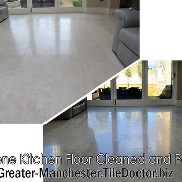
This beautiful Limestone kitchen tiled floor at a property in Peel Green was only a year old and, while it wasn’t in too bad of a state, the customer told me the floor had not been sealed properly due to issues with retaining moisture. The lack of an adequate sealer had allowed the Limestone to become duller over time after exposure to dirt and muck. It also had some more obvious marks and stains in some place and needed some grouting to be done around the corners and edges of the room.
I travelled to the property in Peel Green, which is within the Greater City of Salford in Greater Manchester, to see what could be done to restore the condition of the tiles.
Upon closer inspection of the tiles, I recommended to the customer that we proceed with the process known as burnishing, which we use primarily on Limestone, Marble, and Travertine. Burnishing, which involves the application of diamond encrusted burnishing pads, breaks down old sealers, gets rid of marks, stains and ingrained dirt, and gradually builds and evens out the polish on the tiles.
I started burnishing the Limestone kitchen tiles straight away when I arrived at the property as it was a big area and would require lots of hard work to achieve the desired results within the space of a day.
Our burnishing system consists of four diamond encrusted pads: Coarse, Medium, a Fine and Very Fine. Each pad was applied to the Limestone in sequence in tandem with a small amount of water to act as lubrication, gradually smoothing and polishing the surface of the tiles. After every pad, I also used my wet vac machine to remove any dirty water left on the floor and, after the Fine pad I rinsed the floor thoroughly to remove any dirt left on floor. I then left it to dry.
When I was satisfied that the floor was completely dry, it was time to seal the Limestone tiles. However, I first went over the floor with Very Fine grit pad to provide a final polish before sealing.
My choice of sealer was the impregnating Tile Doctor Colour Grow, a product which enhances the natural colours in the stone whilst also offering robust protection against dirt and stains. Remembering that the tiles had never been properly sealed, I applied plenty of sealer and left it to dry for 10 minutes. Following this, I carefully removed any excess sealer left on the surface with a dry cotton cloth. After sealing I went over the floor once final time with the Very Fine pad, just to smoothen things down and leave an exceptionally neat finish.
When the job was finished, I gave the owner some tips and recommendations on the cleaning of the floor going forward and a complimentary bottle of neutral cleaner to get them started.
The customer was very pleased with the finish, so much so that she opted and take up the Tile Doctor Maintenance Plan to keep the floor looking good for years to come! This involves popping round every 6-12 months to top up the sealer and give the floor a quick polish.
Tony Olmet
Greater Manchester Tile Doctor
 Tile Doctor Ltd
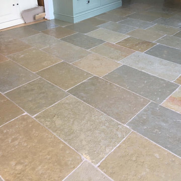
Laid six years ago at a house in Farnham this Sandstone tiled kitchen floor was routinely trampled on by two teenagers, gardening parents and two large dogs. All of this had taken its toll of the sealer which had worn off and without its protection the Sandstone tile and grout had turned an indistinguishable sea of brown.
The floor now needed a deep clean and reseal to restore it appearance and get it looking its best for which I had planned should take two days, the first day for cleaning and drying, the second for sealing and quoted accordingly. My client was happy with the quote and we scheduled a date to do the work.
Farnham is a market town in Surrey and is largest town in the borough of Waverley. It is quite a historic town, with many old buildings, including a number of Georgian houses. With good access links to the A3 and London by train its popular with commuters and I often get requests to work here.
I began by taping up the wooden skirting and the plinths in the kitchen to protect them from splashing during the work. Then armed with Tile Doctor Pro-Clean and a stiff brush I set about cleaning up the grout. The dirt released was removed with a wet vacuum before it had a chance to dry then using more Pro-Clean and a 17” buffing machine fitted with a rotating black nylon pad I cleaned the tiles.
The unamused dogs had been banished to the garden. I love dogs but they were chasing my machine around, so I needed to keep them out of the way. The floor tiles were surprisingly dirty, and the client was quite shocked by the amount of dirt I manged to extract.
Once finished I left the floor to dry off fully overnight, sealing a damp floor is never recommended and can result in a patchy appearance.
Returning the next day, I first checked for areas that needed further attention and then took several moisture readings with a damp meter to check the floor was dry. Satisfied that it was, I was ready to apply the sealer.
We had discussed choice of sealer previously and for this floor I had recommended a Tile Doctor sealer called Seal and Go Extra which would be ideal for her traffic heavy floor. Sealing is an important step as it protects the tiles and grout from dirt becoming ingrained in the stone and improves the look of the stone. Seal and Go Extra is also super tough and should last for years if cleaned with the right product. It sets with a subtle sheen but not a shine which she definitely didn’t want. Three coats of sealer were applied which takes around two hours to be dry to the touch but really needs 24 hours for it to cure.
The sealer brought out the variety of colours in the stone floor and the family were happy with their new floor, now they just had to keep the dogs out of the way for 24 hours!
For aftercare I recommended the use of Tile Doctor Neutral Tile Cleaner to keep the floor in great condition.
Rupert Mcleod
West Surrey Tile Doctor
 RAJ Kitchen and Bath, LLC
“Full apartment design”.
IF you have not yet seen this apartment conversion before, we strongly urge you to go to the bottom left of this page and click on the short 2-minutes video. It would put a lot of things into perspective when you come back and continue reading this.
It is true we were literally handed the keys and told a list of things that they wanted to have happen and we were to go into the apartment, look at the space and come up with a design that would satisfy all of that need. UNTIL we showed up! The unit had really seen some better days but we knew we had to look past that and come up with a concept that would work for them.
The immediate challenges were centered around 3 big ideas:
1. Adding a second bedroom to the already small footprint
2. Figuring out a way to make the kitchen bigger, better and brighter
3. Creating a master room walk in closet
It’s always difficult to add new rooms into existing footprint without expanding out or up and not incurring any opportunity cost. In this case, that was exactly what we had to do. Item one and two above had to be tackled as one. We went ahead and switched out the location of the dining room and eliminating an area where there was a “nook” type eat-in area. By doing so, we were able to cut right into that footprint and change the layout of the kitchen.
That one move allowed us to dig into the kitchen design because it was now the main focal point in the apartment. It was no longer an option to keep it in that tiny hole where it was, so we had to ensure that this design was functional and aesthetically pleasing at the same time. By adding the table into the space where an Island typically would go, we were able to both cut cost and still provide a dining experience. The Table serves as an Island as well when cooking.
We then proceeded to block in the existing doorway to the dining room. By doing this, we were able to create a full room which allowed us to put a door on the other side and called that room Bedroom #2. This was easier to do because all of the mechanicals were already in that space (light, heater and windows). By shifting things around, we also achieved a huge wall to wall closet from inside. PERFECT!
Then we moved into the Single bedroom. We thought it was a big room with a small closet, so by creatively adding an L shaped wall and steal some footprint into the bedroom side, we were able to put a door on that new room and design it for the walk-in closet. Even after this, the bedroom still holds a queen size bed with 2 night stands, a TV on the wall, a sitting chair and plenty of room to walk around. This was done by rethinking the location for the bed and night stands.
The bathroom was gutted to make sure there was no leaks and rebuild from the ground up. We kept all of the plumbing where it was, added a new vanity, medicine cabinet, tiles and lighting and it was done.
From there, the rest of the unit had new flooring all throughout, paint, and lighting. After completion and walk through, this project was handed over back to the clients.
Execution and collaboration between all the trades were: Reggie and his team from Premier Interiors and Rohan from RD Mechanical Services.
p.s. Please see our website to see the video.
 RAJ Kitchen and Bath, LLC
“Full apartment design”.
IF you have not yet seen this apartment conversion before, we strongly urge you to go to the bottom left of this page and click on the short 2-minutes video. It would put a lot of things into perspective when you come back and continue reading this.
It is true we were literally handed the keys and told a list of things that they wanted to have happen and we were to go into the apartment, look at the space and come up with a design that would satisfy all of that need. UNTIL we showed up! The unit had really seen some better days but we knew we had to look past that and come up with a concept that would work for them.
The immediate challenges were centered around 3 big ideas:
1. Adding a second bedroom to the already small footprint
2. Figuring out a way to make the kitchen bigger, better and brighter
3. Creating a master room walk in closet
It’s always difficult to add new rooms into existing footprint without expanding out or up and not incurring any opportunity cost. In this case, that was exactly what we had to do. Item one and two above had to be tackled as one. We went ahead and switched out the location of the dining room and eliminating an area where there was a “nook” type eat-in area. By doing so, we were able to cut right into that footprint and change the layout of the kitchen.
That one move allowed us to dig into the kitchen design because it was now the main focal point in the apartment. It was no longer an option to keep it in that tiny hole where it was, so we had to ensure that this design was functional and aesthetically pleasing at the same time. By adding the table into the space where an Island typically would go, we were able to both cut cost and still provide a dining experience. The Table serves as an Island as well when cooking.
We then proceeded to block in the existing doorway to the dining room. By doing this, we were able to create a full room which allowed us to put a door on the other side and called that room Bedroom #2. This was easier to do because all of the mechanicals were already in that space (light, heater and windows). By shifting things around, we also achieved a huge wall to wall closet from inside. PERFECT!
Then we moved into the Single bedroom. We thought it was a big room with a small closet, so by creatively adding an L shaped wall and steal some footprint into the bedroom side, we were able to put a door on that new room and design it for the walk-in closet. Even after this, the bedroom still holds a queen size bed with 2 night stands, a TV on the wall, a sitting chair and plenty of room to walk around. This was done by rethinking the location for the bed and night stands.
The bathroom was gutted to make sure there was no leaks and rebuild from the ground up. We kept all of the plumbing where it was, added a new vanity, medicine cabinet, tiles and lighting and it was done.
From there, the rest of the unit had new flooring all throughout, paint, and lighting. After completion and walk through, this project was handed over back to the clients.
Execution and collaboration between all the trades were: Reggie and his team from Premier Interiors and Rohan from RD Mechanical Services.
p.s. Please see our website to see the video.
 Simply Perfect
Advice on interior design is available everywhere—from TV shows and websites to books, magazines and apps.
We love seeing people become engaged in design and educated on the wide range of possibilities. But we hope you’ll proceed with caution.
It’s not that style errors are a matter of life and death. It’s just that it’s easy to choose designs that aren’t necessarily reflective of your own personality and character. And since you’re typically stuck with your interior design decisions for years, styles that don’t quite fit can tend to grate on you.
Interiors that give one person comfort may unleash chaos in someone else. This goes beyond favorite colors or hot trends, right to the heart of interior design, where you find questions of composition, balance, repetition, space and more.
The goal is to find that unique combination of design elements that gives you comfort, support and balance.
In one home, that perfect balance was struck through the use of symmetry. A pair of comfortable swivel chairs sit beneath matching indigo patterned paintings. Matching bookcases below the paintings contain similar, but not identical, arrangements of books, vases and bowls. Woods and bronzes help warm up the simple white bookcase shelving.
Two matching poufs in front of the fireplace provide additional seating. The sofa is accented with a pair of pillows with a blue pattern that echoes the artwork.
The effect of the symmetry is to achieve order and simplicity, which I promote at every opportunity. After all, your home interiors should be the setting or the backdrop of your life—not center stage.
Antique bronze and blue are complementary colors. Together, they offer a rich palette of richness and depth, which brings out the beauty of wood and stone.
In the home office, a unique, whitewash-stained wooden desk rests on metal, Sawhorse-inspired legs for a warm, rustic look. The black leather chair features a contemporary silhouette with an antique brass frame. An adjustable desk lamp has bronze accents.
The bookcase combines a sleek, black metal frame with concrete shelves, for another unusual pairing. It’s kept uncluttered for an orderly, peaceful look. Items on the shelves include a bronze-accented lamp and a pair
of high gloss-finished wooden bookends.
The elegant artwork behind the desk is a simple midnight-blue and bronze with mottled white. Deep blues are again picked up in the rug, which adds a stately vibe with a modern pattern and satisfying texture.
Within the framework of symmetry, the living room repeats the blue-and-bronze color scheme.
A large midcentury brass clock above the fireplace keeps the natural stone visible, rather than hidden behind a painting or television, while its straight lines and color create a beautiful contrast.
The sofa is a soft, neutral blue. The pattern on the round brass side table features echoes the darker blue-patterned rug, as well as the rug in the office, tying the rooms together.
Indigo blue books adjacent to bronze vases on the shelves repeat the color scheme. The soapstone-topped coffee table echoes the shape of the fireplace. A pair of tall, matching floor lamps with long wooden bases, brass pulls and simple linen shades combine both the colors and symmetry found throughout the home.
 RAJ Kitchen and Bath, LLC
“Full apartment design”.
IF you have not yet seen this apartment conversion before, we strongly urge you to go to the bottom left of this page and click on the short 2-minutes video. It would put a lot of things into perspective when you come back and continue reading this.
It is true we were literally handed the keys and told a list of things that they wanted to have happen and we were to go into the apartment, look at the space and come up with a design that would satisfy all of that need. UNTIL we showed up! The unit had really seen some better days but we knew we had to look past that and come up with a concept that would work for them.
The immediate challenges were centered around 3 big ideas:
1. Adding a second bedroom to the already small footprint
2. Figuring out a way to make the kitchen bigger, better and brighter
3. Creating a master room walk in closet
It’s always difficult to add new rooms into existing footprint without expanding out or up and not incurring any opportunity cost. In this case, that was exactly what we had to do. Item one and two above had to be tackled as one. We went ahead and switched out the location of the dining room and eliminating an area where there was a “nook” type eat-in area. By doing so, we were able to cut right into that footprint and change the layout of the kitchen.
That one move allowed us to dig into the kitchen design because it was now the main focal point in the apartment. It was no longer an option to keep it in that tiny hole where it was, so we had to ensure that this design was functional and aesthetically pleasing at the same time. By adding the table into the space where an Island typically would go, we were able to both cut cost and still provide a dining experience. The Table serves as an Island as well when cooking.
We then proceeded to block in the existing doorway to the dining room. By doing this, we were able to create a full room which allowed us to put a door on the other side and called that room Bedroom #2. This was easier to do because all of the mechanicals were already in that space (light, heater and windows). By shifting things around, we also achieved a huge wall to wall closet from inside. PERFECT!
Then we moved into the Single bedroom. We thought it was a big room with a small closet, so by creatively adding an L shaped wall and steal some footprint into the bedroom side, we were able to put a door on that new room and design it for the walk-in closet. Even after this, the bedroom still holds a queen size bed with 2 night stands, a TV on the wall, a sitting chair and plenty of room to walk around. This was done by rethinking the location for the bed and night stands.
The bathroom was gutted to make sure there was no leaks and rebuild from the ground up. We kept all of the plumbing where it was, added a new vanity, medicine cabinet, tiles and lighting and it was done.
From there, the rest of the unit had new flooring all throughout, paint, and lighting. After completion and walk through, this project was handed over back to the clients.
Execution and collaboration between all the trades were: Reggie and his team from Premier Interiors and Rohan from RD Mechanical Services.
p.s. Please see our website to see the video.
 ZeroEnergy Design
This LEED Platinum certified house reflects the homeowner's desire for an exceptionally healthy and comfortable living environment, within a traditional neighborhood.
INFILL SITE. The family, who moved from another area of Wellesley, sought out this property to be within walking distance of the high school and downtown area. An existing structure on the tight lot was removed to make way for the new home. 84% of the construction waste, from both the previous structure and the new home, was diverted from a landfill. ZED designed to preserve the existing mature trees on the perimeter of the property to minimize site impacts, and to maintain the character of the neighborhood as well as privacy on the site.
EXTERIOR EXPRESSION. The street facade of the home relates to the local New England vernacular. The rear uses contemporary language, a nod to the family’s Californian roots, to incorporate a roof deck, solar panels, outdoor living space, and the backyard swimming pool. ZED’s careful planning avoided to the need to face the garage doors towards the street, a common syndrome of a narrow lot.
THOUGHTFUL SPACE. Homes with dual entries can often result in duplicate and unused spaces. In this home, the everyday and formal entry areas are one and the same; the front and garage doors share the entry program of coat closets, mudroom storage with bench for removing your shoes, and a laundry room with generous closets for the children's sporting equipment. The entry area leads directly to the living space, encompassing the kitchen, dining and sitting area areas in an L-shaped open plan arrangement. The kitchen is placed at the south-west corner of the space to allow for a strong connection to the dining, sitting and outdoor living spaces. A fire pit on the deck satisfies the family’s desire for an open flame while a sealed gas fireplace is used indoors - ZED’s preference after omitting gas burning appliances completely from an airtight home. A small study, with a window seat, is conveniently located just off of the living space. A first floor guest bedroom includes an accessible bathroom for aging visitors and can be used as a master suite to accommodate aging in place.
HEALTHY LIVING. The client requested a home that was easy to clean and would provide a respite from seasonal allergies and common contaminants that are found in many indoor spaces. ZED selected easy to clean solid surface flooring throughout, provided ample space for cleaning supplies on each floor, and designed a mechanical system with ventilation that provides a constant supply of fresh outdoor air. ZED selected durable materials, finishes, cabinetry, and casework with low or no volatile organic compounds (VOCs) and no added urea formaldehyde.
YEAR-ROUND COMFORT. The home is super insulated and air-tight, paired with high performance triple-paned windows, to ensure it is draft-free throughout the winter (even when in front of the large windows and doors). ZED designed a right-sized heating and cooling system to pair with the thermally improved building enclosure to ensure year-round comfort. The glazing on the home maximizes passive solar gains, and facilitates cross ventilation and daylighting.
ENERGY EFFICIENT. As one of the most energy efficient houses built to date in Wellesley, the home highlights a practical solution for Massachusetts. First, the building enclosure reduces the largest energy requirement for typical houses (heating). Super-insulation, exceptional air sealing, a thermally broken wall assembly, triple pane windows, and passive solar gain combine for a sizable heating load reduction. Second, within the house only efficient systems consume energy. These include an air source heat pump for heating & cooling, a heat pump hot water heater, LED lighting, energy recovery ventilation, and high efficiency appliances. Lastly, photovoltaics provide renewable energy help offset energy consumption. The result is an 89% reduction in energy use compared to a similar brand new home built to code requirements.
RESILIENT. The home will fare well in extreme weather events. During a winter power outage, heat loss will be very slow due to the super-insulated and airtight envelope– taking multiple days to drop to 60 degrees even with no heat source. An engineered drainage system, paired with careful the detailing of the foundation, will help to keep the finished basement dry. A generator will provide full operation of the all-electric house during a power outage.
OVERALL. The home is a reflection of the family goals and an expression of their values, beautifully enabling health, comfort, safety, resilience, and utility, all while respecting the planet.
ZED - Architect & Mechanical Designer
Bevilacqua Builders Inc - Contractor
Creative Land & Water Engineering - Civil Engineering
Barbara Peterson Landscape - Landscape Design
Nest & Company - Interior Furnishings
Eric Roth Photography - Photography
207