
Search results for "Saturation" in Home Design Ideas

 Sandals Luxury Pools, Inc.
Swimming pool installation project with large play step entry.
-Sandals Luxury Pools
-Atlanta's Affordable Swimming Pool Contractor
Inspiration for a mid-sized timeless backyard stone and custom-shaped natural pool remodel in Atlanta
Inspiration for a mid-sized timeless backyard stone and custom-shaped natural pool remodel in Atlanta

 In Detail Interiors
Cozy and Colorful Beach House Remodel!
When you think funky little house by the beach – images like what you are about to see may not be what you would have anticipated. This furnishings project aimed to capture a colorful, fun, active space for a family who wanted to feel at home .Thus, creating casual and comfortable but not boring in the least. A little traveled, a lot of texture, and not much clutter!
From the start, the space was not much to write home about!
The common living areas were boxy with lower ceilings. Quirky ins and outs needed to be optimized. Overall, this project was a prime opportunity for us to really dig in. From treating each room top to bottom and finding the client’s mojo when it came to wallcoverings. Selecting funky lighting and the right mix and match of bold colors and more natural, organic textures.
We came in too late to get involved with the kitchen but helped the client with a few little accents and color choices. Thus, acting as a jumping off point for the large dining space featuring a beautiful (and resilient!) wooden trestle table. We created a mix of seating that offers a little funk, and the fun additional cabinet storage to each end which offered a hideaway. We loved that this vista had such opportunity for great lighting and art, also!
A Colorful, Cozy Living Room
We knew we needed a cozy, lower profile seating area but also some sort of great reading nook by the fireplace. With the large windows and the main entry just off this space, a traffic pattern was delianted that helped guide decisions with the furniture. A funky, nubbier woven fabric on the sectional that hinted towards mid-century modern. The irregular shaped, petrified wood coffee table. The bold statement and colors carried through in the wallcovering and area rug. Jumping to the fireplace area where you can lounge or read with those gorgeous cognac leather recliners. This space needed to feel separate and the same all at once. The balance of scale and colors really helped achieve this!
Can’t forget the bedrooms!
Of course we can’t get by without mentioning a little bedroom love, either.
In the master the overall designs dictated by a bold, saturated woven wood cloth on the headboard wall. We love the mix of color and pattern in here. The bold, sexier mood is 100% a byproduct of the level of rich colors and unusual combinations. Those bold hand-glazed ceramic lamps against those strict geo-pattern bed pillows – so good!
Our sweet tween bedroom that should grow with her for a good, long time. All in all, filled with original art and layered in a softer palette. There was a lot of matching in here at first, but once we convinced her to trust us she started to understand why adding in the unexpected hit of bright coral and spring green made everything sing!
 In Detail Interiors
Cozy and Colorful Beach House Remodel!
When you think funky little house by the beach – images like what you are about to see may not be what you would have anticipated. This furnishings project aimed to capture a colorful, fun, active space for a family who wanted to feel at home .Thus, creating casual and comfortable but not boring in the least. A little traveled, a lot of texture, and not much clutter!
From the start, the space was not much to write home about!
The common living areas were boxy with lower ceilings. Quirky ins and outs needed to be optimized. Overall, this project was a prime opportunity for us to really dig in. From treating each room top to bottom and finding the client’s mojo when it came to wallcoverings. Selecting funky lighting and the right mix and match of bold colors and more natural, organic textures.
We came in too late to get involved with the kitchen but helped the client with a few little accents and color choices. Thus, acting as a jumping off point for the large dining space featuring a beautiful (and resilient!) wooden trestle table. We created a mix of seating that offers a little funk, and the fun additional cabinet storage to each end which offered a hideaway. We loved that this vista had such opportunity for great lighting and art, also!
A Colorful, Cozy Living Room
We knew we needed a cozy, lower profile seating area but also some sort of great reading nook by the fireplace. With the large windows and the main entry just off this space, a traffic pattern was delianted that helped guide decisions with the furniture. A funky, nubbier woven fabric on the sectional that hinted towards mid-century modern. The irregular shaped, petrified wood coffee table. The bold statement and colors carried through in the wallcovering and area rug. Jumping to the fireplace area where you can lounge or read with those gorgeous cognac leather recliners. This space needed to feel separate and the same all at once. The balance of scale and colors really helped achieve this!
Can’t forget the bedrooms!
Of course we can’t get by without mentioning a little bedroom love, either.
In the master the overall designs dictated by a bold, saturated woven wood cloth on the headboard wall. We love the mix of color and pattern in here. The bold, sexier mood is 100% a byproduct of the level of rich colors and unusual combinations. Those bold hand-glazed ceramic lamps against those strict geo-pattern bed pillows – so good!
Our sweet tween bedroom that should grow with her for a good, long time. All in all, filled with original art and layered in a softer palette. There was a lot of matching in here at first, but once we convinced her to trust us she started to understand why adding in the unexpected hit of bright coral and spring green made everything sing!
Find the right local pro for your project
 Dale Cohen Designstudio
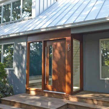
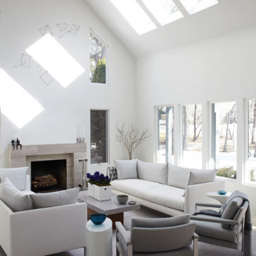
Asked by her client to review a typically mundane South Hampton ‘50s saltbox because “the last designer they talked to said they would have to add on to make the house anything,” Ms. Cohen approached the renovation in exactly the opposite manner. To refine the small building footprint, precise architectural gestures were used with a series of finely calibrated moments make the space more gracious and welcoming. Architectural acts were bold in concept but not in actual construction work; such as capturing the car garage to add a hyper modern sunroom/den along with a powder room and laundry. Reconfiguring one side of the house’s roofline to manipulate the space into a sensational master suite saved the north side of the house from remaining an un-useful attic space. This inner sanctum of bedroom and master bath is reminiscent of a Hampton’s beachscape in all its elegance and minimalism. The only square footage actually added was a tiny 4X4 corner as an addition to the front entry, oddly an essential piece of real estate to make an actual vestibule. All these refinements make for a crafted, articulate result rather than bowing to the bigger is better theme, which is more prevalent in the Hamptons.
The function of the plan and the accompanying finishes are impressive. The Jack and Jill bathroom, an invention of the American post-war housing boom, was outfitted in handsome walnut Duravit vanity cabinets and neutral finishes. The master bath, with its expansive skylights, might be mistaken for a conceptual art installation due to its evocative marble countertop in striped ethereal hues. Finally, Ms. Cohen uses wallpaper like a museum curator, hanging an iconic Knoll pattern to punctuate the dining/media space.
Each room in the house was sculpted via a palette of watercolor blue of varying saturations. Fabrics were culled from the greats of modernist textiles, Maharam’s Quatrefoil pattern in blue and Knoll classic Sway pattern in sea shades. The blue on white “beach” scheme runs from a soft cotton candy sky in the girl’s room to an immersive David Sutherland Park Bark wallpaper in the powder room. This intellectual inquiry as to what are the true colors at the beach belays the sophistication that surpasses the usual nautical curse of the average beach house. Out of the corner of your eye, in almost every quadrant of the house, is a burst of colorful expression and delight; this serves as Ms. Cohen’s painterly gift to the client.
Ms. Cohen’s hidden strength is her ability to choreograph a seating area. Whether it is a formal living room or the ultimate hang out spot, each space has the right amount of distance, intimacy and dare I say intrigue to make the arrangements inviting. Each conversation, because it really looks like a fine chat can be had, has an elegant side table ready for duty and all tête-à-têtes are regulated to a sumptuous area rugs. Habitants in Ms. Cohen’s world only work through deep discourse.
 In Detail Interiors
Cozy and Colorful Beach House Remodel!
When you think funky little house by the beach – images like what you are about to see may not be what you would have anticipated. This furnishings project aimed to capture a colorful, fun, active space for a family who wanted to feel at home .Thus, creating casual and comfortable but not boring in the least. A little traveled, a lot of texture, and not much clutter!
From the start, the space was not much to write home about!
The common living areas were boxy with lower ceilings. Quirky ins and outs needed to be optimized. Overall, this project was a prime opportunity for us to really dig in. From treating each room top to bottom and finding the client’s mojo when it came to wallcoverings. Selecting funky lighting and the right mix and match of bold colors and more natural, organic textures.
We came in too late to get involved with the kitchen but helped the client with a few little accents and color choices. Thus, acting as a jumping off point for the large dining space featuring a beautiful (and resilient!) wooden trestle table. We created a mix of seating that offers a little funk, and the fun additional cabinet storage to each end which offered a hideaway. We loved that this vista had such opportunity for great lighting and art, also!
A Colorful, Cozy Living Room
We knew we needed a cozy, lower profile seating area but also some sort of great reading nook by the fireplace. With the large windows and the main entry just off this space, a traffic pattern was delianted that helped guide decisions with the furniture. A funky, nubbier woven fabric on the sectional that hinted towards mid-century modern. The irregular shaped, petrified wood coffee table. The bold statement and colors carried through in the wallcovering and area rug. Jumping to the fireplace area where you can lounge or read with those gorgeous cognac leather recliners. This space needed to feel separate and the same all at once. The balance of scale and colors really helped achieve this!
Can’t forget the bedrooms!
Of course we can’t get by without mentioning a little bedroom love, either.
In the master the overall designs dictated by a bold, saturated woven wood cloth on the headboard wall. We love the mix of color and pattern in here. The bold, sexier mood is 100% a byproduct of the level of rich colors and unusual combinations. Those bold hand-glazed ceramic lamps against those strict geo-pattern bed pillows – so good!
Our sweet tween bedroom that should grow with her for a good, long time. All in all, filled with original art and layered in a softer palette. There was a lot of matching in here at first, but once we convinced her to trust us she started to understand why adding in the unexpected hit of bright coral and spring green made everything sing!
 In Detail Interiors
Cozy and Colorful Beach House Remodel!
When you think funky little house by the beach – images like what you are about to see may not be what you would have anticipated. This furnishings project aimed to capture a colorful, fun, active space for a family who wanted to feel at home .Thus, creating casual and comfortable but not boring in the least. A little traveled, a lot of texture, and not much clutter!
From the start, the space was not much to write home about!
The common living areas were boxy with lower ceilings. Quirky ins and outs needed to be optimized. Overall, this project was a prime opportunity for us to really dig in. From treating each room top to bottom and finding the client’s mojo when it came to wallcoverings. Selecting funky lighting and the right mix and match of bold colors and more natural, organic textures.
We came in too late to get involved with the kitchen but helped the client with a few little accents and color choices. Thus, acting as a jumping off point for the large dining space featuring a beautiful (and resilient!) wooden trestle table. We created a mix of seating that offers a little funk, and the fun additional cabinet storage to each end which offered a hideaway. We loved that this vista had such opportunity for great lighting and art, also!
A Colorful, Cozy Living Room
We knew we needed a cozy, lower profile seating area but also some sort of great reading nook by the fireplace. With the large windows and the main entry just off this space, a traffic pattern was delianted that helped guide decisions with the furniture. A funky, nubbier woven fabric on the sectional that hinted towards mid-century modern. The irregular shaped, petrified wood coffee table. The bold statement and colors carried through in the wallcovering and area rug. Jumping to the fireplace area where you can lounge or read with those gorgeous cognac leather recliners. This space needed to feel separate and the same all at once. The balance of scale and colors really helped achieve this!
Can’t forget the bedrooms!
Of course we can’t get by without mentioning a little bedroom love, either.
In the master the overall designs dictated by a bold, saturated woven wood cloth on the headboard wall. We love the mix of color and pattern in here. The bold, sexier mood is 100% a byproduct of the level of rich colors and unusual combinations. Those bold hand-glazed ceramic lamps against those strict geo-pattern bed pillows – so good!
Our sweet tween bedroom that should grow with her for a good, long time. All in all, filled with original art and layered in a softer palette. There was a lot of matching in here at first, but once we convinced her to trust us she started to understand why adding in the unexpected hit of bright coral and spring green made everything sing!
 Dale Cohen Designstudio
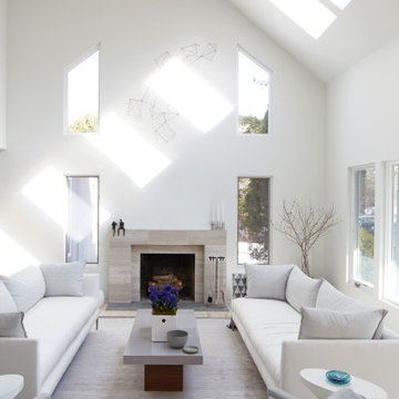
Asked by her client to review a typically mundane South Hampton ‘50s saltbox because “the last designer they talked to said they would have to add on to make the house anything,” Ms. Cohen approached the renovation in exactly the opposite manner. To refine the small building footprint, precise architectural gestures were used with a series of finely calibrated moments make the space more gracious and welcoming. Architectural acts were bold in concept but not in actual construction work; such as capturing the car garage to add a hyper modern sunroom/den along with a powder room and laundry. Reconfiguring one side of the house’s roofline to manipulate the space into a sensational master suite saved the north side of the house from remaining an un-useful attic space. This inner sanctum of bedroom and master bath is reminiscent of a Hampton’s beachscape in all its elegance and minimalism. The only square footage actually added was a tiny 4X4 corner as an addition to the front entry, oddly an essential piece of real estate to make an actual vestibule. All these refinements make for a crafted, articulate result rather than bowing to the bigger is better theme, which is more prevalent in the Hamptons.
The function of the plan and the accompanying finishes are impressive. The Jack and Jill bathroom, an invention of the American post-war housing boom, was outfitted in handsome walnut Duravit vanity cabinets and neutral finishes. The master bath, with its expansive skylights, might be mistaken for a conceptual art installation due to its evocative marble countertop in striped ethereal hues. Finally, Ms. Cohen uses wallpaper like a museum curator, hanging an iconic Knoll pattern to punctuate the dining/media space.
Each room in the house was sculpted via a palette of watercolor blue of varying saturations. Fabrics were culled from the greats of modernist textiles, Maharam’s Quatrefoil pattern in blue and Knoll classic Sway pattern in sea shades. The blue on white “beach” scheme runs from a soft cotton candy sky in the girl’s room to an immersive David Sutherland Park Bark wallpaper in the powder room. This intellectual inquiry as to what are the true colors at the beach belays the sophistication that surpasses the usual nautical curse of the average beach house. Out of the corner of your eye, in almost every quadrant of the house, is a burst of colorful expression and delight; this serves as Ms. Cohen’s painterly gift to the client.
Ms. Cohen’s hidden strength is her ability to choreograph a seating area. Whether it is a formal living room or the ultimate hang out spot, each space has the right amount of distance, intimacy and dare I say intrigue to make the arrangements inviting. Each conversation, because it really looks like a fine chat can be had, has an elegant side table ready for duty and all tête-à-têtes are regulated to a sumptuous area rugs. Habitants in Ms. Cohen’s world only work through deep discourse.
 In Detail Interiors
Cozy and Colorful Beach House Remodel!
When you think funky little house by the beach – images like what you are about to see may not be what you would have anticipated. This furnishings project aimed to capture a colorful, fun, active space for a family who wanted to feel at home .Thus, creating casual and comfortable but not boring in the least. A little traveled, a lot of texture, and not much clutter!
From the start, the space was not much to write home about!
The common living areas were boxy with lower ceilings. Quirky ins and outs needed to be optimized. Overall, this project was a prime opportunity for us to really dig in. From treating each room top to bottom and finding the client’s mojo when it came to wallcoverings. Selecting funky lighting and the right mix and match of bold colors and more natural, organic textures.
We came in too late to get involved with the kitchen but helped the client with a few little accents and color choices. Thus, acting as a jumping off point for the large dining space featuring a beautiful (and resilient!) wooden trestle table. We created a mix of seating that offers a little funk, and the fun additional cabinet storage to each end which offered a hideaway. We loved that this vista had such opportunity for great lighting and art, also!
A Colorful, Cozy Living Room
We knew we needed a cozy, lower profile seating area but also some sort of great reading nook by the fireplace. With the large windows and the main entry just off this space, a traffic pattern was delianted that helped guide decisions with the furniture. A funky, nubbier woven fabric on the sectional that hinted towards mid-century modern. The irregular shaped, petrified wood coffee table. The bold statement and colors carried through in the wallcovering and area rug. Jumping to the fireplace area where you can lounge or read with those gorgeous cognac leather recliners. This space needed to feel separate and the same all at once. The balance of scale and colors really helped achieve this!
Can’t forget the bedrooms!
Of course we can’t get by without mentioning a little bedroom love, either.
In the master the overall designs dictated by a bold, saturated woven wood cloth on the headboard wall. We love the mix of color and pattern in here. The bold, sexier mood is 100% a byproduct of the level of rich colors and unusual combinations. Those bold hand-glazed ceramic lamps against those strict geo-pattern bed pillows – so good!
Our sweet tween bedroom that should grow with her for a good, long time. All in all, filled with original art and layered in a softer palette. There was a lot of matching in here at first, but once we convinced her to trust us she started to understand why adding in the unexpected hit of bright coral and spring green made everything sing!
 Dale Cohen Designstudio
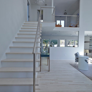
Asked by her client to review a typically mundane South Hampton ‘50s saltbox because “the last designer they talked to said they would have to add on to make the house anything,” Ms. Cohen approached the renovation in exactly the opposite manner. To refine the small building footprint, precise architectural gestures were used with a series of finely calibrated moments make the space more gracious and welcoming. Architectural acts were bold in concept but not in actual construction work; such as capturing the car garage to add a hyper modern sunroom/den along with a powder room and laundry. Reconfiguring one side of the house’s roofline to manipulate the space into a sensational master suite saved the north side of the house from remaining an un-useful attic space. This inner sanctum of bedroom and master bath is reminiscent of a Hampton’s beachscape in all its elegance and minimalism. The only square footage actually added was a tiny 4X4 corner as an addition to the front entry, oddly an essential piece of real estate to make an actual vestibule. All these refinements make for a crafted, articulate result rather than bowing to the bigger is better theme, which is more prevalent in the Hamptons.
The function of the plan and the accompanying finishes are impressive. The Jack and Jill bathroom, an invention of the American post-war housing boom, was outfitted in handsome walnut Duravit vanity cabinets and neutral finishes. The master bath, with its expansive skylights, might be mistaken for a conceptual art installation due to its evocative marble countertop in striped ethereal hues. Finally, Ms. Cohen uses wallpaper like a museum curator, hanging an iconic Knoll pattern to punctuate the dining/media space.
Each room in the house was sculpted via a palette of watercolor blue of varying saturations. Fabrics were culled from the greats of modernist textiles, Maharam’s Quatrefoil pattern in blue and Knoll classic Sway pattern in sea shades. The blue on white “beach” scheme runs from a soft cotton candy sky in the girl’s room to an immersive David Sutherland Park Bark wallpaper in the powder room. This intellectual inquiry as to what are the true colors at the beach belays the sophistication that surpasses the usual nautical curse of the average beach house. Out of the corner of your eye, in almost every quadrant of the house, is a burst of colorful expression and delight; this serves as Ms. Cohen’s painterly gift to the client.
Ms. Cohen’s hidden strength is her ability to choreograph a seating area. Whether it is a formal living room or the ultimate hang out spot, each space has the right amount of distance, intimacy and dare I say intrigue to make the arrangements inviting. Each conversation, because it really looks like a fine chat can be had, has an elegant side table ready for duty and all tête-à-têtes are regulated to a sumptuous area rugs. Habitants in Ms. Cohen’s world only work through deep discourse.
 Dale Cohen Designstudio
Asked by her client to review a typically mundane South Hampton ‘50s saltbox because “the last designer they talked to said they would have to add on to make the house anything,” Ms. Cohen approached the renovation in exactly the opposite manner. To refine the small building footprint, precise architectural gestures were used with a series of finely calibrated moments make the space more gracious and welcoming. Architectural acts were bold in concept but not in actual construction work; such as capturing the car garage to add a hyper modern sunroom/den along with a powder room and laundry. Reconfiguring one side of the house’s roofline to manipulate the space into a sensational master suite saved the north side of the house from remaining an un-useful attic space. This inner sanctum of bedroom and master bath is reminiscent of a Hampton’s beachscape in all its elegance and minimalism. The only square footage actually added was a tiny 4X4 corner as an addition to the front entry, oddly an essential piece of real estate to make an actual vestibule. All these refinements make for a crafted, articulate result rather than bowing to the bigger is better theme, which is more prevalent in the Hamptons.
The function of the plan and the accompanying finishes are impressive. The Jack and Jill bathroom, an invention of the American post-war housing boom, was outfitted in handsome walnut Duravit vanity cabinets and neutral finishes. The master bath, with its expansive skylights, might be mistaken for a conceptual art installation due to its evocative marble countertop in striped ethereal hues. Finally, Ms. Cohen uses wallpaper like a museum curator, hanging an iconic Knoll pattern to punctuate the dining/media space.
Each room in the house was sculpted via a palette of watercolor blue of varying saturations. Fabrics were culled from the greats of modernist textiles, Maharam’s Quatrefoil pattern in blue and Knoll classic Sway pattern in sea shades. The blue on white “beach” scheme runs from a soft cotton candy sky in the girl’s room to an immersive David Sutherland Park Bark wallpaper in the powder room. This intellectual inquiry as to what are the true colors at the beach belays the sophistication that surpasses the usual nautical curse of the average beach house. Out of the corner of your eye, in almost every quadrant of the house, is a burst of colorful expression and delight; this serves as Ms. Cohen’s painterly gift to the client.
Ms. Cohen’s hidden strength is her ability to choreograph a seating area. Whether it is a formal living room or the ultimate hang out spot, each space has the right amount of distance, intimacy and dare I say intrigue to make the arrangements inviting. Each conversation, because it really looks like a fine chat can be had, has an elegant side table ready for duty and all tête-à-têtes are regulated to a sumptuous area rugs. Habitants in Ms. Cohen’s world only work through deep discourse.
 Dale Cohen Designstudio
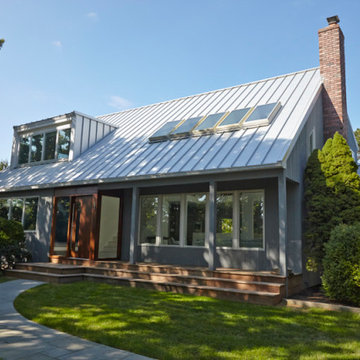
Asked by her client to review a typically mundane South Hampton ‘50s saltbox because “the last designer they talked to said they would have to add on to make the house anything,” Ms. Cohen approached the renovation in exactly the opposite manner. To refine the small building footprint, precise architectural gestures were used with a series of finely calibrated moments make the space more gracious and welcoming. Architectural acts were bold in concept but not in actual construction work; such as capturing the car garage to add a hyper modern sunroom/den along with a powder room and laundry. Reconfiguring one side of the house’s roofline to manipulate the space into a sensational master suite saved the north side of the house from remaining an un-useful attic space. This inner sanctum of bedroom and master bath is reminiscent of a Hampton’s beachscape in all its elegance and minimalism. The only square footage actually added was a tiny 4X4 corner as an addition to the front entry, oddly an essential piece of real estate to make an actual vestibule. All these refinements make for a crafted, articulate result rather than bowing to the bigger is better theme, which is more prevalent in the Hamptons.
The function of the plan and the accompanying finishes are impressive. The Jack and Jill bathroom, an invention of the American post-war housing boom, was outfitted in handsome walnut Duravit vanity cabinets and neutral finishes. The master bath, with its expansive skylights, might be mistaken for a conceptual art installation due to its evocative marble countertop in striped ethereal hues. Finally, Ms. Cohen uses wallpaper like a museum curator, hanging an iconic Knoll pattern to punctuate the dining/media space.
Each room in the house was sculpted via a palette of watercolor blue of varying saturations. Fabrics were culled from the greats of modernist textiles, Maharam’s Quatrefoil pattern in blue and Knoll classic Sway pattern in sea shades. The blue on white “beach” scheme runs from a soft cotton candy sky in the girl’s room to an immersive David Sutherland Park Bark wallpaper in the powder room. This intellectual inquiry as to what are the true colors at the beach belays the sophistication that surpasses the usual nautical curse of the average beach house. Out of the corner of your eye, in almost every quadrant of the house, is a burst of colorful expression and delight; this serves as Ms. Cohen’s painterly gift to the client.
Ms. Cohen’s hidden strength is her ability to choreograph a seating area. Whether it is a formal living room or the ultimate hang out spot, each space has the right amount of distance, intimacy and dare I say intrigue to make the arrangements inviting. Each conversation, because it really looks like a fine chat can be had, has an elegant side table ready for duty and all tête-à-têtes are regulated to a sumptuous area rugs. Habitants in Ms. Cohen’s world only work through deep discourse.
 In Detail Interiors
Cozy and Colorful Beach House Remodel!
When you think funky little house by the beach – images like what you are about to see may not be what you would have anticipated. This furnishings project aimed to capture a colorful, fun, active space for a family who wanted to feel at home .Thus, creating casual and comfortable but not boring in the least. A little traveled, a lot of texture, and not much clutter!
From the start, the space was not much to write home about!
The common living areas were boxy with lower ceilings. Quirky ins and outs needed to be optimized. Overall, this project was a prime opportunity for us to really dig in. From treating each room top to bottom and finding the client’s mojo when it came to wallcoverings. Selecting funky lighting and the right mix and match of bold colors and more natural, organic textures.
We came in too late to get involved with the kitchen but helped the client with a few little accents and color choices. Thus, acting as a jumping off point for the large dining space featuring a beautiful (and resilient!) wooden trestle table. We created a mix of seating that offers a little funk, and the fun additional cabinet storage to each end which offered a hideaway. We loved that this vista had such opportunity for great lighting and art, also!
A Colorful, Cozy Living Room
We knew we needed a cozy, lower profile seating area but also some sort of great reading nook by the fireplace. With the large windows and the main entry just off this space, a traffic pattern was delianted that helped guide decisions with the furniture. A funky, nubbier woven fabric on the sectional that hinted towards mid-century modern. The irregular shaped, petrified wood coffee table. The bold statement and colors carried through in the wallcovering and area rug. Jumping to the fireplace area where you can lounge or read with those gorgeous cognac leather recliners. This space needed to feel separate and the same all at once. The balance of scale and colors really helped achieve this!
Can’t forget the bedrooms!
Of course we can’t get by without mentioning a little bedroom love, either.
In the master the overall designs dictated by a bold, saturated woven wood cloth on the headboard wall. We love the mix of color and pattern in here. The bold, sexier mood is 100% a byproduct of the level of rich colors and unusual combinations. Those bold hand-glazed ceramic lamps against those strict geo-pattern bed pillows – so good!
Our sweet tween bedroom that should grow with her for a good, long time. All in all, filled with original art and layered in a softer palette. There was a lot of matching in here at first, but once we convinced her to trust us she started to understand why adding in the unexpected hit of bright coral and spring green made everything sing!
 In Detail Interiors
Cozy and Colorful Beach House Remodel!
When you think funky little house by the beach – images like what you are about to see may not be what you would have anticipated. This furnishings project aimed to capture a colorful, fun, active space for a family who wanted to feel at home .Thus, creating casual and comfortable but not boring in the least. A little traveled, a lot of texture, and not much clutter!
From the start, the space was not much to write home about!
The common living areas were boxy with lower ceilings. Quirky ins and outs needed to be optimized. Overall, this project was a prime opportunity for us to really dig in. From treating each room top to bottom and finding the client’s mojo when it came to wallcoverings. Selecting funky lighting and the right mix and match of bold colors and more natural, organic textures.
We came in too late to get involved with the kitchen but helped the client with a few little accents and color choices. Thus, acting as a jumping off point for the large dining space featuring a beautiful (and resilient!) wooden trestle table. We created a mix of seating that offers a little funk, and the fun additional cabinet storage to each end which offered a hideaway. We loved that this vista had such opportunity for great lighting and art, also!
A Colorful, Cozy Living Room
We knew we needed a cozy, lower profile seating area but also some sort of great reading nook by the fireplace. With the large windows and the main entry just off this space, a traffic pattern was delianted that helped guide decisions with the furniture. A funky, nubbier woven fabric on the sectional that hinted towards mid-century modern. The irregular shaped, petrified wood coffee table. The bold statement and colors carried through in the wallcovering and area rug. Jumping to the fireplace area where you can lounge or read with those gorgeous cognac leather recliners. This space needed to feel separate and the same all at once. The balance of scale and colors really helped achieve this!
Can’t forget the bedrooms!
Of course we can’t get by without mentioning a little bedroom love, either.
In the master the overall designs dictated by a bold, saturated woven wood cloth on the headboard wall. We love the mix of color and pattern in here. The bold, sexier mood is 100% a byproduct of the level of rich colors and unusual combinations. Those bold hand-glazed ceramic lamps against those strict geo-pattern bed pillows – so good!
Our sweet tween bedroom that should grow with her for a good, long time. All in all, filled with original art and layered in a softer palette. There was a lot of matching in here at first, but once we convinced her to trust us she started to understand why adding in the unexpected hit of bright coral and spring green made everything sing!
 Dale Cohen Designstudio
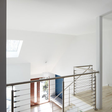
Asked by her client to review a typically mundane South Hampton ‘50s saltbox because “the last designer they talked to said they would have to add on to make the house anything,” Ms. Cohen approached the renovation in exactly the opposite manner. To refine the small building footprint, precise architectural gestures were used with a series of finely calibrated moments make the space more gracious and welcoming. Architectural acts were bold in concept but not in actual construction work; such as capturing the car garage to add a hyper modern sunroom/den along with a powder room and laundry. Reconfiguring one side of the house’s roofline to manipulate the space into a sensational master suite saved the north side of the house from remaining an un-useful attic space. This inner sanctum of bedroom and master bath is reminiscent of a Hampton’s beachscape in all its elegance and minimalism. The only square footage actually added was a tiny 4X4 corner as an addition to the front entry, oddly an essential piece of real estate to make an actual vestibule. All these refinements make for a crafted, articulate result rather than bowing to the bigger is better theme, which is more prevalent in the Hamptons.
The function of the plan and the accompanying finishes are impressive. The Jack and Jill bathroom, an invention of the American post-war housing boom, was outfitted in handsome walnut Duravit vanity cabinets and neutral finishes. The master bath, with its expansive skylights, might be mistaken for a conceptual art installation due to its evocative marble countertop in striped ethereal hues. Finally, Ms. Cohen uses wallpaper like a museum curator, hanging an iconic Knoll pattern to punctuate the dining/media space.
Each room in the house was sculpted via a palette of watercolor blue of varying saturations. Fabrics were culled from the greats of modernist textiles, Maharam’s Quatrefoil pattern in blue and Knoll classic Sway pattern in sea shades. The blue on white “beach” scheme runs from a soft cotton candy sky in the girl’s room to an immersive David Sutherland Park Bark wallpaper in the powder room. This intellectual inquiry as to what are the true colors at the beach belays the sophistication that surpasses the usual nautical curse of the average beach house. Out of the corner of your eye, in almost every quadrant of the house, is a burst of colorful expression and delight; this serves as Ms. Cohen’s painterly gift to the client.
Ms. Cohen’s hidden strength is her ability to choreograph a seating area. Whether it is a formal living room or the ultimate hang out spot, each space has the right amount of distance, intimacy and dare I say intrigue to make the arrangements inviting. Each conversation, because it really looks like a fine chat can be had, has an elegant side table ready for duty and all tête-à-têtes are regulated to a sumptuous area rugs. Habitants in Ms. Cohen’s world only work through deep discourse.
 Dale Cohen Designstudio
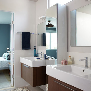
Asked by her client to review a typically mundane South Hampton ‘50s saltbox because “the last designer they talked to said they would have to add on to make the house anything,” Ms. Cohen approached the renovation in exactly the opposite manner. To refine the small building footprint, precise architectural gestures were used with a series of finely calibrated moments make the space more gracious and welcoming. Architectural acts were bold in concept but not in actual construction work; such as capturing the car garage to add a hyper modern sunroom/den along with a powder room and laundry. Reconfiguring one side of the house’s roofline to manipulate the space into a sensational master suite saved the north side of the house from remaining an un-useful attic space. This inner sanctum of bedroom and master bath is reminiscent of a Hampton’s beachscape in all its elegance and minimalism. The only square footage actually added was a tiny 4X4 corner as an addition to the front entry, oddly an essential piece of real estate to make an actual vestibule. All these refinements make for a crafted, articulate result rather than bowing to the bigger is better theme, which is more prevalent in the Hamptons.
The function of the plan and the accompanying finishes are impressive. The Jack and Jill bathroom, an invention of the American post-war housing boom, was outfitted in handsome walnut Duravit vanity cabinets and neutral finishes. The master bath, with its expansive skylights, might be mistaken for a conceptual art installation due to its evocative marble countertop in striped ethereal hues. Finally, Ms. Cohen uses wallpaper like a museum curator, hanging an iconic Knoll pattern to punctuate the dining/media space.
Each room in the house was sculpted via a palette of watercolor blue of varying saturations. Fabrics were culled from the greats of modernist textiles, Maharam’s Quatrefoil pattern in blue and Knoll classic Sway pattern in sea shades. The blue on white “beach” scheme runs from a soft cotton candy sky in the girl’s room to an immersive David Sutherland Park Bark wallpaper in the powder room. This intellectual inquiry as to what are the true colors at the beach belays the sophistication that surpasses the usual nautical curse of the average beach house. Out of the corner of your eye, in almost every quadrant of the house, is a burst of colorful expression and delight; this serves as Ms. Cohen’s painterly gift to the client.
Ms. Cohen’s hidden strength is her ability to choreograph a seating area. Whether it is a formal living room or the ultimate hang out spot, each space has the right amount of distance, intimacy and dare I say intrigue to make the arrangements inviting. Each conversation, because it really looks like a fine chat can be had, has an elegant side table ready for duty and all tête-à-têtes are regulated to a sumptuous area rugs. Habitants in Ms. Cohen’s world only work through deep discourse.

 In Detail Interiors
Cozy and Colorful Beach House Remodel!
When you think funky little house by the beach – images like what you are about to see may not be what you would have anticipated. This furnishings project aimed to capture a colorful, fun, active space for a family who wanted to feel at home .Thus, creating casual and comfortable but not boring in the least. A little traveled, a lot of texture, and not much clutter!
From the start, the space was not much to write home about!
The common living areas were boxy with lower ceilings. Quirky ins and outs needed to be optimized. Overall, this project was a prime opportunity for us to really dig in. From treating each room top to bottom and finding the client’s mojo when it came to wallcoverings. Selecting funky lighting and the right mix and match of bold colors and more natural, organic textures.
We came in too late to get involved with the kitchen but helped the client with a few little accents and color choices. Thus, acting as a jumping off point for the large dining space featuring a beautiful (and resilient!) wooden trestle table. We created a mix of seating that offers a little funk, and the fun additional cabinet storage to each end which offered a hideaway. We loved that this vista had such opportunity for great lighting and art, also!
A Colorful, Cozy Living Room
We knew we needed a cozy, lower profile seating area but also some sort of great reading nook by the fireplace. With the large windows and the main entry just off this space, a traffic pattern was delianted that helped guide decisions with the furniture. A funky, nubbier woven fabric on the sectional that hinted towards mid-century modern. The irregular shaped, petrified wood coffee table. The bold statement and colors carried through in the wallcovering and area rug. Jumping to the fireplace area where you can lounge or read with those gorgeous cognac leather recliners. This space needed to feel separate and the same all at once. The balance of scale and colors really helped achieve this!
Can’t forget the bedrooms!
Of course we can’t get by without mentioning a little bedroom love, either.
In the master the overall designs dictated by a bold, saturated woven wood cloth on the headboard wall. We love the mix of color and pattern in here. The bold, sexier mood is 100% a byproduct of the level of rich colors and unusual combinations. Those bold hand-glazed ceramic lamps against those strict geo-pattern bed pillows – so good!
Our sweet tween bedroom that should grow with her for a good, long time. All in all, filled with original art and layered in a softer palette. There was a lot of matching in here at first, but once we convinced her to trust us she started to understand why adding in the unexpected hit of bright coral and spring green made everything sing!


 In Detail Interiors
Cozy and Colorful Beach House Remodel!
When you think funky little house by the beach – images like what you are about to see may not be what you would have anticipated. This furnishings project aimed to capture a colorful, fun, active space for a family who wanted to feel at home .Thus, creating casual and comfortable but not boring in the least. A little traveled, a lot of texture, and not much clutter!
From the start, the space was not much to write home about!
The common living areas were boxy with lower ceilings. Quirky ins and outs needed to be optimized. Overall, this project was a prime opportunity for us to really dig in. From treating each room top to bottom and finding the client’s mojo when it came to wallcoverings. Selecting funky lighting and the right mix and match of bold colors and more natural, organic textures.
We came in too late to get involved with the kitchen but helped the client with a few little accents and color choices. Thus, acting as a jumping off point for the large dining space featuring a beautiful (and resilient!) wooden trestle table. We created a mix of seating that offers a little funk, and the fun additional cabinet storage to each end which offered a hideaway. We loved that this vista had such opportunity for great lighting and art, also!
A Colorful, Cozy Living Room
We knew we needed a cozy, lower profile seating area but also some sort of great reading nook by the fireplace. With the large windows and the main entry just off this space, a traffic pattern was delianted that helped guide decisions with the furniture. A funky, nubbier woven fabric on the sectional that hinted towards mid-century modern. The irregular shaped, petrified wood coffee table. The bold statement and colors carried through in the wallcovering and area rug. Jumping to the fireplace area where you can lounge or read with those gorgeous cognac leather recliners. This space needed to feel separate and the same all at once. The balance of scale and colors really helped achieve this!
Can’t forget the bedrooms!
Of course we can’t get by without mentioning a little bedroom love, either.
In the master the overall designs dictated by a bold, saturated woven wood cloth on the headboard wall. We love the mix of color and pattern in here. The bold, sexier mood is 100% a byproduct of the level of rich colors and unusual combinations. Those bold hand-glazed ceramic lamps against those strict geo-pattern bed pillows – so good!
Our sweet tween bedroom that should grow with her for a good, long time. All in all, filled with original art and layered in a softer palette. There was a lot of matching in here at first, but once we convinced her to trust us she started to understand why adding in the unexpected hit of bright coral and spring green made everything sing!
 In Detail Interiors
Cozy and Colorful Beach House Remodel!
When you think funky little house by the beach – images like what you are about to see may not be what you would have anticipated. This furnishings project aimed to capture a colorful, fun, active space for a family who wanted to feel at home .Thus, creating casual and comfortable but not boring in the least. A little traveled, a lot of texture, and not much clutter!
From the start, the space was not much to write home about!
The common living areas were boxy with lower ceilings. Quirky ins and outs needed to be optimized. Overall, this project was a prime opportunity for us to really dig in. From treating each room top to bottom and finding the client’s mojo when it came to wallcoverings. Selecting funky lighting and the right mix and match of bold colors and more natural, organic textures.
We came in too late to get involved with the kitchen but helped the client with a few little accents and color choices. Thus, acting as a jumping off point for the large dining space featuring a beautiful (and resilient!) wooden trestle table. We created a mix of seating that offers a little funk, and the fun additional cabinet storage to each end which offered a hideaway. We loved that this vista had such opportunity for great lighting and art, also!
A Colorful, Cozy Living Room
We knew we needed a cozy, lower profile seating area but also some sort of great reading nook by the fireplace. With the large windows and the main entry just off this space, a traffic pattern was delianted that helped guide decisions with the furniture. A funky, nubbier woven fabric on the sectional that hinted towards mid-century modern. The irregular shaped, petrified wood coffee table. The bold statement and colors carried through in the wallcovering and area rug. Jumping to the fireplace area where you can lounge or read with those gorgeous cognac leather recliners. This space needed to feel separate and the same all at once. The balance of scale and colors really helped achieve this!
Can’t forget the bedrooms!
Of course we can’t get by without mentioning a little bedroom love, either.
In the master the overall designs dictated by a bold, saturated woven wood cloth on the headboard wall. We love the mix of color and pattern in here. The bold, sexier mood is 100% a byproduct of the level of rich colors and unusual combinations. Those bold hand-glazed ceramic lamps against those strict geo-pattern bed pillows – so good!
Our sweet tween bedroom that should grow with her for a good, long time. All in all, filled with original art and layered in a softer palette. There was a lot of matching in here at first, but once we convinced her to trust us she started to understand why adding in the unexpected hit of bright coral and spring green made everything sing!
166