
Search results for "Saturation" in Home Design Ideas


 Neumann & Rudy Architecture
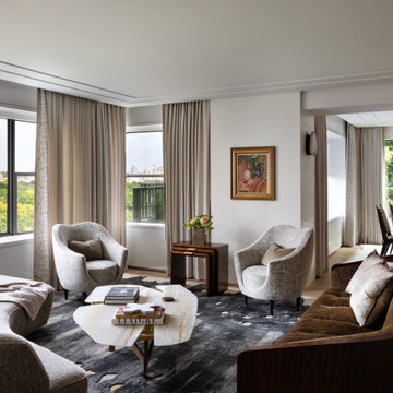
This is a quintessentially urban prewar-into-modern hybrid: a broad, laterally organized reception room whose principal architectural gesture is the corner glazing that dissolves two walls into a panoramic register of treetops and distant skyline. The plan reads as a series of soft, overlapping conversational precincts rather than a single axial arrangement — a pair of swivel-capable lounge chairs anchoring the window wall, a facing pair of high-backed tub chairs, and a deep tuxedo-profile sofa closing the composition toward the viewer — all orbiting an organically contoured cocktail table that performs as the room's centrifugal keystone. The ceiling is treated with a recessed reveal and shallow soffit that traces the perimeter, a device that both conceals drapery hardware and lifts the plane visually, granting the low-slung modern floor plate an unexpected sense of loft. A blade wall carrying a single framed canvas performs critical spatial work, terminating the living volume while permitting an enfilade sightline through to a secondary dining zone beyond, where a glazed wall of ivy-clad courtyard reads as a green tapestry. The geometry throughout is deliberately curvilinear — barrel-backed seating, amoeboid tabletops, splayed tapered legs — set against the orthogonal discipline of window mullions, drapery pleats, and rectilinear millwork, producing a productive tension between architectural rigor and furnishings that behave sculpturally.
**II. Materiality, Color & Texture**
The palette is a study in tonal restraint calibrated for maximum textural incident. Walls are finished in a matte, faintly striated plaster or grasscloth with a warm ecru undertone that absorbs rather than reflects light, establishing a neutral field against which every surface differential registers. Seating is upholstered in a lustrous chenille or crushed velvet of pale greige, whose short pile catches raking daylight and reads almost pearlescent, while the foreground sofa introduces a coarser boucle in an oatmeal register and the opposing sofa shifts decisively into a saturated tobacco-and-umber channel-tufted chenille, its French-polished rosewood or macassar ebony frame supplying the room's darkest, most reflective note. Stone is deployed with connoisseurial precision: the cocktail tables are honed alabaster or backlit-quality onyx, their translucent creamy strata and honey veining offering a warm mineral counterpoint to the cool, ink-washed abstraction of the hand-knotted area rug, which functions as a painterly ground — a gestural silver-and-charcoal wash pooling beneath the furniture. Bronze, patinated brass, and stainless accents appear in table bases, the vessel-form vase, and the sconce, providing metallic punctuation without gleam. Drapery in a heavy sand-toned linen, edged in a beaded or embroidered tape, softens the glazing perimeter and reinforces the room's tactile vocabulary of nap, weave, slub, and polish.
**III. Lighting, Atmosphere & Style Profile**
Natural light is the dominant luminous strategy: the corner glazing admits a soft, diffuse northern wash under overcast conditions, which the designer has intelligently accepted rather than resisted — the flat, shadowless quality flatters the velvet piles and plaster walls, and the drapery is stacked to admit maximum daylight while modulating glare at the jambs. Artificial sources are almost entirely concealed or decorative: a slim architectural sconce on the blade wall, a sculptural biomorphic table lamp in white lacquer or ceramic in the dining zone, and an extraordinary petal-form pendant in patinated metal that reads as an art object first and a fixture second. The resulting atmosphere is hushed, cerebral, and quietly patrician — a room of low chroma and high material intelligence, where drama is supplied by silhouette and surface rather than by color or ornament. Stylistically, the project synthesizes into what might best be termed **Modernist Salon** or **Warm Continental Minimalism**: the DNA of mid-century French decorative arts — Royère, Frank, Adnet — filtered through a contemporary sensibility of tonal layering and soft geometry, with an Art Deco undertow in the ebonized woods and channel tufting. It is a scheme of curatorial discipline: nothing is decorative for its own sake, the view is treated as the primary artwork, and every material is selected for how it behaves in light.

 Cure Design Group
KITCHEN RENOVATION CURRENT CRAFTSMAN
This client started off just being curious about our services - what we could do, and if we could even help her update her kitchen. She and her husband with their two teenage kids have lived in their home for several years without updating anything since the house was originally built. They didn’t quite have a budget in mind yet. They didn’t know their style, or even if they had one. Their timeline was simple, “as fast as you can so we’re not without a kitchen for very long” (usually what we hear for kitchen updates).
After a very productive consultation: determining the scope of work and zeroing in on a budget, I was very excited to update this underwhelming space to something that is modern but timeless, something that is theirs. And, it was easy to see what type of design style they gravitated toward looking at the pieces they already own: Craftsman/Prairie Style. I left the meeting so excited to weave in yet another genre of design to my CDG portfolio! We circled in our contractor to discuss the changes they were looking to make and the scope of work that would be theirs. Then I was off to get designing:
// Because the kitchen’s footprint and the defined breakfast space delineated by the bay, we kept the perimeter cabinetry as it was originally laid out. We updated these cabinets to a beautiful soft Alabaster White with a Barn Wood Glaze to highlight the simplicity of the shaker style doors. We added transom cabinets above the uppers, with only the back wall having seeded glass inserts to highlight some of their collectables.
// The original shaped island was counter-productive (See what I did there?) in functionality and design. We squared this off to reduce some of the angles and gain more storage. We highlighted the new island with a contrasting oak cabinet in a dark finish, to pay our respects to the craftsman style, and topped with a concrete-like countertop as a nod to the Prairie Style, allowing the homeowners to gain two extra seats and a massive -uninterrupted- work surface.
// The small section of cabinetry between the garage entry and fridge now is the perfect dump-station for mail, electronics, whatever is in their hands when they come into the house; and completely hidden by the refrigerator.
// The disconnected cabinetry in the breakfast area makes for a great place to have a working office. Accessible from the kitchen or the adjacent great room, this is the perfect place for the kids to do their homework while mom and dad are putting together dinner. The base cabinets are built out for office-type storage: paper and pencil drawers, filing systems, and cord management. Additionally, the long counter provides a ton of worksurface to spread out.
// The largest transformation was the pantry. We raised the height of the doorway and added huge custom designed bypass sliding barndoors. Finished with a dark stain to compliment the island and cut to inset 4 stained glass windows, typical of this style of design, and driving home the concept for the whole space.
// They were desperate to replace their flooring with something extremely durable to flow throughout the kitchen and the whole main level. This beautiful new flooring is actually a textured LVT(!) Which allowed them to save on overall cost and extend the life of their new flooring purchase.
// They loved their copper table, so we kept it and added new simple, mid-century modern chairs around it and a shiny new craftsman-style chandelier above. We added bright barstools in a burnt orange-red accent, and a bright woven rug to tie it all together.
// Because the kitchen renovation was shaping up to be pretty spectacular, they decided they needed to now replace their ‘now-these-look-a-little-too-old’ upholstered seating in the neighboring great room with 2 new sofas. We found the perfect sage-y-grey fabric which we covered on sofa frames that have and exposed oak-wood base, which we finished in a warm weathered grey.
// As every designer knows, a room isn’t finished until there’s something on the windows. Now that the new flooring was installed and every other room on the main level ‘seemed’ to be updated, we needed to update the window treatments in the dining, and great rooms to reflect their new design concept.
I hope you find the ‘after’ photos refreshing (as refreshing as it was for me to work on something that’s not a “Farm House” style that’s saturating the industry right now!) This was such a fun project and a great collaboration with our contractor.
Find the right local pro for your project
 Opal Exteriors
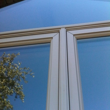
Andersen 400 Series window installation in Orland Park Illinois.
Inspiration for a mid-sized timeless two-story brick beige home design remodel in Chicago
Inspiration for a mid-sized timeless two-story brick beige home design remodel in Chicago

 Rachel Loewen Photography
Photo: Rachel Loewen © 2019 Houzz
Inspiration for an eclectic basement remodel in Chicago
Inspiration for an eclectic basement remodel in Chicago
 Neumann & Rudy Architecture
**I. Spatial Composition & Architectural Volume**
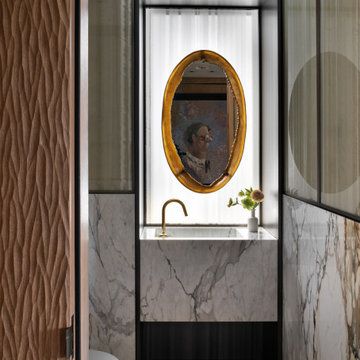
This powder room operates as a compressed, processional vestibule — a jewel-box volume whose narrowness is deliberately weaponized to intensify the encounter with a single focal event. The plan reads as a tight rectilinear corridor, entered obliquely past a pivoting sculptural door leaf at the left foreground, with the sightline funnelling directly to a recessed alcove at the terminal wall. That alcove is the compositional engine of the room: a deep, orthogonal reveal framed in slender blackened-metal profiles, within which a monolithic marble vanity cantilevers as a full-width plinth, its shadow-gap plinth detail dissolving the mass into apparent levitation. The full-height glazed screens flanking both side walls — divided into a disciplined grid of stile-and-rail metal mullions above a stone dado — introduce a Miesian rhythm of verticals that visually widen the space while preserving enclosure. Above, a crisp plaster soffit with a razor-thin perimeter reveal caps the volume, while the mullion grid's continuation across the ceiling plane and door surround creates a cage-like armature, an architectural drawing rendered in three dimensions. The suspended, wall-hung water closet at left is deliberately subordinated, half-concealed by the stone return, ensuring the axial procession terminates not on plumbing but on art.
**II. Materiality, Color & Texture**
The material palette is orchestrated as a controlled dialogue between the geologic, the vegetal, and the metallic. Book-matched Calacatta Viola — or a closely related Paonazzo — sheathes the dado and vanity in slabs whose oxblood, umber, and graphite veining reads as gestural brushwork, its cool bone-white ground counterweighted by the warm ferrous rust of its fissures; the veining on the right-hand wall is sequenced to cascade, treating stone as a continuous painterly field rather than a modular cladding. Against this, the foreground door presents a deeply carved, three-dimensional sculpted timber relief in a mid-tone oak or walnut, its undulating, plaited chevron texture introducing a haptic, almost textile-like tactility that provides the composition's most overtly artisanal register. The glazed screens deploy reeded or fluted glass in a smoky sage-olive cast, their striations diffusing and abstracting whatever lies beyond into vertical striae of light — a translucent counterpoint to the opacity of stone and wood. Blackened bronze or patinated steel mullions supply the graphic scaffolding, while unlacquered brass appears as accent punctuation: the gooseneck spout with exposed swivel collar, and, most emphatically, the flame-patinated bronze oval of the mirror frame, whose molten amber bloom is the single high-saturation event in an otherwise desaturated envelope of greys, greiges, and bone. Underfoot, chevron-laid oak parquet in a soft tobacco stain grounds the palette and repeats the door's zigzag geometry at a domestic scale.
**III. Lighting, Atmosphere & Style Profile**
Lighting is handled with theatrical restraint and a distinctly museological logic. The terminal alcove is backlit by a full-height plane of sheer, pinch-pleated linen sheers washed with daylight — an ambiguous, screened luminance that functions as a lightbox, silhouetting the mirror and reading as a window without conceding a view. Concealed cove or perimeter LED at the soffit reveal lifts the ceiling and grazes the plaster, while the reeded glass side screens capture and refract borrowed light along their flutes, producing a soft vertical shimmer that keeps the narrow volume from collapsing into gloom. The lower register is intentionally darker, the recessed shadow gap beneath the vanity and the bronze toe detail anchoring the composition in a low-key, chiaroscuro base. The atmosphere is hushed, contemplative, and faintly ecclesiastical — the alcove operating as a reredos, the framed portrait glimpsed in the mirror's reflection functioning as an unexpected, wry apparition that injects narrative and humor into an otherwise austere scheme. Stylistically, the room synthesizes into what might be termed *Tactile Luxe Modernism* or Refined Warm Modernism: the structural clarity and metal-gridded transparency of mid-century International Style, tempered by Italian post-war sensuality in the bronze and marble, and finally humanized by contemporary craft-forward texture. The result is a space of considerable discipline that nonetheless privileges touch, patina, and surprise over minimalist abstinence.
 Hill Construction Co
Roger Hill/Hill Construction
Example of a mountain style home design design in San Francisco
Example of a mountain style home design design in San Francisco

 J. Allen Designs
This luxurious retreat located on a hillside with extreme elevation change. This project features Pavestone retaining walls and decks, cast stone coping, tile interior finish, sun ledges, and vanishing edge fountain feature

 ResCom Designs
This patterned roller shade enhances the decor of this dining room patio door
Dining room - mid-sized contemporary dining room idea in Toronto
Dining room - mid-sized contemporary dining room idea in Toronto

 Artistic Glass Solutions - Monique's Studio
Details in this close up picture shows underwater moments...in the "deep ocean" kitchen island glass countertop.
Inspiration for a contemporary kitchen remodel in Boston
Inspiration for a contemporary kitchen remodel in Boston

 Jon Allen Fine Metal Art
Biscayne Bay Fish is an abstract take on a nature inspired painting. Jon truly captures the spirit of the tropics with these beautiful, bright colors. At Jon's studio near Palm Beach, Florida, there are several tanks with tropical fish and other sea life that inspire Jon on a daily basis and this beautiful, unique painting is a product of that inspiration. Hand-painted on aluminum, this stunning abstract piece will complement any contemporary or modern, decor.



 Neumann & Rudy Architecture
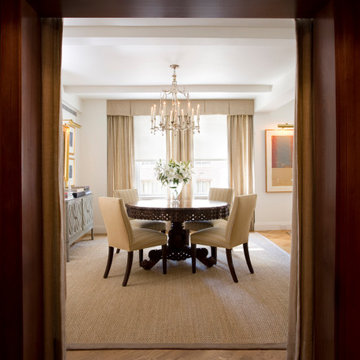
The photograph is composed as a deliberate enfilade study, framing the dining room through a deep, mahogany-cased cased opening that functions as both proscenium and threshold. This heavy portal — with its substantial reveal, plinth-like jambs and crisply mitered head casing — establishes a strong rectilinear armature that compresses the foreground and, by contrast, releases the eye into the luminous volume beyond. The plan reads as a classic pre-war apartment sequence: an axial sightline runs from the gallery floor, across the field of the dining room, and terminates at the window wall, where a curtained bay borrows daylight from the street. The ceiling is articulated by shallow beam drops or applied soffits — a coffer-adjacent treatment that registers the building's structural grid while lending the room a subtle sense of enclosure and datum. Geometry is orchestrated around opposing figures: the orthogonal rigor of casings, valance, beam lines and picture frames set against the centralized circular table, whose radial symmetry anchors the room's midpoint directly beneath the chandelier. Furnishings are held in a loose, non-touching arrangement, with generous circulation clearance at the perimeter, so that the room's volume — rather than its contents — remains the primary subject. Secondary sightlines to the left, toward a mirrored console and gilt-framed panel, and to the right, toward a picture-lit artwork, quietly widen the perceived footprint and imply adjacent rooms beyond the frame.
The material narrative is built on a controlled tonal ascent from dark to light. The foreground is dominated by richly figured, warm-red mahogany millwork and a chevron-laid oak parquet whose bleached, honeyed grain reads with a slight gray wash — a directional pattern that visually propels the viewer toward the interior. Within the dining room, the palette shifts to a low-saturation envelope of chalky off-white plaster walls and putty-toned textiles: floor-length linen or silk-blend drapery panels with a faint slubbed weave, gathered beneath a tailored, flat-front upholstered valance whose crisp horizontal band imparts an atelier precision. Underfoot, a natural sisal or seagrass rug with a linen tape border introduces a coarse, granular tactility that grounds the refined upholstery above; its woven, matte texture is deliberately calibrated against the smoother satin sheen of the dining chairs' subtly striped fabric. The room's tonal fulcrum is the antique carved pedestal table — a near-black, deeply modeled Anglo-Indian or Colonial Revival piece whose pierced apron, scrolled tripod base and paw feet supply the composition's only ornamental exuberance and its darkest value. Accents are chosen for restraint: silvered leaf on the console's fretwork facing, water-gilt on the framed panel, polished nickel or silver on the chandelier and the flower vessel, and the cool white of massed oriental lilies. Undertones remain uniformly warm — greige, ecru, taupe, oatmeal — with cool relief supplied only by the metals and the daylight itself.
Lighting is layered with quiet discipline. Natural light enters as a diffused, north-facing wash through a sheer-veiled window, its intensity softened by roller or Roman shading so that the glazing reads as a luminous plane rather than a view; this creates a gentle contre-jour that silhouettes the chandelier and the table's carved base. The multi-arm chandelier — a silvered, pagoda-crested fixture with slender candle sleeves and faceted drops — serves as sculptural punctuation more than as a working source, its warm 2700K glow registering as ambient sparkle. Accent illumination is deployed with curatorial intent: a picture light grazes the framed work at right, while the recessed downlights and the darkened foreground casings produce a chiaroscuro that heightens the sense of arrival. The cumulative atmosphere is one of hushed formality — composed, aerated, and almost monastic in its refusal of visual noise. Stylistically, the room synthesizes into what might be termed Transitional Classicism, or Warm Neutral Modern Traditional: the bones and millwork are unmistakably pre-war Beaux-Arts-derived, yet the flat-front valances, unadorned wall planes, natural-fiber flooring and simplified parson-back chairs reflect a contemporary editorial sensibility. The single antique table operates as a considered anachronism — a note of patinated gravitas within an otherwise pared-back, texturally driven interior — demonstrating a designer's confidence in restraint punctuated by one authoritative gesture.


 The Wood Wizard
Example of an eclectic l-shaped concrete floor eat-in kitchen design in Los Angeles with a single-bowl sink, flat-panel cabinets, blue cabinets, solid surface countertops, metallic backsplash, stainless steel appliances and an island

 Kevin O'Sullivan + Associates
Detail of buff limestone.
Example of a minimalist beige stone exterior home design in New York
Example of a minimalist beige stone exterior home design in New York

 User
This beautiful tile from Hakatai gets progressively lighter as it climbs the wall. We covered our shower and separate tub surround with this tile. It creates a soothing environment.



 Carolyn O'Neill Visual Artist
Oil painting on canvas
Home design - large contemporary home design idea in Melbourne
Home design - large contemporary home design idea in Melbourne
176