
Search results for "Saturation" in Home Design Ideas
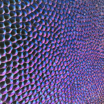


 Lightstreams Glass Tile
Lightstreams Renaissance Intense Blue & Royal Blue
Lightstreams Jewel Accent Tile Aegean Sea
Builder: Garden Lights Landscaping
Mural Design: Lightstreams
Photos by: Macduff Everton

Find the right local pro for your project


 Flores Cleanup & More
Mid-sized trendy backyard concrete paver and rectangular lap and privacy pool landscaping photo

 Deborah Kipp's Decorative Painting (Austin Texas)
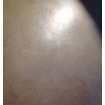
CLOSE-UP VIEW
This master bath makeover starts with bare walls that have been floated out smooth over the sheetrock. Then we hand applied a beautiful custom tinted, soft grey Venetian plaster. After two coats of plaster, the walls were waxed and buffed. This process seals the plaster, leaving a long-lasting finish. The finished product is subtle and undeniably beautiful! I’ve included a close-up view of the finish below.

 Jon Allen Fine Metal Art
JAC 140 - Twilight in Space by Jon Allen
The Jon Allen Collection is an exclusive, hand-selected group of my most personal work to date. Each piece is hand-painted on aluminum. My art itself and my chosen medium, aluminum, are blissfully married. You may not think of the word organic when you hear the word metal, but this is some of my most organic art and that’s simply because metal allows my work to achieve true sentience. Aluminum’s naturally reflective nature enables each color, shape, and stroke to reach its full potential. A new aspect of the painting will reveal itself to you as it basks in the light that surrounds, evades, or envelops it in that moment. When you see the piece from different angles, you will appreciate how vibrant, dynamic, and environmentally influenced these pieces are. What you may see and feel by morning is not what you’ll see or feel by dusk and in many ways, and as such I feel these pieces capture the ever-ebbing and complex nature of human emotion and perception.
Some of these pieces are truly abstract while others are modern takes on traditional landscapes, marine life, and portraits. I hope you enjoy them a fraction of how much I enjoyed creating them. If you have any questions, please don’t hesitate to reach out.
Number of Pieces: 1
Dimensions: 46" x 13" x 2" off the wall
Care & Cleaning: Clean with a soft cloth and plain soap & water
Other Features: Hardware is pre-installed for simple hanging and art will “float” 2” off the wall
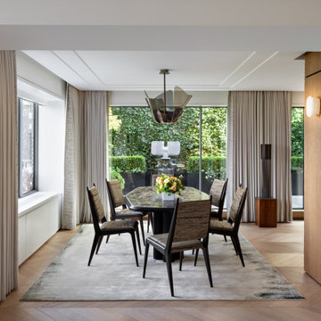
 Neumann & Rudy Architecture
This dining room operates as a processional volume, choreographed along a deep axial sightline that terminates not in a wall but in a garden — an ivy-clad plane of green glimpsed through full-height glazing. The architecture is fundamentally additive rather than decorative: a coffered, stepped ceiling plane with recessed reveal channels floats above the seating zone, its subtle datum lines describing a rectangular "room within a room" that anchors the table without recourse to enclosing partitions. Flanking this central passage, two millwork pylons — one clad in pale limed oak on the right, one in a fine bone-toned wallcovering on the left — function as vestigial pilasters, compressing the entry threshold before releasing into the loftier dining volume. The floor reinforces this directionality through a wide-plank chevron parquet laid on the primary axis, its herringbone rhythm accelerating the eye toward the terrace. The furniture plan is deliberately non-orthogonal: an elongated oval table on twin cylindrical pedestals softens the room's rectilinear discipline, while the loosely arrayed chairs break parade-ground symmetry in favor of a more inhabited, gestural composition. Deep-set corner windows and a low banquette-height sill with integrated casework at left introduce a secondary spatial episode, a quieter alcove that relieves the room's axial insistence.
## II. Materiality, Color & Texture
The palette is a study in warm neutrality calibrated across a narrow tonal band, with contrast delivered through texture rather than hue. The foundational register is greige-to-oatmeal: floor-to-ceiling drapery in a heavy, densely gathered linen falls in pin-sharp cartridge pleats, its matte drape absorbing light and softening the glass wall's hard geometry. Against this, the dining chairs are upholstered in a slubbed, striated fabric — likely a raw silk or abaca-like bast fiber — whose horizontal grain reads almost as bark, and which is set in taut opposition to the ebonized, tapered hardwood frames in the Italian mid-century idiom of Gio Ponti or Ico Parisi. The tabletop, a mottled verdigris-and-bronze stone or fossilized surface, introduces the room's only earth-toned saturation, echoed by the burl-and-walnut plinth supporting a slender fluted bronze sculpture. The oak millwork is limed and open-grained, deliberately dry and tactile beside the high-polish patinated brass of the pendant. Underfoot, a hand-knotted silk rug in cloud-grey with charcoal ombré edges introduces atmospheric perspective — a painterly gradient that dematerializes the floor plane. Chromatic release arrives entirely from two sources: the framed abstract expressionist canvas at right, with its viridian, cobalt and violet gestural detonations, and the living wall of ivy beyond the glass. Both function as color events, not color schemes.
## III. Lighting, Atmosphere & Style Profile
Daylight is the primary luminaire here, entering as a broad, north-soft wash through the terrace glazing and diffused further by the ivy screen, which acts as a natural lambrequin filtering glare into a cool, even green-tinted light. Artificial sources are deployed sculpturally rather than functionally: the pendant — a folded, petal-form composition of smoked glass and patinated metal — reads as a suspended object of art, throwing a warm downward pool onto the table while its dark bronze silhouette provides essential visual weight against the white ceiling. Wall-mounted alabaster sconces bracket the room at both thresholds, their translucent stone glowing with a low-lumen, candle-adjacent warmth that establishes perimeter intimacy after dusk. The resulting atmosphere is serene, curated and quietly patrician — a room engineered for extended conversation rather than display. Stylistically, the project synthesizes a **contemporary Soft Minimalism** with a strongly collected **Mid-Century Italian** sensibility: the restraint of the architectural envelope and monochromatic textile program provides a gallery-like neutral ground, upon which a small number of high-character objects — the sculptural pendant, the Ponti-esque seating, the abstract canvas, the exterior stone sculpture — perform as museum-grade punctuation. It is an interior that achieves luxury through material integrity and negative space rather than ornament.
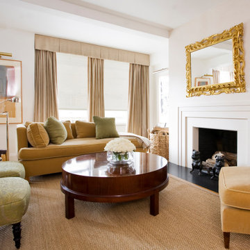 Neumann & Rudy Architecture
This is a compact, pre-war urban parlor handled with the confidence of a much larger room, and its success rests on a disciplined negotiation between rectilinear architecture and curvilinear furnishings. The volume is defined by two competing datum lines: a substantial dropped beam and soffit bridging the left-hand window wall, and the crisp stepped architrave of the fireplace surround opposite, which projects into the room as the primary architectural event. That mantel—executed in tiered, chamfered planes with a shallow reveal and a honed black stone hearth extending as a cantilevered shelf—reads as a stripped-classical or Art Deco–inflected aedicule, its symmetry anchoring the seating plan. Circulation is organized on a diagonal: the long axis established by the low, tight-back sofa beneath the fenestration is intercepted by the oval mahogany cocktail table, whose ellipse dissolves the room's orthogonal grid and permits comfortable passage on all sides. Sightlines are deliberately layered—the gilt mirror above the mantel captures a reflected register of the opposing wall's cornice, drapery, and framed art, effectively doubling the perceived depth of the plan and admitting borrowed light. The furniture is uniformly low-slung, an intentional strategy that preserves headroom and visually raises the ceiling plane, while the exposed leg profiles (turned casters, tapered mahogany posts, square-section table legs) keep the floor plane continuous and the composition buoyant rather than freighted.
The palette is a masterclass in tonal modulation within a narrow chromatic band—warm ivory plaster walls with a faintly pinkish undertone provide the neutral ground against which a family of golds, ochres, and honeyed camels is arranged in ascending saturation. The sofa's cut velvet in a deep saffron-caramel is the room's chromatic keystone, echoed in the club chair at right and moderated by two temperature-shifting accents: sage and moss velvet cushions that introduce a cool, desaturated counterpoint, and a damask-woven celadon slipper chair with matching ottoman whose subtle jacquard relief supplies pattern without noise. Textiles are stratified by pile depth and light response—the matte, slightly slubbed linen of the box-pleated pelmet and floor-length panels absorbs light, while the velvets refract it, producing that characteristic gilded bloom along the seat rolls and cushion edges. Against these soft goods, the designer sets three hard, contrasting registers: the French-polished mahogany table, whose figured, mirror-like top functions as a horizontal reflector; the water-gilded, deeply carved acanthus mirror frame, its burnished high points offering the room's only true metallic brilliance; and the patinated bronze bulldog andirons and blackened firebox, which supply necessary chromatic weight. Underfoot, a coarse woven sisal or seagrass rug provides the essential textural antithesis—dry, granular, and vernacular—as do the loose-woven rush baskets flanking the window, grounding the room's refinement in something agrarian and unpretentious.
Daylighting is generous but rigorously controlled: the twin windows are filtered through translucent roller blinds that diffuse direct sun into an even, high-key wash, and the pelmet with its softly gathered box pleats crops the aperture to conceal hardware and reinforce the horizontal. The result is a luminous, almost overexposed north-facing quality along the left flank that gradates into softer shadow at the hearth wall—a chiaroscuro that gives the room its sense of depth and repose. Artificial illumination is deliberately architectural and understated rather than decorative: a swing-arm picture light above the abstract framed work at left, a second slim picture light on the return wall, and an articulating chrome task/floor lamp with a polished conical shade positioned to serve the reading corner. Notably, there is no central fixture; the strategy is entirely peripheral and layered, calibrated for evening intimacy at cushion height. Stylistically, the room synthesizes into what one might call Restrained American Traditionalism, or more precisely a Warm Modern Classicism—the vocabulary of a New York or London town-house drawing room, edited of clutter and pattern, retaining the ceremonial gestures (gilt overmantel mirror, tailored drapery, symmetrical hearth) while adopting modernist restraint in silhouette, chromatic economy, and the absence of ornament on the case goods. The reference points span Deco, Regency, and mid-century upholstery forms, yet the assembly feels neither eclectic nor historicist. It is, instead, a quietly authoritative interior—luxurious in material and light, ascetic in gesture, and calibrated for daily habitation rather than display.
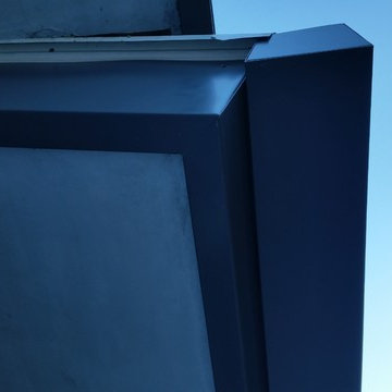


 RoehrSchmitt Architecture
© Gilbertson Photography
Example of a small eclectic green two-story stucco exterior home design in Minneapolis
Example of a small eclectic green two-story stucco exterior home design in Minneapolis

 Cure Design Group
KITCHEN RENOVATION CURRENT CRAFTSMAN
This client started off just being curious about our services - what we could do, and if we could even help her update her kitchen. She and her husband with their two teenage kids have lived in their home for several years without updating anything since the house was originally built. They didn’t quite have a budget in mind yet. They didn’t know their style, or even if they had one. Their timeline was simple, “as fast as you can so we’re not without a kitchen for very long” (usually what we hear for kitchen updates).
After a very productive consultation: determining the scope of work and zeroing in on a budget, I was very excited to update this underwhelming space to something that is modern but timeless, something that is theirs. And, it was easy to see what type of design style they gravitated toward looking at the pieces they already own: Craftsman/Prairie Style. I left the meeting so excited to weave in yet another genre of design to my CDG portfolio! We circled in our contractor to discuss the changes they were looking to make and the scope of work that would be theirs. Then I was off to get designing:
// Because the kitchen’s footprint and the defined breakfast space delineated by the bay, we kept the perimeter cabinetry as it was originally laid out. We updated these cabinets to a beautiful soft Alabaster White with a Barn Wood Glaze to highlight the simplicity of the shaker style doors. We added transom cabinets above the uppers, with only the back wall having seeded glass inserts to highlight some of their collectables.
// The original shaped island was counter-productive (See what I did there?) in functionality and design. We squared this off to reduce some of the angles and gain more storage. We highlighted the new island with a contrasting oak cabinet in a dark finish, to pay our respects to the craftsman style, and topped with a concrete-like countertop as a nod to the Prairie Style, allowing the homeowners to gain two extra seats and a massive -uninterrupted- work surface.
// The small section of cabinetry between the garage entry and fridge now is the perfect dump-station for mail, electronics, whatever is in their hands when they come into the house; and completely hidden by the refrigerator.
// The disconnected cabinetry in the breakfast area makes for a great place to have a working office. Accessible from the kitchen or the adjacent great room, this is the perfect place for the kids to do their homework while mom and dad are putting together dinner. The base cabinets are built out for office-type storage: paper and pencil drawers, filing systems, and cord management. Additionally, the long counter provides a ton of worksurface to spread out.
// The largest transformation was the pantry. We raised the height of the doorway and added huge custom designed bypass sliding barndoors. Finished with a dark stain to compliment the island and cut to inset 4 stained glass windows, typical of this style of design, and driving home the concept for the whole space.
// They were desperate to replace their flooring with something extremely durable to flow throughout the kitchen and the whole main level. This beautiful new flooring is actually a textured LVT(!) Which allowed them to save on overall cost and extend the life of their new flooring purchase.
// They loved their copper table, so we kept it and added new simple, mid-century modern chairs around it and a shiny new craftsman-style chandelier above. We added bright barstools in a burnt orange-red accent, and a bright woven rug to tie it all together.
// Because the kitchen renovation was shaping up to be pretty spectacular, they decided they needed to now replace their ‘now-these-look-a-little-too-old’ upholstered seating in the neighboring great room with 2 new sofas. We found the perfect sage-y-grey fabric which we covered on sofa frames that have and exposed oak-wood base, which we finished in a warm weathered grey.
// As every designer knows, a room isn’t finished until there’s something on the windows. Now that the new flooring was installed and every other room on the main level ‘seemed’ to be updated, we needed to update the window treatments in the dining, and great rooms to reflect their new design concept.
I hope you find the ‘after’ photos refreshing (as refreshing as it was for me to work on something that’s not a “Farm House” style that’s saturating the industry right now!) This was such a fun project and a great collaboration with our contractor.



 Rebel Builders
Industrial transitional English style kitchen. The addition and remodeling were designed to keep the outdoors inside. Replaced the uppers and prioritized windows connected to key parts of the backyard and having open shelvings with walnut and brass details.
Custom dark cabinets made locally. Designed to maximize the storage and performance of a growing family and host big gatherings. The large island was a key goal of the homeowners with the abundant seating and the custom booth opposite to the range area. The booth was custom built to match the client's favorite dinner spot. In addition, we created a more New England style mudroom in connection with the patio. And also a full pantry with a coffee station and pocket doors.
 Lightstreams Glass Tile
Mystic Spring Jewel 2"x6" bullnose glass trim tiles edging a Lightstreams Glass Tiled pool spillway ledge
Example of an island style pool design in San Francisco
Example of an island style pool design in San Francisco
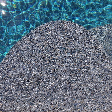
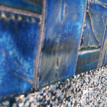
 Pearl Pool Plastering
Wet Edge Prism Matrix Eclipse installed by Pearl Pool Plastering
The pool is in full sunshine with no cloud.
Courtesy of Kobs Pools http://kobspools.com/
 Pearl Pool Plastering
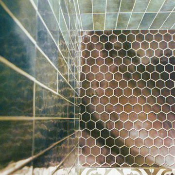
Wet Edge Prism Matrix Eclipse installed by Pearl Pool Plastering
The pool is in full sunshine with no cloud.
Courtesy of Kobs Pools http://kobspools.com/

177