
Search results for "Scaled down options" in Home Design Ideas
 Advance Design Studio, Ltd.
After six years of living in their Huntley IL home, Chris and Meghan were tired of their dark, dingy, outdated kitchen and it was finally time for a long-anticipated change. “The kitchen is the place where we live, it’s where we do everything,” Meghan said. “It was important that it be a space where we wanted to be.” Meghan loves cooking and enjoys including their girls in healthy meal prepping, this led them to want a brighter, more enjoyable kitchen with increased functionality and improved storage.
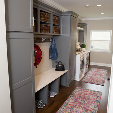
For Chris especially, the laundry room was an entirely dysfunctional eyesore. “We had a washer and a dryer, but it was all kind-of cobbled together!” Chris said. “There were always laundry piles everywhere, we weren’t really sure what we wanted to do in there, but it was time for us to make a change.” The mess of the space was stressful every time they walked in the door from the garage each day. Kids’ backpacks and shoes piled up haphazardly in the makeshift boot-bench closet left the family feeling disorganized and stressed. They needed space for folding clothes and locker cubbies to help keep the family organized.
Having known Christine and Todd in the Huntley community for years, Chris and Meghan were familiar with their work. “We already trusted them personally and having seen their projects for years we knew they did top notch work. After we reviewed the initial round of designs, we knew that hiring them was definitely the right choice,” Meghan and Chris said. Although Chris had done a lot of work in their home himself, the kitchen and laundry room renovation was such a large undertaking that he didn’t want to steal time away from his family to spend what would surely be many long weekends doing the job himself. “That would not have been a wise choice for us,” Chris laughed.
“Our designer, Michelle was very, very, easy to work with; anything we wanted to see or weren’t sure about, she went above and beyond to make this easy for us. She was easy to get hold of and always quick to respond,” the couple said. Michelle pulled ideas that mirrored the couple’s taste and style and was adept at directing the couple to limited choices that didn’t overwhelm them and kept the process moving. “I have a hard time making decisions. Michelle made the decision-making process so easy. I loved how she listened to what I liked and then presented three great options for me to choose from,” Meghan said.
The main objectives for the kitchen were better storage solutions, they wanted the space to reflect their lifestyle and taste, and they wanted it to last for years with low maintenance. One of the first steps in creating a more functional kitchen was relocating the refrigerator, creating an improved workflow for the busy family.
“We didn’t know that we could even move the refrigerator to a new location where it is now, that was something that we never would have thought of,” Chris said. “The new refrigerator location makes the kitchen feel so much bigger. We didn’t add any space, but our whole kitchen with the new design just seems like it’s so much larger than before!” Meghan said.
The perimeter mist colored cabinets helped warm and brighten the entire room, while the graphite colored cabinets on the island added contrast. Using this fresh, clean color palette satisfied the couple’s desire for a bright space that was the exact opposite of what they had before. Organization accessories were also added to the cabinets such as a spice drawer tray and roll outs to create hidden convenience.
“I absolutely love the hidden spices – it makes cooking so much more enjoyable!” Chris said. “And all the pull outs, and the double trash bin, who would think you could get so excited about organization!” the couple said in unison.
One thing they hated in their original kitchen was how dark the space felt. Added lighting on the ceiling with the new light fixtures combined with the lighter cabinetry colors throughout solved this problem. “Our new kitchen has this warm, almost cozy feeling that our old kitchen never had, it’s just a space that I love spending my time in now,” Meghan said. The light airy feeling was accentuated with the use of floating white shelves on either side of the decorative range hood. “We have so much cabinetry space, the new design is amazing we actually have more storage space than we will ever need,” Meghan said.
The island was extended to create more work surface and added space for stool seating. “The new island changes how we live. Now the kids can be in the kitchen with us, doing homework, eating breakfast, and the three of us have special dinners there when Chris is working late,” Meghan said.
The Carrara Marmi Quartz countertops were chosen because they are, not only beautiful, but are made from hard-working material that doesn’t require maintenance. The white subway tile backsplash that wraps to the ceiling behind the focal point cooktop range/hood compliments the crisp white countertops perfectly, while brushed brass hardware and light fixtures keep the design fresh and new.
The couple had a few fears at the beginning of the project, as most homeowners do. Their biggest fear was being out of their kitchen and laundry room for an extended time. The crew made it very easy for the family to work in a limited space keeping the washer and dryer hooked up the majority of the time, and also getting appliances working with minimal downtime.
“They above and beyond accommodated us to get us through the process,” Meghan said. “They did a great job making sure we were as comfortable as possible throughout the process,” Chris added.
“Our project manager DJ did a great job. He was very good at updating us on schedule changes, getting guys in as quickly as possible. Everyone that stepped in the house was nice and did great work,” said Chris. They thought Advance’s carpenter was phenomenal and were impressed when he took a conceptual idea from a photograph and worked with designer Michelle to create a one of a kind range/hood that has become the topic of conversation with friends and family who visit the new kitchen. “He was in our house literally every day for several weeks. He was easy to work with and good at what he did,” Meghan and Chris said.
The focal point of the kitchen; a hand-crafted, custom-built ventilation hood was clad with handpicked reclaimed barnwood. Advance Design’s carpenter built the framework and the cladding to create a one-of-a-kind design element that the couple loves.
“I think it was especially fun for him to create something unique from scratch, showcasing his talent in this area,” Meghan said. “I love that my kitchen is not like everyone else’s. I got to pick out the wood on my hood and watch it being built and was able to choose what pieces of wood went where on it. It’s totally unique.”
Red Oak flooring was toothed-in throughout the kitchen and the rest of the first floor anywhere changes were made. Then the whole floor was refinished to tone down the orange undertones in the existing floor stain, ultimately changing the color complexion of the entire first floor. The result is a completely new feeling to the entire home.
Renovating the laundry room was extremely important to Meghan and Chris, but they had trouble visualizing what the possibilities were for the seemingly small space. Michelle produced beautiful 3D illustrations that helped them envision the space in a whole new way.
“I must have told Michelle 100 times that I am a visual person, seeing the designs in 3D made it so easy to make decisions and see what we could really do with our space,” Meghan said.
A dividing wall and doorway were removed between the existing laundry room and hallway formerly containing a coat closet, providing space to design specialized graphite colored cabinetry matching the kitchen island to house custom storage cubbies for each family member. Adding the tall utility cabinetry in the new laundry area helped solve the storage issue, tucking away cleaning supplies, household items, and even the cat got its own cubby.
“I love how everything is now hidden in its own space. I can’t tell you how much I hated coming home and seeing everything sitting around on counters,” Chris said.
Electrical outlets were planned for the inside of utility cabinets, so devices could charge in hidden locations. Stacking the washer and dryer allowed for wider countertop space to provide a folding area and a special space for clothes to hang. “The way I do laundry has been completely transformed! I can actually fold clothes and hang them now right out of the washer and dryer,” Meghan said.
“The end result in the kitchen and the laundry/mud room was an updated light and bright space, with a smarter work flow that better meets the needs of this family,” Michelle said.
“I would totally recommend Advance Design,” Meghan said. “Sometimes I sit and just look at my kitchen and laundry room and think ‘Wow, I can’t believe I get to live here!’ It’s an understatement to say we love our new space.”
 Accent Woodworking Inc.
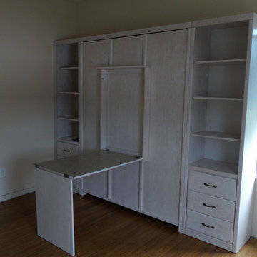
Custom Savona Murphy Wall Bed, Cabinets, Attached Table to Bed Face. Available in Twin, Full, Queen and King
Shown in Whitewash on Oak.
Model: S1800
Table/Desk folds down from face of Wall Bed
OP-WB-FDD - Closed-26w x 40h * Opened-36-38w x 24d
Shown with Triple Drawer Side Cabinets & Optional Snack Trays
Optional: LED Lights available inside Bed
 Brooks + Scarpa Architects
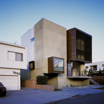
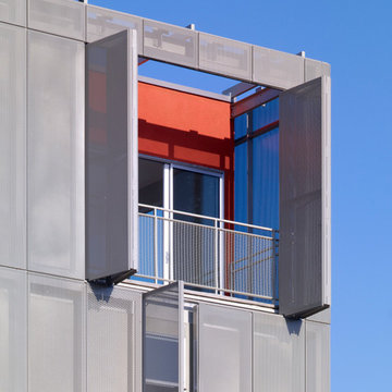
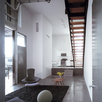
Located in a neighborhood characterized by traditional bungalow style single-family residences, Orange Grove is a new landmark for the City of West Hollywood. The building is sensitively designed and compatible with the neighborhood, but differs in material palette and scale from its neighbors. Referencing architectural conventions of modernism rather than the pitched roof forms of traditional domesticity, the project presents a characteristic that is consistent with the eclectic and often unconventional demographic of West Hollywood. Distinct from neighboring structures, the building creates a strong relationship to the street by virtue of its large amount of highly usable balcony area in the front façade.
While there are dramatic and larger scale elements that define the building, it is also broken down into comprehensible human scale parts, and is itself broken down into two different buildings. Orange Grove displays a similar kind of iconoclasm as the Schindler House, an icon of California modernism, located a short distance away. Like the Schindler House, the conventional architectural elements of windows and porches become part of an abstract sculptural ensemble. At the Schindler House, windows are found in the gaps between structural concrete wall panels. At Orange Grove, windows are inserted in gaps between different sections of the building.
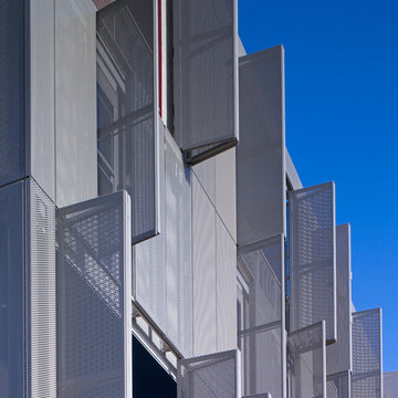
The design of Orange Grove is generated by a subtle balance of tensions. Building volumes and the placement of windows, doors and balconies are not static but rather constitute an active three-dimensional composition in motion. Each piece of the building is a strong and clearly defined shape, such as the corrugated metal surround that encloses the second story balcony in the east and north facades. Another example of this clear delineation is the use of two square profile balcony surrounds in the front façade that set up a dialogue between them—one is small, the other large, one is open at the front, the other is veiled with stainless steel slats. At the same time each balcony is balanced and related to other elements in the building, the smaller one to the driveway gate below and the other to the roll-up door and first floor balcony. Each building element is intended to read as an abstract form in itself—such as a window becoming a slit or windows becoming a framed box, while also becoming part of a larger whole. Although this building may not mirror the status quo it answers to the desires of consumers in a burgeoning niche market who want large, simple interior volumes of space, and a paradigm based on space, light and industrial materials of the loft rather than the bungalow.
Find the right local pro for your project
 Brooks + Scarpa Architects
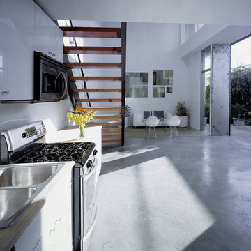
Located in a neighborhood characterized by traditional bungalow style single-family residences, Orange Grove is a new landmark for the City of West Hollywood. The building is sensitively designed and compatible with the neighborhood, but differs in material palette and scale from its neighbors. Referencing architectural conventions of modernism rather than the pitched roof forms of traditional domesticity, the project presents a characteristic that is consistent with the eclectic and often unconventional demographic of West Hollywood. Distinct from neighboring structures, the building creates a strong relationship to the street by virtue of its large amount of highly usable balcony area in the front façade.
While there are dramatic and larger scale elements that define the building, it is also broken down into comprehensible human scale parts, and is itself broken down into two different buildings. Orange Grove displays a similar kind of iconoclasm as the Schindler House, an icon of California modernism, located a short distance away. Like the Schindler House, the conventional architectural elements of windows and porches become part of an abstract sculptural ensemble. At the Schindler House, windows are found in the gaps between structural concrete wall panels. At Orange Grove, windows are inserted in gaps between different sections of the building.
The design of Orange Grove is generated by a subtle balance of tensions. Building volumes and the placement of windows, doors and balconies are not static but rather constitute an active three-dimensional composition in motion. Each piece of the building is a strong and clearly defined shape, such as the corrugated metal surround that encloses the second story balcony in the east and north facades. Another example of this clear delineation is the use of two square profile balcony surrounds in the front façade that set up a dialogue between them—one is small, the other large, one is open at the front, the other is veiled with stainless steel slats. At the same time each balcony is balanced and related to other elements in the building, the smaller one to the driveway gate below and the other to the roll-up door and first floor balcony. Each building element is intended to read as an abstract form in itself—such as a window becoming a slit or windows becoming a framed box, while also becoming part of a larger whole. Although this building may not mirror the status quo it answers to the desires of consumers in a burgeoning niche market who want large, simple interior volumes of space, and a paradigm based on space, light and industrial materials of the loft rather than the bungalow.
 Techo-Bloc
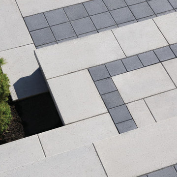
These modern stone steps were designed with out Squadra and Industria pavers!
The Squadra paver brings straight-edged mini-cube paver catchiness to the contemporary home. Inspired by European cobblestone roads, the Squadra paver is the perfect choice for anyone looking for a mini square paver that makes a large statement.
Industry is a modern paver available in over 50 scale and color combinations. This paver's de-icing salt resistance and 100mm height makes it a reliable option for industrial, commercial and institutional applications.
 Poggenpohl Kitchens Hawaii
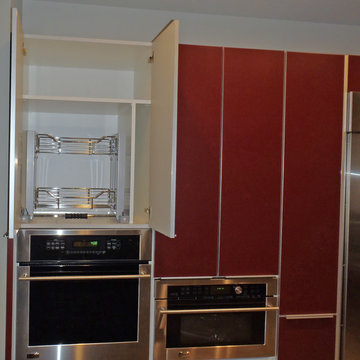
European style Poggenpohl kitchen offers a roomy island with induction cooktop and beverage refrigerator, wet wall with single dish drawer, Grohe fixtures and lift-up cabinet doors, and full-height wall including refrigeration, ovens and plenty of pantry space. All drawers and lift-up doors open at a gentle touch due to the Servo-drive installation. The lift-up doors may be lowered manually or with the touch of a recessed button. The roomy kitchen includes many Universal Design features like wide paths, dimmable lighting, roll-up cooktop and sink area, dish drawer, automatic drawer openers, pull-down shelves, pull-out pantries, and taller toe kick areas.
Photo Credit: Michelle Turner, UDCP


 Mark Thomas Home
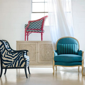
Sam Moore Living Room Cadence Exposed Wood Chair
SKU 4384
Cadence comes standard with a blendown seat cushion and welt trim.
OTHER DETAILS
Brand Sam Moore
Category Living Room
Collection Cadence, Musical Chairs, Styling and Profiling, Sam Moore Selects
Contrasting Fabric Available for inside back, outside arm, outside back and seat. Any fabric. Contrasting options available with an upcharge.
Description Cadence Exposed Wood Chair
Fabric Hundreds of fabric options available
Padding Padded outside back for smoother surface and neater appearance.
Seat Blendown seat consisting of 30% down, 70% polyester fiber. High-end look with feather/down feel but nice cushion crown.
Seat Construction Sinuous wire springs, synthetic webbing, 1.8 lb foam density, 25 lb compression for a comfortable and firm seat with resiliency to last and beveled polyurethane core with polyester wrap
Trim Standard welt trim. Contrasting welt optional with slight upcharge.
Type Chairs, Arm Chairs
Finish Premier wood finishes with elaborate hand detailing available at slight upcharge
DIMENSIONS
Width 29"
Depth 31"
Height 37"
Weight 44 lb
Arm Height 26"
Seat Width 20"
Seat Depth 20 1/2"
Seat Height 21"
 LSM Interiors Inc.
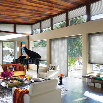
Duette® Architella® honeycomb shades with Vertiglide™
For doors that need extra insulation from the heat or cold, Duette® Architella® honeycomb shades with the Vertiglide™ operating system are the ideal option. The Vertiglide™ operating system is very simple - with no cords, chains or wands - and allows for just one shade to cover the entire window expanse.
Combine these with horizontal Duettes® shades and you have The Whole House Solution™.
Almost immediately you can see how your Duette® honeycomb shades transform any room into a stunning, living space and experience the beauty and privacy you deserve. These versatile shades offer options for: top-down/bottom-up, top down, bottom up, angles, cordless, French doors, skylights and patio doors. Using Duettes® in every room of your home is a possibility and a great easy solution.
 Brooks + Scarpa Architects
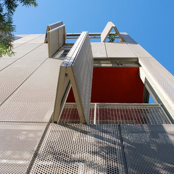
Located in a neighborhood characterized by traditional bungalow style single-family residences, Orange Grove is a new landmark for the City of West Hollywood. The building is sensitively designed and compatible with the neighborhood, but differs in material palette and scale from its neighbors. Referencing architectural conventions of modernism rather than the pitched roof forms of traditional domesticity, the project presents a characteristic that is consistent with the eclectic and often unconventional demographic of West Hollywood. Distinct from neighboring structures, the building creates a strong relationship to the street by virtue of its large amount of highly usable balcony area in the front façade.
While there are dramatic and larger scale elements that define the building, it is also broken down into comprehensible human scale parts, and is itself broken down into two different buildings. Orange Grove displays a similar kind of iconoclasm as the Schindler House, an icon of California modernism, located a short distance away. Like the Schindler House, the conventional architectural elements of windows and porches become part of an abstract sculptural ensemble. At the Schindler House, windows are found in the gaps between structural concrete wall panels. At Orange Grove, windows are inserted in gaps between different sections of the building.
The design of Orange Grove is generated by a subtle balance of tensions. Building volumes and the placement of windows, doors and balconies are not static but rather constitute an active three-dimensional composition in motion. Each piece of the building is a strong and clearly defined shape, such as the corrugated metal surround that encloses the second story balcony in the east and north facades. Another example of this clear delineation is the use of two square profile balcony surrounds in the front façade that set up a dialogue between them—one is small, the other large, one is open at the front, the other is veiled with stainless steel slats. At the same time each balcony is balanced and related to other elements in the building, the smaller one to the driveway gate below and the other to the roll-up door and first floor balcony. Each building element is intended to read as an abstract form in itself—such as a window becoming a slit or windows becoming a framed box, while also becoming part of a larger whole. Although this building may not mirror the status quo it answers to the desires of consumers in a burgeoning niche market who want large, simple interior volumes of space, and a paradigm based on space, light and industrial materials of the loft rather than the bungalow.
 Brooks + Scarpa Architects
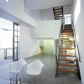
Located in a neighborhood characterized by traditional bungalow style single-family residences, Orange Grove is a new landmark for the City of West Hollywood. The building is sensitively designed and compatible with the neighborhood, but differs in material palette and scale from its neighbors. Referencing architectural conventions of modernism rather than the pitched roof forms of traditional domesticity, the project presents a characteristic that is consistent with the eclectic and often unconventional demographic of West Hollywood. Distinct from neighboring structures, the building creates a strong relationship to the street by virtue of its large amount of highly usable balcony area in the front façade.
While there are dramatic and larger scale elements that define the building, it is also broken down into comprehensible human scale parts, and is itself broken down into two different buildings. Orange Grove displays a similar kind of iconoclasm as the Schindler House, an icon of California modernism, located a short distance away. Like the Schindler House, the conventional architectural elements of windows and porches become part of an abstract sculptural ensemble. At the Schindler House, windows are found in the gaps between structural concrete wall panels. At Orange Grove, windows are inserted in gaps between different sections of the building.
The design of Orange Grove is generated by a subtle balance of tensions. Building volumes and the placement of windows, doors and balconies are not static but rather constitute an active three-dimensional composition in motion. Each piece of the building is a strong and clearly defined shape, such as the corrugated metal surround that encloses the second story balcony in the east and north facades. Another example of this clear delineation is the use of two square profile balcony surrounds in the front façade that set up a dialogue between them—one is small, the other large, one is open at the front, the other is veiled with stainless steel slats. At the same time each balcony is balanced and related to other elements in the building, the smaller one to the driveway gate below and the other to the roll-up door and first floor balcony. Each building element is intended to read as an abstract form in itself—such as a window becoming a slit or windows becoming a framed box, while also becoming part of a larger whole. Although this building may not mirror the status quo it answers to the desires of consumers in a burgeoning niche market who want large, simple interior volumes of space, and a paradigm based on space, light and industrial materials of the loft rather than the bungalow.
 Brooks + Scarpa Architects
Located in a neighborhood characterized by traditional bungalow style single-family residences, Orange Grove is a new landmark for the City of West Hollywood. The building is sensitively designed and compatible with the neighborhood, but differs in material palette and scale from its neighbors. Referencing architectural conventions of modernism rather than the pitched roof forms of traditional domesticity, the project presents a characteristic that is consistent with the eclectic and often unconventional demographic of West Hollywood. Distinct from neighboring structures, the building creates a strong relationship to the street by virtue of its large amount of highly usable balcony area in the front façade.
While there are dramatic and larger scale elements that define the building, it is also broken down into comprehensible human scale parts, and is itself broken down into two different buildings. Orange Grove displays a similar kind of iconoclasm as the Schindler House, an icon of California modernism, located a short distance away. Like the Schindler House, the conventional architectural elements of windows and porches become part of an abstract sculptural ensemble. At the Schindler House, windows are found in the gaps between structural concrete wall panels. At Orange Grove, windows are inserted in gaps between different sections of the building.
The design of Orange Grove is generated by a subtle balance of tensions. Building volumes and the placement of windows, doors and balconies are not static but rather constitute an active three-dimensional composition in motion. Each piece of the building is a strong and clearly defined shape, such as the corrugated metal surround that encloses the second story balcony in the east and north facades. Another example of this clear delineation is the use of two square profile balcony surrounds in the front façade that set up a dialogue between them—one is small, the other large, one is open at the front, the other is veiled with stainless steel slats. At the same time each balcony is balanced and related to other elements in the building, the smaller one to the driveway gate below and the other to the roll-up door and first floor balcony. Each building element is intended to read as an abstract form in itself—such as a window becoming a slit or windows becoming a framed box, while also becoming part of a larger whole. Although this building may not mirror the status quo it answers to the desires of consumers in a burgeoning niche market who want large, simple interior volumes of space, and a paradigm based on space, light and industrial materials of the loft rather than the bungalow.

Sponsored
Westerville, OH

Custom Home Works
Franklin County's Award-Winning Design, Build and Remodeling Expert
 Brooks + Scarpa Architects
Located in a neighborhood characterized by traditional bungalow style single-family residences, Orange Grove is a new landmark for the City of West Hollywood. The building is sensitively designed and compatible with the neighborhood, but differs in material palette and scale from its neighbors. Referencing architectural conventions of modernism rather than the pitched roof forms of traditional domesticity, the project presents a characteristic that is consistent with the eclectic and often unconventional demographic of West Hollywood. Distinct from neighboring structures, the building creates a strong relationship to the street by virtue of its large amount of highly usable balcony area in the front façade.
While there are dramatic and larger scale elements that define the building, it is also broken down into comprehensible human scale parts, and is itself broken down into two different buildings. Orange Grove displays a similar kind of iconoclasm as the Schindler House, an icon of California modernism, located a short distance away. Like the Schindler House, the conventional architectural elements of windows and porches become part of an abstract sculptural ensemble. At the Schindler House, windows are found in the gaps between structural concrete wall panels. At Orange Grove, windows are inserted in gaps between different sections of the building.
The design of Orange Grove is generated by a subtle balance of tensions. Building volumes and the placement of windows, doors and balconies are not static but rather constitute an active three-dimensional composition in motion. Each piece of the building is a strong and clearly defined shape, such as the corrugated metal surround that encloses the second story balcony in the east and north facades. Another example of this clear delineation is the use of two square profile balcony surrounds in the front façade that set up a dialogue between them—one is small, the other large, one is open at the front, the other is veiled with stainless steel slats. At the same time each balcony is balanced and related to other elements in the building, the smaller one to the driveway gate below and the other to the roll-up door and first floor balcony. Each building element is intended to read as an abstract form in itself—such as a window becoming a slit or windows becoming a framed box, while also becoming part of a larger whole. Although this building may not mirror the status quo it answers to the desires of consumers in a burgeoning niche market who want large, simple interior volumes of space, and a paradigm based on space, light and industrial materials of the loft rather than the bungalow.
 Brooks + Scarpa Architects
Located in a neighborhood characterized by traditional bungalow style single-family residences, Orange Grove is a new landmark for the City of West Hollywood. The building is sensitively designed and compatible with the neighborhood, but differs in material palette and scale from its neighbors. Referencing architectural conventions of modernism rather than the pitched roof forms of traditional domesticity, the project presents a characteristic that is consistent with the eclectic and often unconventional demographic of West Hollywood. Distinct from neighboring structures, the building creates a strong relationship to the street by virtue of its large amount of highly usable balcony area in the front façade.
While there are dramatic and larger scale elements that define the building, it is also broken down into comprehensible human scale parts, and is itself broken down into two different buildings. Orange Grove displays a similar kind of iconoclasm as the Schindler House, an icon of California modernism, located a short distance away. Like the Schindler House, the conventional architectural elements of windows and porches become part of an abstract sculptural ensemble. At the Schindler House, windows are found in the gaps between structural concrete wall panels. At Orange Grove, windows are inserted in gaps between different sections of the building.
The design of Orange Grove is generated by a subtle balance of tensions. Building volumes and the placement of windows, doors and balconies are not static but rather constitute an active three-dimensional composition in motion. Each piece of the building is a strong and clearly defined shape, such as the corrugated metal surround that encloses the second story balcony in the east and north facades. Another example of this clear delineation is the use of two square profile balcony surrounds in the front façade that set up a dialogue between them—one is small, the other large, one is open at the front, the other is veiled with stainless steel slats. At the same time each balcony is balanced and related to other elements in the building, the smaller one to the driveway gate below and the other to the roll-up door and first floor balcony. Each building element is intended to read as an abstract form in itself—such as a window becoming a slit or windows becoming a framed box, while also becoming part of a larger whole. Although this building may not mirror the status quo it answers to the desires of consumers in a burgeoning niche market who want large, simple interior volumes of space, and a paradigm based on space, light and industrial materials of the loft rather than the bungalow.
 Lowes - Castle Rock Colorado
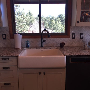
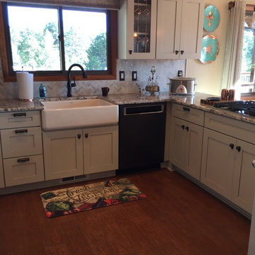
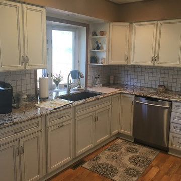
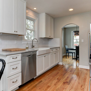
A beautiful update to an original 1976 kitchen with poor storage options. Replaced all cabinets with brighter finish, replace countertops with exotic granite, and replace backsplash with new modern tiles. Reused appliances and flooring to save on renovation cost.
 Randy Angell Designs
The planning phase of this modern retreat was an intense collaboration that took place over the course of more than two years. While the initial design concept exceeded the clients' expectations, it also exceeded their budget beyond the point of comfort.
The next several months were spent modifying the design, in attempts to lower the budget. Ultimately, the decision was made that they would hold off on the project until they could budget for the original design, rather than compromising the vision.
About a year later, we repeated that same process, which resulted in the same outcome. After another year-long hiatus, we met once again. We revisited design thoughts, each of us bringing to the table new ideas and options.
Each thought simply solidified the fact that the initial vision was absolutely what we all wanted to see come to fruition, and the decision was finally made to move forward.
The main challenge of the site was elevation. The Southeast corner of the lot stands 5'6" above the threshold of the rear door, while the Northeast corner dropped a full 2' below the threshold of the door.
The backyard was also long and narrow, sloping side-to-side and toward the house. The key to the design concept was to deftly place the project into the slope and utilize the elevation changes, without allowing them to dominate the yard, or overwhelm the senses.
The unseen challenge on this project came in the form of hitting every underground issue possible. We had to relocate the sewer main, the gas line, and the electrical service; and since rock was sitting about 6" below the surface, all of these had to be chiseled through many feet of dense rock, adding to our projected timeline and budget.
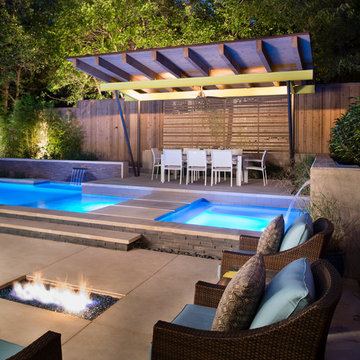
As you enter the space, your first stop is an outdoor living area. Smooth finished concrete, colored to match the 'Leuder' limestone coping, has a subtle saw-cut pattern aligned with the edges of the recessed fire pit.
In small spaces, it is important to consider a multi-purpose approach. So, the recessed fire pit has been fitted with an aluminum cover that allows our client to set up tables and chairs for entertaining, right over the top of the fire pit.
From here, it;s two steps up to the pool elevation, and the floating 'Leuder' limestone stepper pads that lead across the pool and hide the dam wall of the flush spa.
The main retaining wall to the Southeast is a poured concrete wall with an integrated sheer descent waterfall into the spa. To bring in some depth and texture, a 'Brownstone' ledgestone was used to face both the dropped beam on the pool, and the raised beam of the water feature wall.
The main water feature is comprised of five custom made stainless steel scuppers, supplied by a dedicated booster pump.
Colored concrete stepper pads lead to the 'Ipe' wood deck at the far end of the pool. The placement of this wood deck allowed us to minimize our use of retaining walls on the Northeast end of the yard, since it drops off over three feet below the elevation of the pool beam.
One of the most unique features on this project has to be the structure over the dining area. With a unique combination of steel and wood, the clean modern aesthetic of this structure creates a visual stamp in the space that standard structure could not accomplish.
4" steel posts, painted charcoal grey, are set on an angle, 4' into the bedrock, to anchor the structure. Steel I-beams painted in green-yellow color--aptly called "frolic"--act as the base to the hefty cedar rafters of the roof structure, which has a slight pitch toward the rear.
A hidden gutter on the back of the roof sends water down a copper rain chain, and into the drainage system. The backdrop for both this dining area , as well as the living area, is the horizontal screen panel, created with alternating sizes of cedar planks, stained to a calm hue of dove grey.
Sponsored
Columbus, OH

Hope Restoration & General Contracting
Columbus Design-Build, Kitchen & Bath Remodeling, Historic Renovations
 Wentz Design
Photo credit: Greg Grupenhof; Whole-house renovation to existing Indian Hill home. Prior to the renovation, the Scaninavian-modern interiors felt cold and cavernous. In order to make this home work for a family, we brought the spaces down to a more livable scale and used natural materials like wood and stone to make the home warm and welcoming.
 TOC design & construction inc.
DESIGNED BY TOC design
CONSTRUCTION BY TOC design & Construction inc.
PHOTOS BY : Tania Scardellato
I was fortunate to have a young family approach me in desperate need to renovate there only 3 piece bathroom. This space was In dire need of a remodel, with old brown wall to wall tiles and a dated bulky yellow brown single sink vanity.
Storage was a must, lighting a necessity, and proper accessibility to the shower bath area.
We had a tight budget to respect, but a full gut of this bathroom was required. And a good thing too, once we started doing the demolition we noticed that mildew and rotting floors and walls had accumulated throughout the years. Doing it right the first time is no joke when dealing with water and electrical issues.
We discarded all reminisce of old and built from scratch, new walls, new plumbing, new electrical ,new insulation and a new window, a new fan that actually exhausted outside ( I say this laughing as you would be amazed at how many fans are installed but don’t exhaust outside, and you the client would never know unless you go inside the attic space.
Once all the hard stuff was done, the rest is just a matter of smart design. If you have a small bathroom here are some tips to guide you.
10 tips for making a small bathroom feel larger
Is your tiny bathroom cramping your functionality and style, leaving you longing for the enormous bathrooms gracing the pages of design magazines? Even if your bathroom is a fraction of the size, all it takes is some design savvy to make the most of the space you have. Consider these 10 smart tips that will help your bathroom look, feel and function like those larger contenders.
1-Get creative with corners
Space is at a premium in small bathrooms, so it's important to maximize every inch. Corners, for example, provide extra space for shelving, storage units and even hooks. Get creative and install unique design solutions that are not only functional, but also eye-catching. If you love the airiness of floating cabinets, add baskets or decorative boxes under for extra storage. If you are installing floating cabinets insure that they are installed securely to studs or plywood at wall.
2- Let solid colors shine
Busy patterns have a shrinking effect and make small bathrooms seem even smaller. Conversely, light natural hues make a space feel more open. If you're itching to get creative with design, experiment with textures but keep overpowering patterns to a minimum. Tone on tone is the best to achieve this.
3 - Maximize your bathtub
A bathtub takes up a significant portion of the room, but modern, compact options with curved basins, can make the tub feel larger when in use, all while conserving space.
4 - Select a smaller faucet
A faucet is jewelry for the bathroom. And just as accessories can overpower an outfit, a big bulky faucet isn't flattering in a small bath. Single-handle designs conserve counter space, while a wall-mount installation frees it up all together and can create quite the wow-factor, if the budget can accommodate the required changes to plumbing behind the wall.
5 - Make vanity storage simple
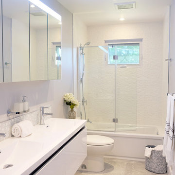
If you're in a storage war with your small bathroom, you're not alone in the battle. Toiletries and personal supplies without a place to call home only add clutter and chaos. Store smart with a space-saving vanity, the dual sink vanity shown here, looks quite simple, but in reality it has 4 sets of full extension drawers, and the vanity tower adds extra storage without overpowering the use of space.
6 - Show off the shower
Shower curtains may be pretty, but they interrupt the visual flow of a bathing space and make it feel significantly smaller. In bathrooms with small footprints, opt for a clear glass sliding shower door that doesn't require the clearance of one with a hinged design. Or as shown in this design and for fraction less expensive a half hinged panel installed on a fixed tempered glass panel. If you're embarking on a big remodel, create the illusion of more space by using same tile in the shower that's used throughout; instead of seeing them as two separate zones, the eye will read them as one.
7 - Discover the treasure of hidden storage
Work with a contractor, and you just might find some serious storage potential hidden behind your walls. Whether it's utilizing space between the studs for shallow shelving or a creating a small linen closet by annexing space from an adjacent room, even small additions can make a big difference.
8 - Focal Point
Tile is a beautiful, durable addition to any bathroom. For dainty spaces, consider installing tile at a diagonal to accentuate the focal point or as in this bathroom I used an oversized textured pattern to bring depth to the space at the window wall.
9 - Choose the right lights
Strategically install light to reflect and brighten a small bathroom to make it appear larger. Recessed lighting is an affordable solution for tiny rooms, offering ample light while taking up little space. Wall sconces alongside a mirror also reflect off the walls and make a room feel bright and airy. I always recommend going with LED lighting at 2800 to 3000K.
10 – Accessorize
This is your time to shine in your decorating skills, have fun with your towels, you can change the color scheme daily just by adding pops of color in your accessories, make sure to get items that serve a dual purpose, like baskets, boxes they can always be used as hampers, storing of towels and even a nice display for your guest.
 Change Your Bathroom©
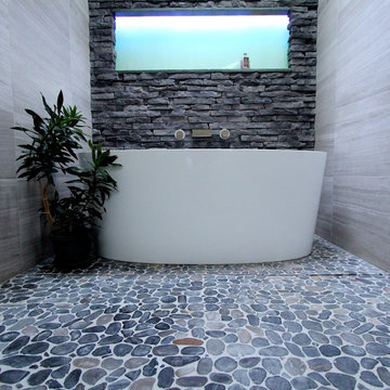
The goal of this project was to upgrade the builder grade finishes and create an ergonomic space that had a contemporary feel. This bathroom transformed from a standard, builder grade bathroom to a contemporary urban oasis. This was one of my favorite projects, I know I say that about most of my projects but this one really took an amazing transformation. By removing the walls surrounding the shower and relocating the toilet it visually opened up the space. Creating a deeper shower allowed for the tub to be incorporated into the wet area. Adding a LED panel in the back of the shower gave the illusion of a depth and created a unique storage ledge. A custom vanity keeps a clean front with different storage options and linear limestone draws the eye towards the stacked stone accent wall.
Houzz Write Up: https://www.houzz.com/magazine/inside-houzz-a-chopped-up-bathroom-goes-streamlined-and-swank-stsetivw-vs~27263720
The layout of this bathroom was opened up to get rid of the hallway effect, being only 7 foot wide, this bathroom needed all the width it could muster. Using light flooring in the form of natural lime stone 12x24 tiles with a linear pattern, it really draws the eye down the length of the room which is what we needed. Then, breaking up the space a little with the stone pebble flooring in the shower, this client enjoyed his time living in Japan and wanted to incorporate some of the elements that he appreciated while living there. The dark stacked stone feature wall behind the tub is the perfect backdrop for the LED panel, giving the illusion of a window and also creates a cool storage shelf for the tub. A narrow, but tasteful, oval freestanding tub fit effortlessly in the back of the shower. With a sloped floor, ensuring no standing water either in the shower floor or behind the tub, every thought went into engineering this Atlanta bathroom to last the test of time. With now adequate space in the shower, there was space for adjacent shower heads controlled by Kohler digital valves. A hand wand was added for use and convenience of cleaning as well. On the vanity are semi-vessel sinks which give the appearance of vessel sinks, but with the added benefit of a deeper, rounded basin to avoid splashing. Wall mounted faucets add sophistication as well as less cleaning maintenance over time. The custom vanity is streamlined with drawers, doors and a pull out for a can or hamper.
A wonderful project and equally wonderful client. I really enjoyed working with this client and the creative direction of this project.
Brushed nickel shower head with digital shower valve, freestanding bathtub, curbless shower with hidden shower drain, flat pebble shower floor, shelf over tub with LED lighting, gray vanity with drawer fronts, white square ceramic sinks, wall mount faucets and lighting under vanity. Hidden Drain shower system. Atlanta Bathroom.
30